There’s nothing that economists love more than a good blackboard (or in modern times, a whiteboard) to work out some basic models of how we think the world works. Supply and demand rules in microeconomics, but macroeconomics has a few good blackboard models too.
So I was excited to see when a member of Congress was using a whiteboard to work through some basic economic logic, as Rep. Katie Porter did in this video she tweeted using the textbook macroeconomics aggregate demand and aggregate supply model:
Investing in workers and infrastructure strengthens our economy. Paying for it and generating surplus revenue with taxes on the ultra-wealthy keeps prices down for families. Using my whiteboard to explain basic economics, I debunked a common Republican talking point on inflation. pic.twitter.com/FokbzFtOqc
However, while I haven’t taught macroeconomics in about a decade, it seems there are a few flaws in her analysis. Flaws enough that this probably wouldn’t get a passing grade on an oral exam. I could detail them myself, but… I will leave this to the readers as an exercise! For fun, even if you don’t think this is the best model in the world, just assume it’s a good model. What did Rep. Porter miss? Leave a comment.
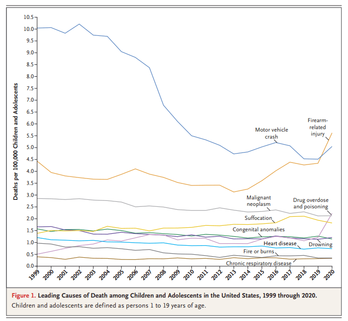
You might have seen this chart recently. It comes from a letter published in the New England Journal of Medicine in April 2022. The data comes directly from the CDC. It shows the leading causes of death for children in the US. You will notice that firearm-related deaths have been rising for much of the past decade, and in 2020 eclipsed car accidents as the leading cause.
Many are sharing this chart in response to the recent elementary school shooting in Nashville. It’s natural to want to study these problems more in the wake of tragedies. After the Uvalde shooting last year, I tried to read as much as I could about the history of homicide and gun violence in the US, and to look at the research on what might work to reduce gun violence, which is summarized in a post I wrote last June.
That being said, I don’t think the chart above accurately characterizes the problem of elementary school shootings. It might accurately describe some broader problem, but it’s misleading with respect to the shooting we all just witnessed. The most important reason is that the definition of “children” here extends to 18- and 19-year-olds. Much of the gun-related homicides for “children” shown here are gang-related violence, not random school shootings at elementary schools. It’s not that we shouldn’t care about these deaths too — we very much should care — but the causes and solutions are entirely different from elementary school mass shootings.
Recently I was watching a lecture by historian Marcus Witcher which addressed the treatment of African Americans in the Jim Crow era. Witcher mentioned the “pig laws,” which were severe legal punishments given to Blacks in the South for what used to be petty crimes. Such as stealing a pig. He mentioned that the fines could be anywhere from $100 to $500, and then he asked me directly: how much is $100 adjusted for inflation today?
My initial, immediate answer was about $3,000. That turns out to be almost exactly correct for around 1880. But the more I thought about it, the more I realized that this wasn’t a satisfactory answer. We were trying to put $100 from a distant past year in context to understand how much of a burden this was for African Americans at the time. Does knowing that adjusted for inflation it’s about $3,000 give us much context?
As you may have heard, there have been a few bank failures in the US in the past week. This has led ordinary people to start refreshing their memory about exactly what “deposit insurance” is and what it means for them. It has also led regulators, politicians, and economists to start refreshing their memory about the social purpose of deposit insurance, which is to stabilize the banking system. There are lots of aspects of the bank failures and deposit insurance to consider, but I think we can all agree that when ordinary people are thinking about this topic, bad things are going on.
While I can’t find a systematic survey of economists on this topic, my guess is that most economists would agree with the statement “on balance, deposit insurance promotes stability in the financial system.”
But there is a minority view, and one with (in my opinion) considerable historical support. Deposit insurance could potentially be destabilizing, since it has the potential (like any form of insurance) to create moral hazard. By lowering the cost of making mistakes, we would expect more mistakes. The cost need not be lowered all the way to zero for moral hazard to be a problem (bank owners still have some skin in the game), but the cost is certainly lower. These problems may be even more of a threat to the financial system than other areas of life covered by insurance.
That’s the theory. What’s the evidence?
My favorite paper on this topic is a 1990 article by Charles Calomiris called “Is Deposit Insurance Necessary? A Historical Perspective.” Not only does it conclude that deposit insurance isn’t necessary, but even more: it may be destabilizing. (You can also read a version of the article intended for a more general audience that Calomiris wrote for the Chicago Fed.)
Much ink has been spilled making cross-country comparisons since the start of the COVID-19 pandemic. I have made a few of these, such as a comparison of GDP declines and COVID death rates among about three dozen countries in late 2021. I also made a similar comparison of G-7 countries in early 2022. But all such comparisons are tricky to interpret if we want to know why these differences exist between countries, which surely ultimately we would like to know. I tried to stress in those blog posts that I was just trying to visualize the effects, not make any claims about causation.
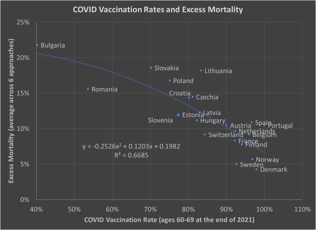
Here’s one more chart which I think is a very useful visualization, and it may give us some hint at causation. The following scatterplot shows COVID vaccination rates and excess mortality for a selection of European countries (more detail below on these measures and the countries selected):
The selection of countries is based on data availability. For vaccination rates, I chose to use the rate for ages 60-69 at the end of 2021. Ages 60-69 is somewhat arbitrary, but I wanted a rate for an elderly age group that was somewhat widely available. There is no standard source for an international organization that published these age-specific vaccine rates (that I’m aware of), but Our World in Data has done an excellent job of compiling comparable data that is available.
Note: I’m using the data on at least one dose of the vaccine. OWID also has it available by full vaccine series, and by booster, but first dose seemed like a reasonable approach to me. Also, I could have used different age groups, such as 70-79 or 80+, but once you get to those age groups the data gets weird because you have a lot of countries over 100%, probably due to both challenging denominator calculations and just general challenges with collecting data on vaccination rates. By using 60-69, only one country in my sample (Portugal) is over 100%, and I just code them as 100%. Using the end of 2021, rather than the most current data, is a bit arbitrary too, but I wanted to capture how well early vaccination efforts went, though ultimately it probably wouldn’t have mattered much.
Also: dropping the outliers of Bulgaria and Romania doesn’t change things much. The second-degree best fit polynomial still has an R2 over 0.60 (for those unfamiliar with these statistics, that means about 60% of the variation is “explained” in a correlational sense).
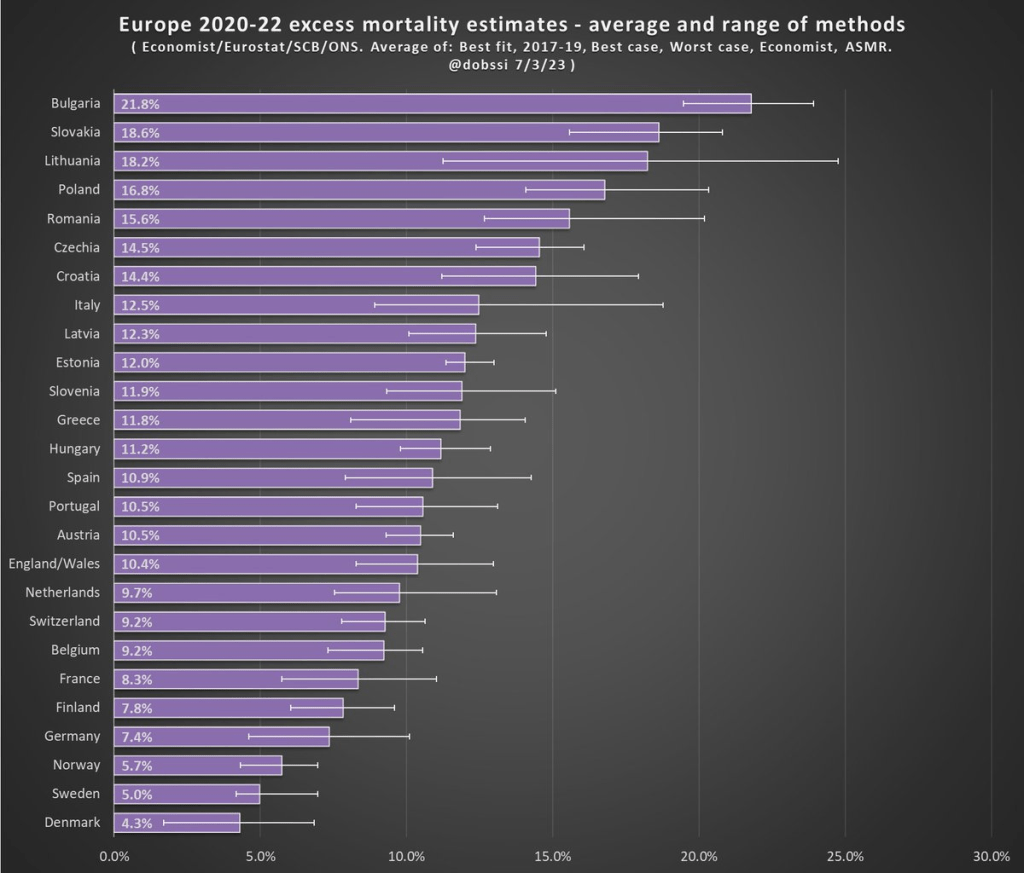
The excess mortality measure I use comes from the following chart. In fact, this entire post is inspired by the fact that this chart and others similar to it have been shared frequently on social media.
The chart comes from a Tweet thread by Paul Collyer. The whole thread is worth reading, but this chart is the key and summary of the thread. What he has done is shown the average and range of a variety of ways of calculating excess mortality. Read his thread for all the details, but the basic issues are what baseline to use (2015-2019 or 2017-2019? A case can be made for both), how to do the age-standardized mortality, and other issues. I won’t make a claim as to which method is best, but averaging across them seems like a fine approach to me.
For the y-axis in my chart, I just used the average for each country from Collyer’s chart. There are 34 countries in his chart, but in the OWID age-specific vaccination rates, only 22 countries were available the overlapped with his group. Unfortunately, this means we drop major countries like Italy, Spain, the UK, and Germany, but you work with the data you have.
For many sharing this and similar chart (such as charts with just one of those methods), the surprising (or not surprising) result to them is that Sweden comes out with almost the lowest excess mortality rate. Some approaches even put Sweden as the very lowest. Sweden!
Why is Sweden so important? Sweden has been probably the most debated country (especially by people not living in the country in question) in the COVID pandemic conversation. In short, Sweden took a less restrictive (some might say much less restrictive) approach to the pandemic. This debate was probably the most fevered in mid-to-late 2020, when some were even claiming that the pandemic was over in Sweden (it wasn’t). The extent to which Sweden took a radically different approach is somewhat overstated, especially in relation to other Nordic countries. And as is clear in both charts above, the Nordic countries all did relatively very well on excess mortality.
The bottom line from my first chart is that what really matters for a country’s overall excess mortality during the pandemic is how well they vaccinated their population. There seems to be a lot of interest on social media to rehash the debates about whether lockdowns (and lighter restrictions) or masks worked in 2020. But what really mattered was 2021, and vaccines were key. A scatterplot isn’t the last word on this (we should control for lots of other things), but it does suggest that a big part of the picture is vaccines (you can see this in scatterplots of US states too). It’s frustrating that many of those wanting to rehash the 2020 debates to “prove” masks don’t work, or whatever, either ignore vaccines or have bought into varying degrees of anti-vaccination theories. It’s completely possible that lockdowns don’t pass a cost/benefit test, but that vaccines also work very well (this has always been my position).
Why did Sweden have such great relative performance on excess mortality? Vaccines are almost certainly the most important factor among many that matter to a much smaller degree.
What About the US?
Note: for those wondering about the US, we don’t have the vaccination rate for ages 60-69 that I can find. Collyer also didn’t include the US in his analysis, it was only Europe. So, for both reasons, I didn’t include them in this post. The CDC does report first-dose vaccinations for ages 65+ in the US, though they top-code states at 95%. As of the end of 2021, here are the states that were below 95%: Mississippi, Louisiana, Tennessee, West Virginia, Indiana, Ohio, Wyoming, Georgia, Arkansas, Idaho, Alabama, Montana, Alaska, Missouri, Texas, Michigan, and Kentucky. These states generally have very high age-adjusted COVID death rates. Ideally we would use age-adjusted excess mortality for US states, but in the US that is horribly confounded by the rise in overdoses, homicides, car accidents, and other causes that are independent of vaccination rates (though they may be related to 2020 COVID policies — this is still a matter of huge debate).
There are many papers with titles in the style of “The Economics of X” with X covering a wide variety of topics, some deadly serious (“Economics of Suicide“) and others more trivial or unintentionally hilarious (“The Economics of Sleep and Boredom” comes to mind). There is a related genre of papers on “The Political Economy of Y,” once again with papers that are both serious and occasionally silly (or sometimes deadly serious papers with silly-sounding titles, such as “The Political Economy of Coffee, Dictatorship, and Genocide“).
But perhaps the best paper of this sort is a 1974 article on the Journal of Political Economy by Alan Blinder, titled “The Economics of Brushing Teeth.” It is, as you might guess, a paper that is somewhat tongue-in-cheek (tongue-in-teeth?), but the paper carefully follows the formal style you would expect from a JPE paper in 1974. I recommend reading the paper in full, and I can assure you that it is not at all like pulling teeth. But if you prefer not to look a gift horse in the mouth, here are a few favorite parts.
The paper is, of course, full of tooth-related puns, even in the footnotes, such as this acknowledgment: “I wish to thank my dentist for filling in some important gaps in the analysis.”
There are also plenty of jokes about human capital theory, jokes that only an economist could love, such as: “The basic assumption is common to all human capital theory: that individuals seek to maximize their incomes. It follows immediately that each individual does whatever amount of toothbrushing will maximize his income.”
Another section manages to poke fun at both sociologists and economists. In reference to a fake paper (no, there is no Journal of Dental Sociology), Blinder chastises the fake sociologist for misattributing a change in brushing patterns (assistant professors brush more) to advancing hygiene standards over time. No! It must be about maximizing income: “To a human capital theorist, of course, this pattern is exactly what would be expected from the higher wages received in the higher professorial ranks, and from the fact that younger professors, looking for promotions, cannot afford to have bad breath.”
And what good is a paper without a formal model of teeth brushing? This is the kind of model that many young economists cut their teeth on in graduate school.
The minimum wage is one of the most studied topics in economics, and also something that is frequently discussed on this blog from many different angles. For someone that isn’t an expert in this area, it can be hard to keep track of all the most recent, cutting-edge research on the topic.
Here’s a brand-new paper in the literature with an important finding: raising the minimum wage increases crime. Specifically, in “The Unintended Effects of Minimum Wage Increases on Crime” the authors find that 16-to-24-year-olds commit more property crimes after a minimum wage increase. For every 1% increase in the minimum wage, there is a 0.2% increase in property crime. That implies a doubling the minimum wage would increase property crimes for this age group by 20%. Here’s a figure from the paper showing this increase in crime:
What is the mechanism by which the rising minimum wage increases crime? Here the authors move into examining one of the central questions of the empirical minimum wage debate: the labor market. The authors do find evidence that employment decreases for this same age group following an increase in the minimum wage. Again, a figure from the paper:
The results in this paper add one more element to the cost-benefit calculus of the minimum wage. But I think the results are also interesting because they seem to point in the opposite direction of a paper co-authored by fellow EWED blogger Mike Makowsky. His paper “The Minimum Wage, EITC, and Criminal Recidivism” found that increasing the minimum wage made it less likely that former prisoners would commit another crime. I would be interested to hear Mike’s thoughts on this paper!
Tyler Cowen is skeptical about the possibility of a pure land-value tax, even though it has many theoretical benefits. In particular, Cowen points to a host of what we might call “Public Choice NIMBY” issues. In the real world, the same political forces that drive all of the current urban planning issues would either prevent it from being implemented at all, or prevent it from actually being implemented the way Henry George would have wanted.
I grant all these objections, but I do note that there have been multiple YIMBY successes in recent years, particularly in California where NIMBY forces are probably the strongest in the country. Still, if Cowen is mostly correct, are there any real-world options that offer some of the benefits of a LVT? In short, the main benefits are that the deadweight loss of the tax is very small, and that land is more likely to be used for its highest-valued use (which in many cases will mean more density, though this intersects with zoning policy).
Yes. For the clearest example, look to Pennsylvania. Cities are allowed to implement what is called a “split-rate property tax.” It does not only tax land, as a pure LVT would do, but instead taxes land at a higher rate than improvements. A ratio around 5:1 is typical (meaning land is taxed at 5 times the rate of improvements), though some cities have been as high as 26:1.
Black families are the poorest major racial or ethnic group in the US. With a median income of $59,541, a Black family only has about 59 percent of the income of a White, Non-Hispanic family. That’s the same proportion, 59 percent, as was true in 1972, the earliest date that we have comparable data. (For most of the data in this post, I will be using Table F-23 from the Census Bureau’s Historical Income Tables.) That’s almost 50 years with no closing of the racial gap in total money income for families.
Of course, what this also means is that family incomes of both Black and Whites grew at the same rate from 1972 to 2021. They both are about 50 percent larger than in 1972, and that’s after accounting for inflation (using the CPI-U-RS). As a first point of optimism, this very much goes against the typical narrative of income stagnation since the early 1970s.
To be sure, some of this growth is because families have more earners today, but even so: they have a lot more income. Having two earners does mean that you must spend more on some consumption categories, such as daycare when kids are young, possibly more on dining out or prepared meals. But even with those additional expenses, these families will have significantly more disposable income than their 1970s counterparts.
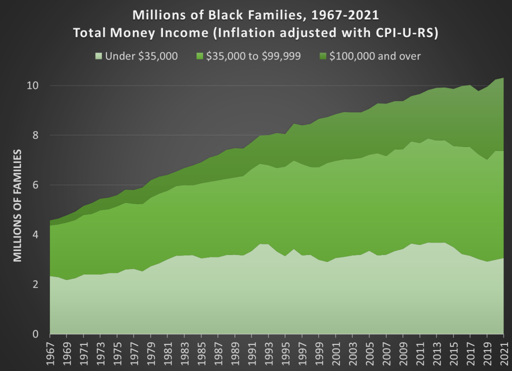
There is an ever more optimistic fact that we need to point out for Black families today: there are many, many more rich Black families today than in 1972. There are more rich families in absolute terms and as a proportion of the total. Here is the basic data from the Census Bureau (it goes back to 1967, the earliest date available for Blacks).
How well have countries recovered from the declines in the pandemic? It’s actually a bit difficult to answer that question, because it depends on how you measure it. Even if we agree that GDP is the best measure, how do we measure recovery? One possibility is to simply ask whether the country has exceeded its pre-pandemic GDP level. Exactly which quarter to use as the baseline is debatable, but here is a chart that Joseph Politano made for G7 countries using the 3rd quarter of 2019 as the baseline.
But we know that absent the pandemic, most countries would have continued growing (absent a recession for some other reason), so just getting back to pre-pandemic levels isn’t necessarily a full recovery. But how much growth should we have expected? It’s a hard question, but here’s a chart along those lines from the Washington Post, using the CBO’s measure of “potential GDP” as what growth might have looked like.
Using either of these approaches, it appears that the US has recovered pretty well, although it would be nice to have a comparison across countries using the same approach as the Washington Post chart does. While there is no consistent measure similar to CBO’s potential GDP figure for all countries, a simple approach is to project growth forward using the average pre-pandemic growth rate. I have done so for a number of countries, using the average growth rate from 2017-2019. In the following charts, the blue line is actual GDP levels, and the orange line is projecting the 2017-2019 growth rate forward. Sorry that I can’t easily fit all these into one chart, so here come the charts!