I’ve written before about how we can afford about 50% more consumption now that we could in 1990. But it’s not all bread and circuses. We can also afford more capital. In fact, adding to our capital stock helps us produce the abundant consumption that we enjoy today. In order to explore this idea I’m using the BEA Saving and Investment accounts. The population data is from FRED.
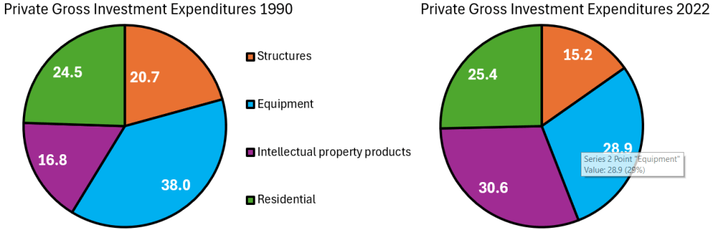
The tricky thing about investment spending is that we need to differentiate between gross investment and net investment. Gross investment includes spending on the maintenance of current capital. Net investment is the change in the capital stock after depreciation – it’s investment in additional capital not just new capital. Below are two pie charts that illustrate how the composition of our *gross investment* spending has changed over the past 30 years. Residential investment costs us about the same proportion of our investment budget as it did historically. A smaller proportion of our investment budget is going toward commercial structures and equipment (I’ve omitted the change in inventories). The big mover is the proportion of our investment that goes toward intellectual property, which has almost doubled.
It’s easiest for us to think about the quantities of investment that we can afford in 2022 as a proportion of 1990. Below are the inflation-adjusted quantities of investment per capita. On a per-person basis, we invest more in all capital types in 2022 than we did in 1990. Intellectual property investment has risen more than 600% over the past 30 years. The investment that produces the most value has moved toward digital products, including software. We also invest 250% more in equipment per person than we did in 1990. The average worker has far more productive tools at their disposal – both physical and digital. Overall real private investment is 3.5 times higher than it was 30 years ago.
Continue reading
