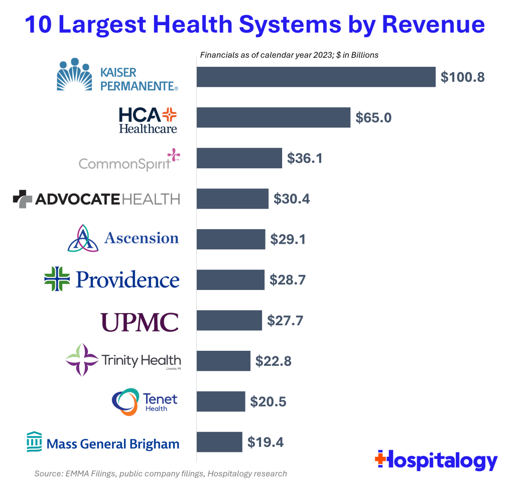
Health spending keeps rising, and hospitals keep consolidating, so the largest health systems in the US keep growing bigger. But getting exact data on how big is surprisingly difficult. So I appreciate that someone else did the work, in this case Blake Madden of Hospitalogy. Here are his top 10:
See his post for the full list of the largest 113 health systems, and details and caveats on the methodology. I have found that Hospitalogy generally has good coverage of the business of health care, and that following Blake on Twitter is a good way to keep up with it.
If we have learned anything in the past 2 years, it’s that people don’t like inflation. Well, you probably already knew that. But I guess we learned that they really, really don’t like inflation. Polls of various sorts still indicate that Americans are upset about inflation, even though the worst of it was happening in June 2022, almost 2 full years ago.
But how much inflation do Americans want? The answer: almost 0%. In fact, the median preference is exactly 0% according to a new working paper titled simply “Inflation Preferences.” The mean preference was 0.2%.
But this paper does more than just survey people on their preferences. It also presents to them several “narratives” about inflation, and to see whether people who have considered those narratives have different preferences. Given my many blog posts about the relationship between wages and inflation (or rather, the race between them), this narrative was interesting to me:
T4 (Wage inflation) When prices increase over time (inflation), worker’s wages may not immediately adjust in proportion. Inflation, therefore, affects the amount of goods and services that workers can buy with their wages. By keeping inflation low, workers can buy a similar amount of goods and services over time.
People who had considered that narrative (wages increases trail price increases) tended to prefer even lower inflation rates, by about 0.7 percentage points. Again, perhaps this is obvious, but it is important to understand how different individuals think about inflation (it was the only one of five narratives that had a statistically significant negative impact on inflation preferences).
Finally, as one final interesting tidbit, survey respondents that were also Economics Majors in college reported higher inflation preferences, by about 1 percentage point.
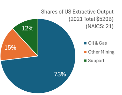
What with all the talk about semi-conductor production and rare-earth mineral extraction, I think that it’s worth examining what the USA produces in terms of what we get out of the ground. This includes mining, quarrying, oil and natural gas extraction, and some support activities (I’ll jump more into the weeds in the future). I’ll broadly call them the ‘extractive’ sectors. How important are these industries? In 2021 extractive production was worth $520 billion. That was roughly 2% of all GDP. Below is the break down by type of extraction.
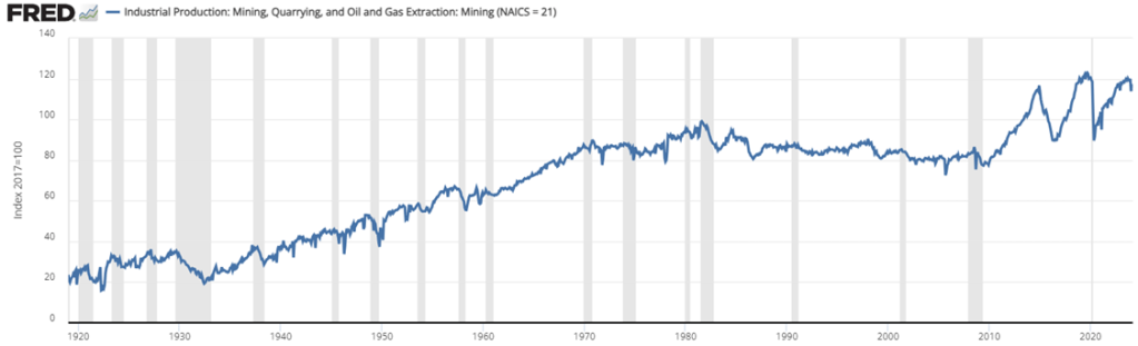
Examining the graph of total extraction output below tells a story. The US increased production of extracted material substantially between the Great Depression and 1970. That’s near the time that the clean water and clean air acts were passed. But the change in the output growth rate is so stark, that I suspect that those were not the only causes of change (reasonable people can differ). For the next 40 years, there was a malaise in output. This was the period during which it was popular to talk about our natural resource insecurity. As in, if we were to be engaged in a large war, then would we be able to access the necessary materials for wartime production?
But for the past 15 years we’ve experienced a boom with extracted output rising by 50%, an average growth rate of 2.7% per year. That’s practically break-neck speeds for an old industry at a time when the phrase ‘great stagnation’ was being thrown about more generally. By 2023, we were near all-time-high output levels (pre-pandemic was higher by a smidge).
For people concerned about resource security, the recent boom is good news. For people who associate digging with environmental degradation, greater extraction is viewed with less enthusiasm. Those emotions are especially high when it comes to fossil fuel production. Below is a graph that identifies the three major components of extraction indexed to the 2021 constant prices. By indexing to the relative outputs of a particular year, the below graph is a close-ish proxy to real output that is comparable in levels.
In January 2023 I had a post looking at the different ways that the Bureau of Labor Statistics measures employment. Those who follow the data closely probably know about the difference between the household and establishment surveys, which the monthly jobs report data is based on. But these are just surveys.
The more comprehensive data (close to the universe of workers, roughly 95%) is the Quarterly Census of Employment and Wages. While more comprehensive, this data comes out with a much longer lag, and is only released once per quarter. The QCEW is just the raw count of workers, which is useful in some ways, but we also know that there are normal seasonal fluctuations, which the QCEW doesn’t adjust for. Therefore, year-over-year changes in jobs are the best way to look at trends in this data. In September 2023 (latest month available), the US had 2.25 million more workers than in the previous September. For comparison, the establishment survey showed an increase of 3.13 million jobs that month, and the household survey showed a change of 2.66 million — suggesting they both might be overstating job growth.
Still with me? Here’s one more set of jobs data: the Business Employment Dynamics data. This dataset is built on the QCEW data, but allows more fine detailed insights into what types and sizes of firms are gaining or losing jobs. Like the QCEW, the most recent data is for the 3rd quarter of 2023 (just released today), but when looking at the aggregate data, it has one advantage over the QCEW: it is seasonally adjusted, so we can look at the most recent quarterly change (not really useful for not-seasonally-adjusted data). The BED data also looks only at private sector jobs, so it is looking at the health of the private labor market (and ignoring changes in government employment).
The latest BED data do show a possibly worrying trend: the 3rd quarter of 2023 showed a net loss of 192,000 private-sector jobs. That’s the first loss since the height of the pandemic, and ignoring the first half of 2020, the only quarterly decline since 2017. Here’s the chart (note: y-axis is truncated because the 2020q2 job loss is so large it makes the chart unreadable):
I should note that this data is subject to revisions, even though the QCEW is mostly complete. The second quarter of 2022 originally showed a decline, but that was later revised upwards as QCEW is updated and seasonal adjustment factors are updated. Still as, this data stands, it is a worrying jobs number that differs from the monthly surveys. For the change from 2023q2 to 2023q3, the establishment survey shows a gain of 640,000 jobs and the household survey also shows a gain of 546,000. Like the QCEW raw data, the BED seasonally adjusted data suggests that the monthly surveys may be overstating job growth.
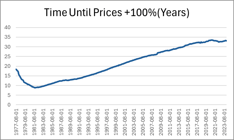
Last month, Jeremy wrote about how long it takes for prices to double. He identified a few intervals of time that are sensible. But I want to pick up the ball and move it further down the field. Not only can we identify how long it took for prices to double in particular eras, we can also do it for *every month*. Below, is a graph that shows us how many years had passed since prices were half as high (PCE Chained Prices).
Expectedly, the minimum time to double consumer prices was in the early 80s, taking just under 9 years for price to double. The prior decade included the highest inflation rates in the past 70 years. Since that time, the number of years needed in order for prices to double steadily rose as the average inflation rate fell. That is, until after the pandemic stimuli which caused the time to plateau. But to be clear, that must mean that prices aren’t doubling any fast that they used to, despite what we’ve heard on the news.
Except… prices are in fact rising faster by 21st century standards. Indeed, measuring the time that it took prices to double covers up a lot of variation. After all, The PCEPI was 15.19 in 1959 and is 122.3 now. That’s only enough difference for three doublings. But as we lower the threshold for price changes, we can see more of the price level patterns. Below-left is the time that was necessary for prices to increase by 50% and below-right is the time that was necessary for prices to rise by 25%.
In these graphs we can see more of the action that happened post-Covid. The time needed for prices to rise by 50% has fallen by about five years since 2020. That’s a 20% shorter time necessary for a 50% increase in prices. The time needed for a 25% increase in prices is even more drastic. As of 2020, people were accustomed to experiencing upwards of 14 years before overall prices rose by 25%. That number fell below 8 years by 2024.
And finally, the most unnerving graph of all is below: the time that was needed for prices to rise by 10%.
While there are many factors to consider, ultimately whether living standards are rising is a race between prices and income. What does that race look like if we start the clock in December 2019, just before the pandemic?
Whether we use median weekly earnings (the purple line) or average hourly earnings for non-management workers (the blue line), they have clearly won the race with two commonly used price indexes (the CPI-U and the PCEPI). That’s good news, and probably not something you hear very often in the discourse about the economy (unless you spend a lot of time reading this blog).
The Federal Reserve Bank of Philadelphia just released the first report on a new survey they are conducting quarterly. Some highlights:
Respondents in January 2024 were more positive about their income prospects than respondents a year earlier; one-third believed their income will increase, compared with 29 percent in January 2023
Younger, more affluent, male, or non-White respondents report a more positive outlook, compared with one year prior. Those who are older than 55 or earn less than $40,000 report notably negative changes in their personal outlook, compared with respondents in the same demographic segments surveyed a year ago
When asked about their ability to pay all of their bills in full this month, 23.5 percent of respondents in January 2024 indicated that they could not pay some or any of their bills; this was 1.5 percentage points higher than in January 2023 (22.0 percent) and the highest rate in the last five quarters
Overall, I’d say it shows an economy with mixed performance, but leaning more positive than negative.
Source: My graph of LIFE Survey data
It will be interesting to see if this ends up taking a place in the set of Fed surveys that are always driving economic discussions, like the Survey of Consumer Finances and the Survey of Professional Forecasters. If they keep it up and start putting out some graphics to summarize it, I think it will. My quick impression (not yet having spoken to Fed people about it) is that it will be the “quick hit” version of the Survey of Consumer Finances. It asks a smaller set of questions on somewhat similar topics, but is released quickly after each quarter instead of slowly after each year. If they stick with the survey it will get more useful over time, as there is more of a baseline to compare to.
Thankfully for US consumers, grocery prices have leveled off. They haven’t fallen, of course, which will still lead to viral complaints about egg prices, etc. But over the past 4 years, wages have almost caught up with grocery prices.
Not so with fast food prices (“limited service meals”), which have definitely outpaced wages over the past 4 years, and continue to grow at an annual rate of about 5 percent (also more than wages).
Furthermore, if we go back to 2014, we see it’s not just a post-pandemic effect on fast food. Prices since 2014 are up 54 percent for fast food according to the BLS, more than the 31 percent overall CPI-U increase and more than average wages (46 percent).
An article from FinanceBuzz puts together some more specific data on a dozen fast-food chains in the US. Consumer favorites for a quick, cheap bite to eat like Taco Bell and McDonald’s have seen menu prices increase by 80 or even 100 percent!
Check out the article for even more specific food item data at each of these restaurants. For example, the most famous of fast-food sandwiches is the Big Mac, which is up from $3.99 in 2014 to $5.99 in 2024, a 50 percent increase. A Whopper meal at Burger King is up 79 percent. All the more reason to seek out deals in the apps, or just good-old in-store discounts, like the “buy one get one for $1” promo at most McDonald’s. This deal would get you two Big Macs for $7, or $3.50 each… less than in 2014! Or since today is Wednesday, you might want to head to Burger King, where Whoppers are $3 at most locations (regular price: around $6).
Price discrimination is alive and well at the drive-thru window, and if you are just ordering from the menu without any discounts, you are really going to feel the pain of inflation.
I’ve written about coffee consumption during US alcohol prohibition in the past. I’ve also written about visualizing supply and demand. Many. Times. Today, I want to illustrate how to use supply and demand to reveal clues about the cause of a market’s volume and price changes. I’ll illustrate with an example of coffee consumption during prohibition.
The hypothesis is that alcohol prohibition would have caused consumers to substitute toward more easily accessible goods that were somewhat similar, such as coffee. To help analyze the problem, we have the competitive market model in our theoretical toolkit, which is often used for commodities. Together, the hypothesis and theory tell a story.
Substitution toward coffee would be modeled as greater demand, placing upward pressure on both US coffee imports and coffee prices. However, we know that the price in the long-run competitive market is driven back down to the minimum average cost by firm entry and exit. So, we should observe any changes in demand to be followed by a return to the baseline price. In the current case, increased demand and subsequent expansions of supply should also result in increasing trade volumes rather than decreasing.
Now that we have our hypothesis, theory, and model predictions sorted, we can look at the graph below which compares the price and volume data to the 1918 values. While prohibition’s enforcement by the Volstead act didn’t begin until 1920, “wartime prohibition” and eager congressmen effectively banned most alcohol in 1919. Consequently, the increase in both price and quantity reflects the increased demand for coffee. Suppliers responded by expanding production and bringing more supplies to market such that there were greater volumes by 1921 and the price was almost back down to its 1918 level. Demand again leaps in 1924-1926, increasing the price, until additional supplies put downward pressure on the price and further expanded the quantity transacted.
We see exactly what the hypothesis and theory predicted. There are punctuated jumps in demand, followed by supply-side adjustments that lower the price. Any volume declines are minor, and the overall trend is toward greater output. The supply & demand framework allows us to image the superimposed supply and demand curves that intersect and move along the observed price & quantity data. Increases toward the upper-right reflect demand increases. Changes plotted to the lower-right reflect supply increases. Of course, inflation and deflation account for some of the observed changes, but similar demand patterns aren’t present in the other commodity markets, such as for sugar or wheat. Therefore, we have good reason to believe that the coffee market dynamics were unique in the time period illustrated above.
*BTW, if you’re thinking that the interpretation is thrown off by WWI, then think again. Unlike most industries, US regulation of coffee transport and consumption was relatively light during the war, and US-Brazilian trade routes remained largely intact.
What’s the connection between social media use and mental health, especially among young people? You’ve probably heard a lot about this recently, in the media, by politicians, and among friends chatting about their kids. Lots of assertions are made, but there is also a bit of research on this topic. As someone who frequently uses social media myself, as well as a parent of young children, and a teacher that works every week with young college students, I am particularly interested in this topic.
Jonathan Haidt and various co-authors have been trying to catalog all the research on the topic and figure out if there is a connection between the decline in teenage mental health and the rise of social media use. Haidt also has a new book on this topic, as well as the decline of “free play” among kids, which I have not yet read but I’ve looked through his documents that contain all of the underlying and summaries of the research he is citing. I’ll read the book soon, as I’m certainly part of the intended audience (see the last sentence of the above paragraph). And while this research is very much outside of my area of expertise, my training as an economist has taught me how to read academic papers and to be convinced by evidence, so once again I’m very much the intended audience on this score as well.
Please read this post as my attempt to understand the evidence and start to form conclusions and/or critique what Haidt is saying. It’s a work in progress, and I’ll write more as I read and think more about it.