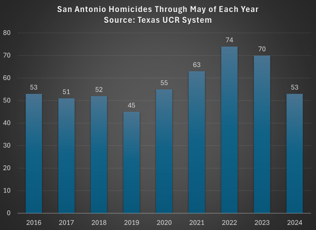
One Up on Wall Street in the Meme Stock Era

Peter Lynch was one of the most successful investors of the 1970’s and 1980’s as the head of the Fidelity Magellan Fund. In 1989 he explained how he did it and why he thought retail investors could succeed with the same strategies in the bestselling book “One Up on Wall Street”. Given the meme stock exuberance of retail investors in the past few years, I thought the book might be due for a comeback.

Instead interest seems flat, and when I do hear Peter Lynch mentioned it is by institutional investors more than retail. But the book seems to me like it is still valuable, so I’ll share some highlights here. This one could easily have been written this year:

Where did the Dow close? I’m more interested in how many stocks went up versus how many went down. These so-called advance/decline numbers paint a more realistic picture. Never has this been truer than in the recent exclusive market, where a few stocks advance while the majority languish. Investors who buy “undervalued” small stocks or midsize stocks have been punished for their prudence. People are wondering: How can the S&P 500 be up 20 percent and my stocks are down? The answer is that a few big stocks in the S&P 500 are propping up the averages.

I see why the book hasn’t caught on with meme stock traders:

Nobody believes in long-term investing more passionately than I do… I think of day-trading as at-home casino care.

I’ve never bought a future nor an option in my entire investing career, and I can’t imagine buying one now. It’s hard enough to make money in regular stocks without getting distracted by these side bets, which I’m told are nearly impossible to win unless you’re a professional trader.

So where does he think retail investors have a chance to get “One Up on Wall Street”?

Continue reading

The Crime Wave May Be Over

Crime of all forms certainly spiked in 2020 and 2021 in most of the US, and continued to remain high for a time after that. But recent data, especially homicide data compiled by AH Datalytics, suggest that crime is falling. When measured by homicide rates, the worst of crimes and the least likely to be underreported, homicide rates across 272 major cities in the US is down 17.6% in 2024 compared with the same period in 2023. And among the 20 cities with the most homicides in 2023, just one (Birmingham, the 20th on the list) saw an increase from 2023 to 2024.

But is this just coming down from a relative high? Are homicide rates still elevated from pre-pandemic? I went through the cities with the most homicides on the AH Datalytics list, and for those where I could find comparable data pre-pandemic, I created the following charts. As you will see, lots of these cities are down to or below pre-pandemic levels (for the period in 2024 that is comparable to prior years). Not every single city, of course, but most are close to 2019 or prior years.

From Cubicles to Code – Evolving Investment Priorities from 1990 to 2022

I’ve written before about how we can afford about 50% more consumption now that we could in 1990. But it’s not all bread and circuses. We can also afford more capital. In fact, adding to our capital stock helps us produce the abundant consumption that we enjoy today. In order to explore this idea I’m using the BEA Saving and Investment accounts. The population data is from FRED.

The tricky thing about investment spending is that we need to differentiate between gross investment and net investment. Gross investment includes spending on the maintenance of current capital. Net investment is the change in the capital stock after depreciation – it’s investment in additional capital not just new capital.  Below are two pie charts that illustrate how the composition of our *gross investment* spending has changed over the past 30 years. Residential investment costs us about the same proportion of our investment budget as it did historically. A smaller proportion of our investment budget is going toward commercial structures and equipment (I’ve omitted the change in inventories). The big mover is the proportion of our investment that goes toward intellectual property, which has almost doubled.

It’s easiest for us to think about the quantities of investment that we can afford in 2022 as a proportion of 1990. Below are the inflation-adjusted quantities of investment per capita. On a per-person basis, we invest more in all capital types in 2022 than we did in 1990. Intellectual property investment has risen more than 600% over the past 30 years. The investment that produces the most value has moved toward digital products, including software. We also invest 250% more in equipment per person than we did in 1990. The average worker has far more productive tools at their disposal – both physical and digital. Overall real private investment is 3.5 times higher than it was 30 years ago.

Continue reading

“Cheapflation”: Inflation Really Does Hit the Bottom Harder

During the peak of the Covid inflation in 2022 I speculated that food inflation was worst for the cheapest products:

typical McDouble now costs well over $2 in most of the US, while a typical Big Mac is still well under $6. You used to be able to get 4-5 McDoubles for the price of a Big Mac; now you typically get less than 3 and sometimes, as in Keene, less than 2.

What’s going on here? First, the McDouble was always absurdly cheap. Second, prices rise most quickly where demand is inelastic, and demand is less elastic for goods that are cheaper and goods that are more like “necessities” than “luxuries”.

That post was just based on a couple anecdotes from my personal experience, but a new NBER working paper by Alberto Cavallo and Oleksiy Kryvtsov confirms that this really was a general trend:

We use micro price data for food products sold by 91 large multi-channel retailers in ten countries between 2018 and 2024. Measuring unit prices within narrowly defined product categories, we analyze two key sources of variation in prices within a store: temporary price discounts and differences across similar products. Price changes associated with discounts grew at a much lower average rate than regular prices, helping to mitigate the inflation burden. By contrast, cheapflation—a faster rise in prices of cheaper goods relative to prices of more expensive varieties of the same good—exacerbated it. Using Canadian Homescan Panel Data, we estimate that spending on discounts reduced the change in the average unit price by 4.1 percentage points, but expenditure switching to cheaper brands raised it by 2.8 percentage points….

The prices of cheaper brands grew between 1.3 to 1.9 times faster than the prices of more expensive brands—and only when inflation surged, not before or after.

Zoning Matters for Rising Housing Costs, Especially After 1980

From a new working paper “The Price of Housing in the United States, 1890-2006” by Ronan C. Lyons, Allison Shertzer, Rowena Gray & David N. Agorastos (emphasis added):

“Zoning was adopted by almost every city in our sample during the 1920s. We see a slightly steeper gradient over the next two periods (coefficients of .48 and .29, respectively). In these periods it is possible both that the existing zoning regimes were causing higher price growth and that home price appreciation was incentivizing cities to adopt even more restrictive measures, particularly by the 1970s (Fischel, 2015; Molloy et al., 2020). The gradient in the final period (1980-2006) is even steeper, however (coefficient of .67), suggesting a closer relationship between zoning and home price appreciation towards the end of the 20th century.”

The authors acknowledge that they cannot establish causality with their data, but this is consistent with existing research, such as a paper by Gyourko and Krimmel that I previously discussed.

Goodbye, Chevron

Last Friday the Supreme Court overturned the doctrine of Chevron deference as part of its ruling in Loper Bright Enterprises v Raimondo. This might not have even been their most discussed ruling of the past week, but in my (non-lawyerly) opinion, there is a good chance it will be their most economically impactful ruling of the past decade. SCOTUSblog explains the basics:

the Supreme Court on Friday cut back sharply on the power of federal agencies to interpret the laws they administer and ruled that courts should rely on their own interpretation of ambiguous laws. The decision will likely have far-reaching effects across the country, from environmental regulation to healthcare costs.

By a vote of 6-3, the justices overruled their landmark 1984 decision in Chevron v. Natural Resources Defense Council, which gave rise to the doctrine known as the Chevron doctrine. Under that doctrine, if Congress has not directly addressed the question at the center of a dispute, a court was required to uphold the agency’s interpretation of the statute as long as it was reasonable. But in a 35-page ruling by Chief Justice John Roberts, the justices rejected that doctrine, calling it “fundamentally misguided.”

Justice Elena Kagan dissented, in an opinion joined by Justices Sonia Sotomayor and Ketanji Brown Jackson. Kagan predicted that Friday’s ruling “will cause a massive shock to the legal system.”

When the Supreme Court first issued its decision in the Chevron case more than 40 years ago, the decision was not necessarily regarded as a particularly consequential one. But in the years since then, it became one of the most important rulings on federal administrative law, cited by federal courts more than 18,000 times.

The most common reaction I’ve seen is that people expect this to reduce the power of executive branch agencies, both in general and relative to courts and businesses, likely resulting in deregulation. Thus those on the economic left have been mostly decrying the decisions, while freemarketers and businesspeople have mostly been celebrating:

Continue reading

Who Will Be the Democratic Presidential Candidate? Follow the Money (Betting Markets)

Back in January I encouraged you to follow the money in the Presidential race, by which I meant follow the betting markets. I suggested this was a good way to cut through the sometimes inaccuracy of polls, and the uncertainty of listening to any one expert or group of experts. Bettors in prediction markets can take all of these into account.

Lately of course the big question in the Presidential race is whether Biden will actually be the Democratic nominee. There is much uncertainty right now, and you will all kinds of predictions from experts, media quoting “inside sources,” and other such rumors. How are you, as a relatively uninformed outsider, supposed to know who to trust?

The answer again I will suggest is: watch the betting markets. And if you check the betting markets today (aggregated across multiple markets by EletionBettingOdds.com), you will see that Biden and Kamala Harris have roughly equal chances of becoming the next President (and Trump is about a 60% favorite):

Continue reading

Not Just Consumer Prices

We all know about inflation. One popular measure is the Consumer Price Index (CPI), which measures the change in price of a fixed basket of goods. The other popular measure used for inflation is the Personal Consumption Expenditures (PCE) price index. This index measures the price of what consumers actually purchase and captures the effects of consumers changing their consumption bundles over time. While the latter is a better measure for the prices at which consumers make purchases, it takes longer to calculate. In practice, the earlier CPI release gives a pretty accurate preview to the PCE price index.

While consumption is a substantial two-thirds of total expenditures in the US economy, other prices definitely matter. On average, a third of our income is spent on other things. Below is a stacked bar chart of quarterly GDP components – the classic Y=C+I+G+NX.* Investment spending composes a relatively stable 16.7% and Government spending composes about 16.5% of GDP. We almost never hear much about the price of these other things.

Continue reading

Coming In to Land

And I twisted it wrong just to make it right
Had to leave myself behind
And I’ve been flying high all night
So come pick me up, I’ve landed

-Fed Chair Ben Folds on the Covid inflation

The Fed has now almost landed the plane, bringing us down from 9% inflation during the Covid era to something approaching their 2% target today. But it is not yet clear how hard the landing will be. Back in March I thought recurrent inflation was still the big risk; now I see the risk of inflation and recession as balanced. This is because inflation risks are slightly down, while recession risk is up.

Inflation remains somewhat above target: over the last year it was 3.3% using CPI, 2.7% by PCE, and 2.8% by core PCE. It is predicted to stay slightly above target: Kalshi estimates CPI will finish the year up 2.9%; the TIPS spread implies 2.2% average inflation over the next 5 years; the Fed’s own projections say that PCE will finish the year up 2.6%, not falling to 2.0% until 2026. The labels on Kalshi imply that markets are starting to think the Fed’s real target isn’t 2.0%, but instead 2.0-2.9%:

The Fed’s own projections suggest this to be the somewhat the case- they plan to start cutting over a year before they expect inflation to hit 2.0%, though they still expect a long run rate of 2.0%. In short, I think there is a strong “risk” that inflation stays a bit elevated the next year or two, but the risk that it goes back over 4% is low and falling. M2 is basically flat over the last year, though still above the pre-Covid trend. PPI is also flat. The further we get from the big price hikes of ’21-’22 with no more signs of acceleration, the better.

But I would no longer say the labor market is “quite tight”. Payrolls remain strong but unemployment is up to 4.0%. This is still low in absolute terms, but it’s the highest since January 2022, and the increase is close to triggering the Sahm rule (which would predict a recession). Prime-age EPOP remains strong though. The yield curve remains inverted, which is supposed to predict recessions, but it has been inverted for so long now without one that the rule may no longer hold.

Looking through this data I think the Fed is close to on target, though if I had to pick I’d say the bigger risk is still that things are too hot/inflationary given the state of fiscal policy. But things are getting close enough to balanced that it will be easy for anyone to find data to argue for the side that they prefer based on their temperament or politics.

To me the big wild card is the stock market. The S&P500 is up 25% over the past year, driven by the AI boom, and to some extent it pulls the economy along with it. The Conference Board’s leading economic indicators are negative but improving overall this year; recently their financial indicators are flat while non-financial indicators are worsening.

Overall things remind me a lot of the late ’90s: the real economy running a bit hot with inflation around 3% and unemployment around 4%; the Fed Funds rate around 5%; and a booming stock market driven by new computing technologies. Naturally I wonder if things will end the same way: irrational exuberance in the stock market giving way to a tech-driven stock market crash, which in turn pushes the real economy into a mild recession.

Of course there is no reason this AI boom has to end the same way as the late-90’s internet boom/bubble. There are certainly differences: the Federal government is running a big deficit instead of a surplus; there are barely a tenth as many companies doing IPOs; many unprofitable tech stocks already got shaken out in 2022, while the big AI stocks are soaring on real profits today, not just expectations. Still, to the extent that there are any rules in predicting stock crashes, the signs are worrying. Today’s Shiller CAPE is below only the internet and Covid meme-stock bubble peaks:

Again, this doesn’t mean that stocks have to crash, or especially that they have to do it soon; the CAPE reached current levels in early 1998, but then stocks kept booming for almost two years. I’m not short the market. But the macro risk it poses is real.

Young Americans Continue to Build Wealth, Across the Distribution

First, here is an updated chart on average wealth by generation, which gives us the first glimpse at 2024 data:

I won’t go into too much detail explaining the chart here, as I have done that in more detail in past posts. But one brief explanatory note: I’m now labeling the most recent generation “Millennials & Gen Z (18+).” Because of the nature of the data from the Fed’s DFA, I can’t separate these two generations (it can be done with the Fed SCF data, but that is now 2 years old). This combined generation now includes everyone from ages 18 to 43 (which means that technically the median age is 30.5, not quite 31 yet), somewhere around 116 million people, which makes it a bit of a weird “generation,” but you work with the data you have. Note though that this makes the case even harder for young Americans to be doing well, as every year I am adding about 400,000 people to the denominator of the calculation, even though 18-year-olds don’t have much wealth.

What’s notable about the data is just how much the youngest “generation” in the chart has jumped up in recent years. They have now have about double the wealth that Gen X had at roughly the same age. Average wealth is about as much as Gen X and Boomers had 5-6 years later in life — and while there are no guarantees, odds are Millennial/Gen Z wealth will be much, much higher in another 5-6 years. You may notice at the tail end of the chart that Gen X and Boomers now have roughly equal amounts of average wealth at the same age (Gen X’s current age), while 2 years ago they were $100,000 ahead. I suspect this is just temporary, and Gen X will soon be ahead again, but we shall see.

Of course, the most common complaint about my data is that these are just averages, so they don’t tell us a lot about the distribution of wealth and could be impacted by outliers. That’s why I’m really excited to share this new data on wealth by decile from the 2022 Fed SCF survey. This data was put together by Rob J. Gruijters and co-authors, and it allows us to compare the wealth of Boomers, Gen X, and Millennials across the wealth distribution. You should read their analysis of the data, but in this post I’ll give my slightly different (and optimistic) interpretation of it.

For all three generations, wealth in the bottom 10% is negative when that generation is in their 30s. And for Millennials, it is the most negative: -$65,000 compared to -$30,000 for Gen X and -$17,000 for Boomers in the bottom decile (as always, the figures are adjusted for inflation). While I haven’t dug into the data, my suspicion is that student debt is driving a lot of the increase. Since this is households in their 30s, I suspect a lot of the bottom decile is composed of folks that just finished graduate and professional school, and are only now starting to acquire assets and pay down debt — they have very high earning potential, which means over their lifetime they will do great, but they are starting from behind. Again, we’ll have to wait and see, but I suspect many in the bottom will quickly climb up the wealth distribution over their working years.

That being said, in the following chart I have left off the bottom 10% for each generation, since displaying negative wealth would make the chart look a little weird. But this chart shows a very optimistic result: Millennials are doing better than Boomers across the distribution, and Millennials are ahead of almost all deciles for Gen X except a few, where they are essentially equal to Gen X (2nd, 7th, and 8th deciles).

The chart may be a little confusing (give me your suggestions to improve it!), but here’s how to read it. The blue bars show Millennial wealth relative to Gen X, at the same age, for each decile (excluding the bottom 10%). For example, the first bar shows that Millennials in the 2nd wealth decile had 100% of the wealth that Gen Xers in the 2nd wealth decile had at the same age — in other words, they were equal. The orange bars show Millennial wealth relative to Baby Boomer wealth at the same age, in the same decile (to repeat, it’s all adjusted for inflation).

Notice that other than the very first bar (Millennials vs. Gen X in the 2nd wealth decile), all of the other bars are over 100%, indicating that Millennials have more wealth than the two prior generations for almost every decile. For some of these, they are much, much greater than 100%. In the 5th decile (close to the median), Millennials have over 50% more wealth than Gen X and almost 200% (double the wealth) of the wealth of Boomers. That’s a massive increase!

A pessimistic read of the chart is that the biggest gains went to the top 10%. Though notice that’s only true relative to Baby Boomers. When compared with Gen X, the 4th and 5th deciles did better than the top 10% in terms of relative improvement. To relate this to the earlier chart in this post, it suggests that relative to Boomers, outliers at the top end might be skewing the average a bit, but that’s probably not the case relative to Gen X. And again, the broad-based gains are visible throughout the distribution from the 2nd decile on up.

Finally, on social media I’ve got several objections about the chart, such as folks not liking the log scale y-axis, and preferring the CPI-U for inflation adjustments instead of the PCEPI that I use. For those objectors, here is a different version of the chart: