As we enter election season, I can sympathize with those that want to ignore it as much as possible. But if you do want to follow it closely, here is my advice: talk is cheap, so follow the money.
And by money, I am not referring to campaign contributions. I mean prediction markets, where people are putting their money where their mouth is, rather than just making predictions based on their own intuition (or their own “model,” which is just a fancy intuition).
There are a number of betting markets online today, but a good aggregator of them is Election Betting Odds.
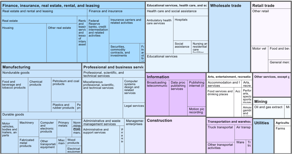
Venture-capital backed startups almost all cluster in the same handful of industries, mostly various types of software. This leaves a variety of large and economically important sectors with almost no venture-capital backed startups. That means those industries see fewer new companies and new ideas; they must rely on either growth from existing firms, which are unlikely to embrace disruptive innovation, or on startups that bootstrap and/or finance with debt, which tend to grow slowly.
Venture capital firm Fifty Years has done a nice job cataloging exactly which industries see the most, and least, investment relative to their size. Here is their picture of the US economy by industry market size:
Now their picture of which industries get the investment (though unfortunately, they aren’t very clear about their data source for it):
They use this to create an “Opportunity Ratio”- current market size divided by current startup funding:
They call the industries with the largest Opportunity Ratios the “Top Underfunded Opportunities”:
I don’t necessarily agree; some industries face shrinking demand, prohibitive regulation, or other fundamental issues making them bad candidates for investment. Conversely, investors haven’t just focused on software randomly or through imitation; they see that it is where the growth is.
Still, herding by investors is real, and I always like the strategy of finding a new game instead of trying to win at the most competitive games, so I do think there is something to the idea of investing in an unsexy industry like paper. Growing up in Maine and watching one paper mill after another close, I always wondered how they managed to lose money in a state that is 90% trees, and whether anyone could find a way to reverse the trend. Perhaps related technology like mass timber or biochar will be the way to take advantage of cheap lumber.
Thanks again to Fifty Years for releasing the data.
Every month we get new data on the labor market in the US from the Bureau of Labor Statistics. As I pointed out last month, the labor market data from 2023 was very good!
But lately on social media, some have been to ask whether this data is credible. Specifically, several people have pointed out that the initial numbers we receive each month almost always seem to be revised downward. Since the initial reports are based on incomplete data (for the jobs data, this would be reports from employers), it is normal that there would be some revisions with more complete data.
We’ve all heard the stereotype. Millennials eat avocado toast (so say the older generations). The uncharitable version is that they can’t afford other things like cars, houses, etcetera due to their expensive consumption habits otherwise. And avocado on toast is the standard bearer for that spendthrift consumption.
I’m here to tell you that it’s bunch of nonsense and that the older folks are just jealous. Millennials, those born between 1981 & 1996, weren’t intrinsically destined to spend their money poorly as some generational sense of entitlement. Nor did the financial crisis imbue them with the mass desire for small but still affordable treats. The reason that millennials got the reputation for eating avocado on toast is that 1) it’s true, 2) because they could afford it, and 3) older generations didn’t even have access.
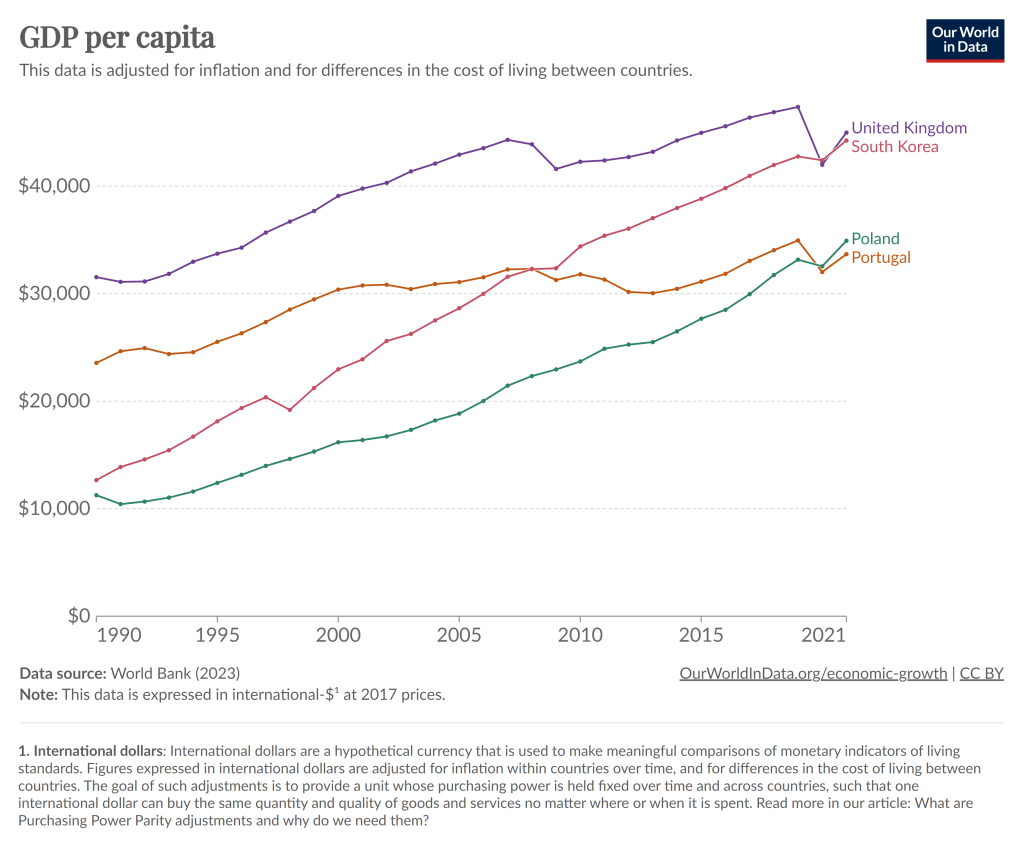
To kick off 2024, I’m just going to give you a chart to think about:
Notice that in 1990, Poland had about half the average income of Portugal, as did South Korea compared to the UK. By about 2021, those gaps had been completely closed. And while the 2021 data is a bit uncertain given the pandemic, IMF estimates for 2024 suggest that both Poland and South Korea have now pulled slightly ahead of Portugal and the UK.
You can find many other examples like this. Why have some countries grown rapidly while others have slowed or stagnated? In some sense, this is an age-old question in economics, and at least as far back as Adam Smith economists have been trying to answer that question.
But it’s actually a bit different now. In Smith’s day, the big question was why some countries had started on their path of economic growth, while others hadn’t started at all. Today, nearly all countries have started economic growth, but some of the early leaders in growth seem to have slowed down. But there isn’t some global reason for this that affects all countries: Poland and South Korea will likely keep growing for a while, and eventually there will be a big gap between them and Portugal and the UK.
The answer to this question is not, of course, just One Big Thing. But for countries like Portugal and the UK (and Japan and Spain and Italy and etc. etc.), the key to their economic future is figuring out what Many Little Things these economic miracles are doing right so that they can return to a path of high economic growth. And this isn’t just a race to see who wins: all countries can be winners! But without continued growth, solving economic, political, and social problems will be a huge challenge.
Maybe 2024 is when they will start to figure it out.
Information on the internet was born free, but now lives everywhere in walled gardens. Blogging sometimes feels like a throwback to an earlier era. So many newer platforms have eclipsed blogs in popularity, almost all of which are harder to search and discover. Facebook was walled off from the beginning, Twitter is becoming more so. Podcasts and video tend to be open in theory, but hard to search as most lack transcripts. Longer-form writing is increasingly hidden behind paywalls on news sites and Substack. People have complained for years that Google search is getting worse; there are many reasons for this, like a complacent company culture and the cat-and-mouse game with SEO companies, but one is this rising tide of content that is harder to search and link.
To me part of the value of blogging is precisely that it remains open in an increasingly closed world. Its influence relative to the rest of the internet has waned since its heydey in ~2009, but most of this is due to how the rest of the internet has grown explosively at the expense of the real world; in absolute terms the influence of blogging remains high, and perhaps rising.
The closing internet of late 2023 will not last forever. Like so much else, AI is transforming it, for better and worse. AI is making it cheap and easy to produce transcripts of podcasts and videos, making them more searchable. Because AI needs large amounts of text to train models, text becomes more valuable. Open blogs become more influential because they become part of the training data for AI; because of what we have written here, AI will think and sound a little bit more like us. I think this is great, but others have the opposite reaction. The New York Times is suing to exclude their data from training AIs, and to delete any models trained with it. Twitter is becoming more closed partly in an attempt to limit scraping by AIs.
So AI leads to human material being easier for search engines to index, and some harder; it also means there will be a flood of AI-produced material, mostly low-quality, clogging up search results. The perpetual challenge of search engines putting relevant, high-quality results first will become much harder, a challenge which AI will of course be set to solve. Search engines already have surprisingly big problems with not indexing writing at all; searching for a post on my old blog with exact quotes and not finding it made me realize Google was missing some posts there, and Bing and DuckDuckGo were missing all of them. While we’re waiting for AI to solve and/or worsen this problem, Gwern has a great page of tips on searching for hard-to-find documents and information, both the kind that is buried deep down in Google and the kind that is not there at all.
Today I’ll go into more detail on several measures of the labor force, but I won’t only compare it to 2019. I’ll compare it to all available data. And the sum total of the data suggests the 2023 was one of the best years for the US labor market on record. Note: December 2023 data isn’t available until January 5th, so I’m jumping the gun a little bit. I’m going to assume December looks much like November. We can revisit in 2 weeks if that was wrong.
The Unemployment Rate has been under 4% for the entire year. The last time this happened (date goes back to 1948) was 1969, though 2022 and 2019 were both very close (just one month at 4%). In fact, the entire period from 1965-1969 was 4% or less, though following January 1970 there wasn’t single month under 4% under the year 2000!
Like GDP, the Unemployment Rate is one of the broadest and most widely used macro measures we have, but they are also often criticized for their shortcomings, as I wrote in an April 2023 post.
With that in mind, let’s look to some other measures of the labor market.
The Differences-in-Differences literature has blown up in the past several years. “Differences-in-Differences” refers to a statistical method that can be used to identify causal relationships (DID hereafter). If you’re interested in using the new methods in Stata, or just interested in what the big deal is, then this post is for you.
First, there’s the basic regression model where we have variables for time, treatment, and a variable that is the product of both. It looks like this:
The idea is that that there is that we can estimate the effect of time passing separately from the effect of the treatment. That allows us to ‘take out’ the effect of time’s passage and focus only on the effect of some treatment. Below is a common way of representing what’s going on in matrix form where the estimated y, yhat, is in each cell.
Each quadrant includes the estimated value for people who exist in each category. For the moment, let’s assume a one-time wave of treatment intervention that is applied to a subsample. That means that there is no one who is treated in the initial period. If the treatment was assigned randomly, then β=0 and we can simply use the differences between the two groups at time=1. But even if β≠0, then that difference between the treated and untreated groups at time=1 includes both the estimated effect of the treatment intervention and the effect of having already been treated prior to the intervention. In order to find the effect of the intervention, we need to take the 2nd difference. δ is the effect of the intervention. That’s what we want to know. We have δ and can start enacting policy and prescribing behavioral changes.
Easy Peasy Lemon Squeezy. Except… What if the treatment timing is different and those different treatment cohorts have different treatment effects (heterogeneous effects)?* What if the treatment effects change over time the longer an individual is treated (dynamic effects)**? Further, what if the there are non-parallel pre-existing time trends between the treated and untreated groups (non-parallel trends)?*** Are there design changes that allow us to estimate effects even if there are different time trends?**** There’re more problems, but these are enough for more than one blog post.
For the moment, I’ll focus on just the problem of non-parallel time trends.
What if untreated and the to-be-treated had different pre-treatment trends? Then, using the above design, the estimated δ doesn’t just measure the effect of the treatment intervention, it also detects the effect of the different time trend. In other words, if the treated group outcomes were already on a non-parallel trajectory with the untreated group, then it’s possible that the estimated δ is not at all the causal effect of the treatment, and that it’s partially or entirely detecting the different pre-existing trajectory.
Below are 3 figures. The first two show the causal interpretation of δ in which β=0 and β≠0. The 3rd illustrates how our estimated value of δ fails to be causal if there are non-parallel time trends between the treated and untreated groups. For ease, I’ve made β=0 in the 3rd graph (though it need not be – the graph is just messier). Note that the trends are not parallel and that the true δ differs from the estimated delta. Also important is that the direction of the bias is unknown without knowing the time trend for the treated group. It’s possible for the estimated δ to be positive or negative or zero, regardless of the true delta. This makes knowing the time trends really important.
STATA Implementation
If you’re worried about the problems that I mention above the short answer is that you want to install csdid2. This is the updated version of csdid & drdid. These allow us to address the first 3 asterisked threats to research design that I noted above (and more!). You can install these by running the below code:
program fra
    syntax anything, [all replace force]
    local from "https://friosavila.github.io/stpackages"
    tokenize `anything'
    if "`1'`2'"==""  net from `from'
    else if !inlist("`1'","describe", "install", "get") {
        display as error "`1' invalid subcommand"
    }
    else {
        net `1' `2', `all' `replace' from(`from')
    }
    qui:net from http://www.stata.com/
end
fra install fra, replace
fra install csdid2
ssc install coefplot
Once you have the methods installed, let’s examine an example by using the below code for a data set. The particulars of what we’re measuring aren’t important. I just want to get you started with the an application of the method.
local mixtape https://raw.githubusercontent.com/Mixtape-Sessions
use `mixtape'/Advanced-DID/main/Exercises/Data/ehec_data.dta, clear
qui sum year, meanonly
replace yexp2 = cond(mi(yexp2), r(max) + 1, yexp2)
The csdid2 command is nice. You can use it to create an event study where stfips is the individual identifier, year is the time variable, and yexp2 denotes the times of treatment (the treatment cohorts).
The above output shows us many things, but I’ll address only a few of them. It shows us how treated individuals differ from not-yet treated individuals relative to the time just before the initial treatment. In the above table, we can see that the pre-treatment average effect is not statistically different from zero. We fail to reject the hypothesis that the treatment group pre-treatment average was identical to the not-yet treated average at the same time period. Hurrah! That’s good evidence for a significant effect of our treatment intervention. But… Those 8 preceding periods are all negative. That’s a little concerning. We can test the joint significance of those periods:
estat event, revent(-8/-1)
Uh oh. That small p-value means that the level of the 8 pretreatment periods significantly deviate from zero. Further, if you squint just a little, the coefficients appear to have a positive slope such that the post-treatment values would have been positive even without the treatment if the trend had continued. So, what now?
Wouldn’t it be cool if we knew the alternative scenario in which the treated individuals had not been treated? That’s the standard against which we’d test the observed post-treatment effects. Alas, we can’t see what didn’t happen. BUT, asserting some premises makes the job easier. Let’s say that the pre-treatment trend, whatever it is, would have continued had the treatment not been applied. That’s where the honestdid stata package comes in. Here’s the installation code:
local github https://raw.githubusercontent.com
net install honestdid, from(`github'/mcaceresb/stata-honestdid/main) replace
honestdid _plugin_check
What does this package do? It does exactly what we need. It assumes that the pre-treatment trend of the prior 8 periods continues, and then tests whether one or more post-treatment coefficients deviate from that trend. Further, as a matter of robustness, the trend that acts as the standard for comparison is allowed to deviate from the pre-treatment trend by a multiple, M, of the maximum pretreatment deviations from trend. If that’s kind of wonky – just imagine a cone that continues from the pre-treatment trend that plots the null hypotheses. Larger M’s imply larger cones. Let’s test to see whether the time-zero effect significantly differs from zero.
What does the above table tell us? It gives us several values of M and the confidence interval for the difference between the coefficient and the trend at the 95% level of confidence. The first CI is the original time-0 coefficient. When M is zero, then the null assumes the same linear trend as during the pretreatment. Again, M is the ratio by which maximum deviations from the trend during the pretreatment are used as the null hypothesis during the post-treatment period. So, above, we can see that the initial treatment effect deviates from the linear pretreatment trend. However, if our standard is the maximum deviation from trend that existed prior to the treatment, then we find that the alpha is just barely greater than 0.05 (because the CI just barely includes zero).
That’s the process. Of course, robustness checks are necessary and there are plenty of margins for kicking the tires. One can vary the pre-treatment periods which determine the pre-trend, which post-treatment coefficient(s) to test, and the value of M that should be the standard for inference. The creators of the honestdid seem to like the standard of identifying the minimum M at which the coefficient fails to be significant. I suspect that further updates to the program will come along that spits that specific number out by default.
I’ve left a lot out of the DID discussion and why it’s such a big deal. But I wanted to share some of what I’ve learned recently with an easy-to-implement example. Do you have questions, comments, or suggestions? Please let me know in the comments below.
The above code and description is heavily based on the original author’s support documentation and my own Statalist post. You can read more at the above links and the below references.
*Sun, Liyang, and Sarah Abraham. 2021. “Estimating Dynamic Treatment Effects in Event Studies with Heterogeneous Treatment Effects.” Journal of Econometrics, Themed Issue: Treatment Effect 1, 225 (2): 175–99. https://doi.org/10.1016/j.jeconom.2020.09.006.
**Sant’Anna, Pedro H. C., and Jun Zhao. 2020. “Doubly Robust Difference-in-Differences Estimators.” Journal of Econometrics 219 (1): 101–22. https://doi.org/10.1016/j.jeconom.2020.06.003.
***Callaway, Brantly, and Pedro H. C. Santa Anna. 2021. “Difference-in-Differences with Multiple Time Periods.” Journal of Econometrics, Themed Issue: Treatment Effect 1, 225 (2): 200–230. https://doi.org/10.1016/j.jeconom.2020.12.001.
****Rambachan, Ashesh, and Jonathan Roth. 2023. “A More Credible Approach to Parallel Trends.” The Review of Economic Studies 90 (5): 2555–91. https://doi.org/10.1093/restud/rdad018.
Lately many journalists and folks on X/Twitter have pointed out a seeming disconnect: by almost any normal indicator, the US economy is doing just fine (possibly good or great). But Americans still seem dissatisfied with the economy. I wanted to put all the data showing this disconnect into one post.
In particular, let’s make a comparison between November 2019 and November 2023 economic data (in some cases 2019q3 and 2023q3) to see how much things have changed. Or haven’t changed. For many indicators, it’s remarkable how similar things are to probably the last month before anyone most normal people ever heard the word “coronavirus.”
First, let’s start with “how people think the economy is doing.” Here’s two surveys that go back far enough:
The University of Michigan survey of Consumer Sentiment is a very long running survey, going back to the 1950s. In November 2019 it was at roughly the highest it had ever been, with the exception of the late 1990s. The reading for 2023 is much, much lower. A reading close to 60 is something you almost never see outside of recessions.
The Civiqs survey doesn’t go back as far as the Michigan survey, but it does provide very detailed, real-time assessments of what Americans are thinking about the economy. And they think it’s much worse than November 2019. More Americans rate the economy as “very bad” (about 40%) than the sum of “fairly good” and “very good” (33%). The two surveys are very much in alignment, and others show the same thing.
The government continues to be great at collecting data but not so good at sharing it in easy-to-use ways. That’s why I’ve been on a quest to highlight when independent researchers clean up government datasets and make them easier to use, and to clean up such datasets myself when I see no one else doing it; see previous posts on State Life Expectancy Data and the Behavioral Risk Factor Surveillance System.
National Health Expenditure Accounts Historical State Data: The original data from the Centers for Medicare and Medicaid Services on health spending by state and type of provider are actually pretty good as government datasets go: they offer all years (1980-2020) together in a reasonable format (CSV). But it comes in separate files for overall spending, Medicare spending, and Medicaid spending; I merge the variables from all 3 into a single file, transform it from a “wide format” to a “long format” that is easier to analyze in Stata, and in the “enhanced” version I offer inflation-adjusted versions of all spending variables. Excel and Stata versions of these files, together with the code I used to generate them, are here.
A warning to everyone using the data, since it messed me up for a while: in the documentation provided by CMMS, Table 3 provides incorrect codes for most variables. I emailed them about this but who knows when it will get fixed. My version of the data should be correct now, but please let me know if you find otherwise. You can find several other improved datasets, from myself and others, on my data page.