Lately on Twitter this chart has been going around:
The chart comes from Bloomberg journalist Justin Fox, who always puts together interesting economic data. You can read his interpretation of the data at Bloomberg, but the folks posting it on Twitter all seem to have the same shock and awe: Detroit was the richest big city in 1949. And of course we all know that today it isn’t. Still, the Detroit MSA has done OK since 1949, even though it is no longer anywhere near the top.
How well has Detroit done? Despite industrial decline and many other major problems, median household income of the Detroit MSA was around $71,000 in 2022 according to the Census Bureau. How does this compare to the $3,627 median income in 1949? It’s about double in real terms: you can multiply it by about 10 using the Census’ preferred inflation adjustment for household incomes since 1949 (the C-CPI-U since 2000, and the R-CPI-U-RS before that).
Interest rates communicate the value of resources over time. For example, if you take out a loan, then the interest rate tells you how much you must to pay in order to keep that money over the life of the loan. The interest rate also reflects how much the lender will be compensated in exchange for parting with their funds. On the consumer side, the interest rate reflects the price that the borrower is willing to pay in order to avoid delaying a purchase.
When a business borrows, the interest rate reflects the minimal amount of value that they would need to create in order to make an accounting profit. For example, if a business borrows $100 for one year at an interest rate of 5%, then they need to earn $105 by the time that they repay the loan in order to break even with zero profit. The business would need to earn more than 5% in order to earn a profit on their borrowing and investment venture.
The longer the business takes to repay their loan, the more interest that accrues. And, the higher the interest rate, the more they need to earn in order to repay their loan.
This logic applies to all production because all production takes time. If production takes very little time, then the impact of the interest cost is miniscule. But, if production takes longer, then interest rates become increasingly relevant. These kinds of products include trees, cheese, wine, livestock, etc. Anything that ages, ferments, or has a lengthy production process will be more sensitive to the cost of borrowing.
How?
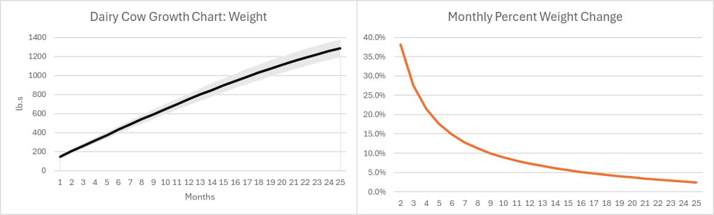
The growth pattern for most (all?) goods looks similar. Below-left is a growth chart for dairy cows . Notice that calves grow quickly at first, and their growth slows over time. For the sake of argument, let’s say that the change in value of a cow mimics the change in weight (Yes, I know that dairy and beef cows are different, but the principle is the same). Below-right is the monthly percent change. Even at an age of 25 months a cow is still growing in value at 2.4% per month or 33% per year.
Of course, there is a risk that some cows don’t survive to slaughter, lowering the expected growth rate. Since most cattle are slaughtered between 18 and 24 months of age, their growth rate at the time of slaughter is 4.4%-2.7% per month. As the interest rate at which farmers borrow rises, the optimal age at slaughter falls. Otherwise, the spread between the growth rate and the interest rate could go negative. Even so, what an investment! If you can borrow at, say, 8% per year, then you’ll make money hand-over-fist on the spread.
Except… Cows cost money to raise, and most of that cost is feed. According to the production indicators and estimated returns published by the USDA, the cost of feed in February of 2023 was $158.11 per hundred pounds of beef. The selling price of beef was $161.07. That leaves $2.96 or a profit of 1.87% earned over the course of 1.5-1.75 years. That investment is starting to look a lot less good, especially since it doesn’t include the cost of maintaining facilities, insurance, etc. It’s no wonder that farmers and ranchers are serious about their subsidies. Clearly, with such tight margins, farmers and ranchers are going to look good and hard at the interest rates that they pay on their debt. And, they do have debt.
However, the recent increase in beef prices is not caused by higher interest rates.
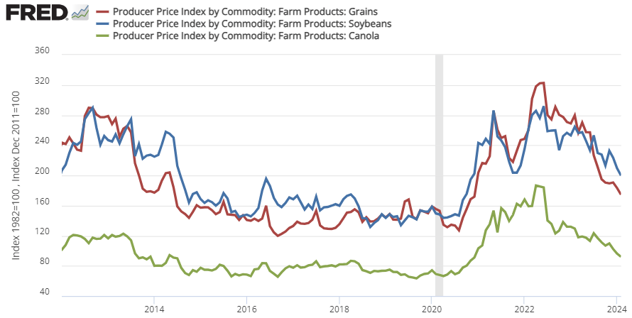
That 1.87% profit margin is at prices and costs from February 2023. Since 2020, the price of cattle feed ingredients (grain, bean, and oil) peaked in the summer of 2022 and are still substantially more expensive than pre-Covid (see below). That means that cows getting slaughtered right now were raised on more expensive feed. This February 2024, the cost of feed per 100lb. of cattle was $191.80. But the cattle selling price was only $180.75. That’s a $11.05 loss for cattle raising. Wholesale prices of cattle might be up recently, but the cost of feed is up by more. It’s not the cattle farmers who are benefiting from the high beef prices. In fact, they’re getting squeezed hard.
There is good news. The cost of feed ingredients has been falling recently, which means that beef farmers should begin to see some relief if the recent trend continues. For Consumers, the price of beef is already down from its 2023 peak.
The Fed made two mistakes during the Great Recession of 2007-2009: being too slow and weak in their initial reaction to the financial crisis, and being too hurried in their attempts to return to a ‘normal’ policy stance. The first mistake turned what could have been a minor road bump into the worst recession in decades, and the second mistake meant it took a full decade from the start of the crisis in 2007 for unemployment to return to pre-crisis levels.
The rapid recovery from the Covid recession shows that the Fed learned from its first mistake in 2007. In 2020, the Fed acted quickly and decisively, so that despite the worst pandemic in a century the US experienced a recession that lasted only months, and it took unemployment barely 2 years to return to pre-Covid levels. But the Fed’s talk about cutting rates this year makes me worry they did not learn the second lesson. Despite all their talk of being “data driven”, I don’t see how a dispassionate look at current inflation, labor market, or financial data could lead them to be considering rate cuts; if anything it currently suggests rate hikes.
Why then is the Fed talking rate cuts? Of course you can dig and find a few data points to support cuts, but I think the driving factor is simply a feeling that interest rates are currently above “normal”. They are digging to find data points to support cuts because they want to return rates to “normal”, just as in the early to mid 2010’s they were digging for reasons to raise rates to “normal”. Rather than being consistently too hawkish or too dovish, they are consistently too eager to return rates to “normal” when circumstances are still abnormal.
This is not simply out of a social and political desire to avoid appearing “weird”, though that is definitely a factor. There is also a long academic tradition of measuring the stance of monetary policy by comparing current interest rates to a neutral, “natural” rate of interest, r*. But this tradition has problems. The “natural” rate of interest is always changing, and at any given time we can’t really know for sure what it is. The current Fed Funds rate may be higher than it has been in recent years, but that doesn’t necessarily mean it is above the current natural rate of interest; the natural rate itself could have risen too. This is why interest rates aren’t a great way to measure the stance of monetary policy. At times Chair Powell himself has made the same point, saying that trying to set policy by comparing to the “natural” rate of interest r* is like “navigating by the stars under cloudy skies”.
Lacking such celestial guidance, I can only hope the Fed will make good on their promise to be data-driven and navigate by the guideposts they can see around them: measures like current inflation and unemployment, or market-based forecasts of such measures.
Let me start by saying high rates of inflation, especially unexpected inflation, is bad. Still, it is useful to have some historical context. We’ve experienced the highest inflation rates in a generation lately, especially in 2022, but past generations experienced inflation too. How to compare?
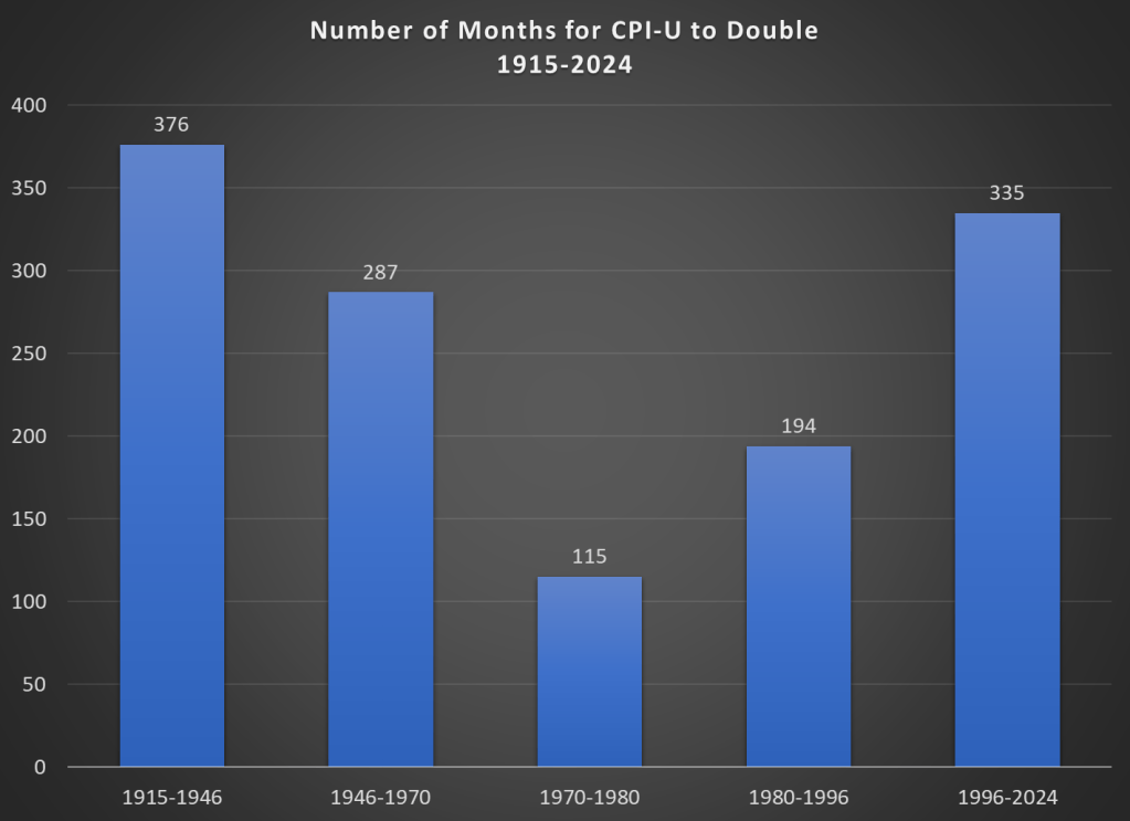
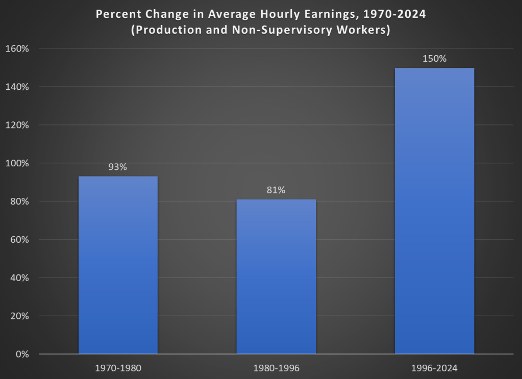
Here’s one approach. Using the latest CPI-U data, we can see that prices on average approximately doubled between March 1996 and February 2024. That’s 335 months to double, or just shy of 28 years. How long did it take prices to double if we keep moving backward in time from March 1996?
It only took 194 months for prices to double from January 1980 until March 1996, just a little over 16 years. Prior to January 1980, prices doubled even quicker, this time taking less than 10 years! Prior to that, it took 24 years for prices to double between WW2 and 1970, and before that you have to go back 31 years to 1915 for another doubling. Judged by this, our recent history doesn’t look so bad.
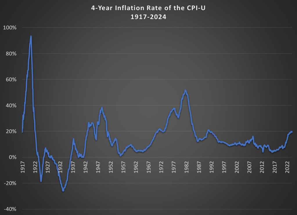
That doesn’t mean everything is OK. As I said above, unexpected inflation is the worst kind, since individuals and businesses aren’t planning for it. And we’ve had 20% inflation in the past 4 years — something not seen since 1991 over a 4-year time period. A 20%+ inflation rate is unusual to us today, but it certainly wasn’t in the past: basically all of the 1970s and 1980s had 20%+ inflation every 4 years, sometimes more than 40% or even 50%.
Finally, while unexpected inflation is bad, we also care about the relationship between wage increases and price increases. We can rightfully bemoan rapid, unexpected price inflation, but if wages are increasing faster than inflation, we are still better off (on average). The BLS average hourly wage series for production and non-supervisory workers only goes back to 1964, so we can’t do a full comparison with the CPI-U, but we can compare the three most recent doublings of prices.
Keep in mind with the chart above that prices (as measured by the CPI-U) increased by 100% for each of these time periods. So, for the 1970s and 1980-1996 periods, wages actually rose by less than rate of inflation — wage stagnation! If we used the PCE price index instead, those time periods still don’t look good: PCE prices increased by 88% for 1970-1980, 85% from 1980-1996, and 78% since 1996. With either price index, the 1996-2024 period is clearly the best of these three, and it’s not even really close.
Let me finish where I started: the recent inflation is bad. I don’t want to downplay that. But some historical perspective is also useful.
Everyone else keeps asking when the Fed will cut rates, and yesterday Chair Powell said they will likely cut this year. Either they are all crazy or I am, because almost every indicator I see indicates we are still above the Fed’s inflation target of 2% and are likely to remain there without some change in policy. Ideally that change would be a tightening of fiscal policy, but since there’s no way Congress substantially cuts the deficit this year, responsibility falls to the Federal Reserve.
Lets start with the direct measures of inflation: CPI is up 3.1% from a year ago. The Fed’s preferred measure, PCE, is up 2.4% from a year ago. Core PCE, which is more predictive of where inflation will be going forward, is up 2.8% over the past year. The TIPS spread indicates 2.4% annualized inflation over the next 5 years. The Fed’s own projections say that PCE and Core PCE won’t be back to 2.0% until 2026.
The labor market remains quite tight: the unemployment rate is 3.7%, payroll growth is strong (353,000 in January), and there are still substantially more job openings than there are unemployed workers. The chattering classes underrate this because they are in some of the few sectors, like software and journalism, where layoffs are actually rising. Real GDP growth is strong (3.2% last quarter), and nominal GDP growth is still well above its long-run trend, which is inflationary.
I do see a few contrary indicators: M2 is still down from a year ago (though only 1.4%, and it is up over the past 6 months). The Fed’s balance sheet continues to shrink, though it is still trillions above the pre-Covid level. Productivity rose 3.2% last quarter.
At least over the past year I think fiscal policy is more responsible than monetary policy for persistent inflation. But I can’t see Congress doing a deficit-reducing grand bargain in an election year; the CBO projects the deficit will continue to run over 5% of GDP. That means our best chance for inflation to hit the target this year is for the Fed to tighten, or at least to not cut rates. If policy continues on its current inflationary path, our main hope is for a deus-ex-machina like a true tech-fueled productivity boom, or deflationary events abroad (recession in China?) lowering prices here.
By now, hopefully we’ve all heard of shrinkflation. But if you haven’t, it’s when the unit price (e.g., the cost per pound) increases not because the price of the good went up, but because the product shrank in size.
Let’s be clear about a few things. First, this is nothing new. Here’s an Economist story from 2019 (pre-pandemic and pre-Bidenflation) talking about shrinkflation. You can find many such anecdotal stories back even further.
Second, the BLS is aware of this. They track it, and price it into the CPI. Take a look at the price data which underlies the CPI: it’s all stated in units. Price per pound, price per dozen, etc.
Moreover, the BLS also recently gave us some data on how frequently this happens. It’s pretty rare. Even among food items, which are a category the includes a fair amount of shrinkflation, only about 3 percent of products experienced any downsizing or upsizing from 2015-2021. That’s right, sometimes packages get larger, not smaller, which effectively lowers the unit price. “Shrinkdeflation” anyone?
Ignore the weird obsession with Biden’s ice cream habit. The Senator is concerned that NYC is not safe.
But what’s the reality? Here’s a map showing the homicide rate in each state, and its relative position to NYC (data is from the CDC for 2022, the most recent complete year available right now).
The light-colored states have a lower homicide rate than NYC (5.2 deaths per 100,000). There’s 18 of those states. But most states have higher homicide rates than NYC. Some are a lot higher, even triple NYC in a few states (colored purple). Alabama’s homicide rate of 13.9 deaths per 100,000 people is about 2.5 times as high as New York City.
But perhaps the homicide rates in these states are being driven by high homicide rates in cities in those states? Comparing a city to a state is perhaps a little strange to do, but I also often hear this retort: well, it’s those cities, especially “Democrat-controlled” cities, that are driving the high homicide rate in Alabama and elsewhere. And while this is true to a certain extent, comparing rural counties to New York City doesn’t make Alabama and the South look much better:
For this map I combined 2021 and 2022 data, because the CDC doesn’t report very small numbers (usually under 10 deaths), so grouping two years is needed to get more data. Even so, there are still a handful of states that don’t have enough homicides for CDC to report them over that two-year period, and they are shown in gray on the map (as well as states that have no rural counties: Delaware, Rhode Island, and New Jersey).
Notice that even focusing on just the rural counties, there are almost 20 states with higher murder rates than New York City. Again, some are double or even triple. Rural Alabama, at 11 deaths per 100,000 people, is exactly double NYC. Notably, the entirety of the rural South is higher than NYC.
If this is all true, why might New York City feel less safe? There are a number of possible explanations, but I’ll offer a few. First, homicide isn’t the only kind of crime. While it does correlate with other crimes, it’s not a 1:1 relationship, so it’s likely that some places with higher homicide rates than NYC have lower levels of assault, rape, or property crimes. These are even more challenging to compare across jurisdictions, but it’s a possible explanation. Related, NYC is a relatively safe big city! Other big cities wouldn’t compare as favorably to Alabama. But folks just seem to love NYC as a punching bag.
The other explanation is just the sheer number of people, and therefore homicides. According to the CDC, NYC had 434 homicides in 2022, that’s an average of more than one per day. You could literally turn on the news every single day and hear about a murder, and perhaps you had even been in the neighborhood where it happened recently. Contrast rural Alabama, which had 65 homicides in 2022. That’s only about one per week. And it might be happening in a completely different part of the state from you, so you either don’t hear about it or think “that’s somewhere else.”
But rural Alabama only has about 600,000 people. NYC has fourteen times as many people. So if we are trying to answer the question “What are the odds that a random person is murdered in a given year?”, we need to take population into account. That’s the logic of reporting homicide rates. Indeed it may feel like NYC is less safe, and that’s a natural human reaction. But that’s why the data is so important, to give us a sense of proportion.
Food prices are up a lot in the past few years. I’ve written about this several times in the past few months. In the US, we’ve seen grocery prices go up 20% on average in just 3 years. That’s much higher than we are used to: in the decade before the pandemic, the average 3-year increase was just 4%. In fact, the 3-year increase was negative for much of 2017 and 2018. To find increases this big, you have to go back to the late 1970s and early 1980s (when sometimes the 3-year grocery inflation rate was almost 50%).
But if it’s any consolation, this is not a problem that is unique to the US: food prices are up around the globe. That’s a relevant insight when we come to a recent viral video from Tucker Carlson’s visit to a Russian grocery store. Carlson says that the inflation and cost of groceries will “radicalize you against our leaders.”
So what has food price inflation looked like in Russia, the US, and the other G7 countries? (What used to be called the G8, until Russia invaded Crimea in 2014.) Here’s the chart:
Cumulatively since January 2021, when our current “leaders” came into power in the US, food prices are up 20% in the US, as I said above. But notice that this is on the low end for this group of countries. Japan, with consistently low inflation and occasionally deflation over the past few decades, has been the lowest over this timeframe (though even in Japan, food prices are up about 7 percent in the past year).
But notice who is the highest: Russia, where grocery prices are up 32% in the past 3 years. Certainly, their invasion of Ukraine and the resulting global sanctions plays a role in this, but even if we look at early 2022, the cumulative 15% food inflation was much higher than any G7 country.
So blaming our leaders for rampant inflation is probably not a good idea, especially if you are trying to portray Russia in a positive light.
Perhaps the more charitable interpretation of Tucker Carlson is that the nominal price of groceries is lower, rather than the rate of inflation (even though he does mention inflation in the video). The basket of food they purchase in the video comes out to the equivalent of about $100 at current exchange rates. Everyone on his crew guessed it would be around $400.
I can’t say whether their guess of $400 was accurate, but it would not be totally surprising if the prices of non-tradable goods were lower. This is what would expect in a country with lower wages. While we normally think of services as non-tradable, it’s also reasonable to assume that a lot of fresh food, such as produce, bread, and dairy, is also non-tradable (at least not without high transaction costs).
Carlson’s claim that people “literally can’t buy the groceries they want” is a much more apt statement of the state of affairs in Russia (and other poor countries) than it is in the US and Western Europe.
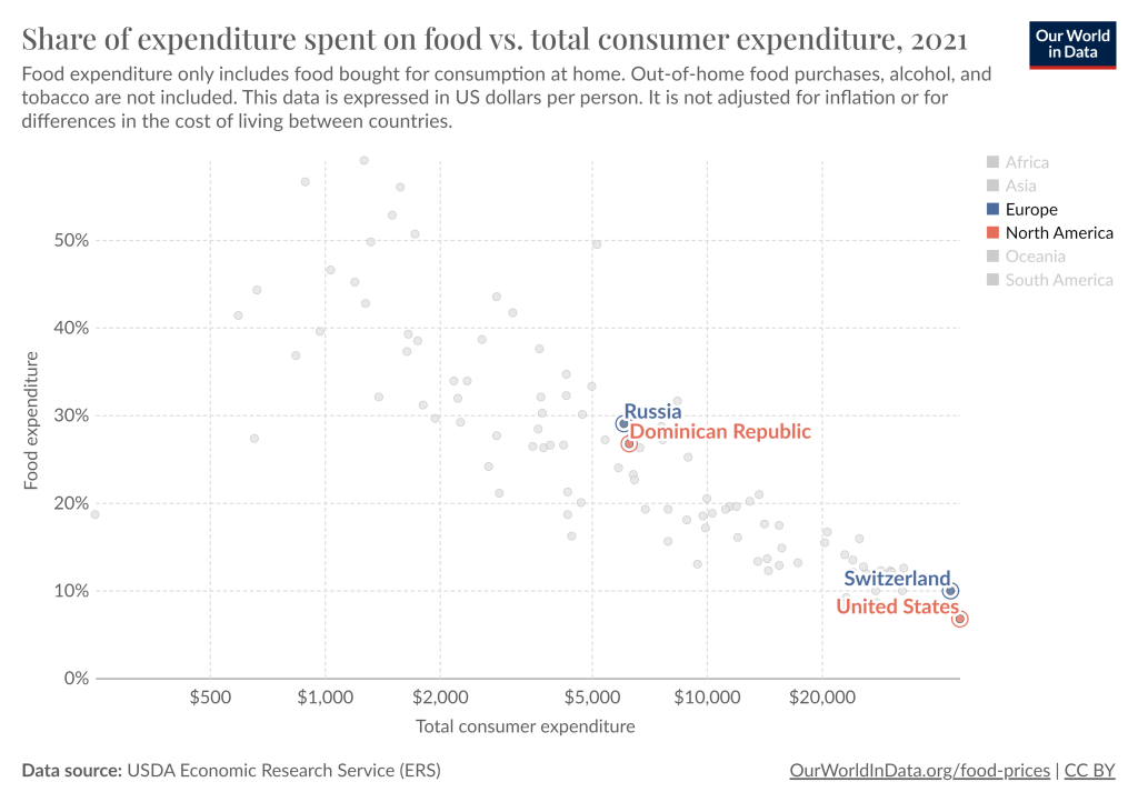
The average Russian allocates about 30% of their spending to groceries, similar to the Dominican Republic. And this data is from 2021, just before the massive spike in food prices in Russia. Meanwhile, the US is by far the lowest, at just under 7%. The UK, Canada, and Switzerland are the closest to the US, but they are in the 9-10% range. Food in the US is cheap.
The food inflation we’ve experienced in the US has been bad, the worst in a generation. But it’s not exactly clear that our “leaders” are to blame. And it’s also pretty clear that it’s much worse in the rest of the world, especially in Russia.
I found a new time series and panel data tool that I want to share. What does it do? It’s called xtbreak and it finds what are known as ‘structural breaks’ in the data. What does that mean? It means that the determinants of a dependent variable matter differently at different periods of time. In statistics we’d say that the regression coefficients are different during different periods of time. To elaborate, I’ll walk through the same example that the authors of the command use.
The data contains weekly US covid cases and deaths for 2020-2021. Here’s what it looks like:
So, what’s the data generating process? It stands to reason that the number of deaths is related to the number of cases one week prior. So, we can adopt the following model:
That seems reasonable. However, we suspect that δ is not the same across the entire sample period. Why not? Medical professionals learned how to better treat covid, and the public changed their behavior so that different types of people contracted covid. Further, once they contracted it, the public’s criteria for visiting the doctor changed. So, while the lagged number of cases is a reasonable determinant of deaths across the entire sample, we would expect it to predict a different number deaths at different times. In the model above, we are saying that δ changes over time and maybe at discrete points.
First, xtbreak allows us to test whether there are any structural breaks. Specifically, it can test whether there are S breaks rather than S-1 breaks. If the test statistic is greater than the critical statistics, then we can conclude that there are some number of breaks. Note that there being 5 breaks given that there are 4 depends on there also be at least 4 breaks. And since we can’t say that there are certainly 4 breaks rather than 3, it would be inappropriate to say that there are 4 or 5 breaks.
Great, so if there are three structural breaks, then when do they occur? xbtreak can answer that too (below). The three structural breaks are noted as the 20th week of 2020, the 51st week of 2020, and the 11th week of 2021. Conveniently, there is also a confidence interval. Note that the confidence intervals for 2020w11 and 2021w11 breaks are nice and precise with a 1-week confidence interval. The 2nd break, however, has a big 30-week confidence interval (nearly 7 months). So, while we suspect that there is a 3rdstructural break, we don’t know as precisely where it is.
Regardless, if there are three structural breaks, then that means that there are four time periods with different relationships between lagged covid cases and covid deaths. We can create a scatter plot of the raw data and run a regression to see the different slopes. Below we can see the different slopes that describe the impact of lagged covid cases on deaths. Sensibly, covid cases resulted in more deaths earlier during the pandemic. As time passed, the proportion of cases which resulted in death declined (as seen in the falling slope of the dots). It’s no wonder that people were freaking out at the start of the pandemic.
What’s nice about this method for finding breaks is that it is statistically determined. Of course, it’s important to have a theoretical motivation for why any breaks would occur in the first place. This method is more rigorous than eye-balling the data and provides opportunities to hypothesis test the number of breaks and their location. If you read the documentation, then there are other tests, such as breaks in the constant, that are also possible.
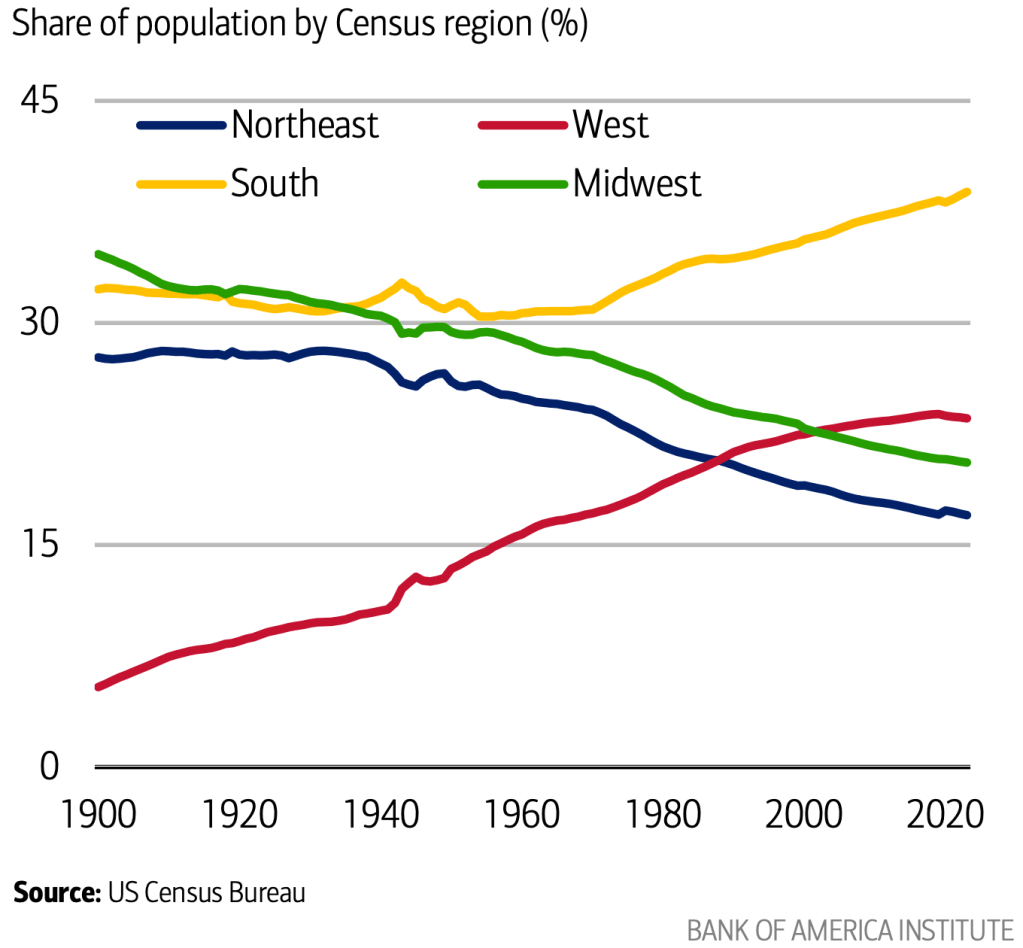
Americans have moved westward in every decade of our history. But after over 200 years, that trend may finally be ending.
A new report from Bank of America notes that the share of Americans who live in the West has been falling since 2020:
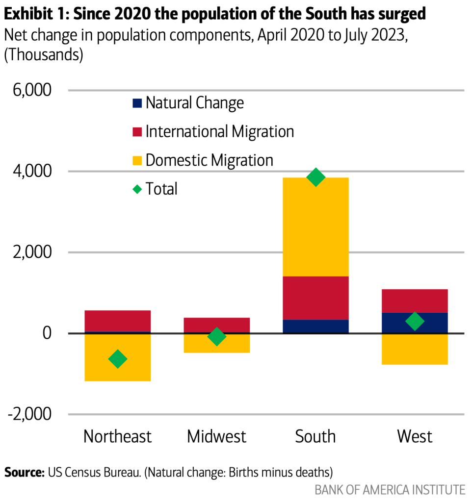
The absolute population of the West is still growing slightly, but the Southeast is growing so quickly that it makes every other region of the country a smaller share by comparison:
I think this has a lot to do with the decline in housing affordability that Jeremy discussed yesterday. Americans always went West for free land, or cheap land, or cheap housing. Or in more recent decades on the Pacific coast, they went for nice weather and good jobs with non-insane housing prices. But now all that is gone, and if anything housing prices are pushing people East.
I see some green shoots of zoningreform with the potential to lower housing costs in the West. But I worry that this is too little too late, and that 2030 will confirm that our long national trek Westward has finally been defeated by our own poor housing policy.