My new working paper with Will Hickman is up on SSRN: Do People Trust Humans More Than ChatGPT?
We study whether people will pay for a fact-check on AI writing. ChatGPT can be very useful, but human readers should not trust every fact that it reports. Yesterday’s post was about ChatGPT writing false things that look real.
The reason participants in our experiment might pay for a fact-check is that they earn bonus payments based on whether they correctly identify errors in a paragraph. If participants believe that the paragraph does not contain any errors, they should not pay for a fact-check. However, if they have doubts, it is rational to pay for a fact-check and earn a smaller bonus, for certain.
Abstract: We explore whether people trust the accuracy of statements produced by large language models (LLMs) versus those written by humans. While LLMs have showcased impressive capabilities in generating text, concerns have been raised regarding the potential for misinformation, bias, or false responses. In this experiment, participants rate the accuracy of statements under different information conditions. Participants who are not explicitly informed of authorship tend to trust statements they believe are human-written more than those attributed to ChatGPT. However, when informed about authorship, participants show equal skepticism towards both human and AI writers. There is an increase in the rate of costly fact-checking by participants who are explicitly informed. These outcomes suggest that trust in AI-generated content is context-dependent.
Our original hypothesis was that people would be more trusting of human writers. That turned out to be only partially true. Participants who are not explicitly informed of authorship tend to trust statements they believe are human-written more than those attributed to ChatGPT.
We presented information to participants in different ways. Sometimes we explicitly told them about authorship (informed treatment) and sometimes we asked them to guess about authorship (uninformed treatment).
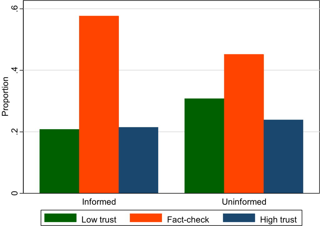
This graph (figure 5 in our paper) shows that the overall rate of fact-checking increased when subjects were given more explicit information. Something about being told that a paragraph was written by a human might have aroused suspicion in our participants. (The kids today would say it is “sus.”) They became less confident in their own ability to rate accuracy and therefore more willing to pay for a fact-check. This effect is independent of whether participants trust humans more than AI.
We are thinking of fact-checking as often a good thing, in the context of our previous work on ChatGPT hallucinations. So, one policy implication is that certain types of labels can cause readers to think critically. For example, Twitter labels automated accounts so that readers know when content has been chosen or created by a bot.
Our working paper is currently trending on SSRN top ten lists such as this one.
Suggested Citation:
Buchanan, Joy and Hickman, William, Do People Trust Humans More Than ChatGPT? (November 16, 2023). GMU Working Paper in Economics No. 23-38, Available at SSRN: https://ssrn.com/abstract=4635674