I want to share some changes that I’ll make to my game theory course, just for the record. It’s an intense course for students. They complete homeworks, midterm exams, they present scholarly articles to the class, and they write and present a term paper that includes many parts. Students have the potential to learn a huge amount, including those more intangible communication skills for which firms pine.
There is a great deal of freedom in the course. Students model circumstances that they choose for the homeworks, and they write the paper on a topic that they choose. The 2nd half of the course is mathematically intensive. When I’ve got a great batch of students, they achieve amazing things. They build models, they ask questions, they work together. BUT, when the students are academically below average, the course much less fun (for them and me). We spend way more time on math and way less time on the theory and why the math works or on the applicable circumstances. All of that time spent and they still can’t perform on the mathematical assignments. To boot, their analytical production suffers because of all that low marginal product time invested in math. It’s a frustrating experience for them, for me, and for the students who are capable of more.
This year, I’m making a few changes that I want to share.
Minimal Understanding Quizzes: All students must complete a weekly quiz for no credit and earn beyond a threshold score in order to proceed to the homework and exams. I’m hoping to stop the coasters from getting ‘too far’ in the course without getting the basics down well enough. The quizzes must strike the balance of being hard enough that students must know the content, and easy enough that they don’t resent the requirement.
Inpatient costs were 27% higher (95% CI 0.252, 0.285), but length of stay was 12% shorter (95% CI −0.131, −0.100), in Comprehensive Cancer Centers relative to community hospitals.
In other words, these cutting-edge hospitals that tend to treat complex cases are more expensive, as you would expect; but despite getting tough cases they actually manage a shorter average length of stay. We can’t nail down the mechanism for this but our guess is that they simply provide higher-quality care and make fewer errors, which lets people get well faster.
The NCI Cancer Centers Program was created as part of the National Cancer Act of 1971 and is one of the anchors of the nation’s cancer research effort. Through this program, NCI recognizes centers around the country that meet rigorous standards for transdisciplinary, state-of-the-art research focused on developing new and better approaches to preventing, diagnosing, and treating cancer.
Our paper focuses on New York state because of their excellent data, the New York State Statewide Planning and Research Cooperative System Hospital Inpatient Discharges dataset, which lets us track essentially all hospital patients in the state:
We use data on patient demographics, total treatment costs, and lengths of stay for patients discharged from New York hospitals with cancer-related diagnoses between 2017 and 2019.
You know I’m all about sharing data; you can find our data and code for the paper on my OSF page here.
My coauthor on this paper is Ryan Fodero, who wrote the initial draft of this paper in my Economics Senior Capstone class last Fall. He is deservedly first author- he had the idea, found the data, and wrote the first draft; I just offered comments, cleaned things up for publication, and dealt with the journal. I’ve published with undergraduates several times before but this is the first time I’ve seen one of my undergrads hit anything close to a top field journal. You can find a profile of Ryan here; I suspect it won’t be the last you hear of him.
I was reading “The Ultimate Guide to Barbie” the other day, and I noticed an interesting piece of data towards the end of the magazine: the original Barbie doll in 1959 retailed for $3. Today, according to the magazine, a Barbie costs around $14-19. And they further told us that adjusted for inflation, that $3 original Barbie is about $24 today.
I’m not sure exactly where they got that number. Using the BLS CPI tool, it’s more like $31.50. And while I appreciate the attempt to give us historical context, I think for the typical reader will still be a bit perplexed. What does it mean to say $3 in 1959 is equal to $24 (or $31.50) today? Well, it means that the price of Barbie dolls has risen more slowly than other goods and services (quality adjusted). But I think we can do better on the context.
Here’s my best attempt to give context:
The chart shows the number of minutes of work that the median woman would need to work to purchase a Barbie doll for her daughter. In 1959, it took almost 2 hours of work. Today, it takes only about a half hour (I’m using the lower range from the magazine, $14 for a Barbie today, although there are plenty of $10-11 Barbies on Amazon).
Another way of thinking about it: with the same amount of work, a working mother today could buy her daughter 3-4 times as many Barbies as her counterpart in 1959.
I deliberately used median female wages here to make another historical comparison. Women’s earnings have increased much more than men’s since 1959. Back then, median female earnings for full-time, year round workers was only 61% of male earnings. Today, it is close to 85%. True, that’s still not parity. And for those that know the history, you will also know that the closing of that gap has stagnated in recent years. But this is still some major progress during the Barbie Era.
Finally, as I have emphasized before, looking too much at the cost of one product over time has limits. What about other goods and services? A toy, even a well-known brand like Barbie, is a tradable good that can be manufactured anywhere in the world (it looks like Indonesia is where many Barbies are made today). So it wouldn’t be surprising that it has got cheaper over time. But what about all goods and services?
Here’s where inflation adjustments are most useful. Not for individual goods and services, but for looking at incomes over time. How much stuff can a given income purchase compared to the past? That’s what inflation adjustments are for. And this chart shows male and female median earnings in 1959 and 2023, with the 1959 figures adjusted to 2023 dollars using the PCE price index.
When we adjust for changes in all prices, not just Barbies, we can see that median female earnings have roughly doubled between 1959 and 2023. That’s not quite as robust as the “Barbie standard of living,” which allows you to purchase 3-4 times as many dolls. But 2 times as much stuff is pretty good. It’s especially good when compared with male earnings growth, which grew about 44 percent.
It should be obvious here that these are just the raw medians, not controlling for anything like education, experience, or occupational choice. Controlling for those will shrink the gap a bit more. But the gains for women in the labor market since the introduction of Barbie are large and worth celebrating.
A stopped clock is occasionally right. And so are perma-bears, those commentators or analysts who continually predict that GDP and stocks will plunge – perhaps in the next quarter, but more often say six months from now. (And that deadline keeps getting pushed back every six months).
When I was first getting started investing, I was overly influenced by these seemingly cautious and sober souls, and I consequently lost out considerably compared to my colleagues who blithely stayed fully invested. So I hold my native pessimism in check when investing, and stay mainly in the market, but with a little cash in reserve just in case The Big One hits.
All that said, I do try to sample various points of view. If I have been mainly seeing positive chatter, I turn to my favorite perma-bear, an analyst named Jeffrey Snider. His YouTube channel is called Eurodollar University, and he runs a subscription service as well.
Jeff seems like a genuinely nice guy, who believes that his dire readings of the macroeconomic tea leaves are helping folks avoid disaster. His demeanor is more like an earnest teacher, not a huckster trying to sell something. I should add that he offers meaningful insights on the Eurodollar scene, which is globally significant and which most analysts do not understand or even recognize.
But Jeff’s bias is nearly always toward the negative, and it is something of a good-natured joke among his viewers. Typical comments: “ The market can remain irrational longer than Jeff can stay pessimistic” and “Jeff is the best on Youtube. I watch his videos every night right before I go to bed. In less than 5 minutes, I’m in a semi-conscious coma. Its better than any sleeping pill. That smooth soothing voice extoling the virtues of a collapsing economy works wonders. A++”.
Well, what is the bear-meister saying now? He claims that the seemingly red-hot employment numbers that have been reported in recent months are less hot than they appear. I will paste in a few snips from his recent YouTube, It Just Happened…The JOB MARKET JUST BROKE!! .
One point he makes is that there has been a persistent, inaccurate bias to the upside in the payroll numbers reported by the BLS. These big numbers are what gets reported; what does not get reported so much is, month after month, these monster payroll increases are quietly revised downwards, often by substantial amounts:
Even with the adjustments, these still seem like large increases in employment. Undaunted, Jeff pokes holes in the hot labor market scenario by claiming that full time employment is actually stagnant; it is the rise in part-time workers that creates the seemingly large army of the newly employed. The fact that total hours worked has plateaued seems to support his case here:
Another factor is worker hoarding. Employers were so burned trying to scramble for workers during the 2022 reopening-from-Covid that they are keeping their workers on payroll (even part-time), just in case the economy picks up and they need to pull them in full-time. A case in point is manufacturing. New orders are down considerably this year, and headed even lower, yet manufacturers have not cut their workforces appreciably:
If orders stay low for a long enough time, however, the manufacturers will have no choice but to start massive layoffs.
As another indicator of labor market softness, temporary workers may be a leading indicator of employment trends. They are not such a core part of a company, so there is less hoarding of them. And temporary help services have been in a steady decline this year, which is consistent with a cooler economy:
Sell Everything??
As I said, it is worth considering all sides. I think the specific points mentioned above are all valid ones. I would add that if students actually start payments on all those loans which taxpayers and the Fed have subsidized for the past three years, that will finally put a crimp in the spending. Also, the surprise downgrade of U.S. federal debt by the Fitch rating agency , and resulting jump in interest rates, has finally gotten people talking about out-of-control government spending, for one week anyway. Also, the great China-reopening that was supposed to jump-start the global economy seems to be pretty flat.
However, a couple of counter-points to the bearish narrative:
First, even if manufacturing is rolling over, in the U.S. it is fairly small relative to services. At least in some geographical areas, my anecdotal reports say that it is still a challenge to get good workers to do services.
Second, the tidal wave of cash from pandemic giveaways that washed into our collective bank accounts is still not depleted. Consumer confidence is high, and we are spending freely. This economy is a big, big ship, and it is still steaming full ahead, brushing aside high interest rates and yield curve inversions. The recession seems to continually recede. There will inevitably be a downturn someday, of course, but absent some geopolitical event, I think it may take some time for it to arrive.
And finally, even if the long-awaited recession does arrive, it may not necessarily be so bad for stocks. Since the 2008-2009 Great Financial Crisis, the Fed has taken a very active role in supporting the markets. Wall Street has been conditioned to expect the Fed to flood the system with money if a serious downturn occurs. Also, the Street is betting that there will be enough howls of pain over the high interest being paid on the federal debt that unbearable pressure will be brought on the Fed to loosen up; the vaunted independence of that institution will be put to the test, with Congressional threats to alter their charter if they don’t cave to pressure. And so, “[economic] bad news is [investing] good news”, in contrast to the pre-2008 world. Furthermore, federal deficit spending ramps up during recessions, and as noted in The Kalecki Profit Equation: Why Government Deficit Spending (Typically) MUST Boost Corporate Earnings , this deficit spending tends to boost earnings.
And so even if Jeff Snider is correct that the economy is rolling over and will soon slide downward, this may not give investors a very useful signal. As another one of his YouTube viewers has commented, “This channel is a masterclass in learning that knowledge about the macro environment does not provide an edge in markets.”
The author of Secondhand, Adam Minter, simultaneously appreciates the value created by large “impersonal” markets and also paints colorful pictures of the individual people involved. He has respect for individuals in the system who, using local knowledge, extract all the value out of what rich people consider to be trash. Minter sits in the seat of Adam Smith.
But it is not the popular movement, but the travelling of the minds of men who sit in the seat of Adam Smith that is really serious and worthy of attention.
Lord Acton, Letter of Lord Acton to Mary Gladstone
Another piece about clothes from AdamSmithWorks is: “WHO ARE YOU WEARING?” FASHION PRODUCTION IN THE AGE OF ADAM SMITH. This article does “the pin factory” for clothes. The global supply chain is incredible, just looking at manufacturing alone. Minter takes it further by following goods all the way from their first consumer to their very last user.
There is some good news about how the world is getting better as the average person gets richer, but trash does also cause problems as we consume more stuff. Does Minter write about the environmental concerns of the “fast fashion” camp? He has a different idea than what others have proposed like taxing by volume or banning some commercial activity. In terms of practical advice, Minter advocates for labeling consumer goods by how long they are expected to last. It’s tragic when someone spends $20 on a good that will wear out after 1 year when they should have spent $30 on a good that will last 10 years. There are some “dollar bills on the ground” here because consumers don’t accurately assessing quality at the time of purchasing. The power of brands to signal quality helps with this problem, but if you don’t want washing machines piling up in landfills then you might want stores to put a greater emphasis on durability at the point of sale. We do something like that with nutrition labels, so it is possible.
90 plus per cent of people, they spend all their time on the buy decision and then they figure it out as they go along on when to sell and we say that’s crazy. You need to establish sell criteria, even if it’s just rebalance, even if it’s a trailing stop, whatever it may be on all your public market positions, because otherwise it gets emotional and that creates huge problems.
Last week I explained why I buy individual stocks. This week I’ll share how I think about when to sell individual stocks, as I go through my portfolio and decide what to hold and what to sell. This is the first time I’m doing this exercise, though I should have done it long ago; until now I’ve unfortunately been on the wrong side of the above Meb Faber quote.
I actually think that most people are correct not to put much thought into what to sell, because I still agree with Buffett and most economists that most people should just buy and hold diversified index funds. Thinking about selling too much might lead people to sell everything whenever they get worried, sit in cash, and miss out on years of gains. But the important truth in Faber’s point is that if you are buying stocks or active funds for any reason other than “its a great company/idea that I’d like to hold indefinitely”, it makes sense to put as much thought into when/whether to sell as when/whether to buy.
People buy stocks all the time based on short-term arguments like “this banking crisis is overblown”, or “I think the Fed is about to cut rates”, or “this IPO is going to pop”, or “I think the company will beat earnings expectations this quarter”. These might be good or bad arguments to buy but they are all arguments about why it makes sense to hold a certain stock for weeks or months, not for years or indefinitely.
But people often buy a stock for short-term reasons like these, then hold on to it long term- either out of inertia, or because they grow attached to it, or because it lost money and they want to hold until it “makes it back” (sunk cost fallacy). None of these reasons really make sense; they might work out because buying and holding often does, but at that point you might as well be in index funds. If you’re going to be actively trading based on ideas, it makes sense to sell once you know whether your idea worked or not (e.g., did the company you thought would beat earnings actually do it) to free up capital for the next idea (unless you genuinely have a good new idea about the same stock, or you think it makes sense to hold onto it a full year to hit long-term capital gains tax). Its also always fair to fight status quo bias and ask “would I buy this today if I didn’t already own it?” (especially if its in a non-taxable account).
Maybe this is obvious to you all, and writing it out it sounds obvious to me, but until now I haven’t actually done this. For instance, I bought Coinbase stock at their IPO because I thought it would trade up given the then-ongoing crypto / meme stock mania. I was correct in that the $250 IPO started trading over $300 immediately; but then I just held on for years while it fell, fell, fell to below $100. The key difference I’m trying to get at here is the one between ideas and execution: its not that I thought Coinbase had such good fundamentals that it was a good long term buy at $250 and my idea was wrong; instead I had a correct short-term idea of what would happen after the IPO, but incorrectly executed it as if it were a long-term idea (mostly through inertia, not paying attention, and not putting in an immediate limit sell order at a target price after buying).
So if you buy stocks for short- or medium-term reasons, it makes sense to periodically think about which to sell. I’ll show how I I think about this by going through some examples from my own current portfolio below (after the jump because I think the general point above is much more important that my thinking on any specific stock, which by the way is definitely not investment advice):
About one year ago, I wrote a post with the title “Are We in A Recession?” At the time there was much talk, both in the popular media and among economists, about whether we were in a recession or not, and what “technically” counts as a recession. Now with hindsight, I think we can pretty clearly say that we were not in a recession last summer, nor at any point in 2022.
One thing is true: GDP did decline for two quarters in the first half of 2022. In fact, even the more nuanced “real average of GDP and GDI” declined for two quarters. But as I explained in that July 2022 post, that’s not how the NBER defines a recession. It often coincides with their defined recession, but they used a separate set of indicators. And while some economics textbooks do use the two quarters of declining GDP definition, as I explained in a follow-up post, that’s not the most common textbook definition.
The first half of 2022 is a good candidate for a possible recession, but when we look at the NBER’s preferred 6 measures of economic activity, it seems pretty clear that this was not a recession. If you start the data in the last few months of 2021, you do have small declines in two measures through July 2022 (real personal income and real manufacturing sales), but this looks nothing like past recessions, which have large declines in all or most of the 6 measures.
OK, but that was then, this is now. Are we in a recession now or headed into one? You can find lots of models and surveys or different groups of economists out there. I’m not sure that any particular one is the best, so I won’t dive into those. But if we look at the average of GDP and GDI again, we do notice that 2022q4 was negative and 2023q1 was very weak. Maybe that was a recession?
Again, we can start the NBER indicators around that time to see. Starting from September 2022, we can indeed see that there is some weakness in a lot of the measures for the next 2-3 months. But when we look out 6 months or so from then, we once again only have 2 of the 6 indicators that are below the September 2022 level, and the declines are mild (less than 1 percent). You can play around with the start date a bit, but I think September is the best candidate for a peak, and it’s still pretty weak.
OK, OK, you say, but that’s still all the past. What about the future? Sorry dear reader, I don’t have a crystal ball or the economic equivalent (a model). All I can say is what the data shows right now (which is always backward looking), and as of right now most broad measures of the economy aren’t declining. Yet!
This doesn’t mean everything is great in the economy. Inflation is bad. Poverty is bad. Inequality is, often, bad. We always have these things. But are they getting better? Or are they getting worse? A recession is a particularly bad thing, and something that is often hard to precisely define and measure (for good reason: the economy is complex and hard to measure!). All indication of the available data is that, whatever other bad things are happening right now, a recession is probably not one of those things.
Lot’s of economists use FRED – that’s Federal Reserve Economic Data for the uninitiated. It’s super easy to use for basic queries, data transformations, graphs, and even maps. Downloading a single data series or even the same series for multiple geographic locations is also easy. But downloading distinct data series can be a hassle.
I’ve written previously about how the Excel add-on makes getting data more convenient. One of the problems with the Excel add-on is that locating the appropriate series can be difficult – I recommend using the FRED website to query data and then use the Excel add-on to obtain it. One major flaw is how the data is formatted in excel. A separate column of dates is downloaded for each series and the same dates aren’t aligned with one another. Further, re-downloading the data with small changes is almost impossible.
Only recently have I realized that there is an alternative that is better still! Stata has access to the FRED API and can import data sets directly in to its memory. There are no redundant date variables and the observations are all aligned by date.
The conventional wisdom among economists is that large, liquid asset markets like the US stock market are incredibly informationally efficient. The Efficient Market Hypothesis (EMH) means that these markets near-instantly incorporate all publicly available information, making future prices essentially impossible to predict (a random walk with drift). As a result, economists’ investment advice is that you shouldn’t try to beat the market, because its impossible except through luck; instead you should aim to tie the market by owning most all of it via diversified low-fee index funds (e.g. SPY or VT).
This idea usually sounds crazy when people first hear it, but it works surprisingly well. You’d think that at least half of participants would beat the market average each year, but active strategies can generate such high fees that its actually much less than that. Further, people who beat the market one year aren’t more likely than average to beat it the next, suggesting that their winning year was luck rather than skill. Even Warren Buffet, who economists will sometimes concede is an exception to this rule, thinks that it is best for the vast majority of people to behave as if the EMH is true:
In 2008, Warren Buffett issued a challenge to the hedge fund industry, which in his view charged exorbitant fees that the funds’ performances couldn’t justify. Protégé Partners LLC accepted, and the two parties placed a million-dollar bet.
Buffett has won the bet, Ted Seides wrote in a Bloomberg op-ed in May. The Protégé co-founder, who left in the fund in 2015, conceded defeat ahead of the contest’s scheduled wrap-up on December 31, 2017, writing, “for all intents and purposes, the game is over. I lost.”
Buffett’s ultimately successful contention was that, including fees, costs and expenses, an S&P 500 index fund would outperform a hand-picked portfolio of hedge funds over 10 years. The bet pit two basic investing philosophies against each other: passive and active investing.
This has been the approach I’ve taken for most of my life, but over the last 3 years I’ve gone from ~99% believing in efficient markets to perhaps ~80%. Missing on crypto felt forgivable, since it was so new and unusual; I recognized that in the early days of a small, illiquid market the EMH might not apply, I just misjudged what counted as “early days” (I figured that by 2011 “everyone” knew about it because Bitcoin had been discussed on Econtalk; its up ~1000x since).
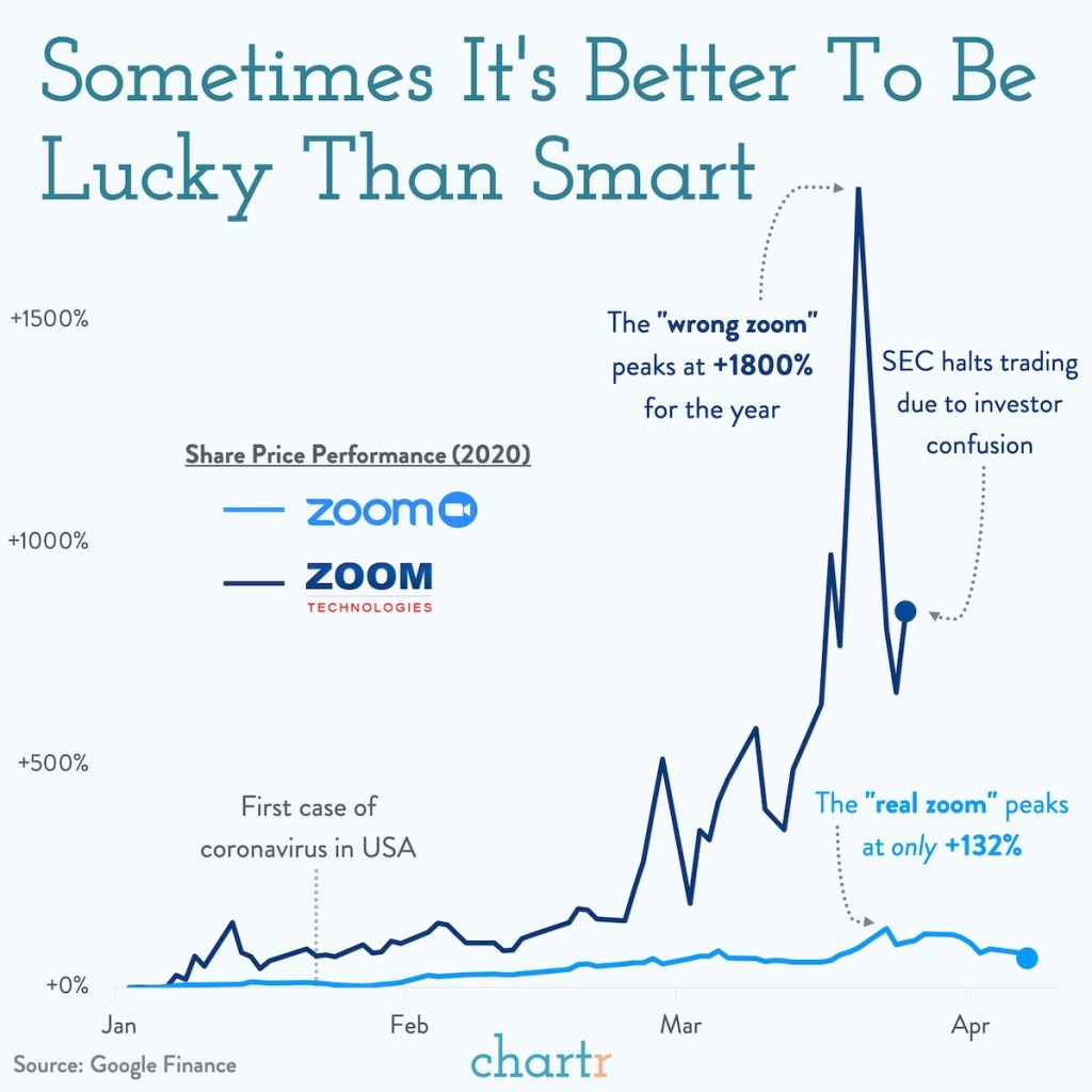
But with the Covid era the anomalies just kept piling up. All through February 2020, the smart people on Twitter were increasingly convincing me that this would be a huge pandemic; the main thing reassuring me was that stocks were up. But by late February they finally started crashing; instead of trusting the markets, I apparently should have trusted my own judgement and bought puts. Then investors starting buying the “wrong” Zoom instead of the one whose business benefitted from Covid:
Then we saw “meme stock mania” with many stocks spiking for reasons clearly unconnected with their fundamental value. Many at Wall Street Bets were clear that they were buying not because of business fundamentals, or even because they thought the price would go up, but because they liked the company, or wanted to be part of a movement, or wanted to send a message, or “own the shorts”.
Anecdotes got me to start taking some of the anti-EMH economics literature more seriously. For instance, Robert Shiller’s work showing that while it might be near-impossible to predict what a single stock will do tomorrow better than chance, predicting what the overall market will do over the longer run is often possible.
By revealed preference, is still mostly buy the EMH. About 80% of my net worth (not counting my home) is in diversified low-fee index funds. But that means 20% isn’t; its in individual stocks or actively traded ETFs with more-than-minimal fees. Why do this? I see 4 reasons buying individual stocks isn’t crazy:
Free trading: Buying a bunch of individual stocks used to incur huge fees. Now, many brokerages offer free trading. Even if the EMH is true, buying a bunch of individual stocks won’t lose me money on average, just time.
Still diversified: Buying into active funds instead of passive ones does tend to mean higher fees, and that is a real concern, but they do still tend to be quite diversified. Even buying individual stocks can leave you plenty diversified if you buy enough of them. Right now I hold about 45, with none representing more than 0.5% of my portfolio; one of them going bankrupt causes no problems. If anything I’m starting to feel over-diversified, and that I should concentrate more on my highest-conviction bets.
Learning: Given the above, even if the EMH is 100% true, my monetary losses due to fees and under-diversification will be tiny. The more significant cost is to my time- time spent paying attention to markets and trading. This is a real cost, enough that I think anyone who finds this stuff boring or unpleasant really should take the conventional econ advice of putting their money in a diversified low-fee index fund and forgetting about it. But I’m starting to find financial markets interesting, and I think keeping up with markets is a great way to learn about the real economy- they always suggest questions about why some companies, sectors, factors, or countries are outperforming others. In some EMH models, the return to trading isn’t zero, but instead is just high enough to compensate traders for their time. In this case, people who find markets interesting have a comparative advantage in trading.
Outperforming Through New Information: All but the strongest version of the EMH suggests that those with “private information” can outperform the market. Reading about the very top hedge funds I think they really are good rather than lucky, and the reason is that they have information that others don’t. Sometimes this is better models but often it is simply better data; Jim Simons got historical data on markets at a frequency that no one else had, and analyzed it with supercomputers no one else had. That’s a genuine information advantage, and I don’t think it’s a coincidence that he wound up with tens of billions of dollars. This should be incredibly encouraging to academics. We can’t all be Jim Simons (who was a math professor and codebreaker before starting Renaissance Technologies; Ed Thorpe was another math prof who got rich in markets), but discovering and creating private information is exactly what we do all day as researchers. My hard drive and my head are full of “private information” that others can’t trade on; of course right now most of it is about things like “how certificate of need laws affect self-employment” that have no obvious connection to asset prices, and there is a lot more competition from people trying to figure out markets than from people trying to figure out health economics. But discovering new information that no one else knows is not only possible, it is almost routine for academics, and its not crazy to think this can lead to outperforming the market.
Overall I think economists have gone a bit too far talking themselves and others out of the idea that they could possibly beat the market. I’ll discuss some more specific ideas in the next few weeks, but for now I leave you with 3 big ideas: you can’t win if you don’t try; winning is in fact possible; and if you are smart about it (avoid leverage, options, concentration) then defeat is not that costly.
Disclaimer: This is not investment advice.I say this both as a legal CYA, and because I don’t (yet?) have the track record to back up my big talk
Last week I wrote an optimistic take on inflation. The rate of general price inflation has fallen a lot in recent months, and wage growth is now clearly outpacing inflation. That’s all good news.
Today, the Fed will announce their latest interest rate decision. Will the good news on inflation lead the Fed to stop raising interest rates? I’m not very good at making predictions, but today I’ll give a pessimistic take on inflation which suggests the Fed (and everyone else) should still be concerned about inflation.
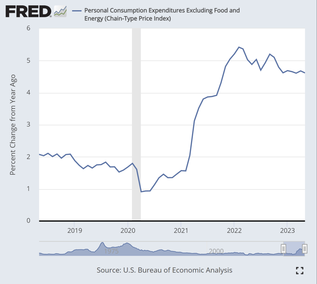
The pessimistic take can be summarized in two charts. First, this chart shows the year-over-year change in the core PCE inflation index. As most readers will know, core indexes take out food and energy prices. This is not a “cheat” to mask important goods, it’s done because these are particularly volatile categories of goods. If we want to see the true underlying trend in inflation, we should ignore price fluctuations that are driven largely by weather and geopolitics.
While there is some moderation in inflation in this chart, we don’t see anything like the dramatic decline in the CPI-U, which fell from about 9 to 3 percent over roughly the past year. True, there is some decline over the past year, but only about 1 percentage point, and it has been stuck at just over 4.6 percent for the past 6 months. This is not a return to normalcy, as this rate historically has stayed in the band of 1-2 percent.
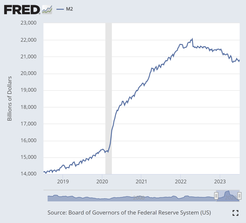
The second pessimistic chart is M2, a broad measure of the money supply.
The dramatic increase in M2 during 2020 is clear. That’s a big source of the inflation issues we’ve had over the past 2 years. There is some cause for optimism in this chart: M2 has clearly shrunk from the peak in Spring 2022. In fact, using a year-over-year percentage change, M2 has been negative since last November.
But if we look very recently, there is less cause for optimism. Since late April, M2 has stopped falling. In fact, it’s up a little bit. Is this a sign that the Fed doesn’t really have inflation under control? Perhaps. The increase isn’t huge, and there’s always some seasonality and noise to this data so we shouldn’t overanalyze this small deviation from the general decline in the past year plus. But we’ll need to continue watching this data.