This week the University of the Arts in Philadelphia announced they were closing effective immediately, leaving students scrambling to transfer and faculty desperate for jobs. U Arts now joins Cabrini University and Birmingham-Southern as some the 20 US colleges closing or being forced to merge so far this year. This trend of closures is likely to accelerate given falling birth rates that mean the number of college-age Americans is set to decline for decades; short-term issues like the FAFSA snafu and rising interest rates aren’t helping either.
All this makes it more important for potential students and employees to consider the financial health of colleges they might join, lest they find themselves in a UArts type situation. But how do you predict which colleges are at significant risk of closing? One thing that jumps out from this year’s list of closures is that essentially every one is a very small (fewer than 2000 undergrad) private school. Rural schools seem especially vulnerable, though this year has also seen plenty of closures in major cities.
There appear to be a number of sourcestracking the financial health of colleges, though most are not kept up to date well. Forbes seems to be the best, with 2023 ratings here; UArts, Cabrini, and Birmingham-Southern all had “C” grades. If you have access to them, credit ratings would also be good to check out; Fitch offers a generally negative take on higher ed here.
In a 2020 Brookings paper, Robert Kelchen identified several statistically significant predictors of college closures:
I used publicly available data compiled by the federal government to examine factors associated with college closures within the following two to four years. I found several factors, such as sharp declines in enrollment and total revenue, that were reasonably strong predictors of closure. Poor performances on federal accountability measures, such as the cohort default rate, financial responsibility metric, and being placed on the most stringent level of Heightened Cash Monitoring, were frequently associated with a higher likelihood of closure. My resulting models were generally able to place a majority of colleges that closed into a high-risk category
The Higher Learning Commission reached similar conclusions. Of course, there is a danger in identifying at-risk colleges too publicly:
Since a majority of colleges identified of being at the highest risk of closure remained open even four years later, there are practical and ethical concerns with using these results in the policy process. The greatest concern is that these results become a self-fulfilling prophecy— being identified as at risk of closure could hasten a struggling college’s demise.
Still, would-be students, staff and faculty should do some basic research to protect themselves as they considering enrolling or accepting a job at a college. College employees would also do well to save money and keep their resumes ready; some of these closures are so sudden that employees find out they are out of a job effective immediately and no paycheck is coming next month.
Say that there is a labor market and that there is no income tax. If an income tax is introduced, then what should we expect to happen? Specifically, what will happen to employment, the size of the labor force, and the number of people unemployed? Will each rise? Fall? Remain unchanged? Change ambiguously? Take a moment and jot down a note to test yourself.
As it turns out, what your answer is depends on what your model of the labor market is. Graphically, they are all quantities of labor. The size of the labor force is the quantity of labor supplied contingent on some wage that workers receive. It’s the number of people who are willing to work. Employment is the quantity of laborers demanded by firms contingent on to wage that they pay. Finally, the quantity of people unemployed is the difference between the size of the labor force and the quantity of workers employed (Assuming that the labor force is greater than or equal to employment).
I was writing up something for my graduating seniors about how to keep learning economics after school, and realized I might as well share it with everyone. This may not be the best way to do things, it is simply what I do, and I think it works reasonably well.
Blogs by Economists: There are many good ones, but besides ours Marginal Revolution is the only one where I aim to read every post
Podcasts on the Economy: NPR’s The Indicator (short, makes abstract concepts concrete), Bloomberg’s Odd Lots (deeper dives on subjects that move financial markets)
Podcasts by Economists: Conversations with Tyler and Econtalk (note that both often cover topics well outside of economics). Macro Musings goes the other way and stays super focused on monetary policy.
Twitter/X: This is a double-edged sword, or perhaps even a ring of power that grants the wearer great abilities even as it corrupts them. The fastest way to get informed or misinformed and angry, depending on who you follow and how you process information. Following the people I do gives you a fighting chance, but even this no guarantee; even assuming you totally trust my judgement, sometimes I follow people because they are a great source on one issue, even though I think they are wrong on lots of other things. Still, by revealed preference, I spend more time reading here than other single source.
Finance/Investing: Making this its own category because it isn’t exactly economics. Matt Levine has a column that somehow makes finance consistently interesting and often funny; unlike the rest of Bloomberg, you can subscribe for free. He also now has a podcast. If you’d like to run money yourself some day, try Meb Faber’s podcast. If you’d like things that touch on finance and economics but with more of a grounding in real-world business, try the Invest Like the Best podcast or The Diff newsletter.
Economics Papers: You can get a weekly e-mail of the new papers in each field you like from NBER. But most econ papers these days are tough to read even for someone with an undergrad econ degree (often even for PhDs). The big exception is the Journal of Economic Perspectives, which puts in a big effort to make its papers actually readable.
Books: This would have to be its own post, as there are too many specific ones to recommend, and I don’t know that I have any general principle of how to choose.
This is a lot and it would be crazy to just read all the same things I do, but I hope you will look into the things you haven’t heard of, and perhaps find one or two you think are worth sticking with. Also happy to hear your suggestions of what I’m missing.
Last weekend brought me back to Temple University, ten years after graduating, for a conference of econ PhD alums. I had so many reactions:
Mixing a research conference with what is effectively a reunion or homecoming is a great idea for a PhD program, and more schools should do it. It brought together alumni from all different years, but it especially felt like a reunion to me since it’s been ten years since I graduated (not that I really know about reunions; I’ve never been to a high school or college one).
Philadelphia in general and Temple University in particular have gotten much nicer (though still gritty). Some of this I expected; the country is getting steadily richer, and it seems like every college is always on a building spree. But as with New Orleans, it is a city still well below its peak population that I first got to know in the aftermath of the great recession. Unemployment in Philly is now well under half what it was the whole time I lived there, and it shows.
Life is short. I was saddened, but not shocked, to hear that one of my professors had died. I was saddened and shocked to hear that one of my fellow students had.
As a kid, whenever I went back to one of my old schools, I usually felt nostalgia mixed with the feeling that everything seemed small. Then I thought this smallness was only about me having grown taller, but now I wonder. At Temple the economics department has changed buildings, but when I went back to the old building everything seemed small, despite me being the same size I was in grad school. But at the time the building loomed so large in my mind; I was so focused on the things that happened there, the classes and tests, the study sessions and writing in the computer lab, what the professors thought, and everything that it all represented. All that apparently made the rooms seem physically larger in a way they now don’t once I have graduated and the professors moved.
Temple PhDs are much more successful than I would have guessed at the time. It was hard for students attending what was then a bottom-ranked program during the Great Recession to be optimistic about our job prospects, especially when we worried we might fail out of the program (a valid concern when, afaik, only 4 of the 11 students in my year finished their PhDs). But things turned out great; just in the past 10 years from a small program there are many people who are tenured or tenure track at decent schools, who have research or important supervisory positions at the Fed, or who are making a name for themselves in the private sector (like Adam Ozimek).
Why have we so exceeded our low expectations? The improving economy helped. Economics PhDs from anywhere turned out to be a valuable degree. Perhaps our training was stronger than we gave it credit for at the time. I see two main tracks for success coming out of a lower-ranked program, where the school’s name alone might not open doors:
find some way to get your foot in the door of a major institution like the Fed system or a major bank, then work your way up. The initial way in could be something less competitive, like an internship or a job you don’t necessarily need a PhD for. But once you are in you will be judged mostly on your performance within the institution, not your credentials. In a panel on non-academic jobs, several alums emphasized that conditional on having enough technical skills to get hired, at the margin people/communication skills are much more important to advancement than further technical skills.
Temple’s economics PhD program paused admissions back in 2020, but is aiming to restart with a redesigned program in 2025.
I teach one hour-forty minute classes on Tuesdays and Thursdays. And I allot only sixty minutes for exams. While student enjoy having the unexpected spare time after an exam, that’s a lot of learning time to miss. Therefore, after my midterms, we do an in-class activity that is a low-stakes, competitive game (and, entirely voluntary).
I call this game “The Extent of the Market” and it has three lessons. Here’s how the game works:
I have a paper handout, a big bag of variety candy, and a URL. The handout is pictured below-left and lists the types of candy. Each student rates their preference with zero being the least preferred candy. Whether they keep their preferences a secret is up to them. Next, I distribute two pieces of candy to each of them. Importantly, their candy endowment is random and they don’t get to choose or trade (yet). Finally, the URL takes them to a Google sheet pictured below-right where they can choose an id and enter there ‘value score’ under Round 0 by summing the candy ratings of their endowment.
Round 1 is where they get to make choices. I tell students that their goal is to maximize their score and that there is a prize at the end. They are now permitted to trade with anyone at their table or in their row. It doesn’t take long since their candy preferences compose of only the short list, their endowments are small, and the group of potential trade partners is small. When trading is finished, they enter there new scores under round 1.
Lesson #1: Voluntary trade makes people better off.
For each transaction that occurred, someone’s score increased. And in most cases two people’s scores increased. Not everyone will have traded and not everyone will have a higher score. But no one will have a lower score, given the rules and objective of the game. Importantly, the total amount and variety of candy in the little classroom economy hasn’t changed. But the sum of the values in Round 1 increased from Round 0. Trade helps allocate resources where they provide the most value, even if the total amount of physical stuff remains fixed. If it’s a microeconomics class, then this is where you mention Pareto improvements.
Round 2 follows the same process, but this time they may trade with anyone in their quadrant or section of the room. After trading concludes, they enter their scores at the URL under round 2.
Lesson #2: More potential trade partners increases the potential gains from trade.
Again, the variety and total amount of candy in the room remains constant. The only thing that increased was the size of the group of people with whom students could trade. And, they again earn higher scores or, at least, scores that are no lower. People have diverse resources and diverse preferences, and the more of them that you can trade with, the more opportunities to find complementary gains. Clearly, this means that increasing the size of the pool of trading partners is beneficial. One among the many reasons that the USA has had great economic success is that we are a large country geographically with diverse resources and a population of diverse preferences. This means that we have a large common market with many opportunities for mutually beneficial trade. The bigger that we make that common market, the better. Clearly, the implications run afoul of buy-local and protectionist inclinations.
Round 3 proceeds identically with students able to trade with anyone in the room and they enter their scores. At this time the game is finished. It’s important to identify the cumulative class scores across time and to reemphasize lessons #1 & #2. Often, the cumulative value-score will have doubled from Round 0, despite the fixed recourses, making no one worse off. If trading with a row, and then a section, and then the whole class results in gains, then there is an analogy to be drawn to a state, country, and the globe.
Lesson #3: Trade changes the distribution of resources.
Despite an initial distribution of resources, voluntary trade changed that distribution. While no one is worse off and plenty of students are better off, measured inequality may have been affected. Regardless, once a voluntary trade occurs, the distribution of candy and of scores changes. This has implications for redistributive policies. If income or wealth is redistributed in order to achieve some ideal distribution, then the ability to freely trade alters that distribution. The only way to achieve it again would be for another intervention to change the candy distribution by force or threat thereof. Consider that sports superstar Lebron James became rich by playing basketball for people who like to watch him. If we redistribute his income, and then permit him the freedom to voluntarily play basketball again, then the income distribution will change as he again trades and increases his income. Similarly, giving money to a low marginal product worker can provide some short-term relief. But, if the worker resumes their prior behavior and productivity, then the same determinants and resulting income persist.
It’s a fund game and students enjoy it. There are some important limitations. #1: There is no production in this game nor incentives for production. This is a feature for the fixed resources aspect of the game. But this is a bug insofar as students think about US jobs vs international jobs. I can assert that the supply side works similarly to the demand side, but students see it less clearly (it helps to draw these parallels throughout the semester). #2: While there is a maximum possible score in the game, the value created in reality is unbounded. There is no highest possible score IRL. #3: There are no feedback dynamics. Taxes associated with income redistribution cause workers to require higher pay, worsening pre-tax inequality. People respond to incentives, and the tax/subsidy component that determined the initial distribution of candy is absent.
It’s a fun game. If you try it, then please let me know how it goes or leave suggestions in the comments.
*By default, Google Sheets anonymizes users. You could have them sign in or use an institutional cloud drive to remove problems that might be associated anonymity.
**If your student can’t handle choosing their own id, then you can just list your students.
***Ideally, each increased trade-group is a superset of the prior round’s potential trading partners.
****You can do more than 3 rounds, but the principle doesn’t change
*****More trade will occur with more students, a greater variety of possible candies, and with more candies endowed per person. You can alter these as needed depending on the classroom limitations.
Elementary school kids can miss a day of school. If they are doing something wholesome and constructive on their day off, no one would claim that it hurts the child who is doing the alternate activity.
Does it hurt other people? There is an ungated section of this Matt Yglesias post concluding that when rich people pull their kids out of school it “… ultimately harms less-privileged children.” For now, assume that is true. We could internalize the externality, like surge pricing on toll roads. Let parents pay a fine to take their kids out of school. The fine would fund programs that help everyone. Let parents pay back into the public good. Charge $25/day which could go toward buying classroom supplies for the inconvenienced teacher.
This flexibility might lead to richer families keeping their kids in conventional schools, which seems like a good thing. No one would have to pay the fine. There is and would still be a system for excusing absences due to unavoidable things like surgery.
Requiring a doctor’s note for excused absences is already a tax. Requiring a parent to miss half a day of work to go take a child to the doctor is more punishing than paying a $25 fine, for many families.
The fine could even increase with the number of missed days. Only super rich families would be able to afford to take 2 children on a 3-week trip. I wouldn’t be able to afford it. But I wouldn’t mind if our school generated revenue off of those who can. Those people would probably donate a new playground in exchange for a plaque.
Is another example where it would be reasonable to charge people to not use something? In a way, insurance companies try to fine people for not using the gym. Running with this example, paid private schools could easily call this a tuition reimbursement for high attendance. Unfortunately, I think it would be politically impossible to implement in public schools.
The government is unique among economic institutions insofar as it can use coercion legally. But not all activities are coercive. Clearly, taxation is overwhelmingly coercive. Some people say that they are happy to pay taxes, but the voluntary gifts to the US Treasury are itsy-bitsy (just over $1m for FY 2023). Most regulations also include the threat of fines or jail time for non-compliance.
But once the government has the money in their coffers, there is plenty that they can do consensually. Once they have the resources, they are often just another potential transactor in the markets for goods and services. While the government can transact as well as anyone else, there is a fundamental theoretical difference for how we should interpret those transactions. Specifically, there is a principal-agent problem such that we can’t quite identify the welfare that is enjoyed by consumers when the government makes purchases. We really have very little idea.
Garett Jones uses the analogy of the government confiscating potatoes. The worst use would be for the government to throw the valuable resources into the river. Those resources help no one. Improved welfare would be yielded if the government just transferred those potatoes back to people. Sure, there’s the transaction cost of administration, but people get their potatoes back. Finally, the great hope is that the government takes the potatoes and makes tasty potato fritas such that they return to the public something more valuable than they took. These might be things that fall into the public goods category or solving collective action problems generally.
The above examples illustrates that how the government spends matters a lot for the welfare implications of the newly purchased government resources. But, we need to recall that there is an entire private segment of the market that is affected by the government transactions.
Short-Run Analysis
In a competitive market, firms face increasing marginal costs and make decisions about their levels of output. When the government makes purchases, it’s simply acting as another demander. How does the entry of a larger demander affect everyone else in the market? See the below GIF.
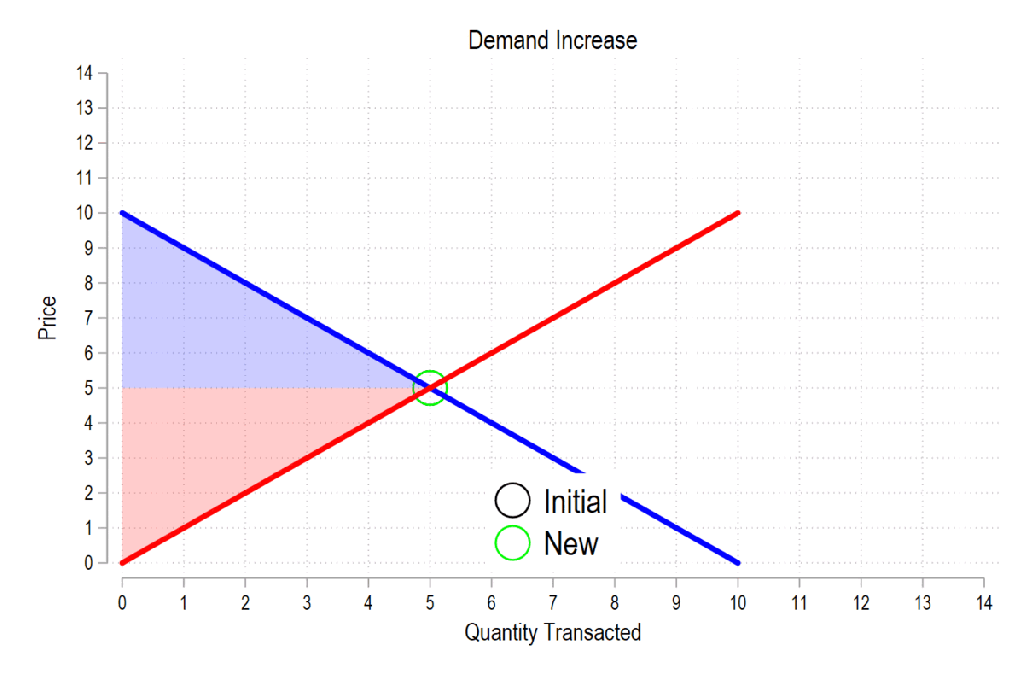
Last time the gifs were simply about price & quantity and welfare. I’m sharing some more GIFs, this time in regard to welfare and taxes.
First, see the below gif. It shows us that both consumer surplus (blue area) and producer surplus (red area) always rise if there is a demand increase (assuming the law of supply and law of demand).
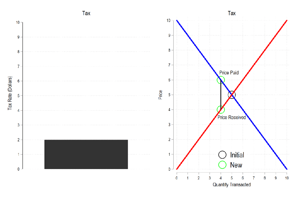
Next, let’s consider a basic tax. We can represent it as the difference between what the demander pays and what the supplier receives. The bigger the tax, the bigger the difference between the two.
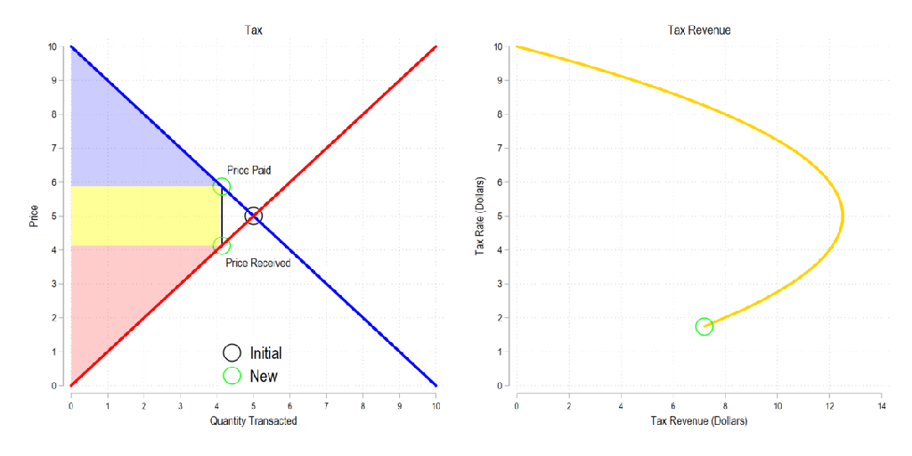
Now let’s combine the tow ideas: If taxes rise, then the quantity transacted falls, price paid rises, price received falls, and both consumer and producer surplus fall. Not only that, since there is an inverse relationship between the tax rate and the quantity transacted, it may be that increasing the tax rate more *reduces* revenue. The idea that there is a tax revenue maximizing tax rate is illustrated below right and is known as the Laffer curve.
I’ve discussed the ways to teach supply and demand in the past. Regardless, almost all principles of economics classes require a book. But even digital books are often just intangible versions of the hard copy. Supply and demand are illustrated as static pictures, using arrows and labels to do the leg-work of introducing exogenous changes. There’s often a text block with further explanation, but it lacks the kind of multi-sensory explanation that one gets while in a class.
In a class, the instructor can gesticulate and vary their speech explain the model, all while drawing a graph. That’s fundamentally different from reading a book. Studying a book requires the student to repeatedly glance between the words and the graph and to identify the appropriate part of the graph that is relevant to the explanation. For new or confused students, connected the words to one of many parts of a graph is the point of failure.
This is part of why the Marginal Revolution University videos do well. They’re well produced, with context and audio-overlaid video of graphs. It’s pretty close to the in-person experience sans the ability to ask questions, but includes the additional ability to rewind, repeat, adjust the speed, display captions, and share.
The Differences-in-Differences literature has blown up in the past several years. “Differences-in-Differences” refers to a statistical method that can be used to identify causal relationships (DID hereafter). If you’re interested in using the new methods in Stata, or just interested in what the big deal is, then this post is for you.
First, there’s the basic regression model where we have variables for time, treatment, and a variable that is the product of both. It looks like this:
The idea is that that there is that we can estimate the effect of time passing separately from the effect of the treatment. That allows us to ‘take out’ the effect of time’s passage and focus only on the effect of some treatment. Below is a common way of representing what’s going on in matrix form where the estimated y, yhat, is in each cell.
Each quadrant includes the estimated value for people who exist in each category. For the moment, let’s assume a one-time wave of treatment intervention that is applied to a subsample. That means that there is no one who is treated in the initial period. If the treatment was assigned randomly, then β=0 and we can simply use the differences between the two groups at time=1. But even if β≠0, then that difference between the treated and untreated groups at time=1 includes both the estimated effect of the treatment intervention and the effect of having already been treated prior to the intervention. In order to find the effect of the intervention, we need to take the 2nd difference. δ is the effect of the intervention. That’s what we want to know. We have δ and can start enacting policy and prescribing behavioral changes.
Easy Peasy Lemon Squeezy. Except… What if the treatment timing is different and those different treatment cohorts have different treatment effects (heterogeneous effects)?* What if the treatment effects change over time the longer an individual is treated (dynamic effects)**? Further, what if the there are non-parallel pre-existing time trends between the treated and untreated groups (non-parallel trends)?*** Are there design changes that allow us to estimate effects even if there are different time trends?**** There’re more problems, but these are enough for more than one blog post.
For the moment, I’ll focus on just the problem of non-parallel time trends.
What if untreated and the to-be-treated had different pre-treatment trends? Then, using the above design, the estimated δ doesn’t just measure the effect of the treatment intervention, it also detects the effect of the different time trend. In other words, if the treated group outcomes were already on a non-parallel trajectory with the untreated group, then it’s possible that the estimated δ is not at all the causal effect of the treatment, and that it’s partially or entirely detecting the different pre-existing trajectory.
Below are 3 figures. The first two show the causal interpretation of δ in which β=0 and β≠0. The 3rd illustrates how our estimated value of δ fails to be causal if there are non-parallel time trends between the treated and untreated groups. For ease, I’ve made β=0 in the 3rd graph (though it need not be – the graph is just messier). Note that the trends are not parallel and that the true δ differs from the estimated delta. Also important is that the direction of the bias is unknown without knowing the time trend for the treated group. It’s possible for the estimated δ to be positive or negative or zero, regardless of the true delta. This makes knowing the time trends really important.
STATA Implementation
If you’re worried about the problems that I mention above the short answer is that you want to install csdid2. This is the updated version of csdid & drdid. These allow us to address the first 3 asterisked threats to research design that I noted above (and more!). You can install these by running the below code:
program fra
    syntax anything, [all replace force]
    local from "https://friosavila.github.io/stpackages"
    tokenize `anything'
    if "`1'`2'"==""  net from `from'
    else if !inlist("`1'","describe", "install", "get") {
        display as error "`1' invalid subcommand"
    }
    else {
        net `1' `2', `all' `replace' from(`from')
    }
    qui:net from http://www.stata.com/
end
fra install fra, replace
fra install csdid2
ssc install coefplot
Once you have the methods installed, let’s examine an example by using the below code for a data set. The particulars of what we’re measuring aren’t important. I just want to get you started with the an application of the method.
local mixtape https://raw.githubusercontent.com/Mixtape-Sessions
use `mixtape'/Advanced-DID/main/Exercises/Data/ehec_data.dta, clear
qui sum year, meanonly
replace yexp2 = cond(mi(yexp2), r(max) + 1, yexp2)
The csdid2 command is nice. You can use it to create an event study where stfips is the individual identifier, year is the time variable, and yexp2 denotes the times of treatment (the treatment cohorts).
The above output shows us many things, but I’ll address only a few of them. It shows us how treated individuals differ from not-yet treated individuals relative to the time just before the initial treatment. In the above table, we can see that the pre-treatment average effect is not statistically different from zero. We fail to reject the hypothesis that the treatment group pre-treatment average was identical to the not-yet treated average at the same time period. Hurrah! That’s good evidence for a significant effect of our treatment intervention. But… Those 8 preceding periods are all negative. That’s a little concerning. We can test the joint significance of those periods:
estat event, revent(-8/-1)
Uh oh. That small p-value means that the level of the 8 pretreatment periods significantly deviate from zero. Further, if you squint just a little, the coefficients appear to have a positive slope such that the post-treatment values would have been positive even without the treatment if the trend had continued. So, what now?
Wouldn’t it be cool if we knew the alternative scenario in which the treated individuals had not been treated? That’s the standard against which we’d test the observed post-treatment effects. Alas, we can’t see what didn’t happen. BUT, asserting some premises makes the job easier. Let’s say that the pre-treatment trend, whatever it is, would have continued had the treatment not been applied. That’s where the honestdid stata package comes in. Here’s the installation code:
local github https://raw.githubusercontent.com
net install honestdid, from(`github'/mcaceresb/stata-honestdid/main) replace
honestdid _plugin_check
What does this package do? It does exactly what we need. It assumes that the pre-treatment trend of the prior 8 periods continues, and then tests whether one or more post-treatment coefficients deviate from that trend. Further, as a matter of robustness, the trend that acts as the standard for comparison is allowed to deviate from the pre-treatment trend by a multiple, M, of the maximum pretreatment deviations from trend. If that’s kind of wonky – just imagine a cone that continues from the pre-treatment trend that plots the null hypotheses. Larger M’s imply larger cones. Let’s test to see whether the time-zero effect significantly differs from zero.
What does the above table tell us? It gives us several values of M and the confidence interval for the difference between the coefficient and the trend at the 95% level of confidence. The first CI is the original time-0 coefficient. When M is zero, then the null assumes the same linear trend as during the pretreatment. Again, M is the ratio by which maximum deviations from the trend during the pretreatment are used as the null hypothesis during the post-treatment period. So, above, we can see that the initial treatment effect deviates from the linear pretreatment trend. However, if our standard is the maximum deviation from trend that existed prior to the treatment, then we find that the alpha is just barely greater than 0.05 (because the CI just barely includes zero).
That’s the process. Of course, robustness checks are necessary and there are plenty of margins for kicking the tires. One can vary the pre-treatment periods which determine the pre-trend, which post-treatment coefficient(s) to test, and the value of M that should be the standard for inference. The creators of the honestdid seem to like the standard of identifying the minimum M at which the coefficient fails to be significant. I suspect that further updates to the program will come along that spits that specific number out by default.
I’ve left a lot out of the DID discussion and why it’s such a big deal. But I wanted to share some of what I’ve learned recently with an easy-to-implement example. Do you have questions, comments, or suggestions? Please let me know in the comments below.
The above code and description is heavily based on the original author’s support documentation and my own Statalist post. You can read more at the above links and the below references.
*Sun, Liyang, and Sarah Abraham. 2021. “Estimating Dynamic Treatment Effects in Event Studies with Heterogeneous Treatment Effects.” Journal of Econometrics, Themed Issue: Treatment Effect 1, 225 (2): 175–99. https://doi.org/10.1016/j.jeconom.2020.09.006.
**Sant’Anna, Pedro H. C., and Jun Zhao. 2020. “Doubly Robust Difference-in-Differences Estimators.” Journal of Econometrics 219 (1): 101–22. https://doi.org/10.1016/j.jeconom.2020.06.003.
***Callaway, Brantly, and Pedro H. C. Santa Anna. 2021. “Difference-in-Differences with Multiple Time Periods.” Journal of Econometrics, Themed Issue: Treatment Effect 1, 225 (2): 200–230. https://doi.org/10.1016/j.jeconom.2020.12.001.
****Rambachan, Ashesh, and Jonathan Roth. 2023. “A More Credible Approach to Parallel Trends.” The Review of Economic Studies 90 (5): 2555–91. https://doi.org/10.1093/restud/rdad018.


