The Impact of the Pandemic on US States: GDP and Deaths

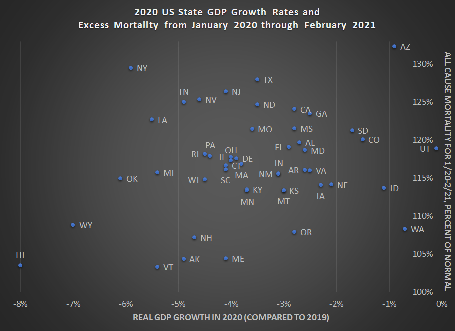
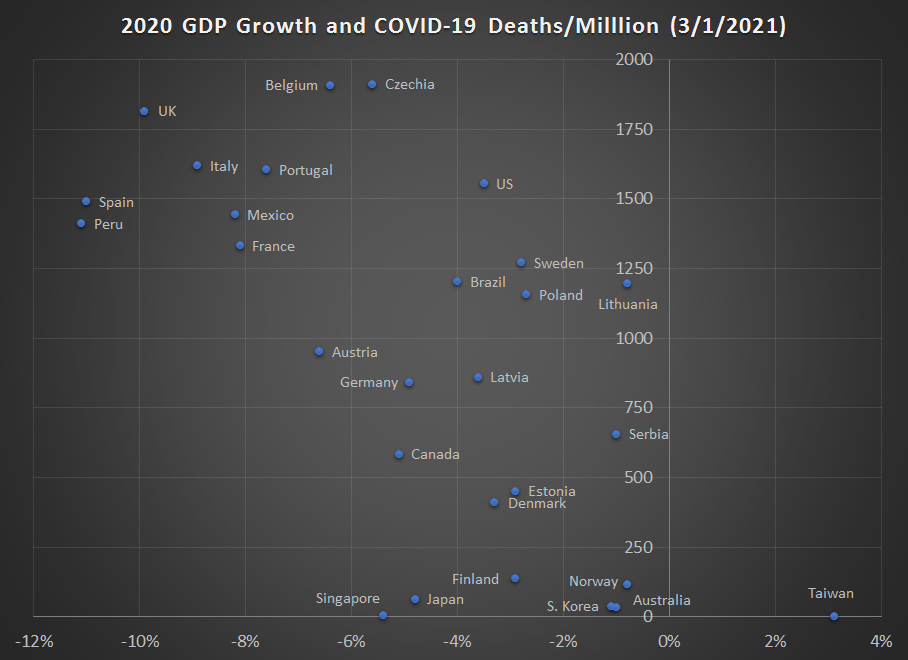
Following up on my recent post on country GDP growth rates and mortality in 2020, we now have the first look at state GDP growth rates for 2020 from the BEA.

As with the national data, I would look to caution against over-interpreting this data. I’m presenting it here to give a picture of how 2020 went for states (including a few months of 2021 for morality data). One thing you will notice is that there appears to be little correlation with the raw data between GDP declines and mortality. Lots of important factors (policy, behavior, demographics, weather, luck) aren’t controlled for here. Still, I think it’s useful to see all the data in one picture, given how much many of us have been following the daily, weekly, and monthly releases.

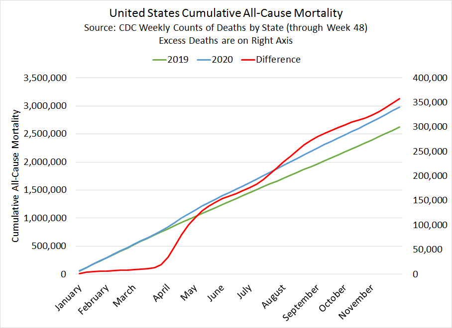
Here is the data. Below I’ll explain more how I created this chart, especially the excess mortality data.

Continue reading

GDP Growth in 2020

Last year was a historically bad year for many reasons, but to economists that badness is most visible in our widest measure of the economy: Gross Domestic Product. All issues with GDP aside, especially as a perfect measure of relative living standards, the annual real (inflation-adjusted) growth rate of GDP gives us a good picture of how much national economies were harmed by the pandemic, private behavior changes, and government restrictions (disentangling these three effects is hard — I will leave that to the academic journals rather than a blog post).

While GDP is reported with a lag of several months and is subject to revision, many countries have now reported full GDP data for 2020. For those that don’t follow GDP very closely, for a developed country an annual rate of growth of about 2% is pretty normal and respectable. For further context, in the US recent recessions had declines of -2.5% in 2009, -0.1% 1991, and -1.8% in 1982 (the 2001 recession never had an annual decline, only a few quarterly declines). While it is unusual for countries to go more than 10 years without a decline, it does happen. For example, Australia’s last annual decline was in 1991, when it declined -1.3%. But that’s unusual.

This chart shows the 2020 GDP growth rates (mostly negative, with one exception — Taiwan) for 2020 for most countries were I could find data. What this number shows us is the total amount of economic activity in 2020 compared with the total amount of economic activity in 2019 (adjusted for inflation, of course). I believe this is a better measure than others you might see, such as data that compares the level in the 4th quarters of 2020 and 2019 (a country could have had a terrible 2nd quarter but still gotten back close to the prior year level, and a simple Q-over-Q measure would miss that decline). As I did for the 3rd quarter data, this chart also plots the cumulative COVID-19 death rates on the vertical axis.

GDP data comes from government statistical agencies and media reports. COVID-19 death data is from Our World in Data.

What can we learn from this data?

Continue reading

Economic Research on COVID-19

The past 12 months has been dominated by COVID-19, the related recession, the government response, and other matters. But it has not just dominated our lives, it has also dominated new research, including research by economists!

Working papers from the National Bureau of Economic Research are one place to track on-going research by economists. While not all economic research is released as an NBER working paper (there are other series, and some economists just post them on their own website or department page), the volume of NBER papers should tell us something about the trends.

Here’s a chart showing the weekly NBER working papers that are in some way related to COVID-19. The first batch of three papers was released in late February, one long year ago. The second batch of nine papers came one month later. Since then, there have been papers released every single week, with the exception of the week of Christmas.

In total, there have 373 papers released that relate to COVID-19. The peak comes in late May and early June, with 61 papers released in a 4-week period and 21 of those papers coming out on May 25 alone. Since the May-June peak, we’ve seen a slow decline in papers on COVID-19, and we are now at our lowest level, with just 14 papers released in the past 4 weeks.

Continue reading

Emily Oster on Vaccines in February 2021

My third post on Covid data heroes features Dr. Emily Oster. Emily is a mom. Lot’s of economists are moms, but few have incorporated it quite as much into their careers. Emily has written a book on pregnancy and a new one on what to do with the kids after they are born. She does a great job explaining scientific research in a way that is easy to understand.

Emily made a big push to collect data on schools and covid back when there was crippling uncertainty about how dangerous it is to let children go to school in person.

She has a great email newsletter and substack. Her latest post is called “Vaccines & Transmission Redux Redux”. In this post, she distills the latest research to give practical advice on when kids can see grandparents once the vaccines are out.

For a long time now, some families have been avoiding close contact with elderly relatives. When can we go back to normal?

Continue reading

Going back to the gym?

Who doesn’t want to be stronger? You can get on the floor and do 5 pushups right now. Did you do it? Probably not. (If you did, great work.) For most people, nothing is stopping you from getting strong, except yourself.

I just keep sitting around. Going to a gym and meeting with an instructor in person used to be a way around this problem. This takes our human foibles and makes them work to our advantage. The sunk cost fallacy can work for us.

If you bought a stock and it’s a loser, you should sell! Too many people keep holding and go down with the ship.

However, knowing themselves, many people also go to the gym and sign up for a class. Not wanting to walk away from their investment, they actually do the classes.

The WSJ reports that many gyms are closing after Covid-19 forced the customers out. The article describes the machines people have brought into their homes to replace gyms. The Peloton is a signature of the year 2020. The new trend brings a live human trainer into the process of exercising alone at home.

The new machines can collect data on the user. This data is transmitted to instructors and maybe even friends. Now, from the comfort of your own home, you can “sign up for a class” again.

Had Covid struck in 1980, people might have bought fitness machines for their basements and they might even have bought a VHS to pop in and exercise with. But they would have been missing the link to a human who knows where they are supposed to be, which apparently provides more motivation.

The market has loved Peloton and smart money seems to think it will continue to do well, even with a vaccine already rolling out.

Continue reading

Vegetarians and Profits

Like most people, vegetarians have some weird opinions. Let’s assume that they have the ultimate goal of fewer live-stock deaths and less chattel cattle. Ask a vegetarian what they are achieving by choosing not to eat meat and you’ll hear the explanations let loose. By abstaining from meat they’re “reducing factory farm profits” or “helping to keep the price of beef low and unprofitable”. While being a vegetarian may save more cows from the butcher’s blade, it’s not at all clear that vegetarians have a good understanding of their sometimes perpetual boycotts.

What do vegetarians even do?

The decision to consume meat or not falls nicely into the supply-and-demand framework. Fewer people willing to eat meat means fewer purchases of meat products – no matter the price. A decline in meat demand lowers both the number of cows that ranchers will raise a slaughter and the price that they receive. There you have it. By lowering demand for meat, vegetarians reduce both the quantity and price of meat, reducing profits for those evil, animal-carving businessmen.

Not so fast.

Continue reading

Excess Mortality in 2020

My last post of 2020 tried to end the year on an optimistic note: the rapid innovation of a new vaccine was truly a marvel. But I also warned you that I would have a post in the new year talking about the deaths of 2020 during the pandemic. And here it is.

Throughout 2020, I have tried to keep up with the most recent data, not only on officially coded COVID-19 deaths, but also on other measures. An important one is known as excess mortality, which is an attempt to measure the number of deaths in a year that are above the normal level. Defining “normal” is sometimes challenging, but looking at deaths for recent years, especially if nothing unusual was happening, is one way to define normal. The team at Our World in Data has a nice essay explaining the concept of excess mortality.

One thing to remember about death data is that it is often reported with a lag. The CDC does a good job of regularly posting death data as it is reported, but these numbers can be unfortunately deceptive. For example, while the CDC has some death data reported through 51 weeks of 2020, but they note that death data can be delayed for 1-8 weeks, and some states report slower than others (for reasons that are not totally clear to me, North Carolina seems to be way behind in reporting, with very little data reporting after August).

So there’s the caution. What can we do with this data? Since 2019 was a pretty “normal” year for deaths, we can compare the deaths in 2020 to the same weeks of data in 2019. In the chart at the right, I use the first 48 weeks of the year (through November), as this seems to be fairly complete data (but not 100% complete!). The red line in the chart shows excess deaths, the difference between 2019 and 2020 deaths. From this, we can see that there were over 357,000 excess deaths in 2020 in the first 11 months of the year, or about a 13.6% increase over the prior year.

Is 13.6% a large increase? In short, yes. It is very large. I’ll explain more below, but essentially this is the largest increase since the 1918 flu pandemic.

Continue reading

Economists Watching Vaccines Every Day

EWVED could be our new name. Americans worked so hard to develop a vaccine (here’s Jeremy’s ode to development) and now we are seeing the distribution become painfully slow.

Continue reading

2020 Holiday Viewing

Forget “The Christmas Prince” or “The Prince Christmas” or whatever is on Netflix. Why not spend your holiday refreshing this new vaccine dashboard?

Here’s the announcement:

I personally know a few health care workers who got their shots (do not say “jab” to me) this past week. It’s all very exciting! Here at University of Alabama at Birmingham (UAB), the medical community has freezers, fortunately.

Here’s VP Mike Pence getting his vaccine:

Jeremy and Doug have both talked about allocation this week. Economists get really jazzed about allocating scarce resources. It’s been frustrating to watch first tests and now vaccines not be available on a market. Excellent points are also made every week over at Marginal Revolution on how we are missing an opportunity to get the incentives right. Supply. Curves. Slope. Up. (Thousands. Dying. Every. Week.)

Allocating the vaccines: central planning or the free market?

In the short term, there are only a few million doses of the COVID vaccines available, but well over 100 million adults in the US that want to take the vaccine if offered for free to the consumer. There are also billions worldwide that would like the vaccine.

So who should get it first? In practice in the US, the allocation method has already been determined politically: the federal government will allocate vaccines to the states, and states will allocate them to individuals based on a priority list: health workers and the most vulnerable first, then teachers, etc. The NY Times has a tool that shows you your probable place in line.

But essentially the allocation method being used is central planning.

John Cochrane has proposed a “free market” solution: sell the vaccine to the highest bidder. Or at least, sell some doses to the highest bidder.

As an economist, there is always some appeal in thinking about a free market solution. But there is a problem in this case: there are positive externalities from taking the vaccine. It not only benefits me, but it also benefits others. My willingness to pay only reflects the benefit to me, the private benefit. The social benefit is mostly ignored by a simple auction, and in the aggregate for a vaccine most of the benefits are likely to be social benefits. But positive externalities don’t imply we need to use central planning!

Continue reading