Last year was a historically bad year for many reasons, but to economists that badness is most visible in our widest measure of the economy: Gross Domestic Product. All issues with GDP aside, especially as a perfect measure of relative living standards, the annual real (inflation-adjusted) growth rate of GDP gives us a good picture of how much national economies were harmed by the pandemic, private behavior changes, and government restrictions (disentangling these three effects is hard — I will leave that to the academic journals rather than a blog post).
While GDP is reported with a lag of several months and is subject to revision, many countries have now reported full GDP data for 2020. For those that don’t follow GDP very closely, for a developed country an annual rate of growth of about 2% is pretty normal and respectable. For further context, in the US recent recessions had declines of -2.5% in 2009, -0.1% 1991, and -1.8% in 1982 (the 2001 recession never had an annual decline, only a few quarterly declines). While it is unusual for countries to go more than 10 years without a decline, it does happen. For example, Australia’s last annual decline was in 1991, when it declined -1.3%. But that’s unusual.
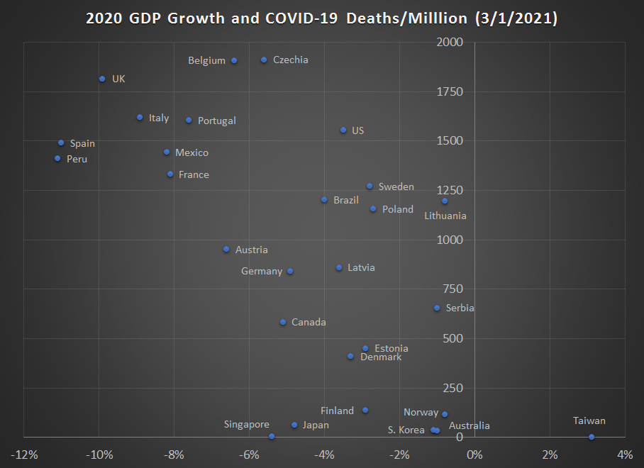
This chart shows the 2020 GDP growth rates (mostly negative, with one exception — Taiwan) for 2020 for most countries were I could find data. What this number shows us is the total amount of economic activity in 2020 compared with the total amount of economic activity in 2019 (adjusted for inflation, of course). I believe this is a better measure than others you might see, such as data that compares the level in the 4th quarters of 2020 and 2019 (a country could have had a terrible 2nd quarter but still gotten back close to the prior year level, and a simple Q-over-Q measure would miss that decline). As I did for the 3rd quarter data, this chart also plots the cumulative COVID-19 death rates on the vertical axis.
What can we learn from this data?
First of all, I would caution any suggestions about causation between these two numbers. The both reflect the same basic fact: how hard a country was hit by the pandemic. A country like Australia or Taiwan that performed well on both economic and health measures got these outcomes for the same reason: the weren’t hit hard by the pandemic. I will leave aside in this post questions about how much of this is due to government policy and how much of that policy could have been replicated in other countries. But Australia, Taiwan, and South Korea were, for a variety of reasons, able to avoid being hit hard by the pandemic.
Here is one thing that jumps out at me from the data: there are a large number of countries that had GDP declines between -2% and -4%, a level that is certainly bad but is not outside the range of a “normal” recession. But within this band of -2% to -4%, total COVID deaths range tremendously, from just 135 deaths per million people in Finland to over 1500 deaths per million in the US, or over 10 times as many. Notably also Sweden is almost 10 times Finland’s death rate and over 3 times Denmark’s death rate.
Could Sweden have looked more like Denmark and Finland with slightly different policies? Could the US? These questions have already been debated endlessly, and I suspect they will continue to be debated. It’s a question that is really hard to ever answer definitively, but it is worth asking.
Another pattern I notice is that many major Western European countries nicely fit on a line that extends from the worst outcome in the UK down through Italy, France, Germany, Denmark, and finally the best outcome in Norway. Among the largest European nations, only Spain does not fit perfectly on this line, though they are close. Once again, don’t infer too much about causation. For a variety of reasons that we don’t fully understand right now (and maybe never will, but science will try) the United Kingdom was hit especially hard. Both their economy and their health suffered considerably.
Could the UK, with fewer government restrictions, have ended up in a similar position to Belgium and Czechia? Those two countries also were hit extremely hard by the pandemic, but Czechia’s GDP decline was at least only half as bad as the UK. Or, without the government restrictions, would deaths have been even higher in the UK? That might seem unfathomable, but it is not. Right now 13 states in the US, with a combined population of 80 million people, have higher COVID death tolls than the UK, in some cases dramatically more (such as New Jersey, which is 45% higher than the UK).
We probably don’t need to say this again, but I will: 2020 was a really bad year. We are now starting to get a complete picture of just how bad it was. The variation across countries, and in some cases within countries or even with large US states, is so large that social scientists will continue to study this issue for years to try and learn more about the causes. But let’s be cautious about quick analyses posted online now which claim they have identified the cause, or that there was no cause, only bad luck or demographic factors. Causation is a tricky thing to figure out.

Chinese GDP figures are readily available. Including them would have added a great deal to your investigation.
LikeLike