Negative headlines tend to get more attention than bland positive titles. We have seen a lot of angst in the past few months over the massive capex spend by big tech companies, with questions over whether there will be adequate returns on these investments.
There was a genuine untethered bubble in tech stocks circa 1997-2000. Companies with no earnings and no moats were given billion-dollar valuations, on the strength of a business plan sketched on a cocktail napkin. After the brutal bursting of that bubble, tech stocks repriced and then steadily strengthened for the next 25 years.
Nevertheless, it seems there is always some negative narrative to be found regarding tech stock valuations and prospects. Seeking Alpha author Beth Kindig writes that investors who were spooked by all those bubble warnings lost out big time:
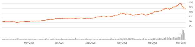
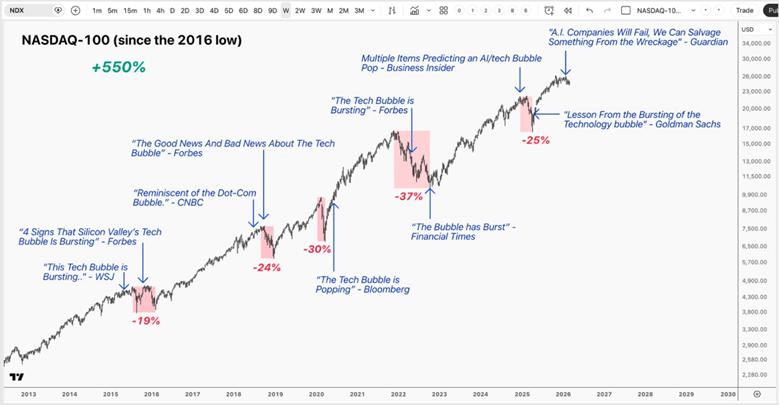
Investors have been hearing “tech bubble” warnings for more than a decade — but instead of collapsing, the Nasdaq‑100 has gained 550%. If we look back ten years ago to 2015, headlines such as “Sell everything! 2016 will be a cataclysmic year” confronted investors with calls for an imminent recession. The bears made repeated claims that a “tech bubble” was about to burst with some of the world’s most prominent venture capitalists drawing parallels to the dot-com era.
What followed tells a very different story, with not only the Nasdaq-100 up 550% over a 10-year period but also high-flying stocks like Shopify returning as much as 5200% and Nvidia returning 22,000% over the same period.
It’s true that capturing those gains does not come easy. Investors had to hold through five drawdowns that were greater than 20%, including two declines greater than 30%, while tuning out a constant stream of bearish commentary – often from reputable sources – proclaiming the long-awaited tech bubble has finally “popped.” Despite these strong convictions, the long-term trend remained intact.
She presented this graphic which illustrates many of the negative headlines over the past decade:
While she acknowledges that traditional cloud computing applications are slowing in growth rates, and there will be general market price volatility, she contends that AI is still in an acceleration phase:
The dot-com era was defined by oversupply and fragile fundamentals; today’s AI buildout is being led by the world’s strongest operators, backed by real revenues and profits, and constrained by hard limits in compute, memory, networking, and power.
The more important question isn’t whether we’ll see a pullback — it’s where we are in the cycle. AI is still transitioning from the training phase into the inference phase, where monetization will accelerate and the “capex with no revenue” narrative will begin to fade. In other words, the loudest bubble debates are arriving before the most important revenue engine fully turns on.
Those of us who are long tech stocks hope she is correct.