Last week I discussed absolute measures of portfolio performance and management, specifically between two portfolios that are composed of different assets (utilities and tech). I began with comparing the basics of return, standard deviation, and Sharpe ratio to some other possible portfolio in the Markowitz cloud. But, simply comparing the difference between these possible portfolios can be sensitive to the spread of stats within a specific Markowitz cloud. In other words, it’s not scale independent. A larger spread of possible stats can make a portfolio look bad due to the spread return/standard deviation/Sharpe ratio alone.
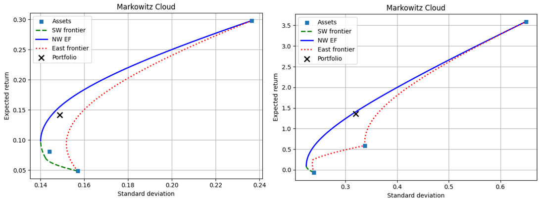
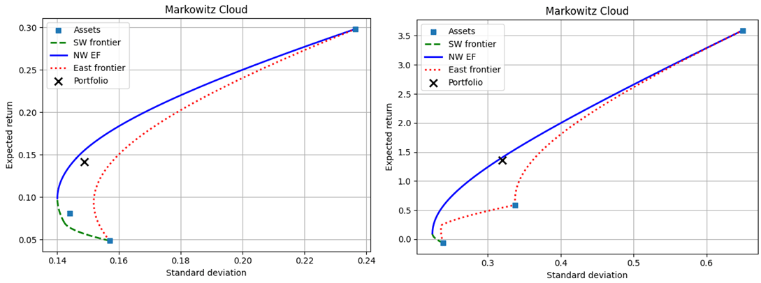
In this post I introduce quasi-relative measures. Again, I lean on the Markowitz cloud. They’re pasted below (Utilities on the left, tech on the right).
If we can somehow express the returns, volatilities, and Sharpe ratios on a common scale that is independent of the level values, then we can make the realized portfolios more comparable. One thing that we can do is to express a stat as a weighted linear average between the maximum and minimum possible values. Conditional on the realized standard deviation, there exists a maximum and minimum of possible return. Something like the below. Rho is the weight on the maximum return. It’s also the proportion of possible conditional returns that are lower than the realized return.
The unconditional version is the same, but would be relative to the global maximum and minimum stats. We can represent the weigh on the maximum return and the percentile among possible returns as gamma.
A final quasi-relative measure of performance is the dissimilarity index between the realized portfolio weights and some reference portfolio weights. This provides a measure of how much the asset weights would need to change in order to adjust the portfolio. If changing portfolio weights is costly, then it’s also a measure of the transaction cost of reallocation. It’s quasi-relative because it is independent of the spread of possible performance stats.
Below are the quasi-relative measures for each the utility and tech company portfolios.
It’s feeling like the late ’90s, with an impressive new technology pushing tech stocks and the broader US market to all-time highs. Retail investors are using new platforms to get in on the action, tech companies are doing more IPOs to take advantage of the higher stock prices, and other companies are trying to boost their stocks by saying they are pivoting to the new technology (though often they aren’t really changing).
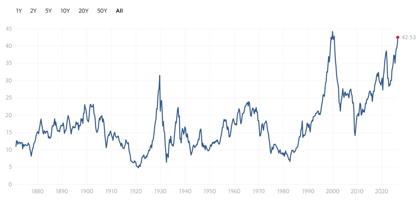
The excitement drives valuations to record levels:
Shiller CAPE Ratio
In the ’90s, the internet really was a transformational new technology that would enable lots of profitable new companies. But the market got ahead of itself, a bubble that led to a crash- the S&P fell by almost half, while the tech-heavy NASDAQ fell by over 3/4 and took 15 years to recover.
History rhymes, but it doesn’t repeat exactly. I don’t currently expect a big crash driven by AI stocks; it helps that unlike in the ’90s, many of the big players are currently profitable. But I also don’t expect the NASDAQ to keep posting 20+% returns every year.
If the AI bull market doesn’t end in a dramatic crash, how will it end? It’s already shrugged off a war. A US recession is unlikely this year, though plausible next year.
The end I see slowly approaching comes from crowding out. What Robert Solow said about computers in 1987 is true about AI today: you see the AI age everywhere except the productivity statistics. There’s only so much money to go around in markets when productivity growth is unexceptional and savings rates are falling.
We’re already seeing the war hit certain markets (if not US stocks). Iran’s gulf neighbors are now putting lots of money into missile defense, money they now won’t be spending on data centers or gold (down 16% from pre-war), and everyone else has to spend more on oil.
Interest rates have been rising- partly due to central bank attempts to fight inflation, partly due to ongoing high rates of government borrowing, and partly due to financing the AI buildout itself. Higher rates make it more expensive for companies to invest in the physical AI buildout, and make investors discount future AI revenues more while making bonds a more attractive substitute for stocks today. 10-year TIPS now yield 2% over the inflation rate, a sharp contrast to the 2021 stock boom when they yielded less than inflation. If I were older I’d be loading up on TIPS, and even at 38 I’m starting to get tempted.
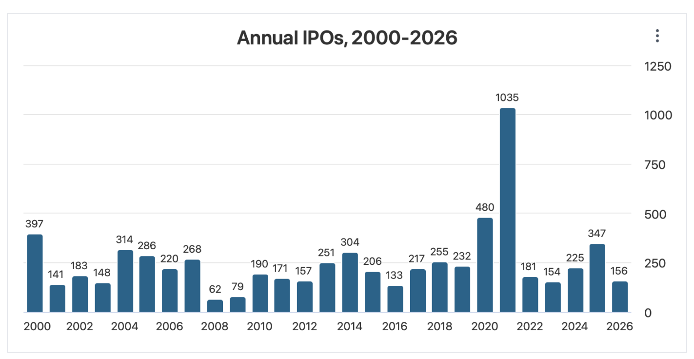
Trying to call the top exactly is a fool’s errand, but if I were feeling foolish, I’d point to the big upcoming IPOs. SpaceX just filed for an IPO that would be the biggest ever both for the amount of money raised ($75 billion) and the total company valuation ($1.77 trillion). This shatters the previous records for the biggest overall raise ($29 billion raised by Saudi Aramco when it went public in 2019) and the biggest raise by an American company ($18 billion raised by Visa in 2008). OpenAI and Anthropic are likely to follow with IPOs that would also break the previous records- making 3 companies each trying to raise more than the $45 billion raised by the entire US IPO market in 2025. Even if the process of going public doesn’t reveal any flaws in the companies, that money has to come from somewhere- and it takes up a substantial proportion of all net inflows to US stocks in a typical year (IPOs plus new money into existing stocks).
In short- where will the money come from? What are investors going to sell in order to buy into these IPOs? Technically they could do it all with cash, but I think it’s at least plausible that they start selling other stocks. The selling pressure will continue after the IPOs as employees of the newly-public companies see their stocks vest and other early investors become able to sell off.
I’m not trying to time the market. Even if this is a ’90s re-run, we could easily still be in the 1998 buildup, not the 2000 peak and crash. But I am diversifying. US stocks are currently the world’s most expensive. Investors value US stocks that highly because there’s a real chance that US companies are profitably building the technologies that will drive the future. But there’s also a real chance they aren’t– and if that state of the world comes to pass, I’d prefer to own a significant chunk of bonds, foreign stocks, and real assets.
The basic idea is that we want to compare the performance of different portfolios or their managers. This is relatively easy as long as the portfolios contain the same assets. Then, the portfolios are simply characterized by the different weights among the different assets. But how do we compare the performance of portfolios whose assets are different? In finance, we usually assume that everyone can invest in everything. But there are plenty of cases in which that’s a bad assumption: when clients want exposure to particular industries, when there are statutory limitations on holding certain assets, or when an individual company is considering specific projects within the same company under conditions of scarce financing.
The most primitive step is to compare the return and standard deviation of two different portfolios. However, higher risk investments tend to have higher returns in dynamic equilibrium. So, if we were to compare the returns of a tech company to a utility company, then we’d often see the tech companies performing better. But, if we compare the volatilities, then the utility companies would tend to perform better. Sharpe stepped in with a ratio to express the excess return (benefit) per standard deviation (the cost). This way, we can compare the price of volatilities between two portfolios. We’ll stick with just these basic 3 measures: return, standard deviation, and Sharpe ratio. (Others do exist)
Let’s put some meat on this with an example. Say that we have two portfolios, each composed of different assets. There’s a utility portfolio that’s composed of NEE, DUK, and SO. There’s also a tech portfolio that’s composed of AMD, MSFT, and NVDA. Both portfolios have weights of (0.33, 0.33, 0.34). The results of the utility versus the tech portfolio are:
Returns: 14.2% vs 136.3%
Standard Deviation: 14.9% vs 32%
Sharpe: 0.684 vs 4.134
Goodness me! The tech portfolio returns much more in absolute terms and much more per unit of risk. It’s twice as volatile as the utility portfolio, but the returns are almost ten times as high. If you could, then many of us would choose the tech portfolio over the utility portfolio. But, what if, for one reason or another, you can only invest in one of the two industries? Or, what if you want to invest your money with a skilled manager, rather than a risky one?
One way to tackle this problem is to introduce the Markowitz cloud. Specifically, we can essentially list out all of the possible portfolios along with their return and standard deviations. Then, we can compare the actual performance to the entire menu of possible performances within each set of assets. Below are the possible performances for the utility (left) versus the tech (right) portfolio. The actual portfolios are marked with an X.
One way to evaluate the two portfolios is to compare their return, standard deviation, and Sharpe ratio to the other candidates that were achievable with the same assets. As we can see, conditional on the assets, neither portfolio minimized the volatility, maximized return, nor maximized the Sharpe ratio. Furthermore, assuming that the realized rate of return was the goal, neither portfolio minimized the conditional volatility. Assuming that the realized volatility was the goal, neither portfolio maximized the conditional return. Below are two tables that describe some candidate alternatives and how they differ from the realized portfolio.
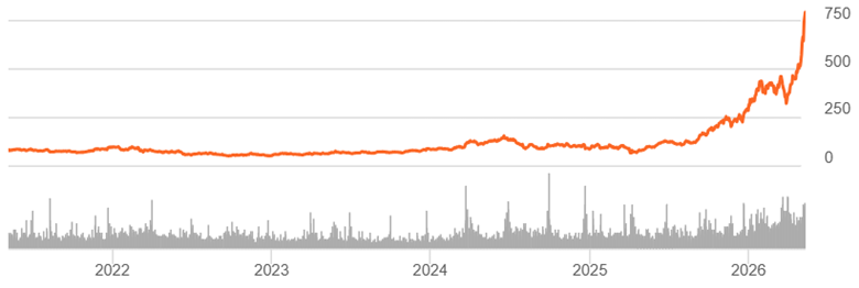
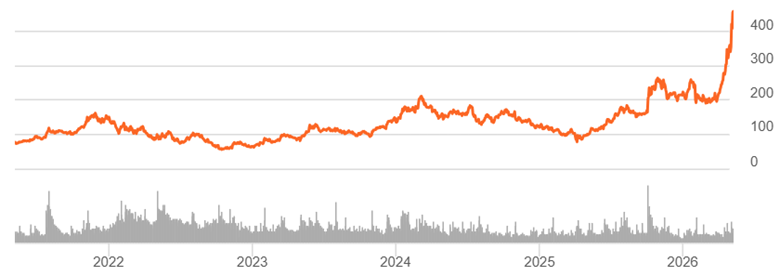
The share prices of many semiconductor chip companies have gone nearly vertical in the past month. Here are five-year charts for Micron (MU) and AMD, as of the close Monday:
Micron (MU) 5-Year Stock Chart
Advanced Micro Devices (AMD) 5-Year Stock Chart
Many analysts have been taken by surprise by the magnitude of the recent surge and prices. There has been no sudden, truly new news to drive this shift. It has been known for over a year that there is a huge shortage of memory chips, allowing Micron to charge high prices for its products. But apparently the official quarterly announcement of earnings and projections substantiated that narrative. The bears have been claiming that memory chips are a cyclic business, where chip shortages are followed by building more manufacturing capacity, which inevitably leads to overcapacity and a crash in memory chip prices. It has happened repeatedly, and therefore the current Micron stock party would end in tears after a couple of years. But the bears have been beaten back to their caves for now. Micron was up another full 7% yesterday.
AMD, which specializes in central processing units (CPUs), also released good earnings and strong projections. But the real share price driver there seems to be the new narrative that the shift from the shift to agentic AI will require a higher ratio of CPUs to GPUs. GPUs (graphic processing units) are the engines that do the core large language model (LLM) AI calculations. But apparently an increasing number of CPUs will be required to coordinate the activities of the GPUs:
AI agents—or the Agentic Era, as called by analysts—need more CPUs per GPU because they are responsible for the orchestration of AI workloads and the required data processing in order for the agent to accomplish its task, or, more simply, CPUs organize the steps of the workflow for the agent. Traditional LLM models—not agents—required a CPU:GPU ratio of 1:4 to 1:8, but analysts anticipate this ratio to shift toward 1:2 or even 1:1 in the coming years.
All that to say demand for AMD‘s chips is projected to increase.
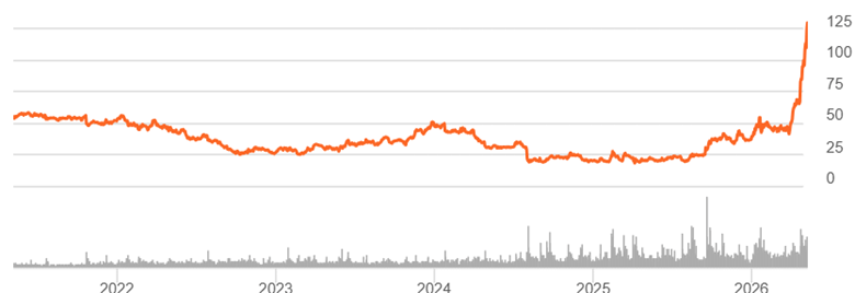
So far, so good. But apparently being swept up in the whirlwind of exhilaration is the share price for lowly Intel (INTC). Intel was the leading manufacturer of processor chips back in the day, but it missed the boat on GPUs and just cannot seem to execute at global standards. In recent years, Intel has mainly been famous for ever-slipping deadlines on producing high performing chips. Its earnings have been approximately zero for some time. The good news is it now has a foundry business. The bad news is that the foundry business loses around $2 billion a year. The foundry has pulled in a few large customers, and after their experience there, they all run screaming for the exits. But wait, there’s been an announcement that Apple may contract with Intel to produce some low-end chips. Whoopee!
Intel (INTC) Five-year stock chart
Folks who look at technical behavior of stocks rather than the fundamentals of the business seem somewhat skeptical about the current surge. Terms like overbought are thrown around. I read an article claiming that hedging activities in the options market is creating an artificial, temporary demand for these high-flying stocks:
It is also fairly clear what has been driving these overbought conditions at the index level: aggressive call buying is creating a gamma squeeze across several stocks, such as Micron (MU). This occurs when aggressive call buying forces dealer hedging flows, resulting in purchases of the underlying stock. The more the stock rises, the more call buying tends to increase, and the cycle builds on itself.
My take on this spectacle
I can get the fundamental bull case in general for Micron stock. I bought into it about six months ago. Even that far back, it was clear that the demand for memory chips far outstripped the supply, so Micron could not help minting money for the next year or two. It was one of my fairly rare successes in stock picking. Sadly, I only bought a little bit, because I was influenced by many negative articles claiming that memory chips are a cyclic business, so this boom would end like all the previous Micron booms, with a glut and a crash.
There seems to be a solid bull case for AMD as well. For pitiful Intel, however, I see its price chart as a sign of market FOMO.
Where these stock prices go from here, I have no idea. My observation over the years is that this level of enthusiasm is usually followed eventually by, “What was I thinking?”, and a return to earth. However, in the meantime, tech stock prices often run up longer and further than I would have thought possible.
Usual disclaimer: Nothing here should be taken as advice to buy or sell any security.
Next week the Fed will almost certainly hold interest rates steady. Stephen Miran will probably dissent saying the Fed should be cutting rates. Kevin Warsh, Trump’s nominee for Fed Chair, would also like to see cuts. But other prominent voices think that rising oil and gas prices mean we should be raising rates.
I still think that rate hikes make more sense than cuts- but not because of oil. The high oil and gas prices we’re seeing are obviously driven by supply shocks from the Iran war- not increasing demand. Raising rates to fight an oil shock would mean repeating a classic mistake.
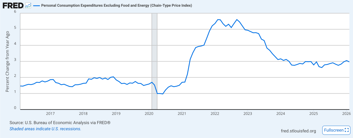
But raising rates to fight core inflation that is at 3% makes perfect sense. Especially when inflation (overall or core) hasn’t been at or below the Fed’s supposed 2.0% target in over 5 years, and market forecasts predict it will stay well above 2.0% for the next 5 years.
Especially when real GDP is growing, and NGDP is still above trend, and the unemployment rate is 4.3%. Financial conditions are so loose that stock markets are hitting all time highs in the middle of a war.
Various Taylor Rules suggest that the Fed Funds rate should be between 4.25% and 6.25%, but the Fed currently has us at 3.75%.
I see so many good arguments to raise rates- there is no reason to bring up a bad one like oil prices. If we must latch on to a headline to find the argument to raise rates, let’s focus on a shoe company’s stock going up 600% because they announced they were pivoting AI.
Negative headlines tend to get more attention than bland positive titles. We have seen a lot of angst in the past few months over the massive capex spend by big tech companies, with questions over whether there will be adequate returns on these investments.
There was a genuine untethered bubble in tech stocks circa 1997-2000. Companies with no earnings and no moats were given billion-dollar valuations, on the strength of a business plan sketched on a cocktail napkin. After the brutal bursting of that bubble, tech stocks repriced and then steadily strengthened for the next 25 years.
Nevertheless, it seems there is always some negative narrative to be found regarding tech stock valuations and prospects. Seeking Alpha author Beth Kindig writes that investors who were spooked by all those bubble warnings lost out big time:
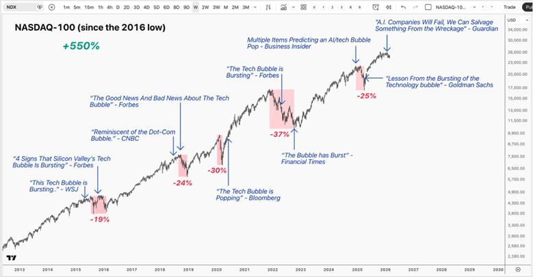
Investors have been hearing “tech bubble” warnings for more than a decade — but instead of collapsing, the Nasdaq‑100 has gained 550%. If we look back ten years ago to 2015, headlines such as “Sell everything! 2016 will be a cataclysmic year” confronted investors with calls for an imminent recession. The bears made repeated claims that a “tech bubble” was about to burst with some of the world’s most prominent venture capitalists drawing parallels to the dot-com era.
What followed tells a very different story, with not only the Nasdaq-100 up 550% over a 10-year period but also high-flying stocks like Shopify returning as much as 5200% and Nvidia returning 22,000% over the same period.
It’s true that capturing those gains does not come easy. Investors had to hold through five drawdowns that were greater than 20%, including two declines greater than 30%, while tuning out a constant stream of bearish commentary – often from reputable sources – proclaiming the long-awaited tech bubble has finally “popped.” Despite these strong convictions, the long-term trend remained intact.
She presented this graphic which illustrates many of the negative headlines over the past decade:
While she acknowledges that traditional cloud computing applications are slowing in growth rates, and there will be general market price volatility, she contends that AI is still in an acceleration phase:
The dot-com era was defined by oversupply and fragile fundamentals; today’s AI buildout is being led by the world’s strongest operators, backed by real revenues and profits, and constrained by hard limits in compute, memory, networking, and power.
The more important question isn’t whether we’ll see a pullback — it’s where we are in the cycle. AI is still transitioning from the training phase into the inference phase, where monetization will accelerate and the “capex with no revenue” narrative will begin to fade. In other words, the loudest bubble debates are arriving before the most important revenue engine fully turns on.
Those of us who are long tech stocks hope she is correct.
After being convinced by a series of favorable articles, I bought a few shares last month of the EWY fund, which holds shares of major South Korean companies. The narrative seemed compelling: the vast production of compute processing chips for AI has led to a structural supply shortage of fast memory chips. South Korean firms excel in making these chips, and so high, growing profits seemed assured. What could possibly go wrong?
What I didn’t know was that thousands of other retail investors were thinking the exact same thing, and hence had bid the price of EWY up to possibly unreasonable levels. Somehow, my bullish analysts missed that point. In particular, the South Korean market is driven by an unusually high level of margin trading, where investors borrow money on margin to buy shares. A market drop leads to margin calls, which leads to forced selling, which really crashes prices.
The other thing I did not know was that, two days after my purchase, the attacks on Iran would commence. Oops. Among other things, this would drive up the world price of oil, which impacts energy importers like South Korea. This seems to have been the trigger for the sharp stock drop.
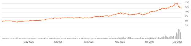
Here is the six-month price chart for EWY:
As it happened, I bought pretty much at the top, and as of Monday midday when I am writing this, EWY was down about 17%. That doesn’t look like much of a drop on the chart, because of the long run-up to this point, but it is an unpleasant development if you just bought in two weeks ago.
Fortunately, when I bought the EWY shares, I set up a protective options collar, since this was not a high conviction buy. First, I bought a put with a strike price about 7% below my purchase price, which would limit my maximum loss on the EWY shares to 7%. A problem is that this put cost serious money (about 11% of the share price), so my maximum loss could actually be 7% plus 11% = 18%. Therefore, I offset nearly all the cost of the put by selling a call with a strike price about 17% above the current EWY share price. That meant that I could profit from a rise in EWY share price by up to 17%, while being protected against a drop of more than 7%. That seemed like a favorable asymmetry (7% max loss vs 17% max gain).
This arrangement (buying a protective put to limit downside, financed by selling a call which limits upside) is called an options “collar”. I’d rather accept a limited upside than have to worry about doing clever trading to mitigate a big loss.
As of Monday, my collar was working well to protect the overall position. As might be expected, the value of my put increased, with the drop in EWY share price. But also, the value of my call decreased, which further helps me, since I am short that call. The net result was that about 75% of the loss in the stock price was compensated by the changes in values of the two options.
This is just a small, experimental position, but it was nice to see practical outcomes line up with theory.
Disclaimer: As usual, nothing here should be considered advice to buy or sell any security.
Individuals or their families act as infinitely lived agents.
All governments and agents can borrow and lend at a single rate.
The path of government expenditures is independent of financing choices
Assumption 2) appears patently absurd on its face. I certainly cannot borrow at the same interest rate that the US Treasury can. QED. Do not pass go, do not collect $200. The yield on 1-year US treasuries is 3.58%. I can’t borrow at that rate… Or can I?
Let’s do some casuistry.
What is a loan?
It’s a contract that:
Provides the borrower with access to spending
with or without collateral
with a promise to repay the lender at defined times, usually with interest.
So, when you borrow $5 from a friend and pay it back on the same day, it’s a loan. The contract is verbal, there is no collateral, the repayment time is ‘soon’ with flexibility, and the interest rate is zero.
A mortgage is a collateralized loan. You borrow from a bank, make monthly payments for the term of the loan, and accrue interest on the principal. The contract is written, the house or a portion of its value is the collateral, and the interest rate is positive.
What about a Pawnshop loan? Most of us are probably unfamiliar with these. In this circumstance, a person has valuable non-assets that and the pawnshop has money. They engage in a contractual asset swap. The borrower lends the non-money asset to the pawnshop as collateral and borrows money from the pawnshop. The pawnshop borrows the non-money asset and lends the money to the borrower. The borrower can use the money as they please, but the pawnshop can not use the non-money asset – they can simply hold it. They collect interest in order to cover their opportunity costs.
One outcome is that the borrower repays the loan and interest by the maturity date and reclaims their non-money asset. Another outcome is that the borrower retains the option to default without any further obligation. But they lose the right to reclaim their property according to the repayment terms. If the borrower exercises the option to default, then the pawnshop acquires full rights to the non-money asset. The pawnshop often resells the asset at a profit. The profit is relatively reliable because the illiquidity of the non-money asset allows the pawnshop to lend much less than its retail value. That illiquidity is also why the borrower is willing to accept the terms.
If we accept that the pawnshop contract is a loan, which is just a collateralized loan with a mostly standard default option, then get ready for this.
We’re bombing Iran, and Iran is now bombing most of its neighbors. Oil prices are up ~20% since the bombing began last weekend, and stocks are down.
Iranian “Supreme Leader” Khamenei is now dead. Prediction markets sort of saw this coming; I mentioned here a month ago that markets thought it more likely than not that Khamenei would be “out of office” this year.1
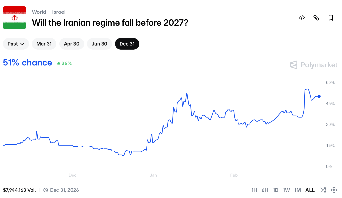
Real-money US-regulated exchanges can’t directly cover the war, but others can and do, such as the international Polymarket:
Polymarket’s argument for why they offer these markets
This market shows that regime change is likely, but will take time- a 51% chance by the end of the year, but only a 13% chance by the end of the month.
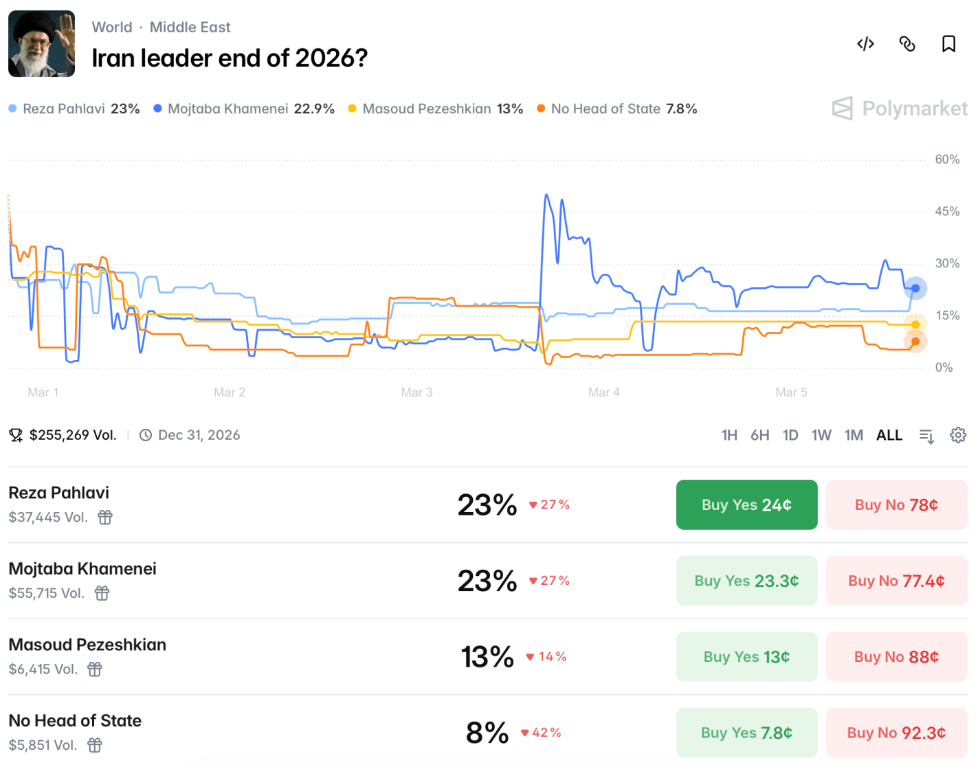
How would this be achieved? Markets see a 60% chance that there will be US troops in Iran this year, though this market could be triggered by just a few special forces operators, or by troops visiting for humanitarian purposes after domestically-driven regime change. There will likely be a US-Iran ceasefire by the end of May. It’s not clear at all who will be running Iran at the end of the year:
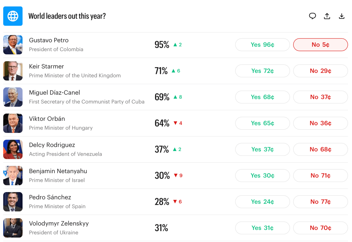
Iran is far from the only country whose future leadership is unclear. Last month I noted that the current leaders of Britain, Hungary, and Cuba would likely be out of office by year end. These are all now looking even more likely than they did a month ago:
So I’ll repeat:
Myself, I find most of these market odds to be high, and I’m tempted to make the “nothing ever happens” trade and bet that everyone stays in office. But even if all these markets are 10pp high, it still implies quite an eventful year ahead. Prepare accordingly.
US-regulated exchanges can’t offer markets on death. Kalshi’s rules stated that if Khamenei died, the market would refund everyone at current prices rather than paying as if he were “out of office”. When he died many people got mad at Kalshi- some who had bet he’d be “out of office” and were mad that they weren’t paid at 100%, others that Kalshi was offering something too close to a death market- “how else would he lose power” (even though Maduro and Assad provide clear recent examples) ↩︎
I invested in my first private company in 2022; my first opportunity to cash out of a private investment came this year when Our Bond did an IPO, now trading on Nasdaq as OBAI.
I’m happy to get a profitable exit less than 4 years after my first investment, given that I’m investing in early-stage companies. Venture funds tend to run for 10 years to give their companies time to IPO or get acquired, and WeFunder (the private investment platform I used) says that “On average, companies on Wefunder that earn a return take around 7 years to do so.” The speed here is especially striking given that I didn’t invest in Our Bond itself until April 2025.
Most private companies that raise money from individual investors are very early stage, what venture capitalists would call “pre-seed” or “seed-stage” companies looking for angel investors. Later-stage companies often find it simpler to raise their later stages (Series B, et c) from a few large institutional investors. But a few choose to do “community rounds” and allow individuals to invest later. This is what Our Bond did right before their IPO, allowing me to exit in less than a year.
This helps calm my biggest concern with equity crowdfunding- adverse selection:
The companies themselves have a better idea of how well they are doing, and the best ones might not bother with equity crowdfunding; they could probably raise more money with less hassle by going to venture funds or accredited angel investors.
My guess is that the reason some good companies bother with this is marketing. Why did Substack bother raising $7.8 million from 6000 small investors on WeFunder in 2023, when they probably could have got that much from a single VC firm like A16Z? They got the chance to explain how great their company and product is to an interested audience, and to give thousands of investors an incentive to promote the company. Getting one big check from VCs is simpler, but it doesn’t directly promote your product in the same way.
All this is enough to convince me that the equity crowdfunding model enabled by the 2012 JOBS Act will continue to grow.
Still, things could have easily gone better for me, as these markets are clearly inefficient and have complexities I’m still learning to navigate. Profitability is not just about choosing the right companies to invest in, but about managing exits. I expected the typical IPO roadshow would give me months of heads-up, but Our Bond surprised its investors with a direct listing. The first thing I heard about the IPO was a February 4th email from “VStockTransfer” that I thought was a scam at first, since it was a 3rd-party company I’d never heard of asking me to pay them money to access my shares. But Our Bond confirmed it was real- VStockTransfer was the custodian for the private shares, and charges $120 to “DRS transfer” them to a brokerage of your choice where they can be sold.
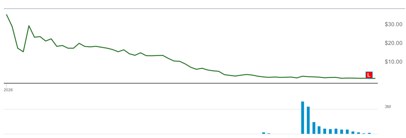
I submitted the request to move the shares to Schwab the same day, but Schwab estimated it would take a week to move them. Neither Schwab nor VStockTransfer ever sent me a notification that the shares had been transferred, and by the time I noticed they had moved a week later, the stock price had fallen dramatically:
As I write this on February 18th, the OBAI price represents a 1.3x return on the price I invested in the private company at last April. When I was first able to sell some stock on February 11th, the price represented a 3x return; if I’d been able to sell right away on the 4th without waiting for the brokerage transfer process, it would have been a 10x return.
By the Efficient Market Hypothesis this timing shouldn’t be so critical, but I knew there would be a rush for the exits as lots of private investors would want to unload their shares at the first opportunity, an opportunity some would have waited years for. Sometimes old-fashioned supply and demand analysis is a better guide to markets than the EMH: demand for OBAI stock had no big reason to change in February, but freely floating supply saw a big increase as private shares got unlocked and moved to brokerages.
Getting a 10x return vs a 1.3x return on one of your winners is the difference between a great early investor and a bad one. I always thought such differences would be driven by who picks the best companies to invest in, but at least in this case it could be driven by who is fastest on the draw with brokerage transfers.
If I ever find myself holding shares in another company that does a direct listing, I’ll be doing whatever I can to make sure the transfer goes as fast as possible (pick the fastest brokerage, check on the transfer status every day, et c). This process also seems like one reason to do fewer, larger private investments- a fixed $120 transfer fee is a big deal if the initial investment was in the low hundreds but wouldn’t matter much for a larger one.
Being accredited would help there, allowing access to additional later-stage, less-risky companies. But I’ll call OBAI a win for equity crowdfunding, and a big win for asset pricing theories based on liquidity and flows over efficient estimation of the present discounted value of future cashflows.