A recent essay by Jeffrey Tucker asks “Has Life Really Improved in Half a Century?” Specifically, Mr. Tucker is interested in measuring median income of families (he uses household income, but families are clearly what he is interested in).
Tucker grants that real median household income has increased by about 40 percent from 1984 to 2024 (if he had used family income instead, the increase is almost 50 percent). But… he says this is illusory. That’s because it now takes two incomes to achieve that median income, whereas it only took one income in the past:
“Adding another income stream to the household is a 100 percent rise in work expectations but it has yielded only a 20-plus percent rise in material income. The effective pay per hour of work for the household has fallen by 40 to 50 percent!”
(He makes a data error by saying that in 1976 real median household income was $68,000-$70,000, when it was actually $59,000 in 2024 dollars in 1976 — real income didn’t fall from 1976 to 1984!)
Last week I wrote a fairly long post in response to an essay by Michael Green. His essay attempted to redefine the poverty line in the US, by his favored calculation up to $140,000 for a family of four. That $140,000 number caught fire, being covered across not only social media and blogs, but in prominent places such as CNN and the Washington Post. That $140,000 number was key to all of the headlines. It grabbed attention and it got attention. So it’s useful to devote another post this week to the topic.
And Mr. Green has written a follow-up post, so we have something new to respond to. Mr. Green has also said a lot of things on Twitter, but Twitter can be a place for testing out ideas, so I will mostly stick to what he posted on Substack as his complete thoughts. I am also called out by name in his Part 2 post, so that’s another reason to respond (even though he did not respond directly to anything I said).
Once again, I’ll have 3 areas of contention with Mr. Green:
As with last week, I maintain that $140,000 is way too high for a poverty line representing the US as a whole (and Mr. Green seems to agree with this now, even though $140,000 was the headline in all of the major media coverage)
There are already existing alternative measures of what he is trying to grasp (people above the official poverty line but still struggling), such as United Way’s ALICE, or using a higher threshold of the poverty rate (Census has a 200% multiple we can easily access)
His idea of the “Valley of Death” is already well-covered by existing analyses of Effective Marginal Tax Rates, and tax and benefit cliffs. This isn’t to say that more attention is warranted, but Mr. Green doesn’t need to start his analysis from scratch. And this “Valley” is probably narrower than he thinks.
UPDATE: Michael Green has written a follow-up post which essentially agrees that $140,000 is not a good national poverty line, but he still has concerns. I have written a new response to his post.
A recent essay by Michael W. Green makes a very bold claim that the poverty line should not be where it is currently set — about $31,200 for a family of four — but should be much higher. He suggests somewhere around $140,000. The essay was originally posted on his Substack, but has now gone somewhat viral and has been reposted at the Free Press. (Note: that actual poverty threshold for a family of four with two kids is $31,812 — a minor difference from Mr. Green’s figure, so not worth dwelling on much, but this is a constant frustration in his essay: he rarely tells us where his numbers come from.)
I think there are at least three major errors Mr. Green makes in the essay:
He drastically underestimates how much income American families have.
He drastically overstates how much spending is necessary to support a family, because he uses average spending figures and treats them as minimum amounts.
He obsesses over the Official Poverty Measure, since it was originally based on the cost of food in the 1960s, and ignores that Census already has a new poverty measure which takes into account food, shelter, clothing, and utility costs: the Supplement Poverty Measure.
I won’t go into great detail about the Official Poverty Measure, as I would recommend you read Scott Winship on this topic. Needless to say, today the OPM (or some multiple of it) is primarily used today for anti-poverty program qualification, not to actually measure how well families are doing today. If we really bumped the Poverty Line about to $140,000, tons of Americans would now qualify for things like Medicaid, SNAP, and federal housing assistance. Does Mr. Green really want 2/3 of Americans to qualify for these programs? I doubt it. Instead, he seems to be interested in measuring how well-off American families are today. So am I.
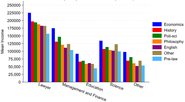
This is post coauthored with Jack Cavanaugh, Ave Maria University Graduate of 2025.
Say that you want to become a successful lawyer. What does that mean? One possible meaning is that you are well-compensated. Money is not everything, but it does give people more options for how to spend their time and resources. Law degrees are a type of graduate degree. So, what bachelor’s degree major should one choose in preparation for law school? We lack rich administrative data on college majors and LSAT scores.
Luckily, the 2023 American Community Survey (ACS) comes to the rescue. It has all of the typical demographic covariates, income, occupation, and college major. So, if we make the small leap that well-prepared law school students become high-performing lawyers who are ultimately paid more, then what college major puts you on the right path? What should your major be?
We don’t look at an exhaustive list. We place several occupations into bins and examine only a few alternative majors. Any unlisted major falls under ‘other’. Below are the raw average incomes by occupational category and college major. Note two majors in particular. First, Pre-law literally has the word ‘law’ in the name and is marketed as preparation for law school. However, it is the undergraduate major associated with the lowest paid lawyers. For that matter, Pre-law majors have the lowest pay no matter what their occupation is. Second, Economics majors are the most highly paid in all of the occupations.
Has it gotten easier or harder for Americans to afford the basic necessities of life? Part of the answer to this question depends on how you define “basic necessities,” but using the common triad of food, clothing, and housing seems like a reasonable definition since these composed over 80% of household spending in 1901 in the United States.
If we use that definition of necessities, here is what the progress has looked like in the US since 1901:
The data comes from various surveys that the Bureau Labor Statistics has collected over the years, collectively known as the Consumer Expenditure Surveys. The surveys were conducted about once every 1-2 decades from 1901 up until the 1980s, and then annually starting in 1984. Some of these are multi-year averages, but to simplify the chart I’ll just state one year (e.g., “1919” is for 1918 and 1919). The categories are fairly comprehensive: “food” includes both groceries and spending at restaurants; “housing” includes either mortgage or rent, plus things like utilities and maintenance; and “clothing” includes not only the cost of the clothes themselves, but services associated with them such as repairs or alterations (much more important in the past).
We can see in the chart that over time the share spent on these three areas of spending has declined dramatically, taken as a group. Housing is different, but it has been fairly stable over time, mostly staying between 22% and 29% of income (the Great Depression being an exception). There are two time periods when these costs rose: the Great Depression and the late 1970s/early 1980s. Both are widely recognized as bad economic times, but they are aberrations. The jump from 1973 to 1985 in spending on necessities was fully offset by 2003, and today spending on necessities is well below 1973 — even though for housing, it is a few percentage points greater.
A chart like this shows great progress over time, but it will inevitably raise many questions. Let me try to answer a few of them in advance.
A new essay by J. Zachary Mazlish answers the title question in the affirmative: yes, inflation made the median voter poorer. The post is data-heavy, with lots of charts and different ways of slicing the data, which is great! But since I am called out by name (or rather, my evil twin, Jeremy Horpendahl), I want to respond specifically to the claim about my data, but also I’ll make a few broader points.
Regular readers will recognize the chart in that Tweet comes from an EWED post from April 2024. Mazlich says that my chart and others like it are “misleading for understanding the election because a) they compare wages now versus January 2020, rather than January 2021.”
Fair enough, but if you read my Tweet you will see that I am specifically responding to an NPR story which said, “if you look at the difference between what… groceries cost in 2019 and what it costs today, and what wages looked like in 2019 and today, the gap is really gigantic.” So, they are specifically using 2019 as a baseline in that story, and my chart specifically used that as the baseline too! That’s why I thought that chart was relevant.
It’s true, of course, that if you want to understand median voter sentiment about the Biden administration, you should probably start the data at the beginning of the Biden administration. But I was responding to the more general claim people make, that they are worse off than in 2019.
With that clarification out of the way, what does Mazlich’s broader post say?
African Americans have seen much adversity throughout US history, but also significant economic progress. One way to measure economic progress is by looking at wealth. There is a fantastic paper by Derenoncourt and co-authors recently published titled “Wealth of Two Nations: The U.S. Racial Wealth Gap, 1860–2020” which puts together the best historical data on Black and White wealth in the US.
The paper primarily focuses on wealth inequality, and here it paints a pessimistic picture since 1950: while the racial wealth gap was closing up until 1950, it stalled after that, and possibly got worse after the 1980s. But using that same data, we can focus on the growth of Black wealth, and here the results are quite optimistic: inflation-adjusted Black wealth per capita was about 7 times larger in 2019 than it was in 1950. Black wealth per capita has roughly doubled since from about 1992 to 2019 (inflation adjusted).
Here’s the long-run data in a chart, which shows that in 2019 Black wealth per capita was 86 times greater than in 1870 (inflation adjusted). That’s some real economic progress!
For income data, there is no long-run historical series similar to the wealth series that I am aware of, but there are estimates for particular years. For example, Robert Margo estimates that Black income per capita was about $1,500 in 1870 (inflation adjusted to 2022 dollars) and $2,400 in 1900 (once again, inflation adjusted to 2022). Margo says that these data should be comparable to the Census CPS Historical Income tables, and the 2022 estimate from this series is $31,180 for Blacks. This data suggests that Black per capita income is 21 times was it was in 1870, and about 3 times what it was in 1967 (first year in the Census CPS series).
Using the same census data for families, rather than individuals, we can also look at the growth of Black family income since 1967. This data suggests that both median and mean family income for Blacks roughly doubled in inflation-adjusted terms from 1967 to 2022, which isn’t as impressive as the tripling of per capita income, but keep in mind that families are smaller today than in 1967. When we look at the distribution of those incomes, the progress becomes very clear:
In 1967, half of Black families had incomes under $35,000 (in 2022 inflation-adjusted dollars), which is close to the official definition of poverty (depending on family size). By 2022, this had been cut in half: just 25 percent of Black families were under $35,000.
The number of “rich” Black families (incomes of at least $100,000) in 1967 was miniscule: only about 200,000 families, just 5 percent of the total. In 2022, there were an additional 3 million rich Black families, now comprising almost one-third of the total, and outnumbering poor Black families. The number of rich Black families has grown by about 1 million in just the past decade — no stagnation there! The Black “middle class” (incomes between $35,000 and $100,000) now has 4.5 million families — the same number as the total count of Black families in 1967.
Of course, there is still much work to be done on economic progress in the US. But the astonishing economic progress of Blacks since emancipation and since the Civil Rights era is worth celebrating, even if racial gaps haven’t closed much recently.
While there are many factors to consider, ultimately whether living standards are rising is a race between prices and income. What does that race look like if we start the clock in December 2019, just before the pandemic?
Whether we use median weekly earnings (the purple line) or average hourly earnings for non-management workers (the blue line), they have clearly won the race with two commonly used price indexes (the CPI-U and the PCEPI). That’s good news, and probably not something you hear very often in the discourse about the economy (unless you spend a lot of time reading this blog).
Lately on Twitter this chart has been going around:
The chart comes from Bloomberg journalist Justin Fox, who always puts together interesting economic data. You can read his interpretation of the data at Bloomberg, but the folks posting it on Twitter all seem to have the same shock and awe: Detroit was the richest big city in 1949. And of course we all know that today it isn’t. Still, the Detroit MSA has done OK since 1949, even though it is no longer anywhere near the top.
How well has Detroit done? Despite industrial decline and many other major problems, median household income of the Detroit MSA was around $71,000 in 2022 according to the Census Bureau. How does this compare to the $3,627 median income in 1949? It’s about double in real terms: you can multiply it by about 10 using the Census’ preferred inflation adjustment for household incomes since 1949 (the C-CPI-U since 2000, and the R-CPI-U-RS before that).
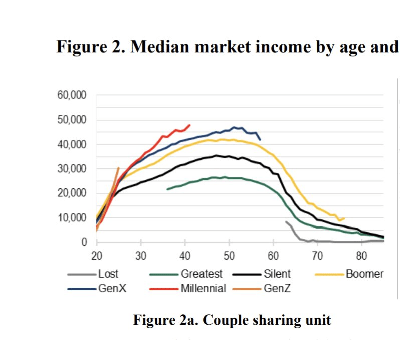
Regular readers know that I’ve written numerous times about the wealth levels of younger generations, such as this post from last month. Judged by average (and usually median too) wealth, younger generations are doing as well and often better than past generations. This is not too surprising, if you generally think that subsequent generations are better off than their parents, but many people today seem to think that progress has stopped. The data suggest it hasn’t stopped!
Now there’s a great new paper by Kevin Corinth and Jeff Larrimore which looks at not wealth but income levels by generation. The look at income in a variety of different ways, including both market income and post-tax/transfer income. But the result is pretty consistent: each generation has higher incomes (inflation adjusted) than the previous generation. Here’s a typical chart from the paper: