Forecasting 2025

WSJ’s survey of economists reports that inflation expectations for 2025 were around 2% before the election, but are closer to 3% now. Their economists expect GDP growth slowing to 2%, unemployment ticking up slightly but staying in the low 4% range, with no recession. The basic message that 2025 will be a typical year for the US macroeconomy, but with inflation being slightly elevated, perhaps due to tariffs.

Kalshi has a lot of good markets up that give more detailed predictions for 2025:

For those who hope for DOGE to eliminate trillions in waste, or those who fear brutal austerity, the message from markets is that the huge deficits will continue, with the federal debt likely climbing to over $38 trillion by the end of the year. This is one reason markets see a 40% chance that the US credit rating gets downgraded this year.

While the US has only a 22% chance of a recession, China is currently at 48%, Britain at 80%, and Germany at 91%. The Fed probably cuts rates twice to around 4.0%.

Will wage growth keep pace with inflation? It’s a tossup. Corporate tax cuts are also a tossup. The top individual rate probably won’t fall below it’s current 37%.

If you want to make your own predictions for the year, but don’t want to risk money betting on Kalshi, there are several forecasting contests open that offer prizes with no risk:

ACX Forecasting Contest: $10,000 prize pool, 36 questions, must submit predictions by Jan 31st

Bridgewater Forecasting Contest: $25,000 prize pool, half of prizes are reserved for undergraduates. Register now to make predictions between Feb 3rd and March 31st. Doing well could get you a job interview at Bridgewater.

Is the Great Grocery Inflation Over?

The average price of a dozen eggs is back up over $4, about the same as it was 2 years ago during the last avian flu outbreak. Egg prices are up 65% in the past year. But does that mean the grocery inflation we experienced in 2021-22 is roaring back?

No really. Spending on eggs is around 0.1% of all consumer spending, and just about 2% of consumer spending on groceries. Symbolically, it may be important, since consumers pick up a dozen eggs on most shopping trips. But to know what’s going on with groceries overall, we have to look at the other 98% of grocery spending.

It’s been a wild 4 years for grocery prices in the US. In the first two years of the Biden administration, grocery prices soared over 19%. But in the second two years, they are up just 3% — pretty close to the decade average before the pandemic (even including a few years with grocery deflation!).

As any consumer will tell you, just because the rate of inflation has fallen doesn’t mean prices on average have fallen. Prices are almost universally higher than 4 years ago, but you can find plenty of grocery items that are cheaper (in nominal terms!) than 1 or 2 years ago: spaghetti, white bread, cookies, pork chops, chicken legs, milk, cheddar cheese, bananas, and strawberries, just to name a few (using BLS average price data).

There is no way to know the future trajectory of grocery prices, and we have certainly seen recent periods with large spikes in prices: in addition to 2021-22, the US had high grocery inflation in 2007-2009, 1988-1990, and almost all of the period from 1972-1982 (two-year grocery inflation was 37% in 1973-74!). Undoubtedly grocery prices will rise again. But the welcome long-run trend is that wages, on average, have increased much faster than grocery prices:

“Time Prices” Today Compared With 1924 and 1971

I’ve written before on this blog about “time prices”: the amount of time it takes at a particular wage to buy a specific product. Time prices are especially useful for making historical comparisons of the real price of a good or service. Rather than adjusting historical prices for inflation (which only tells you whether they have increased faster or slower than average prices), time prices give you a real comparison of whether a good has become more or less affordable.

Antony Davies recently did a 100-year comparison of time prices for an average worker in the US. He compared prices in 1924 for several common food items, gasoline, electricity, movie tickets, airline tickets, an automobile, and several measures of housing costs to the best comparable thing in 2024. This following table shows his results:

You will notice a few things here. For the median worker, most things are much more affordable in 2024. Some things are dramatically so! For many items, the median worker in 2024 is similar to someone in the top 1% in 2024. Huge improvements in the standard living.

It will probably not surprise you that one major exception is housing. For renters, things are not obviously worse, but they are not better, depending on what size of city you are in (renters also have lower incomes, but that would be true in both time periods). However compared to the average home price, things look much worse in 2024. You can reasonably reply that the home is much larger and better quality in 2024 (as late as 1940, barely half of homes had complete indoor plumbing!), and this is all true. Still, an average house today is much better, but also much less affordable.

Despite the high cost of housing, the average worker today is much better off than 1924. It’s hard to deny it.

But what about more recent times? As a recurring meme likes to date it, what about since 1971?

Continue reading

Don’t Let Nominal Prices Fool You (Thanksgiving Edition)

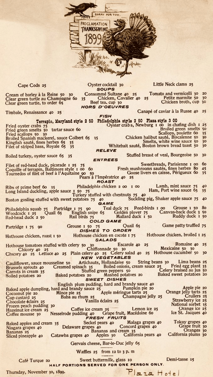
When you see prices from the past, especially the distant past, your normal reaction is perhaps one of envy or nostalgia. Take for example the Thanksgiving menu from the Plaza Hotel in New York in 1899. As you browse the menu, note that the prices are in cents, not dollars.

The most expensive items on the menu are only a few dollars, while many items can be had for around 50 cents. But hopefully your nostalgia will soon fade when you recall that wages were probably lower back then.

But how much lower?

According to data from MeasuringWorth.com (an excellent resource affiliated with the Economic History Association), the average wage for production workers in manufacturing was 13 cents per hour in 1899. From this we can immediately see that a dish such as Ribs of Prime Beef (60 cents) would take about 4.5 hours of work for a production worker to purchase.

How can we compare these prices and wages from 1899 to today?

Continue reading

Did Inflation Make the Median Voter Poorer?

A new essay by J. Zachary Mazlish answers the title question in the affirmative: yes, inflation made the median voter poorer. The post is data-heavy, with lots of charts and different ways of slicing the data, which is great! But since I am called out by name (or rather, my evil twin, Jeremy Horpendahl), I want to respond specifically to the claim about my data, but also I’ll make a few broader points.

Here’s the Tweet of mine that he links to:

https://twitter.com/jmhorp/status/1854548669317455894

Regular readers will recognize the chart in that Tweet comes from an EWED post from April 2024. Mazlich says that my chart and others like it are “misleading for understanding the election because a) they compare wages now versus January 2020, rather than January 2021.”

Fair enough, but if you read my Tweet you will see that I am specifically responding to an NPR story which said, “if you look at the difference between what… groceries cost in 2019 and what it costs today, and what wages looked like in 2019 and today, the gap is really gigantic.” So, they are specifically using 2019 as a baseline in that story, and my chart specifically used that as the baseline too! That’s why I thought that chart was relevant.

It’s true, of course, that if you want to understand median voter sentiment about the Biden administration, you should probably start the data at the beginning of the Biden administration. But I was responding to the more general claim people make, that they are worse off than in 2019.

With that clarification out of the way, what does Mazlich’s broader post say?

Continue reading

Un Poco Loco, But Effective? Almost 1 Year of President Milei

I don’t like to follow politics, much less politics in another country. Policy on the other hand? I’m always hooked.

Most of us have heard of President Javier Milei by now. He became Argentina’s president in December of 2023. Prior, he had been in charge of a private pension company, a university professor who taught macroeconomics, had hosted a radio show, and has written several books. See his Wikipedia entry for more.

What makes him worth talking about is that he appears a little… unique. He’s boisterous and rattles off economic stories and principles like he wants you to get up and do something about it. To anyone in the US, he looks and behaves like a weird 3rd-party candidate – sideburns and all. He’s different. Here he is bombastically identifying which government departments he would eliminate:

I’ve enjoyed the spectacle, but haven’t paid super close attention. I know that he is libertarian in political outlook, drops references to Austrian economists and their ideas by the handful, and doesn’t mince words. Here he is talking at the Davos World Forum (English & Dubbed).

So what?

Argentina has a long history of high inflation and debt defaults. Every president always says that they’ll fix it, and then they don’t. There have been periods of lower inflation, but they don’t persist. Among Milei’s stated goals was to end that cycle and bring down inflation. His plan was to substantially reign in deficit spending by eliminating entire areas of government. We’re now approaching a year since Milei took office, and I thought that I would check in. Below is the CPI for Argentina since 2018. As soon as Milei took office prices spiked, but have started coming down more recently. Similarly, the Argentine Peso has fallen in value by 50% since he’s taken office. Ouch!

Continue reading

Grocery Inflation Since 2019: BLS Data is Probably About Right

Grocery prices are definitely up a lot in the past few years. I’ve wrote about this several times before. But lately there has been a trend on social media to “post your receipts” and show how much your grocery prices have gone up. Unfortunately, very few people actually post the full receipts, often just showing the total, which leads to wild claims like prices being up 250% in just the past 2 years! That’s a huge contrast to BLS “food at home” category of the CPI, which shows an increase of 4.7% from July 2022 to July 2024 (it’s also unclear in the video what the exact date of the receipt is, he just says “2 years”). Depending on the exact base month, you’re going to be in the 20-25% compared with pre-pandemic or early pandemic using BLS data.

What if we actually looked at receipts? I tried such an exercise in November 2023, when there was another round of social media videos claiming prices had doubled in just a single year. My own personal receipt matched the corresponding BLS data pretty closely, but that was just one receipt with only eight items from Sam’s Club (which might not match grocery stores, for various reasons). At the time, I couldn’t find any good receipts from 2019 or 2020 (Kroger and Walmart drop old receipts in your account after about 2 years), but after scouring an old email account, I discovered two more receipts to compare. These are both from Walmart, in 2019 and 2020, and they contain a larger number of items than my Sam’s Club receipt (each with about a dozen and half items that are fairly typical grocery purchases, and I was able to find matching products today).

I present… the receipts!

Continue reading

Services, and Goods, and Software (Oh My!)

When I was in high school I remember talking about video game consumption. Yes, an Xbox was more than two hundred dollars, but one could enjoy the next hour of that video game play at a cost of almost zero. Video games lowered the marginal cost and increased the marginal utility of what is measured as leisure. Similarly, the 20th century was the time of mass production. Labor-saving devices and a deluge of goods pervaded. Remember servants? That’s a pre-20th century technology. Domestic work in another person’s house was very popular in the 1800s. Less so as the 20th century progressed. Now we devices that save on both labor and physical resources. Software helps us surpass the historical limits of moving physical objects in the real world.


There’s something that I think about a lot and I’ve been thinking about it for 20 years. It’s simple and not comprehensive, but I still think that it makes sense.

  • Labor is highly regulated and costly.
  • Physical capital is less regulated than labor.
  • Software and writing more generally is less regulated than physical capital.


I think that just about anyone would agree with the above. Labor is regulated by health and safety standards, “human resource” concerns, legal compliance and preemption, environmental impact, and transportation infrastructure, etc. It’s expensive to employ someone, and it’s especially expensive to have them employ their physical labor.

Continue reading

On Average, American Wage Earners are Better Off Than They Were Four Years Ago

As I wrote last November, the question “are you better off than you were four years ago?” is a common benchmark for evaluating Presidential reelection prospects. And even though Biden is no longer running for reelection, voters will no doubt be considering the economic performance of his first term when thinking about their vote in November.

The good news for American wage earners (and possibly Harris’ election prospects) is that average wages have now outpaced average price inflation since January 2021. Despite some of that time period containing the worst price inflation in a generation, wages have continued to grow even as price growth has moderated. Key chart:

For most of Biden’s term, it was true that prices had outpaced wages. But no longer.

The real growth in wages, admittedly, is not very robust, despite being slightly positive. How does this compare to past performance under recent Presidents? Surprisingly, pretty well! (Lots of caveats here, but this is what the raw data shows.)

Inflation in the G7 and Russia

Among the former G8 countries, Russia has by far the highest cumulative inflation rate since January 2020, almost double the amount of inflation we’ve seen in the US and in most G7 countries. No doubt the effects of the wartime economy are contributing to this, but even in February 2022 before they invaded Ukraine, their inflation still had clearly been worse.

The US is on the high end for this group, but pretty close to the median. Japan looks really good on inflation, but that’s probably not much comfort to them since their economy is still smaller than before the pandemic. By this measure, the US looks pretty good (chart from Joey Politano):

GDP estimates for Russia are a little tricky because of the war, but according to IMF estimates, Russia’s economy in 2023 was about 5.6% larger than 2019 in real terms.

See also: Food Inflation in the G7 and Russia