A chart showing the average income by major was recently making the rounds on social media. So, I tried to replicate it. It turned out that some of the college majors were omitted. That part actually makes sense. The 2024 American Community Survey includes 174 degree fields – which is way too many for a clearly labeled bar chart. So, for local advertisement, I used only the majors and their equivalents that are offered at my university. That chart is below (unweighted).
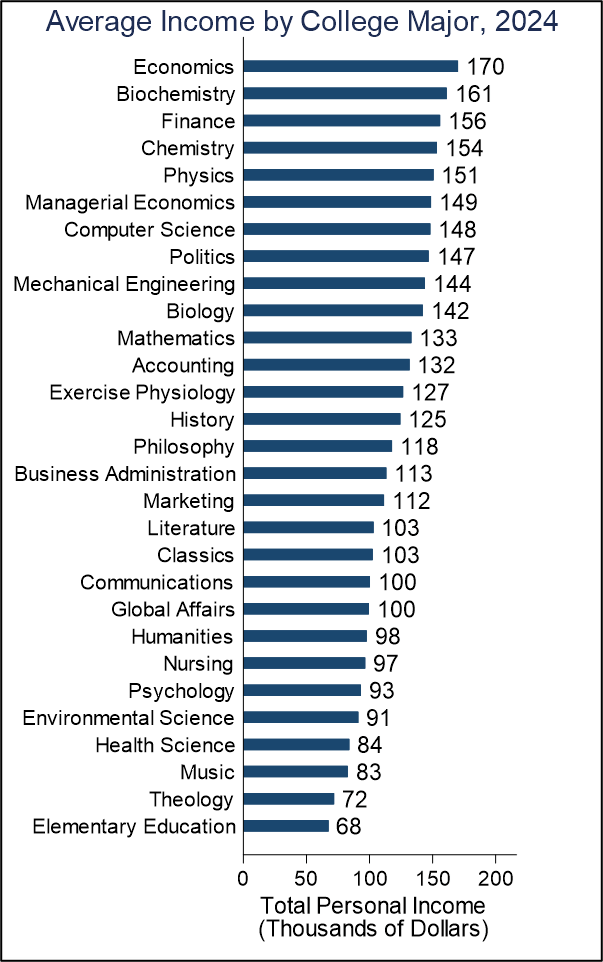
These are just raw average earnings by college major for employed adults. They all have decent sample sizes. Below is the cumulate distribution of sample size for each major. The smallest sample size is 45 (Military Technologies) and only 3% have sample sizes below 100. Only 34% have sample sizes below 1k.
You better believe that my colleagues and I show this chart to every single one of our classes. Obviously, it’s truncated from the full 174 majors, but it’s the relevant chart for us. If we use the full sample of college majors, Economics ($170k) drops to 3rd highest income, behind “Petroleum Engineering” ($173k) and “Health and Medical Preparatory Programs” ($183k). To be perfectly honest, those latter two sound a lot more difficult and have surprisingly little pay bump in compensation. Being more difficult is also consistent with the smaller sample size Economics=13k, Petroleum Engineering=343, and Health and Medical Preparatory Programs=1,099.
One challenge that I’ve heard about the chart is that top business schools, such as Wharton, have Economics majors and various business concentrations. So, those top performing financiers are getting categorized as Economics in a way that is a bit misleading to young students elsewhere who are trying to decide on a major. If that’s true, then we should see Economics drop in the rankings if we omit the top-most earners. After all, the criticism is that they’re pulling up the average.
Continue reading
