I’ve written before on this blog about “time prices”: the amount of time it takes at a particular wage to buy a specific product. Time prices are especially useful for making historical comparisons of the real price of a good or service. Rather than adjusting historical prices for inflation (which only tells you whether they have increased faster or slower than average prices), time prices give you a real comparison of whether a good has become more or less affordable.
You will notice a few things here. For the median worker, most things are much more affordable in 2024. Some things are dramatically so! For many items, the median worker in 2024 is similar to someone in the top 1% in 2024. Huge improvements in the standard living.
It will probably not surprise you that one major exception is housing. For renters, things are not obviously worse, but they are not better, depending on what size of city you are in (renters also have lower incomes, but that would be true in both time periods). However compared to the average home price, things look much worse in 2024. You can reasonably reply that the home is much larger and better quality in 2024 (as late as 1940, barely half of homes had complete indoor plumbing!), and this is all true. Still, an average house today is much better, but also much less affordable.
Despite the high cost of housing, the average worker today is much better off than 1924. It’s hard to deny it.
But what about more recent times? As a recurring meme likes to date it, what about since 1971?
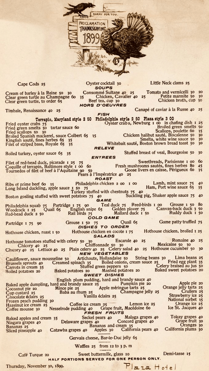
When you see prices from the past, especially the distant past, your normal reaction is perhaps one of envy or nostalgia. Take for example the Thanksgiving menu from the Plaza Hotel in New York in 1899. As you browse the menu, note that the prices are in cents, not dollars.
The most expensive items on the menu are only a few dollars, while many items can be had for around 50 cents. But hopefully your nostalgia will soon fade when you recall that wages were probably lower back then.
But how much lower?
According to data from MeasuringWorth.com (an excellent resource affiliated with the Economic History Association), the average wage for production workers in manufacturing was 13 cents per hour in 1899. From this we can immediately see that a dish such as Ribs of Prime Beef (60 cents) would take about 4.5 hours of work for a production worker to purchase.
How can we compare these prices and wages from 1899 to today?
A new essay by J. Zachary Mazlish answers the title question in the affirmative: yes, inflation made the median voter poorer. The post is data-heavy, with lots of charts and different ways of slicing the data, which is great! But since I am called out by name (or rather, my evil twin, Jeremy Horpendahl), I want to respond specifically to the claim about my data, but also I’ll make a few broader points.
Regular readers will recognize the chart in that Tweet comes from an EWED post from April 2024. Mazlich says that my chart and others like it are “misleading for understanding the election because a) they compare wages now versus January 2020, rather than January 2021.”
Fair enough, but if you read my Tweet you will see that I am specifically responding to an NPR story which said, “if you look at the difference between what… groceries cost in 2019 and what it costs today, and what wages looked like in 2019 and today, the gap is really gigantic.” So, they are specifically using 2019 as a baseline in that story, and my chart specifically used that as the baseline too! That’s why I thought that chart was relevant.
It’s true, of course, that if you want to understand median voter sentiment about the Biden administration, you should probably start the data at the beginning of the Biden administration. But I was responding to the more general claim people make, that they are worse off than in 2019.
With that clarification out of the way, what does Mazlich’s broader post say?
As I wrote last November, the question “are you better off than you were four years ago?” is a common benchmark for evaluating Presidential reelection prospects. And even though Biden is no longer running for reelection, voters will no doubt be considering the economic performance of his first term when thinking about their vote in November.
The good news for American wage earners (and possibly Harris’ election prospects) is that average wages have now outpaced average price inflation since January 2021. Despite some of that time period containing the worst price inflation in a generation, wages have continued to grow even as price growth has moderated. Key chart:
For most of Biden’s term, it was true that prices had outpaced wages. But no longer.
The real growth in wages, admittedly, is not very robust, despite being slightly positive. How does this compare to past performance under recent Presidents? Surprisingly, pretty well! (Lots of caveats here, but this is what the raw data shows.)
We all know about inflation. One popular measure is the Consumer Price Index (CPI), which measures the change in price of a fixed basket of goods. The other popular measure used for inflation is the Personal Consumption Expenditures (PCE) price index. This index measures the price of what consumers actually purchase and captures the effects of consumers changing their consumption bundles over time. While the latter is a better measure for the prices at which consumers make purchases, it takes longer to calculate. In practice, the earlier CPI release gives a pretty accurate preview to the PCE price index.
While consumption is a substantial two-thirds of total expenditures in the US economy, other prices definitely matter. On average, a third of our income is spent on other things. Below is a stacked bar chart of quarterly GDP components – the classic Y=C+I+G+NX.* Investment spending composes a relatively stable 16.7% and Government spending composes about 16.5% of GDP. We almost never hear much about the price of these other things.
Many people have nostalgia for nominal prices of the past. I’ve written about this topic in various contexts before, but the primary error in doing this is that you must also look at nominal wages from the past. Prices in isolation give us little context of how affordable they were.
One area with a lot of nostalgia is food prices of the past, specifically grocery prices (I’ve also written about fast food prices). While I have addressed grocery price inflation since 2021 in another post (it’s bad, but probably not as bad as social media leads you to believe), there is another version of grocery price nostalgia that goes back even further. For example, this image shows up on social media frequently with nostalgia for 1980 prices:
(Note that the image also mentions housing prices, but the clear focus of the image is on groceries. I won’t dig into housing in this post, but it’s something I have written a lot about before, and I would recommend you start with this post on housing prices from February 2024. But she sure looks happy! As models often do in promotional photos.)
Could you buy all those groceries for $20 in 1980? And how should we think about comparing that to grocery prices today?
One approach to grocery affordability is to look at how much a family spends as a share of their budget on food and other items. In the past I’ve used this approach to show that food spending has fallen dramatically over time as a share of a household’s budget, including since the early 1980s. But perhaps that approach is flawed. Maybe housing has got more expensive, so families are cutting back on food spending to accommodate for that fact, but they are getting less or lower quality food.
For another approach, I will use Average Price Data for grocery items from the BLS CPI series. Note that I am using actual average retail price data, not prices series data, which means there are not adjustments for quality changes or substitutions. No funny stuff, just the raw price data (the only adjustment is if product sizes changes, which of course we want them to do, so we aren’t fooled by shrinkflation — so BLS uses a constant package size, such as 1 pound for many items or a dozen eggs, etc.).
The items I have chosen out of the 150-plus price series are the 24 items which are available in both 1980 and 2024. There may be some biases by doing this, but in general BLS is continuing to collect data on things that people continue buying. So it’s the best apples-to-apples comparison we can do (note that there are no apples in this list! Apples are tracked in the CPI, but there is no continuous price series from 1980 to 2024 for one apple variety).
How best to compare prices over time? Rather than “adjusting for inflation,” as is common in the popular press and by some economists, a better approach that I and other economists use is called “time prices.” Time prices show the number of hours or minutes it would take to purchase the good in two different years, using some measure of wages or income (I will use both average and median wages in this post). By looking at prices compared with wages for individual items, we can see whether each items as well as the entire basket has become more or less affordable.
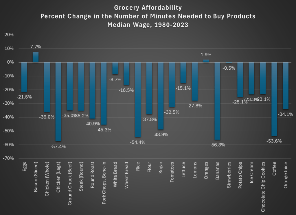
Here is what time prices for these 24 items look like if we use average wages (I use a series that covers about 80% of the workforce, but excludes supervisors and managers). For this chart, I use prices in April 1980 and April 2024, since there is some seasonality to some prices (and April 2024 is the most recent price and wage data available, so it’s as current as I can get).
The chart shows that for 23 out of the 24 items, it takes fewer minutes of work to buy the items in April 2024 than it did in April 1980. For many items, it is a huge decrease: 13 items decrease by 30 percent or more (30 percent is also the average decrease). And while we once again might be concerned by selection bias of the goods, we have a nice variety here of proteins, grains, baking items, vegetables, fruits, snacks, and drinks. Unfortunately for the bacon lovers out there it is the one product going in the other direction, but there are still a variety of other proteins that have become much more affordable (pork chops are much cheaper!).
Here’s one way in which the image of the lady shopping wasn’t wrong: you could get a basket of groceries for about $20 in 1980. The basket I’ve put together (which is obviously different from the woman’s basket, but you work with the data you have) would cost $27 if you bought the package sizes BLS tracks (e.g., one pound for most of the meats and produce). In 2024, that same basket would cost $84. That’s 3 times as much! But since wages are over 4 times higher, the family is better off and groceries are, in a real sense, more affordable.
Speaking of wages though, is my chart perhaps biased because I’m using the average wage? What if we used another measure, such as the median wage? For that, I can use the EPI’s median wage series (which comes from the CPS), and I also converted it to a nominal wage for 2023. This wage data is only available annually, with the most recent being 2023, so I will also use 2023 price data for this chart (note: for oranges and strawberries, I use the second quarter average price, since they weren’t available year round in 1980 — another subtle example of growing abundance and prosperity today).
The immediate thing you will notice is that there isn’t much difference between the average wage chart. Bacon is still less affordable. We know have oranges being slightly less affordable and strawberries being basically the same, though keep in mind as I mentioned above the chart that these weren’t available year-round in 1980.
But other than bacon and those seasonal fruits, everything is more affordable in 2023 than 1980. The average decrease is the same as the prior chart: 30 percent fewer minutes of work at the median wage to purchase this basket of goods, with 13 of the 24 items decreasing by more than that 30 percent average. The reason for this similarity is that both the average and median wages as measured by these series are more than 4 times higher than 1980.
But are these 24 items representative of other grocery items that we don’t have complete price data in the public BLS series? They are probably pretty close. The unweighted percent change in the items from April 1980 to April 2024 was 201%. If we use the CPI Food at Home component, which includes many more items but also changes in composition as buying habits change, we see a slightly larger 255% increase. But that is still less than wages have increased since 1980 (by over 300% for both average and median wages). As our incomes rise, we will naturally switch to better and more expensive foods, which can explain the 255% vs 201% difference in price increases, but it also shows the BLS isn’t engaging in any funny business with the indexes: if they kept the basket of goods constant, price increases would be smaller.
While the rise in prices since 2021 might rightly make us nostalgic for the pre-pandemic era of prices, let’s not be nostalgic for 1980 grocery prices.
Inflation continues to remain stubbornly high in the US. While Core CPI is down to 3.6%, the lowest it has been in 3 years, this is still well above the Fed’s 2% target (the Fed’s preferred Core PCE is a bit lower at 2.8%). But consumers are tired of the cumulative inflation, which, depending on your preferred gauge of inflation, is somewhere around 20% in the past 4 years. Consumers want to know: will prices ever go down again?
The answer is: Yes, and some prices already have declined!
For example, you can look at broad categories of consumer purchases, such as durable goods, which are down almost 5 percent since the peak in August 2022. Durable goods include items such as used cars (down 17.3 percent since February 2022), furniture (down 6 percent since August 2022), and appliances (down 7.2 percent since March 2023).
We can even jump into the nondurables category and look at specific items, such as groceries which seem to be on everyone’s mind. Here’s a list of items and the price decrease since their peak (I ignore a few items where it is only a purely seasonal cycle that made them cheaper in April 2024):
Spaghetti and macaroni: -4.3% (Feb 2023)
Bacon: -12.8% (Oct 2022)
Chicken legs: -10.6% (Aug 2023)
Chicken breasts: -14.4% (Sept 2022)
Eggs: -40.6% (Jan 2023)
Milk: -8.3% (Nov 2022)
Cheddar cheese: -9.4% (Sep 2022)
Bananas: -2.6% (Sept 2022)
Oranges: -14.7% (Sept 2022)
Lemons: -12.3% (May 2022)
Strawberries: -12.9% in the past year (and down 34.6% since seasonal peak in Dec 2022)
Ground coffee: -6.2% (Dec 2022)
It’s true that this is a cherry-picked list: lots of items are at all-time highs! My goal here is to show that, Yes!, some prices will fall. Others may too in the near future. And while it’s also true that most prices are still well above 2019 levels, that’s not universally true. The April 2024 prices of lemons, strawberries, and tomatoes are roughly equal to their April 2019 prices.
And it’s not just food. Natural gas this January was 20% cheaper than January 2023. Regular unleaded gasoline is down 11.6% from 2 years ago (and down 25% from the peak in Summer 2022, but we’ll wait to see what this summer looks like). Even some services, such as airline fares, are down 6.7% from 2 years ago (and down 16% from June 2022).
Some of these price decreases could be due to factors specific to the production and supply of those goods, but another factor is monetary policy. Broad measures of the money supply such as M2 show a decline of about 4 percent in the past 2 years. That hasn’t yet produced overall deflation, but it has probably contributed to the decline in the goods and services mentioned.
Looking at price changes can only tell us so much though, especially focusing on individual item prices. The big picture is that over the past 4 years, wages have increased more than prices overall across most of the income distribution (only the highest quintile lost out on the race between wages and prices). Falling prices would certainly help this trend continue, but most consumers have more buying power than they did in 2019, even if they don’t feel like they do.
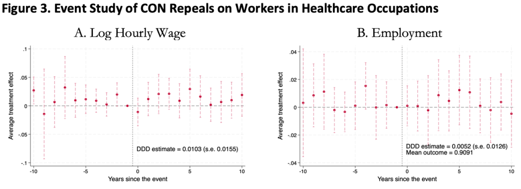
This was surprising to me, as I kind of expected CON laws to harm workers. Certificate of Need laws require many types of health care providers to obtain the permission of a state board before they are allowed to open or expand. This could lead to fewer health care facilities, and so less demand for health care workers, lowering wages and employment. It could also lead to less competition among health care employers, to similar effect.
On the other hand, less competition in the market for health services could raise profits, with room to share them in the form of higher wages. Or, CON being primarily targeted at capital expenditures like facilities and equipment could increase the demand for labor (to the extent that labor and capital are substitutes in health care). All these competing theories seem to cancel out to one big null when we look at the data.
We use 1979-2019 data from the Current Population Survey and a generalized triple-difference approach comparing CON-repealing to CON-maintaining states, and find a bunch of fairly precise zeroes. This holds for many different definitions of “health care worker”: those who work in the health industry, in health occupations, in hospitals, in health care outside hospitals, nurses, physicians, and more.
This is the first word on the topic, not the last; I wouldn’t be too surprised if someone down the road finds that CON does significantly affect health care workers. In this paper we pushed hard on the definition of “health care workers”, but not on “Certificate of Need” or “wages”. We simply classify states as “CON” or “non-CON” because that is what we have data for, but some states have much stricter programs than others, and some day someone will compile the data on this back to the 1970’s. The easier thread to pull on is “wages”. We use one good measure (the natural log of inflation-adjusted hourly real wages), but don’t do any robustness checks around it; considering “business income” could be especially important here. It is also possible that CON affects workers in other ways; we only checked wages and employment.
The full paper is here (ungated here) if you want to read more.
Let me start by saying high rates of inflation, especially unexpected inflation, is bad. Still, it is useful to have some historical context. We’ve experienced the highest inflation rates in a generation lately, especially in 2022, but past generations experienced inflation too. How to compare?
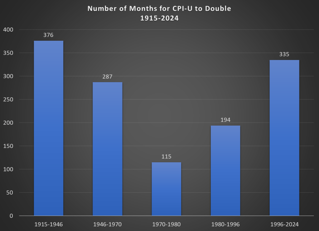
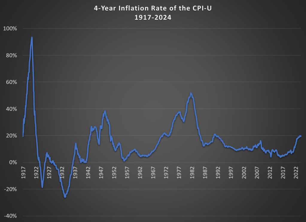
Here’s one approach. Using the latest CPI-U data, we can see that prices on average approximately doubled between March 1996 and February 2024. That’s 335 months to double, or just shy of 28 years. How long did it take prices to double if we keep moving backward in time from March 1996?
It only took 194 months for prices to double from January 1980 until March 1996, just a little over 16 years. Prior to January 1980, prices doubled even quicker, this time taking less than 10 years! Prior to that, it took 24 years for prices to double between WW2 and 1970, and before that you have to go back 31 years to 1915 for another doubling. Judged by this, our recent history doesn’t look so bad.
That doesn’t mean everything is OK. As I said above, unexpected inflation is the worst kind, since individuals and businesses aren’t planning for it. And we’ve had 20% inflation in the past 4 years — something not seen since 1991 over a 4-year time period. A 20%+ inflation rate is unusual to us today, but it certainly wasn’t in the past: basically all of the 1970s and 1980s had 20%+ inflation every 4 years, sometimes more than 40% or even 50%.
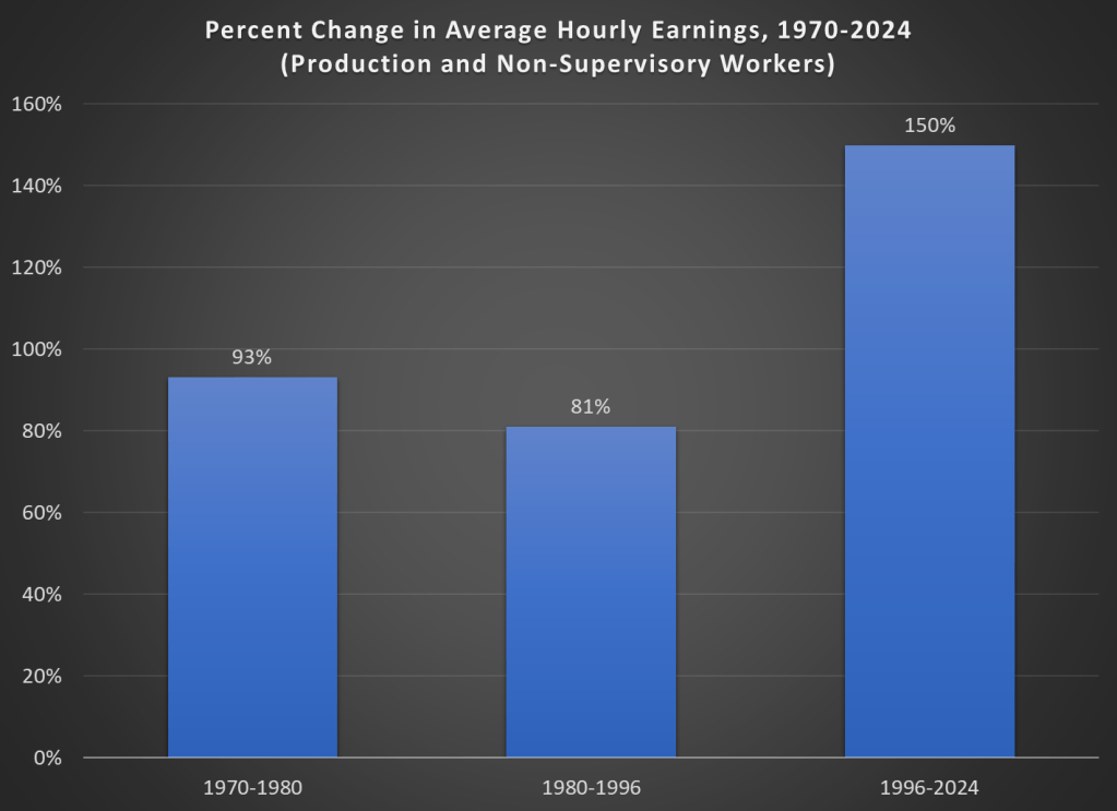
Finally, while unexpected inflation is bad, we also care about the relationship between wage increases and price increases. We can rightfully bemoan rapid, unexpected price inflation, but if wages are increasing faster than inflation, we are still better off (on average). The BLS average hourly wage series for production and non-supervisory workers only goes back to 1964, so we can’t do a full comparison with the CPI-U, but we can compare the three most recent doublings of prices.
Keep in mind with the chart above that prices (as measured by the CPI-U) increased by 100% for each of these time periods. So, for the 1970s and 1980-1996 periods, wages actually rose by less than rate of inflation — wage stagnation! If we used the PCE price index instead, those time periods still don’t look good: PCE prices increased by 88% for 1970-1980, 85% from 1980-1996, and 78% since 1996. With either price index, the 1996-2024 period is clearly the best of these three, and it’s not even really close.
Let me finish where I started: the recent inflation is bad. I don’t want to downplay that. But some historical perspective is also useful.
Today I’ll go into more detail on several measures of the labor force, but I won’t only compare it to 2019. I’ll compare it to all available data. And the sum total of the data suggests the 2023 was one of the best years for the US labor market on record. Note: December 2023 data isn’t available until January 5th, so I’m jumping the gun a little bit. I’m going to assume December looks much like November. We can revisit in 2 weeks if that was wrong.
The Unemployment Rate has been under 4% for the entire year. The last time this happened (date goes back to 1948) was 1969, though 2022 and 2019 were both very close (just one month at 4%). In fact, the entire period from 1965-1969 was 4% or less, though following January 1970 there wasn’t single month under 4% under the year 2000!
Like GDP, the Unemployment Rate is one of the broadest and most widely used macro measures we have, but they are also often criticized for their shortcomings, as I wrote in an April 2023 post.
With that in mind, let’s look to some other measures of the labor market.