Game Theory and Behavior is extremely readable. Carpenter and Robbett have a great set of examples (e.g. the poison drink dilemma from The Princess Bride). I think the book has been developed from teaching a course that resonates with undergraduates today. The authors are both experimental economists, so there is natural integration with lab results from experiments with games.
Topics covered include:
Game Theory and standard definitions
Solving Games
Sequential Games
Bargaining
Markets
Social Dilemmas
Voting
Behavioral Extensions of Standard Theory
In their words:
This book provides a clear and accessible formal introduction to standard game theory, while at the same time addressing how people actually behave in these games and demonstrating how the standard theory can be expanded or updated to better predict the behavior of real people. Our objective is to simultaneously provide students with both the theoretical tools to analyze situations through the logic of game theory and the intuition and behavioral insights to apply these tools to real world situations. The book was written to serve as the primary textbook in a first course in game theory at the undergraduate level and does not assume students have any previous exposure to game theory or economics.
Not every book on game theory would be described as extremely readable. The authors do present mathematical concepts and solutions and practice problems. I want to be clear that I’m not implying that their book is not rigorous. They present game theory as primarily an intuitive and important framework for decisions instead of as primarily a mathematical object, which should go over well with most undergraduate students.
The following are questions that occurred to me as I was writing this post, with ChatGTP replies.
The census data in particular is vast and relatively comprehensive. But, it’s not all perfect.
Consider three variables:
Labforce, which categorizes whether someone is employed
Occ1950, which categorizes occupation types
Edscor50, which imputes a relative education score based on occupation
These all seem like appropriate variables that a labor economist might want to control for when explaining any number of phenomena. There is a problem. Edscor50, and the several measures like it, are occupation based. Specifically, the scores use details about 1950 occupations to impute educational details. There are similar indices used for earnings, income, status, socioeconomic status, and prestige.
The US government is great at collecting data, but not so good at sharing it in easy-to-use ways. When people try to access these datasets they either get discouraged and give up, or spend hours getting the data into a usable form. One of the crazy things about this is all the duplicated effort- hundreds of people might end up spending hours cleaning the data in mostly the same way. Ideally the government would just post a better version of the data on their official page. But barring that, researchers and other “data heroes” can provide a huge public service by publicly posting datasets that they have already cleaned up- and some have done so.
I just added a data page to my website that highlights some of these “most improved datasets”:
the IPUMS versions of the American Community Survey, Current Population Survey, and Medical Expenditure Panel Survey
I hope to keep adding to this page as I find other good sources of unofficial/improved data, and as I create them (one of my post-tenure goals). See the page for more detail on these datasets, and comment here if you know of existing improved datasets worth adding, or if you know of needlessly terrible datasets you think someone should clean up.
There’s still a few more days left in the year, but at this point it is safe to say, unfortunately, that it was a very bad year for investing. This Google chart shows most of the bad news. Note: nothing in this post is investment advice about the future, just a summary of the past.
The S&P 500, the typical benchmark for US equities, was down 20%. Bonds, usually a safe haven, were down over 14% as measured by the Vanguard Total Bond fund (more on bonds later).
Gold, the traditional hedge against bad times, was flat. I guess that’s not so bad. But gold is also traditionally considered a hedge against inflation, and inflation will probably end up being somewhere in the range of 5-7% this year (depending on your preferred index). So in real terms, even gold was down. And the supposed new hedge against fiat currency? Bitcoin is down 65% (crypto has other potential redeeming features, but inflation hedging was supposed to be one of them).
Did anything do well? Oil was basically flat too, starting and ending the year in the $75-80 range. Of course, oil companies did very well this year — Exxon is up over 70%, since prices were elevated for much of the year. But picking individual stocks is always fraught with danger. For example, you might think electric car companies would have done well in the past year, given the high gas prices for much of the year, yet Tesla was down over 70% (I won’t speculate here about why, but it may have other idiosyncratic explanations).
There is one boring, sleeper investment that would have earned you a decent return. Not a massive return, but one that will likely be slightly higher than the rate of price inflation (once we have complete inflation data). And the investment is totally safe, and by April you would have known exactly your rate of return for the full year: 8.5%.
That investment? Series I Savings Bonds, issued by the US Treasury. Series I Bonds pay a fixed rate of return for 6 months, which you know at the time you buy it. The interest rate rests every 6 months based on the rate of CPI inflation. If you invested in these bonds in January 2022, you would have earned 3.56% for 6 months, and then you would have earned 4.81% for the second half of 2022. And this was all known as early as April 2022 (though not officially confirmed by the Treasury until May).
While a lot of people were talking about the possibility of high inflation at the beginning of 2022, I don’t recall many people advising anyone to buy these bonds. It’s not a super well known investment, and not super exciting. Plus each investor is capped at $10,000 per year in most cases, so you couldn’t have moved all your money into I Bonds. Another restriction is that you lose some of the interest if you pull the money out before 5 years.
Still, this was one bright spot in an otherwise terrible year for most broad investment types.
I noted a month ago that President Xi and the CCP have taken credit for relatively low (reported) deaths from COVID, due to strict lockdown protocols. By “strict” we mean locking down whole cities and blockading residents in their apartment buildings for months at a stretch. However, public protests rose to an unprecedented level, and so the Chinese government has done a surprising full 180 policy change, towards almost no restrictions.
According to Dr. Ezekiel Emanuel in the Wall Street Journal, the way this policy is being carried out has the makings of a mass human tragedy:
Zero Covid was always untenable and had to be ended. But it could have been done responsibly.
Among other things, that would involve buying Pfizer and Moderna bivalent vaccines and administering them to the elderly and other high-risk people, and purchasing Paxlovid and molnupiravir to treat those who test positive. Supplies of these products are ample. Authorities could continue mask mandates to reduce transmission. And China could institute a rigorous wastewater testing program to identify potential SARS-CoV-2 variants as soon as possible – and commit to sharing the data with the world.
Due to nationalistic pride, China has spurned the purchase of effective mRNA vaccines from Pfizer and Moderna, pushing instead the less-effective in-house vaccine.
Readers may recall in the early days of COVID spread in the West, masking and social distancing were promoted, not because they would prevent everyone from ultimately becoming infected, but because these measures would “flatten the curve” (i.e. reduce the peak load on hospitals at any one time, but instead spread it out over time). China is headed into a very un-flattened infection curve; some 800 million people (10% of the world’s population) may get COVID in the next 3 months, overwhelming hospitals and leading to over a million deaths. Besides the near-term human costs, this concentration of active COVID cases is likely to lead to a slew of new, even more virulent variants which will affect the rest of the world, along with China. What should help mitigate the situation is that the newer, most virulent variants of COVID may be somewhat less fatal than the original strain.
Why is the Chinese government doing it this way? Well, the sooner the country gets through mass exposure to the virus, the sooner everyone can get back to their factories and start producing stuff again. If in the process a bunch of (mainly older) people die, well, that’s just the price of progress. Let ‘er rip…
[U.S.]Epidemiologist and health economist Dr Eric Feigl-Ding estimate that 60 per cent of China’s population is likely to be infected over the next 90 days. “Deaths likely in the millions—plural,” he added.
According to Eric, bodies were seen piled up in hospitals in Northeast China. “Let whoever needs to be infected infected, let whoever needs to die die. Early infections, early deaths, early peak, early resumption of production,” the epidemiologist said terming it to be summary of Chinese Communist Party’s (CCP) current goal.
But don’t expect any acknowledgement of mass death from the official Chinese media. Just as the initial COVID outbreak was denied and censored by the Chinese propaganda machine, so the current surge is being minimized. From Barrons:
On Friday, a party-run newspaper cited an official estimate of half a million daily new cases in the eastern city of Qingdao. By Saturday, the story had been amended to remove the figure, an AFP review of the article showed….
Several posts on the popular Weibo platform purporting to describe Covid-related deaths appeared to have been censored by Friday afternoon, according to a review by AFP journalists.
They included several blanked-out photos ostensibly taken at crematoriums, and a post from an account claiming to belong to the mother of a two-year-old girl who died after contracting the virus.
Posts about medicine shortages and instances of price gouging were also taken down, according to censorship monitor GreatFire.org.
And social media users have posted angry or sardonic comments in response to the perceived taboo around Covid deaths.
Many rounded on a state-linked local news outlet after it reported Wu Guanying — designer of the mascots for the 2008 Beijing Olympics — had died of a “severe cold” at the age of 67.
Perhaps we should not be surprised that the Chinese Center for Disease Control and Prevention just reported zero COVID deaths for December 25 and 26.
Here is a cinematic modern take on a very old song. Wikipedia: “The 1851 translation by John Mason Neale from Hymns Ancient and Modern is the most prominent by far…” And, “The hymn has its origins over 1,200 years ago in monastic life in the 8th or 9th century.”
On Twitter, folks have been supporting and piling on to a guy whose bottom line was that we are able to afford much less now than we could in 1990 (I won’t link to it because he’s not a public figure). The piling on has been by economist-like people and the support has been from… others?
Regardless, the claim can be analyzed in a variety of ways. I’m more intimate with the macro statistics, so here’s one of many valid stabs at addressing the claim. I’ll be using aggregates and averages from the BEA consumer spending accounts.
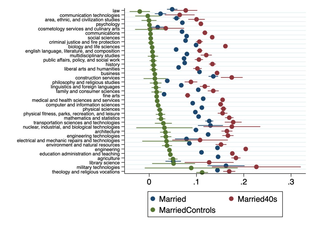
In a May post I described a paper my student my student had written on how college majors predict the likelihood of being married and having children later in life.
Since then I joined the paper as a coauthor and rewrote it to send to academic journals. I’m now revising it to resubmit to a journal after referee comments. The best referee suggestion was to move our huge tables to an appendix and replace them with figures. I just figured out how to do this in Stata using coefplot, and wanted to share some of the results:
Points represent marginal effects of coefficient estimates from Logit regressions estimating the effect of college major on marriage rates relative to non-college-graduates. All regressions control for sex, race, ethnicity, age, and state of residence. MarriedControls additionally controls for personal income, family income, employment status, and number of children. Married (blue points) includes all adults, others include only 40-49 year-olds. Lines through points represent 95% confidence intervals.Points represent coefficient estimates from Poisson regressions estimating the effect of college major on the number of children in the household relative to non-college-graduates. All regressions control for sex, race, ethnicity, age, and state of residence. ChildrenControls additionally controls for personal income, family income, employment status, and number of children. Children (blue points) includes all adults, others include only 40-49 year-olds. Lines through points represent 95% confidence intervals.
Many details have changed since Hannah’s original version, and a lot depends on the exact specification used. But 3 big points from the original paper still stand:
Almost all majors are more likely to be married than non-college-graduates
The association of college education with childbearing is more mixed than its almost-uniformly-positive association with marriage
College education is far from uniform; differences between some majors are larger than the average difference between college graduates and non-graduates
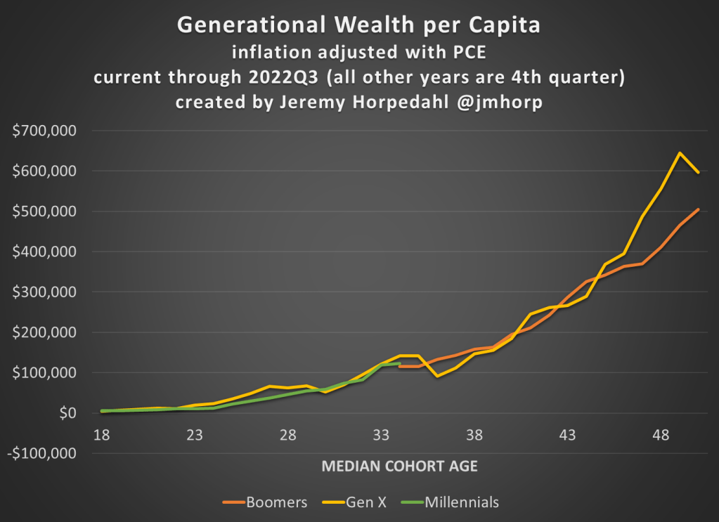
I’ve covered the topic of generational wealth before, and here’s the latest data on how each generation was doing at roughly the same age. The data is updated through the 3rd quarter of 2022.
The main takeaways:
Millennials are roughly equal in wealth per capita to Baby Boomers and Gen X at the same age.
Gen X is currently much wealthier than Boomers were at the same age: about $100,000 per capita or 18% greater
Wealth has declined significantly in 2022, but the hasn’t affected Millennials very much since they have very little wealth in the stock market (real estate is by far their largest wealth category)
I make a hobby of reading, and sometimes acting on, investment advice, particularly regarding high-yielding securities (many of my holdings are now yielding over 10%/year). One of the best authors on the Seeking Alpha investing site writes under the name of Colorado Wealth Management. He mainly writes on REIT (real estate investment trust) stocks, but recently opined on the wisdom of raising interest rates to combat inflation regarding some of the major components of CPI.
His article, Why High Yields Will Be Popular Again, may be behind a paywall for some readers, so I will summarize some key points. He kind of sidesteps the influence of massive federal deficit spending that injected trillions and trillions of new dollars into the economy for COVID, which I think has been the major driver for this inflation; and the reignited deficit spending which is already on the books for November and likely even huger for December of this year. However, he does make some interesting (and new to me) points regarding food prices in particular.
He sees the price 2021-2022 price increases in some major food items as being driven by supply constraints, rather then by excessive demand. Specifically eggs, coffee, and vegetable oils have been hit by exogenous factors which have constrained supply; raising interest rates will not help here, and may even hurt if higher rates make it harder for farmers to recover and re-start high production. I’ll transition to his charts and mainly his excerpted words, in italics below:
Avian Flu, Culled Hens, and the Price of Eggs
The background here is that tens of millions of chickens, including egg-laying hens, have been deliberately killed (“culled”) this year in an attempt to slow the spread of avian flu. This, of course, cuts into the egg supply and raises egg prices. We went through a similar cycle in 2015 with avian flu, where culling led to a rise in egg prices, but then prices fell naturally as a new crop of chicks grew into egg-laying hens. Similarly, the current shortage in eggs should correct itself:
Raising interest rates has never produced additional eggs. Raising interest rates and driving a recession (with larger credit spreads) only makes it more difficult for farmers to get the funding necessary to replace tens of millions of hens that were culled to slow the spread of the avian flu….If interest rates don’t work, what will? The cure for high prices is high prices. We can see how it played out with the Avian flu in 2015:
Is Jerome Powell going to lay even one egg? Probably not.
Are farmers going to focus on turning their chicks into egg-laying hens? Absolutely.
Since eggs go into several other products, it drives inflation throughout the grocery store. Even if a product doesn’t use eggs, the drop in egg production means more people eating other foods.
Drought in Brazil and the Price of Coffee
Coffee prices have been rising rapidly. Well, domestic prices have been rising rapidly. Global prices actually declined since peaking in February 2022:
So, what drove the price up? Brazil normally produces over 35% of the world’s coffee and bad weather in Brazil (not to mention the pandemic impacts) drove dramatically lower production in 2021. As the shortfall in production became evident, global prices began rising rapidly. That’s why the global [wholesale] prices were ripping higher in 2021, not 2022. However, [retail] consumers are seeing most of the impact over the last several months.
War in Ukraine and the Price of Sunflower Oil
Margarine requires vegetable oil. Soybean, palm, sunflower, and canola oil are the key ingredients. What country produces the most sunflower oil? Ukraine. This is one of several inflationary impacts of the war. You can see the impact of reduced supply in the following chart:
Government Bungling in Indonesia and the Price of Palm Oil
What happened to palm oil? How could it soar so much and then fall so hard?
The first issue is that dramatic increases in the price of fertilizer made production more expensive. … That contributed to a reduction in supply. However, Indonesia is the world’s largest exporter of palm oil. Yet exports of palm levy were subject to a huge levy. That made exporting far more expensive. Despite the levy, it was still worth producing and exporting palm oil. Then the Indonesian government decided to simply ban exports over concern about higher domestic prices. Banning exports for a country that produces 59% of the world’s total palm oil exports had a predictable impact.
If you guessed that the supply of palm oil couldn’t be sold domestically, you’d be right. The ban was lifted. However, it was only after:
“High palm oil stocks have forced mills to limit purchases of palm fruits. Farmers have complained their unsold fruits have been left to rot. There were 7.23 million tonnes of crude palm oil in storage tanks at the end of May, data from the Indonesian Palm Oil Association (GAPKI) showed on Friday.“
With palm oil prices at all time-record highs, nearly triple the level from two years prior, the supply was left to rot. Each business tried to make the best decision they could, given the ban on exports. Rather than record profits for mills and record profits for farmers, the produce was wasted. That’s supply constraints for the global market, and it destroys the local economy.
Global prices are plunging now as mills seek to unload their storage. As bad as the higher prices were for the rest of the world, no one suffered worse than the farmers whose product became worthless as a result of government failure.
Contrary to today’s popular opinion, higher interest rates won’t do anything to improve production of vegetable oil.