I’m a big fan of Friedrich Hayek. I first read his work in an academic setting. But many people first encounter him via The Road to Serfdom, his book that outlines the political and social consequences of state economic controls. I always meant to go back and read it, but it usually took a back seat to other works. Now, I’m slowly making my way through.
A lovely snippet includes Hayek explaining the popular sentiment that “it’s only money” or that money-related concerns are base or superficial. Such an attitude is especially common when people recount their childhood or family life during times of financial difficulty. The story often goes “times were hard, but we had each other”. Similarly, a popularly derisive trope is that economists ‘only care about money’ [, rather than the more important things].
A couple years ago, my Co-blogger Mike described his productive, but novice intern. The helper could summarize expert opinion, but they had no real understanding of their own. To boot, they were fast and tireless. Of course, he was talking about ChatGPT. Joy has also written in multiple places about the errors made by ChatGPT, including fake citations.
I use ChatGPT Pro, which has Web access and my experience is that it is not so tireless. Much like Mike, I have used ChatGPT to help me write Python code. I know the basics of python, and how to read a lot of of it. However, the multitude of methods and possible arguments are not nestled firmly in my skull. I’m much faster at reading, rather than writing Python code. Therefore, ChatGPT has been amazing… Mostly.
I have found that ChatGPT is more like an intern than many suppose:
In macroeconomics we have basic tools to help us talk about economic growth, which is simply the percent change in RGDP per capita. What causes growth? Lot’s of things. All else constant, if more people are employed, then more will be produced. But the productivity of those workers matters too. That’s why we calculate average labor productivity (ALP), which is the GDP per worker. This tells us how much each worker produces. All else constant, more ALP means more GDP.*
What affects ALP? Nearly everything: Technology, demographics, health, culture, and public policy. Most of these have long-term effects. So, it’s better to think in terms of regimes. After all, incurring debt now can result in a lot of investment and production, but there’s no guarantee that it can be sustained year after year. This is why I don’t get terribly excited about individual good or bad policies at any moment. There’s a lot of ruin in a nation. I care more about the long-run policy regime that is fostered over time.
Given the variety of inputs to economic growth, there’s always plenty of room for complaint about policy – even if the economy is doing well. In this post, I’m inspired by a Youtube video that a student shared with me. The OP laments poor policy in Massachusetts. But compared to some other nearby states, MA is doing just fine economically. This is not the same as saying that the OP is wrong about poor policies. Rather, a regime of policy, technology, interests, etc. is built over time and there can be a lot wrong in growing economies.
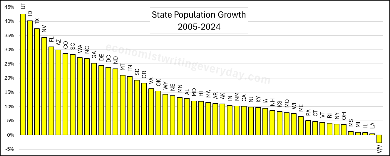
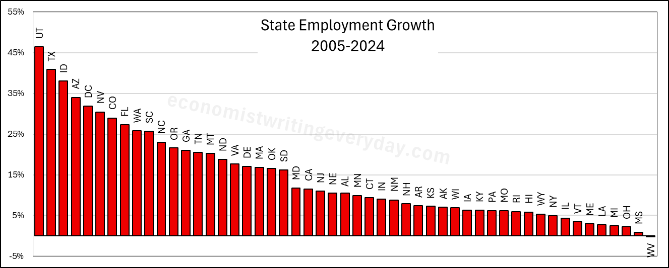
In the interest of being comprehensive, this post includes basic growth stats for all states from 2005 through 2024 (the years of FRED-state GDP).** First, let’s start with the basic building blocks of population, employment, and RGDP. Institutions matter. Policy affects whether people migrate to/from the state, fertility, how many people are employed, and what they can produce.
People like to talk about migration and the flocking to Texas & Florida. But that fails to catch the people who choose to stay in their state. Utah is 43% more populous than it was 20 years ago. But you don’t hear much clamoring for their state policies. Idaho and Nevada also beat Florida in terms of percent change. Where are the calls to be like Idaho? Employment largely tracks population, though not perfectly. The RGDP numbers can change quickly with commodity prices, reflected in the performance of North Dakota. But remember, these numbers cover a 20 year span. So, any one blockbuster or dower year won’t move the rankings much.
Of course, these figures just set the stage. What about the employment-population ratio, ALP, and RGDP per capita? Read on.
The Republicans hold a majority in both chambers of congress and they are the party of the president. They want to use that opportunity to pass substantial legislation that addresses their priorities. Hence, the One, Big, Beautiful Bill (OBBB). But, just like the Democratic party, Republican congressmen are a coalition with various and sometimes divergent policy agendas. There are ‘Trump’ Republicans, who want tariffs, executive orders, and deportations. There are more liberal members who want more free markets. You can also find the odd ‘crypto bro’, blue-state representatives, and deficit hawks. Given the slim majority in the House of Representatives, they all have to get something out of the legislation. Put them together, and what have you got?* You get a signature piece of legislation that no one is happy about but everyone touts.
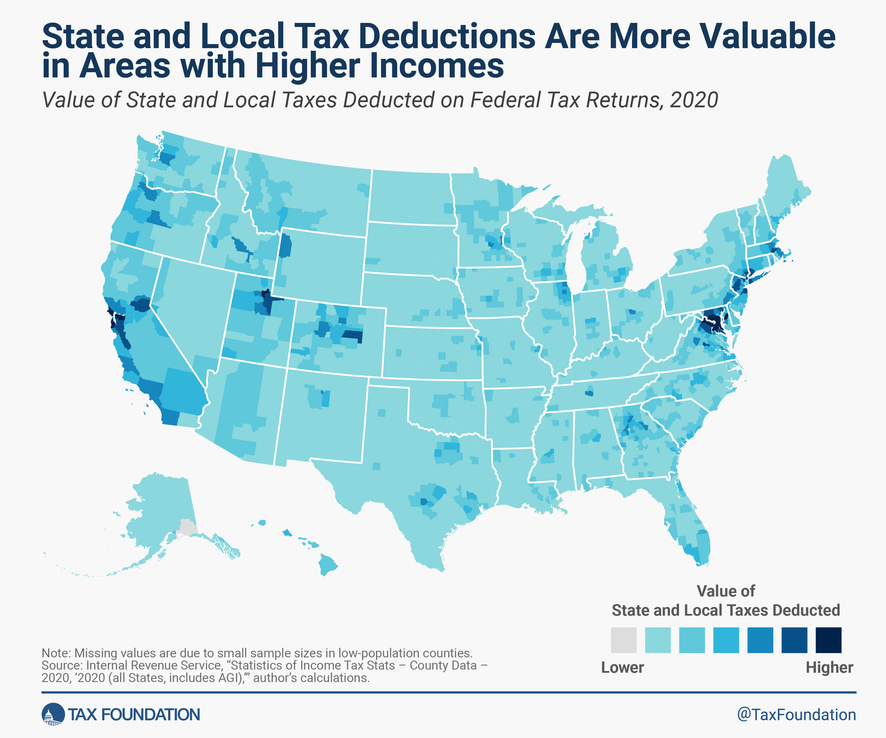
One example of such compromise is the State and Local Tax federal income tax deduction, or SALT deduction. The idea behind it is that income shouldn’t be taxed twice. If you pay a part of your income to your state government in the form of taxes, then the argument goes that you shouldn’t be taxed on that part of your income because you never actually saw it in your bank account. The state took it and effectively lowered your income. The state and local taxes get deducted from the taxable income that you report to the federal government. The reasoning is that you shouldn’t need to pay taxes on your taxes.
Paying taxes on your taxes sounds bad. And plenty of people don’t like one tax, much less two. The Tax Foundation has done a lot of good work to cut through the chaff and has published many pieces on the SALT deduction over the years.**
Cut and Dry SALT Deduction Facts:
It’s a tax cut
It reduces federal tax revenue
It adds tax code complication
It is used by people who itemize rather than take the standard income tax deduction
Prior to the 2017 Tax & Jobs Act, there was no limit on the SALT deduction. After, the limit was $10k.
The current OBBB increases the SALT deduction.
Those are the basics. Everything else is analysis. The Grover Norquist Republicans never see a tax cut that looks bad, so they’d like to see the SALT limit raised or disappear. Tax think tanks that like simplicity don’t like the SALT deduction because it adds complication. Plenty of others say they don’t like complication, but often change their mind when it comes to the details (much like cutting government waste). Think tanks tend to be a bit lonely on this point.
People mostly care about the SALT deduction due to the distributional effects. Who ends up benefiting from the deduction? The short answer is people who 1) itemize & 2) have heavy state and local tax bills. Who is that? Rich people of course! They have high incomes and lots of wealth and real estate – on which they pay taxes. But not all rich people pay loads of state taxes. So the SALT deduction is a tax cut that primarily benefits rich people who live in high tax districts. Where’s that? See the below.
Everybody follows a different path. Sometimes that path includes a late start on saving for retirement. Say that you have $0 in your retirement account right now. Is it too late? What can you get as a result of contributing $100 per month? Maybe more than you think.
Let’s start with an annuity equation that tells us our balance at retirement with some assumptions baked in. Let’s assume that we have zero dollars saved and contribute $100 per month. What rate of return do we earn? The S&P earns an average of 10% per year, which may not keep happening. We can conservatively assume 7.5%, but there are other concerns. Taxes and inflation will both eat away at that. Let’s subtract 2.5% for inflation with the Fisher approximation, leaving a real rate of return of 5%. We’ll chop off 20% due to taxes*. Below is the annuity equation that tells us the balance at retirement, depending on how many years from now you retire.
Assuming that you retire at 65 years of age, the graph below describes your balance at retirement depending on the age at which you started saving $100 per month. Of course, it’s not the balance that most people are worried about. Rather, we care about the implied monthly retirement check. The graph describes that on the right axis too, assuming that constant real payments will be made forever as perpetuity payments. We can see that getting started early matters a lot. But starting at age 40 still gets you real monthly retirement payments that are just shy of $200. That’s not too shabby.
Of course, nobody receives all of the perpetuity payments.
This is an update to a previous post that I did on per-capita real consumption in 1990 vs 2021. As of 2021, we still weren’t sure after the pandemic what was transitory vs structural, and it was unclear whether incomes would keep up with inflation. We now have three more years of data through 2024. News flash: We’re even richer.
I like to use the BEA real quantity indices. Those track what is actually consumed in volumes rather than by deflating total spending by price indices. Divided by population, we can calculate the real quantities of goods and services that people actually consumed per capita.
Even after the pandemic policies have settled down, we are still SO MUCH RICHER – and even richer than we were with all of the pandemic-related stimulus. The worst consumption category since the pandemic has been food and beverage for off-premise consumption, and that is *up* 4.6% since 2020, increasing 31% since 1990. So, while I understand that people can’t enjoy the the low prices of yesteryear, we are still better off in that category than pre-pandemic. In the other categories, everything is awesome.
Since 1990, our consumption of communication services has risen 332%, our houses are 254% better furnished, and we have 118% greater quality-adjusted clothing consumption. All of this is already adjusted for inflation and is per-capita. Since the pandemic, these numbers are still up by 20.4%, 9.8%, and 31.1% respectively. People didn’t like the post-pandemic inflation. I get that. But these improvements in average consumption are mind boggling.
The widespread availability and easy user interface of artificial intelligence (AI) has put great power at everyone’s fingertips. We can do magical things.
Before the internet existed we would use books to help us better interpret the world. Communication among humans is hard. Expressing logic and even phenomena is complex. This is why social skills matter. Among other things, they help us to communicate. The most obvious example of a communication barrier is language. I remember having a pocket-sized English-Spanish dictionary that I used to help me memorize or query Spanish words. The book helped me communicate with others and to translate ideas from one language to another.
Math books do something similar but the translation is English-Math. We can get broader and say that all textbooks are translation devices. They define field-specific terms and ideas to help a person translate among topic domains, usually with a base-language that reaches a targeted generalizability. We can get extreme and say that all books are translators, communicating the content of one person’s head to another.
But sometimes the field-to-general language translation doesn’t work because readers don’t have an adequate grasp of either language. It isn’t necessarily that readers are generally illiterate. It may be that the level of generality and degree of focus of the translation isn’t right for the reader. Anyone who has ever tried to teach anything with math has encountered this. Students say that the book doesn’t translate clearly, and the communication fails. The book gets the reader’s numeracy or understood definitions wrong. Therefore, there is diversity among readers about how ‘good’ a textbook is.
Search engines are so useful because you can enter some keywords and find your destination, even if you don’t know the proper nouns or domain-specific terms. People used to memorize URLs and that’s becoming less common. Wikipedia is so great because if you want to learn about an idea, they usually explain it in 5 different ways. They tell the story of who created something and who they interacted with. They describe the motivation, the math, the logic, the developments, and usually include examples. Wikipedia translates domain-specific ideas to multiple general languages of different cognitive aptitudes or interests. It scatters links along the way to help users level-up their domain-specific understanding so that they can contextualize and translate the part that they care about.
Historical translation technology was largely for the audience. More recently, translation technology has empowered the transmitters.
I have a good friend who is a professor in philosophy at another university. He was telling me about the struggle among his colleagues to determine the recipient of their annual department award. Every year the department chooses from among the graduating philosophy major students one to recognize for excellence. This year, they faced the challenge of incommensurables.
One student had a high GPA in the major, but had a severe case of senioritis and had phoned-in her senior courses. A second had a slightly worse GPA, but had face-planted the senior thesis. Still a 3rd student had merely a good GPA, but wrote an excellent publishable thesis.
The philosophy faculty could not agree. They each shared stories and arguments about the relative weights of the performance indicators and the relative value of the performances. I don’t know if you know any academics, but suffice it to say that they both A) tend not to be good administrators and B) tend not to be invited to productive meetings. I’m glad that I wasn’t in the room.
In fact, the faculty met twice! They were at an impasse. The department award winner is usually no contest. The person who excels in one area tends to also excel in the others. This year, the decision was so unclear and the faculty were so divided that they even seriously considered withholding the award entirely. None of the candidates was excellent on all counts.
Finally, trying to come to a decision – if not an agreement – they decided to adopt something that they’d heard good things about: Ranked Choice Voting. I was thrilled to hear this. What an opportunity to exhibit the nuance and beauty of this collective choice method! They agreed to adopt whatever the outcome would be. As my friend told me this, I was giddy with anticipation. What an exciting story! More good experiences with ranked choice voting may improve its popularity and make widespread its adoption.
If you don’t know, Ranked Choice Voting involves everyone ranking the candidates in order of preference. In this case 1 is most preferred and 3 is least preferred. Then, the candidate with the fewest first-ranked votes is eliminated from the running. The voters whose first preference was nixed now have their votes reallocated to their 2nd preferred candidates. Since only two candidates remain, one of them has won the majority and the election ends with an outcome that is usually considered better than the simple ‘just choose your favorite’ version that most of us use at our local polls.
This post is co-written with John Olis, History major at Ave Maria University.
There is a popular myth that manufacturing jobs of the past provided a leg-up to young people. The myth goes like this. Manufacturing jobs had low barriers to entry so anyone could join. Once there, the job paid well and provided opportunities for fostering skills and a path toward long-term economic success. There is more to the myth, but let’s stop there for the moment. Is the myth true?
One of my students, John Olis, did a case study on Connecticut in 1920-1930 using cross sectional IPUMS data of white working age individuals to evaluate the ‘Manufacturing Myth’. We are not talking causal inference here, but the weight of the evidence is non-zero. The story above has some predictions if not outright theoretical assertions.
Manufacturing jobs paid better than non-manufacturing jobs for people with less human capital.
Manufacturing jobs yielded faster income growth than non-manufacturing jobs.
Implicitly, manufacturing jobs provided faster income growth for people with less human capital.
Using only one state and two decades of data obviously makes the analysis highly specific. Expanding the breadth or the timescale could confirm or falsify the results. But historical Connecticut is a particularly useful population because 1) it had a large manufacturing sector, 2) existed prior to the post WWII boom in manufacturing that resulted from the destruction of European capacity, and 3) had large identifiable populations with different levels of human capital.
Who had less human capital on average? There are two groups who are easy to identify: 1) immigrants and 2) illiterate people. Immigrants at the time often couldn’t speak English with native proficiency or lacked the social norms that eased commercial transactions in their new country (on average, not always). Illiterate people couldn’t read or write. Therefore, having a comparative advantage in manual labor, we’d expect these two groups to be well served by manufacturing employment vs the alternative.
Being cross-sectional, the individuals are not linked over time, so we can’t say what happened to particular people. But we can say how people differed by their time and characteristics. Interaction variables help to drill-down to the relevant comparisons. There are two specifications for explaining income*, one that interacts manufacturing employment with immigrant status and one that interacts the status of illiteracy. The baseline case is a 1920 non-operative native or literate person. Let’s start with the below snapshot of 1920. The term used in the data is ‘operative’ rather than ‘manufacturer’, referring to people who operate machines of one sort or another. So, it’s often the same as manufacturing, but can also be manufacturing-adjacent. The below charts illustrate the effect of lower human capital in pink and the additional subpopulation impacts of manufacturing in blue.
In the left-hand specification, native operatives made 2.2% less than the baseline population. That is, being an operative was slightly harmful to individual earnings. Being an immigrant lowered earnings a substantial 16.8%, but being an operative recovered most of the gap so that immigrant operatives made only 6.1pp less than the baseline population and only 3.9pp less than native operatives. In the right-hand specification, unsurprisingly, being illiterate was terrible for one’s earnings to the tune of 23.4pp. And while being an operative resulted in a 1.2% earnings boost among natives, being an operative entirely eliminated the harm that illiteracy imposed on earnings.
Both graphs show that manufacturing had tiny effects for a typical native or literate individual. But manufacturing mattered hugely for people who had less human capital. So, prediction 1) above is borne out by the data: Manufacturing is great for people with less-than-average human capital.
I just learned about the Bayesian Dawid-Skene method. This is a summary.
Some things are confidently measurable. Other things are harder to perceive or interpret. An expert researcher might think that they know an answer. But there are two big challenges: 1) The researcher is human and can err & 2) the researcher is finite with limited time and resources. Even artificial intelligence has imperfect perception and reason. What do we do?
A perfectly sensible answer is to ask someone else what they think. They might make a mistake too. But if their answer is formed independently, then we can hopefully get closer to the truth with enough iterations. Of course, nothing is perfectly independent. We all share the same globe, and often the same culture or language. So, we might end up with biased answer. We can try to correct for bias once we have an answer, so accepting the bias in the first place is a good place to start.
The Bayesian Dawid-Skene (henceforth DS) method helps to aggregate opinions and find the truth of a matter given very weak assumptions ex ante. Here I’ll provide an example of how the method works.
Let’s start with a very simple question, one that requires very little thought and logic. It may require some context and social awareness, but that’s hard to avoid. Say that we have a list of n=100 images. Each image has one of two words written on it, “pass” and “fail”. If typed, then there is little room for ambiguity. Typed language is relatively clear even when the image is substantially corrupted. But these words are written, maybe with a variety of pens, by a variety of hands, and were stored under a variety of conditions. Therefore, we might be a little less trusting of what a computer would spit out by using optical character recognition (OCR). Given our own potential for errors and limited time, we might lean on some other people to help interpret the scripts.