In aggregate, consumer spending on different broad categories of goods is relatively stable. The year 2019 feels like forever ago – and it was more than half a decade ago. But since then we’ve been hit by a pandemic and an AI shock and a trade war, and tariffs, and… plenty. We live in different times. Except, broadly, consumers are spending their money much as they did six years ago. Let’s compare some data from the 2nd quarter of 2019 and 2025.
First the Spending
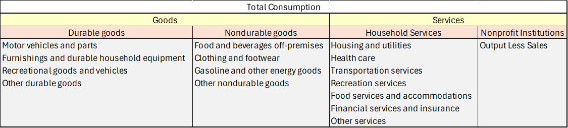
Consumption spending is categorized in the below table.
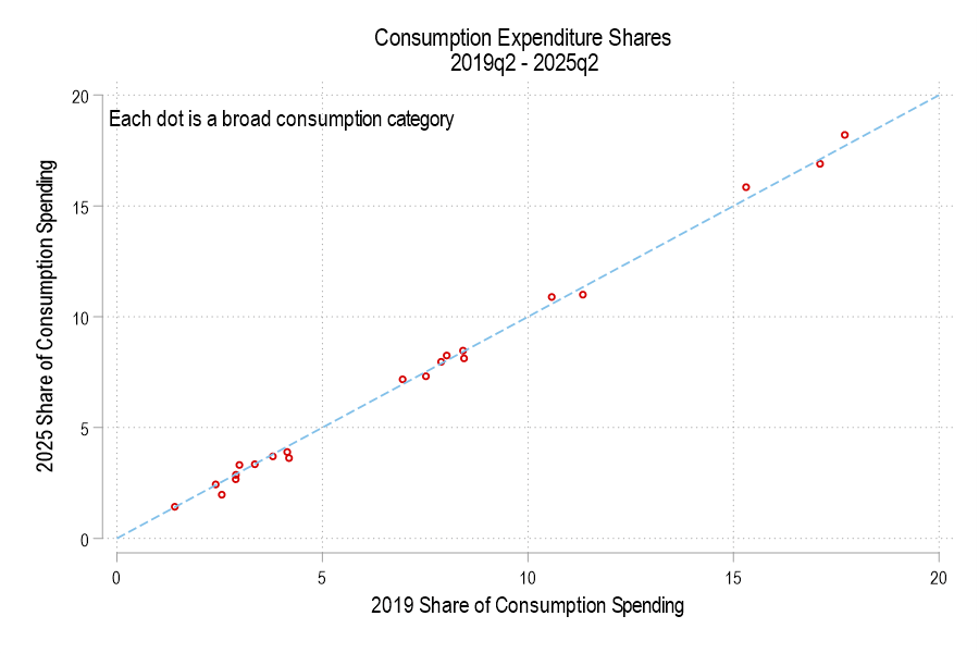
If total consumption spending (not inflation-adjusted) is 100%, then how has the allocation of spending changed? Below is a graph comparing each consumption component’s 2019 share versus 2025. The dotted line denotes an identical share. I haven’t labeled the categories because, suffice it to say, that spending shares are little different. None is more than one percentage point different.
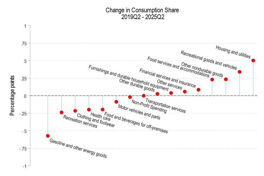
The below figure displays the spending share difference. We’re spending less of our consumption on gasoline and the like, recreational services, and clothing. Surprisingly, we’re also spending less on healthcare and food for off-premises consumption (non-restaurants). However, we’re spending a greater share on housing, recreational goods, food services for on-premises consumption (restaurants).
Much of what economics has to say about tariffs comes from microeconomic theory. But it’s mostly sectoral in nature. Trade theory has some insights. But the effects on the whole of an economy are either small, specific to undiversified economies, or make representative agent assumptions that avoid much detail. Given that the economics profession has repeatedly said that the Trump tariffs would contribute to inflation, it seems like we should look at the historical evidence.
Lay of the Land
Economists say things like ‘competition drives prices closer to marginal cost’. Whether the competitor lives abroad is irrelevant. More foreign competition means lower prices at home. But that’s a partial equilibrium story. It’s true for a particular type of good or sector. What happens to prices in the larger economy in seemingly unrelated industries? The vanilla thinking that it depends on various elasticities.
I think that the typical economist has a fuzzy idea that the general price level will be higher relative to personal incomes in some sort of real-wages and economic growth mental model. I don’t think that they’re wrong. But that model is a long-run model. As we’ve discovered, people want to know about inflation this month and this year, not the impact on real wages over a five-year period.
Part of the answer is technical. If domestic import prices go up, then we’ll sensibly see lower quantities purchased. The magnitude depends on the availability of substitutes. But what should happen to total import spending? Rarely do we talk about the expenditure elasticity of prices. Rarely do we get a simple ‘price shock’ in a subsector. It’s unclear that total spending on imports, such as on coffee, would rise or fall – not to mention the explicit tax increase. It’s possible that consumers spend more on imports due to higher prices, or less due to newly attractive substitutes. The reason that spending matters is that it drives prices in other parts of the economy.
For example, I argued previously that tariffs reduce dollars sent abroad (regardless of domestic consumer spending inclusive of tariffs) and that fewer dollars will return as asset purchases. I further argued that uncertainty makes our assets less attractive. That puts downward pressure on our asset prices. However, assets don’t show up in the CPI.
According to the above discussion, it’s unclear whether tariffs have a supply or demand impact on the economy. The microeconomics says that it’s a supply-side shock. But the domestic spending implications are a big question mark.
What is a Tariff Shock?
That’s the title of a recent working paper from the Federal Reserve Bank of San Francisco. It’s a fun paper and I won’t review the entirety. They start by summarizing historical documents and interpreting the motivation of tariffs going back to 1870. They argue that tariffs are generally not endogenous to good or bad moments in a business cycle and they’re usually perceived as permanent. The authors create an index to measure tariff rates.
Here’s the fun part. They run an annual VAR of unemployment, inflation, and their measure of tariffs. Unemployment in negatively correlated with output and reflects the real side of the economy. Along with inflation, we have the axes of the Aggregate Supply & Aggregate Demand model. Tariffs provide the shock – but to supply or demand?. Below are the IRF results:
We all like high returns on our investments. We also like low volatility of those returns. Personally, I’d prefer to have a nice, steady 100% annual return year after year. But that is not the world we live in. Instead, there are a variety of returns with a diversity of volatilities. A general operating belief is that assets with higher returns tend to be associated with greater return volatility. The phrase ‘scared money don’t make money’ implies that higher returns are risky. The Sharpe ratio is a tool that helps us make sense of the risk-reward trade-off.
Let’s start with the definition.
By construction, the risk-free return is guaranteed over some time period and can be enjoyed without risk. Practically speaking, this is like holding a US treasury until maturity. We assume that the US government won’t default on its debt. Since there is no risk, the volatility of returns over the time period is zero.
Since an asset’s return doesn’t mean much in a vacuum, we subtract the risk-free return. The resulting ‘excess return’ or ‘risk premium’ tells us the return that’s associated with the risk of the asset. Clearly, it’s possible for this difference to be negative. That would be bad since assets bear a positive amount of risk and a negative excess return implies that there is no compensation for bearing that risk.
The standard deviation of an asset’s returns are a measure of risk. An asset might have a higher or lower value at sale or maturity. Since the future returns are unknown and can end up having any one of many values, this encapsulates the idea of risk. Risk can result in either higher or lower returns than average!
Putting all the pieces together, the excess return per risk is a measure of how much an asset compensates an investor for the riskiness of the returns. That’s the informational content of the Sharpe ratio, which we can calculate for each asset using historical information and forecasts. Once we’ve boiled down the risk and reward down to a single number, we can start to make comparisons across assets with a more critical eye.
Sometimes friends or students will discuss their great investment returns. They achieve the higher returns by adopting some amount of risk. That’s to be expected. But, invariably, they’ve adopted more risk than return! That means that their success is somewhat of a happy accident. The returns could easily have been much different, given the volatility that they bore.
Let’s get graphical.
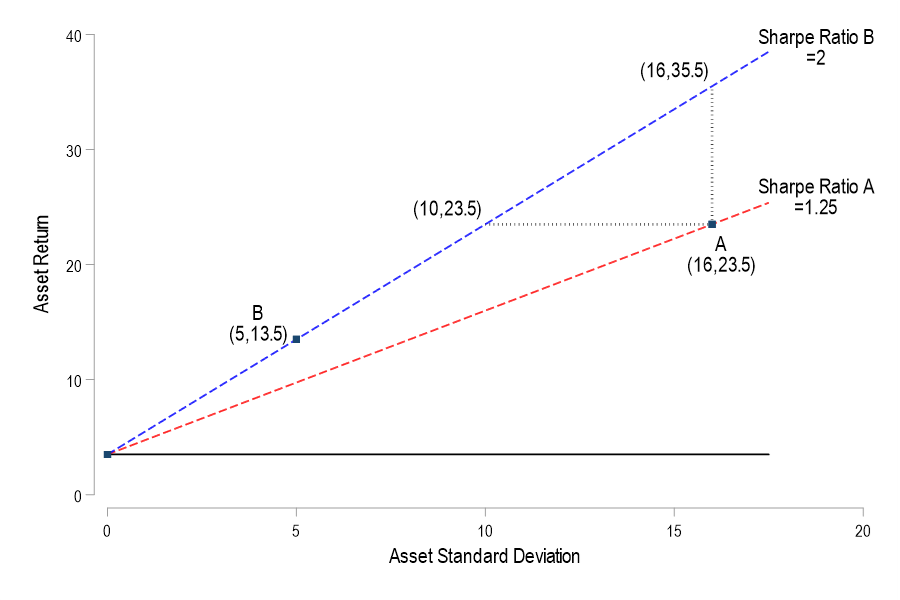
Consider a graph in (standard deviation, return) space. In this space we can plot the ordered pair for some portfolios. The risk-free return occurs on the vertical intercept where the return is positive and the standard deviation is zero. Say that a student was thrilled with asset A’s 23.5% return and that it’s standard deviation of returns was 16%. Meanwhile, another student was happy with asset B’s 13.5% return and 5% standard deviation. With a risk-free rate of 3.5%, the Sharpe ratios are 1.25 & 2 respectively. We can plot the set of standard deviation and return pairs that would share the same constant Sharpe ratio (dotted lines). Solving for the asset return:
The above is simply a linear function relating the return and standard deviation. In particular, it says that for any constant Sharpe ratio, there is a linear relationship between possible asset returns and standard deviations. The below graph plots the two functions that are associated with the two asset Sharpe ratios. The line between the risk-free coordinate and the asset coordinate identifies all of the return-standard deviation combinations that share the same Sharpe ratio. This line is known as the iso-Sharpe Line.
With this tool in hand, we can better interpret the two student asset performances. There are a couple of ways to think about it. If asset A’s 23.5% return had been achieved with an asset that shared the Sharpe ratio of asset B, then it would have had risk that was associated with a standard deviation of only 10%. Similarly, if asset A’s volatility remained constant but enjoyed the returns of asset B’s Sharpe ratio, then its return would have been 35.5% rather than 23.5%. In short, a higher Sharpe ratio – and a steeper iso-Sharpe line – imply a bigger benefit for each unity of risk. The only problem is that a such an nice asset may not exist.
What do portfolio managers even get paid for? The claim that they don’t beat the market is usually qualified by “once you deduct the cost of management fees”. So, managers are doing something and you pay them for it. One thing that a manager does is determine the value-weights of the assets in your portfolio. They’re deciding whether you should carry a bit more or less exposure to this or that. This post doesn’t help you predict the future. But it does help you to evaluate your portfolio’s past performance (whether due to your decisions or the portfolio manager).
Imagine that you had access to all of the same assets in your portfolio, but that you had changed your value-weights or exposures differently. Maybe you killed it in the market – but what was the alternative? That’s what this post measures. It identifies how your portfolio could have performed better and by how much.
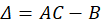
I’ve posted several times recently about portfolio efficient frontiers (here, here, & here). It’s a bit complicated, but we’d like to compare our portfolio to a similar portfolio that we could have adopted instead. Specifically, we want to maximize our return given a constant variance, minimize our variance given a constant return or, if there are reallocation frictions, we’d like to identify the smallest change in our asset weights that would have improved our portfolio’s risk-to-variance mix.
I’ll use a python function from github to help. Below is the command and the result of analyzing a 3-asset portfolio and comparing it to what ‘could have been’.
Over the last two weeks I’ve been learning and writing about possible portfolios, the risk-return boundaries, and the efficient frontiers. This won’t be the last post either. I created a python function that can accept a vector of asset returns and a covariance matrix, then produce the piece-wise parabolic function for all of the possible frontiers. It also optionally graphs them, noting the minimum possible variance.
Previously, I plotted the possible portfolio variances and returns that can result from different asset weights. I also plotted the efficient frontier, which is the set of possible portfolios that minimize the variance for each portfolio return.* In this post, I elaborate more on the efficient frontier (EF).
To begin, recall from the previous post the possible portfolio returns and variances.
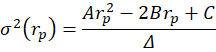
From the above the definitions we can see that the portfolio return depends on the asset weights linearly and that the variance depends on the asset weights quadratically because the two w terms are multiplied. Since the portfolio return can be expressed as a function of the weights, this implies that the variance is also a quadratic function of returns. Therefore, every possible portfolio return-variance pair lies on a parabola. So, it follows that every pair along the efficient frontier also lies on a parabola. Not every pair lies on the same parabola, however – the efficient frontier can be composed on multiple parabolas!
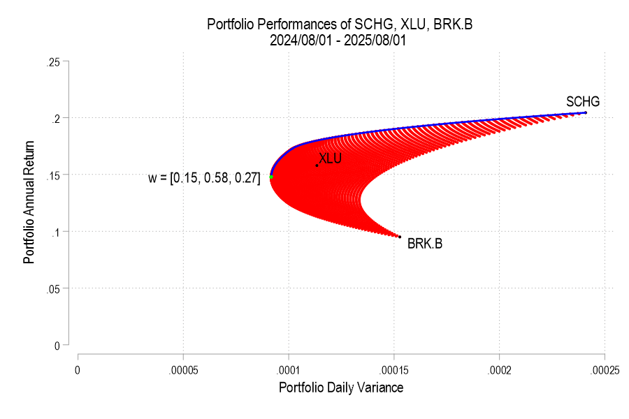
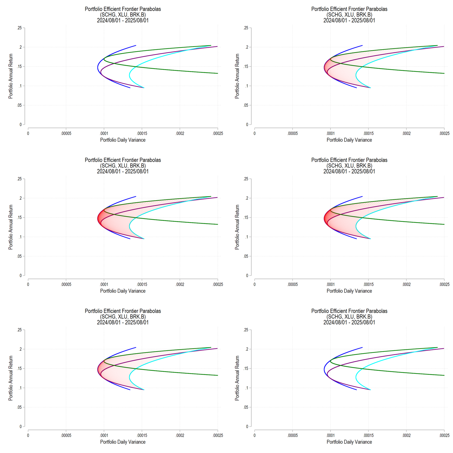
I’ll use the same 3 possible assets from the previous post, below is the image denoting the possible pairs, the EF set, and the variance-minimizing point.
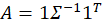
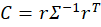
One way to find the EF is to calculate every possible portfolio variance-return pair and then note the greatest return at each variance. That’s a discrete iterative process and it definitely works. One drawback is that as the number of assets can increase the number of possible weight combinations to an intractable number that makes iterative calculations too time consuming. So, we can instead just calculate the frontier parabolas directly. Below is the equation for a frontier parabola and the corresponding graph.
Notice that the above efficient frontier doesn’t appear quite right. First, most obviously, the portion below the variance-minimizing return is inapplicable – I’ve left it to better illustrate the parabola. Near the variance-minimizing point, the frontier fits very nicely. But once the return increases beyond a certain level, the frontier departs from the set of possible portfolio pairs. What gives? The answer is that the parabola is unconstrained by the weights summing to zero. After all, a parabola exists at the entire domain, not just the ones that are feasible for a portfolio. The implication is that the blue curve that extends beyond the possible set includes negative weights for one or more of the assets. What to do?
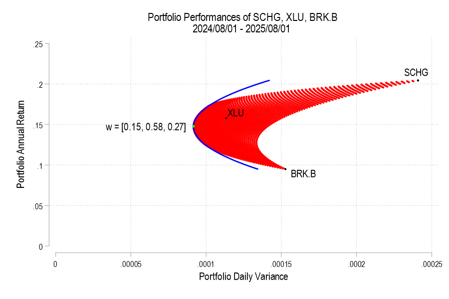
As we deduced earlier, each pair corresponds to a parabola. So, we just need to find the other parabolas on the frontier. The parabola that we found above includes the covariance matrix of all three assets, even when their weights are negative. The remaining possible parabolas include the covariance matrices of each pair of assets, exhausting the non-singular asset portfolios. The result is a total of four parabolas, pictured below.
All of us have assets. Together, they experience some average rate of return and the value of our assets changes over time. Maybe you have an idea of what assets you want to hold. But how much of your portfolio should be composed of each? As a matter of finance, we know that not only do the asset returns and volatilities differ, but that diversification can allow us to choose from a menu of risk & reward combinations. This post exemplifies the point.
1) Describe the Assets
I analyze 3 stocks from August 1, 2024 through August 1, 2025: SCHG (Schwab Growth ETF), XLU (Utility ETF), and BRK.B (Berkshire Hathaway). Over this period, each asset has an average return, a variance, and co-variances of daily returns. The returns can be listed in their own matrix. The covariances are in a matrix with the variances on the diagonal.
The return of the portfolio that is composed of these three stocks is merely the weighted average of the returns. In particular, each return is weighted by the proportion of value that it initially composes in the portfolio. Since daily returns are somewhat correlated, the variance of the daily portfolio returns is not merely equal to the average weighted variances. Stock prices sometimes increase and decrease together, rather than independently.
Since the covariance matrix of returns and the covariance matrix are given, it’s just our job to determine the optimal weights. What does “optimal” mean? This is where financiers fall back onto the language of risk appetite. That’s hard to express in a vacuum. It’s easier, however, if we have a menu of options. Humans are pretty bad at identifying objective details about things. But we are really good at identifying differences between things. So, if we can create a menu of risk-reward combinations, then we’re better able to see how much a bit of reward costs us.
2) Create the Menu
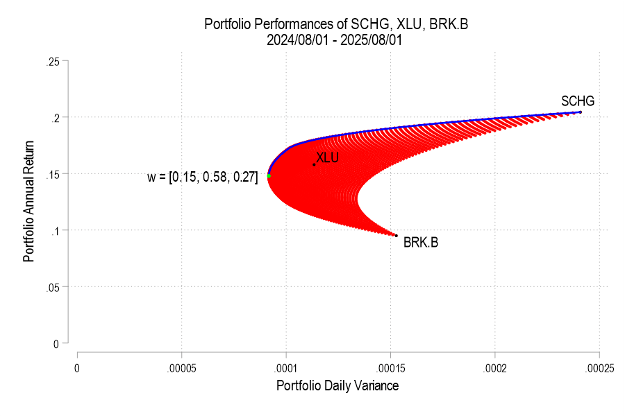
In our simple example of three assets, we have three weights to determine. The weights must sum to one and we’ll limit ourselves to 1% increments. It turns out that this is a finite list. If our portfolio includes 0% SCHG, then the remaining two weights sum to 100%. There are 101 possible pairs that achieve that: (0%, 100%), (1%,99%), (2%,98%), etc. Then, we can increase the weight on SCHG to 1% for which there are 100 possible pairs of the remaining weights: (0%,99%), (1%, 98%), (2%, 97%), etc. We can iterate this process until the SCHG weight reaches 100%. The total number of weight combinations is 5,151. That means that there are 5,151 different possible portfolio returns and variances. The below figure plots each resulting variance-return pair in red.
Jerome Powell’s term as Fed Chair ends in late May 2026. President Trump has said that he will nominate a new chair and the US senate will confirm them. It may take multiple nominations, but that’s the process. The new chair doesn’t govern monetary and interest rate policy all by their lonesome, however. They have to get most of the FOMC on board in order to make interest rate decisions. We all know that the president wants lower interest rates and there is uncertainty about the political independence of the next chair. What will actually happen once Jerome is out and his replacement is in?
The treasury markets can give us a hint. The yields on government debt tend to follow the federal funds rate closely (see below). So, we can use some simple logic to forecast the currently expected rates during the new Fed Chair’s first several months.
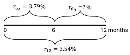
Here’s the logic. As of October 16, the yield on the 6-month treasury was 3.79% and the yield on the 1-year treasury was 3.54%. If the market expectations are accurate, then holding the 1-year treasury to maturity should yield the same as the 6-month treasury purchased today and then another one purchased six months from now. The below diagram and equation provide the intuition and math.
Since the federal funds rate and US treasury yields closely track one another, we can deduce that the interest rates are expected to fall after 6 months. Specifically, rates will fall by the difference in the 6-month rates, or about 49.9 basis points (0.499%). This cut is an expected value of course. Given that the cut is between a half and a zero percent, we can back out the market expectation of for a 0.5% vs 0.0% cut where α is the probability of the half-point cut.* Formally:
Talk to some economists and they’ll tell you that exchange rates aren’t economically important. They say that exchange rates between countries are a reflection of supply and demand for one another’s stuff. So, at the macro, it’s a result and not a determinant of transnational economic activity.
For individual firms at the micro level, it’s the opposite. They don’t affect the exchange rate by their lonesome and are instead affected by it. If you have operations in a foreign country, then sudden changes to the exchange rate can cause your costs to be much higher or lower than you had anticipated. The same is true when you sell in a foreign country, but for revenues. This type of risk is called ‘exchange rate risk’ since it’s possible that none of the prices in either country changed and yet your investment returns change merely because of an appreciated currency.
Supply & Demand
Exchange rates are determined by supply and demand for currencies. Demand is driven by what people can do with a currency. If a country’s goods become more attractive, then demand for those goods rise and demand for the currency rises. After all, most retailers and wholesalers in the US require that you pay using US dollars. Importantly, it’s not just manufacturing goods that drive demand for currency. Demand for services, real estate, and financial assets can also affect the supply and demand for currency. In fact, many foreigners are specifically interested in stocks, bonds, US treasuries, and other investments. The more attractive all of those things are, the more demand there is for them.
Of course, the market for currency also includes suppliers. Who does that? Answer: Anyone who holds dollars and might buy something. Indeed, all buyers of goods or financial products are suppliers of their medium of exchange. In the US, we pay in dollars. Especially since 1972, suppliers have also included other central banks and governments. They treat the US currency as if it’s a reserve of value, such as gold, that can be depended upon if they need a valuable asset (hence the name, “Federal Reserve”). This is where the term ‘reserve currency’ comes from – not from the dollar-denominated prices of some internationally traded commodities. Though, that’s come to be an adopted meaning.
Another major supplier of currency is the US central bank. It has the advantage of being able to print US dollars. But it doesn’t have an exchange rate policy. So, it’s not targeting a particular price of the US dollar versus any other currency. The Fed does engage in some international reserve lending, but it’s not for the purpose of supplying currency to foreign exchange markets.
The US Exchange Rate in 2025
One of the reasons that the US has such popular financial assets is that we have highly developed financial markets and the rule of law. People trust that, regardless of the individual performance of an asset, the rules of the game are mostly known and evenly applied. For example, we have a process to follow when bond issuers default. So, our popularity is not merely because our assets have higher returns. Rather, US investment returns have dependably avoided political risk – relative to other countries anyway.
A periodically recurring conversation on social media is whether imports are bad for GDP. Everyone thinks they are clearly right, and then they lazily defer to brief dismissal of the opposing view. Some of this might be due to media format. Something just a tiny bit more thorough could help to resolve the painfully unproductive online interactions… And just maybe improve understanding.
It starts with the GDP expenditure identity:
The initial assertion is that imports reduce GDP. After all, M enters the equation negatively. So, all else constant, an increase in M reduces Y. It’s plain and simple.
Many economists reply that the equation is an accounting identity and not a theory about how the world works and that the above logic is simply confusing these two things. This reply 1) allows its employers to feel smart, 2) doesn’t address the assertion, & 3) doesn’t resolve anything. In fact, this reply erects a wall of academic distinction that prevents a resolution. What a missed opportunity to perform the literal job of “public intellectual”.
How are Imports Bad/Good/Irrelevant for GDP?
Let’s add a small but important detail to the above equation to distinguish between consumption of goods produced domestically and those produced elsewhere.