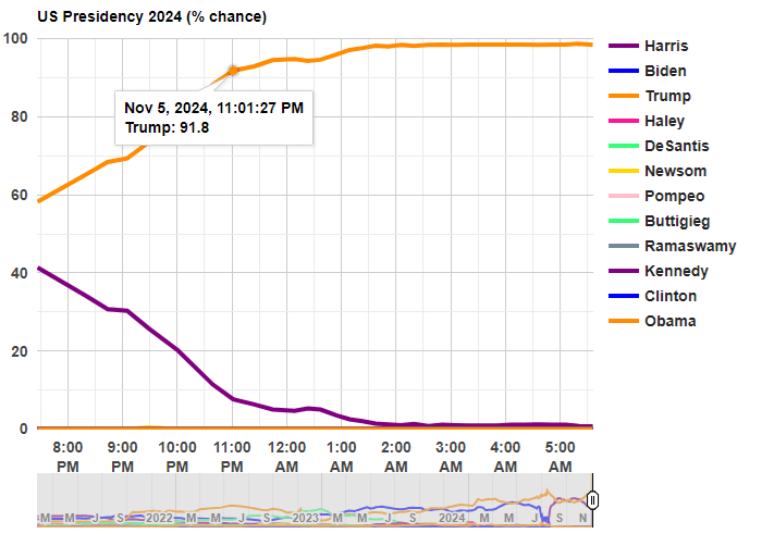
Where Are The 7 Million Missing Men?

You may have heard that there are roughly 7 million men of working age that are not currently in the labor force — that is, not currently working or looking for work. The statistic has been produced in various ways using slightly different definitions by different researchers, but the most well-known is from Nicholas Eberstadt who uses the age cohort of 25-55 years old and gets about 7 million (in 2015). More recently and perhaps more prominently is from Senator JD Vance, and as with almost all issues he has tied this to illegal immigration.

The 7-million-men statistic is true enough, and if we limit it to native-born American men with native-born parents (I assume this is the group Vance is concerned about), we can get right at 7 million non-working men in 2024 by expanding the age cohort slightly to 20-55 year olds.

Why are these men not working? According to what they report in the CPS ASEC, here are the reasons broken down by 5-year age cohort (I drop 55-year-olds here to keep the group sizes equal, which shrinks the total to 6.7 million men):

By far the largest reason given for not working is illness or disability, which is 42% of the total for all of these men, the largest reason for every age group except 20-24 (who are mostly in school if they aren’t working), and it’s the majority for workers ages 30-54 (about 56% of them report illness or disability). Slightly less than 10% report “could not find work” as the reason they weren’t working, which is about 650,000 men in this age group (and are native-born with native-born parents). And over half of those reporting that they couldn’t find work are under age 30 — for those ages 30-54, it’s only about 7% of the total.

More men report that they are taking care of the home/family (800,000) than report not being able to find work (650,000). And a lot more report that they are currently in school — almost 1.5 million, and even though they are mostly concentrated among 20–24-year-olds, about one-third of them are 25 or older.

It’s certainly true that the number of working age men in the labor force has fallen over time. In 1968, 97% of men ages 20-54 had worked at some point in the past 12 months (that’s for all men regardless of nativity, which isn’t available back that far in the CPS ASEC). In 2024, that was down to about 87%. But even if we could wave a magical wand and cure all of the men that are ill or disabled, this would add less than 3 million people to the labor force, not nearly enough to make up for all of the immigrants that Vance and others are suggesting have taken the jobs of native-born Americans.

Interest Rates & Wining

There’s so much to say about interest rates. Many people think about them in the context of whether they should refinance or in terms of their impact on borrowing. But interest rates also matter for production beyond impacting loans for new productive projects. Interest rates aren’t just a topic for debtors.

Interest rates impact all production that takes time. That’s the same as saying that interest rates affect all production – but the impact is easier to see for products that require more time to produce.

There’s this nice model called ‘Portfolio Theory’. Taken literally, it says that everything you own can be evaluated in terms of its liquidity, the time until it will be sold, its expected returns, and the volatility and correlation of those returns. Once you start to look at the world with this model, then it’s much easier to interpret. Buying a car? That’s usually a bad investment. It’s better to tie up a smaller amount of money into that depreciating asset rather than to let a larger sum of money experience dependably negative returns. Of course, this assumes that there are alternative uses for your money and alternative places to invest your resources – hopefully in assets with growing rather than decaying value. People often recommend purchasing used cars rather than new cars. Both new and used cars are bad investments and you can choose to invest a lot or a little.

Producers make a similar calculation. All kinds of things motivate them: love, tradition, excellence…  But everyone responds to incentives. Consider vintners. They might be a farmer of grapes and a manufacturer and seller of wine. They might like to talk about nostalgia, forward notes, a peppery nose, and other finer things. But even they respond to prices and opportunity cost.

Continue reading

Forecasting Swing States with Economic Data

Ray Fair at Yale runs one of the oldest models to use economic data to predict US election results. It predicts vote shares for President and the US House as a function of real GDP growth during the election year, inflation over the incumbent president’s term, and the number of quarters with rapid real GDP growth (over 3.2%) during the president’s term.

Currently his model predicts a 49.28 Democratic share of the two-party vote for President, and a 47.26 Democratic share for the House. This will change once Q3 GDP results are released on October 30th, probably with a slight bump for the dems since Q3 GDP growth is predicted to be 2.5%, but these should be close to the final prediction. Will it be correct?

Probably not; it has been directionally wrong several times, most recently over-estimating Trump’s vote share by 3.4% in 2020. But is there a better economic model? Perhaps we should consider other economic variables (Nate Silver had a good piece on this back in 2011), or weight these variables differently. Its hard to say given the small sample of US national elections we have to work with and the potential for over-fitting models.

But one obvious improvement to me is to change what we are trying to estimate. Presidential elections in the US aren’t determined by the national vote share, but by the electoral college. Why not model the vote share in swing states instead?

Doing this well would make for a good political science or economics paper. I’m not going to do a full workup just for a blog post, but I will note that the Bureau of Economic Analysis just released the last state GDP numbers that they will prior to the election:

Mostly this strikes me as a good map for Harris, with every swing state except Nevada seeing GDP growth above the national average of 3.0%. Of course, this is just the most recent quarter; older data matters too. Here’s real GDP growth over the past year (not per capita, since that is harder to get, though it likely matters more):

RegionReal GDP Growth Q2 2023 – Q2 2024
US3.0%
Arizona2.6%
Georgia3.5%
Michigan2.0%
Nevada3.4%
North Carolina4.4%
Pennsylvania2.5%
Wisconsin3.3%

Still a better map for Harris, though closer this time, with 4 of 7 swing states showing growth above the national average. I say this assuming as Fair does that the candidate from the incumbent President’s party is the one that will get the credit/blame for economic conditions. But for states I think it is an open question to what extent people assign credit/blame to the incumbent Governor’s party as opposed to the President. Georgia and Nevada currently have Republican governors.

Overall I see this as one more set of indicators that showing an election that is very close, but slightly favoring Harris. Just like prediction markets (Harris currently at a 50% chance on Polymarket, 55% on PredictIt) and forecasts based mainly on polls (Nate Silver at 55%, Split Ticket at 56%, The Economist / Andrew Gelman at 60%). Some of these forecasts also include national economic data:

Gelman suggests that the economy won’t matter much this time:

We found that these economic metrics only seemed to affect voter behaviour when incumbents were running for re-election, suggesting that term-limited presidents do not bequeath their economic legacies to their parties’ heirs apparent. Moreover, the magnitude of this effect has shrunk in recent years because the electorate has become more polarised, meaning that there are fewer “swing voters” whose decisions are influenced by economic conditions.

But while the economy is only one factor, I do think it still matters, and that forecasters have been underrating state economic data, especially given that in two of the last 6 Presidential elections the electoral college winner lost the national popular vote. I look forward to seeing more serious research on this topic.

Federalism in Action: The Case of Alcohol and Local Autonomy

Where would you expect Federalism to occur? In other words, where would expect a government to devolve authority to a lower government. Importantly, this is different from freedom vs authoritarianism. The lower government might choose to be more or less free. For example, right now in Florida there is a state-wide constitutional amendment on the ballot that would enshrine each individual’s right to hunt and fish. Ignoring the particulars of what that means, it’s clearly a step toward centralizing policy rather than decentralizing it. Central governments can be strong and protect citizens, or they can strip us of rights. Either way, being small players and far-removed, it’s difficult for us to affect the policy decisions.

That concern is philosophical, however. Maybe my opinion shouldn’t matter (one could easily argue). Even as a matter of prudence, one-size-fits all sets a standard, but the standard may not be a good fit for every locality and circumstance. There is a trade-off between ease of navigating a uniform policy across the land and customized policies that are particular to local priorities. Given that Americans can vote, is there a way for us to think about when a policy will be (should be?) centralized vs decentralized?

There is a great case study by Strumpf & Oberholzer-Gee* on the matter of alcohol policy after the end of national prohibition. The US has a dizzying array of liquor laws across the country and even across states. Some states have a central policy of dry or wet, while others devolve the authority to lower governments. How should we think about that policy? What determines the policy of central versus devolved authority?

Continue reading

Consumer Expenditures in 2023

Today BLS released the annual update to the Consumer Expenditure Survey, which is exactly what it sounds like: a survey of US consumers about what their spending. The sample size is “20,000 independent interview surveys and 11,000 independent diary surveys” so it’s a pretty big sample. And this is a really great data source, because versions of it go back over 100 years (though the current, annual survey with a lot of detail starts in 1984).

What does this new data tell us? One area that has received a lot of attention lately is food spending (including a lot of attention on this blog), especially the cost of groceries. According to the CPI food at home index, grocery prices are up almost 26 percent since the beginning over 2020. That’s a lot! But incomes are up too, so how does this affect spending patterns?

Here’s what food and grocery spending for middle-quintile households looks like:

Compared to the pre-pandemic 2019 levels, consumers are spending slightly less of their income on food (12.7% vs. 13.2%), though a slightly larger share of their income is being spent on groceries (8.1% vs. 7.8%). Those changes are noticeable, though this isn’t the radical realignment of spending patterns you might expect from such a big change in food prices. The reason is clear: while grocery prices are up about 26%, middle-quintile incomes are up a similar 25% since 2019. That’s falling behind a little bit, but incomes have roughly kept pace with rising food prices. And from 2022 to 2023, both of these percentages decreased slightly, by about 0.3 percentage points.

Continue reading

Interpreting New DIDs

If you didn’t know already, the past five years has been a whirl-wind of new methods in the staggered Differences-in-differences (DID) literature – a popular method to try to tease out causal effects statistically. This post restates practical advice from Jonathan Roth.

The prior standard was to use Two-Way-Fixed-Effects (TWFE). This controlled for a lot of unobserved variation over individuals or groups and time. The fancier TWFE methods were interacted with the time relative to treatment. That allowed event studies and dynamic effects.

Continue reading

Our Bizarre Labor Market

The Federal Reserve cut interest rates yesterday for the first time since 2019. They raised rates dramatically in 2022 to fight off high inflation, and kept them high since. This cut signals that they are now less worried about inflation, which is now nearing (but not at) their 2% target, and more worried about the slowing (?) labor market. To me their action was reasonable, but doing a smaller cut or waiting longer would also have been reasonable, because the labor market is giving such mixed signals at the moment.

Most concerning is that unemployment increased from 3.5% last July to 4.3% this July. On previous occasions that unemployment in the US increased that rapidly, we then saw recessions and much more growth in unemployment. But unemployment ticked down to 4.2% last month, and layoffs have been flat:

How do you get a big increase in unemployment without a big increase in layoffs? There are two main ways, one good and one bad, and we have both. The bad news, especially for new graduates, is that hiring has slowed:

But the better news is that there are simply more people wanting to work. This is generally a good sign for the economy; in bad economic times many people don’t count as “unemployed” because they are so discouraged that they don’t bother actively looking for work. In July though, prime-age labor force participation hit 84%, the highest level since 2001:

The prime-age employment-to-population ratio just hit 80.9%, also the highest level since 2001:

Labor force participation and employment-to-population among all adults are not so high, though it could be a positive that many people under 25 are in school and many people over 54 are able to retire. Finally, total payrolls got a big downward revision, but one that still implies positive growth every month.

Looking beyond the labor market though, GDP grew at a strong 3.0% in Q2, and is projected to be similar in Q3. Inflation breakevens are exactly on target. Overall it looks like some recession indicators that worked historically, like the Sahm Rule and Yield Curve Inversion, are about to break down- especially now that the Fed cutting is rates.

Source: New York Fed

The Top 1 Percent Paid a Lot of Taxes in 2021

In 2021 the top 1 percent of taxpayers in the United States paid 36 percent of all federal taxes (they have 21.1 percent of income). This figure had been below 20 percent until the mid-1990s, and as recently as 2019 it was just 24.7 percent (they had 15.9 percent of the income that year).

The data comes from the latest CBO report on “The Distribution of Household Income in 2021.”

The increase is primarily due to a large number of high-income households realizing capital gains in 2021. With all the talk lately of potentially taxing unrealized capital gains, it’s important to note that we do tax realized gains, and these change a lot from year to year. Another contributing factor is that the share of the bottom 60 percent of households only paid 1 percent of federal taxes in 2021, a big drop from 2019 due to a big increase in temporary refundable tax credits.

Better Off Than 4 Years Ago? Median Family Income Edition

Are you better off than you were four years ago? That question was asked at the Presidential debate last night. But more importantly, we also got a massive amount of new data on income and poverty from Census yesterday. That data allows us to make that just that comparison, although somewhat imperfectly.

The Census data is excellent and detailed, but it’s annual data, meaning that the release yesterday only goes through 2023. We won’t have 2024 data for another year. Such is the nature of good data. (Note: I’ve tried to address this same question with more real-time data, such as average wages). Still, it’s a useful comparison to make. It’s especially useful right now because the new 2023 data on income are (for most categories) the highest ever with one exception: 4 years ago, in 2019.

A reasonable read of the data on income (whether we use households, families, or persons) is that in 2023 the median American was no better off than in 2019, after adjusting for inflation. In fact, they were probably slightly worse off. I fully expect this will no longer be true when we have 2024 data: it will certainly be above 4 years prior (2020) and likely above 2019 too (more on this below). But we can’t say that for sure right now.

So let’s do a comparison of “are you better off than 4 years ago” for recent Presidents that were up for reelection (treating 2024 as a reelection year for Biden-Harris too), using the 4-year comparison that would have been available at the time using real median family income. Notice that this data would be off by one year, but it’s what would have been known at the time of the election.

Continue reading