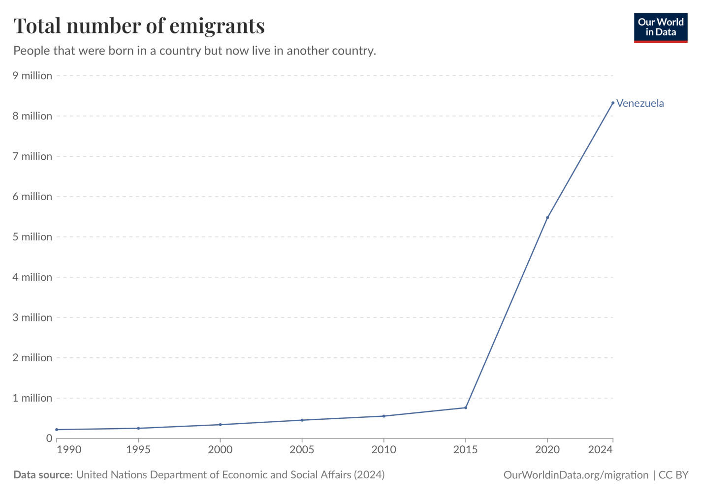
Venezuela held an election this week; President Maduro says he won, while the opposition and independent observers say he lost. Disputed elections like this are fairly common across the world, but where Venezuela really stands out is not how people vote at the ballot box- it is how they vote with their feet.
Reuters notes that “A Maduro win could spur more migration from Venezuela, once the continent’s wealthiest country, which in recent years has seen a third of its population leave.”
This makes Venezuela the largestrefugee crisis in the history of the Americas, and depending on how you count the partition of India, perhaps the largest refugee crisis in human history that was not triggered by an invasion or civil war.
Instead, it has been triggered by the Maduro regime choosing terrible policies that have needlessly and dramatically impoverished the country
Plus some foreshadowing:
I hope that the Venezuelan government will soon come to represent the will of its people. I’m not sure how that is likely to happen, though I guess positive change is mostly likely to come from Venezuelans themselves (perhaps with help from Colombia and Brazil); when the US tries to play a bigger role we often make things worse. But what has happened in Venezuela for the past 10 years is clearly much worse than the “normal” bad economic policies and even democratic backsliding that we see elsewhere.
Here’s an update on the chart I shared then, showing that the diaspora has continued to swell:
I hope that Venezuela will soon become the sort of country people don’t want to flee. I don’t necessarily expect that it will, but it’s not now a crazy hope:
With the arrest of Venezuelan President Maduro, the US is potentially attempting to remake the institutions of yet another country. I say potentially because, as of now, all that has happened is that Maduro was removed. His VP stepped in to replace him, and it appears that, for now, the rest of the structure of government is in place.
Nonetheless, any time the US intervenes in the affairs of another country, it brings back the old debates about regime change, nation building, exporting democracy, etc. Many want to discuss the legal and moral implications of these actions — and these are certainly worth discussing! — but as social scientists we should also ask “does it work?”
For example, one excellent paper on regime change via CIA covert intervention is from Absher, Grier, and Grier. They look at five cases during the Cold War in Latin America of CIA-sponsored regime change, and find moderate declines in income and large declines in democratic institutions. Not a good case for regime change and exporting democracy!
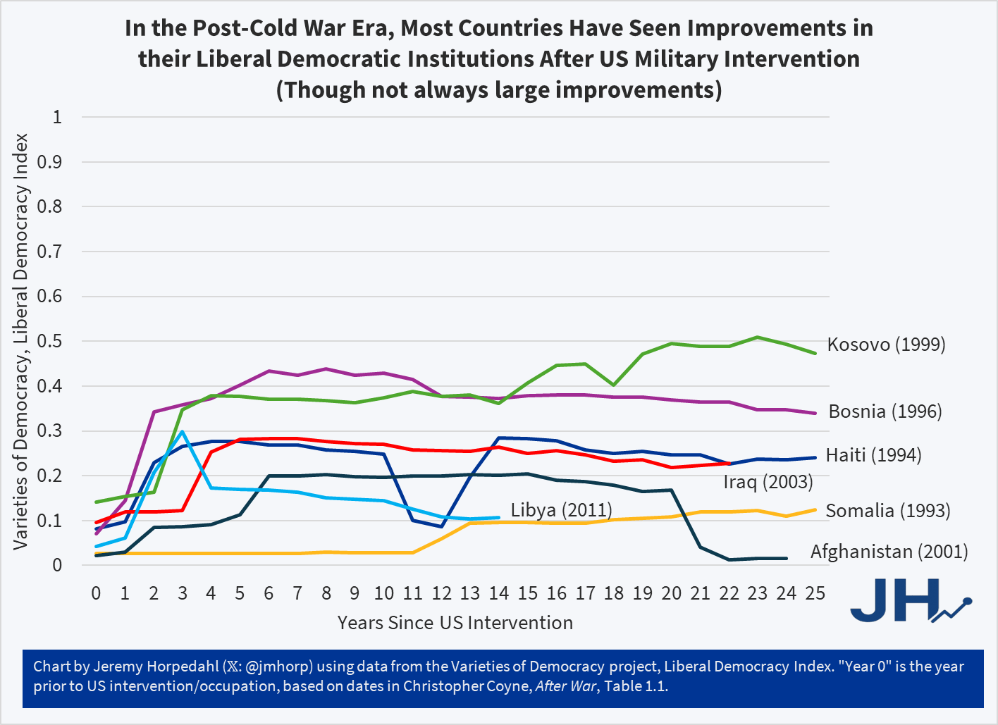
But what if we look at more recent interventions — post-Cold War — and look at direct military interventions by the US, rather than covert CIA operations or indirect funding of factions within a country. This is more in line with what might be happening in Venezuela right now (if regime change is ultimately what the US military pushes for). Using a list from Chris Coyne’s book After War (table 1.1) as a starting point for the relevant cases, and then using data from the V-Dem Liberal Democracy Index, we have seven cases since 1990 to examine (note: I have added Libya to Coyne’s list, which I believe is the only new addition of explicit military intervention since he created the list):
The first thing you might notice is that relevant to their starting position (pre-US military intervention), all except one of these countries saw improvements in their V-Dem Liberal Democracy Score after 25 years (or whatever the end point is for those more recent than 25 years). Some of the improvements — such as Libya, Somalia, and Iraq — are quite small, around 0.1 points on the 1-point scale. But other improvements — especially Kosovo and Bosnia — are quite large, around 0.3 points on the 1-point scale.
The one decline is Afghanistan, though you will note that during the occupation (which lasted a very, very long time, until 2021) their liberal democracy score did improve slightly, about as much as Iraq. I should also note that if we didn’t use my 25-year cut-off, Haiti would also have slipped back to roughly where they were in 1993, with a large decline happening since 2020.
For reference on this scale: the US scores 0.75 in 2024, the best scoring country is Denmark with 0.88, the World average is 0.37 (or 0.29 weighted by population), and the European average is 0.62 (or 0.56 weighted by population).
So while the improvements in Kosovo and Bosnia are impressive, they still fall below the average score in Europe. And those examples point to another problem with my simple analysis: we don’t have the counterfactual of what their score would be without US intervention. That kind of sophisticated analysis is what the above-mentioned Absher paper does (using synthetic control), but it’s more than I can do in a short blog post. Nonetheless, we should note that while we can’t say that US intervention caused these improvements, things didn’t get worse in most countries (as many critics of intervention assume always happens) — Afghanistan being the notable exception after the US ended the occupation.
Now that I’ve got the causation caveat out of the way, we should note a few more limitations of my analysis. First, perhaps the V-Dem Liberal Democracy Index isn’t the best one to use. Our World in Data has seven democratic measurement sets to choose from, and even from V-Dem there are others we could have used. I think Liberal Democracy best captures what we are usually talking about in terms of “does it work?” but you could use another measure. However, glancing through the other available measures, such as Polity, I don’t think the picture would be radically different with another measure of liberal democracy. 25 years is also somewhat arbitrary of a cut-off, though in Coyne’s book he uses 20 years, so I’m going beyond that.
Finally, I want to stress even more than on the causation point: none of these improvements mean the intervention passes a cost-benefit test. There was much destruction of lives and property in all of these cases, the use of US tax dollars, and some other harms to the US and international law (e.g., restrictions of civil liberties in the US from the War on Terror). I do not want to suggest that this means the interventions were worth the cost, merely that they did not fail on this one measure of improving democracy. It is also not a prediction that future interventions, such as in Venezuela, will succeed. Instead, I wrote this post because it goes against my priors (I would not have guessed improvements in 6/7 cases).
Last January I shared a roundup of forecasts for the year from markets and professional economists. Were they any good? Here was their prediction for the US economy:
WSJ’s survey of economists reports that inflation expectations for 2025 were around 2% before the election, but are closer to 3% now. Their economists expect GDP growth slowing to 2%, unemployment ticking up slightly but staying in the low 4% range, with no recession. The basic message that 2025 will be a typical year for the US macroeconomy, but with inflation being slightly elevated, perhaps due to tariffs.
The verdicts (based on current data, which isn’t yet final for all of 2025):
Inflation: Nailed it exactly (2.7%)
GDP: We’re still waiting on Q4, but 2025 as a whole is on track to be a bit above the 2.0% forecast.
Unemployment: 4.6% as of November 2025, a bit above the 4.3% forecast
Recession: Didn’t happen, making the 22% chance forecast look fine
So the professional forecasters were probably a bit low on GDP and unemployment, but overall I’d say they had a good year. What about prediction markets?
For those who hope for DOGE to eliminate trillions in waste, or those who fear brutal austerity, the message from markets is that the huge deficits will continue, with the federal debt likely climbing to over $38 trillion by the end of the year. This is one reason markets see a 40% chance that the US credit rating gets downgraded this year.
While the US has only a 22% chance of a recession, China is currently at 48%, Britain at 80%, and Germany at 91%. The Fed probably cuts rates twice to around 4.0%.
Deficits: Nailed it, the federal debt is currently around $38.4 trillion.
US Credit Downgrade: It’s hard to score a prediction of a 40% chance of a binary event happening, but in any case Moodys downgraded the US’ credit rating in May, so that all three major agencies now rate it as not perfect.
The Fed: Cut rates a bit more than expected.
Foreign Recessions: China and Britain avoided recessions. Germany had a recession by the technical definition of Kalshi’s market, but not really in practice (FRED shows -0.2% Real GDP growth in Q2 followed by 0.00000% growth in Q3). Britain avoiding recession when markets showed an 80% chance was the biggest miss among the forecasts I highlighted.
Overall though, I’d say forecasters did fairly well in predicting how 2025 turned out, in spite of curveballs like the April tariff shock.
If you think the forecasters are no good and you can do better, you have more options than ever. Prediction markets are getting more questions and more liquidity if you’re up for putting your money where your mouth is; if you don’t want to put your own money at risk, there are forecastingcontests with prizes for predicting 2026.
By almost any measure, 2025 was a great year for the United States.
Despite inflation remaining elevated and the damage from new tariffs, the economy did well. Inflation-adjusted median earnings are higher than a year ago, though only by about 1.3%. While most prices are still rising, one bright spot for affordability is that home prices are falling in much of the country (according to Zillow estimates).
The unemployment rate did tick up slightly, from 4.2% last November to 4.6% currently. This is definitely an indicator to watch over the next few months, but it is still well below average.
But even outside of the economy, there is plenty of good news in the data. Crime rates are plummeting. The murder rate fell something like 20%, as well as every major category of crime (violent crime overall is down 10%). This are some of the largest one-year drops in crime the US has ever seen.
Homicides aren’t the only category of deaths that are falling in 2025. For most categories of death as tracked by the CDC, there is a long lag (6 months or more) before all of the deaths are categorized. So we can’t look at complete 2025 data yet. For example, drug overdoses have increased massively in recent years, especially during the pandemic. But after plateauing in 2021-23, drug ODs started falling in 2024 and have continued to fall in early 2025. For the 12 months ending in April 2025, drug OD deaths were 26% lower than the prior 12 months. If we look at just the first 5 months of the year, 2024 was 20% lower than 2023, and 2025 was another 20% lower than 2024. For the first five months of 2025, ODs are basically back down to the same level as 2018 and 2019. Motor vehicle deaths also increased during the pandemic, but they are down 8% in the first half of 2025, essentially back down to 2018-19 levels.
Was it all good news? No, you can certainly find some data to be pessimistic about. For example, despite the efforts of DOGE and other attempts to cut federal government spending, over $2 trillion was added to the national debt in 2025, up 6 percent from the end of 2024 and surpassing $38 trillion. And as I mentioned above with the unemployment rate, there is some evidence the labor market may be weakening.
Not all is rosy as we head into 2026, but 2025 was a year filled with many positive trends on the economic front and in society more generally. May your new year be prosperous and healthy!
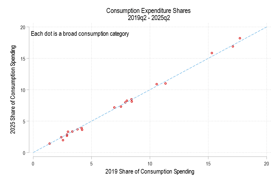
In aggregate, consumer spending on different broad categories of goods is relatively stable. The year 2019 feels like forever ago – and it was more than half a decade ago. But since then we’ve been hit by a pandemic and an AI shock and a trade war, and tariffs, and… plenty. We live in different times. Except, broadly, consumers are spending their money much as they did six years ago. Let’s compare some data from the 2nd quarter of 2019 and 2025.
First the Spending
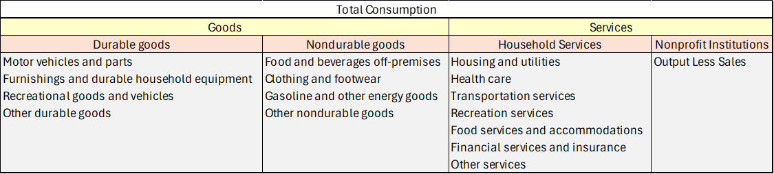
Consumption spending is categorized in the below table.
If total consumption spending (not inflation-adjusted) is 100%, then how has the allocation of spending changed? Below is a graph comparing each consumption component’s 2019 share versus 2025. The dotted line denotes an identical share. I haven’t labeled the categories because, suffice it to say, that spending shares are little different. None is more than one percentage point different.
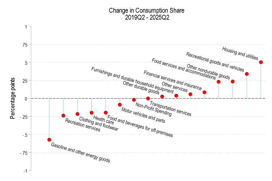
The below figure displays the spending share difference. We’re spending less of our consumption on gasoline and the like, recreational services, and clothing. Surprisingly, we’re also spending less on healthcare and food for off-premises consumption (non-restaurants). However, we’re spending a greater share on housing, recreational goods, food services for on-premises consumption (restaurants).
BLS is slowly (actually, it probably feels very quick for those working on it!) catching up on data releases that were delayed during the federal government shutdown. This week, we saw the release of the November jobs report, which also includes data from October, even though there was no separate release for October. Well, kinda.
For the household survey (which is used to calculate the unemployment rate, among many other measures of the labor market), there is no October report. Because there is no data to be collected. Look at Table A in the employment situation report, and you will see no data in the column for October 2025. Look at the FRED page for the unemployment rate, and you will notice a gap in October. As I wrote a few weeks ago, this is not the end of the world, but it is rather sad for a gap to show up in a series that consistently ran for 933 months back to 1948.
So what is in the jobs report? Lots of new information. A few related areas that have gotten a lot of attention this week are the changes in federal government employment vs. private sector employment, and the changes in native-born vs. foreign-born employment.
Much of what economics has to say about tariffs comes from microeconomic theory. But it’s mostly sectoral in nature. Trade theory has some insights. But the effects on the whole of an economy are either small, specific to undiversified economies, or make representative agent assumptions that avoid much detail. Given that the economics profession has repeatedly said that the Trump tariffs would contribute to inflation, it seems like we should look at the historical evidence.
Lay of the Land
Economists say things like ‘competition drives prices closer to marginal cost’. Whether the competitor lives abroad is irrelevant. More foreign competition means lower prices at home. But that’s a partial equilibrium story. It’s true for a particular type of good or sector. What happens to prices in the larger economy in seemingly unrelated industries? The vanilla thinking that it depends on various elasticities.
I think that the typical economist has a fuzzy idea that the general price level will be higher relative to personal incomes in some sort of real-wages and economic growth mental model. I don’t think that they’re wrong. But that model is a long-run model. As we’ve discovered, people want to know about inflation this month and this year, not the impact on real wages over a five-year period.
Part of the answer is technical. If domestic import prices go up, then we’ll sensibly see lower quantities purchased. The magnitude depends on the availability of substitutes. But what should happen to total import spending? Rarely do we talk about the expenditure elasticity of prices. Rarely do we get a simple ‘price shock’ in a subsector. It’s unclear that total spending on imports, such as on coffee, would rise or fall – not to mention the explicit tax increase. It’s possible that consumers spend more on imports due to higher prices, or less due to newly attractive substitutes. The reason that spending matters is that it drives prices in other parts of the economy.
For example, I argued previously that tariffs reduce dollars sent abroad (regardless of domestic consumer spending inclusive of tariffs) and that fewer dollars will return as asset purchases. I further argued that uncertainty makes our assets less attractive. That puts downward pressure on our asset prices. However, assets don’t show up in the CPI.
According to the above discussion, it’s unclear whether tariffs have a supply or demand impact on the economy. The microeconomics says that it’s a supply-side shock. But the domestic spending implications are a big question mark.
What is a Tariff Shock?
That’s the title of a recent working paper from the Federal Reserve Bank of San Francisco. It’s a fun paper and I won’t review the entirety. They start by summarizing historical documents and interpreting the motivation of tariffs going back to 1870. They argue that tariffs are generally not endogenous to good or bad moments in a business cycle and they’re usually perceived as permanent. The authors create an index to measure tariff rates.
Here’s the fun part. They run an annual VAR of unemployment, inflation, and their measure of tariffs. Unemployment in negatively correlated with output and reflects the real side of the economy. Along with inflation, we have the axes of the Aggregate Supply & Aggregate Demand model. Tariffs provide the shock – but to supply or demand?. Below are the IRF results:
I said years ago on my Ideas Page that we need data and research on Benefit Cliffs:
Benefits Cliffs: Implicit marginal tax rates sometimes go over 100% when you consider lost subsidies as well as higher taxes. This could be trapping many people in poverty, but we don’t have a good idea of how many, because so many of the relevant subsidies operate at the state and local level. Descriptive work cataloging where all these “benefits cliffs” are and how many people they effect would be hugely valuable. You could also study how people react to benefits cliffs using the data we do have.
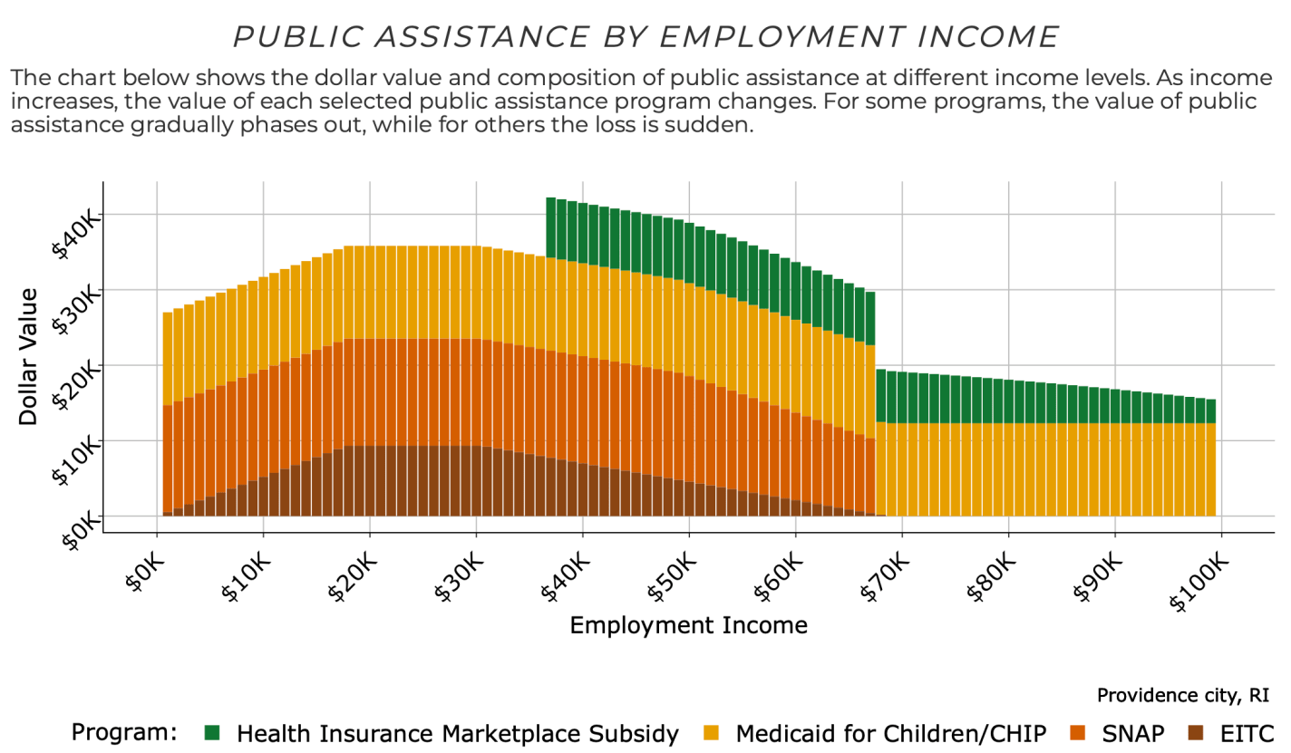
But it turns out* that the Atlanta Fed has now done the big project I’d hoped some big institution would take on and put together the data on benefits cliffs. They even share it with an easy-to-use tool that lets you see how this applies to your own family. Based on your family’s location, size, ages, assets, and expenses, you can see how the amount of public assistance you are eligible for varies with your income:
Then see how your labor income plus public assistance changes how well off you are in terms of real resources as your labor income rises:
For a family like mine with 3 kids and 2 married adults in Providence, Rhode Island, it shows a benefit cliff at $67,000 per year. The family suddenly loses access to SNAP benefits as their labor income goes over $67k, making them worse off than before their raise unless their labor income goes up to at least $83,000 per year.
I’ve long been concerned that cliffs like this in poorly designed welfare programs will trap people in (or near) poverty, where they avoid taking a job, or working more hours, or going for a promotion, or getting married, in order to protect their benefits. This makes economic sense for them over a 1-year horizon but could keep them from climbing to independence and the middle-class in the longer run. You can certainly find anecdotes to this effect, but it has been hard to measure how important the problem is overall given the complex interconnections between federal, state, and local programs and family circumstances.
I look forward to seeing the research that will be enabled by the full database that the Atlanta Fed has put together, and I’m updating my ideas page to reflect this.
*I found out about this database from Jeremy’s post yesterday. Mentioning it again today might seem redundant, but I didn’t want this amazing tool to get overlooked for being shared toward the bottom of a long post that is mainly about why another blogger is wrong. I do love Jeremy’s original post, it takes me back to the 2010-era glory days of the blogosphere that often featured long back-and-forth debates. Jeremy is obviously right on the numbers, but if there is value in Green’s post, it is highlighting the importance of what he calls the “Valley of Death” and what we call benefit cliffs. The valley may not be as wide as Green says it is and it may be old news to professional tax economists, but I still think it is a major problem, and one that could be fixed with smarter benefit designs if it became recognized as such.
Last week I wrote a fairly long post in response to an essay by Michael Green. His essay attempted to redefine the poverty line in the US, by his favored calculation up to $140,000 for a family of four. That $140,000 number caught fire, being covered across not only social media and blogs, but in prominent places such as CNN and the Washington Post. That $140,000 number was key to all of the headlines. It grabbed attention and it got attention. So it’s useful to devote another post this week to the topic.
And Mr. Green has written a follow-up post, so we have something new to respond to. Mr. Green has also said a lot of things on Twitter, but Twitter can be a place for testing out ideas, so I will mostly stick to what he posted on Substack as his complete thoughts. I am also called out by name in his Part 2 post, so that’s another reason to respond (even though he did not respond directly to anything I said).
Once again, I’ll have 3 areas of contention with Mr. Green:
As with last week, I maintain that $140,000 is way too high for a poverty line representing the US as a whole (and Mr. Green seems to agree with this now, even though $140,000 was the headline in all of the major media coverage)
There are already existing alternative measures of what he is trying to grasp (people above the official poverty line but still struggling), such as United Way’s ALICE, or using a higher threshold of the poverty rate (Census has a 200% multiple we can easily access)
His idea of the “Valley of Death” is already well-covered by existing analyses of Effective Marginal Tax Rates, and tax and benefit cliffs. This isn’t to say that more attention is warranted, but Mr. Green doesn’t need to start his analysis from scratch. And this “Valley” is probably narrower than he thinks.
What do portfolio managers even get paid for? The claim that they don’t beat the market is usually qualified by “once you deduct the cost of management fees”. So, managers are doing something and you pay them for it. One thing that a manager does is determine the value-weights of the assets in your portfolio. They’re deciding whether you should carry a bit more or less exposure to this or that. This post doesn’t help you predict the future. But it does help you to evaluate your portfolio’s past performance (whether due to your decisions or the portfolio manager).
Imagine that you had access to all of the same assets in your portfolio, but that you had changed your value-weights or exposures differently. Maybe you killed it in the market – but what was the alternative? That’s what this post measures. It identifies how your portfolio could have performed better and by how much.
I’ve posted several times recently about portfolio efficient frontiers (here, here, & here). It’s a bit complicated, but we’d like to compare our portfolio to a similar portfolio that we could have adopted instead. Specifically, we want to maximize our return given a constant variance, minimize our variance given a constant return or, if there are reallocation frictions, we’d like to identify the smallest change in our asset weights that would have improved our portfolio’s risk-to-variance mix.
I’ll use a python function from github to help. Below is the command and the result of analyzing a 3-asset portfolio and comparing it to what ‘could have been’.