The Washington Post recently ran a fun, data-filled article on berry consumption and parenting. Lots of good tidbits in the article, including that Americans eat a lot more berries than in the recent past, and that a lot of the availability is thanks to foreign trade and imports. But despite being somewhat light-hearted, the article does seem very negative, especially in the title and introduction, about how parents are spending a lot of money on berries.
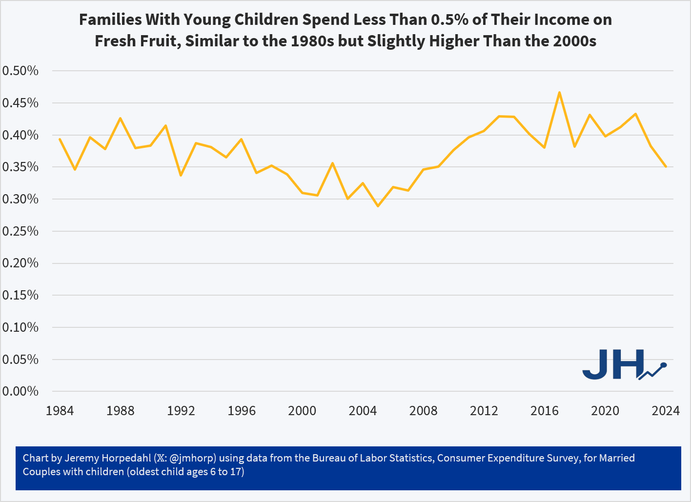
First things first, are berries breaking the budget for parents? Probably not. While the Consumer Expenditure Survey doesn’t give us data on specific types of berry spending, the broader category of Fresh Fruits is a very small share of consumer spending. It has pretty consistently consumed between 0.30% and 0.45% of income for families with children over the past 4 decades. That’s less than $1 out of every $200 of income. True, there has been a slight rise since over the past 20 years or so, but this is still a small share of the budget.
On average, families with children are spending around $600 per year on Fresh Fruit. And that’s all fruit, not just berries! Just a little over $10 per week. But even for an item that families spend a small share of their income on, such as eggs, perhaps the fact that prices have increased so much recently makes families stand up and notice. Berry spending might seem out of control, even if it’s a small share of income.
What does the price data on berries show? My usual source on this the BLS average price data that forms the basis for the CPI, but they only publicly publishes a series for strawberries, not the other famous berries (blueberries, raspberries, etc.). There is one chart on prices in the WaPo article, but it only compares strawberries to bananas over time (they got both of these from BLS). Because banana prices have been very stable in nominal prices over time, it looks like strawberry prices are exploding! But it’s really more notable that banana prices haven’t rise.
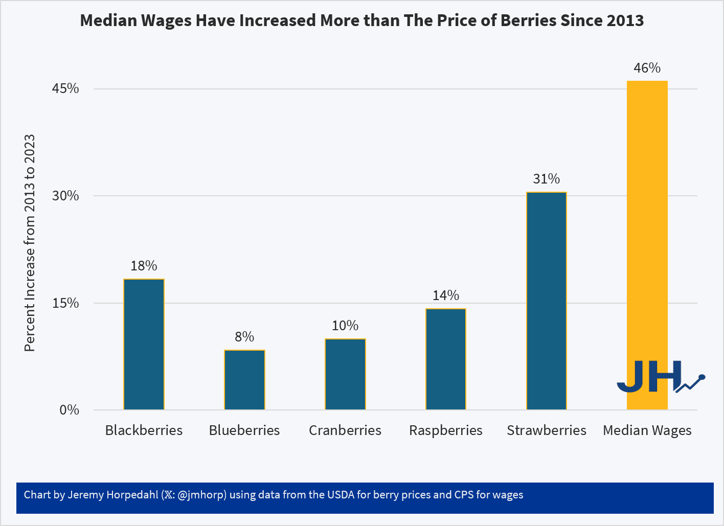
USDA does have some fruit and vegetable specific retail price data, but it only goes from 2013 to 2023. That’s shorter than I would normally like, but it can give us a clue about whether there has been some recent explosion in berry prices. And ending in 2023 isn’t ideal either, but overall inflation has been moderate since 2023, so it’s probably an OK source to use. Here’s what the data shows (prices are for fresh berries, except cranberries which are for dried):
Relative to median wages, berries of all kinds are now more affordable than a decade ago. Parents may still feel squeezed by all the berries their kids are eating, but in terms of affordability and share of the family budget, there is probably no need for a Berry Panic.
Two years ago I wrote about post about how long it took consumer prices to double in the US. The most recent time period looked pretty good compared to most of the 20th century. But lately I’ve seen a lot of social media posts talking about prices doubling (e.g., “you need twice as much income as the 1990s to match the standard of living back then”), so it’s worth looking at again.
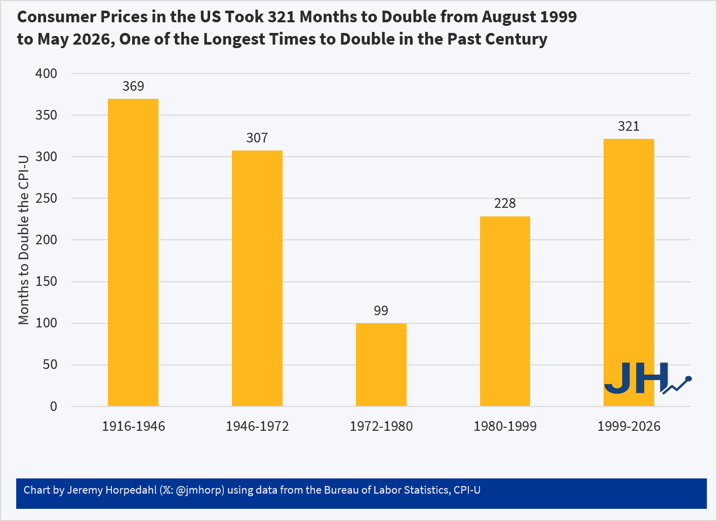
The results aren’t that different:
Using the CPI-U, consumer prices in the US doubled in the most recent 321 months. Not only is that a longer period of time to double than most of the 20th century, in the prior 321 months (November 1972 to August 1999) consumer prices doubled twice: nominal prices were almost 4 times higher in August 1999 than in November 1972!
While the CPI-U does slightly overstate inflation, we don’t get much different results if we used chained indexes. For example, using the PCEPI, it took 390 months for prices to double between October 1993 and April 2026. Either way, prices roughly doubling from some time in the 1990s to today is accurate. But wages have more than doubled since then: you only have to go back to July 2005 for average wages to double (they are up 139% since August 1999 and 190% since October 1993). Or if we use a median wage series (such as EPI’s using CPI data), nominal wages doubled from 2002 to 2025 (I have readjusted that series back to nominal wages). In real terms, median wages are 22 percent since 1999 and 29 percent since 1993.
Of course, it would be better if prices weren’t doubling over any time frame! But the most recent doubling of prices that we lived through is the longest period to double in the lifetime of almost everyone alive in the US today.
I have put a working paper on SSRN describing three ways I incorporated AI into my Business Statistics 200-level class for undergraduates at Samford University in Spring 2026. Read the paper at the link.
Abstract Economics education almost always includes a component of statistics. Most undergraduate economics curricula require an upper-division econometrics course, and many economists teach data analysis. These courses help students become conversant with major contributions in economics research, but they can be challenging to teach. On its own, the mathematics of regression, error minimization, and statistical software may not feel exciting to students, especially compared with the intuitive economic reasoning that often draws them into the discipline. At the same time, students are increasingly interested in artificial intelligence and large language models. This note describes three practical teaching exercises designed to connect ordinary least squares, Excel training, and LLMs. The goal is to use students’ curiosity about AI to motivate classic statistical reasoning and practical spreadsheet skills.
The image is from ChatGPT 5.5 Thinking mode and it took over a minute to generate. The fact that their laptop screen is pointing away from them is funny (unrealistic). The portrayal of Tom Holland and Zendaya is good, which is what the audience cares about. So, this seems like a case of AI hallucinating up the thing that people want.
Citation: Buchanan, Joy, “Connecting Classroom Econometrics and Excel Training with Large Language Models” (May 27, 2026). Available at SSRN: https://ssrn.com/abstract=6839039
Note: I have been posting my papers to SSRN for a long time as a way to distribute them faster and more widely. I have heard rumors that SSRN might stop working, for my purposes. If anyone has suggestions for what I should do about the papers I have up there, please let me know! Or, if you are readying this post-summer-2026 and want a copy, send me a message at my Samford email so I can send you a copy.
Last week I discussed absolute measures of portfolio performance and management, specifically between two portfolios that are composed of different assets (utilities and tech). I began with comparing the basics of return, standard deviation, and Sharpe ratio to some other possible portfolio in the Markowitz cloud. But, simply comparing the difference between these possible portfolios can be sensitive to the spread of stats within a specific Markowitz cloud. In other words, it’s not scale independent. A larger spread of possible stats can make a portfolio look bad due to the spread return/standard deviation/Sharpe ratio alone.
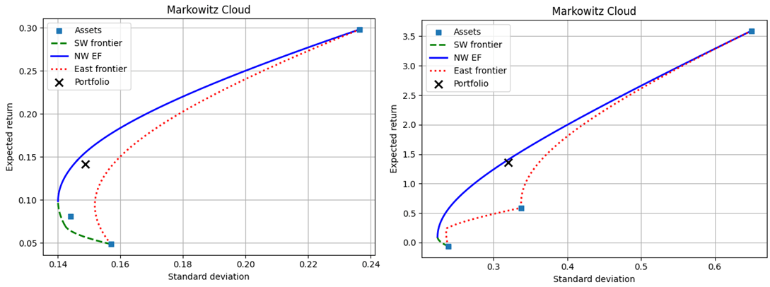
In this post I introduce quasi-relative measures. Again, I lean on the Markowitz cloud. They’re pasted below (Utilities on the left, tech on the right).
If we can somehow express the returns, volatilities, and Sharpe ratios on a common scale that is independent of the level values, then we can make the realized portfolios more comparable. One thing that we can do is to express a stat as a weighted linear average between the maximum and minimum possible values. Conditional on the realized standard deviation, there exists a maximum and minimum of possible return. Something like the below. Rho is the weight on the maximum return. It’s also the proportion of possible conditional returns that are lower than the realized return.
The unconditional version is the same, but would be relative to the global maximum and minimum stats. We can represent the weigh on the maximum return and the percentile among possible returns as gamma.
A final quasi-relative measure of performance is the dissimilarity index between the realized portfolio weights and some reference portfolio weights. This provides a measure of how much the asset weights would need to change in order to adjust the portfolio. If changing portfolio weights is costly, then it’s also a measure of the transaction cost of reallocation. It’s quasi-relative because it is independent of the spread of possible performance stats.
Below are the quasi-relative measures for each the utility and tech company portfolios.
Over the years, many people have tried to create alternatives to the CPI for measuring inflation. Probably the most famous is “Shadow Stats,” which Tim Lee has convincingly shown isn’t actually measuring price inflation (it’s just adding a fixed factor to the CPI).
But the CPI critics keep coming. One that was recently released is called the “Reality Index.” This index tries to improve on the CPI-U in two ways. First, it uses fixed weights for the items in the basket, and importantly it uses the 2024 weights and applies them to past years (this is called a Paasche index). Second, it takes out some BLS prices to avoid using hedonically adjusted prices, and other price calculations that the Reality Index author thinks are weird.
Both of these changes are problematic. I will explain why.
1. Fixed Basket of Goods/Services Doesn’t Make Sense
Many critics of the CPI complain about the shifting weights in the CPI. “We just want to measure the cost of a fixed basket over time.” But measuring a fixed basket over time isn’t actually that useful. I will explain why in a moment. But that’s not even what the Reality Index does! Instead, it takes the 2024 CPI weights (which come from the Consumer Expenditure Survey), and then consistently applies those weights to past years. The Index isn’t measuring the cost of a fixed basket of goods from some past year — it is using the 2024 basket, and assuming that’s what people consumed in the past.
The author of the Reality Index, Tom Elliott, is either confused about this or is being deliberately misleading, for example in a recent WSJ essay promoting the Index, he says “That same basket, the one the government says rose 1.87 times since 2000, has actually risen about 2.4 times.” But that’s false. To do that calculation, you would need to use the 2000 CPI weights and follow them forward to 2024 (this is called a Laspeyres index). Instead, he uses the 2024 weights and follows them backwards. He could do the calculation that he references in the WSJ essay, but he does not.
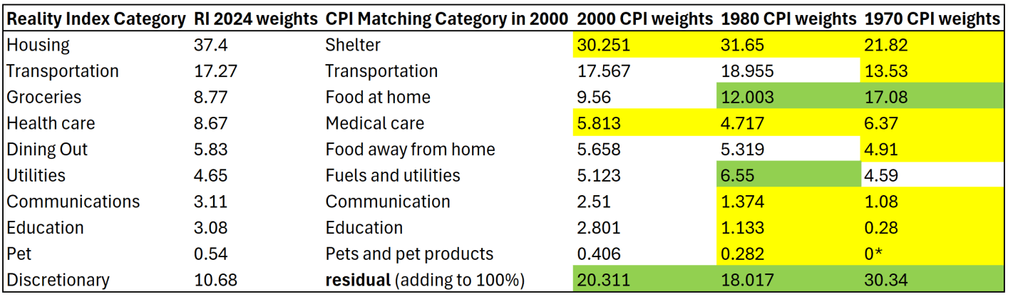
To see why this is a bad approach, let’s compare the weights in the Reality Index with a few past years. I have done my best to translate the weights for the 10 categories listed on this page to actual BLS categories, though I will admit that none of their category weights matched exactly to what I found at BLS. But I’m pretty confident it is correct.
I am also pretty confident that the “discretionary” category is just a residual for everything that wasn’t in the other 9 categories, though I can’t find them explicitly saying this. Yellow highlighting indicates the category in past years was smaller than the 2024 weights. Green highlighting indicates past years were larger weights.
The first thing you might notice is that the CPI weights have changed significantly over time. Relative to 1970, housing/shelter gets almost twice as much weight today. Conversely, groceries/food at home gets about half the weight today as it had in 1970. The “discretionary” category (the residual to make it add to 100%) used to be 30 percent of a household budget, using this approach! That should really give you pause: do we really think a typical household in 1970 considered 30% of their budget to be “discretionary”? I highly doubt it. That discretionary category includes clothing, which was over 10% of household spending in 1970 (it’s around 2% today).
Related to that, you may also notice that categories which have had above average inflation over this time frame — such as housing, healthcare, and education — all have bigger weights today than in the past. Meanwhile, food and clothing have seen less price inflation, but they are weighted much less. This process will tend to overstate inflation of the past, as the CPI in 1970 placed less weight on, say, housing, so when you put more weight on it, of course the inflation rate will go up. And indeed, as the Reality Index’s historical analysis shows, the biggest gaps in inflation between the RI and CPI were in the 1970s (4.9% gap in 1979 and 4.7% gap in 1978). But this is ahistorical: people were not spending 37% of their budget on shelter in the 1970s! In fact, they were spending almost as much on groceries in 1970 as they did on shelter.
The Reality Index is essentially projecting backwards to a fake reality of the past, because it uses the 2024 weights in all past years. But this isn’t capturing anything real about the world, and it is at best an interesting thought experiment. Of course, part of the reason people now spend more of their budget on housing and healthcare is because they have gotten more expensive and to some extent crowded out other spending. But they are also categories we might expect demand to increase as incomes increase (normal goods). And notice this is the opposite of the standard critique of the CPI: as things get more expensive, critics claim the CPI assumes people spend less on those items. Instead, the CPI-U weights are updated each year based on the latest Consumer Expenditure Survey data, and goods/services with higher rates of inflation now consumer more of the weight of the CPI than in the past.
(*Note: the “pet” category is listed as 0% in 1970 because BLS didn’t itemize it separately due to it being so small. That’s of little consequence, since it is such a small share in every year — I’m surprised they didn’t just stuff pets in the discretionary category.)
2. Swapping Quality-Adjusted Measures for Nominal Prices is Often a Bad Idea
Using the 2024 weights for past years is reason enough to not find the Reality Index useful. But let me just say a few words about the substitute prices that the Reality Index uses. The changes are either trying to use something that isn’t hedonically adjusted for quality, or to overcome some of the strange calculations, especially for housing and health care.
The basic idea is that we want to compare the performance of different portfolios or their managers. This is relatively easy as long as the portfolios contain the same assets. Then, the portfolios are simply characterized by the different weights among the different assets. But how do we compare the performance of portfolios whose assets are different? In finance, we usually assume that everyone can invest in everything. But there are plenty of cases in which that’s a bad assumption: when clients want exposure to particular industries, when there are statutory limitations on holding certain assets, or when an individual company is considering specific projects within the same company under conditions of scarce financing.
The most primitive step is to compare the return and standard deviation of two different portfolios. However, higher risk investments tend to have higher returns in dynamic equilibrium. So, if we were to compare the returns of a tech company to a utility company, then we’d often see the tech companies performing better. But, if we compare the volatilities, then the utility companies would tend to perform better. Sharpe stepped in with a ratio to express the excess return (benefit) per standard deviation (the cost). This way, we can compare the price of volatilities between two portfolios. We’ll stick with just these basic 3 measures: return, standard deviation, and Sharpe ratio. (Others do exist)
Let’s put some meat on this with an example. Say that we have two portfolios, each composed of different assets. There’s a utility portfolio that’s composed of NEE, DUK, and SO. There’s also a tech portfolio that’s composed of AMD, MSFT, and NVDA. Both portfolios have weights of (0.33, 0.33, 0.34). The results of the utility versus the tech portfolio are:
Returns: 14.2% vs 136.3%
Standard Deviation: 14.9% vs 32%
Sharpe: 0.684 vs 4.134
Goodness me! The tech portfolio returns much more in absolute terms and much more per unit of risk. It’s twice as volatile as the utility portfolio, but the returns are almost ten times as high. If you could, then many of us would choose the tech portfolio over the utility portfolio. But, what if, for one reason or another, you can only invest in one of the two industries? Or, what if you want to invest your money with a skilled manager, rather than a risky one?
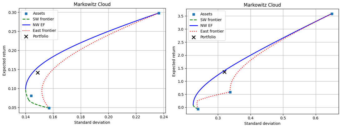
One way to tackle this problem is to introduce the Markowitz cloud. Specifically, we can essentially list out all of the possible portfolios along with their return and standard deviations. Then, we can compare the actual performance to the entire menu of possible performances within each set of assets. Below are the possible performances for the utility (left) versus the tech (right) portfolio. The actual portfolios are marked with an X.
One way to evaluate the two portfolios is to compare their return, standard deviation, and Sharpe ratio to the other candidates that were achievable with the same assets. As we can see, conditional on the assets, neither portfolio minimized the volatility, maximized return, nor maximized the Sharpe ratio. Furthermore, assuming that the realized rate of return was the goal, neither portfolio minimized the conditional volatility. Assuming that the realized volatility was the goal, neither portfolio maximized the conditional return. Below are two tables that describe some candidate alternatives and how they differ from the realized portfolio.
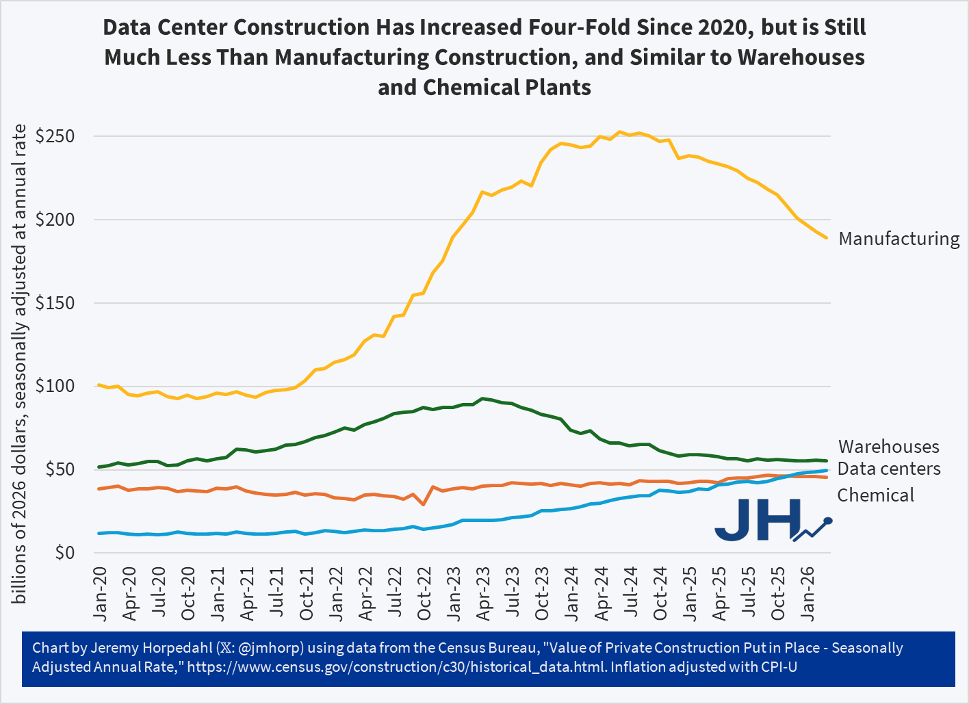
Data centers seem to be popping up everywhere. And based on the value of current construction, the US is indeed building a lot more data centers than we were in 2020 or 2021, about four times as much data center construction (inflation adjusted).
But… did you know that we build a lot more good-old manufacturing than data centers? Almost four times as much in recent months. And that’s even after a decline in manufacturing construction over the past year and a half.
The US also builds about the same amount of warehouses and chemical plants as we do data centers. Data centers may exceed those two categories in a few years, but for now they are pretty similar.
Keep in mind that manufacturing and chemical facilities also use a lot of electricity and water, and have plenty of local negative externalities! Warehouses probably have a lot less resource consumption and external effects, but it’s not zero either.
Are data centers popping up everywhere? Well, people are certainly noticing them. But so are lots of other types of buildings, which rarely register more than a peep from concerned citizens and local media, unless there is some clear and obvious external effect.
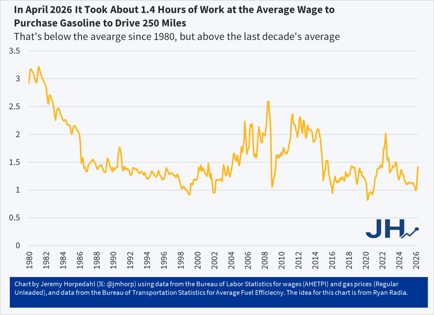
Two months ago I wrote about gasoline prices and tried to give the current prices some historical context. Gas prices have, of course, only continued to increase since then. Here’s a chart I created to give a bit more context, using an idea from Ryan Radia: how much does it cost to drive a car 250 miles? Since fuel efficiency has increased over time, we might be understating how much it costs to drive today relative to the past. And of course, to give the “cost” proper context I have stated in terms of hours worked at the average wage (note: the final data point is from April 2026, as we don’t have wage data for May yet):
In April 2026 it took about 1.4 hours of work at the average wage ($32.23) to purchase enough gasoline to drive 250 miles (10.7 gallons) at the average fuel efficiency (23.4 miles per gallon). That average fuel efficiency figure is from 2024, the latest available, so it could be a bit higher today. Maybe it’s a little easier than 1.4 hours of work to buy it, but even if fuel efficiency had crept up to 25 mpg (that would be a big increase in 2 years, historically speaking), it would still be 1.3 hours of work.
1.4 hours of work is certainly a big jump from earlier in 2026, but you’ll notice it is still on the low end in this chart, and well below the peak we saw in June 2022 of just over 2 hours of work to buy 250 miles worth of gasoline.
But 23.4 miles per gallon is pretty low, as this is includes lots of trucks and SUVs with pretty bad fuel efficiency. What if we looked at some more fuel efficient vehicles?
Here’s a few I checked on (all for 2026 models, with gas and electricity at current national averages):
Toyota Camry: 0.71 hours of work
Chrysler Pacifica Hybrid: 0.61 hours on electric, 1.18 hours on gasoline
Tesla Model Y: 0.37 hours of work
It will probably not surprise you that the all-electric Tesla Model Y is cheaper than the average car to operate at current prices, but you may not have realized that it is almost four times cheaper. But the Toyota Camry, with all models operating as hybrids now, also comes in pretty good at about half the cost of the average vehicle to operate (and the Camry is a very affordable car to purchase). The Chrysler Pacifica hybrid minivan does pretty well too, though even operating only on electricity (30 miles at a time), it’s only slightly more fuel efficient than the Camry.
In the world of academic preprints, arXiv has long been the go-to platform for researchers to share work quickly. But with the explosion of generative AI tools, the repository is drawing a line in the sand.
On May 14, 2026, arXiv moderator Thomas Dietterich announced a clarified enforcement policy. If a submission contains incontrovertible evidence that authors didn’t properly check LLM-generated content, all listed authors face serious consequences.
Attention @arxiv authors: Our Code of Conduct states that by signing your name as an author of a paper, each author takes full responsibility for all its contents, irrespective of how the contents were generated. 1/
— Thomas G. Dietterich (@tdietterich) May 14, 2026
What counts as “Incontrovertible Evidence”? The policy targets clear signs of unchecked AI output, including:
Hallucinated or fake references
Meta-comments left by the model (e.g., “Here is a 200-word summary; would you like me to make any changes?” or placeholder instructions like “fill in the real numbers from your experiments”)
Other obvious errors, plagiarized text, biased content, or misleading claims generated by AI
arXiv’s Code of Conduct already holds every author fully responsible for the entire paper’s contents.
The Penalty
One-year ban from submitting new papers to arXiv.
After the ban, future submissions must first be accepted at a reputable peer-reviewed venue before arXiv will host them.
At first researchers discussing the policy online seemed happy about the one-year ban, but when I pointed out that it is essentially a ban for life to use it at a pre-print venue, some people became nervous.
The one-year ban is actually a forever ban on working papers which is more serious https://t.co/1VGUcUoc15
Why now? arXiv has been overwhelmed by low-effort “AI slop.” These papers are marked by fabricated citations and shallow summaries. This erodes trust in the entire preprint ecosystem.
In response to the complaints (someone like me would be worried that I’ll somehow let an error slip through and then be banned for life from posting working papers), Scientific Director Steinn Sigurðsson shared:
on the whole @arxiv flap about hallucinated references etc
you don't see the stuff we reject… some of it is really really egregious
the decision to impose additional consequences is largely to throttle that stuff so n00bs and bad actors don't trash us trying repeatedly
Elon Musk buying Twitter is the big news this week. He wants to enhance free speech on the site and, according to him, make it more open and fun. Some fans are hoping that he will make the content moderation and ban policy more transparent. Maybe that’s possible.
If no one can be banned, then bad actors will bring the whole platform down. Inevitably, good people get caught in the net, and it’s devastating to be locked out of a platform where your peers are sharing.
However, if you want to be taken seriously by tech folk then ask for a system that is possible. A substantially better experience might be incompatible with the site being free to users.
Part of the problem that I don’t hear people talking about is that a free platform is not easily compatible with good customer service.
For some not-fake work and citations: Buchanan et al. (2024) provided early clear evidence that a mark of LLM-written work is fake citations. And, Buchanan and Hickman (2024) show that certain framings can prompt people to be more suspicious of AI-generated writing, such that they are pushed toward doing a fact-check before believing all claims.
Buchanan, Joy, and William Hickman. “Do people trust humans more than ChatGPT?.” Journal of Behavioral and Experimental Economics 112 (2024): 102239.
Buchanan, Joy, Stephen Hill, and Olga Shapoval. “ChatGPT hallucinates non-existent citations: Evidence from economics.” The American Economist 69.1 (2024): 80-87.
I was listening to an episode of The Deduction, a podcast by the Tax Foundation. As if that first sentence isn’t evident enough, I was reminded of how confusing taxes are – period. Even experts disagree and see grey areas. As I was listening, I thought “man, they need a graph”. So, here we are.
Income Tax Vocabulary
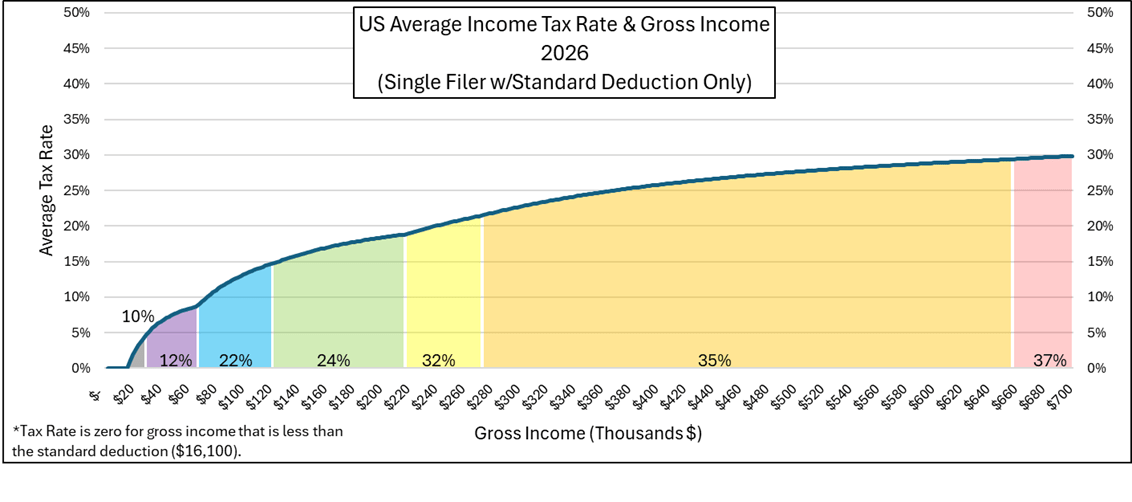
The money that you are paid by your employer is your gross income. Not all of it is taxable. You can deduct money from your gross income to get your taxable income. Most people subtract the ‘standard deduction’ from their gross income, which is how I’ll proceed in this post. Since the standard deduction for 2026 is $16,100 for a single earner, that means that your taxable income is $16,100 less than your gross income. By following a formula, one can calculate the amount of money that they must pay the government. These payments can be all at once, throughout the year, or even directly from your paycheck. The total that’s due to the government by April 15 is called the total tax liability. Finally, the money that the government doesn’t take, and that you get to keep, is called your net income. It’s your income net of taxes.
If you’ve had a job, then you are probably most familiar with your gross income, what your employer pays you, and your net income, what you get to take home. The steps in between might include some hand-waving.
Marginal Tax Rates
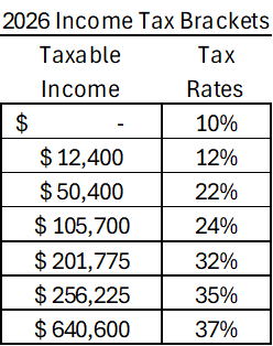
One of the most confusing pieces of the income tax code is marginal income taxes. Below are the brackets for 2026.
Marginal Tax rates work like this: Every dollar that you earn faces a tax rate. If your taxable income would be below zero, then you pay zero in taxes. But if your taxable income is $5k, then it gets taxed at a rate of 10%. That part should be pretty straightforward. But what if your taxable income is $15k? According to the table, you face a tax rate of 10% for dollars earned up to $12,400. That would be a tax liability of $1,240. But the remainder of your $15k in taxable income exists in the next tax bracket. That portion of your taxable income faces a tax rate of 12%. Sticking with the example, $2,600 is in the 12% tax bracket, so the tax liability for that portion of your taxable income is $312 (=$2.6k*0.12). Therefore, your total tax liability would be the sum of your tax liabilities across all applicable tax brackets: $1,552 (=$1,240+$312).
There are some features of marginal tax rates that are worth mentioning. Since the tax rates on the lower taxable income brackets don’t change, earning more gross income never reduces your net income unless the tax rate exceeds 100% (which it doesn’t here). So, when someone says that their taxable income is in the 35% tax rate bracket, they probably just mean that their last dollar earned is there. They’re only paying 35% on the taxable income that’s above $256,225. They’re not paying 35% of all earned dollars to the Internal Revenue Service (IRS).
Below is a graph that details the different marginal tax rates with shaded areas. The blue line is the average tax rate. It’s calculated by dividing the tax liability by the gross income. Even though one might earn an income that’s greater than $257k where the marginal tax rate is 35% or greater, the average tax rate remains lower, topping out at about 30% in this figure. The average tax rate is lower than an earner’s top marginal tax rate because the income in those lower brackets never disappears or get taxed at a higher rate.