Common sense and Bayes’ Rule agree: extraordinary claims require extraordinary evidence
Trust more when papers publicly share their data and code
Trust higher-ranked journals more up to the level of top subfields (e.g. Journal of Health Economics, Journal of Labor Economics), but top general-interest journals can be prone to relaxing standards for sensationalist or ideologically favored claims (e.g. The Lancet, PNAS, Science/Nature when covering social science)
More recent is better for empirical papers, data and methods have tended to improve with time
Overall effects are more trustworthy than interaction or subgroup effects, the latter two are easier to p-hack and necessarily have lower statistical power
Trust large experiments most, then quasi-experiments, then small experiments, then traditional regression (add some controls and hope for the best)
The real effect size is half what the paper claims
That last is inspired by a special issue of Nature out today on the replicability of social science research. An exception to rule #4, this is an excellent project I will write more about soon.
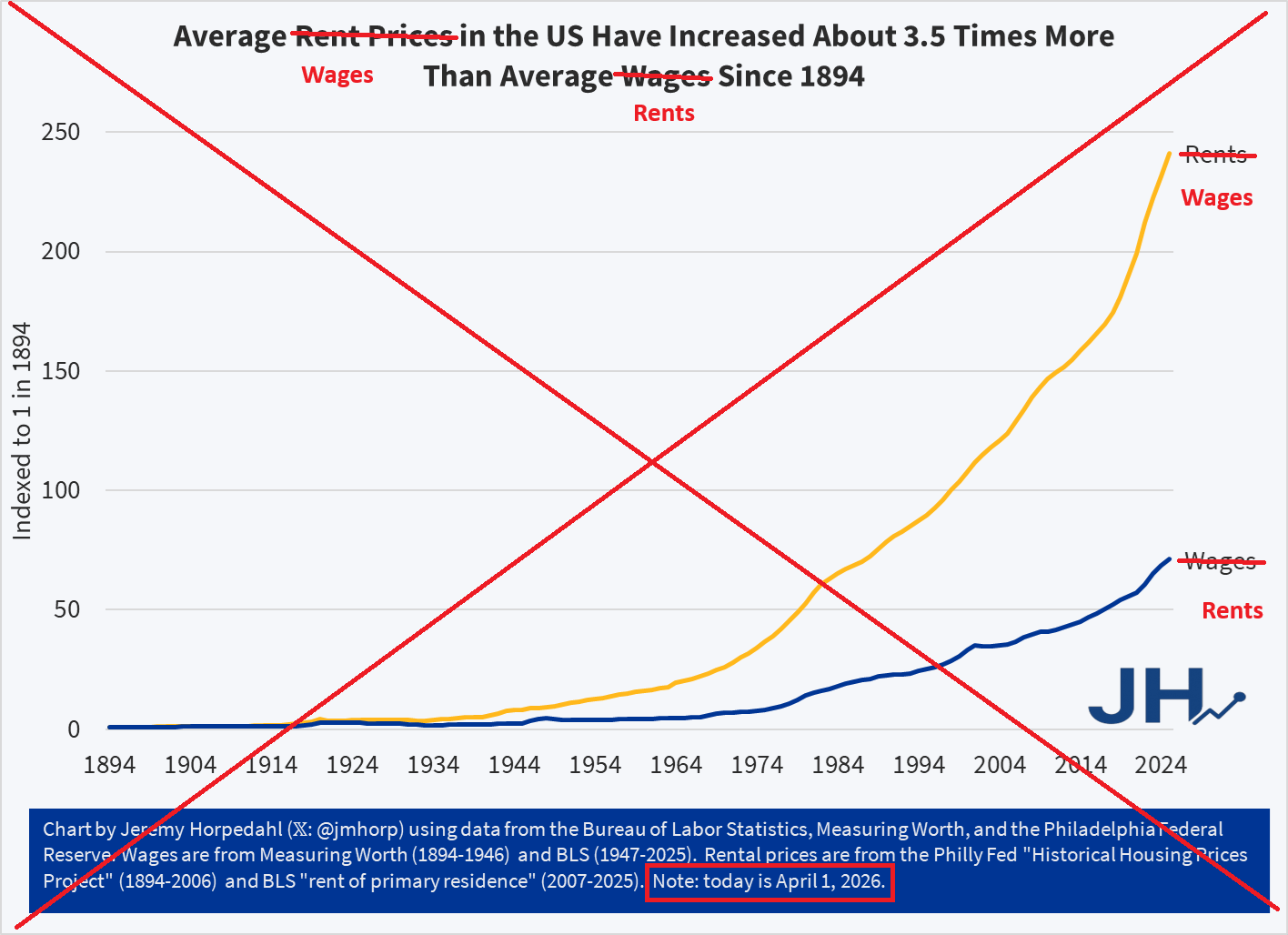
A recent viral Tweet shares a political cartoon from 1894, which shows a worker being squeezed by high rents and low wages. The Tweet claims “the problem has only gotten worse.”
134 years ago this cartoon was drawn, and in 134 years the problem has only gotten worse. pic.twitter.com/vvyLXXEe6s
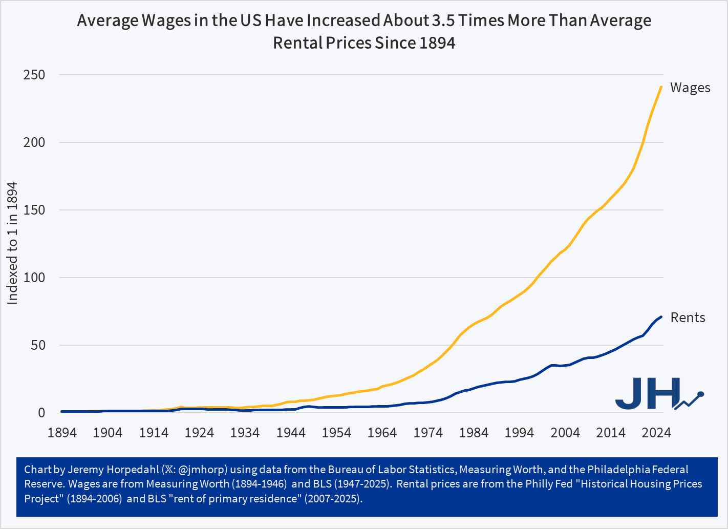
Can this be true? Are workers today actually worse off than they were in 1894? At first blush, this seems obviously wrong. Here is a chart I created showing real (inflation-adjusted) wages since 1894. They are eight times higher today (I have combined two wage series and two price indices, so don’t take this as being perfect, but roughly accurate).
Figure 1
Whatever concerns we might have about high rents today, there must have been some other major improvements in the cost of living relative to wage increases since 1894, given that one hour of work can purchase about 8 times as many real goods and services today.
But is there a narrower case for the cartoon? What if we only focus on wages? We can do this by using a great new resource from the Philadelphia Fed, which provides some long-run data on housing prices in the US, for both purchasing a home and renters. The data series conveniently goes all the way back to 1890, so we can make the comparison with 1894 using the nominal rent index (it ends in 2006, but we can merge it with the modern CPI for rental housing). What if we compare this rental price series to the same wage series I used in the chart above?
Figure 2
The trend in this second chart is very troubling. Rents have increased much faster than nominal wages. While other goods and services may be more affordable, rents — which consume around 24 percent of household income for renters — are rising relative to wages. Sure, we can talk all day about how the quality has improved — larger apartments, indoor plumbing, modern safety features that didn’t exist in 1894 — yet still, renters can only rent what is available. And today rental housing is much more expensive than on April 1, 1894.
APRIL FOOLS!
The data was all correct, other than the fact that I tricked you by swapping the wage and rent lines. Wages have actually increased much faster than rents since 1894 (though they have increased roughly equal rates in recent decades). Sorry for that little trick, I’m a little surprised no one noticed. Perhaps I am just too well-known for being a straight shooter with data. Here is the real chart:
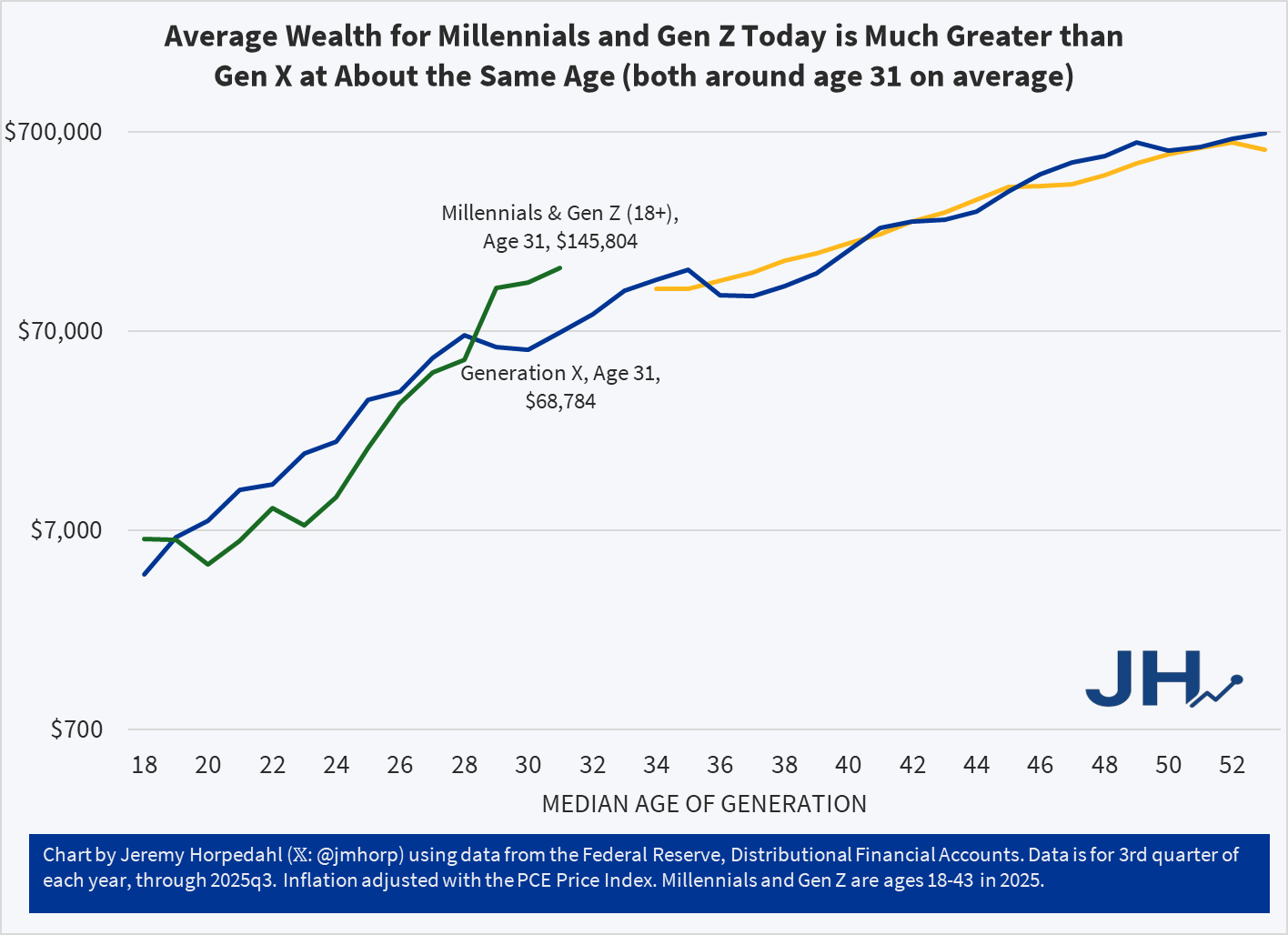
Today I am posting an update to the generational wealth chart that I have posted many times in the past. This update brings the data through the 3rd quarter of 2025 for the youngest cohort, which includes both Millennials and a growing part of Gen Z in the data from the Federal Reserve. I am somehow hesitant to post this chart, as it is starting to be data that is less useful as the younger generations age, for two reasons.
The first problem with the data is that the Fed is lumping everyone from ages 18-43 together as one generation. Given that the youngest Millennials were 29 in 2025, we are now including a significant part of Gen Z, which is OK in itself, but it becomes harder to compare with generations that encompass only 16 or 17 years of birth cohorts. Secondly, the data from the Fed’s Distributional Financial Accounts is only benchmarked every three years with the Fed’s more detailed Survey of Consumer Finances. Currently only the 2022 version of the survey is available, which is now probably a bit out of date. Based on past updates, it is entirely possible that it is underestimating wealth for the youngest cohort. But I think we will have much more certainty about this data once the 2025 SCF is available and used as a benchmark for the DFA data.
With all of those caveats aside, here is the updated chart:
As I am currently working on a book manuscript using the Survey of Consumer Finances, I will be very excited to finally have the 2025 data available. Until then, this is probably the best intergenerational comparison we can do, and it continues to look very positive for the youngest cohorts. With an average of almost $146,000 of wealth for the combined Millennial/Gen Z cohort, they are well ahead of where Gen X was even in their late 30s, and ahead of Boomers at around age 37 as well. All of this bodes well for young people, despite frequent expressions of pessimism, but we should hold off judgement until the 2025 data is fully updated.
If you’ve been on LinkedIn recently, then you may have seen the chatter about teaching your artificial intelligence to have various skills. I saw one post by a guy who claimed to have created several skills, each representing a tech billionaire.
At first, I thought “I am behind the 8-ball. What is this new thing?”. Obviously I know what the word “skill” is and how people use it, but I had not encountered its use in the context of AI having it. What does it mean for an AI to have a skill? I somewhat dreaded the the work of learning the new skill of teaching my AI skills.
Then I had lunch with a computer scientist and I learned that skills are nothing new.
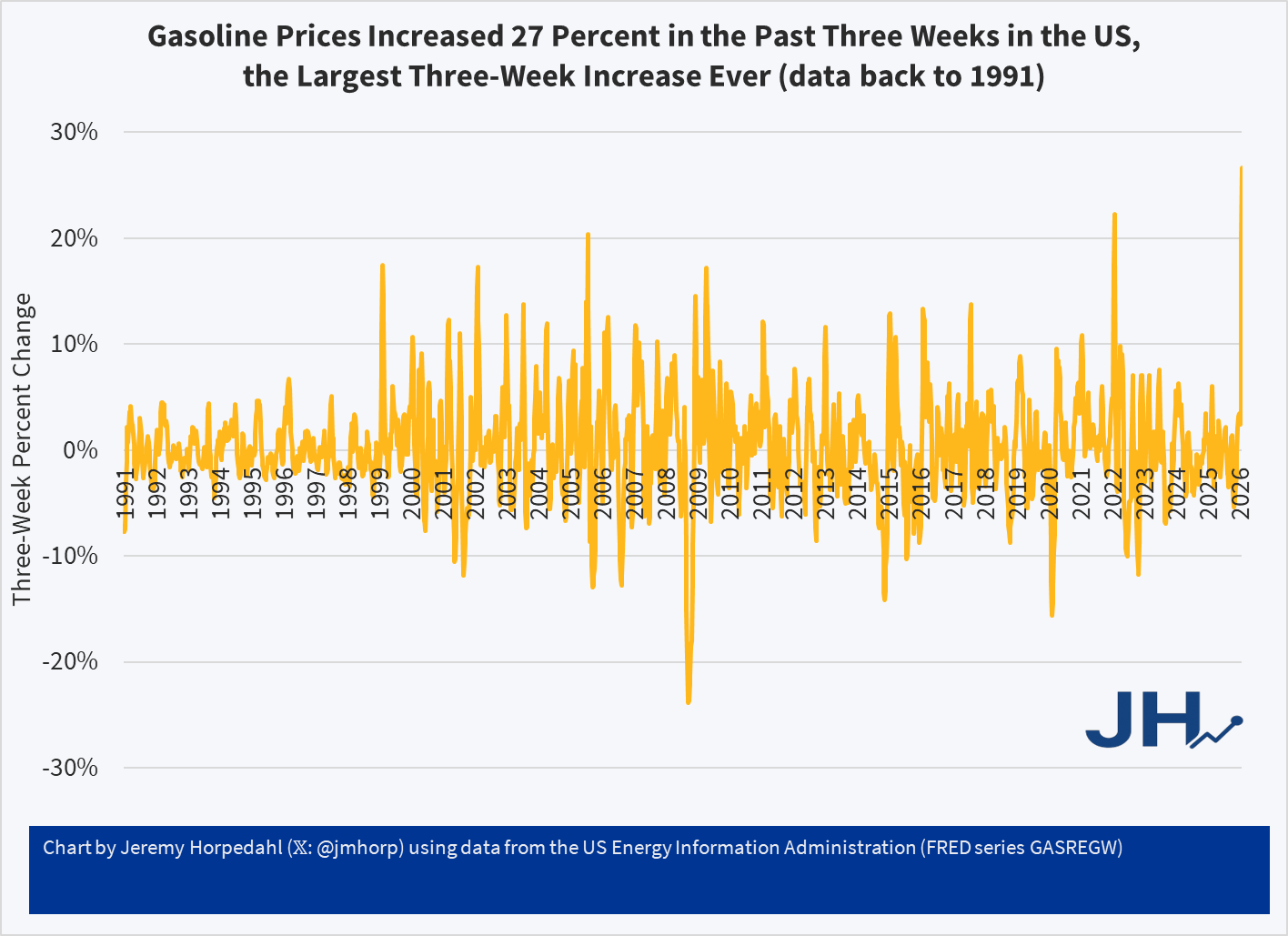
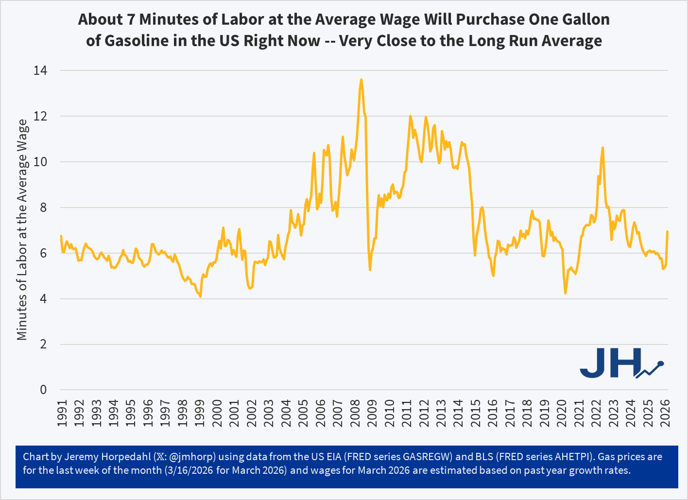
In the (so far) short military engagement with Iran, crude oil and gasoline prices have jumped significantly. The three-week change in gasoline prices at the pump for US consumers was 27 percent, the largest three-week increase consumers in the US have ever seen (with data back through the 1990s). The four-week increase is also a record.
Despite this sharp increase, gasoline prices remain near the long-run average in terms of affordability: it takes about 7 minutes of work at the average wage to purchase a gallon of gasoline. To be sure, this is a big jump of where it had been earlier in 2026, at about 5 minutes of labor. Nonetheless, gasoline is still (for now!) more affordable than it was, relative to wages, for almost all of 2022 and 2023.
The following chart shows cumulative population growth in the US since 2010, from two sources: the natural population growth (birth minus deaths) and international migration:
In total, the US population has increased by about 30 million people since 2010. Cumulatively, about 55 percent of the growth has been from international migration, but there are two distinct periods within this 15-year timeframe. From 2010 to 2020, about 60 percent of the population growth was from natural population change, both cumulatively and in most of those years. From 2021 forward, 70-90 percent of the growth has been from international migration.
The flip in 2021 happens because both factors changed. First, the natural rate of population growth slowed dramatically, with just 146,000 people added to the population, compared with close to 1 million or more before the COVID pandemic. The decline in population growth is a result of gradually slowing birth rates, but also skyrocketing death rates in 2021-2022: about 3.4 million deaths per year, compared with about 2.8 million pre-pandemic. Second, international migration picked up dramatically, from around half a million people in 2019-2020, to an average of over 2 million per year from 2022-2024.
Note: the years in this data run from July to June, so when it says 2025 in the chart, this means from 7/1/2024 to 6/30/2025. Thus, we don’t yet have a full year of data under Trump. But even with the half year under Trump, which includes 6-7 months under Biden when the border policy was already being reversed, the latest year of data from Census suggests the US still had a net international migration of almost 1.3 million people. That’s half the number from 2024, but still well above pre-pandemic numbers. Keep in mind that these are estimates, subject to change, and estimating changes in the illegal immigrant population is often very difficult to do accurately. But these are probably the best estimates that we have right now.
What does the future hold? Of course, any future projection has to make assumptions about how both the birth rate and immigration rate will change over the coming years. But a recent estimate from CBO suggests that by around 2032-2033 the natural rate of population growth will essentially hit zero, and that by the early 2050s it will be so negative as to completely offset the projected immigration. In other words, total population growth could essentially be zero in the US by 2055 or so. That’s 30 years in the future, so take it with a grain of salt, as any small change in immigration, births, or deaths could throw that projection way off. But it seems like a fairly likely scenario.
During president Trump’s first term in office, he made a bunch of waves (as he’s wont to do). His more educated supporters said that he engaged in substantial deregulation of telecommunications, which got a lot of press. There was a quiet contingent of educated voters who were relatively silently supportive on Trump’s regulatory policy, even if his character was indefensible or his other policy was less desirable.
But was Trump a great deregulator? Or was it one of those cases when we say that he regulated *less* than his fellow executives? The George Washington University Regulatory Studies Center can help shed some light with their data. Specifically, they have calculated the number of ‘economically significant’ regulations passed during each month of each president going back through Ronald Reagan’s term. What counts as ‘economically significant’? The definition has changed over time. But, generally, ‘economically significant’ regulations:
“Have an annual [adverse] effect on the economy of $100 million or more
Or, adversely affect in a material way the economy, a sector of the economy, productivity, competition, jobs, the environment, public health or safety, or State, local, or tribal governments or communities.”
The only exception to this is between April 6, 2023 and January 20, 2025 when the threshold was raised to $200 million.
The Data
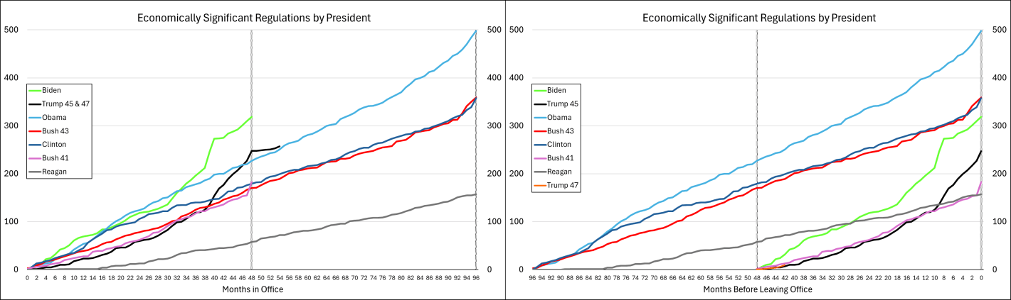
The graph below-left shows the number of economically significant regulations for each president since the start of his term, through July of 2025. It’s reproduced from the link above except that I appended Trump’s second term onto his first term. What does the graph tell us? There doesn’t seem to be much of a difference between republicans and democrats. Rather, it seems that, generally, the number of economically significant regulations increases over time. Importantly, the below lines are cumulative by president. So each year’s regulations each cost $100m annually and that’s on top of the existing ones already in place. So, regulatory costs generally rise, with the caveat that we don’t see the relief provided by small or rescinded regulations (for that matter, we don’t see small regulatory burdens here either). Something else that the below graph tells us is that presidents tend to accelerate their economically significant regulations prior to leaving office. Reagan was the only exception to this pattern and he *slowed* the number of regulations as the end of his term approached.
Below-right is the same data, but the x-axis is months until leaving office. Every president since Bush-41 has accelerated their burdensome regulations during their final months in office. The timing of the acceleration corresponds to how close the preceding election was and whether the incumbent president lost. Whereas all presidents regulate more in their last 2-3 months in office, the presidents who were less likely to win re-election started regulating more starting around eight months prior to leaving office. Of course, they wouldn’t say that they expected to lose, but they sure regulated like there was no tomorrow.
What about Trump? Trump’s fewer regulations is caused by his single term. He definitely still added to the regulatory burden (among economically significant regulations, anyway). While Trump started with the fewest additional regulations since Reagan, and Biden started with the most ever initial regulations, together they earn the top prizes for most regulations added in their first term.
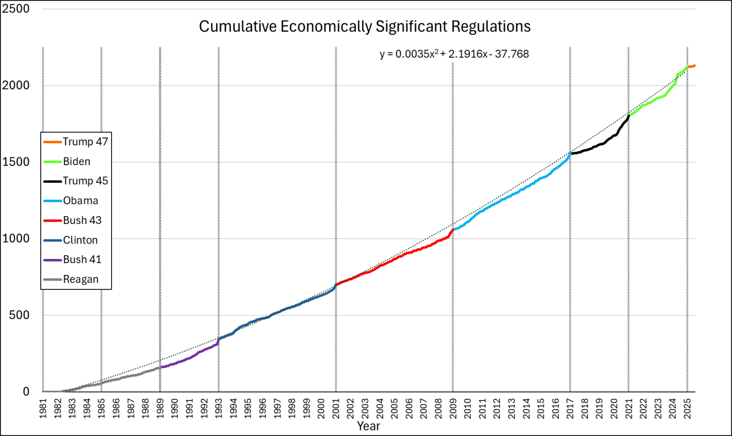
What if we append these regulations from end-to-end? That’s what the below chart does. We do have to be careful because the series is a measure of gross economically significant regulations and not net economically significant regulations. So, it’s possible that some rescissions dampened the below values, but this is the data that I have for the moment. While each presidential administrations increases regulation more than the prior, the good news is that the rate of change is not exponential. The line of best fit is quadratic. We’re experiencing growing regulations, but at least it’s not compound growth.
The Cost
We can estimate the costs of these economically significant regulations. It’s a rough cut, and definitely a lower bound since rescission is rare and $100 million is itself a lower bound, but we can multiply the number of regulations by $100m to get minimum annual cost. Like I said, the Biden criterion from April 2023 through January 20, 2025 changed, so those regulations get counted as $200 million instead. The change in definition means that the regulation counts underestimate the late-term Biden regulations relative to the other presidencies.
A recent essay by Jeffrey Tucker asks “Has Life Really Improved in Half a Century?” Specifically, Mr. Tucker is interested in measuring median income of families (he uses household income, but families are clearly what he is interested in).
Tucker grants that real median household income has increased by about 40 percent from 1984 to 2024 (if he had used family income instead, the increase is almost 50 percent). But… he says this is illusory. That’s because it now takes two incomes to achieve that median income, whereas it only took one income in the past:
“Adding another income stream to the household is a 100 percent rise in work expectations but it has yielded only a 20-plus percent rise in material income. The effective pay per hour of work for the household has fallen by 40 to 50 percent!”
(He makes a data error by saying that in 1976 real median household income was $68,000-$70,000, when it was actually $59,000 in 2024 dollars in 1976 — real income didn’t fall from 1976 to 1984!)
The flu and covid-19 vaccines don’t work super well. Both vaccines permit infection and transmission at quite high rates. The benefit from these vaccines come largely from reductions in mortality or severe symptoms conditional on infection. The covid-19 vaccine is itself especially risky or ineffective depending on the age and health of the individual. Plenty of people eschew vaccines.
I live in Collier County, Florida where there have been 61 confirmed cases of measles so far this year. I have since learned that Measles is EXTREMELY contagious. It floats around the air and on items and just sort of hangs out and waits for a place to replicate. I’ve also learned that symptoms include a fever, eye irritation, possible brain swelling, severe dehydration, and a characteristic rash. The severe dehydration easily puts people in the hospital, the eye irritation can lead to permanent vision loss, and the brain swelling can be acute, or a symptom delayed by 5-6 years, which can also be fatal. I’ve also learned that having the vaccine, which is usually administered in two doses, provides about 97% immunity. The vaccine works so well, that the department of health recommends no behavioral change among the vaccinated population when there is a measles outbreak. Barring unique circumstances, measles immunity can persist for a lifetime.
Unfortunately, a large segment of the anti-vaccine mood affiliation retains the salience of the covid-19 vaccine characteristics. Other vaccines and diseases in the typical pediatric schedule are not similar. Most of these prevent infection >90% of the time (TDAP is low at 73%), prevent transmission, reduce mortality when there are breakthrough infections, are effective for years or decades, and are extremely safe for all age groups.
The risks of disease versus the corresponding vaccine are orders of magnitude away from each other. The tables below summarize the data (with sources). I did not double check the source on every single figure. If you glance below, then you’ll see why: Even if the numbers are closer by 10 or 100 times, vaccines still look really good.
First, mortality: The data is divided by disease and age group, and provides mortality rates for both the disease and for the vaccine. The numbers are proportions, conditional on infection or vaccination. There are a lot of zeros in the vaccine mortality rates and certainly more than for the diseases. For example, a measles infection is 10,000 more lethal than the MMR vaccine which prevents it. In fact, all of those zeros in the vaccine rates reflect mortality that is so uncommon, that the estimated one out of every 10 million is just rounded up because researchers don’t think that the risk is zero.
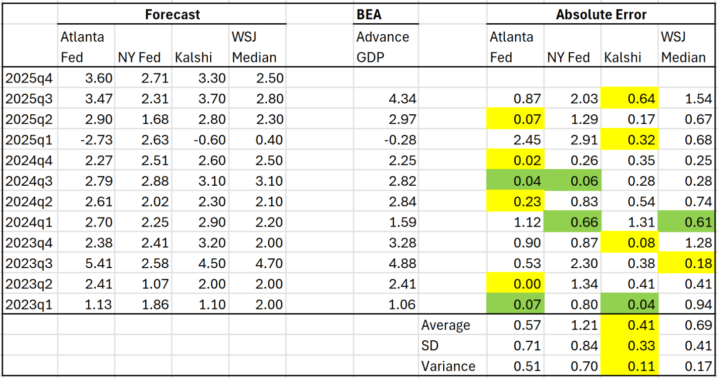
UPDATE 2/19/2026: the last GDPNow estimate from the Atlanta Fed is 3.0% and the Kalshi markets are now predicting 2.8%. I would expect this is a slightly better range than the 3.3-3.6% from my post written on 2/18/2026.
In April 2025 I wrote about several different forecasts for GDP growth. At the time the latest GDP quarter available was 2025Q1. We’ve had two more quarters of data since then, plus a highly anticipated report for Q4 coming out this Friday. How have these different predictions done recently? Here is the updated table from that prior post:
When I wrote the post in April 2025, I said that a simple average of the Atlanta Fed and Kalshi forecasts was the best simple predictor of the actual BEA advance figure. Based on the middle quarters of 2025, I think that continued to be true: each of them was the best estimate in one quarter, and perhaps just as importantly the NY Fed and WSJ survey of economists understated GDP growth pretty significantly.
There is still one more Atlanta Fed GDPNow update coming tomorrow before we get the actual BEA data on Friday, but based on where the numbers are now, we should expect Q4 to be around 3.4-3.5% (annualized) growth rate. This would put the total 2025 calendar year growth at around 2.3% — decent, but still below 2024’s 2.8% growth.