Daniel Kahneman, the psychologist who won a Nobel prize in economics and wrote the best-selling book “Thinking Fast and Slow“, died yesterday at age 90. Others will summarize his biography and the substance of his work, but I wanted to highlight two aspects of his style that I think fueled his unusual success among both the public and economists.
Daniel Kahneman’s new book amazes me. Not so much due to the content, though I’m sure that will blow your mind if you haven’t previously heard about it through studying behavioral economics or psychology or reading Less Wrong. It is the writing style: Kahneman is able to convey his message succinctly while making it seem intuitive and fascinating. Some academics can write tolerably well, but Kahneman seems to be on a level with those who write popularly for a living- the style of a Jonah Lehrer or Malcolm Gladwell, but no one can accuse the Nobel-prize-winning Kahneman of lacking substance.
This made me wonder if it is simply an unfair coincidence that Kahneman is great at both writing and research, or causation is at work here. True, in more abstract and mathematical fields great researchers do not seem especially likely to be great writers (Feynman aside). But to design and carry out great psychology experiments may require understanding the subject intuitively and through introspection. This kind of understanding- an intuitive understanding of everyday decision-making- may be naturally easier to share than other kinds of scientific knowledge, which use processes (say, math) or examine territories (say, subatomic particles) which are unfamiliar to most people. Kahneman says that he developed the ideas for most of his papers by talking with Amos Tversky on long walks. I suspect that this strategy leads to both good idea generation and a good, conversational writing style.
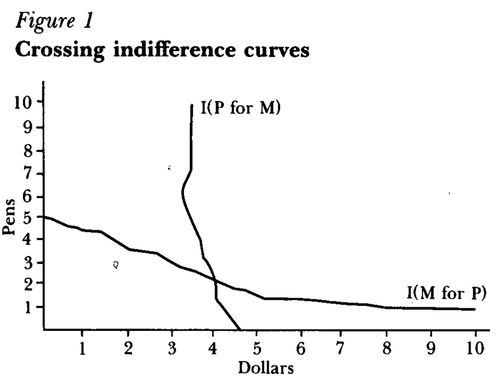
But how did a psychologist get economists to not just take his work seriously, but award him the top prize in our field? One key step was learning to speak the language of our field, or coauthor with people who do. For instance, summarizing the results of an experiment as showing indifference curves crossing where rationally they should not:
Finally, something that helped Kahneman appeal to all parties was that he avoided the potential trap of being the arrogant behavioral economist. Most economists have a natural tendency toward arrogance, kept somewhat in check by our belief that most people are fundamentally rational. Behavioral economists who think most people are irrational can be the most arrogant if they think they are the only sane one, and should therefore tell everyone else how to behave. But Kahneman avoided this by seeming to honestly believe he is just as subject to behavioral biases as everyone else.
I’ve always told my health economics students that Medicaid is both better and worse than all other insurance in the US for its enrollees.
Better, because its cost sharing is dramatically lower than typical private or Medicare plans. For instance, the maximum deductible for a Medicaid plan is $2.65. Not $2650 like you might see in a typical private plan, but two dollars and sixty five cents; and that is the maximum, many states simply set the deductible and copays to zero. Medicaid premiums are also typically set to zero. Medicaid is primarily taxpayer-financed insurance for those with low incomes, so it makes sense that it doesn’t charge its enrollees much.
But Medicaid is the worst insurance for finding care, because many providers don’t accept it. One recent survey of physicians found that 74% accept Medicaid, compared to 88% accepting Medicare and 96% accepting private insurance. I always thought these low acceptance rates were due to the low prices that Medicaid pays to providers. These low reimbursement rates are indeed part of the problem, but a new paper in the Quarterly Journal of Economics, “A Denial a Day Keeps the Doctor Away”, shows that Medicaid is also just hard to work with:
24% of Medicaid claims have payment denied for at least one service on doctors’ initial claim submission. Denials are much less frequent for Medicare (6.7%) and commercial insurance (4.1%)
Identifying off of physician movers and practices that span state boundaries, we find that physicians respond to billing problems by refusing to accept Medicaid patients in states with more severe billing hurdles. These hurdles are quantitatively just as important as payment rates for explaining variation in physicians’ willingness to treat Medicaid patients.
Of course, Medicaid is probably doing this for a reason- trying to save money (they are also trying to prevent fraud, but I have no reason to expect fraud attempts are any more common in Medicaid than other insurance, so I don’t think this can explain the 4-6x higher denial rate). This certainly wouldn’t be the only case where states tried to save money on Medicaid by introducing crazy rules hassling providers. You can of course argue that the state should simply spend more to benefit patients and providers, or spend less to benefit taxpayers. But the honest way to spend less is to officially cut provider payment rates or patient eligibility, rather than refusing to pay providers as advertised. In addition to being less honest, these administrative hassles also appear to be less efficient as a way to save money, probably because they cost providers time and annoyance as well as money:
We find that decreasing prices by 10%, while simultaneously reducing the denial probability by 20%, could hold Medicaid acceptance constant while saving an average of 10 per visit.
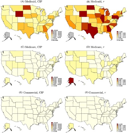
Medicaid is a joint state-federal program with enormous differences across states, and administrative hassle is no exception. For administrative hassle of providers, the worst states include Texas, Illinois, Pennsylvania, Georgia, North Dakota, and Wyoming:
Source: Figure 5 of A Denial a Day Keeps the Doctor Away, which notes: “The left column shows the mean estimated costs of incomplete payments (CIP) by state and payer. The right column shows the mean CIP as a share of visit value by state and payer. “
My paper “Missouri’s Medicaid Contraction and Consumer Financial Outcomes” is now out at the American Journal of Health Economics. It is coauthored by Nate Blascak and Slava Mikhed, researchers at the Federal Reserve Bank of Philadelphia. They noticed that Missouri had done a cut in 2005 that removed about 100,000 people from Medicaid and reduced covered services for the remaining enrollees. Economists have mostly studied Medicaid expansions, which have been more common than cuts; those studying Medicaid cuts have focused on Tennessee’s 2005 dis-enrollments, so we were interested to see if things went differently in Missouri.
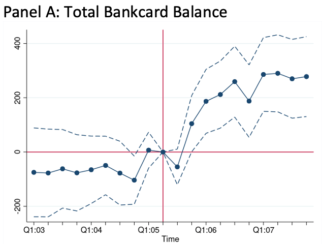
In short, we find that after Medicaid is cut, people do more out-of-pocket spending on health care, leading to increases in both credit card borrowing and debt in third-party collections. Our back-of-the-envelope calculations suggest that debt in collections increased by $494 per Medicaid-eligible Missourian, which is actually smaller than has been estimated for the Tennessee cut, and smaller than most estimates of the debt reduction following Medicaid expansions.
We bring some great data to bear on this; I used the restricted version of the Medical Expenditure Panel Survey to estimate what happened to health spending in Missouri compared to neighboring states, and my coauthors used Equifax data on credit outcomes that lets them compare even finer geographies:
The paper is a clear case of modern econometrics at work, in that it is almost painfully thorough. Counting the appendix, the version currently up at AJHE shows 130 pages with 29 tables and 11 figures (many of which are actually made up of 6 sub-figures each). We put a lot of thought into questioning the assumptions behind our difference-in-difference estimation, and into figuring out how best to bootstrap our standard errors given the small number of clusters. Sometimes this feels like overkill but hopefully it means the final results are really solid.
For those who want to read more and can’t access the journal version, an earlier ungated version is here.
Disclaimer: The results and conclusions in this paper are those of the authors and do not indicate concurrence by the Agency for Healthcare Research and Quality or the US Department of Health and Human Services. The views expressed in this paper are solely those of the authors and do not necessarily reflect the views of the Federal Reserve Bank of Philadelphia or the Federal Reserve System. Any errors or omissions are the responsibility of the authors.
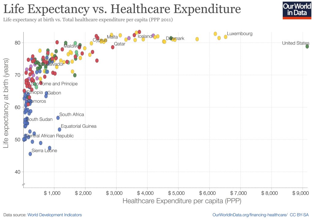
When you look across countries, it appears that the first $1000 per person per year spent on health buys a lot; spending beyond that buys a little, and eventually nothing. The US spends the most in the world on health care, but doesn’t appear to get much for it. A classic story of diminishing returns:
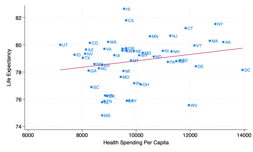
This might tempt you to go full Robin Hanson and say the US should spend dramatically less on health care. But when you look at the same measures across US states, it seems like health care spending helps after all:
Source: My calculations from 2019 IHME Life Expectancy and 2019 KFF Health Spending Per Capita
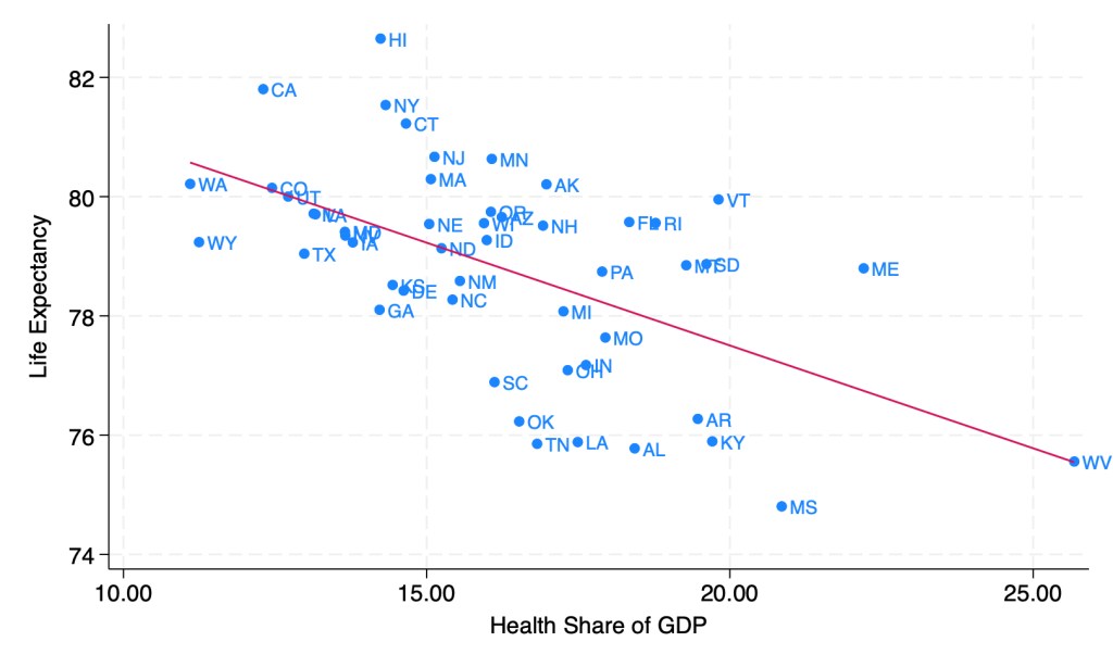
Last week though, I showed how health spending across states looks a lot different if we measure it as a share of GDP instead of in dollars per capita. When measured this way, the correlation of health spending and life expectancy turns sharply negative:
Source: My calculations from 2019 IHME life expectancy, Gross State Product, and NHEA provider spending
Does this mean states should be drastically cutting health care spending? Not necessarily; as we saw before, states spending more dollars per person on health is associated with longer lives. States having a high share of health spending does seem to be bad, but this is more because it means the rest of their economy is too small, rather than health care being too big. Having a larger GDP per capita doesn’t just mean people are materially better off, it also predicts longer life expectancy:
Source: My calculations from 2019 IHME life expectancy and 2019 Gross State Product
As you can see, higher GDP per capita predicts longer lives even more strongly than higher health spending per capita. Here’s what happens when we put them into a horse race in the same regression:
The effect of health spending goes negative and insignificant, while GDP per capita remains positive and strongly significant. The coefficient looks small because it is measured in dollars, but what it means is that a $10,000 increase in GDP per capita in a state is associated with 1.13 years more life expectancy.
My guess is that the correlation of GDP and life expectancy across states is real but mostly not caused by GDP itself; rather, various 3rd factors cause both. I think the lack of effect of health spending across states is real, between diminishing returns to spending and the fact that health is mostly not about health care. Perhaps Robin Hanson is right after all to suggest cutting medicine in half.
The Differences-in-Differences literature has blown up in the past several years. “Differences-in-Differences” refers to a statistical method that can be used to identify causal relationships (DID hereafter). If you’re interested in using the new methods in Stata, or just interested in what the big deal is, then this post is for you.
First, there’s the basic regression model where we have variables for time, treatment, and a variable that is the product of both. It looks like this:
The idea is that that there is that we can estimate the effect of time passing separately from the effect of the treatment. That allows us to ‘take out’ the effect of time’s passage and focus only on the effect of some treatment. Below is a common way of representing what’s going on in matrix form where the estimated y, yhat, is in each cell.
Each quadrant includes the estimated value for people who exist in each category. For the moment, let’s assume a one-time wave of treatment intervention that is applied to a subsample. That means that there is no one who is treated in the initial period. If the treatment was assigned randomly, then β=0 and we can simply use the differences between the two groups at time=1. But even if β≠0, then that difference between the treated and untreated groups at time=1 includes both the estimated effect of the treatment intervention and the effect of having already been treated prior to the intervention. In order to find the effect of the intervention, we need to take the 2nd difference. δ is the effect of the intervention. That’s what we want to know. We have δ and can start enacting policy and prescribing behavioral changes.
Easy Peasy Lemon Squeezy. Except… What if the treatment timing is different and those different treatment cohorts have different treatment effects (heterogeneous effects)?* What if the treatment effects change over time the longer an individual is treated (dynamic effects)**? Further, what if the there are non-parallel pre-existing time trends between the treated and untreated groups (non-parallel trends)?*** Are there design changes that allow us to estimate effects even if there are different time trends?**** There’re more problems, but these are enough for more than one blog post.
For the moment, I’ll focus on just the problem of non-parallel time trends.
What if untreated and the to-be-treated had different pre-treatment trends? Then, using the above design, the estimated δ doesn’t just measure the effect of the treatment intervention, it also detects the effect of the different time trend. In other words, if the treated group outcomes were already on a non-parallel trajectory with the untreated group, then it’s possible that the estimated δ is not at all the causal effect of the treatment, and that it’s partially or entirely detecting the different pre-existing trajectory.
Below are 3 figures. The first two show the causal interpretation of δ in which β=0 and β≠0. The 3rd illustrates how our estimated value of δ fails to be causal if there are non-parallel time trends between the treated and untreated groups. For ease, I’ve made β=0 in the 3rd graph (though it need not be – the graph is just messier). Note that the trends are not parallel and that the true δ differs from the estimated delta. Also important is that the direction of the bias is unknown without knowing the time trend for the treated group. It’s possible for the estimated δ to be positive or negative or zero, regardless of the true delta. This makes knowing the time trends really important.
STATA Implementation
If you’re worried about the problems that I mention above the short answer is that you want to install csdid2. This is the updated version of csdid & drdid. These allow us to address the first 3 asterisked threats to research design that I noted above (and more!). You can install these by running the below code:
program fra
    syntax anything, [all replace force]
    local from "https://friosavila.github.io/stpackages"
    tokenize `anything'
    if "`1'`2'"==""  net from `from'
    else if !inlist("`1'","describe", "install", "get") {
        display as error "`1' invalid subcommand"
    }
    else {
        net `1' `2', `all' `replace' from(`from')
    }
    qui:net from http://www.stata.com/
end
fra install fra, replace
fra install csdid2
ssc install coefplot
Once you have the methods installed, let’s examine an example by using the below code for a data set. The particulars of what we’re measuring aren’t important. I just want to get you started with the an application of the method.
local mixtape https://raw.githubusercontent.com/Mixtape-Sessions
use `mixtape'/Advanced-DID/main/Exercises/Data/ehec_data.dta, clear
qui sum year, meanonly
replace yexp2 = cond(mi(yexp2), r(max) + 1, yexp2)
The csdid2 command is nice. You can use it to create an event study where stfips is the individual identifier, year is the time variable, and yexp2 denotes the times of treatment (the treatment cohorts).
The above output shows us many things, but I’ll address only a few of them. It shows us how treated individuals differ from not-yet treated individuals relative to the time just before the initial treatment. In the above table, we can see that the pre-treatment average effect is not statistically different from zero. We fail to reject the hypothesis that the treatment group pre-treatment average was identical to the not-yet treated average at the same time period. Hurrah! That’s good evidence for a significant effect of our treatment intervention. But… Those 8 preceding periods are all negative. That’s a little concerning. We can test the joint significance of those periods:
estat event, revent(-8/-1)
Uh oh. That small p-value means that the level of the 8 pretreatment periods significantly deviate from zero. Further, if you squint just a little, the coefficients appear to have a positive slope such that the post-treatment values would have been positive even without the treatment if the trend had continued. So, what now?
Wouldn’t it be cool if we knew the alternative scenario in which the treated individuals had not been treated? That’s the standard against which we’d test the observed post-treatment effects. Alas, we can’t see what didn’t happen. BUT, asserting some premises makes the job easier. Let’s say that the pre-treatment trend, whatever it is, would have continued had the treatment not been applied. That’s where the honestdid stata package comes in. Here’s the installation code:
local github https://raw.githubusercontent.com
net install honestdid, from(`github'/mcaceresb/stata-honestdid/main) replace
honestdid _plugin_check
What does this package do? It does exactly what we need. It assumes that the pre-treatment trend of the prior 8 periods continues, and then tests whether one or more post-treatment coefficients deviate from that trend. Further, as a matter of robustness, the trend that acts as the standard for comparison is allowed to deviate from the pre-treatment trend by a multiple, M, of the maximum pretreatment deviations from trend. If that’s kind of wonky – just imagine a cone that continues from the pre-treatment trend that plots the null hypotheses. Larger M’s imply larger cones. Let’s test to see whether the time-zero effect significantly differs from zero.
What does the above table tell us? It gives us several values of M and the confidence interval for the difference between the coefficient and the trend at the 95% level of confidence. The first CI is the original time-0 coefficient. When M is zero, then the null assumes the same linear trend as during the pretreatment. Again, M is the ratio by which maximum deviations from the trend during the pretreatment are used as the null hypothesis during the post-treatment period. So, above, we can see that the initial treatment effect deviates from the linear pretreatment trend. However, if our standard is the maximum deviation from trend that existed prior to the treatment, then we find that the alpha is just barely greater than 0.05 (because the CI just barely includes zero).
That’s the process. Of course, robustness checks are necessary and there are plenty of margins for kicking the tires. One can vary the pre-treatment periods which determine the pre-trend, which post-treatment coefficient(s) to test, and the value of M that should be the standard for inference. The creators of the honestdid seem to like the standard of identifying the minimum M at which the coefficient fails to be significant. I suspect that further updates to the program will come along that spits that specific number out by default.
I’ve left a lot out of the DID discussion and why it’s such a big deal. But I wanted to share some of what I’ve learned recently with an easy-to-implement example. Do you have questions, comments, or suggestions? Please let me know in the comments below.
The above code and description is heavily based on the original author’s support documentation and my own Statalist post. You can read more at the above links and the below references.
*Sun, Liyang, and Sarah Abraham. 2021. “Estimating Dynamic Treatment Effects in Event Studies with Heterogeneous Treatment Effects.” Journal of Econometrics, Themed Issue: Treatment Effect 1, 225 (2): 175–99. https://doi.org/10.1016/j.jeconom.2020.09.006.
**Sant’Anna, Pedro H. C., and Jun Zhao. 2020. “Doubly Robust Difference-in-Differences Estimators.” Journal of Econometrics 219 (1): 101–22. https://doi.org/10.1016/j.jeconom.2020.06.003.
***Callaway, Brantly, and Pedro H. C. Santa Anna. 2021. “Difference-in-Differences with Multiple Time Periods.” Journal of Econometrics, Themed Issue: Treatment Effect 1, 225 (2): 200–230. https://doi.org/10.1016/j.jeconom.2020.12.001.
****Rambachan, Ashesh, and Jonathan Roth. 2023. “A More Credible Approach to Parallel Trends.” The Review of Economic Studies 90 (5): 2555–91. https://doi.org/10.1093/restud/rdad018.
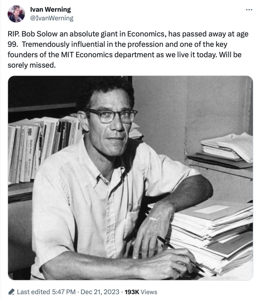
2023 continues to be a dangerous year for eminent economists. We have once again lost a Nobel laureate who was influential even by the standard of Nobelists, Robert Solow:
I’m sure you will soon see many tributes that discuss his namesake Solow Model (MR already has one), or discuss him as a person. I never got to meet him (just saw him give a talk) and the Solow Model is well known, so I thought I’d take this occasion to discuss one of his lesser-known papers- “Sustainability: An Economists Perspective“. What follows comes from my 2009 reaction to his paper:
We study whether people will pay for a fact-check on AI writing. ChatGPT can be very useful, but human readers should not trust every fact that it reports. Yesterday’s post was about ChatGPT writing false things that look real.
The reason participants in our experiment might pay for a fact-check is that they earn bonus payments based on whether they correctly identify errors in a paragraph. If participants believe that the paragraph does not contain any errors, they should not pay for a fact-check. However, if they have doubts, it is rational to pay for a fact-check and earn a smaller bonus, for certain.
Abstract: We explore whether people trust the accuracy of statements produced by large language models (LLMs) versus those written by humans. While LLMs have showcased impressive capabilities in generating text, concerns have been raised regarding the potential for misinformation, bias, or false responses. In this experiment, participants rate the accuracy of statements under different information conditions. Participants who are not explicitly informed of authorship tend to trust statements they believe are human-written more than those attributed to ChatGPT. However, when informed about authorship, participants show equal skepticism towards both human and AI writers. There is an increase in the rate of costly fact-checking by participants who are explicitly informed. These outcomes suggest that trust in AI-generated content is context-dependent.
Our original hypothesis was that people would be more trusting of human writers. That turned out to be only partially true. Participants who are not explicitly informed of authorship tend to trust statements they believe are human-written more than those attributed to ChatGPT.
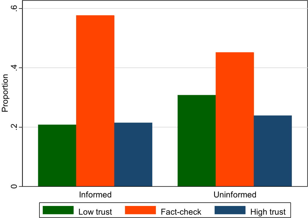
We presented information to participants in different ways. Sometimes we explicitly told them about authorship (informed treatment) and sometimes we asked them to guess about authorship (uninformed treatment).
This graph (figure 5 in our paper) shows that the overall rate of fact-checking increased when subjects were given more explicit information. Something about being told that a paragraph was written by a human might have aroused suspicion in our participants. (The kids today would say it is “sus.”) They became less confident in their own ability to rate accuracy and therefore more willing to pay for a fact-check. This effect is independent of whether participants trust humans more than AI.
We are thinking of fact-checking as often a good thing, in the context of our previous work on ChatGPT hallucinations. So, one policy implication is that certain types of labels can cause readers to think critically. For example, Twitter labels automated accounts so that readers know when content has been chosen or created by a bot.
Suggested Citation: Buchanan, Joy and Hickman, William, Do People Trust Humans More Than ChatGPT? (November 16, 2023). GMU Working Paper in Economics No. 23-38, Available at SSRN: https://ssrn.com/abstract=4635674
Citation: Buchanan, J., Hill, S., & Shapoval, O. (2024). ChatGPT Hallucinates Non-existent Citations: Evidence from Economics. The American Economist. 69(1), 80-87 https://doi.org/10.1177/05694345231218454
Blog followers will know that we reported this issue earlier with the free version of ChatGPT using GPT-3.5 (covered in the WSJ). We have updated this new article by running the same prompts through the paid version using GPT-4. Did the problems go away with the more powerful LLM?
The error rate went down slightly, but our two main results held up. It’s important that any fake citations at all are being presented as real. The proportion of nonexistent citations was over 30% with GPT-3.5, and it is over 20% with our trial of GPT-4 several months later. See figure 2 from our paper below for the average accuracy rates. The proportion of real citations is always under 90%. GPT-4, when asked about a very specific narrow topic, hallucinates almost half of the citations (57% are real for level 3, as shown in the graph).
The second result from our study is that the error rate of the LLM increases significantly when the prompt is more specific. If you ask GPT-4 about a niche topic for which there is less training data, then a higher proportion of the citations it produces are false. (This has been replicated in different domains, such as knowledge of geography.)
What does Joy Buchanan really think?: I expect that this problem with the fake citations will be solved quickly. It’s very brazen. When people understand this problem, they are shocked. Just… fake citations? Like… it printed out reference for papers that do not actually exist? Yes, it really did that. We were the only ones who quantified and reported it, but the phenomenon was noticed by millions of researchers around the world who experimented with ChatGPT in 2023. These errors are so easy to catch that I expect ChatGPT will clean up its own mess on this particular issue quickly. However, that does not mean that the more general issue of hallucinations is going away.
Not only can ChatGPT make mistakes, as any human worker can mess up, but it can make a different kind of mistake without meaning to. Hallucinations are not intentional lies (which is not to say that an LLM cannot lie). This paper will serve as bright clear evidence that GPT can hallucinate in ways that detract from the quality of the output or even pose safety concerns in some use cases. This generalizes far beyond academic citations. The error rate might decrease to the point where hallucinations are less of a problem than the errors that humans are prone to make; however, the errors made by LLMs will always be of a different quality than the errors made by a human. A human research assistant would not cite nonexistent citations. LLM doctors are going to make a type of mistake that would not be made by human doctors. We should be on the lookout for those mistakes.
ChatGPT is great for some of the inputs to research, but it is not as helpful for original scientific writing. As prolific writer Noah Smith says, “I still can’t use ChatGPT for writing, even with GPT-4, because the risk of inserting even a small number of fake facts… “
I still can't use ChatGPT for writing, even with GPT-4, because the risk of inserting even a small number of fake facts or bad interpretations into a blog post is unacceptable, meaning that it requires so much time to fact-check that it doesn't save effort.
Some economists love to write about sports because they love sports. Others love to write about sports because the data are so good compared to most other facets of the economy. What other industry constantly releases film of workers doing their jobs, and compiles and shares exhaustive statistics about worker performance?
To take an extreme example, suppose an average high-school athlete got thrown into a professional football or basketball game; a fan asked to evaluate them could probably figure out that they don’t belong there within minutes, or perhaps even just by glancing at them and seeing they are severely undersized. But what if an average high school coach were called up to coach at the professional level? How long would it take for a casual observer to realize they don’t belong? You might be able to observe them mismanaging games within a few weeks, but people criticize professional coaches for this all the time too; I think you couldn’t be sure until you see their record after a season or two. Even then it is much less certain than for a player- was their bad record due to their coaching, or were they just handed a bad roster to work with?
The sports economics literature seems to confirm my intuition that coaches are difficult to evaluate. This is especially true in football, where teams generally play fewer than 20 games in a season; a general rule of thumb in statistics is that you need at least 20 to 25 observations for statistical tests to start to work. This accords with general practice in the NFL, where it is considered poor form to fire a coach without giving him at least one full season. One recent article evaluating NFL coaches only tries to evaluate those with at least 3 seasons. If the article is to be believed, it wasn’t until 2020 that anyone published a statistical evaluation of NFL defensive coordinators, despite this being considered a vital position that is often paid over a million dollars a year:
This week the Nobel Foundation recognized Claudia Goldin “for having advanced our understanding of women’s labour market outcomes”. If you follow our blog you probably already know that each year Marginal Revolution quickly puts up a great explanation of the work that won the economics Prize. This year they kept things brief with a sort of victory lap pointing to their previous posts on Goldin and the videos and podcast they had recorded with her, along with a pointer to her latest paper. You might also remember our own review of her latest book, Career and Family.
But you may not know that Kevin Bryan at A Fine Theorem does a more thorough, and typically more theory-based explanation of the Nobel work most years; here is his main take from this year’s post on Goldin:
Goldin’s work helps us understand whose wages will rise, will fall, will equalize going forward. Not entirely unfairly, she will be described in much of today’s coverage as an economist who studies the gender gap. This description misses two critical pieces. The question of female wages is a direct implication of her earlier work on the return to different skills as the structure of the economy changes, and that structure is the subject of her earliest work on the development of the American economy. Further, her diagnosis of the gender gap is much more optimistic, and more subtle, than the majority of popular discourse on the topic.
He described my favorite Goldin paper, which calculates gender wage gaps by industry and shows that pharmacists moved from having one of the highest gaps to one of the lowest as one key feature of the job changed:
Alongside Larry Katz, Goldin gives the canonical example of the pharmacist, whose gender gap is smaller than almost every other high-wage profession. Why? Wages are largely “linear in hours”. Today, though not historically, pharmacists generally work in teams at offices where they can substitute for each other. No one is always “on call”. Hence a pharmacist who wants to work late nights while young, then shorter hours with a young kid at home, then a longer worker day when older can do so. If pharmacies were structured as independent contractors working for themselves, as they were historically, the marginal productivity of a worker who wanted this type of flexibility would be lower. The structure of the profession affects marginal productivity, hence wages and the gender gap, particularly given the different demand for steady and shorter hours among women. Now, not all jobs can be turned from ones with convex wages for long and unsteady hours to ones with linear wages, but as Goldin points out, it’s not at all obvious that academia or law or other high-wage professions can’t make this shift. Where these changes can be made, we all benefit from high-skilled women remaining in high-productivity jobs: Goldin calls this “the last chapter” of gender convergence.
There is much more to the post, particularly on economic history; it concludes:
When evaluating her work, I can think of no stronger commendation than that I have no idea what Goldin will show me when I begin reading a paper; rather, she is always thoughtful, follows the data, rectifies what she finds with theory, and feels no compunction about sacrificing some golden goose – again, the legacy of 1970s Chicago rears its head. Especially on a topic as politically loaded as gender, this intellectual honesty is the source of her influence and a delight to the reader trying to understand such an important topic.
This year also saw a great summary from Alice Evans, who to my eyes (admittedly as someone who doesn’t work in the subfield) seems like the next Claudia Goldin, the one taking her work worldwide:
Claudia Goldin has now done it all. With empirical rigor, she has theorised every major change in American women’s lives over the twentieth century. These dynamics are not necessarily true worldwide, but Goldin has provided the foundations.
I’ve seen two lines of criticism for this prize. One is the usual critique, generally from the left, that the Econ Nobel shouldn’t exist (or doesn’t exist), to which I say:
The critique from the right is that Goldin studied unimportant subjects and only got the prize because they were politically fashionable. But labor markets make up most of GDP, and women now make up almost half the labor force; this seems obviously important to me. Goldin has clearly been the dominant researcher on the topic, being recognized as a citation laureate in 2020 (i.e. someone likely to win a Nobel because of their citations). At most politics could explain why this was a solo prize (the first in Econ since Thaler in 2017), but even here this seems about as reasonable as the last few solo prizes. David Henderson writes a longer argument in the Wall Street Journal for why Claudia Goldin Deserves that Nobel Prize.
Best of all, Goldin maintains a page to share datasets she helped create here.