The November election in Florida will include 6 proposed amendments to the Florida State Constitution. They only pass if at least 60% of voters vote YES. Here are some brief takes from an economic perspective.
Amendment 1: Partisan Election of Members of District School Boards
Currently, school district boards are locally elected and they do not have a party affiliation listed on the ballot. If passed, the amendment would permit party affiliation to be on the ballot. Partisan primaries would also be introduced, reducing the number of candidates in the general elections. The argument in favor is that party affiliation itself communicates information to voters. Removing that information forces voters to abstain, vote randomly, or to vote based on other information.
An argument against is that, in Florida, only registered party members may vote in primaries. If passed, parties will endorse particular candidates according to the primary results, winnowing the field. I happen to live in a county with an overwhelming republican majority, so the party-endorsed candidate will probably win. The outcome will be that the median republican primary-voter will choose the winning candidate in the primary rather than the median voter during the election. Voting “YES” aggregates information from a smaller set of voters.
Ray Fair at Yale runs one of the oldest models to use economic data to predict US election results. It predicts vote shares for President and the US House as a function of real GDP growth during the election year, inflation over the incumbent president’s term, and the number of quarters with rapid real GDP growth (over 3.2%) during the president’s term.
Currently his model predicts a 49.28 Democratic share of the two-party vote for President, and a 47.26 Democratic share for the House. This will change once Q3 GDP results are released on October 30th, probably with a slight bump for the dems since Q3 GDP growth is predicted to be 2.5%, but these should be close to the final prediction. Will it be correct?
Probably not; it has been directionally wrong several times, most recently over-estimating Trump’s vote share by 3.4% in 2020. But is there a better economic model? Perhaps we should consider other economic variables (Nate Silver had a good piece on this back in 2011), or weight these variables differently. Its hard to say given the small sample of US national elections we have to work with and the potential for over-fitting models.
But one obvious improvement to me is to change what we are trying to estimate. Presidential elections in the US aren’t determined by the national vote share, but by the electoral college. Why not model the vote share in swing states instead?
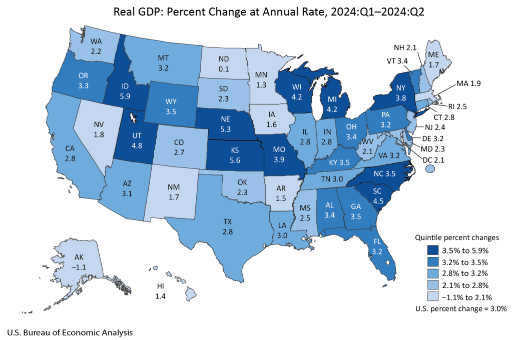
Doing this well would make for a good political science or economics paper. I’m not going to do a full workup just for a blog post, but I will note that the Bureau of Economic Analysis just released the last state GDP numbers that they will prior to the election:
Mostly this strikes me as a good map for Harris, with every swing state except Nevada seeing GDP growth above the national average of 3.0%. Of course, this is just the most recent quarter; older data matters too. Here’s real GDP growth over the past year (not per capita, since that is harder to get, though it likely matters more):
Region
Real GDP Growth Q2 2023 – Q2 2024
US
3.0%
Arizona
2.6%
Georgia
3.5%
Michigan
2.0%
Nevada
3.4%
North Carolina
4.4%
Pennsylvania
2.5%
Wisconsin
3.3%
Still a better map for Harris, though closer this time, with 4 of 7 swing states showing growth above the national average. I say this assuming as Fair does that the candidate from the incumbent President’s party is the one that will get the credit/blame for economic conditions. But for states I think it is an open question to what extent people assign credit/blame to the incumbent Governor’s party as opposed to the President. Georgia and Nevada currently have Republican governors.
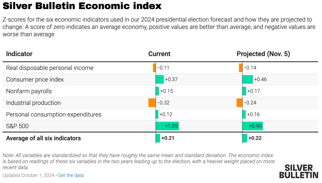
Overall I see this as one more set of indicators that showing an election that is very close, but slightly favoring Harris. Just like prediction markets (Harris currently at a 50% chance on Polymarket, 55% on PredictIt) and forecasts based mainly on polls (Nate Silver at 55%, Split Ticket at 56%, The Economist / Andrew Gelman at 60%). Some of these forecasts also include national economic data:
Gelman suggests that the economy won’t matter much this time:
We found that these economic metrics only seemed to affect voter behaviour when incumbents were running for re-election, suggesting that term-limited presidents do not bequeath their economic legacies to their parties’ heirs apparent. Moreover, the magnitude of this effect has shrunk in recent years because the electorate has become more polarised, meaning that there are fewer “swing voters” whose decisions are influenced by economic conditions.
But while the economy is only one factor, I do think it still matters, and that forecasters have been underrating state economic data, especially given that in two of the last 6 Presidential elections the electoral college winner lost the national popular vote. I look forward to seeing more serious research on this topic.
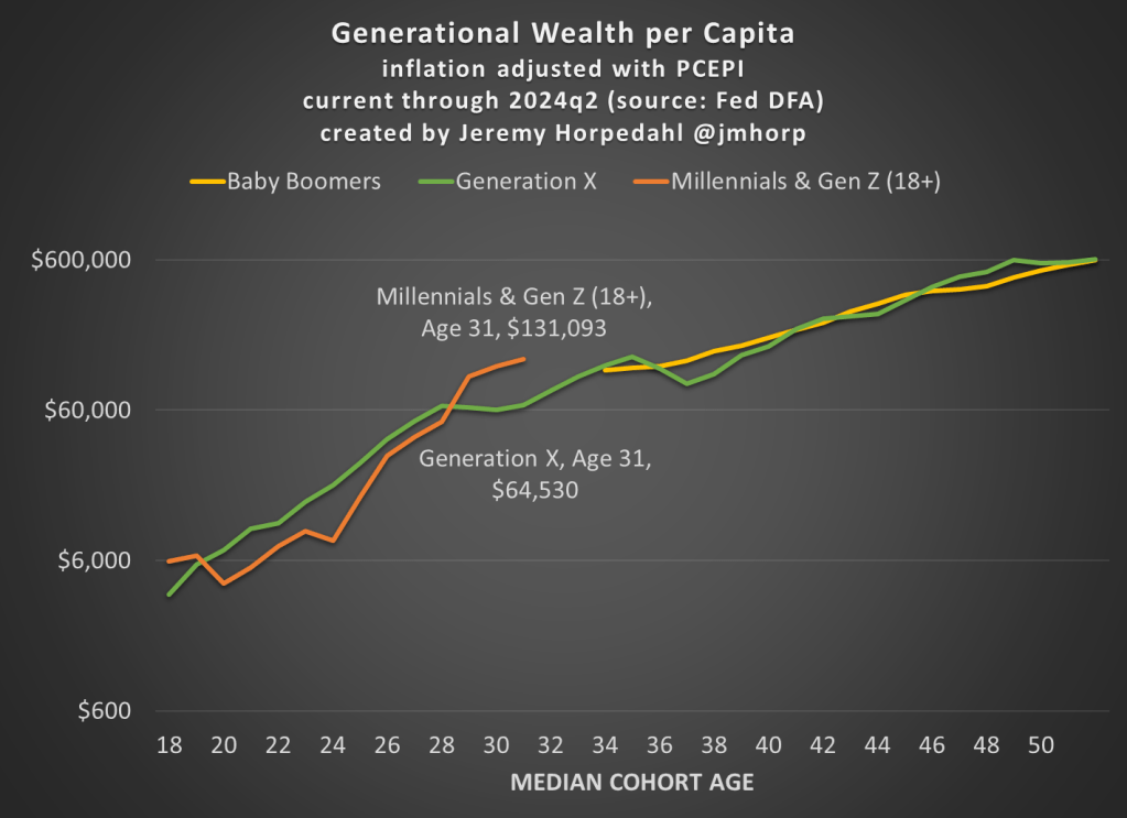
The Fed’s Distributional Financial Accounts have been updated with one more quarter of data, so here’s the latest update to the generational wealth chart:
Not much has changed from last quarter, and please do read my post from June 2024 for an explanation of why I’ve combined Millennials and Gen Z in this chart (and some data on inequality within generations).
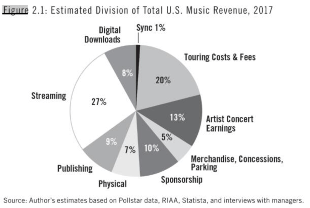
I missed Alan Kreuger’s 2019 book on the economics of popular music when it first came out, but picked it up recently when preparing for a talk on Taylor Swift. It turns out to be a well-written mix of economic theory, data, and interviews with well-known musicians, by an author who clearly loves music. Some highlights:
[Music] is a surprisingly small industry, one that would go nearly unnoticed if music were not special in other respects…. less than $1 of every $1,000 in the U.S. economy is spent on music…. musicians represented only 0.13 percent of all employees [in 2016]; musicians’ share of the workforce has hovered around that same level since 1970.
there has been essentially no change in the two-to-one ratio of male to female musicians since the 1970s
The gig economy started with music…. musicians are almost five times more likely to report that they are self-employed than non-musicians
30 percent of musicians currently work for a religious organization as their main gig. There are a lot of church choirs and organists. A great many singers got their start performing in church, including Aretha Franklin, Whitney Houston, John Legend, Katy Perry, Faith Hill, Justin Timberlake, Janelle Monae, Usher, and many others
Today BLS released the annual update to the Consumer Expenditure Survey, which is exactly what it sounds like: a survey of US consumers about what their spending. The sample size is “20,000 independent interview surveys and 11,000 independent diary surveys” so it’s a pretty big sample. And this is a really great data source, because versions of it go back over 100 years (though the current, annual survey with a lot of detail starts in 1984).
What does this new data tell us? One area that has received a lot of attention lately is food spending (including a lot of attention on this blog), especially the cost of groceries. According to the CPI food at home index, grocery prices are up almost 26 percent since the beginning over 2020. That’s a lot! But incomes are up too, so how does this affect spending patterns?
Here’s what food and grocery spending for middle-quintile households looks like:
Compared to the pre-pandemic 2019 levels, consumers are spending slightly less of their income on food (12.7% vs. 13.2%), though a slightly larger share of their income is being spent on groceries (8.1% vs. 7.8%). Those changes are noticeable, though this isn’t the radical realignment of spending patterns you might expect from such a big change in food prices. The reason is clear: while grocery prices are up about 26%, middle-quintile incomes are up a similar 25% since 2019. That’s falling behind a little bit, but incomes have roughly kept pace with rising food prices. And from 2022 to 2023, both of these percentages decreased slightly, by about 0.3 percentage points.
I am one of several founders of a club with the abbreviation F.E.W. for Finance and Economics Women. This is a student organization that we have at Samford and that Dr. Darwyyn Deyo runs at San Jose State University.
Our short paper is mostly a how-to guide including a draft of a club charter document. We describe our institutions and how we use this group to engage and encourage students. Please read it for more details on how to start a club.
Like most student groups, the FEW model relies on student leaders who take initiative. Having done this for more than 6 years, we have a growing network of alumni and local business partners who connect to current students through FEW events. Personally, I am lucky that 3 faculty members total support the club at my school.
Women are often minorities in upper-division econ and finance classes. Women also have some unique challenges when it comes to choosing career paths and navigating the workplace. These events (e.g. bringing in a manager from a local bank to talk with student over lunch) allow a space for students to ask questions they might not normally ask in a classroom setting or in a standard networking environment.
We report the results of a small survey in our paper. We can’t infer causality, nor did we run any experiments. However, we did find that women were more likely to report that a role model in their chosen profession influenced their choice of major. Part of the purpose of the FEW model is to expose students to a variety of role models who they might not otherwise connect with.
Here’s a news article with a picture of the founding group at Samford. I have great appreciation and respect for our student leaders who keep it going, and I am grateful to the graduates who stay in contact with us.
If you didn’t know already, the past five years has been a whirl-wind of new methods in the staggered Differences-in-differences (DID) literature – a popular method to try to tease out causal effects statistically. This post restates practical advice from Jonathan Roth.
The prior standard was to use Two-Way-Fixed-Effects (TWFE). This controlled for a lot of unobserved variation over individuals or groups and time. The fancier TWFE methods were interacted with the time relative to treatment. That allowed event studies and dynamic effects.
The Federal Reserve cut interest rates yesterday for the first time since 2019. They raised rates dramatically in 2022 to fight off high inflation, and kept them high since. This cut signals that they are now less worried about inflation, which is now nearing (but not at) their 2% target, and more worried about the slowing (?) labor market. To me their action was reasonable, but doing a smaller cut or waiting longer would also have been reasonable, because the labor market is giving such mixed signals at the moment.
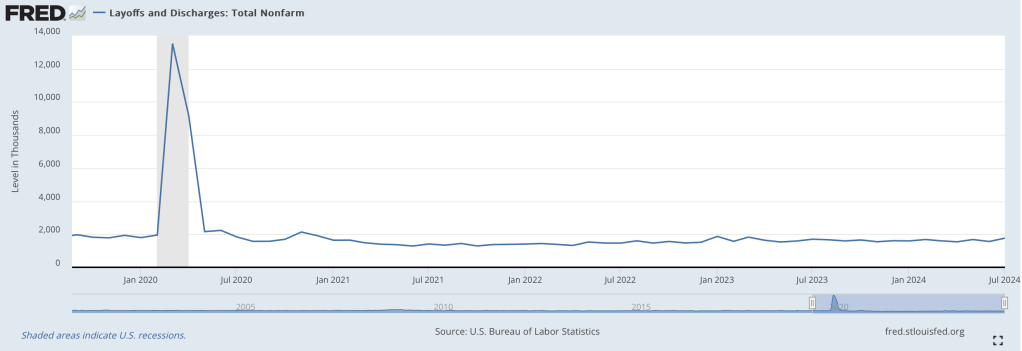
Most concerning is that unemployment increased from 3.5% last July to 4.3% this July. On previous occasions that unemployment in the US increased that rapidly, we then saw recessions and much more growth in unemployment. But unemployment ticked down to 4.2% last month, and layoffs have been flat:
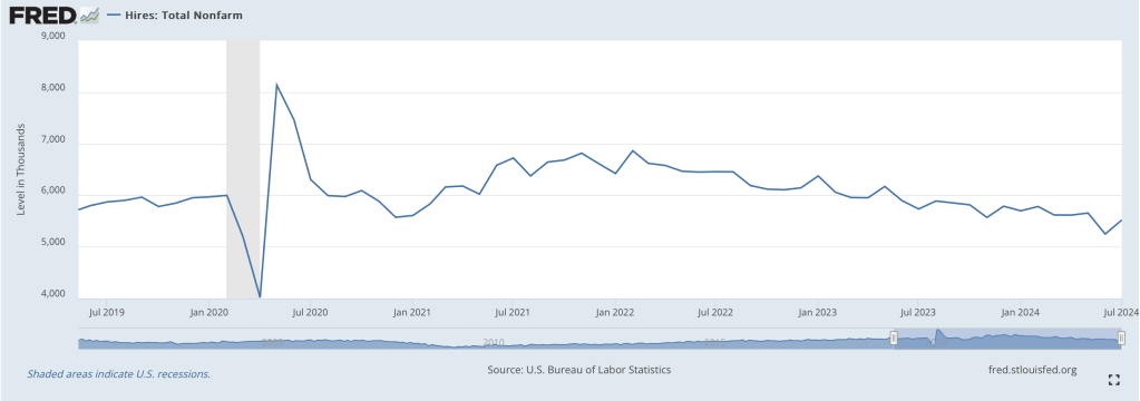
How do you get a big increase in unemployment without a big increase in layoffs? There are two main ways, one good and one bad, and we have both. The bad news, especially for new graduates, is that hiring has slowed:
But the better news is that there are simply more people wanting to work. This is generally a good sign for the economy; in bad economic times many people don’t count as “unemployed” because they are so discouraged that they don’t bother actively looking for work. In July though, prime-age labor force participation hit 84%, the highest level since 2001:
The prime-age employment-to-population ratio just hit 80.9%, also the highest level since 2001:
Labor force participation and employment-to-population among all adults are not so high, though it could be a positive that many people under 25 are in school and many people over 54 are able to retire. Finally, total payrolls got a big downward revision, but one that still implies positive growth every month.
Looking beyond the labor market though, GDP grew at a strong 3.0% in Q2, and is projected to be similar in Q3. Inflation breakevens are exactly on target. Overall it looks like some recession indicators that worked historically, like the Sahm Rule and Yield Curve Inversion, are about to break down- especially now that the Fed cutting is rates.
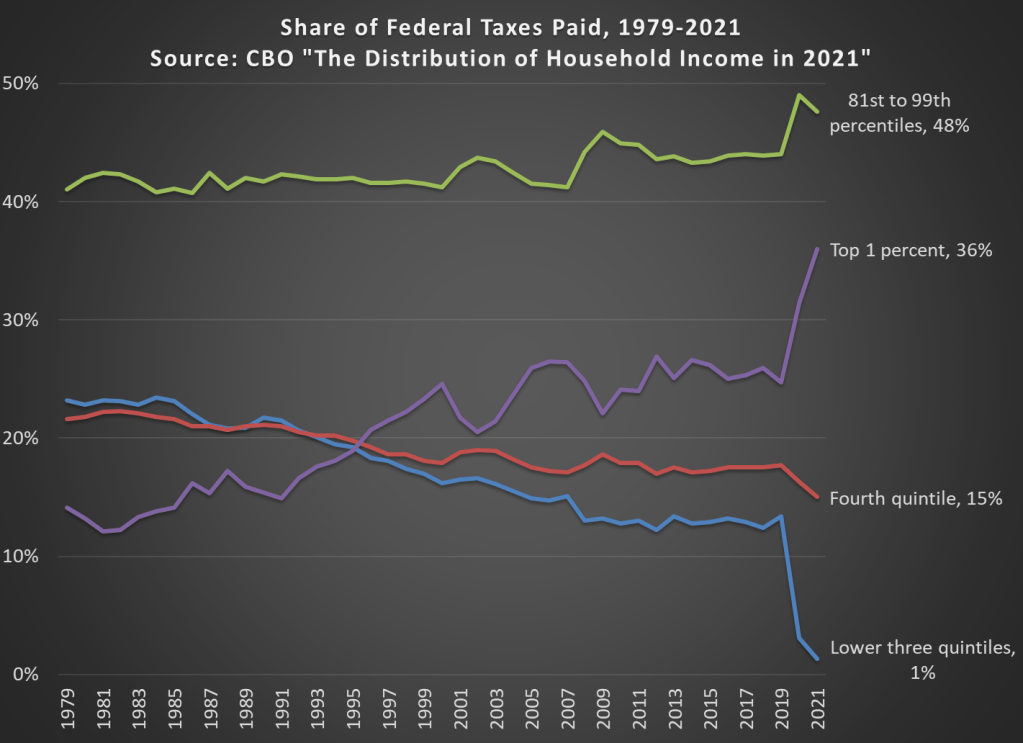
In 2021 the top 1 percent of taxpayers in the United States paid 36 percent of all federal taxes (they have 21.1 percent of income). This figure had been below 20 percent until the mid-1990s, and as recently as 2019 it was just 24.7 percent (they had 15.9 percent of the income that year).
The increase is primarily due to a large number of high-income households realizing capital gains in 2021. With all the talk lately of potentially taxing unrealized capital gains, it’s important to note that we do tax realized gains, and these change a lot from year to year. Another contributing factor is that the share of the bottom 60 percent of households only paid 1 percent of federal taxes in 2021, a big drop from 2019 due to a big increase in temporary refundable tax credits.
Jared Diamond is a polymath (biochemistry, physiology, ornithology, ecology; MacArthur Genius Grant; etc.) perhaps best known for his Guns, Germs and Steel (1997). In that book (which I read) he proposed that shared learnings and practices across the vast Eurasian continent led to optimized food crops and agricultural practices for Eurasian peoples, which in turn led to dense, stratified societies where technical development could progress. This included Chinese and other Asian societies, not just Europeans. This enabled large military forces equipped with formidable weapons, that could dominate non-Eurasian peoples when they came in contact. The rest is history.
In another popular book (which I also read), Collapse: How Societies Choose to Fail or Succeed (2005), Diamond presented explanations for the collapse or (relative) failure of a number of modern and historical societies. These included the Norse settlers in Greenland, the Maya of Central America, and Easter Island.
Easter Island, known as Rapa Nui by its natives, is the most isolated inhabited landmass on Earth. It lies some 2200 miles west of Chile and 1200 miles east of Pitcairn Island (think: mutiny on the Bounty). The first European contacts were brief visits by various ships in the early 1700’s. At that point, there appeared to be several thousand inhabitants, and no large trees. It seems that Polynesian settlers arrived on the island around 1200 A.D., though perhaps as early as 800. The pollen record and carbon-14 dating showed that large palm trees were present on the island, but disappeared around 1650.
Easter Island is perhaps best known for its many large (20-30 ft high) stone carvings called moai:
Scholars have supposed that a large, hierarchical society was needed to produce the some 1000 moai observed on Easter Island. These statues were later deliberately toppled, for reasons unknown.
Following the suggestions of some early anthropologists, Diamond spun a riveting apocalyptic tale of overpopulation and stupidity: supposedly the population grew to some 15,000 souls, mindlessly chopping down all the trees to transport and erect the huge stone carvings. This deforestation, together with exhaustion of nutrients in the soil, led to a downward spiral in the welfare of the community: no trees = soil erosion and water runoff and no edible nuts; no wood= no boats = few fish. Shifts in trade winds or climate were also implicated. Tribal warfare, class struggle and cannibalism erupted, with mass deaths through violence and starvation, all before the Europeans showed up. The account of internecine conflict was supported by the natives’ oral traditions. This whole story arc was taken to be a parable for our times: if you mess with your ecosystem, society may not stand the strain.
Perhaps jealous of upstart Jared Diamond’s success, some fifteen authors from the professional anthropology guild ganged up and published an attack volume titled Questioning Collapse in 2009. They disputed many of Diamond’s assertions, including his Easter Island collapse scenario.
Results from the past several years have swung the consensus firmly against the ecocide collapse theory. For instance, a carbon-14 dating study of bone and wood artifacts by DiNapoli, et al. indicated a steady growth in population up until European contact in the early 1700s. The same conclusion was reached in a recent study by J. Víctor Moreno-Mayar et al., using DNA measurement from native genomes dating between 1670 and 1950. Also, it seems from mariners’ reports that toppling of the statues did not begin until after European contact. The loss of the trees is now attributed mainly to the Polynesian rats brought with the natives; the rats eat the palm seeds.
What actually did the natives in was a series of raids by Peruvian slave-traders in 1862. They abducted about half of the 3000 inhabitants, including the leaders and cultural carriers. After a public outcry o\in 1865 by the bishop of Tahiti, the embarrassed Peruvian government repatriated the surviving slaves, but they carried back a smallpox infection which killed off most of the rest. “1868 saw the entire social order of Easter Island collapse, there were no more standing Moai statues… In 1877, only 110 impoverished and disheartened inhabitants remained.” Ouch. So, the social order did collapse, but not from climate change or ecological stupidity.
In 1888, Chile took over Easter Island as a protectorate, shielding the inhabitants from further slaver attacks. That began a fitful recovery for the Rapa Nui people, who as of 2017 numbered 3,512. This is roughly the population prior to European contact.


