You’ve probably heard the phrase that US states are often “laboratories of democracy.” The phrase comes from a Supreme Court case. It’s well known enough that it has a short Wikipedia page. The basic idea is simple: states can try out different policies. If it works, other states can copy it. If it doesn’t work, it only hurts that state.
The 2020-21 pandemic has provided a number of possibilities for the “states as laboratories” concept. Here’s three big ones I can think of (please add more in the comments!):
Do states that end unemployment benefits sooner have quicker labor market recoveries? Or are these not the main drag on the labor market?
Do states that offer incentives for vaccination have higher vaccination rates? And what sort of incentives work best?
These are all good questions, but let me throw some cold water on this whole concept: we might not be able to learn anything from these “experiments”! The primary reason: the treatments aren’t randomly assigned. States choose to implement them.
Let’s think through the potential problems with each of these three areas:
Texas is one of the most regulated states in the country.
This is one of the surprises that emerged from the State RegData project, which quantifies the number of regulatory restrictions in force in each state. It turns out that a state’s population size, rather than political ideology or any thing else, is the best predictor of its regulations.
This is what I found, with my coauthors James Broughel and Patrick McLaughlin, when we set out to test whether a previous paper (Mulligan and Shliefer 2005) that showed a regulation-population link held up when we used the better data that is now available. We found that across states, a doubling of population size is associated with a 22 to 33 percent increase in regulation.
It’s almost summer. About half the US population has at least one dose of a COVID vaccine. For many Americans that haven’t had their employment impacted by the pandemic, their bank accounts are flush with cash and they are ready to do one thing with that cash: travel. See family and friends. See something other than the inside of your own home.
And for many Americans traveling this summer, they will fly. The airlines, no doubt, will appreciate your business. At this time last year, the world had so radically shifted that Zoom’s market cap was bigger than the 7 largest airlines in the world. In May 2020, air passenger traffic in the US was less than 10% of traffic in 2019. Today, we’ve recovered a lot, but we are still only back to about two-thirds of normal levels. And since airplanes are just a marginal cost with wings, flying all their planes at close to full capacity is crucial for airlines to return to profitability. They really need you to fly the friendly skies this summer.
One of the reasons that so many Americans are able to fly in today is because flying is, compared to historical prices, very cheap.
How cheap is flying to today compared to the past? Let’s look at some historical price data for flights.
US housing prices shot up during the pandemic. People spending all day at home wanted bigger houses, and the Fed fueled their demand with low interest rates. But home owners didn’t want to sell- the total number of homes on the market is less than half what it was a year ago. This combination of rising demand & falling supply has sent prices way up & cut the time homes spend on the market.
Contrary to popular belief, its actually rare for economists to make market forecasts and most of us aren’t especially well-equipped to do so- but I’m going to try anyway! I think home prices will almost certainly stop growing so quickly, and may actually fall, within two years.
Why? The end of the pandemic, the rise of new construction, and the end of low interest rates.
You’ve probably seen the headlines. Corn prices are double what they were a year ago. Lumber prices are triple. You can find all kinds of other scary examples. Is runaway inflation just around the corner? Is it already here?
And yet, measures of prices that consumers pay are much more stable. The most widely tracked measure, the CPI-U, is up 4.2% over the past year. That’s through April — and keep in mind that it’s starting from a low base since March-May 2020 saw falling prices). The Personal Consumption Expenditures index, often preferred by economists, is up just 2.3% (though that’s only through March).
So what gives? Do these consumer measures understate inflation in some way? Or is the increase in commodity prices telling us that consumer prices will increase soon?
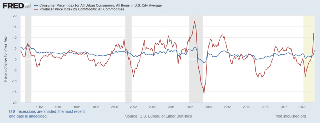
Let’s take that second question first. Do higher commodity prices necessarily lead to higher consumer prices? The answer is a clear no. First, we can see that in the data. The producer price index for all commodities (such as corn and lumber) is up 12% over the year (through March, with April data coming out tomorrow). That’s a big increase. But as the chart below suggests, that probably will not lead to 12% increases in consumer prices. It probably won’t even lead to a 5% increase in consumer prices.
Notice two things about this chart. First, commodity prices (the red line) are much more volatile than consumer prices, both on the upside and downside. Second, there really isn’t much of a lag, if any. The direction of change is similar in both indexes, almost to the month. When producer commodity prices go up, consumer prices also go up, that very same month, but not by the same amount. So all of that 12% increase in producer prices is probably already reflected in consumer prices.
Why might this be? Simple supply and demand analysis (hello Econ 101 critics!) can tell us why.
I’m James Bailey, an economist at Providence College who studies how government policies affect health care and the labor market. Thanks to Joy for the chance to join the blog for a few months!
For my first post, I have to share the brand new book I wrote a chapter of, “Regulation and Economic Opportunity: Blueprints for Reform“. Normally academic volumes like this are sold for hundreds of dollars, so only a few people with access to academic libraries end up reading them. But the publisher of this volume, the Center for Growth and Opportunity, released it as a free Ebook– so I hope you’ll check it out. It covers everything from housing and health care to energy and education to beer and cigarettes.
I wrote chapter 5, on how various regulations affect wages and employment. Here’s an excerpt:
If you drink bourbon whiskey (or even if you don’t) you’ve probably heard of Pappy Van Winkle. Bourbon has experienced something of a revival in the past two decades, after being in decline for much of the 20th century. As part of this revival, some bourbons have become very highly sought after by the nouveau bourbon enthusiasts. And the various offerings of Pappy Van Winkle are arguably the most highly sought after. Finding Pappy is almost impossible these days, though this was also true a decade ago so it’s not really a “new” phenomena.
So here’s the “puzzle” for economists: why aren’t Pappy and other rare whiskies sold at market prices? No one in the “legal” market seems willing to do so. I put “legal” in quotation marks because there is a robust secondary market for these bottles, and the legal status of these sales is entirely unclear to me as an economist (alcohol markets are, to say the least, highly regulated).
In these secondary markets, it is not unusual for a 20-year bottle of Pappy Van Winkle to sell for $2,000. The “manufacturer’s suggested retail price” is $199.99. But you will never find this bottle on the shelf for that price. The bottles are held by retailers, either to sell to friends, auction off for charity, or conduct a lottery for the right to purchase the bottle at well below market prices.
So why doesn’t the distillery raise the MSRP? Clearly, they do this from time to time. Ten years ago, if you were lucky enough to find this bottle it was around $100 (I was lucky enough, on occasion). Clearly, they recognize that prices can increase. And that’s not just “keeping up with inflation”: $100 in 2011 is about $120 in current dollars. By 2016, they had raised the MSRP to $169.99. But why doesn’t the distillery raise the price more, perhaps all the way up to the market clearing price? By doing so, they would, perhaps, be able to ramp up production so that in 2041 there might be a lot more Pappy on the shelf. At the very least, they could dramatically increase their profit.
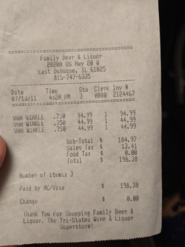
Receipt for 1 bottle of 20-year Pappy and 2 bottles of 12-year Van Winkle “Special Reserve” from 2011.
Also, why don’t retailers just put bottles on the shelf at $2,000? Stores occasionally do this, but mostly because they are fed up with all of the customers calling about rare bottles. Sometimes they will price it even higher than secondary markets. But usually, they allocate the bottles by something other than the price mechanism. Why? Businesses don’t usually leave dollar bills, especially $1,000 dollar bills, on the table.
Have you seen this chart? I certainly have. It floats around on social media a lot. The chart seems to indicate that poor Americans are better off than the average person in most other rich countries. Roughly equal to Canada and France, and better off than Denmark or New Zealand.
When I’ve asked for sources in the past, people usually aren’t sure. They remember downloading it from somewhere, but they can’t recall where.
But I think I found the source: it’s this article from JustFacts. After seeing how they calculated it, I’m skeptical that it provides a good comparison of poor Americans to other countries.
Here’s what the chart does. For most countries, it uses a World Bank measure of consumption per capita. They then convert that to US dollars using PPP adjustments. For the poor in the US, they use a consumption estimate for the bottom 20% of households (Table 6), and then divide by the average number of people per household. For the poor in the US, the average consumption for 2010 was an amazing $57,049, more than double the poverty line! That’s about $21,000 per poor person.
Online platforms are allowing us to trade used goods more easily than before. Similarly, sites like UpWork and Uber are making it easier to trade small blocks of human labor. Since the gig economy is growing (as documented by Dimitri Koustas), it’s important to understand how it is affecting workers.
Liya Palagashvili of Mercatus has a working paper with Paoula Suarez “Women as Independent Workers in the Gig Economy” examining particularly how the growing opportunities to work on a gig basis has affected women in different ways than men. They note, for example, that (in 2014–2015) 87 percent of independent workers on the Etsy platform were female, while 14 percent of workers on Uber’s platform were female.
Abstract: New technologies and digital platforms have ushered in a rise of gig, freelance, contract, and other types of independent work. Although independent workers and the gig economy as a whole have received plenty of attention, little research has examined the heterogeneity of work characteristics among different independent work opportunities, specifically as it relates to the participation of women in this workforce. Existing data indicate that some digital platforms are more male dominated, whereas others are more female dominated. What accounts for these differences? In this paper, we empirically examine the heterogeneity of work within independent work opportunities in relation to female participation by analyzing work characteristics in the United States from the Occupational Information Network (O*Net) database that reflect greater temporal flexibility, which has been shown to vary across occupations and to attract more female workers. Our findings suggest that women in the independent work context do self-select into the types of independent work jobs that reflect greater temporal flexibility, as is the case for women working in traditional employment. However, our findings also reveal that the way in which the existing literature measures temporal flexibility in traditional work settings may not be the same as the way it is measured in the context of independent work. We discuss the implications of our findings for public policy and labor laws. (emphasis mine)
Dmitri Koustas of U. Chicago has a forthcoming paper “Is New Platform Work Different than Other Freelancing?”
Abstract: The rise of freelance work in the online platform economy (OPE) has received considerable media and policy attention in recent years, but freelance work is by no means a new phenomenon. In this paper, we draw on I.R.S. tax records to identify instances when workers begin doing online platform work versus other freelance/independent contractor “gig” work for firms. We find gig work occurs around major reductions in outside income, and document usage over the lifecycle. Our results provide suggestive evidence on motivations for entering into each type of work. (emphasis mine)
people take on this work primarily because they’ve lost a job or some of their income — and particularly for younger workers, app-based services have been significantly more lucrative than more traditional side hustles.
I got to (virtually) talk to Dmitri Koustas, who is now a leading expert on gig work, this week. He became interested in the gig economy when he was thinking through a more traditional econ. question of generally how people modulate their labor supply in response to income shocks.
He also has a working paper “Is Gig Work Replacing Traditional Employment? Evidence from Two Decades of Tax Returns”
First half of the Abstract: We examine the universe of tax returns in order to reconcile seemingly contradictory facts about the rise of alternative work arrangements in the United States. Focusing on workers in the “1099 workforce,” we document the share of the workforce with income from alternative, non-employee work arrangements has grown by 1.9 percentage points of the workforce from 2000 to 2016. More than half of this increase occurred over 2013 to 2016 and can be attributed almost entirely to dramatic growth among gigs mediated through online labor platforms. We find that the rise in online platform work for labor is driven by earnings that are secondary and supplemental sources of income. Many of these jobs do not show up in self-employment tax records… (emphasis mine)