There is a narrative about US history that goes like this: “Historical racism was really bad and limited opportunities for blacks. Blacks were not allowed to participate in a set of occupations and other civic life. The absence of blacks from typically higher income occupations reduced the number of competitors in those sectors. Not only did blacks have fewereconomic opportunities, the whites who were insulated from competition earned monopoly rents. Therefore, if blacks were excluded, the whites who were in exclusive sectors earned profits at the expense of blacks.”
The logic is neat. Are there any holes in it?Let’s see.
Last week my post was about a new article I have with Scott Winship on the “cost of thriving” today versus 1985. That paper has gotten quite a bit of coverage, including in the Wall Street Journal, which is great but also means you are going to get some pushback. Much of it comes in the form of “it just doesn’t feel like the numbers are right” (see Alex Tabarrok on this point), and that was the conclusion to the WSJ piece too.
Here’s a response of that nature from Mish Talk: “There’s no way a single person is better off today, especially a single parent with two kids based on child tax credits that will not come close to meeting daycare needs.”
He mentions daycare costs, but never comes back to it in the post (it’s mostly about housing costs). Daycare costs are undoubtedly an important cost for families with young children (though since Cass’ COTI is about married couples with one earner, they may not be as relevant). And in the CPI-U, daycare and preschool costs only getting a weight of 0.5%. Surely that’s not reality for the families that actually do pay daycare costs! If only there was an index that applied to the costs of raising children.
In fact, there already is. Since 1960, the USDA has been keeping track of the cost of raising a child. Daycare costs are definitely given much more weight: 16% of the expenditures on children got to child care and education. And much of that USDA index (recently updated by Brookings) looks similar to what COTI includes: housing, food, transportation, health care, education, but also clothing and daycare. I wrote about it in a post last year and compared that cost to various measures of income (including single-earner families and median weekly earnings). But what if we compared it to Oren Cass’ preferred measure of income, males 25 and older working full-time? Here’s the chart.
62 weeks. That’s how long the median male worker would need to work in a year to support a family in 2022, according to the calculations of Oren Cass for the American Compass Cost-of-Thriving Index released this year. Not only is 62 weeks longer than the baseline year of 1985 (when it took about 40 weeks, according to COTI), but there is a big problem: there aren’t 62 weeks in year. It is, by this calculation, impossible for a single male earner to support a family.
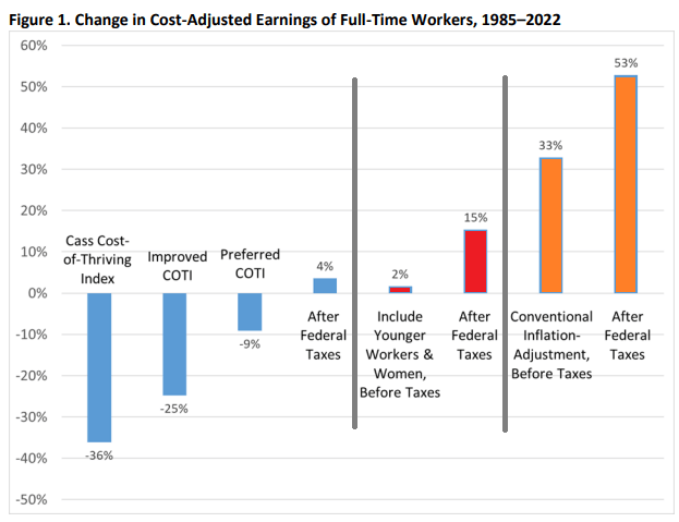
Is this true? In our new AEI paper, Scott Winship and I strongly disagree. First, we challenge the 62-week figure. With a few reasonable corrections to Cass’ COTI, we show that it is indeed possible for a median male earner to support a family. It takes 42 weeks, not 62 as reported in COTI.
But wait, there’s more. Much more. In our paper, we provide a range of reasonable estimates for how the cost of thriving has changed since 1985. In the COTI calculation, the standard of living for a single-earner family has fallen by 36 percent since 1985. In our most optimistic estimate, the standard of living has risen by 53 percent. The chart below summarizes our various alternative versions of COTI. How do we get such radically different results? Is this all a numbers game?
On summer vacation, I recently visited Mount Rushmore. It’s amazing structure, and the story of its construction is as impressive as the monument itself. Much of the story you learn when visiting is the story of its creation. As an economist, of course seeing the following display with wage data got me very excited:
While the sign says that laborers made 30 cents per hour, searching online it appears that 50 cents was more common. More skilled workers, such as assistant sculptors, made $1.50 per hour. These were, as the sign says, “good wages” for that time. In the economy generally, production workers made around 50 cents per hour our as well around that time period, and most of the construction of Rushmore was during the Depression (some of the workers were WPA funded), so having any job, much less one that paid pre-Depression wages, was certainly a good one.
How does this compare to wages today? This is always a tricky question, as I have documented on this blog several times before, but the most straight forward approach (and good first approximation) is a simple CPI inflation adjustment. Using 1929 as the baseline year, when construction was in full swing, 30 cents an hour is roughly $5 today, 50 cents per hour is close to $9, and $1.50 would be about $26.50. That doesn’t sound too bad!
The best comparison I like to use is BLS’s average hourly earnings for private production and non-supervisory workers. Averages aren’t perfect, but this measure excludes management occupations that will be distorting the average. In May 2023, that wage was $28.75 per hour. So the average worker today earns 3-6 times as much per hour as these “good paying jobs” in the late 1920s and the Depression. And, as the Rushmore signage notes, these jobs were seasonal. Their off-season jobs probably paid even less.
The wage of the assistant sculptor does compare well with average wages today, but that pay was unusual for the time and was likely a highly skilled worker. The only record I can find of anyone making that much at Rushmore was Lincoln Borglum, the son of the main sculptor Gutzon Borglum. Lincoln oversaw the completion of the project after Gutzon’s death, and it was only in later years on the project that his pay was increased to $1.50 per hour.
For the typical laborer on Rushmore, having a good job was indeed good to have, but the wages pale in comparison to a typical worker today.
In November 1738, clothier Henry Coulthurst informed weavers that he was cutting their piecework rates and would henceforth pay them in goods rather than cash. Needless to say, they were upset. Food prices were rising, and lower wages meant hunger and want.
Over three days in December, the weavers rioted. They smashed Coulthurst’s mill, wrecked his home, and “drank, carried out, and spilt, all the Beer, Wine and Brandy in the cellars.” They returned the following day to demolish Coulthurst’s house…
Wow. Our paper on cutting nominal wages is called “If Wages Fell During a Recession” We ran an experiment in which workers could retaliate if they experienced a nominal wage cut. They did! They couldn’t smash their employer’s house, but some of the slighted workers dropped their effort level down to the minimum level which meant that their employer made no more money in the experiment.
In my talk at IUE (show notes here and YouTube video), I connect the wage cut paper to another experiment on beliefs. One wonders, considering how serious the consequences turned out to be for Henry Coulthurst, why he was not able to anticipate the backlash against wage cuts. Being wrong was costly for him.
People are not always good at appreciating how strongly others have become attached to their own reference points. That’s why the paper on beliefs is called “My Reference Point, Not Yours“
Getting long-run historical PE ratios of US stocks by industry seems like the kind of thing that should be easy, but is not. At least, I searched for an hour on Google, ChatGPT, and Bing AI to no avail.
I eventually got monthly median PEs for the Fama French 49 industries back to 1970 from a proprietary database. I share two key stats here: the average of median monthly industry PE 1970-2022, and the most recent data point from late 2022.
Industry
Long Run Mean
End 2022
AERO
12.14
19.49
AGRIC
10.75
9.64
AUTOS
9.65
17.52
BANKS
10.38
10.46
BEER
15.23
35.70
BLDMT
12.00
15.41
BOOKS
12.95
17.60
BOXES
12.18
10.69
BUSSV
12.07
13.03
CHEMS
12.40
19.26
CHIPS
10.48
17.47
CLTHS
11.45
10.94
CNSTR
8.98
4.58
COAL
8.04
2.92
DRUGS
1.14
8.01
ELCEQ
10.78
17.85
FABPR
10.28
19.40
FIN
11.16
12.97
FOOD
14.30
25.03
FUN
9.10
21.06
GOLD
3.18
-5.95
GUNS
11.50
5.05
HARDW
7.96
19.16
HLTH
11.91
6.09
HSHLD
12.60
20.15
INSUR
10.95
16.33
LABEQ
13.46
25.18
MACH
12.51
20.27
MEALS
13.83
19.19
MEDEQ
6.81
27.64
MINES
8.06
16.27
OIL
6.96
9.00
OTHER
12.20
27.68
PAPER
12.50
16.69
PERSV
12.86
-0.65
RLEST
8.13
-0.30
RTAIL
12.26
8.58
RUBBR
12.11
12.81
SHIPS
9.79
17.42
SMOKE
11.74
17.79
SODA
12.38
32.09
SOFTW
8.21
-2.85
STEEL
8.18
4.30
TELCM
6.75
9.58
TOYS
9.18
-1.32
TRANS
11.25
13.11
TXTLS
9.43
-49.00
UTIL
12.34
17.41
WHLSL
11.08
13.13
Mean Industry Median
10.52
12.73
One obvious idea for what to do with this is to invest in industries that are well below their historical price, and avoid industries that are above it (not investment advice). Looking just at current PEs is ok, but a stock with a PE of 8 isn’t necessarily a good value if its in an industry that typically has PEs of 6.
By this metric, what looks overvalued? Money-losing industries (negative current earnings): Gold, Personal Services, Real Estate, Software, Toys, and Textiles. Making money but valuations 19+ above historical average: Medical Equipment, Beer, Soda. Most undervalued relative to history: Guns, Health, Coal, Construction, Steel, Retail (all 3+ below the historical average).
Of course, I don’t recommend blindly investing in these “undervalued” industries- not just for legal reasons, but because sometimes the market prices them low for a reason- that earnings are expected to fall. The industry may be in secular decline due to new types of competition (coal, steel, retail). Or investors may expect it to get hit with a big cyclical decline in an upcoming recession or rotation from the Covid goods/manufacturing economy back to services (guns, construction, steel, retail). Health services (as opposed to drugs and medical equipment) stands out here as the sector where I don’t see what is driving it to trade at barely half of its usual PE.
I’d still like to get data on long run market-cap weighted mean PE by industry, as opposed to the medians I show here. The best public page I found is Aswath Damodaran’s data page, which has a wide variety of statistics back to about 1999. Some of the current PEs he calculates are quite different from those in my source, another reason to tread carefully here. I’m not sure how much of this is mean vs median and how much is driven by different classification of which stocks fit in which industry category.
This gets at a big question for anyone trying to actually trade on this- do you buy single stocks, or industry ETFs? Industry ETFs make sense in principle (since we’re talking about industry level PEs overall) and also add built-in diversification. But the PE for the ETF’s basket of stocks likely differs from that of the industry as a whole. It would make more sense to compare the ETF’s current PE to its own historical PE, but most industry ETFs have very short track records (nothing close to the 53 years I show here). PE is also far from the only valuation metric worth considering.
All this gets complex fast but I hope the historical PE ratio by industry makes for a helpful start.
In the tapestry of human progress studies, two authors, Adam Smith and Virginia Postrel, have left their mark on the story of productivity and innovation. Their books, written centuries apart, both explore the power of specialization and the division of labor.
Part of the reason this came out this week is that I’m reading The Fabric of Civilization. So good! It had come highly recommended before, but I finally have an excuse to read it because I’m working on an article about fashion.
It’s teen girls who care about what they wear, and rough military men do not even think about it. Right? Wrong.
Up Front is a book depicting WWII soldiers by cartoonist Bill Mauldin. Around page 135, Mauldin describes how men dressed who were close to the front lines but not actually in combat. Mauldin coined the term garritrooper (a portmanteau of garrison and paratrooper). I thank Prof. Mike Munger for the pointer.
The garritroopers are able to look like combat men or like the rear soldiers, depending on the current fashion trend. When the infantry was unpublicized and the Air Forces were receiving much attention, the emphasis was on beauty… [The garritroopers] would not wear ordinary GI trousers and shoes, but went in for sun glasses, civilian oxfords, and officers’ forest-green clothing. This burned up many decidedly unglamorous airplane mechanics who worked for a living and didn’t look at all like the Air Force men the garritrooper saw in the magazines.
We are all trying to look like the celebrities in magazines, even if we don’t all agree on who is a celebrity and which magazine to read.
Look at that smirk, found on the Wikipedia page. Bill Mauldin is temporarily my new favorite writer.
Gary Becker, the Nobel laureate in economics, applied economic reasoning to social circumstances and particularly to families. He argued that children are a normal consumption good, and people consume more children with higher incomes. However, he also emphasized a quantity-quality trade-off. More children in a family means fewer resources and attention for each child. Higher-income couples may opt to invest in classes, training, and spend more time with a unitary child rather than increasing the number of children.
However, goods have multiple attributes and children do not merely provide a stream of consumption value while in the household. They offer access to future resources when they become employed themselves. Having more children or higher-quality children increases the economic benefits that older parents can enjoy, such as more help with household activities and the ability to travel with their adult children. Old-age benefits such as social security now serve the function of insulating people from their prior investments in future consumption.
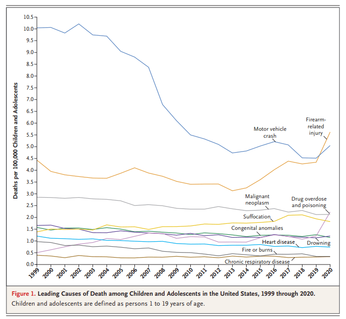
You might have seen this chart recently. It comes from a letter published in the New England Journal of Medicine in April 2022. The data comes directly from the CDC. It shows the leading causes of death for children in the US. You will notice that firearm-related deaths have been rising for much of the past decade, and in 2020 eclipsed car accidents as the leading cause.
Many are sharing this chart in response to the recent elementary school shooting in Nashville. It’s natural to want to study these problems more in the wake of tragedies. After the Uvalde shooting last year, I tried to read as much as I could about the history of homicide and gun violence in the US, and to look at the research on what might work to reduce gun violence, which is summarized in a post I wrote last June.
That being said, I don’t think the chart above accurately characterizes the problem of elementary school shootings. It might accurately describe some broader problem, but it’s misleading with respect to the shooting we all just witnessed. The most important reason is that the definition of “children” here extends to 18- and 19-year-olds. Much of the gun-related homicides for “children” shown here are gang-related violence, not random school shootings at elementary schools. It’s not that we shouldn’t care about these deaths too — we very much should care — but the causes and solutions are entirely different from elementary school mass shootings.