That’s the title of a talk I’ll be giving Saturday at the Financial Capability Conference at Rhode Island College. Registration for the conference, which also features personal finance speakers and top Rhode Island politicians, is free here.
A preview: after many changes, the average tariff on the goods Americans import has settled in the 15-20% range:
If the tariffs stay in place, which is far from certain, this will represent roughly a 2% increase in overall costs for Americans (a ~17% tax on imports which are ~14% of the economy predicts a 2.4% increase, but a bit of that will be paid by foreign producers lowering prices).
This is bad for US consumers, but not as bad as the Covid-era inflation, and likely not as bad as our upcoming problems with debt and plans to weaken the dollar. It is more valuable for most people to make sure they are getting the personal finance basics right than to think about how to avoid tariffs, though they may want to consider investments that hold their value with a weakening dollar.
Tomorrow, the Bureau of Labor Statistics is set to release the first major report of economic data that was delayed by the federal government shutdown: the September 2025 employment situation report. It’s good that we will get that information, but notice that we’re now in the middle of November and we’re just now learning what the unemployment rate was in the middle of September — 2 months ago (you can see their evolving updated release calendar at this link). This is less than ideal for many reasons, including that the Federal Reserve is trying to make policy decisions with a limited amount of the normal data.
What about the October 2025 unemployment rate? Early indications from the White House are that we just will never know that number. Why? Because the data likely wasn’t collected, due to the federal government shutdown. There was some confusion about this recently, with many people asking why they don’t just release it. Well, that’s because they can’t release what they don’t collect: the unemployment rate comes from the Current Population Survey, a joint effort of the BLS and Census where they interview 60,000 households every month. The survey was not done in October. It would not be impossible to do this retroactively, but the data would be of lower quality and, again, quite delayed. That gap in a series that goes back to 1948 wouldn’t be the end of the world, but it is symbolic of the disfunction of our current political moment.
What about GDP? We are now over half way through the 4th quarter of the year, and… we still don’t know what happened with GDP in the third quarter of 2025. BEA is in the process of revised their release calendar too, but they haven’t yet told us when 3rd quarter GDP will be released. In this case, the data was likely collected, but there is a certain amount of processing that needs to be done. Sure, we have estimates from places like the Atlanta Fed’s GDPNow model, but the trouble is… many of the inputs it uses are government data which haven’t been released yet for the last month of the quarter.
Eventually, all will mostly be well and back to normal, even if there are a few monthly gaps in some data series. The temporary data darkness may be coming to an end soon, but I fear it will not be the last time this happens.
Michael Burry is famed for being among the first to both discern and heavily trade on the ridiculousness of subprime mortgages circa 2007. He is a quirky guy: brilliant, but probably Asperger‘s. That comes through in his portrayal in the 2015 movie based on the book, The Big Short.
He called it right with mortgages in 2007, but was early on his call, and for many months lost money on the bold trading positions he had put on in his hedge fund, Scion Capital. Investors in his fund rebelled, though he eventually prevailed. Reportedly he made $100 million himself, and another 700 million for his investors, but in the wake of this turmoil, he shut down Scion Capital.
In 2013 he reopened his hedge fund under the name Scion Asset Management. He has generated headlines in the past several years, criticizing high valuations of big tech companies. Disclosure of his short positions on Nvidia and Palantir may have contributed to a short-term decline in those stocks. He has called out big tech companies in general for stretching out the schedule of depreciation of their AI data center investments, to make their earnings look bigger than they really are.
Burry is something of an investing legend, but people always like to take pot shots at such legends. Burry has been rather a permabear, and of course they are right on occasion. For instance, I ran across the following OP at Reddit:
Michael burry is a clown who got lucky once
I am getting sick and tired of seeing a new headline or YouTube video about Michael burry betting against the market or shorting this or that.
First of all the guy is been betting against the market all his career and happened to get lucky once. Even a broken clock is right twice in a day. He is one of these goons who reads and understands academia economics and tries to apply them to real world which is they don’t work %99 of the time. In fact guys like him with heavy focus on academia economic approach don’t make it to far in this industry and if burry didn’t get so lucky with his CDS trade he would be most likely ended up teaching some bs economic class in some mid level university.
Teaching econ at some mid-level university, ouch. (But a reader fired back at this OP: OP eating hot pockets in his moms basement criticizing a dude who has made hundreds of millions of dollars and started from scratch.)
Anyway, Burry raised eyebrows at the end of October, when he announced that he was shutting down his Scion Asset Management hedge fund. This Oct 27 announcement was accompanied by verbiage to the effect that he has not read the markets correctly in recent years:
With a heavy heart, I will liquidate the funds and return capital—minus a small audit and tax holdback—by year’s end. My estimation of value in securities is not now, and has not been for some time, in sync with the markets.
To me, all this suggested that Burry’s traditional Graham-Dodd value-oriented approach had gotten run over by the raging tech bull market of the past eight years. I am sensitive to this, because I, too, have a gut bias towards value, which has not served me well in recent years. (A year ago I finally saw the light and publicly recanted value investing and embraced the bull, here on EWED).
Out of curiosity, therefore, I did some very shallow digging to try to find out how his Scion fund has performed in the last several years. I did not find the actual returns that investors would have seen. There are several sites that analyze the public filings of various hedge funds, and then calculate the returns on those stocks in those portfolio percentages. This is an imperfect process, since it will miss out on the actual buying and selling prices for the fund during the quarter, and may totally miss the effects of shorting and options and convertible warrants, etc., etc. But it suggests that Scion’s performance has not been amazing recently. Funds are nearly always shut down because of underperformance, not overperformance.
Pawing through sites like HedgeFollow (here and here) , Stockcircle, and Tipranks, my takeaway is that Burry probably beat the S&P 500 over the past three years, but roughly tied the NASDAQ (e.g. fund QQQ). This performance would naturally have his fund investors asking why they should be paying huge fees to someone who can’t beat QQQ.
What’s next for Burry? In a couple of tweets on X, Burry has teased that he will reveal some plans on November 25. The speculation is that he will refocus on some personal asset management fund, where he will not be bothered by whiny outside investors. We shall see.
A large portion of my favorite art and artists frame themselves as “anti-capitalist”. Now, I know I am repeatedly on the record saying that the terms “capitalism” and “socialism” have been stripped of most meaning at this point, with limited ability to communicate any useful information save group signaling or mood affiliation (i.e. everything I don’t like is an exemplar of late-stage capitalism or crypto Marxist socialism), but the language is used enough within the art I like that it’s worth pondering a moment.
Now, I think it’s a bit of a trap to impose strong interpretations on how artists interpret themselves or their art. It’s their art, not mine. I also think it’s a memeable offense to try to “gotcha” artists who sell their art in the marketplace as capitalists who doth protest too much.
Yeah, I get it, everyone has to eat, even if you would prefer to live in a socialist utopia. I do think there is more worth untangling, though, and as an act of good faith I will spoil part of my conclusion. I don’t think there is anti-capitalism art anymore than there is pro-capitalism art. Rather, I think there is art and there is propaganda.
Art is one of many luxuries yielded by the remainder of time not subsumed by the needs of survival. A society that builds within itself a marketplace that rewards specialization, innovation, and efficiency will find itself suffused in art. I’m sure there are things beyond relationships, purpose, and art that make life worth living, but I can’t think of any. If in pursuing your purpose you can find art and build community, well, that’s a life well-lived.
So does art depend on the marketplace or is it an act of rebellion against it? Can it be both? I think it can. The true threat to art is not the intercession of commerce but service to power. Art is characterized more than anything by a direct, if parasocial, relationship between the artist and their audience. Service to power corrupts that relationship, demanding service to an intentionally unobserved third party. The perceived communication from the artist is now an act of deception, surrepticiously communicating the preferred messaging of the third-party. Beyond just robbing the artist of their integrity, it undermines the confidence an audience can have in all the art it consumes. Propaganda is, in this manner, a negative externality, polluting everything that art can and does provide in our lives.
When writers and other artists complain about the interventions of private equity, they are complaining about a couple things. First, and probably foremost, it is often the insistence on a revenue model (high risk, high growth) that simply does not translate to the current media landscape. It’s a bad model and makes for bad business. It should not be ignored, however, that one of the failures that a high-growth revenue model brings to a media context is a necessary subserviance to power. Service to large equity stakes (i.e. evil rich people), yes, but also service to regulatory authorties, cultural authorities, anyone and everyone that might derail your path to the hearts of the largest common denominator, to the other side of a dreamed of (and likely wholly imaginary) tipping point beyond which the glories of power law scaling will turn your tens of millions into hundreds of billions.
When a story teller places you in a dystopian future where the vagaries of a galactic-scale marketplace lead to the devaluing of life on wholesale planetss in service to the profits of preexisting conglomerates, corporations, and sultanates, it is often framed as anti-capitalist fiction. And that’s a natural summation: people are commodified, exchanged, and disposed of. But of course the power behind commodification comes with military bodies, royal lineages, and a sci-fi feudalism whose roots always trace back eventually coercive force. Commerce may be the engine producing the resources underpinning your evil army (soldiers gotta have something to eat, a way to get there, and something to shoot), but in the end the big bad evil empire is always pointing a gun.
Conversely, when a comedian both sets up shop in Austin, TX and underpins a genre of comedy that frames itself as “anti-woke”, it is not disappinting to most artists because it is “pro-capitalism”. It’s disappointing because once you scratch the surface, it becomes clear it is in service of power. It’s not aligning itself as anti-woke because there are three words that audiences will shame them for using. It’s doing so in the hopes that punching down on the same vulnerable, (often extremely) small minority populations targeted by other locuses of political and media power, they can acquire the same kind of most-favored nation status that have lifted the careers of others whose mediocre talents were insuffient to garner an audience on their own.
Art is inherently, maybe even necessarily, anti-power, because there is no room in the relationship with it’s audience for the interests of a third party. Art needs patrons, yes. The marketplace is a boon to the production and consumption of art. But when the movies, television, writing, music, video games, dance, etc of our lives is compelled to serve the interests of anyone but the artist and the audience, people sniff it out. They rebel. They blame. Whether they blame the market, the government, or religious authorities, well, that just depends on the current framing of power. And honestly, I’m not sure the framing matters all that much. It might show up in the artist’s statement next to the installation or in their AMA on reddit, but most people don’t read those, they already know who to be mad at. And besides, the art already exists. They don’t need intervention from any third-parties, maybe not even the artists.
The French magazine L’Express is widely read as magazines go. I was asked to give comments on fast fashion. An interview with me has been published in French at
Idées: Alors que Shein provoque une controverse nationale en France, l’économiste américaine invite à un regard nuancé sur la fast fashion, rappelant que le trop-plein de vêtements est un problème très récent dans l’histoire humaine.
Ideas: While Shein is causing a national controversy in France, the American economist urges a more nuanced view of fast fashion, reminding us that the overabundance of clothing is a very recent problem in human history.
I enjoyed talking with their reporter Thomas Mahler (kindly for me, in English). He informed me that French politicians are proposing to ban Shein from the country, meanwhile millions of people in France shop through Shein regularly.
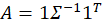
Previously, I plotted the possible portfolio variances and returns that can result from different asset weights. I also plotted the efficient frontier, which is the set of possible portfolios that minimize the variance for each portfolio return.* In this post, I elaborate more on the efficient frontier (EF).
To begin, recall from the previous post the possible portfolio returns and variances.
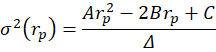
From the above the definitions we can see that the portfolio return depends on the asset weights linearly and that the variance depends on the asset weights quadratically because the two w terms are multiplied. Since the portfolio return can be expressed as a function of the weights, this implies that the variance is also a quadratic function of returns. Therefore, every possible portfolio return-variance pair lies on a parabola. So, it follows that every pair along the efficient frontier also lies on a parabola. Not every pair lies on the same parabola, however – the efficient frontier can be composed on multiple parabolas!
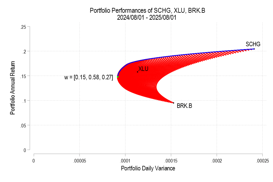
I’ll use the same 3 possible assets from the previous post, below is the image denoting the possible pairs, the EF set, and the variance-minimizing point.
One way to find the EF is to calculate every possible portfolio variance-return pair and then note the greatest return at each variance. That’s a discrete iterative process and it definitely works. One drawback is that as the number of assets can increase the number of possible weight combinations to an intractable number that makes iterative calculations too time consuming. So, we can instead just calculate the frontier parabolas directly. Below is the equation for a frontier parabola and the corresponding graph.
Notice that the above efficient frontier doesn’t appear quite right. First, most obviously, the portion below the variance-minimizing return is inapplicable – I’ve left it to better illustrate the parabola. Near the variance-minimizing point, the frontier fits very nicely. But once the return increases beyond a certain level, the frontier departs from the set of possible portfolio pairs. What gives? The answer is that the parabola is unconstrained by the weights summing to zero. After all, a parabola exists at the entire domain, not just the ones that are feasible for a portfolio. The implication is that the blue curve that extends beyond the possible set includes negative weights for one or more of the assets. What to do?
As we deduced earlier, each pair corresponds to a parabola. So, we just need to find the other parabolas on the frontier. The parabola that we found above includes the covariance matrix of all three assets, even when their weights are negative. The remaining possible parabolas include the covariance matrices of each pair of assets, exhausting the non-singular asset portfolios. The result is a total of four parabolas, pictured below.
12 states representing 21% of US high schoolers passed mandates for personal finance classes just since 2022. This sounds like a good idea that will enable students to navigate the modern economy. But does it work in practice?
A 2023 working paper “Does State-mandated Financial Education Affect Financial Well-being?” by Jeremy Burke, J. Michael Collins, and Carly Urban argues that it does, at least for men:
We find that the overall effects of high school financial education graduation requirements on subjective financial well-being are positive, between 0.75 and 0.80 points, or roughly 1.5 percent of mean levels. These overall effects are driven almost entirely by males, for whom financial education increases financial well-being by 1.86 points, or 3.8 percent of mean financial well-being.
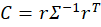
The paper has nice figures on financial wellbeing beyond the mandate question:
As soon as I heard about the rapid growth in these mandates from Meb Faber and Tim Ranzetta, I knew there was a paper to be written here. I was glad to see at least one has already tackled this, but there are more papers to be written: use post-2018 data to evaluate the new wave of mandates, evaluate the economics mandates in addition to the personal finance ones, and use a more detailed objective measure like the Survey of Consumer Finances.
There’s also more to be done in practice, hiring and training the teachers to offer these new classes:
our estimates are likely attenuated due to poor compliance by schools subject to new financial education curriculum mandates. Urban (2020) finds evidence that less than half of affected schools may have complied. As a result, our estimated overall and differential effects may be less than half the true effects
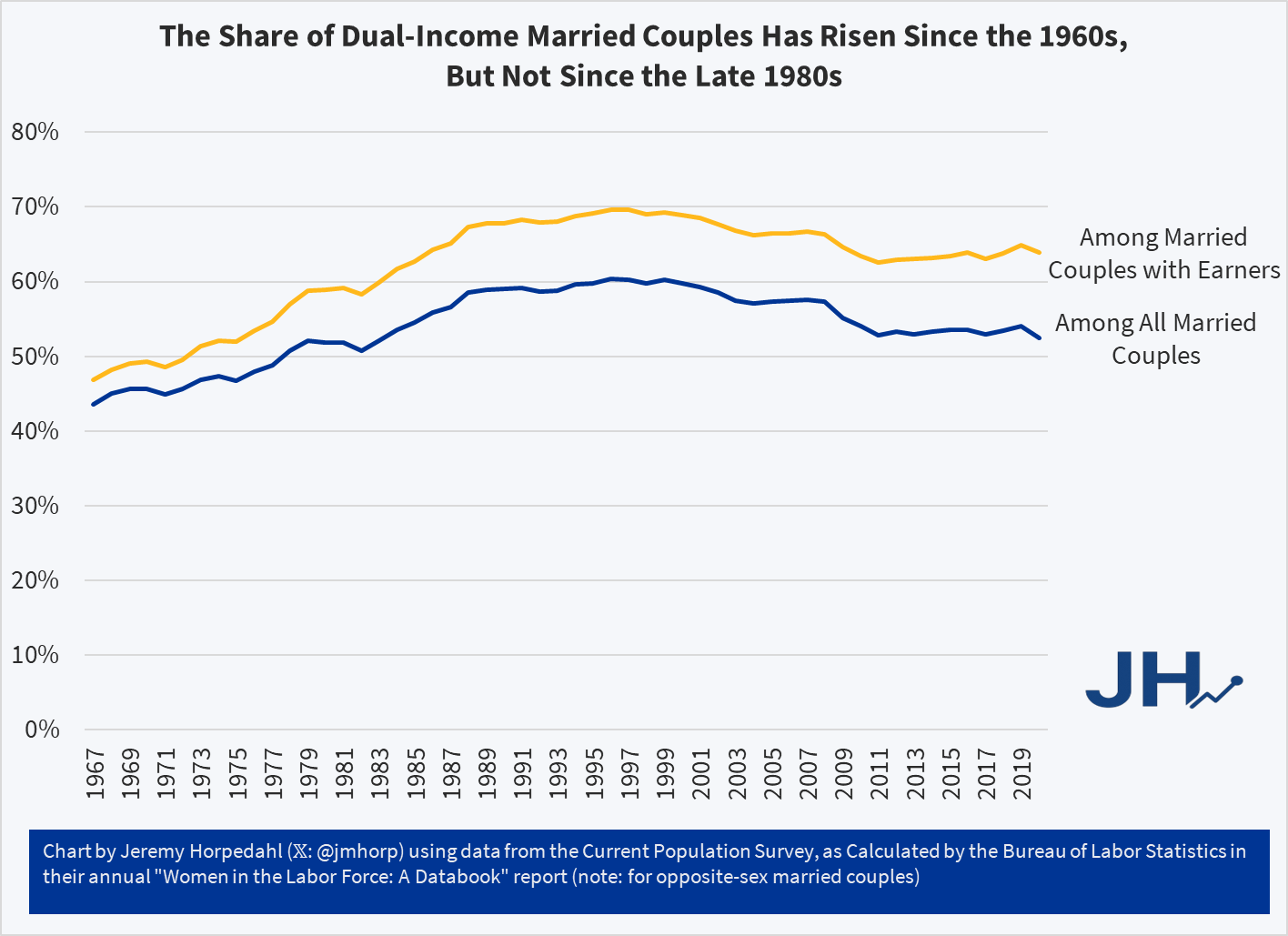
In addition to questions about inflation adjustments and general disbelief, one of the more common questions about this data is how much of it is driven by rising dual-income families, where both the husband and wife work (for purposes of this post, I will look only at opposite-sex couples, since going back to the 1960s this is the only way we can really make consistent comparisons).
In short: most of the growth of high-income families can not be explained by the rise of dual-income families. The basic reason is that the growth in dual-income families had mostly already occurred by the 1980s or 1990s (depending on the measure). So the tremendous growth since about 1990, when just about 15 percent of families were above $150,000 (in 2024 dollars), is better explained by rising prosperity, not a trick of more earners.
You can see this in a number of ways. First, here is the share of married couples where both spouses are working. I have presented the data including all married couples (blue line), as well as only married couples with some earners (gold line), since the aging of the population is biasing the blue-line downwards over time.
Meta stock has dropped about 13% when its latest quarterly earnings were released, then continued to slide until today’s market exuberance over a potential end to the government shutdown. What is the problem?
Meta has invested enormous sums in AI development already, and committed to invest even more in the future. It is currently plowing some 65% (!!) of its cash flow into AI, with no near-term prospects of making big profits there. CEO Mark Zuckerberg has a history of spending big on the Next Big Thing, which eventually fizzles. Meta’s earnings have historically been so high that he can throw away a few billion here and there and nobody cared. But now (up to $800 billion capex spend through 2028) we are talking real money.
Up till now Big Tech has been able to finance their investments entirely out of cash flow, but (like its peers), Meta started issuing debt to pay for some of the AI spend. Leverage is a two-edged sword – – if you can borrow a ton of money (up to $30 billion here) at say 5%, and invest it in something that returns 10%, that is glorious. Rah, capitalism! But if the payout is not there, you are hosed.
Another ugly issue lurking in the shadows is Meta’s dependence on scam ads for some 10% of its ad revenues. Reuters released a horrifying report last week detailing how Meta deliberately slow-walks or ignores legitimate complaints about false advertising and even more nefarious mis-uses of Facebook. Chilling specific anecdotes abound, but they seem to be part of a pattern of Meta choosing to not aggressively curtail known fraud, because doing so would cut into their revenue. They focus their enforcement efforts in regions where their hands are likely to be slapped hardest by regulators, while continuing to let advertisers defraud users wherever they can get away with it:
…Meta has internally acknowledged that regulatory fines for scam ads are certain, and anticipates penalties of up to $1 billion, according to one internal document.
But those fines would be much smaller than Meta’s revenue from scam ads, a separate document from November 2024 states. Every six months, Meta earns $3.5 billion from just the portion of scam ads that “present higher legal risk,” the document says, such as those falsely claiming to represent a consumer brand or public figure or demonstrating other signs of deceit. That figure almost certainly exceeds “the cost of any regulatory settlement involving scam ads.”
Rather than voluntarily agreeing to do more to vet advertisers, the same document states, the company’s leadership decided to act only in response to impending regulatory action.
Thus, the seamy underside of capitalism. And this:
…The company only bans advertisers if its automated systems predict the marketers are at least 95% certain to be committing fraud, the documents show. If the company is less certain – but still believes the advertiser is a likely scammer – Meta charges higher ad rates as a penalty, according to the documents.
So…if Meta is 94% (but not 95%) sure that an ad is a fraud, they will still let it run, but just charge more for it. Sweet. Guess that sort of thinking is why Zuck is worth $250 million, and I’m not.
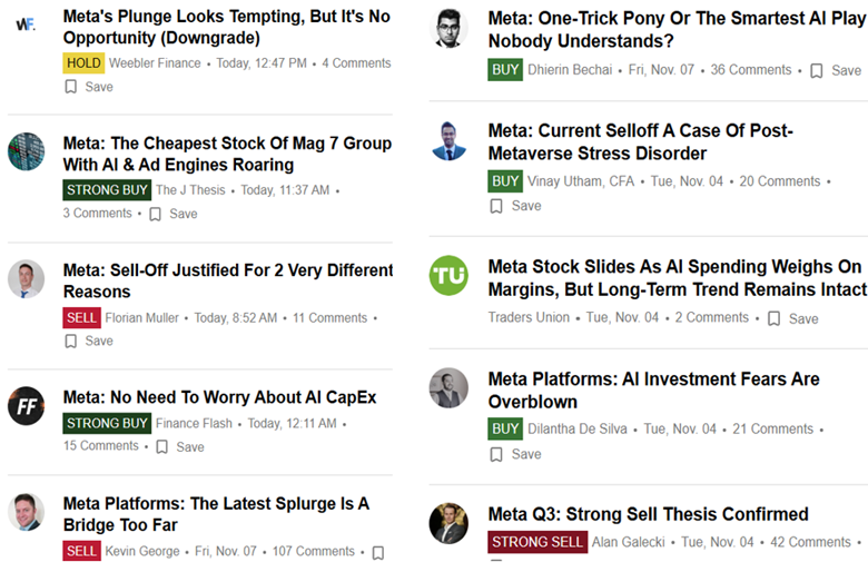
But never fear, Meta’s P/E is the lowest of the Mag 7 group, so maybe it is a buy after all:
In the United States, most people just turned their clocks back one hour for the end of Daylight Saving Time. This annual ritual happens in fall when we “gain” an extra hour of sleep but also notice that the sun starts setting earlier in the evening.
For many of us, we get, once again, bright daylight at least 30 minutes before the kids are due at school. In most parts of the country, that means sunrise is now somewhere between 6:30 and 7:00 a.m. This helps families who are trying to get moving, find shoes, and make breakfast before the first bell rings. The morning light makes it feel to kids like the day is starting as opposed to Mom trying to “make them get up.”
Although every child and schedule is different, sunlight helps parents navigate the morning with their dependents.
I hear people complain every year that they can’t hang out with friends in the daylight after work once the clocks change. I understand that. It’s not easy to balance all these competing needs. If I were only in charge of myself, I could imagine getting up in total darkness and finishing work with a couple of hours of daylight left to enjoy. I think I could handle that just fine. But as a society, with kids, parents, teachers, bus drivers, and caregivers all trying to operate on a shared schedule, it seems reasonable to prioritize morning light. That’s when the essential stuff happens. If it helps parents, consider keeping it.
A last note for parents: If this system is going to work, turn off devices and screens at some reasonable time such as before 8:30pm. Otherwise, the world practically turning on its axis to help you (okay, I’m exaggerating) won’t do much good. The blue light from phones, tablets, and televisions suppresses melatonin, the hormone that helps us fall asleep, and tricks the brain into thinking it’s still daytime. As a bonus, if you were hoping your kid would read more, they might read before bed if it’s the only thing they are allowed to do. Reading a paper book with a normal light does not mess up the sleep schedule so much.
The brilliant thing about reading to kids who are in bed is that, if they aren’t paying attention, you can turn out the light and tell them they are going to sleep 5 minutes early. This works best if it’s pitch-black dark outside at bedtime. Stop scrolling and go to sleep (if you are reading this after dark).
Some people deal with different circumstances close to the poles like seasonal depression. I have no advice about that, although the technology of sun-mimicking lamps is available. Maybe that’s why Americans are moving to the sun belt with air conditioning.