I thought this was going to be another election post, but it didn’t turn out that way.
My plan was to do another annual portfolio review, with a focus on changes I’ll make to my portfolio as a result of how the election impacts various market themes, and how my take on the election differs from the market’s take. But as I looked at my portfolio, what struck me wasn’t how the election changes things, but instead how severely my stock picks underperformed the incredible 26% return the S&P has posted so far this year.
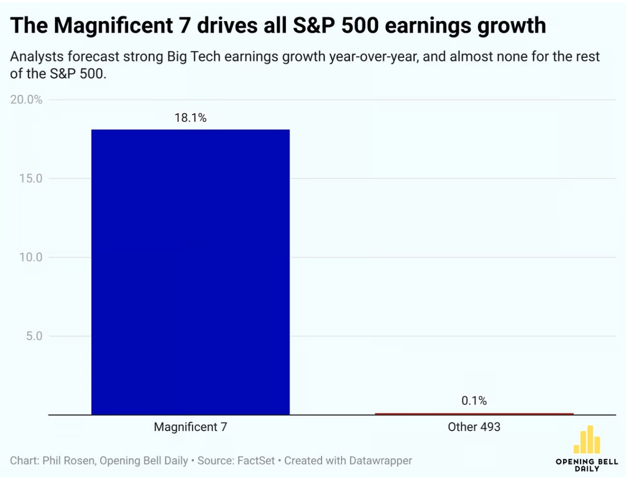
My first couple years of stock picking tended to match the S&P, roughly what you’d expect if markets are efficient and I’m just throwing darts. But more recently so much of the overall return of the market has been driven by just 7 mega-cap stocks, the “Magnificent 7”, that if you don’t own them you are probably underperforming big time.
Of course buying a broad index, especially a market-cap-weighted one like the S&P, is a way to ensure you own at least a piece of the big winners, which is one reason economists usually recommend buying the broad index. And I did this with 80% of my portfolio, to match my 80% belief in the efficient markets hypothesis. But I’m now back up to 90% belief in efficient markets, at least for stocks.
This efficiency seems to change a lot over time. Probably fewer than 10% of US stocks have obvious mis-pricings right now; really none stand out as super mispriced to a casual observer like me. Instead, it seems like every 10 years or so a broad swathe of the market is driven crazy by a bubble or a crash, and you get lots of mispricing- like tech in 2000, forced/panic selling at the bottom in 2009, or meme stocks in 2021. The rest of the time, the stock market is quite efficient. So, in typical times, just be boring and buy and hold a broad index fund.
Of course, you might think that AI is a bubble now. I certainly don’t love the 68 P/E on NVIDIA, but this doesn’t strike me as a true bubble driven by irrational hope- peoples’ hopes have proven well justified so far, with AI performing miracles and the Mag 7 delivering huge profits. So like Scott, I’m finally giving up on being overweight value stocks. Perhaps our capitulation is the sign that growth’s decade-plus run is finally about to reverse; but if so, I’ll try not to regret it. After all, the S&P has plenty of value stocks too.
A new essay by J. Zachary Mazlish answers the title question in the affirmative: yes, inflation made the median voter poorer. The post is data-heavy, with lots of charts and different ways of slicing the data, which is great! But since I am called out by name (or rather, my evil twin, Jeremy Horpendahl), I want to respond specifically to the claim about my data, but also I’ll make a few broader points.
Regular readers will recognize the chart in that Tweet comes from an EWED post from April 2024. Mazlich says that my chart and others like it are “misleading for understanding the election because a) they compare wages now versus January 2020, rather than January 2021.”
Fair enough, but if you read my Tweet you will see that I am specifically responding to an NPR story which said, “if you look at the difference between what… groceries cost in 2019 and what it costs today, and what wages looked like in 2019 and today, the gap is really gigantic.” So, they are specifically using 2019 as a baseline in that story, and my chart specifically used that as the baseline too! That’s why I thought that chart was relevant.
It’s true, of course, that if you want to understand median voter sentiment about the Biden administration, you should probably start the data at the beginning of the Biden administration. But I was responding to the more general claim people make, that they are worse off than in 2019.
With that clarification out of the way, what does Mazlich’s broader post say?
Will Growth Stocks Continue to Trounce Value Stocks?
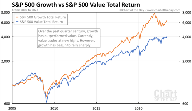
It’s no secret that growth stocks, mainly big tech companies like Apple and Microsoft, have massively out-performed so-called value stocks in the past fifteen years. Value stocks tend to have lower price/earnings and steady earnings and low price/earnings. They include sectors such as petroleum, utilities, traditional banks, and consumer products. These companies often pay substantial dividends from their cash flow.
Here are some charts which make the point. This 2005-early 2023 chart shows value stocks (blue curve) having a small edge 2005-2008, then the growth stocks (orange curve) keep ripping higher and higher. Financial stocks, which mainly fall in the value category, were hit particularly hard in the 2008-2009 downturn.
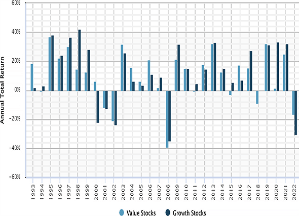
Here is a bar chart display of annual returns of value stocks (blue bars) and of growth stocks for the years 1993-2022. In 1997-1999 growth stocks outperformed. This was the great tech bubble – I remember it well, investors were shoveling money into any enterprise with a customer-facing website, whether or not there was any reasonable path to profitability. Reality caught up in 2000 (“What was I thinking??”), tech stock prices crashed and then tech was hated for a couple of years. But by 2009 or so, today’s big tech firms had emerged and established their quasi-monopolies, and started actually making money and even more money.
So, is the answer to just allocate all your equity portfolio to big tech and walk away? This is a question I have been asking myself. Even as growth stocks dominate year after year, there have continued to be voices warning that this is anomaly; historically, value stocks have performed better. So, with the sky-high valuations of today’s big tech, there is due to be a big mean reversion where the “Magnificent 7” get crushed, and Big Banks and Big Oil and Proctor & Gamble and even humble utilities finally get to shine.
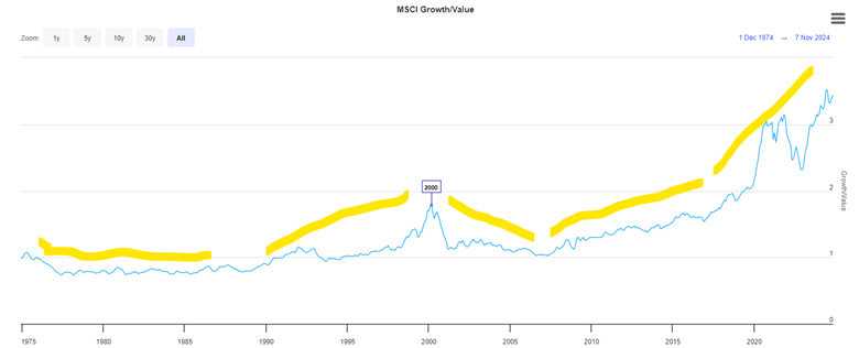
I don’t have a chart that goes that far back, but I have read that over the past 100 years, value has usually beat “growth”. Here is a hard-to-read plot of value vs growth for 1975-2024. I have added yellow highlighter lines to mark major trend periods. Growth underperformed 1975-1990, then growth picked up steam and culminated in the peak in the middle of the chart at 2000. Growth then underperformed 2000-2008, as noted earlier, as the excesses of the tech bubble were unwound, and people made paper fortunes in the real estate bubble of 2001-2007.
Growth has dominated since 2009, excerpt for 2022. That was the year the Fed raised interest rates, which tends to punish growth stocks. However, with their unstoppable increases in earnings (accounting for the vast majority of the earnings in the whole S&P 500), big tech has come roaring back. Yes, they sport high P/E ratios, but they have the earnings and the growth to largely justify their high valuations.
I have been influenced by the continual cautions about growth stocks becoming overvalued. Many an expert has advocated for value stocks. In June of this year, Bank of America head of US equity strategy Savita Subramanian told an audience at the Morningstar Investment Conference: “I have one message to you: Buy large-cap value.” So, for the past couple of years, I have gone relatively light on big tech and have over-allocated to “safer” investments like fixed income and value stocks. Silly me.
In the last few months, I finally decided to give up fighting the dominant trend, and so I put some funds into SCHG, which is specifically large cap growth, and in other growth-heavy funds. As you may imagine, these funds are loaded with Nvidia and Meta and other big tech. They have done very well since then.
How about going forward? Will the growth dominance continue, or will the dreaded mean reversion strike at last? At some point, I suspect that big tech earnings will slow down to where their high valuations can no longer be supported. But I don’t know when that will be, so I will just stay diversified.
Boilerplate disclaimer: Nothing here should be taken as advice to buy or sell any security.
If you’re trying to understand the US election outcome, this is the only graph you need:
I’m not saying “anti-incumbency” is everything. There are a lot of forces wrapped up within this graph. My unnuanced take is that that the pandemic hens came home to roost for incumbent parties. Every single bundle of pandemic policies, from the heaviest handed to the most laissez-faire, were characterized by inevitable trade-offs. People don’t like tradeoffs regardless of whether the bill is paid with a year of doubled fatalities, two years of tripled unemployment, or three years of quadrupled inflation. And that’s why I think incumbent parties, be it US Democrats or UK Tories, lost significant ground. If you want to parse it farther, you could argue US Republicans should be disappointed they didn’t win more given how well opposition parties performed elsewhere.
None of that will change the Take Economy, of course. Thousands of pundits, published or barstool, are all describing in exquisite detail exactly the manner in which this election is a referendum on how the Democrats handled exactly the issue they personally happen to care the most about. It doesn’t mean any one of their opinions is narrowly wrong. I’m sure there was a more perfect campaign to be run, if only because there always is and was.
National politics is rarely a referendum and it’s never just the will of the people. It’s a chaotic system. It’s the weather. We forecast the weather. We makes plans. We accomodate, mitigate, and celebrate. And yes, sometimes we just try to survive it. But we can’t control it.
When MOOCs (Massive Open Online Courses) burst onto the education scene in the early 2010s, they were hailed as the future of learning. With the promise of democratizing education by providing free access to world-class courses from top universities.
Leading universities rushed to put their courses online, venture capital poured in, and platforms like Coursera and edX grew rapidly. Yet today, while MOOCs still exist, they’ve largely retreated to the margins of education. Meanwhile, long-form podcasts have emerged as a surprisingly powerful force in American intellectual life.
Is this ironic? I wanted to learn a bit about MOOCs while I took a walk before writing this blog post. I typed “MOOCs” into the Apple Podcasts search bar.
I learned about MOOCs from Russ Roberts at a reasonable pace (when I listen to podcasts, I do it at 1x speed but I’m almost always doing something like driving or folding laundry).
I consider myself a lifelong learner. I buy and read books. Like hundreds of millions of people around the world, I like podcasts. I will attend lectures sometimes, especially if I personally know someone in the room. I did sit in classrooms for course credit throughout college and graduate school. I took extra classes that I did not need to graduate purely out of interest, and yet I have never once been tempted to sign up for a MOOC.
Enough introspection from me. My viral “tweet” this week was: “MOOCs never took off, as far as I can tell, and yet long-form podcasts are shaping the nation.”
Did MOOCs fail? Many millions of people signed up for MOOCs. A much smaller percentage of people completed MOOCs. Some users find MOOCs worth paying for.
However, if you listen to the podcast with John Cochrane in 2014, you can see the promise that MOOCs failed to live up to. The idea was that many people who did not have access to a “top quality” education would get one through MOOCs. Turns out that access is not the bottleneck.
If you’ve ever been vegetarian or if you have ever spoken to a vegetarian about their diet, then you have probably heard or asked “How do you get enough protein?”. While it’s important for health and economic achievement to get adequate protein, not too long after comes the questions about types and sources of protein. This question is relevant for vegetarians and vegans, but also people with meat allergies and people with religious dietary guidelines that prohibit meat always or seasonally. Let’s break it down.
Some omnivores are incredulous that vegetarianism can provide adequate protein or protein quality. But protein itself is relatively easy to get and any judgmental attitudes on both sides are mostly just vibes. Legumes and nuts tend to have a lot of protein. But relative to what?
The World Health Organization recommends that an 80-kilogram (176 lb) adult should get 66.4 grams of protein per day (0.83g per kg). That’s the protein content of about a 9oz of peanuts. Protein is super important and it’s luckily not that hard to get if you eat a variety of foods. Even if you’re trying to consume double the WHO recommended daily intake (RDI), it’s an easy feat.
Below is a table of some popular protein sources. The table includes the grams of protein per 100 grams of food, which makes the protein content a percent. The table also includes the number of grams needed in order to achieve the WHO protein RDI of 66.4 grams. The last column is for our American readers who need the serving to be in ounces.
Last week I laid out my own expectations for what economic policy would look like in a Trump or Harris presidency. Now after yesterday’s market reaction, we can infer what market participants as a whole expect by roughly doubling the size of yesterday’s market moves. Prediction markets had a 50-60% change of Trump winning as of Tuesday morning’s market close, which moved to a 99+% chance by Wednesday morning. Look at how other markets moved over the same time, multiply it by 2-2.5x, and you get the expected effect of a Trump presidency relative to a Harris presidency. So what do we see?
Stocks Up Overall: S&P 500 up 2%, Dow up 3%, Russell 2000 (small caps) up 6%. My guess this is mostly about avoiding tax increases- the odds that most of the Tax Cuts and Jobs Act gets renewed when it expires in 2025 just went way up. Lower corporate taxes boost corporate earnings directly, while lower taxes on households mean that they have more money to spend on their stocks and their products. Lower regulation and looser antitrust rules are also likely to boost corporate earnings.
Bond Prices Down (Yields Up): 10yr Treasury yields rose from 4.29% to 4.4%. This is the flip side of the tax cuts- they need to be paid for, and markets expect they will be paid for through deficits rather than cutting spending. The government will issue more bonds to borrow the money, lowering the value of existing bonds.
Dollar Up: The US dollar is up 2% against a basket of foreign currencies. I think this is mostly about the expected tariffs. People like the sound of the phrase “strong dollar” but it isn’t necessarily a good thing; it makes it cheaper to vacation abroad, but makes it harder to export, even before we consider potential retaliatory tariffs.
Crypto Way Up: Bitcoin went up 7% overnight, Ethereum is now 15% up since Tuesday. Crypto exchange Coinbase was up 31%. Markets anticipate friendlier regulation of crypto, along with a potential ‘strategic Bitcoin reserve’.
Single Stock Moves: Private prison stocks are up 30%+. Tesla is up 15%, mostly due to Elon Musk’s ties to Trump, but also due to tariffs. Foreign car companies were way down on the expectation of tariffs- Mercedes-Benz down 8%, BMW down 10%, Honda down 8%.
Sector Moves: Steel stocks are up on the expectation of tariffs, while solar stocks (which can’t catch a break, doing poorly under Biden despite big subsidies and big revenue increases) were down 12% in the expectation of falling subsidies. Bank stocks did especially well, with one bank ETF up 12%. This gives us one hint on what to me is now the biggest question about the second Trump administration- who will staff it? I could see Trump appointing free-market types, or wall-streeters in the mold of Steve Mnuchin, or dirigiste nationalist conservatives in the JD Vance / Heritage Foundation mold, or an eclectic mix of political backers like Elon Musk and RFK Jr, or a combination of all of the above. The fact that bank stocks are way up tells me that markets expect the free-marketers and/or the Wall-Street types to mostly win out.
Just Ask Prediction Markets: If you want to know what markets expect from a Presidency, you can do what I just did, look at moves the big traditional markets like stocks and bonds and try to guess what is driving them. But increasingly you can skip this step and just ask prediction markets directly- the same markets that just had a very goodelection night. Kalshi now has markets on both who Trump will nominate to cabinet posts, as well as the fate of specific policies like ‘no tax on tips‘
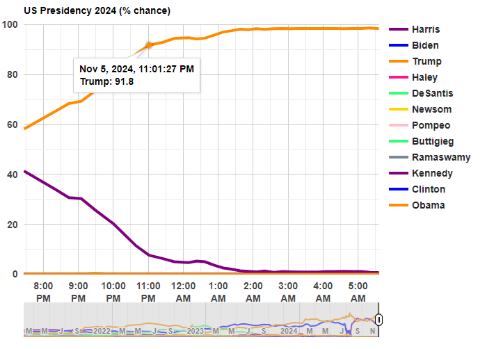
Last night was a big win for Trump, but it was also a big win for prediction markets. In January 2024, I suggested that one of the best ways to follow the election was by following prediction markets. That prediction turned out to be correct!
Before any polls had closed, prediction markets had Trump with about 60% odds of winning. That’s far from a sure thing, but it’s much better than many prediction models, which all had the race as basically a 50-50 toss-up with a very slight edge to Harris (though one simple model that I wrote about two weeks ago had Harris slightly losing the popular vote, a good call in hindsight). So going into the election results, you would have been more confident that a Trump win was a real possibility if you watched predictions markets
Last night after the results started coming in, the average over five different prediction markets from Election Betting Odds put Trump at over 90% odds by 11:00pm Eastern Time. By about 12:45am, he was already over 95%. These aren’t absolutely certain odds, but if you were watching the election night news coverage, they were still treating this as essentially a toss-up in the battleground states.
The Associated Press hadn’t even called Georgia, the second of the battleground states, by the time prediction markets were over 95% for the overall race! Decision Desk HQ, which is a very good source for calling races in real time, didn’t declare Trump the winner until 1:21am, when they called Pennsylvania (they also have a nice explanation of how they made the call). The AP didn’t declare Trump the winner until 5:34am, when they called Wisconsin.
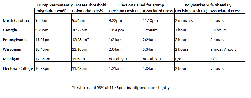
Polymarket is the largest of the five markets in the Election Betting Odds average, and they are also a good source because they have markets for all of the battleground states (here’s the market for Michigan, which still hasn’t been called as of 11:30am on Wednesday by most news sources!). This table shows when the 90% and 95% thresholds were permanently crossed on Polymarket odds for each of the 5 early battleground states, in comparison with the DDHQ and the AP.
Notice that the 90% threshold consistently beats DDHQ by at least an hour (the one exception is North Carolina, where DDHQ called it very early — they are very good at what they do!). And the 90% threshold is consistently beating the AP by at least 3 hours.
None of this should be read as a criticism of the Associated Press. They should be cautious about predictions! But if you want to know things fast (or, before your bedtime in this case), prediction markets are clearly worth following.
How can prediction markets be so far ahead of media sources? Because there is a strong incentive to be right early: that’s how you make money in these markets! How exactly this is done is unclear, since the traders are all anonymous and we generally can’t ask them. But likely they are doing a similar analysis of counties results compared to the 2020 election, as DDHQ told us they did after the fact, just quicker (indeed, if you were watching news coverage, they were doing the same thing, just in an ad hoc way, and much more slowly).
Typically, the federal government spends more than it takes in. This has been going on for decades. At moderate levels, i.e. moderate debt/GDP ratios, this is not cause for concern. Presumably the national economy will grow enough to service the debt.
Historically, deficit spending would temporarily increase during some crisis like a major recession or major war, then it quickly tapered back down again. There was a general understanding, it seems, among most voters and most politicians that huge deficits were not healthy; one would not want to burden future generations with a lot of debt.
During the 2020-2021 epidemic experience, however, politicians found they got instant popularity by handing out trillions in stimulus money; anyone who squeaked that we couldn’t afford this much largesse got run over. And this spend-big, tax-small mentality has now become entrenched. Both presidential candidates have been traversing the nation promising juicy tax cuts. Apparently, we the people have decided to vote ourselves lots of free money right now, and the heck with future generations.
Here is a forecast from the Congressional Budget Office, with the optimistic assumption that we will never get another recession, showing that the recent levels of deficit are much higher than historical norms:
This is just the yearly deficit, not the exponentially-growing accumulated debt. The influence of the total debt may be seen in the mushrooming interest outlays. Below is another chart with data from the St Louis Fed, displaying both deficit level and unemployment over the past 80 years. Again, deficit spending would ramp up during recessions, due to reduced tax revenue and increased spending on unemployment benefits, etc., but then it would ramp right back down again. It failed to come back down completely after the 2008-2009 recession, and indeed started ramping up around 2016, even with low unemployment.
I don’t see this trend changing, and so investors need to take this into account. Here I will summarize some key points from analyst Lyn Alden Schwartzer in her article on the Seeking Alpha investing site titled Why Nothing Stops The Fiscal Train.
She notes that besides the primary deficit, the interest paid on the federal debt is a transfer of money to mainly the private sector, and so is further stimulus. This is one factor that has helped keep the economy stronger, and inflation higher, than it would otherwise be.
Some key bullet points in the article are
The U.S. faces structurally high fiscal deficits driven by unbalanced Social Security, inefficient healthcare spending, foreign adventurism, accumulated debt interest, and political polarization.
Investment implications suggest favoring equities and scarce assets over bonds, with defensive positions in T-bills, gold, and inflation-protected Treasury notes.
Fiscal dominance will likely lead to persistent inflation, asset price volatility, and potential stagflation, making traditional recession indicators less reliable.
A neutral-to-negative outlook on U.S. stocks in inflation-adjusted terms, with better prospects for international equities and cyclical mid-sized U.S. stocks.
She suggests looking to the recent histories of emerging economies to see what happens in nations with perhaps stagnating real economies kept afloat by ongoing federal deficits. Her tentative five-year outlook for investing is bearish on the major U.S. stock indices (gotten overpriced) and on government bonds (real returns, in light of anticipated ongoing inflation, will be low), but bullish on international stocks, inflation-protected bonds, short-term T-bills, gold, and bitcoin (again, all mainly driven by expected stubborn inflation as the money supply keeps growing):
-For U.S. stocks, I have a neutral-to-negative view on the major U.S. stock indices in inflation-adjusted terms. They’re starting from an expensive baseline, and with a high ratio of household investable assets already stuffed into them. However, I do think that among the universe of more cyclical and/or mid-sized stocks that make up smaller portions of the U.S. indices, there are plenty of reasonably priced ones with better forward prospects.
-For international stocks, I think the 2024-2025 Fed interest rate cutting cycle is one of the first true windows for them to have a period of outperformance relative to U.S. stocks for a change. It doesn’t mean that they certainly will follow through with that, but my base case is for a meaningful asset rotation cycle to occur, with some of the underperforming international equity markets having a period of outperformance. At the very least, I would want some exposure to them in an overall portfolio, to account for that possibility.
-For developed market government bonds, like the U.S. and elsewhere, I don’t have a positive long-term outlook in terms of maintaining purchasing power. A ten-year U.S. Treasury note currently yields about 3.7%, while money supply historically grows by an average of 7% per year, and $20 trillion in net Treasury debt is expected to hit the market over the next decade. So I think the long end of the curve is a useful trading sardine, but not something I want to have passive long exposure to.
-A five-year inflation-protected Treasury note, however, pays about 1.7% above CPI, and I view that as a reasonable position for the defensive portion of a portfolio. T-bills are also useful for the defensive portion of a portfolio. They’re not my favorite assets, but there are worse assets out there than these.
-Gold remains interesting for this five-year period, although it might be tactically overbought in the near-term. It has had a nice breakout in 2024, but is still relatively under-owned by most metrics, and should benefit from the U.S. rate cutting cycle. So I’m bullish as a base case.
-Bitcoin has been highly correlated with global liquidity, and I expect that to continue. My five-year outlook on the asset is very bullish, but the volatility must be accounted for in position sizes for a given portfolio and its requirements.
I’ll add two comments on this list. First, the bond market is usually pretty good about figuring things out, and has evidently realized that endless huge deficits mean endless huge bond issuance and ongoing inflation. Thus, even though the Fed is lowering short-term rates, bond buyers have started demanding higher rates on long-term bonds. And so long-term government bonds may not be as bad as Schwartzer thinks.
Second, for reasons described in The Kalecki Profit Equation: Why Government Deficit Spending (Typically) MUST Boost Corporate Earnings, when you work through the various sectoral balances in the macro economy, most of the huge deficit spend dollars will end up in either corporate earnings or in the foreign trade deficit. So the ongoing deficits will continue to buoy up U.S. corporate earnings, and hence U.S. stock prices.
Voting costs time and attention, arguably the only resources everyone is short on. The compensation is implicit, ephemeral, and uncertain. Never make the mistake of thinking you can predict exactly how much other people will behave when the price is subjective and wrapped in uncertainty.
A democracy is an endless cascade of institutions designed to pick winners. Those winners are themselves a product of the rules as much, if not more, than the preferences of voters. Rules will inevitably be gamed, sometimes in manners that seem unfair at best, antithetical to the ambitions of democracy at their worst. A good rule of thumb, however, is that the more unfair an outcome seems, the more fragile it is. A minority party that has gerrymandered voting districts to the hilt might have disproportionate power one day, but they are exactly one exogenous shock away from a electoral cascade event. Any political party is never more than one election away from the dustbin of history.
Polling is increasingly challenging and it’s hard not to feel like they are always fighting the last war. How do you find out what people want in a world where, as previously mentioned, time and attention are scarce? How do you poll people who won’t answer the phone and, even worse, those who do answer phone are decidedly different from those who do? Same thing for people on Facebook. Same thing for people at the mall. Same thing for anyone who uses one tool or media instead of another. It’s never been easier to learn about an exact subset of people, while never harder to learn about everyone.
The electoral college is an extremely dumb peculiar institution. Tuesday could be a tie or a two point differential, but the most likely outcome is a roughly 80 point blowout. The catch being that the blowout could go either way.
I voted (early) for Harris/Walz. I hope they win, but not sure I can say much else for sure. Democracy is hard.