The stock market drools and rips higher at the slightest sign that inflation is abating, since that portends rate cuts instead of rate hikes by the Fed, and a return to the golden days of easy money. But what do the latest data show? Here I’ll show several charts to show what we know so far.
First, regarding U.S. inflation, here are a pair of charts from a raging bull article by Dan Victor titled The Fed Pivot Debate And Why Bulls Are Winning.
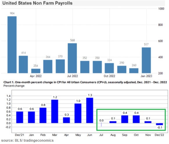
The last couple months’ data points in the lower chart show that inflation (as estimated by CPI) has essentially leveled out and may be starting to decline a little. That is fine but it still leaves inflation far above the Fed’s 2% target. Victor defines a Fed “pivot” not as actually cutting rates, but simply a halt to raising them. By that somewhat anemic definition, sure, a Fed pivot could well come in the next few months. But that leaves rates still very high by recent standards. The real question is when will inflation come down low enough to justify significant rate cuts. The Fed screwed up so abysmally last year with its ridiculous “this inflation is only transitory supply chain issues” that they really cannot afford to relent too soon, and let inflationary psychology take hold.
Side comment: the big “blowout” jobs number for January (last bar on the right, on the top chart above) caused a huge buzz. But there are strong reasons to discount it as an artifact of “ revisions, adjustments, control factors, and recoding “, per Jeffrey Snider.
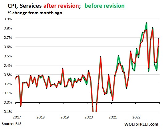
On the other side of the bull/bear divide, Wolf Richter published a glass-half-empty article noting how the Bureau of Labor Statistics recently revised its CPI numbers, and the changes shifted the numbers so as to undermine the argument that inflation has started to drop rapidly:
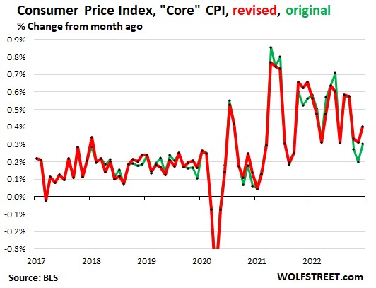
The chart above with revisions (red line) shows core CPI barely declining over the past 9 months or so, and no trend for an acceleration in that decline. The chart below shows CPI for Services (where we consumers spend most of our money, and which is closely correlated to wages) is holding nearly steady around a red-hot 0.55%/month or about 6.6% annualized. It could be longer than the market thinks before there are substantial rate cuts.
And from the Eurozone, there is this chart, courtesy of Bloomberg via Yahoo, depicting the results of polling economists as to the future course of inflation there:
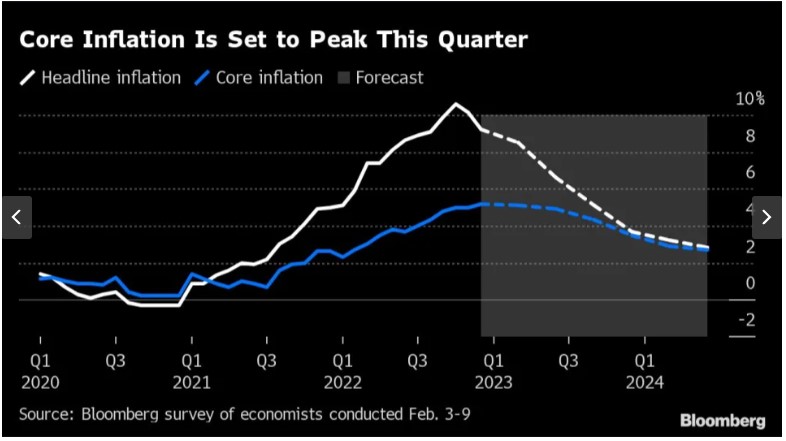
The consensus view is that inflation in Europe will not approach the 2% target until well into 2024. The European Central Bank is expected to hike by 0.5% in March, followed by another 0.25% to reach 3.25%. (This is much lower than the Fed’s interest rates, but that is probably because the U.S. is still working off the orgy of COVID-related payments that dumped trillions in peoples’ pockets here in 2020-2021). Cuts by the ECB are not expected until the second quarter of 2024.
THIS JUST IN: The January CPI data just came out today (2/14), and pretty much matches up with the picture presented above. Inflation is falling, but ever so slowly, and so it becomes more likely that the Fed will keep its rates higher for longer:
“The Consumer Price Index (CPI) for January showed a 0.5% increase in prices over the past month, an acceleration from the prior reading, government data showed Tuesday. On an annual basis, CPI rose 6.4%, continuing a steady march down from a 9.1% peak last June. Economists had expected prices to climb 6.2% over the year and jump 0.5% month-over-month, per consensus estimates from Bloomberg. …
Core CPI, which strips out the volatile food and energy components of the report, climbed 5.6% year-over-year, more than expected, and 0.4% over the prior month. Forecasts called for a 5.5% annual increase and 0.4% monthly rise in the core CPI reading.”
(For another recent take on the inflation picture, see James Bailey’s The Murky Macro Picture, on this blog).

One thought on “Bulls and Bears Spar Over Pace of Inflation Decline and Rate Cuts”