Last week South Carolina Governor McMaster signed a bill repealing almost all Certificate of Need (CON) laws in the state. If you want to open or expand a health care facility in South Carolina, you can now do so faster, cheaper, and with more certainty.
This is a bigger deal than West Virginia’s reform earlier this year because it applies to almost all types of facilities, and applies to both new facilities and expansions of existing facilities. Only two parts of the CON system remain: a 3-year sunset where hospitals still need special permission to add beds, and a permanent restriction on nursing homes (why? see my recent post on why states hate nursing homes).
As is often the case, this reform took years to enact. I wrote last year about a repeal bill passing the SC Senate; it didn’t make it through the House then, but did this time. As I said then:
This seems like good news; here at EWED we’ve previouslywritten about some of the costs of CON. I’ve written several academic papers measuring the effects of CON, finding for instance that it leads to higher health care spending. I aimed to summarize the academic literature on CON in an accessible way in this article focused on CON in North Carolina.
CON makes for strange bedfellows. Generally the main supporter of CON is the state hospital association, while the laws are opposed by economists, libertarians, Federal antitrust regulators, doctors trying to grow their practices, and most normal people who actually know they exist. CON has persisted in most states because the hospitals are especially powerful in state politics and because CON is a bigger issue for them than for most groups that oppose it. But whenever the issue becomes salient, the widespread desire for change has a real chance to overcome one special interest group fighting for the status quo. Covid may have provided that spark, as people saw full hospitals and wondered why state governments were making it harder to add hospital beds.
Why did reform succeed this time in South Carolina? From where I sit in Rhode Island I can only guess, but here are my guesses. First, the reform side really had their stuff together. See this nice page from SC think tank Palmetto Promise on why to repeal CON, and this paper from Matt Mitchell that does a comprehensive review of the literature on CON and explains what it means for South Carolina. Legislative supporters like Senator Wes Climer just kept pushing.
Second, the biggest opponent of CON reform is usually the state hospital association, but in this case they did not formally oppose repeal. Why not? Here I’m really speculating, but in general it has been faster-growing states that repeal CON. Population growth makes it obvious that new facilities are needed, and it means that existing facilities are thinking about how to grow to take advantage of new opportunities, rather than thinking about lobbying to maintain their share of a static or shrinking pie. You can see some hospital CEOs say they don’t mind repeal in this article (where I’m also quoted). South Carolina has been growing at a decent clip, as is Florida, which also almost-entirely repealed CON in 2019. On this theory, the next big CON reform would happen in a fast-growingCON state like Montana, Delaware, North Carolina, Georgia, or Tennessee. If I had to pick one, I’d say North Carolina.
Update: Apparently Montana already repealed all non-nursing home CON in 2021 and I missed it!
When music rights make the news, it’s generally because a superstar’s entire catalog is selling for hundreds of millions of dollars. That may be why I always assumed that buying music rights would be difficult and expensive- that you’d both have to know the right people to even hear about potential deals, and have to be quite rich to afford them.
But this week I found out about Royalty Exchange, a site that currently lists hundreds of music rights for sale. They certainly appear to make the process of finding and buying rights, and collecting royalties, easy (I haven’t bought any yet so can’t say for sure). They currently list songs and partial catalogs from all sorts of artists you’ve heard of:
When I say I find many listings to be surprisingly cheap, I mean this relative to the hundred million dollar deals you hear about. Of those that offer a list price (as opposed to simply asking for offers), the vast majority are over $10,000, and many are over $100,000. Overall I’d put it in the “luxury car” bucket- expensive enough that its a bad idea for a normal middle-class person to buy one, but cheap enough that they could if they really wanted to. It’s a bit of a better idea than a luxury car, since its more investment than consumption. But if I actually bought the Flogging Molly catalog like I want to, I’d be taking an unnecessary risk by putting a large proportion of my net worth in a single investment. Their music is great and I think it will maintain its popularity, but if I’m wrong and people stop listening to it I’d lose out. So, for most people it’s a bad idea in the same way that putting half your retirement account into a single company’s stock is bad idea. But I’m surprised its even possible.
Why are these rights so affordable? Sometimes, of course, its because the artist isn’t that popular. But why are the rights to songs and musicians that are household names affordable? It seems to mainly be because the rights have been sliced and diced so that you’re only buying a small piece of them. Consider Miley Cyrus above. First of all its only the rights to one of her songs (admittedly a hit song). Second, you’re only buying the rights for ten years (lifetime rights are sometimes available but naturally they cost more). Finally, you’re only buying some of the rights, in this case the right to get paid when someone publicly performs the song (but not when someone streams it or buys a copy):
Even given all that though, I’m surprised how cheap the rights are. I expected that people would overpay for them because they like an artist, or for the bragging rights. But the yields seem pretty reasonable, often over 10%. Yields could rise or fall over time as an artist becomes more or less popular, or as the economics of the music industry change, but current prices generally seem justified by the income stream. I look forward to having enough money that this could make sense as an investment for me; I expect I might in 10 or 20 years, but maybe some of you are already there.
The cheapest listing from an artist I’ve heard of, Busta Rhymes (only performance rights, only certain tracks)
Predicting elections is hard. Poll aggregators and prediction markets can help. Many of the usual suspects like FiveThiryEight and PredictIt aren’t covering Sunday’s election in Turkey, partly due to their ownissues, and partly because US organizations often ignore foreign elections. But we do have several good predictors to consider, and they all list opposition candidate Kiliçdaroglu as a slight favorite.
Polymarket is most optimistic for the opposition, giving them a 67% chance. British betting site Smarkets gives them a 61% chance. Play-money site Manifold Markets gives them 56%. Finally, no-money prediction site Metaculus gives a 60% chance that the opposition wins, and a 79% chance that Erdogan leaves office if he loses the election. I’m not sure how the count the Swift Centre, a small closed panel of forecasters, but they are the exception in seeing Erdogan as a slight favorite.
My economist’s instinct is to trust the real-money markets more here, although Manifold and Metaculus outperformed them in the 2022 US midterms. The usual bias is to predict a win for the candidate you like more (which for Westerners on these markets means betting against Erdogan), and have real money on the line can help counteract this. On the other hand, some might use betting markets as a hedge and bet on the outcome they don’t want. In this case the betting markets are slightly more favorable to the opposition, but the gap is small.
Of course, the biggest real-money markets are those that don’t ask directly about the election: the markets for Turkish stocks and bonds. These have generally performed well in the past year as the opposition’s chances have risen, which may indicate that markets think a new Prime Minister with more conventional economic views will get inflation under control.
Last weekend fellow Temple University economics PhD Adam Ozimek hosted the inaugural #EconTwitterIRL conference. He managed to get 100+ people, including many big names, to come to his bowling alley / arcade in Lancaster, PA.
The overall demographic of Econ Twitter people appears to be youngish professionals, mostly male, surprisingly social and normal-looking (surprising to me because I retain the ’90s-era stereotype that people who write a lot online are nerds who don’t want to talk to anyone IRL).
Adam opened with a history of EconTwitter, which to him is not just about Twitter, but is anywhere where communities of people write about economics online. This starts with the comment sections of the earliest blogs, like Brad DeLong’s, in the early 2000’s. Then in the late 2000’s many commenters start their own blogs, like Karl Smith at Modeled Behavior. In the 2010’s Econ Twitter comes into its own. It may persist or a new forum might take over, but either way the discussion and community will live on.
While it was cool to see a live recording of Odd Lots, and a panel on innovation with MacArthur Genius Heidi Williams, my favorite panel was the one on immigration, because it saw the most serious disagreement. Garett Jones and Daniel Di Martino argued for reforms to the immigration system that would move it away from a focus on family reunification and toward a focus on skills and other indications (like country of origin) that immigrants would benefit the US economy. In contrast, Leah Boustan argued that the current system has worked well, including for assimilation and economic growth, and we should be wary of making big changes to it. Moderator Cardiff Garcia pointed out the oddity of the economists from George Mason and the Manhattan Institute arguing for a “socialist” system where the government determines what the economy needs when it comes to immigration, while the Princeton economist argues against. Garett Jones noted that the rest of his department at Mason disagree with him, but he’s glad to have the freedom to disagree.
While the panel saw intense disagreement about what the ideal system looks like, all panelists shared a frustration with parts of the current system that seem to pointlessly slow or prevent high-skill immigration. Some of this is bureaucracy slowing the process for immigrants who are legally allowed already. Some is politicians refusing to make the smallest, simplest, most common-sense fixes unless they are part of a comprehensive immigration reform that hits their big priority. The big priorities differ by party, but the commitment to holding simple fixes hostage is bipartisan.
Hopefully discussions like this can start to change things. That might sound naive or idealistic, but on an earlier panel Matt Yglesias noted that we should be both impressed and slightly scared of how aware Capitol Hill staffers are about the opinions of Econ Twitter.
Source. Got 2nd at trivia as part of team Acemoglu et al (actual Acemoglu not included).
The magic of all this is that you never know what can come from a post. You might make a friend, make an enemy, get a job, lose a job, influence public policy, get a job in the White House… even make (or lose) a million dollars. So we keep poasting, and once in a while see the results IRL.
One of the oldest theories in economics is the idea of compensating differentials. A job represents not just a certain amount of money per hour, but a whole package of positive and negative things. Jobs have more or less stability, flexibility, fun, room to grow, danger… and non-cash benefits like health insurance. The idea of compensating differentials is that, all else equal, jobs that are good on these other margins can pay lower cash wages and still attract workers (thus, the danger of doing what you love). On the other hand, jobs that are bad on these other margins need high wages if they want to hire anyone (thus, the deadliest catch)
I think this theory makes perfect sense, and we see evidence for it in many places. But when it comes to health insurance, everything looks backwards. A job that offers employer-provided health insurance is better to most employees than one that doesn’t, so by compensating differentials it should be able to offer lower wages. There’s just one problem: US data shows that jobs offering health insurance also offer significantly higher wages. The 2018 Current Population Survey shows that workers with employer-provided health insurance had average wages of $33/hr, compared to $24/hr for those without employer insurance.
All the economists are thinking now: that’s not a problem, compensating differentials is an “all else equal” claim, but not all else is equal here. The jobs with health insurance pay higher wages because they are trying to attract higher-skilled workers than the jobs that don’t offer insurance.
That’s what I thought too. It is true that jobs with insurance hire quite different workers on average:
The problem is, once we control for all the observable ways that insured workers differ, we still find that their wages are significantly higher than workers who don’t get employer-provided insurance. Like, 10-20% higher. That’s after controlling for: year, sex, education, age, race, marital status, state of residence, health, union membership, firm size, whether the firm offers a pension, whether the employee is paid hourly, and usual hours worked. I’ve thrown in every possibly-relevant control variable I can think of and employer-provided health insurance always still predicts significantly higher wages. Of course, there are limits to what we get to observe about people using surveys; I don’t get any direct measures of worker productivity. Possibly the workers who get insurance are more skilled in ways I don’t observe.
We can try to account for these unobserved differences by following the same person from one job to another. When someone switches jobs, they could have health insurance in both jobs, neither, only the new, or only the old. What happens to the wages of people in each of these situations? It turns out that gaining health insurance in a new job on average brings the biggest increase in wages:
What could be going on here? One possibility is that health insurance makes people healthier, which improves their productivity, which improves their wages. But we control for health status and still find this effect. The real mystery is that papers that study mandatory expansions of health insurance (like the ACA employer mandate and prior state-level mandates) tend to find that they lower wages. Why would employer-provided health insurance lower wages when it is broadly mandated, but raise wages for individuals who choose to switch to a job that offers it?
My current theory is that “efficiency benefits” are offered alongside “efficiency wages”. The idea of efficiency wages is that some firms pay above-market wages as a way of reducing turnover. Workers won’t want to leave if they know their current job pays above-market, and so the company saves money on hiring and training. But this only works if other firms aren’t doing it. The positive correlation of wages and insurance could be because the same firms that pay “efficiency wages” are more likely to pay “efficiency benefits”- offering unusually good benefits as a way to hold on to employees.
I still feel like these results are puzzling and that I haven’t fully solved the puzzle. This post summarizes a currently-unpublished paper that Anna Chorniy and I have been working on for a long time and that I’ll be presenting at WVU tomorrow. We welcome comments that could help solve this puzzle either on the empirical side (“just control for X”) or the theoretical side (“compensating differentials are being overwhelmed here by X”).
I’ve written here about my ideas page of economics papers I’d like to see.
After that post I heard from others who maintain similar pages. David Friedman has a small page here with research ideas, along with larger pages of short story ideas and product ideas.
HiveReview is a site where one can post or comment on both completed papers and paper ideas. The site does many things at once, but one use case is to post ideas in search of collaborators or to search for projects where someone wants a collaborator for their idea.
I learned today that Gwern Branwen maintains a large page of “Questions“, some of which could be research ideas, mostly outside of economics. He also has pages of research ideas and startup ideas. Some examples of Questions:
Given the crucial role of trust and shared interests in success stories like Xerox PARC or the Apollo Project or creative collaborations in general, why are there so few extremely successful pairs of identical twins?
Nicotine alternatives or analogues: there seem to be none, but why not?
Nicotine is one of the best stimulants on the market: legal, cheap, effective, relatively safe, with a half-life less than 6 hours. It also affects one of the most important and well-studied receptors. Why are there no attempts to develop analogues or replacements for nicotine which improve on it eg. by making it somewhat longer-lasting or less blood-pressure-raising, when there are so many variants on other stimulants like amphetamines or modafinil or caffeine?
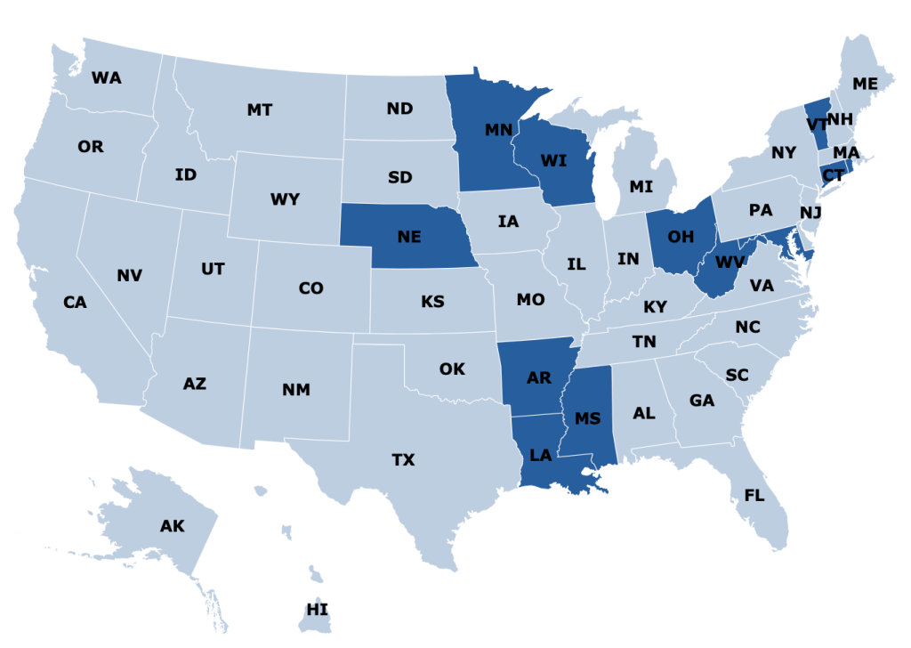
Medicaid is a health insurance program for those with low incomes, funded largely by states. Overall it accounts for less than 20% of US medical spending. But there is one area where it is the dominant payer: nursing homes. Nursing homes are expensive, and Medicare (the typical insurance for those over 65) won’t cover them after the first hundred days, so most nursing home residents end up paying out of pocket until they burn through all their savings and wind up on Medicaid. At which point, Medicaid pays about $100,000 per year to the nursing home for the rest of their life.
States are responsible for up to half of that cost, and so start looking for ways to save money. One idea they have is to make it harder to build nursing homes: if there aren’t beds available, potential nursing home patients will have to stay home instead, where they can’t rack up Medicaid spending the same way. In fact, some states go all the way to a complete moratorium on new nursing homes:
Some other states allow new nursing homes, but only with a special permission slip called a Certificate of Need (CON). CON is often required for other types of health facilities as well, like hospitals or dialysis centers. Research by me and others has generally found that CON doesn’t work as a way to reduce spending, and in fact actually increases it. CON might reduce the number of facilities, but that reduction of supply and competition gives the remaining facilities more power to raise prices.
So which effect dominates- does the smaller number of facilities reduce total spending, or do the higher prices increase it? It depends on the elasticity of demand:
In health care demand is typically quite inelastic, so the price effect dominates, and spending goes up:
But nursing homes could be an exception here. Elasticity of demand could be relatively high because of the number of potential substitutes- home care or assisted living for those with relatively low medical needs, hospitals for those with relatively high medical needs. Plus this is the one type of health care where Medicaid is the dominant payer. They could be especially resistant to price increases here, both due to their market power and their willingness to keep prices so low that facilities won’t take Medicaid patients (another way to save money!).
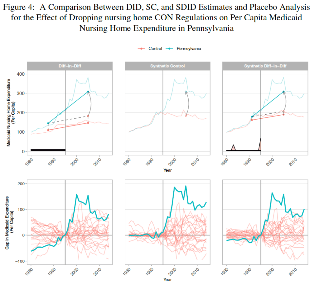
A new paper by Vitor Melo and Elijah Neilson finds that this is indeed the case. Indiana, Pennsylvania, and North Dakota repealed their nursing home CON requirements in the ’90s, and at least for IN and PA their Medicaid spending went way up. The paper uses a new “synthetic difference in difference” technique that seems appropriate, and creates figures that seem confusing at first but get a ton of information across:
They correctly note that they don’t evaluate the welfare effects of the policy; it’s possible that the extra nursing home beds following CON repeal bring huge benefits to seniors that are worth the higher spending. But nursing homes could be the exception to the general rule that CON fails to achieve the goals, like reduced spending, that advocates set for it.
West Virginia just repealed their Certificate of Need requirement for hospitals and birthing centers. Until now anyone wanting to open or expand a hospital needed to apply to a state board for permission. The process took time and money and could result in the board saying “no thanks, we don’t think the state needs another hospital”.
Now anyone wanting to open or expand a hospital and birthing center can skip this step and get to work. This means more facilities and more competition, which in turn leads to lower health care spending relative to trend.
Of course, the rest of West Virginia’s Certificate of Need requirements remain in place; if you want to open many other type of health care facilities, or purchase major equipment like an MRI, you must still get the state board to approve its “necessity”. In some cases, you shouldn’t even bother applying; West Virginia has a Moratorium on opioid treatment programs. Ideally West Virginia would join its neighbor Pennsylvania in a complete repeal of Certificate of Need requirements.
But making it easier to build hospitals and birthing centers is a major step. Hospitals are the largest single component of health spending in the US, and improved facilities might help reduce West Virginia’s infant mortality from its current level as the 4th worst state.
Update 4/7/23: A knowledgable correspondent suggests that the law may only allow existing hospitals to expand without CON (while totally new hospitals would still require one), citing this article. The text of the bill itself seems ambiguous to me. The section “Exemptions from certificate of need” adds “Hospital services performed at a hospital”. For birthing centers by contrast, new construction is clearly now allowed by right: exemptions from CON now include “Constructing, developing, acquiring, or establishing a birthing center”.
Partly this has been a regulatory issue. Raising equity adds all sorts of legal burdens. Traditionally businesses could only accept equity investments from accredited investors and a small number of friends and family unless they did a full IPO and became public (hard enough that there are less that 5000 public companies in the US out of millions of businesses). This changed with the JOBS Act of 2012, which allowed small businesses to raise money from large numbers of non-accredited investors without having to register with the SEC.
Following the JOBS Act, equity crowdfunding sites like WeFunder emerged to match new businesses with potential investors. But equity crowdfunding has taken off relatively slowly:
Its seen more success recently with some additional regulatory relief and the overall market boom of 2020-2021. But at ~$400 million/yr, its still well under 1% of all venture investment (~$300 billon/yr), which is itself tiny relative to the public stock market ($40 trillion market cap).
Why has equity crowdfunding been slow to take off? Partly its new and most people still don’t know about it. Partly early-stage companies aren’t a good way for most people to invest a significant fraction of their money; you probably want to be at least close to accredited investor levels (~$300k/yr income or $1 million liquid wealth) for it to make sense, and those at the accredited investor level already have other options. WeFunder is up front about the risks:
The other issue here is with asymmetric information and adverse selection. Its hard to find out much information about early-stage companies to know if they are a good investment; part of the point of the JOBS Act is that the companies don’t need to tell you much. The companies themselves have a better idea of how well they are doing, and the best ones might not bother with equity crowdfunding; they could probably raise more money with less hassle by going to venture funds or accredited angel investors.
I’ve long thought this adverse selection would be the killer issue, but my impression (not particularly well-informed and definitely not investment advice) is that there are now quality companies raising money this way, or at least companies that could easily raise money elsewhere. WeFunder has a whole page of Y-Combinator-backed companies raising money there. This week Substack, an established company that has already raised lots of venture funding, offered crowd equity and reached the $5 million limit of how much they could legally accept in a single day.
Overall I think this model is working well enough that I’m no longer in a hurry to become an accredited investor. Accredited investors have many more options for companies they can invest in and aren’t subject to the $2,200/yr limit on how much they can invest in early-stage companies. But even if I completed the backdoor process of getting accredited without being rich, I wouldn’t want to put more than $2,200/yr into early-stage companies until I was a millionaire, at which point I’d be accredited the usual way. And while most companies aren’t raising crowd equity, enough are that there seem to me to be no shortage of choices.