Food prices are up a lot in the past few years. I’ve written about this several times in the past few months. In the US, we’ve seen grocery prices go up 20% on average in just 3 years. That’s much higher than we are used to: in the decade before the pandemic, the average 3-year increase was just 4%. In fact, the 3-year increase was negative for much of 2017 and 2018. To find increases this big, you have to go back to the late 1970s and early 1980s (when sometimes the 3-year grocery inflation rate was almost 50%).
But if it’s any consolation, this is not a problem that is unique to the US: food prices are up around the globe. That’s a relevant insight when we come to a recent viral video from Tucker Carlson’s visit to a Russian grocery store. Carlson says that the inflation and cost of groceries will “radicalize you against our leaders.”
So what has food price inflation looked like in Russia, the US, and the other G7 countries? (What used to be called the G8, until Russia invaded Crimea in 2014.) Here’s the chart:

Cumulatively since January 2021, when our current “leaders” came into power in the US, food prices are up 20% in the US, as I said above. But notice that this is on the low end for this group of countries. Japan, with consistently low inflation and occasionally deflation over the past few decades, has been the lowest over this timeframe (though even in Japan, food prices are up about 7 percent in the past year).
But notice who is the highest: Russia, where grocery prices are up 32% in the past 3 years. Certainly, their invasion of Ukraine and the resulting global sanctions plays a role in this, but even if we look at early 2022, the cumulative 15% food inflation was much higher than any G7 country.
So blaming our leaders for rampant inflation is probably not a good idea, especially if you are trying to portray Russia in a positive light.
Perhaps the more charitable interpretation of Tucker Carlson is that the nominal price of groceries is lower, rather than the rate of inflation (even though he does mention inflation in the video). The basket of food they purchase in the video comes out to the equivalent of about $100 at current exchange rates. Everyone on his crew guessed it would be around $400.
I can’t say whether their guess of $400 was accurate, but it would not be totally surprising if the prices of non-tradable goods were lower. This is what would expect in a country with lower wages. While we normally think of services as non-tradable, it’s also reasonable to assume that a lot of fresh food, such as produce, bread, and dairy, is also non-tradable (at least not without high transaction costs).
Carlson’s claim that people “literally can’t buy the groceries they want” is a much more apt statement of the state of affairs in Russia (and other poor countries) than it is in the US and Western Europe.
We can see this in a few ways. For example, here’s a chart showing the percent of consumer spending that goes to groceries:
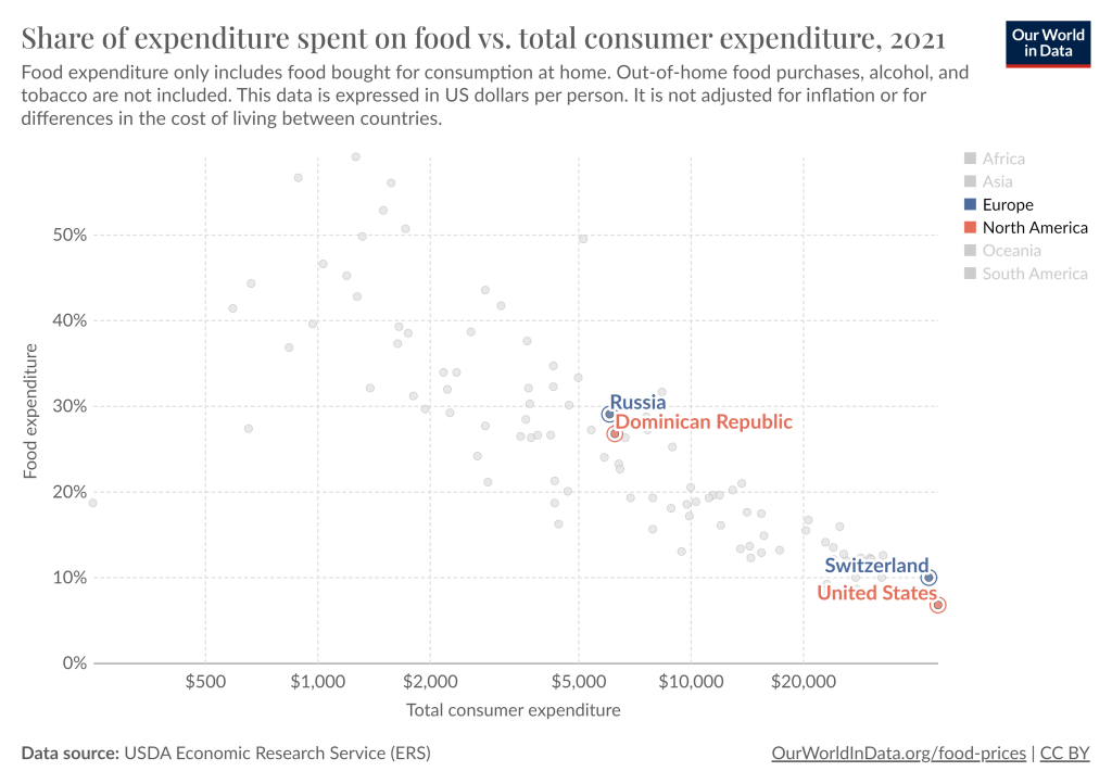
The average Russian allocates about 30% of their spending to groceries, similar to the Dominican Republic. And this data is from 2021, just before the massive spike in food prices in Russia. Meanwhile, the US is by far the lowest, at just under 7%. The UK, Canada, and Switzerland are the closest to the US, but they are in the 9-10% range. Food in the US is cheap.
And those high average levels from Russia obscure a wide-ranging distribution of food insecurity. In a story from Russian state-owned news agency TASS, they report that over 60% of Russians spend at least half of their monthly income on food. Even Putin is publicly acknowledging that inflation is a problem.
The food inflation we’ve experienced in the US has been bad, the worst in a generation. But it’s not exactly clear that our “leaders” are to blame. And it’s also pretty clear that it’s much worse in the rest of the world, especially in Russia.