The year 2023 was a pretty good one for the economy, whether judged by the labor market or economic growth. Despite this good economic growth, total receipts of the federal government were down about 7 percent from 2022 (note: I’m using calendar years, rather than fiscal years). Here’s a chart (note: in NOMINAL dollars) of total federal revenue since 2009:
I want to stress that these are nominal dollars (there, I’ve said it three times, hopefully there is no confusion). Nominal dollars are usually not the best way to look at historical data, but for purposes of looking at recent government budgets, sometimes it is. Especially when revenue is declining: if I adjusted this for inflation, the decline in 2023 would be even larger!
You’ll notice also that the decline in 2023 is even larger than the decline in 2020, the height of the pandemic when many people were out of work due to government regulations and changes in consumer behavior. The 2023 decline is big!
So, what the heck in going on with federal revenue in 2023?
I’ve written numerous times about generational wealth on this blog. My biggest post was one comparing different generations using the Fed’s Distributional Financial Accounts back in September 2021. I’ve posted several updates to that post as new the quarterly data was released, but this post contains a major update. I’ll explain in great detail below about the updates, but first let me present the latest version of the chart (through 2023q3):
Regular readers will notice a few differences compared with past charts. The big one is that young people have a lot more wealth than it appeared in past versions of this chart! You’ll also notice that I have relabeled this line “Millennials & Gen Z (18+)” and shifted that line over to the left a few years to account for the fact that this isn’t just the wealth of Millennials, and therefore the median age of this group is lower than in my past charts. The two dollar figures I highlighted are at the median age of 30 for these age cohorts (unfortunately we don’t have data for Boomers at that age).
As we enter election season, I can sympathize with those that want to ignore it as much as possible. But if you do want to follow it closely, here is my advice: talk is cheap, so follow the money.
And by money, I am not referring to campaign contributions. I mean prediction markets, where people are putting their money where their mouth is, rather than just making predictions based on their own intuition (or their own “model,” which is just a fancy intuition).
There are a number of betting markets online today, but a good aggregator of them is Election Betting Odds.
Every month we get new data on the labor market in the US from the Bureau of Labor Statistics. As I pointed out last month, the labor market data from 2023 was very good!
But lately on social media, some have been to ask whether this data is credible. Specifically, several people have pointed out that the initial numbers we receive each month almost always seem to be revised downward. Since the initial reports are based on incomplete data (for the jobs data, this would be reports from employers), it is normal that there would be some revisions with more complete data.
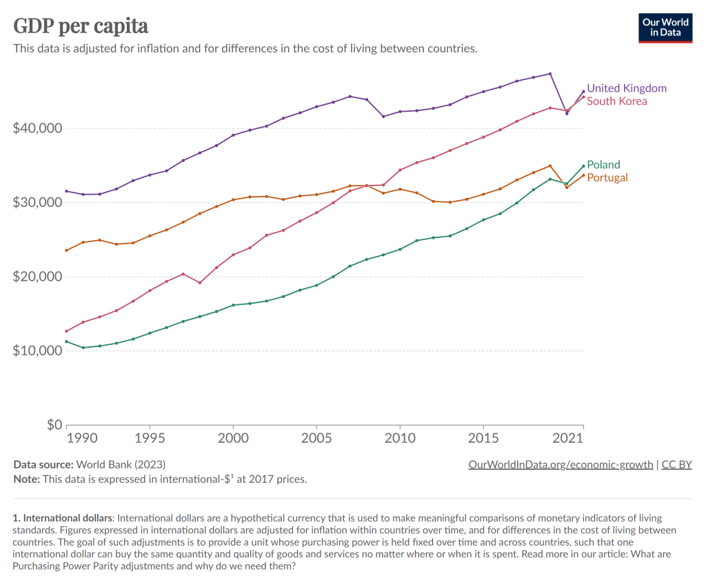
To kick off 2024, I’m just going to give you a chart to think about:
Notice that in 1990, Poland had about half the average income of Portugal, as did South Korea compared to the UK. By about 2021, those gaps had been completely closed. And while the 2021 data is a bit uncertain given the pandemic, IMF estimates for 2024 suggest that both Poland and South Korea have now pulled slightly ahead of Portugal and the UK.
You can find many other examples like this. Why have some countries grown rapidly while others have slowed or stagnated? In some sense, this is an age-old question in economics, and at least as far back as Adam Smith economists have been trying to answer that question.
But it’s actually a bit different now. In Smith’s day, the big question was why some countries had started on their path of economic growth, while others hadn’t started at all. Today, nearly all countries have started economic growth, but some of the early leaders in growth seem to have slowed down. But there isn’t some global reason for this that affects all countries: Poland and South Korea will likely keep growing for a while, and eventually there will be a big gap between them and Portugal and the UK.
The answer to this question is not, of course, just One Big Thing. But for countries like Portugal and the UK (and Japan and Spain and Italy and etc. etc.), the key to their economic future is figuring out what Many Little Things these economic miracles are doing right so that they can return to a path of high economic growth. And this isn’t just a race to see who wins: all countries can be winners! But without continued growth, solving economic, political, and social problems will be a huge challenge.
Maybe 2024 is when they will start to figure it out.
Today I’ll go into more detail on several measures of the labor force, but I won’t only compare it to 2019. I’ll compare it to all available data. And the sum total of the data suggests the 2023 was one of the best years for the US labor market on record. Note: December 2023 data isn’t available until January 5th, so I’m jumping the gun a little bit. I’m going to assume December looks much like November. We can revisit in 2 weeks if that was wrong.
The Unemployment Rate has been under 4% for the entire year. The last time this happened (date goes back to 1948) was 1969, though 2022 and 2019 were both very close (just one month at 4%). In fact, the entire period from 1965-1969 was 4% or less, though following January 1970 there wasn’t single month under 4% under the year 2000!
Like GDP, the Unemployment Rate is one of the broadest and most widely used macro measures we have, but they are also often criticized for their shortcomings, as I wrote in an April 2023 post.
With that in mind, let’s look to some other measures of the labor market.
Lately many journalists and folks on X/Twitter have pointed out a seeming disconnect: by almost any normal indicator, the US economy is doing just fine (possibly good or great). But Americans still seem dissatisfied with the economy. I wanted to put all the data showing this disconnect into one post.
In particular, let’s make a comparison between November 2019 and November 2023 economic data (in some cases 2019q3 and 2023q3) to see how much things have changed. Or haven’t changed. For many indicators, it’s remarkable how similar things are to probably the last month before anyone most normal people ever heard the word “coronavirus.”
First, let’s start with “how people think the economy is doing.” Here’s two surveys that go back far enough:
The University of Michigan survey of Consumer Sentiment is a very long running survey, going back to the 1950s. In November 2019 it was at roughly the highest it had ever been, with the exception of the late 1990s. The reading for 2023 is much, much lower. A reading close to 60 is something you almost never see outside of recessions.
The Civiqs survey doesn’t go back as far as the Michigan survey, but it does provide very detailed, real-time assessments of what Americans are thinking about the economy. And they think it’s much worse than November 2019. More Americans rate the economy as “very bad” (about 40%) than the sum of “fairly good” and “very good” (33%). The two surveys are very much in alignment, and others show the same thing.
State tax revenue is down a lot since last year. The latest comparable data from Census’s QTAX survey is for the 2nd quarter of 2023, and it shows a massive hit: state tax revenue was down 14% from the same quarter in 2022, which is about $66 billion. Almost all of that decline is from income tax revenue, specifically individual income tax revenue which is down over 30% (almost $60 billion). General sales taxes, the other workhorse of state budgets, is essentially flat over the year.
That’s a huge revenue decline! So, what’s going on? In some states, there has been an attempt to blame recent tax cuts. It’s not a bad place to start, since half of US states have reduced income taxes in the past 3 years, mostly reducing top marginal tax rates. But that can’t be the full explanation, since almost every state saw a reduction in revenue: just 3 states had individual income tax revenue increases (Louisiana, Mississippi, and New Hampshire) from 2022q2 to 2023q2, and they were among the half of states that reduced rates!
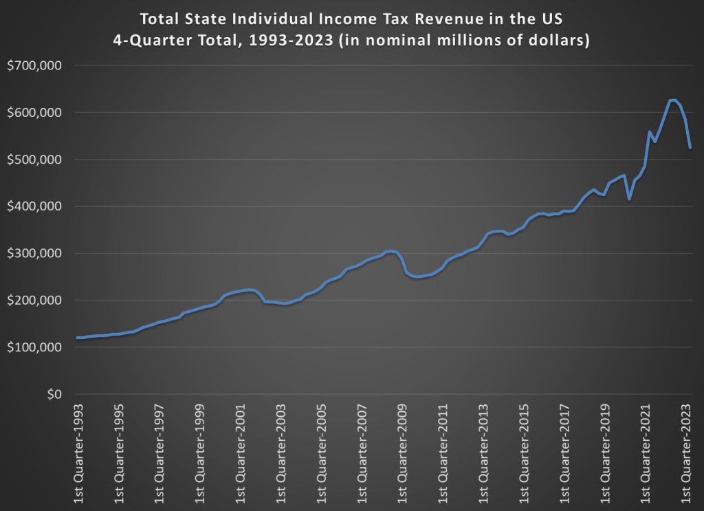
To get some perspective let’s look at long-run trends. This chart shows total state individual income tax revenue for all 50 states (sorry, DC) going back to 1993. I use a 4-quarter total, since tax receipts are seasonal (and because states sometimes move tax deadlines due to things like disasters, a specific quarter can sometimes look weird). And importantly, this data is notinflation adjusted. Don’t worry, I will do an adjustment further below in this post, but for starters let’s just look at the nominal dollars, because nominal dollars are how states receive money!
A few months ago I looked at the richest and poorest MSAs in the US, including adjusting for the cost of living in each MSA. One big thing I found was that the list doesn’t change that much when you adjust for the cost of living: San Jose, San Francisco, Bridgeport (CT), Boston, and Seattle are still the highest income MSAs even after accounting for the fact that they are also high-cost-of-living places to live. The gap shrinks, but they are still in the lead.
But that was adjusting for all the factors in the cost of living. But what if we just looked at one important aspect of the cost of living: housing. And since the cost-of-living adjustments (BEA’s RPP) that I was using are from 2021, what if we tried to bring the data up as close to the present as possible? We know that housing prices have increased a lot since 2021, but also that the cost of borrowing has risen dramatically too. What would this show us about the cost of living for different MSAs?
A tool from the Harvard Joint Center for Housing Studies allows us to make some pretty up-to-date comparisons. Their interactive map shows data for the 179 largest MSAs (about half of the total MSAs in the US) on the median price of each home for the second quarter of 2023 and uses interest rates from that quarter to show the rough principal and interest cost (assuming a 3.5% down payment). Taxes and insurance costs for each MSA are also estimated.
Based on those assumptions, their tool provides the minimum income you would need to purchase a home in that area, assuming a 31% debt-to-income ratio for the mortgage. And the income levels needed vary quite widely across MSAs, from a low of $44,000 in Cumberland, Maryland, to a high of over $500,000 in San Jose, CA. That’s a huge difference.
Of course, we know that incomes also vary across MSAs. But they don’t vary that much. The JCHS tool doesn’t provide this data (though a JCHS map from 2017 did compare house prices to incomes), but we can look up median family income for each MSA from Census. Doing so we see that San Jose is indeed unaffordable based on the current (2022) median income, which is “only” about $170,000. A nice income compared to the national median, but only about 1/3 of the $500,000 you would need to afford a home in San Jose. Cumberland looks much better though: median family income is over $77,000 there, about 76% more than you would need to buy a home!
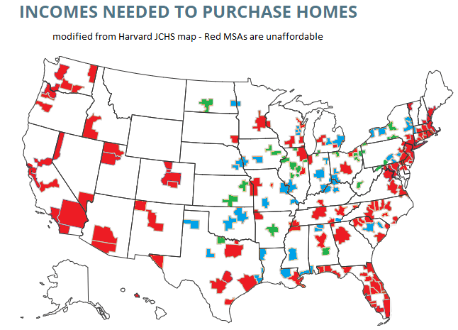
What if we did a similar calculation for all MSAs in the JCHS data? The following map is my attempt to do so. Sorry, but my graphics skills are not the best, so this map isn’t as pretty as it could be (I started with the JCHS map, and just shaded in the colors I wanted to use). But I think it conveys the general idea.
Green-shaded MSAs are the most affordable: places like Cumberland, Maryland, where median family income is well above (at least 20% above, my arbitrary threshold) the amount JCHS says you need to buy a home. There are 27 Green-shaded MSAs. Blue-shaded MSAs are affordable too, and median income is between 100% and 120% of the amount needed to afford a home on the JCHS standard. There are 41 of these, making 68 total MSAs out of these 179 that are affordable. Red-shaded MSAs are less than 100%, and thus unaffordable (though as I will discuss below, some are much closer to affordable than others).
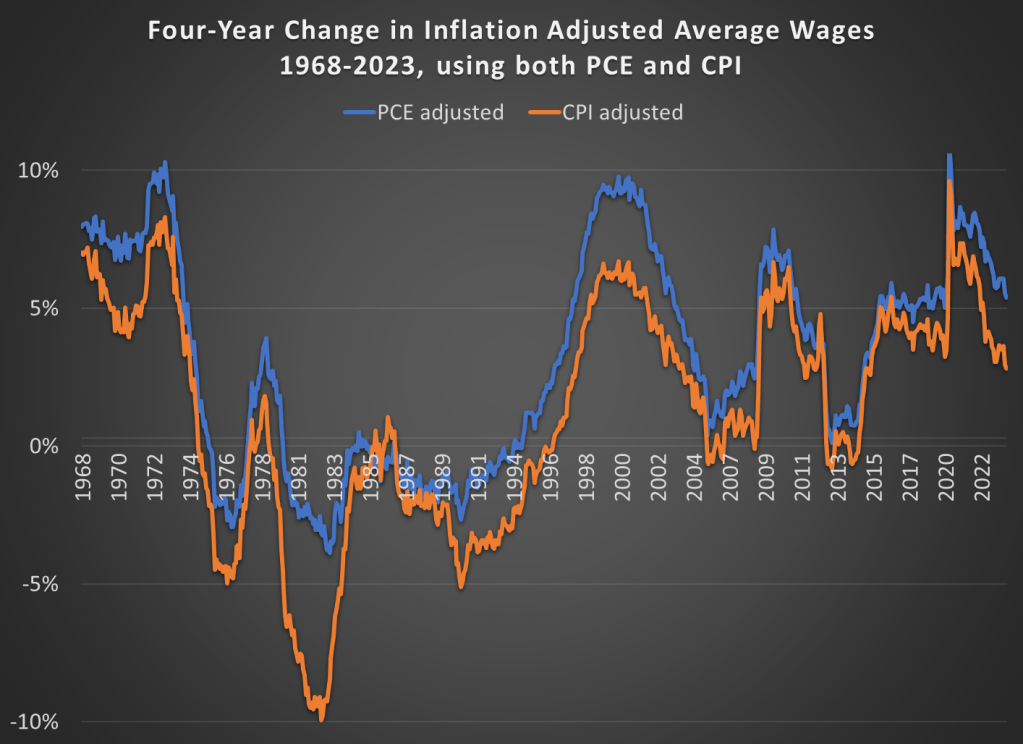
In the October 1980 Presidential debate, Ronald Reagan famously asked that question to the American voters. His next sentence made it clear he was talking about the relationship between prices and wages, or what economists call real wages: “is it easier for you to go and buy things in the stores than it was four years ago?”
Reagan was a master of political rhetoric, so it’s not surprising that many have tried to copy his question in the years since 1980. For example, Romney and Ryan tried to use this phrase in their 2012 campaign against Obama. But it’s a good question to ask! While the President may have less control over the economy than some observers think, the economy does seem to be a key factor in how voters decide (for example, Ray Fair has done a pretty good job of predicting election outcomes with a few major economic variables).
Voters in 2024 will probably be asking themselves a similar question, and both parties (at least for now) seem to be actively encouraging voters to make such a comparison. We still have 12 months of economic data to see before we can really ask the “4 years” question, but how would we answer that question right now? Here’s probably the best approach to see if people are “better off” in terms of being able to “go and buy things at the stores”: inflation-adjusted wages. This chart presents average wages for nonsupervisory workers, with two different inflation adjustments, showing the change over a 4-year time period.