While we know that COVID primarily affects the elderly, the mortality and other effects on the non-elderly aren’t trivial. I have explored this in several past posts, such as this November 2021 post on Americans in their 30s and 40s. But now we have more complete (though not fully complete) mortality data for 2021, so it’s worth revisiting the question of COVID and the non-elderly again.
For this post, I will primarily focus on the 12-month period from November 2020 through October 2021. While data is available past October 2021 on mortality for most causes, data classified by “intent” (suicides, homicides, traffic accidents, and importantly drug overdoses) is only fully current in the CDC WONDER data through October 2021. This timeframe also conveniently encompasses both the Winter 2020/21 wave and the Delta wave of COVID (though not yet the Omicron wave, which was quite deadly).
First, let’s look at excess mortality using standard age groups. For this calculation, I use the period November 2018 through October 2019 as the baseline. The chart shows the increase in all-cause deaths in percentage terms. It is also adjusted for population growth, though for most age groups this was +/- 1% (the 65+ group was 3% larger than 2 years prior).
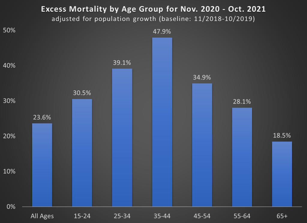
A few things jump out here. First notice the massive increase in mortality for the 35-44 age group (much more on this later). Almost 50% more deaths! To put that in raw numbers, deaths increased from about 82,000 to 122,000 for the 35-44 age group, and population growth was only about 1%. And while that is the largest increase, there were huge increases for every age group that includes adults.
Also notice that the 65+ age group certainly saw an increase, but it is the smallest increase among adults! Of course, in raw numbers the 65+ age group had the most excess deaths: about 450,000 of the 680,000 excess deaths during this time period. But since the elderly die at such high rates in every year, the increase was as large in percentage terms.
One related fact that doesn’t show up in the chart: while there were about 680,000 excess deaths during this time frame in the US in total, there were only about 480,000 deaths where COVID-19 was listed as the underlying cause of death. That means we have about 200,000 additional deaths in this 12-month time period to account for, or a 24% increase (population growth overall was only 0.4%).
That’s a lot of other, non-COVID deaths! What were those deaths? Let’s dig into the data.
Continue reading