What’s a Sewer Worth?

Have access to clean water and a functioning sewer system is something that many Americans take for granted. Not all Americans, of course, especially those in rural areas not connected to an urban water system. But most Americans do. But how much is it worth?

It’s a hard question to answer. We know clean water and sewers probably have large effects on disease transmission. For example, Ferrie and Troesken (2008) looked at several major improvements in Chicago’s water system, and found that there were large declines in mortality from diseases like typhoid fever after the improvements (here’s an ungated working paper, with the much better title “Death and the City“). But the limits of earlier studies like this are that they primarily looking at a time series of mortality rate and relating this to some change in public infrastructure. A good attempt, but perhaps not convincing to everyone.

A better method would be to look at not mortality rates but property values. People are, surely, willing to pay more for a home with piped water and a sewer system. But how much more? Knowing this could give us better information on the value of the water systems. And that’s exactly what the authors of a new working paper do, once again visiting Chicago in the nineteenth century to look at how much property values increased after the installation of water and sewer systems. The paper is “The Value of Piped Water and Sewers” by Coury, Kitagewa, Shertzer, and Turner (ungated version).

The effects are huge. There most conservative estimate is that sewer and water systems doubled property values (a 110% increase), but the effect could be much larger (almost 4 times as much, if I am reading it correctly, under other reasonable assumptions).

People are willing to pay a lot for sanitation, it turns out.

Continue reading
Are Special Elections Special?

While the United States does have its problems with democracy, one area where we shine is direct democracy. Rare at the federal level, at the state and local level direct democracy is quite common in the US, much more so than most other democracies (Switzerland also stands out). Almost half the states have some form of citizen initiative or referendum process, and it is used frequently in most of those states. But even more direct democracy takes place at the local level.

And much of that direct democracy at the local level takes place through what are called special elections. I’m not talking about elections to fill unexpected vacancies in office — though of course those do happen. I’m talking about actual voting on issues. Many of these issues revolve around questions of public finance: whether to raise a local sales tax, to approve a property tax millage, or to issue bonds for a capital project.

One very relevant example for me is an upcoming special election in my city of Conway, Arkansas. Citizens are being asked to approve the issuing of bonds to construct a community center, pool, soccer fields, and some other amenities. The bonds would be secured by a tax on restaurants. The tax already exists — city councils can put these in place without a public vote. But to issue bonds, the citizens must be asked. I wrote an op-ed about it in my local paper (if that is gated, try this blog post).

The key is that this is a special election. There are no other issues on the ballot. It takes place on February 8th, not a date that probably stands out in voters minds as an election date. What will this special election mean for voter turnout? A lot of academic research, including a paper that I wrote (currently under review, but summarized here), finds clear evidence that voter turnout will be much lower. Will the result be different? Again, a lot of evidence suggests yes. For example, property tax elections in Louisiana were less likely to pass with higher turnout, and less likely to pass in a general election (my research finds a similar result for sales tax elections in Arkansas).

But why are tax increases less likely to pass in special elections? On this question there are many theories, but they are hard to test. Is it because different kinds of voters show up at special elections, representing a different sample of the population? Possibly, but evidence is hard to find.

A new paper just published in the American Political Science Review sheds some light on these questions.

Continue reading

Is the Labor Market Back?

Last month I asked if travel was back. Air travel has recovered a lot from the depths of the pandemic, but it was still only about 80-85% of pre-pandemic levels.

Labor markets also plummeted during the worst of the pandemic, and have slowly (and sometimes quickly) clawing their way back. But are we back to pre-pandemic levels?

The national unemployment rate is now under 4%, a level which is rarely reached even in the best of times. But there is considerable variation across states.

The latest BLS release of state unemployment data shows that some states are at their historic lows, with one state standing out: Nebraska currently has the lowest unemployment rate a state has ever recorded at 1.7% in December 2021 (the data go back to 1976). Utah is also just below 2% in December — at 1.9% it’s the 2nd lowest in history (after Nebraska, of course).

Of course, all is not well everywhere. California and Nevada have the highest unemployment rates, at around 6.5%. This is well above their pre-pandemic levels of about 4%, and also well above what you would expect during normal times, other than during and immediately following at recession.

So is the labor market back in Nebraska, Utah, and other similar states? Not so fast.

Continue reading

Are Car Accidents Getting Labeled as “COVID Deaths”?

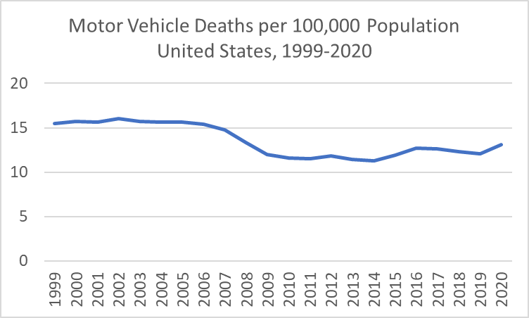
Of all the increases in mortality in 2020, one that is notable is motor vehicle accidents. There were 43,045 deaths from motor vehicle accidents, according to the final CDC data. This means motor vehicle accident was listed on the death certificate, even if it was not determined to be the “underlying cause,” though for 98% of these deaths the accident was listed as the underlying cause.

The increase from past years was large. Compared with 2019, there were over 3,000 more motor vehicle deaths, though such as increase is not unheard of: 2015 and 2016 each saw increases of around 2,500. Even so, the crude death rate from motor vehicle accidents in 2020 was the highest it has been since 2008.

If that weren’t bad enough, another theory emerged in 2020 and continues to be suggested today: that car crashes are being labeled as “COVID deaths,” artificially inflating the COVID death count. While one can find this claim made almost daily by anonymous Twitter users, one of the most prominent statements was on Fox News in December 2020. Host Raymond Arroyo said that car accidents were being counted as COVID deaths, and that due to errors like this COVID deaths could be inflated by as much as 40 percent. Senator Marco Rubio made a similar claim on Twitter in December 2021, though he was talking about hospitalizations, not deaths.

Back in 2020, many doctors and medical professionals tried to debunk the “car accidents being labeled as COVID deaths” claim, but the problem was we didn’t have complete data. Anonymous anecdotes were cited, but medical professionals tried to reassure the public this wasn’t the case or at least wasn’t widespread.

But now, we have the data! That is, the complete CDC mortality data for 2020 available through the CDC WONDER database.

What does this data show us? Short answer: there aren’t that many car accidents being labeled as COVID deaths. At most, it’s about 0.03% of COVID deaths.

Continue reading

Latest Inflation Data: Hot Dogs and Cheese On Sale!

The latest CPI inflation data was released this morning. Mostly the new data just confirms what we’ve seen the past few months: consumer price inflation is at the highest levels in decades, and it is now very broad based.

To see how broad based the inflation is, we can look at any of the “special aggregates” that the BLS produces. CPI less food. CPI less shelter. CPI less food, shelter, energy, used cars and trucks (what a mouthful!). All of these are up substantially over the past year. The lowest number you can get is that last aggregate I listed, which excludes almost 60% of consumer spending, and even it is up 4.7% over the past year — the largest increase since 1991 for that particular special index.

Or, you can just look at food. We all have probably observed that meat prices are way up recently — about 15% over the past year. But it’s not just meat. It’s fruit, vegetables, grains, dairy… the whole darn food pyramid. In fact, there are only two food categories (hot dogs and cheese) and two drinks (tea and wine) that are actually down since December 2020.

I’ve covered the symbolic importance of hot dog prices before, but the fact that only four food or drink categories had price decreases are indications that food-price inflation is extremely broad-based.

So what’s causing the inflation?

Continue reading

Really Stable Prices

Breaking news in America this week: Little Caesars will be raising the price of their Hot-N-Ready Pizzas from $5 to $5.55. Some see this as a sign of the times, just another bit of bad news among all the inflation data lately. But what really surprised me is that this price has been stable they introduced it in 1997. This means that compared to median wages, these pizzas were about 50% cheaper than 1997 (before this price increase). That’s a doubling of America’s Pizza Standard of Living in just 24 years.

Keeping a fixed price is a somewhat rare, but fascinating pricing strategy. It can even become part of the identity of the product. The most famous example was Coca-Cola, which sold a 6.5 ounce bottle for 5 cents from 1886 to 1959. It’s so famous that it has its own Wikipedia page! “Always 5 cents” became a marketing slogan for them. And while we may regard that time period as one of generally low inflation, consumer prices on average more than tripled from 1886 to 1959.

Probably the most famous recent example is Costco’s $1.50 hot dog and soda combo, which has been stable in price since 1985. Rumor has it that the founder of Costco once told the current CEO that he’d kill him if he raised the price of the hot dog. Since 1985, nominal median wages in the US have tripled, meaning that your Costco Hot Dog Standard of Living has also tripled.

The concept of nickel and dime stores and later dollar stores are similar concepts, but they aren’t necessarily selling the exact same products over time. Coca-Cola, Hot-N-Ready pizzas, and Costco hot dogs really are the same product from year-to-year, so these products stand out as amazing examples of price stability during periods of time when most prices were rising in nominal terms (other than new technologies).

What are some other examples of consistently stable prices?

2021: Our Most Popular Posts

While the blog got its start with Joy Buchanan in mid-2020, we are now just finishing up our first full year and now have a full weekly slate of bloggers. This seems like a good opportunity to reflect on our most popular posts from each of our regular bloggers. We hope you enjoy looking back at these popular posts.

Monday: Mike Makowsky

Makowsky‘s most popular post was from May 2021, titled “Academic Publishing: How I think we got here.” This post generated a significant amount of discussion on Twitter among economists and other academics, and is the second most widely read post on this blog with almost 10,000 views. Makowsky outlined the history and incentives of “how we got here” in terms of the problems with academic publishing, and he is skeptical that there is any easy fix. It seems there is nothing economists love arguing about more than our profession itself. (Follow Makowsky on Twitter)

Tuesday: Scott Buchanan

Scott Buchanan‘s most popular post is “Money as a Social Construct” is from September 2020. It discusses the very basic definition of what we mean by money, and the importance of social trust for both the functioning of money and general social order. The related theme of cryptocurrencies is something he has written a lot about in the last few months of 2020. (He is not yet on Twitter!)

Continue reading

Is Travel Back?

According to the most recent TSA data, on December 21st of this year there were 1,979,089 people traveling by plane. That’s almost exactly equal to the number of people that flew in the US on the same date in 2019: 1,981,433 travelers. It’s also double the number of people that few on December 21, 2020 (about 992,000). These numbers are encouraging. Does that mean that we’re back to normal levels of travel?

Not quite. We shouldn’t read too much into one day of data, for a variety of reasons, but most importantly because while we’re looking at the same date, travel varies throughout the week and December 21st is a different day of the week every year (Tuesday this year, Saturday in 2019). It’s better to use a weekly average and compare it to 2019. Here’s what the data looks like for 2020 and 2021.

With this data, we can see that airline travel is back to about 85 percent of 2019 levels. That’s not bad, but airline travel was already back to 85 percent by early July 2021, with some variation since then, but generally staying in the 70-90 percent range for most of the second half of the year.

For those that are flying this year, there is good news in terms of prices (unusual to have good prices news right now): airfares are still about 20 percent cheaper than pre-pandemic levels. In fact, airline prices are the cheapest they have been since 1999. In nominal terms! If you are interested in even more historical price data, take a look at my May 2021 post on the “golden age” of flight.

And of course, flying is not the most common way that people travel for Christmas and the holiday season. According to estimates from AAA, only about 6 percent of holiday travelers choose to fly. This was true in 2019, and will be roughly true in 2021 (as usual, 2020 was the exception: around 3 percent). By far the most common mode of travel in the US is driving, accounting for over 90 percent of holiday travel.

If you are traveling by car, there isn’t much good news for prices. As you have no doubt heard constantly for the past few months, gasoline costs a lot more than it did last Christmas, on average about $1 per gallon more. But even compared to Christmas 2019, gasoline prices are almost 29 percent higher. The last time gasoline prices were this high (in nominal terms) around Christmas was in 2013.

I hope you all have safe holiday travels, and we’ll all look forward to better prices in the New Year!

800,000 Deaths? Or 1 Million Deaths?

According to the Johns Hopkins COVID tracker, the US has now surpassed 800,000 COVID deaths during the pandemic. The CDC COVID tracker is almost to 800,000 too. But is this number right? Confusion about COVID deaths and total deaths has been rampant throughout the pandemic, especially when comparing across countries.

One method that many have suggested is excess deaths, which is generally defined as the number of deaths in a country above-and-beyond what we would expect given pre-pandemic mortality levels. It’s a very rough attempt at creating a counterfactual of what mortality would have looked like without the pandemic. Of course, you can never know for sure what the counterfactual would look like. Would overdoses in the US have increased anyway? Hard to say, though they had been on the rise for years even before the pandemic.

So don’t treat excess deaths as a true counterfactual, but just a very rough estimate. I wrote about excess deaths in the US way back in January 2021 (feels like a lifetime ago!), and at the time for 2020 it looked like the US had about 3 million total deaths (in the first 48 weeks of 2020), which was about 357,000 deaths more than expected (again, based on historical levels of the past few years), or about 13.6% above normal.

But once we had complete data for 2020, deaths were even higher: about 19% above expected, or somewhere around 500,000 excess deaths. This compares with the official COVID death count of about 385,000 in 2020 for the US.

What happens if we update those numbers with the most recent available mortality data for 2021? Keep in mind that data reporting is always delayed, so I’ll just use data through October 2021. The following chart shows both confirmed COVID deaths and total excess mortality, cumulative since the beginning of 2020.

As we can see in the chart, there are a lot more excess deaths than confirmed COVID deaths. There were already over 1 million excess deaths through the end of October 2021 in the US, cumulative since January 2020. This compares with about 766,000 confirmed COVID deaths. That’s a big gap!

We could spend a lot of time trying to understand this gap of 250,000 deaths. Is this under-reporting of COVID deaths? Is it deaths caused by government restrictions? Is it caused by the overwhelming of the health system?

I won’t be able to answer any of those questions today. Instead, let’s ask a different question: is the potential US undercount of COVID deaths unusual?

Continue reading

Has Economic Growth Really Slowed Since 1970?

In the post-WW2 era, by many different measures the US economy performed better before about 1970 than after. You can apparently see this in many different statistics. For example, the productivity slowdown is a well-known and well-studied phenomenon. And even given the productivity slowdown, median wages don’t seem to have kept pace with productivity growth.

I think there are good reasons to doubt these particular statistics. For example, on wages and productivity see this working paper by Stansbury and Summers.

But even considering all these criticisms of the statistics, we do observe that overall GDP growth has been slower since about 1970. Why might this be?

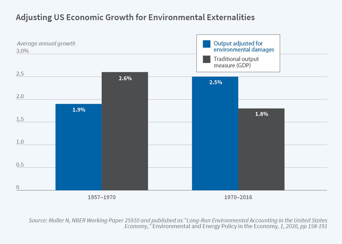
In an NBER summary of his research, Nicholas Muller argues that a big part of the GDP growth slowdown is because we aren’t including environmental damage in the calculation. This is not a new argument (Muller is an important contributor to this literature), and the exclusion of environmental damage is a well-known flaw of GDP, but Muller’s paper does a great job of quantifying how much we are mismeasuring GDP. The following figure is a nice summary of what GDP growth looks like when we consider environmental damage.

2021number3_muller1.jpg

If we use the standard measure of GDP, growth indeed slowed down after 1970. If instead we augment GDP for environmental damages, the period after 1970 was actually faster! The adjustment both slows down growth from 1957-1970, and speeds up growth after 1970.

There are lots of things we can draw from this, but if the results are close to accurate, there is a clear implication: environmental regulations (such as the Clean Air Act) do reduce GDP growth, as traditionally measured. So the skeptics of regulation are partially right: regulation reduces growth!

However, this seems to be a clear case where standard critiques of GDP (as you can find in just about any Econ 101 textbook — yes, really!) need to be incorporated into the complete cost-benefit analysis of the impacts of environmental regulation.