More Or Less Money

Money and interest rates have been in the news because the Fed wants to slow the rate of inflation, maintain financial stability, and avoid a recession. Let’s break it down. First, some broad context. The M1 and M2 were all chugging along prior to 2020. M2 was growing along with NGDP and, after raising interest rates, the Fed had begun lowering them again. Then Covid, the stimuli, and the redefinition of M1 happened. Now, we’re trying to get back to something that looks like normal. See the graphs below.

https://fred.stlouisfed.org/graph/?g=1aFgM
https://fred.stlouisfed.org/graph/?g=1aFgO

But these aggregates gloss over some relevant compositional changes. Let’s go one-by-one.

The monetary base includes both bank reserves and currency in circulation. We could break it down further, but I’ll save that for another time. What we see is that while currency in circulation did grow faster post-covid, it was nothing compared to the growing reserve balances. From January to May of 2020, currency grew by 7.5% while reserves almost doubled. That means a few things. 1) People weren’t running on banks. Covid was not a financial crises in the sense that people were withdrawing huge sums of cash. 2) Banks were well capitalized, safe, and stable. Further, uncertainty aside, banks were ready to lend. And they did. Not long after the recession, everyone and their brother was re-financing or taking on new debt. More recently, we can see that currency has stabilized and, again, most of the action has been in reserve balances. As of September 2023, reserve balances are down 23% from the high in September 2021.

https://fred.stlouisfed.org/graph/?g=1aF06

The thing about the monetary base, however, is that reserves don’t translate into more spending unless the reserves are loaned out. The money supply that people can most easily spend, M1, is composed of currency held outside of banks, deposit balances, and “other liquid deposits” (green line below).*  See the graph below. Again, most of the action wasn’t in the physical printing of hard, physical cash. People’s checking account balances ballooned thanks to less spending on in-person services and thanks to the stimulus checks and other relief programs. Deposit balances more than doubled from January to December of 2020. Ultimately, deposit balances were 3.3 *times* higher by August of 2022. Since then, the balances have been on a slow, steady decline of about 5.8% over the course of the year. But even then, it’s those “other” deposits, previously categorized as M2, where most of the action is. The value of those balances have fallen by a whopping 2.5 *trillion* and 19% dollars in the past 18 months. People are drawing down their savings.

https://fred.stlouisfed.org/graph/?g=1aFgV

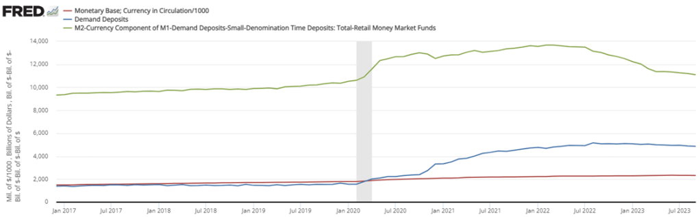
Finally, we get to M2, the less liquid measure of the money supply. Besides the M1 components, it also includes small time deposits, such as CD’s, and money market funds (not including those held in IRA and Keogh accounts). Money market funds and small time deposits have *increased* in value since the post stimulus tightening as people chase the allure of higher interest rates on offer. Measured by volume, the declines in the broad money supply have darn near all come from declines in M1 (again, the jump is redefinition). And of that, it’s almost entirely coming out of “other” liquid deposits, as illustrated above. That’s savings balances. It’s true that there is some other-other balances, but it’s mostly savings accounts.

https://fred.stlouisfed.org/graph/?g=1aFgY

Zooming in on just those “other” balances (below left), people still have higher balances than they did prior to the pandemic. But by now, they’re below the pre-pandemic trend.  Savings accounts are depleted. However, since many people don’t use savings account anymore due to the decade plus of low interest rates, it’s appropriate to consider both “other” accounts and demand deposits (below right). By that measure, we still have plenty of post-Covid liquidity at our disposal.

https://fred.stlouisfed.org/graph/?g=1aFLj
https://fred.stlouisfed.org/graph/?g=1aFLo


*Other liquid deposits consist of negotiable order of withdrawal (NOW) and automatic transfer service (ATS) balances at depository institutions, share draft accounts at credit unions, demand deposits at thrift institutions, and savings deposits, including money market deposit accounts.

PS. So where is all this above-trend NGDP coming from, if not the money supply? Hmmmm.

Inflation Update: With and Without the Outliers

Inflation has been constantly in the news over the past 2 years, but it has especially been in the news lately with regards to one country: Argentina. That country has been experiencing triple-digit annual inflation lately, and it has become one of the key issues in the current presidential race.

How bad is inflation in Argentina? Here’s a comparison to some other G20 countries from September 2019 through September 2023 (data from the OECD).

Cumulative consumer price inflation in Argentina over the past 4 years is over 800 percent. That means goods which cost 100 pesos in September 2019 now costs 900 pesos, on average. Well, they did in September. It’s almost November now, so if the recent inflation rates persisted, those goods are around 1,000 pesos now.

Turkey also stands out as a country with very rapid inflation the past 4 years — without Argentina on the chart, Turkey would clearly stand out from the rest. But other than Turkey, all the other countries are bunched at the bottom. Has there not been much difference among them? Not quite.

This next chart removes Argentina and Turkey:

In this second chart we see two standouts on the opposite end of the spectrum: Japan and Switzerland have had extremely low inflation, just 6 and 5 percent cumulatively since late 2019 (and this is not unusual for these two countries in recent history).

For us here in the USA, things don’t look so good. Only Brazil and the EU are higher (and the EU is mostly due to energy price inflation in Eastern Europe), so other than that we are basically tied with the UK for the worst inflation performance among very high income countries during the pandemic. That’s bad news! But perhaps one silver lining is that average wages in the US have outpaced inflation slightly: 23 percent vs 20 percent growth over this time period. That’s not much to celebrate — except relative to most of the rest of the world.

Kids Are Much Less Likely to Be Killed by Cars Than in the Past

On X.com Matt Yglesias posted a chart that sparked some conversation about child safety:

Of course, it was probably more his comment about the “rise of more intensively supervised childhood activities” that generated the feedback and pushback. And I assume his comment was partially tongue-in-cheek, as often happens on Twitter, and designed to generate that very discussion. Still, it is worth thinking about. Exactly why did that decline happen?

I’ve posted on this topic before. In my March 2023 post, I looked at very broad categories of child death. While all death categories have declined, about half of the decrease (depending on the age group, but half is about right) is from a decline in deaths from diseases, as opposed to external causes. And fewer disease death can largely be attributed to improvements in healthcare, broadly defined. Good news!

Of course, that means that about half of the decline is from things other than diseases. What caused those declines? Let’s look into the data. Specifically, let’s look into the data on deaths from car accidents.

Continue reading

The Goldin Nobel

This week the Nobel Foundation recognized Claudia Goldin “for having advanced our understanding of women’s labour market outcomes”. If you follow our blog you probably already know that each year Marginal Revolution quickly puts up a great explanation of the work that won the economics Prize. This year they kept things brief with a sort of victory lap pointing to their previous posts on Goldin and the videos and podcast they had recorded with her, along with a pointer to her latest paper. You might also remember our own review of her latest book, Career and Family.

But you may not know that Kevin Bryan at A Fine Theorem does a more thorough, and typically more theory-based explanation of the Nobel work most years; here is his main take from this year’s post on Goldin:

Goldin’s work helps us understand whose wages will rise, will fall, will equalize going forward. Not entirely unfairly, she will be described in much of today’s coverage as an economist who studies the gender gap. This description misses two critical pieces. The question of female wages is a direct implication of her earlier work on the return to different skills as the structure of the economy changes, and that structure is the subject of her earliest work on the development of the American economy. Further, her diagnosis of the gender gap is much more optimistic, and more subtle, than the majority of popular discourse on the topic.

He described my favorite Goldin paper, which calculates gender wage gaps by industry and shows that pharmacists moved from having one of the highest gaps to one of the lowest as one key feature of the job changed:

Alongside Larry Katz, Goldin gives the canonical example of the pharmacist, whose gender gap is smaller than almost every other high-wage profession. Why? Wages are largely “linear in hours”. Today, though not historically, pharmacists generally work in teams at offices where they can substitute for each other. No one is always “on call”. Hence a pharmacist who wants to work late nights while young, then shorter hours with a young kid at home, then a longer worker day when older can do so. If pharmacies were structured as independent contractors working for themselves, as they were historically, the marginal productivity of a worker who wanted this type of flexibility would be lower. The structure of the profession affects marginal productivity, hence wages and the gender gap, particularly given the different demand for steady and shorter hours among women. Now, not all jobs can be turned from ones with convex wages for long and unsteady hours to ones with linear wages, but as Goldin points out, it’s not at all obvious that academia or law or other high-wage professions can’t make this shift. Where these changes can be made, we all benefit from high-skilled women remaining in high-productivity jobs: Goldin calls this “the last chapter” of gender convergence.

Source: A Grand Gender Convergence: Its Last Chapter

There is much more to the post, particularly on economic history; it concludes:

When evaluating her work, I can think of no stronger commendation than that I have no idea what Goldin will show me when I begin reading a paper; rather, she is always thoughtful, follows the data, rectifies what she finds with theory, and feels no compunction about sacrificing some golden goose – again, the legacy of 1970s Chicago rears its head. Especially on a topic as politically loaded as gender, this intellectual honesty is the source of her influence and a delight to the reader trying to understand such an important topic.

This year also saw a great summary from Alice Evans, who to my eyes (admittedly as someone who doesn’t work in the subfield) seems like the next Claudia Goldin, the one taking her work worldwide:

That is the story of “Why Women Won”.

Claudia Goldin has now done it all. With empirical rigor, she has theorised every major change in American women’s lives over the twentieth century. These dynamics are not necessarily true worldwide, but Goldin has provided the foundations.

I’ve seen two lines of criticism for this prize. One is the usual critique, generally from the left, that the Econ Nobel shouldn’t exist (or doesn’t exist), to which I say:

The critique from the right is that Goldin studied unimportant subjects and only got the prize because they were politically fashionable. But labor markets make up most of GDP, and women now make up almost half the labor force; this seems obviously important to me. Goldin has clearly been the dominant researcher on the topic, being recognized as a citation laureate in 2020 (i.e. someone likely to win a Nobel because of their citations). At most politics could explain why this was a solo prize (the first in Econ since Thaler in 2017), but even here this seems about as reasonable as the last few solo prizes. David Henderson writes a longer argument in the Wall Street Journal for why Claudia Goldin Deserves that Nobel Prize.

Best of all, Goldin maintains a page to share datasets she helped create here.

Is the Job Growth Driven by Part-Time Workers?

A few weeks ago I wrote about several measures of the labor market, and whether the labor market was actually doing well. It’s a good idea to look beyond the headline unemployment rate, but even looking at alternative unemployment rates, labor force participation, employment rates, and unemployment insurance claims, I concluded in that post that the labor market is still looking healthy.

Lately I have heard another objection to the job growth numbers: part-time employment. I’ve seen this pop-up a few times on Twitter lately and just yesterday my co-blogger Scott Buchanan (in a post primarily about excess savings) stated that “much of the jobs creation this year has been in the part-time category.”

So is the jobs recovery mostly about part-time jobs? What is going on?

First things first: most of the data on part-time employment is from the household survey. There’s already a lot of noise in the household survey, due to the sample size, and part-time workers are a small share of the workforce, so expect it to be even noisier. In short, don’t trust one-month fluctuations too much. Furthermore, most of the data folks look at is seasonally adjusted. That’s generally good practice! But again, for a small number in a small sample, the seasonal adjustment factors won’t be perfect. Don’t read too much into one or a few months of data.

Let’s get the big picture first. How much of the labor force in the US is usually working part-time (defined in most data as less than 35 hours per week)? As usual FRED is the best place to go for graphing BLS data:

Continue reading

Monetary and Fiscal Policy Is Still Easy

The last post where I attempted a macro prescription was in April 2022, when I said the Fed was still under-reacting to inflation. That turned out right; since then the Fed has raised rates a full 500 basis points (5 percentage points) to fight inflation. So I’ll try my luck again here.

Headline annual CPI inflation has fallen from its high of 9% at the peak last year to 3.7% today. Core PCE, the measure more closely watched by the Fed, is at a similar 3.9%. Way better than last year, but still well above the Fed’s target of 2%. Are these set to fall to 2% on the current policy path, or does the Fed still need to do more?

The Fed’s own projections suggest one more rate hike this year, followed by cuts next year. They expect inflation to remain a bit elevated next year (2.5%), and that it will take until 2026 to get all the way back to 2.0%. They expect steady GDP growth with no recession.

What do market-based indicators say? The yield curve is still inverted (usually a signal of recession), though long rates are rising rapidly. The TIPS spread suggests an average inflation rate of 2.18% of the next 5 years, indicating a belief the Fed will get inflation under control fairly quickly. Markets suggest the Fed might not raise rates any more this year, and that if they do it will only be once. All this suggests that the Fed is doing fine, and that a potential recession is a bigger worry than inflation.

Some of my other favorite indicators muddy this picture. The NGDP gap suggests things are running way too hot:

M2 shrank in the last month of data, but has mostly leveled off since May, whereas a year ago it seemed like it could be in for a major drop. I wonder if the Fed’s intervention to stop a banking crisis in the Spring caused this. Judging by the Fed’s balance sheet, their buying in March undid 6 months of tightening, and I think that underestimates its impact (banks will behave more aggressively knowing they could bring their long term Treasuries to the Fed at par, but for the most part they won’t have to actually take the Fed up on the offer).

The level of M2 is still well above its pre-Covid trend:

Before I started looking at all this data, I was getting worried about a recession. Financial markets are down, high rates might start causing more things to break, the UAW strike drags on, student loan repayments are starting, one government shutdown was averted but another one in November seems likely. After looking at the data though, I think inflation is still the bigger worry. People think that monetary policy is tight because interest rates have risen rapidly, but interest rates alone don’t tell you the stance of policy.

I’ll repeat the exercise with the Bernanke version of the Taylor Rule I did in April 2022. Back then, the Fed Funds rate was under 0.5% when the Taylor Rule suggested it should be at 9%- so policy was way too loose. Today, the Taylor Rule (using core PCE and the Fed’s estimate of the output gap) suggests:

3.9% + 0.5*(2.1%-1.8%) + 0.5%*(3.9%-2%) + 2% = 7%

This suggests the Fed is still over 1.5% below where they need to be. Much better than being 9% below like last April, but not good. The Taylor rule isn’t perfect- among other issues it is backward-looking- but it tends to be at least directionally right and I think that’s the case here. Monetary policy is still too easy. Fiscal policy is still way too easy. If current policy continues and we don’t get huge supply shocks, I think a mild “inflationary boom” is more likely than either stagflation or a deflationary recession.

Pinball Prices (Not Adjusted for Inflation)

Last weekend I had the opportunity to visit an arcade, but not one of those modern fancy arcades with virtual reality, laser tag, etc. This arcade specializes in having old-school games, primarily pinball, but also early video arcade games. You pay a cover charge ($5 for kids, $10 for adults), and then you use quarters to play the games. But here’s the cool part: the price of the games is the same as it was when the games were first released.

As an economist, of course, I was very interested in the prices.

They had pinball machines that dated back the 1960s, and video games from the late 1970s. Most video arcade games were around 50 cents for the early games (late 1970s and early 1980s). But the pinball machines started out at 25 cents, with the earliest game they had being a Bally Blue Ribbon machine, manufactured in 1965 (interestingly, some of the earlier machines had slots for both dimes and quarters — I assume the price was adjustable mechanically). Notably, you also got to play 5 balls for this price (3 balls seems to be standard later on).

How should we think about that 25 cents? A standard reaction is to adjust the number for inflation. Using the CPI-U as the inflation index, that means the 25 cents from 1965 is “worth” about $2.40 now. That’s interesting, but I don’t think it really provides the relevance that we want today.

An alternative is to calculate the “time price” of playing the game. Using the average hourly wage of $2.67 in December 1965, we can calculate that it would take about 5.5 minutes of work to pay for that game — a game which probably only lasts about 5.5 minutes, unless you are really good at it!

Another comparison we could do is with the cost of video games today compared with wages today. But that’s not really a fair comparison — video games are much more advanced today. We would need to do some sort of quality adjustment, which is overly complicated.

But, at least in my case, there is no need to do the quality adjustment — I can play the exact same game as 1965. In fact, I did (several times). There was also that $10 cover charge that I mentioned, and if I spread that fixed cost over 40 games, it cost me about 50 cents per play (including the 25 cents to start the machine) to play the 1965 Bally’s Blue Ribbon Pinball machine. At the average wage today of $29 per hour, it takes about 1 minute to afford a play of that same game. In other words, my Blue-Ribbon-Pinball standard of living is about 5.5 times greater than in 1965.

Now this isn’t to say we are 5.5 times better off overall than 1965. Prices don’t stay constant for most goods! But hopefully it is a useful way to think about that 25 cent price tag from the past, and how to compare it to today.

New Center for the Restoration of Economic Data

Regular readers will know that we love not only economics, but also history and data. We especially love it when “data heroes” take data that was difficult or impossible to access and make it easily available to everyone. The Federal Reserve Bank of Philadelphia just announced a project that brings together all of these things we love, their new Center for the Restoration of Economic Data:

Our mission is to advance research in topics related to regional economics and consumer finance by making economic data available in readily accessible, digital form. CREED combines state-of-the-art machine learning technology with deep subject matter expertise to convert natively unstructured data (information in books, images, and other undigitized formats) into readily accessible digital data.

The CREED research team shares the original analog or unstructured data as well as the code used to recover and clean these data, which are aggregated for use in novel economic research. Our collection features volumes of old, often overlooked, and frequently inaccessible data, which have been mined, restored, and converted into unstructured digital and analytically usable formats.

Their first project is to map all of the racially restrictive covenants in the city of Philadelphia. Until the U.S. Supreme Court declared such covenants to be unenforceable in 1948, they often barred properties from being sold to non-whites or non-citizens. After 1948 redlining took different forms, some of which may still persist today.

CREED shares the underlying data used to build the map here, and they say much more is one the way. I love it when economic historians (and regular historians) digitize old paper records and share the resulting data, and hope to see more examples like this to share in the coming years.

Disclaimer: I am a visiting scholar at the Federal Reserve Bank of Philadelphia but I was not involved with this project

Who is the Wealthiest Generation? Mid-2023 Update

The Federal Reserve has released the latest update to their Distributional Financial Accounts data, which the data underlying several of my past posts on generational wealth. With that recent data, I have updated the chart of wealth for Baby Boomers, Generation X, and Millennials.

The data is shown on a log scale to better show growth rates and allow for easier visual comparisons. But if you are interested in the more precise numbers, in the most recent quarter (2023q2) Generation X has, on average about $620,000 in net wealth, which compares favorably with Baby Boomers at about the same age (in 2006) with about $539,000 in net wealth per person. That’s about 20 percent more.

Millennials have about $115,000 in net wealth on average, which also compares favorably with Baby Boomers, who had slightly more at about the same age (in 1990) with $121,000 in net wealth on average. Given the uncertainties of all the data that goes into this, I’d say those are roughly equal. Gen X had a bit more around the same age (in 2007) with $149,000, but that fell significantly the next two years during the Great Recession.

(For more detail on my approach to creating the chart, see the linked post above, but in short I’m using the Fed DFA data for wealth, Census Bureau data by single year of age for population, and the Personal Consumption Expenditures price index for inflation adjustments (I also have a chart with the CPI-U — it’s not much different). Wealth data is for the 2nd quarter in each year (to match 2023), except for 1989 since the 3rd quarter is the first available.)

Given how much wealth can fluctuate based on housing values (see above for Gen X from 2007-2009), it might be useful to look at the data with housing. Housing is also a weird kind of wealth — for the most part, you can’t access it without selling (other than certain home equity loans), and when you do sell, unless your home appreciated more than average, you just have to move to another home that also appreciated.

Here’s the chart excluding housing value and mortgage debt:

The chart… doesn’t change much. The values are all lower, of course, but the comparisons across generations look pretty similar. Gen X right now is 17 percent wealthier than Boomers at the same age. And if we look at all three generations around the median age of 35, they are pretty close: Gen X with $123,000 (but slipping over the next few years), Boomers with $99,000, and Millennials with $90,000.

Median Family Income in US States, 2022

Last week I wrote about median income in the US, and how it had declined since 2019 and 2021 through 2022 (inflation adjusted, of course). The big story is that median income (both for households and families) has been falling in recent years. While there are some silver linings when looking at subgroups, such as Black families, the overall data isn’t good.

But while that is true for the US overall, it’s not true for every state. In fact, it’s not even true for most states! From 2019 to 2022, there were 29 states that saw their median family incomes rise! That’s adjusted for inflation (I’m using the C-CPI-U, which is Census’s preferred inflation measure for this data). The income data in this post all comes from the Census ACS 1-year estimates.

Here’s a map showing the states that had increases in median family income (green) and those that had decreases (in red). (This is my first time experimenting with Datawrapper maps, feedback appreciated!)

Some states had pretty robust growth, with New Mexico and Arizona leading the way with around 5 percent growth. There is substantial variation across US states, including with big declines like Wyoming at -5 percent, and Oklahoma and Illinois are -3 percent.

A few weeks ago I also wrote about the richest and poorest MSAs in the US. But what about the richest and poorest states in the US? The following map shows that data.

The immediate fact which will jump out at you is that the lowest income US states are almost all located in the South. This will probably not surprise most of us, although it probably is a bit surprising since the data is adjusted for differences in the cost of living (using the BEA RPP data). Even after making these adjustments, the South is still clearly the poorest region (and it definitely was the poorest without the adjustments).

Among the higher income states, they are distributed pretty well across the rest of the non-South. There are 16 states (plus DC) that have median family incomes over $100,000 (again, cost of living adjusted), and while many of these are in New England and the Mid-Atlantic, there area still a few in the Midwest, Great Plains, and the West. Utah and New Jersey have similar incomes, as do Virginia and Rhode Island.

The highest income states are Massachusetts and Connecticut, with over $112,000 in median family income, while the lowest are Mississippi and West Virginia, both under $78,000. Median family income in Massachusetts is 46 percent higher than Mississippi. And that’s after adjusting for differences in the cost of living.