The answer to that question is, of course, “no.” No one number can alone tell us the whole story, whether we are talking about the economy, health, education, population, or any other social statistic. But when you look at other measures of the health of the labor market, you usually find that they tell a similar story to the unemployment rate.
My goal in this post is to dive a little deeper into the data on the labor market, but really the goal is broader: to give you a little insight about how to interpret data. Some rules of thumb, perhaps. But really there is One Big Rule: numbers need context. A number on its own doesn’t tell us much of anything. How does it compare to the past? How does it compare to other places?
With the unemployment rate at historic lows for both the US and many states, I’ve started to see many people saying that, not only doesn’t the unemployment rate give us the full story, but many other indicators point in the opposite direction. Is this true? Let’s dig into the data. Here’s one example of someone saying this for Arkansas. I’ll focus on Arkansas, since that’s where I live and I pay attention to the economic data here pretty closely, but I’ll also refer to national data where appropriate.
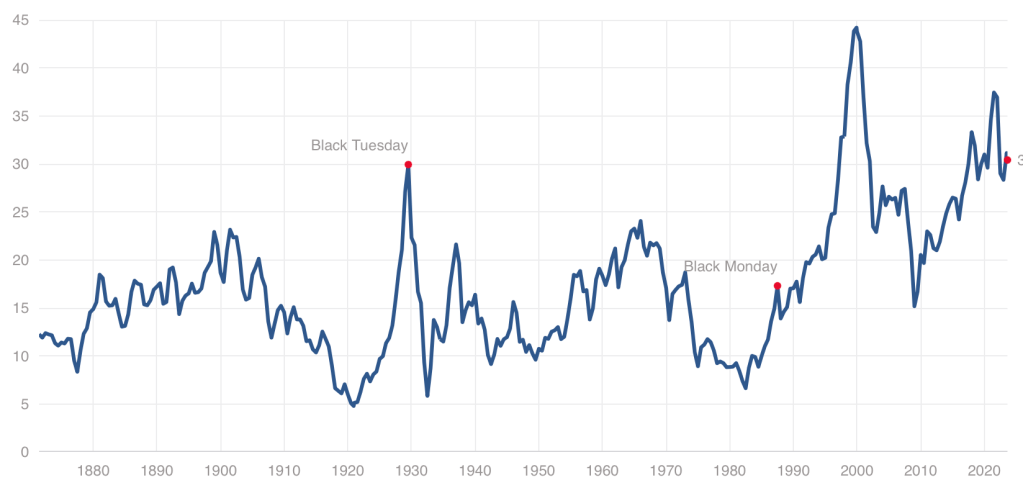
While we have stepped back from the meme stock craziness of 2021, US stocks remain quite expensive by historical standards, with our Cyclically Adjusted Price to Earnings (CAPE) ratio at almost twice its long-run average:
Even at a high price, US stocks could still be worth it, and I certainly hold plenty. But I also think it it a good time to consider the alternatives. US Treasury bond yields are the highest they’ve been since 2007. But there are also many countries where stocks are dramatically cheaper than the US- and not just high-risk basket-cases, but stable “investable” countries.
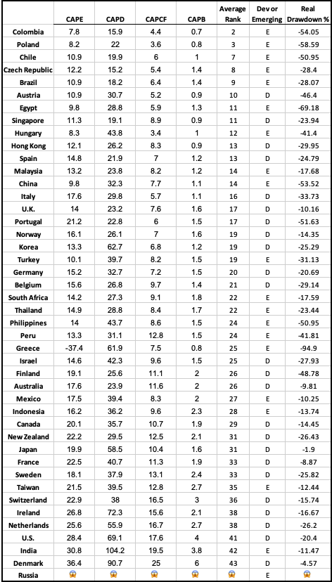
There are several reasonable ways to measure what counts as “expensive” for stocks in addition to the CAPE ratio I mention above. The Idea Farm averages out four such measures to determine how expensive different “investable” (large, stable) country stock markets are. Here is their latest update:
You can see that US stocks are expensive not only relative to our own history, but also relative to other countries, lagging only India and Denmark. That means that much of the world looks like a relative bargain, with the cheapest countries being Colombia, Poland, Chile, Czech Republic, and Brazil.
Of course, sometimes stocks, just like regular goods and services, are cheap for a reason: they just aren’t that good. They might be cheap because investors expect slow growth, or a recession, or political risk. But if you don’t share these expectations about a cheap stock (or country), that’s when to really take a look. I certainly did well buying Poland after I saw they were the cheapest in last year’s global valuation update and thought there was no good reason for them to stay that cheap.
I like that the chart above provides a simple ranking of investable markets. But if you wish it included more valuation measures, or small frontier markets, you can find that from Aswath Damodaran here. Some day I hope to provide a data-based, rather than vibes-based, analysis of which countries are “cheap/expensive for a reason” vs “cheap/expensive for no good reason”, featuring measures like industry composition, population growth, predictors of economic growth, and economic freedom. For now you just get my uninformed impression that Poland and Colombia seem like fine countries to me.
Disclosure: I’m long stocks or indices in several countries mentioned, including EPOL, FRDM, PBR.A, CIB, and SMIN. Not investment advice.
You may have heard that there is a new viral song which deals with a few economic issues. Noah Smith has a good analysis of “Rich Men North of Richmond,” which he mostly finds to be incorrect in its analysis (for example, of welfare policy). But Smith does say that the song has a point: manufacturing wages haven’t performed well in recent years. Not only has pay for factory workers “[lagged] the national average in recent years,” for those workers in Virginia, it’s lower in real terms than in 2010.
Well that all doesn’t sound good! Smith is only going back to about 2000 with the data he shows. What if we took a longer run perspective? What if we took a really long-run perspecitive?
Here’s wages for blue-collar factor workers that goes back to 1939 in the US:
The wage data (for manufacturing production workers) is from BLS and the PCE price index is from the BEA. What do you notice as you look at the data?
First, it is true that the last 20 years or so hasn’t been great. Only about 8% cumulative growth since 2002. That’s not great!
But as you look back further, you’ll notice that gains are substantial. Compared to what some might consider the “golden age” of manufacturing wages, the early 1950s, real wages have roughly doubled. It’s true, the growth rate from 1939-1973 is much, much better than the following 50 years. Wouldn’t it be nice if that growth rate had continued! But no doubt you’ve seen many memes saying something like “in the 1950s you could support a family on one high-school graduate income, but not today!” This data suggests that view of the 1950s is a little distorted by nostalgia.
One final thing to note: we might think that one big change in recent decades is that a lot more compensation goes to benefits, rather than wages. There’s actually a total compensation series for blue-collar workers going all the way back to 1790:
The total compensation data, as well as the CPI data that I used to inflation-adjust the figures (to 2022 dollars), comes from the fantastic resource Measuring Worth. This is a total compensation measurement, so it includes benefits, but the source data tells us that up until the late 1930s, it’s really just a wage measure. So potentially we could splice this together with the above chart, to get a “wage only” series covering the entire history of the US.
However, when we look at total compensation, we still see the post-1970s stagnation. Real compensation is roughly the same as about 1977. Yikes! Note here that we’re using the CPI, since the PCE index only goes back to 1929, and the CPI tends to overstate inflation (yes, that’s right, sorry CPI truthers). Still, it’s not the most optimistic picture.
Or isn’t it? With all of the automation and global competition in manufacturing coming on board in the past 50 years, perhaps our baseline is that things could have been much worse. In any case, if we look at total compensation, it’s currently about double what it was in the post-WW2 era. That’s even with the dip in 2022 due to high CPI inflation.
Wages and compensation of blue-collar productions workers have indeed been growing slowly for the past few decades. That much is true. On the other hand, they are still among the highest they have ever been in history, over 50 times (not 50%, 50 times!) higher than at the birth of this nation. This ranks them as probably the highest wages anywhere in world history for an occupation that doesn’t require an advanced degree. That history is worth knowing.
Inpatient costs were 27% higher (95% CI 0.252, 0.285), but length of stay was 12% shorter (95% CI −0.131, −0.100), in Comprehensive Cancer Centers relative to community hospitals.
In other words, these cutting-edge hospitals that tend to treat complex cases are more expensive, as you would expect; but despite getting tough cases they actually manage a shorter average length of stay. We can’t nail down the mechanism for this but our guess is that they simply provide higher-quality care and make fewer errors, which lets people get well faster.
The NCI Cancer Centers Program was created as part of the National Cancer Act of 1971 and is one of the anchors of the nation’s cancer research effort. Through this program, NCI recognizes centers around the country that meet rigorous standards for transdisciplinary, state-of-the-art research focused on developing new and better approaches to preventing, diagnosing, and treating cancer.
Our paper focuses on New York state because of their excellent data, the New York State Statewide Planning and Research Cooperative System Hospital Inpatient Discharges dataset, which lets us track essentially all hospital patients in the state:
We use data on patient demographics, total treatment costs, and lengths of stay for patients discharged from New York hospitals with cancer-related diagnoses between 2017 and 2019.
You know I’m all about sharing data; you can find our data and code for the paper on my OSF page here.
My coauthor on this paper is Ryan Fodero, who wrote the initial draft of this paper in my Economics Senior Capstone class last Fall. He is deservedly first author- he had the idea, found the data, and wrote the first draft; I just offered comments, cleaned things up for publication, and dealt with the journal. I’ve published with undergraduates several times before but this is the first time I’ve seen one of my undergrads hit anything close to a top field journal. You can find a profile of Ryan here; I suspect it won’t be the last you hear of him.
About one year ago, I wrote a post with the title “Are We in A Recession?” At the time there was much talk, both in the popular media and among economists, about whether we were in a recession or not, and what “technically” counts as a recession. Now with hindsight, I think we can pretty clearly say that we were not in a recession last summer, nor at any point in 2022.
One thing is true: GDP did decline for two quarters in the first half of 2022. In fact, even the more nuanced “real average of GDP and GDI” declined for two quarters. But as I explained in that July 2022 post, that’s not how the NBER defines a recession. It often coincides with their defined recession, but they used a separate set of indicators. And while some economics textbooks do use the two quarters of declining GDP definition, as I explained in a follow-up post, that’s not the most common textbook definition.
The first half of 2022 is a good candidate for a possible recession, but when we look at the NBER’s preferred 6 measures of economic activity, it seems pretty clear that this was not a recession. If you start the data in the last few months of 2021, you do have small declines in two measures through July 2022 (real personal income and real manufacturing sales), but this looks nothing like past recessions, which have large declines in all or most of the 6 measures.
OK, but that was then, this is now. Are we in a recession now or headed into one? You can find lots of models and surveys or different groups of economists out there. I’m not sure that any particular one is the best, so I won’t dive into those. But if we look at the average of GDP and GDI again, we do notice that 2022q4 was negative and 2023q1 was very weak. Maybe that was a recession?
Again, we can start the NBER indicators around that time to see. Starting from September 2022, we can indeed see that there is some weakness in a lot of the measures for the next 2-3 months. But when we look out 6 months or so from then, we once again only have 2 of the 6 indicators that are below the September 2022 level, and the declines are mild (less than 1 percent). You can play around with the start date a bit, but I think September is the best candidate for a peak, and it’s still pretty weak.
OK, OK, you say, but that’s still all the past. What about the future? Sorry dear reader, I don’t have a crystal ball or the economic equivalent (a model). All I can say is what the data shows right now (which is always backward looking), and as of right now most broad measures of the economy aren’t declining. Yet!
This doesn’t mean everything is great in the economy. Inflation is bad. Poverty is bad. Inequality is, often, bad. We always have these things. But are they getting better? Or are they getting worse? A recession is a particularly bad thing, and something that is often hard to precisely define and measure (for good reason: the economy is complex and hard to measure!). All indication of the available data is that, whatever other bad things are happening right now, a recession is probably not one of those things.
Lot’s of economists use FRED – that’s Federal Reserve Economic Data for the uninitiated. It’s super easy to use for basic queries, data transformations, graphs, and even maps. Downloading a single data series or even the same series for multiple geographic locations is also easy. But downloading distinct data series can be a hassle.
I’ve written previously about how the Excel add-on makes getting data more convenient. One of the problems with the Excel add-on is that locating the appropriate series can be difficult – I recommend using the FRED website to query data and then use the Excel add-on to obtain it. One major flaw is how the data is formatted in excel. A separate column of dates is downloaded for each series and the same dates aren’t aligned with one another. Further, re-downloading the data with small changes is almost impossible.
Only recently have I realized that there is an alternative that is better still! Stata has access to the FRED API and can import data sets directly in to its memory. There are no redundant date variables and the observations are all aligned by date.
Last week I wrote an optimistic take on inflation. The rate of general price inflation has fallen a lot in recent months, and wage growth is now clearly outpacing inflation. That’s all good news.
Today, the Fed will announce their latest interest rate decision. Will the good news on inflation lead the Fed to stop raising interest rates? I’m not very good at making predictions, but today I’ll give a pessimistic take on inflation which suggests the Fed (and everyone else) should still be concerned about inflation.
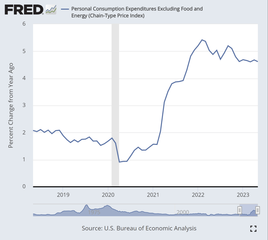
The pessimistic take can be summarized in two charts. First, this chart shows the year-over-year change in the core PCE inflation index. As most readers will know, core indexes take out food and energy prices. This is not a “cheat” to mask important goods, it’s done because these are particularly volatile categories of goods. If we want to see the true underlying trend in inflation, we should ignore price fluctuations that are driven largely by weather and geopolitics.
While there is some moderation in inflation in this chart, we don’t see anything like the dramatic decline in the CPI-U, which fell from about 9 to 3 percent over roughly the past year. True, there is some decline over the past year, but only about 1 percentage point, and it has been stuck at just over 4.6 percent for the past 6 months. This is not a return to normalcy, as this rate historically has stayed in the band of 1-2 percent.
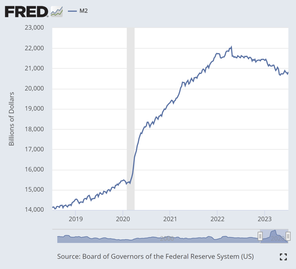
The second pessimistic chart is M2, a broad measure of the money supply.
The dramatic increase in M2 during 2020 is clear. That’s a big source of the inflation issues we’ve had over the past 2 years. There is some cause for optimism in this chart: M2 has clearly shrunk from the peak in Spring 2022. In fact, using a year-over-year percentage change, M2 has been negative since last November.
But if we look very recently, there is less cause for optimism. Since late April, M2 has stopped falling. In fact, it’s up a little bit. Is this a sign that the Fed doesn’t really have inflation under control? Perhaps. The increase isn’t huge, and there’s always some seasonality and noise to this data so we shouldn’t overanalyze this small deviation from the general decline in the past year plus. But we’ll need to continue watching this data.
We have all heard of the prohibition era. Popularly, it refers to the period from 1920-1933 during which it was illegal to sell, transport, and import alcohol in the US. National prohibition was enacted by the 18th amendment and repealed by the 21st amendment. That’s the basic picture.
But did you know that there were state alcohol prohibitions prior to the national one? In fact, there were 3 major waves of state alcohol prohibitions. The first was in the 1850s, the 2nd was in the 1880s, and then the 3rd preceded the 18th amendment. The image below illustrates the number of states that had statewide dry policies. You can see the first two waves and then the tsunami just prior to 1920.
The latest CPI-U price data shows that the rate of inflation in the US has slowed significantly to just 3% in the past 12 months. That’s a huge improvement from the peak last June, when the annual rate of inflation was over 9%. Still, prices as a whole aren’t falling, and they clearly aren’t anywhere near where they were before the pandemic: using the CPI-U, prices are up over 17% since January 2020.
Lately I’ve heard many people asking a good question: will prices ever get back down to where they were? Usually they mean pre-pandemic prices, though sometimes they refer to a particular point-in-time (such as the start of Biden’s presidency). The only correct answer is “we don’t know,” but I think a likely answer for many goods and services is “no.” For many reasons, the nominal prices of most goods and services rise over time. Though this is not true for everything, of course (newer technologies are one example we often see).
But what about specific goods that we buy frequently? Will we ever see gasoline consistently below $3 per gallon again? Will we ever see milk consistently below $4 per gallon again? What about eggs and bread? And indeed, these prices are well above January 2020 levels: 23% higher for milk, 43% for bread, 45% for gasoline, and a whopping 52% for eggs. For the price data, I am using this convenient data on common food and energy goods from BLS.
For some of these items, I do think you might someday see prices fall back to levels consumers were used to from the recent past, since food and energy prices tend to be volatile. For others, though maybe not. But I think we as consumers can become overly focused on staples that we buy frequently and can easily recall the price in our heads. For example, while eggs, bread, and milk are items that we buy frequently (including being the staples of stocking up before a storm), in total these constitute just 0.6% of average consumer spending.
If instead of those 3 staples, your mind naturally anchors on produce prices, the trends look different: oranges are up 23%, but bananas are only up 10%, and tomatoes are, in fact, down 14% since January 2020. But again, these items are less than 0.5% of total consumer spending. Ideally, we shouldn’t anchor on any one subset of goods when doing a good analysis, even if it is natural for us to do so in our lives as consumers.
This is where the benefit of a price index, like the CPI-U, comes in.
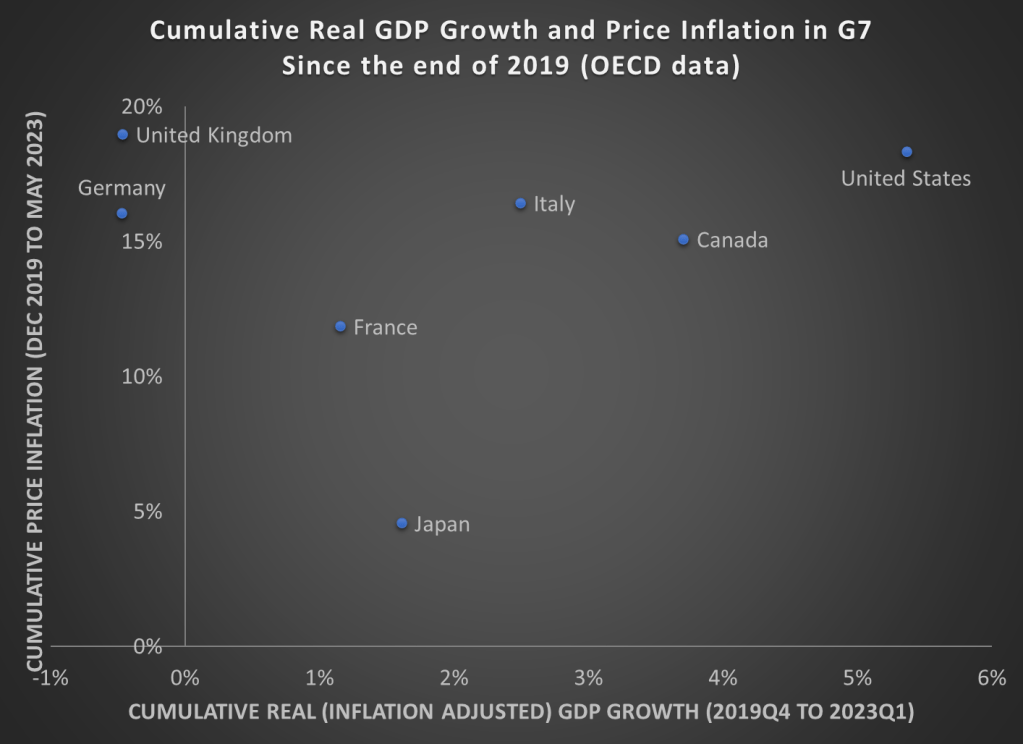
As we prepare for the release of second quarter GDP data over the next few weeks, here is a chart showing cumulative GDP growth (inflation adjusted) and Price inflation for G7 countries. While inflation has been high everywhere (except for Japan), the US comes out looking very well relatively on GDP growth. That’s especially true compared to the UK and Germany, which have also had high price inflation, but have actually had negative economic growth since the end of 2019.