Chocolate Prices Will Shoot Up

I write about various topics, usually with at least some loose connection to economics. Sometimes these are fairly macro issues, other times there are specific, actionable observations. For instance, back in March of 2021, we inferred from the critical shortages of semiconductors that car manufacturing would be severely crimped, likely leading to big price increases in cars.  Our post “Chip Shortages Shutting Down Auto Assembly Lines; Buy Your Car Now Or Else” came out just in time (red arrow below) to alert the readership here:

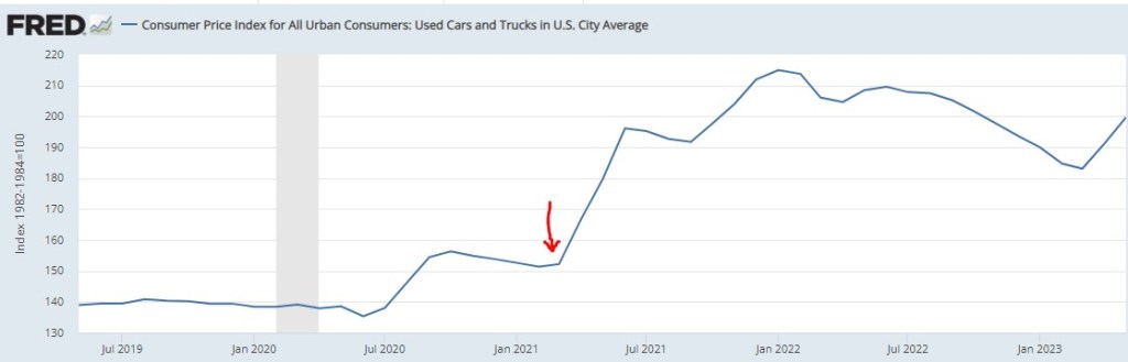
https://fred.stlouisfed.org/series/CUSR0000SETA02 – – Consumer Price Index for All Urban Consumers: Used Cars and Trucks in U.S. City Average

Chocolate Prices

But now, a price increase of more ubiquitous import looms. Most of us were not in the market for cars in March of 2021, but some 81% of us eat chocolate, with the average American consuming about 9.5 pounds a year. Indeed, 50% “cannot live without it every day.”

And so, it is with a heavy heart that I bring warning of a rise in the price of chocolate. Back in pandemic lockdown, I was bored and speculated a few bucks in cocoa futures, as tracked by the NIB exchange traded fund. My shares went up, and then down, and I sold out to limit losses (which was a good move at the time), and moved onto other investments.

Imagine my surprise when I randomly checked on NIB this week and saw the price ramp-up in the past few months:

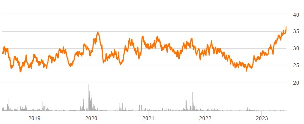
Source: Seeking Alpha

A quick internet search led to a CNBC article which confirmed my worst fears:

“The cocoa market has experienced a remarkable surge in prices … This season marks the second consecutive deficit, with cocoa ending stocks expected to dwindle to unusually low levels,” S&P Global Commodity Insights’ Principal Research Analyst Sergey Chetvertakov told CNBC in an email.

…Chetvertakov added that the arrival of the El Niño weather phenomenon is forecast to bring lower than average rainfall and powerful Harmattan winds to West Africa where cocoa is largely grown. Côte d’Ivoire and Ghana account for more than 60% of the world’s cocoa production

The price of cocoa will feed into the price of consumer chocolate products, especially dark chocolate which has more actual cocoa content. And the price of sweets generally will rise on the back of sugar prices, which stand at 11-year highs, driven again largely by weather.

There is still time to stock up ahead of the hoarders…

Intro to Textual Indices: Ngrams & Newspapers

There have been a lot of popular papers in the past decade or so that make use of textual analysis. A fun one is “The Mainstreaming of Marx” by Magness & Makovi. They use Google Ngram to analyze the popularity of people mentioned in books and determine when Karl Marx became popular.  “Measuring Economic Policy Uncertainty” by Baker, Bloom, & Davis is one of my favorites. They use set theory to detect terms in newspapers that denote economic policy uncertainty. In this post, I’m just going to describe practical differences between the two data sources and how the interpretations differ.

Ngram

Ngram measures takes a term and measures how popular that term is in its corpus of book text, which is about 6% of all books ever written (in English, anyway). Because popularity is expressed as a percent, we can make direct popularity level comparisons among words. For example: “Cafe” & “Coffee Shop”. In the figure below, we can see that the word “cafe” was more popular in books until very recently.

Continue reading

A Surprisingly Good Year for Homebuilders

The Federal Reserve has been increasing interest rates at the fastest pace since the 1980’s, from near-zero rates in March of last year to over 5% today. This has led to rapid slowdowns in interest-rate sensitive sectors like housing, cars, and startups. Because most people finance their home buying, higher interest rates mean higher monthly payments for a house at a given price. Since many people were already buying houses near the highest monthly payment banks would allow them to, higher interest rates mean they need to buy cheaper houses or just stay out of the market and rent. This is especially true as the interest expense on mortgages has tripled in two years:

Source: Jeff Weniger

You’d think this would be bad news for homebuilders, and for most of 2022 markets agreed: homebuilder stocks fell 36% from the beginning of 2022 to September 2022 after the Fed started raising rates in March. But homebuilder stocks have recovered since September, with some major names like D.R. Horton and Lennar hitting all time highs. Why?

I bought homebuilder stocks in January but I have to say even I wasn’t expecting such a fast recovery (if I had, I would have bought a lot more). I was buying because they were cheap on a price to earnings basis and temporarily out of fashion; I love stocks that are priced like they’re in a secular decline to bankruptcy when its clear they are actually just having a bad cycle and will recover when it turns. But I thought I’d have to wait years for falling interest rates and a recovering housing market for this to happen. Instead these are up 20-100% in 6 months. Why?

The big thing I missed was that high interest rates have hit their competition harder, reducing supply as well as demand. Who is the competition for homebuilders? Existing homeowners. Homeowners with the “golden handcuffs” of a 3% mortgage who don’t want to move if it means switching to a 7% mortgage. I’m seeing this personally in Rhode Island- I’d kind of like a house with a bigger yard on a quieter street, but there are only 5 houses for sale in my whole school district. Between that and interest rates, we’re staying put. But for people who really need to move, new homes are making up a record proportion of the available inventory:

Source: Jeff Weniger

This situation seems likely to persist for at least months, and possibly years. The Fed paused its rate hikes yesterday for the first time since last March, but indicated that more hikes may lie ahead. I’m tempted to take the win and sell homebuilder stocks, but they still have price to earnings ratios under 10, and the “golden handcuffs” on their competition seem likely to stay on for at least another year.

“Good Money at the Time”

On summer vacation, I recently visited Mount Rushmore. It’s amazing structure, and the story of its construction is as impressive as the monument itself. Much of the story you learn when visiting is the story of its creation. As an economist, of course seeing the following display with wage data got me very excited:

While the sign says that laborers made 30 cents per hour, searching online it appears that 50 cents was more common. More skilled workers, such as assistant sculptors, made $1.50 per hour. These were, as the sign says, “good wages” for that time. In the economy generally, production workers made around 50 cents per hour our as well around that time period, and most of the construction of Rushmore was during the Depression (some of the workers were WPA funded), so having any job, much less one that paid pre-Depression wages, was certainly a good one.

How does this compare to wages today? This is always a tricky question, as I have documented on this blog several times before, but the most straight forward approach (and good first approximation) is a simple CPI inflation adjustment. Using 1929 as the baseline year, when construction was in full swing, 30 cents an hour is roughly $5 today, 50 cents per hour is close to $9, and $1.50 would be about $26.50. That doesn’t sound too bad!

The best comparison I like to use is BLS’s average hourly earnings for private production and non-supervisory workers. Averages aren’t perfect, but this measure excludes management occupations that will be distorting the average. In May 2023, that wage was $28.75 per hour. So the average worker today earns 3-6 times as much per hour as these “good paying jobs” in the late 1920s and the Depression. And, as the Rushmore signage notes, these jobs were seasonal. Their off-season jobs probably paid even less.

The wage of the assistant sculptor does compare well with average wages today, but that pay was unusual for the time and was likely a highly skilled worker. The only record I can find of anyone making that much at Rushmore was Lincoln Borglum, the son of the main sculptor Gutzon Borglum. Lincoln oversaw the completion of the project after Gutzon’s death, and it was only in later years on the project that his pay was increased to $1.50 per hour.

For the typical laborer on Rushmore, having a good job was indeed good to have, but the wages pale in comparison to a typical worker today.

Historical Price to Earnings Ratios By Industry

Getting long-run historical PE ratios of US stocks by industry seems like the kind of thing that should be easy, but is not. At least, I searched for an hour on Google, ChatGPT, and Bing AI to no avail.

I eventually got monthly median PEs for the Fama French 49 industries back to 1970 from a proprietary database. I share two key stats here: the average of median monthly industry PE 1970-2022, and the most recent data point from late 2022.

IndustryLong Run MeanEnd 2022
AERO12.1419.49
AGRIC10.759.64
AUTOS9.6517.52
BANKS10.3810.46
BEER15.2335.70
BLDMT12.0015.41
BOOKS12.9517.60
BOXES12.1810.69
BUSSV12.0713.03
CHEMS12.4019.26
CHIPS10.4817.47
CLTHS11.4510.94
CNSTR8.984.58
COAL8.042.92
DRUGS1.148.01
ELCEQ10.7817.85
FABPR10.2819.40
FIN11.1612.97
FOOD14.3025.03
FUN9.1021.06
GOLD3.18-5.95
GUNS11.505.05
HARDW7.9619.16
HLTH11.916.09
HSHLD12.6020.15
INSUR10.9516.33
LABEQ13.4625.18
MACH12.5120.27
MEALS13.8319.19
MEDEQ6.8127.64
MINES8.0616.27
OIL6.969.00
OTHER12.2027.68
PAPER12.5016.69
PERSV12.86-0.65
RLEST8.13-0.30
RTAIL12.268.58
RUBBR12.1112.81
SHIPS9.7917.42
SMOKE11.7417.79
SODA12.3832.09
SOFTW8.21-2.85
STEEL8.184.30
TELCM6.759.58
TOYS9.18-1.32
TRANS11.2513.11
TXTLS9.43-49.00
UTIL12.3417.41
WHLSL11.0813.13
Mean Industry Median10.5212.73

One obvious idea for what to do with this is to invest in industries that are well below their historical price, and avoid industries that are above it (not investment advice). Looking just at current PEs is ok, but a stock with a PE of 8 isn’t necessarily a good value if its in an industry that typically has PEs of 6.

By this metric, what looks overvalued? Money-losing industries (negative current earnings): Gold, Personal Services, Real Estate, Software, Toys, and Textiles. Making money but valuations 19+ above historical average: Medical Equipment, Beer, Soda. Most undervalued relative to history: Guns, Health, Coal, Construction, Steel, Retail (all 3+ below the historical average).

Of course, I don’t recommend blindly investing in these “undervalued” industries- not just for legal reasons, but because sometimes the market prices them low for a reason- that earnings are expected to fall. The industry may be in secular decline due to new types of competition (coal, steel, retail). Or investors may expect it to get hit with a big cyclical decline in an upcoming recession or rotation from the Covid goods/manufacturing economy back to services (guns, construction, steel, retail). Health services (as opposed to drugs and medical equipment) stands out here as the sector where I don’t see what is driving it to trade at barely half of its usual PE.

I’d still like to get data on long run market-cap weighted mean PE by industry, as opposed to the medians I show here. The best public page I found is Aswath Damodaran’s data page, which has a wide variety of statistics back to about 1999. Some of the current PEs he calculates are quite different from those in my source, another reason to tread carefully here. I’m not sure how much of this is mean vs median and how much is driven by different classification of which stocks fit in which industry category.

This gets at a big question for anyone trying to actually trade on this- do you buy single stocks, or industry ETFs? Industry ETFs make sense in principle (since we’re talking about industry level PEs overall) and also add built-in diversification. But the PE for the ETF’s basket of stocks likely differs from that of the industry as a whole. It would make more sense to compare the ETF’s current PE to its own historical PE, but most industry ETFs have very short track records (nothing close to the 53 years I show here). PE is also far from the only valuation metric worth considering.

All this gets complex fast but I hope the historical PE ratio by industry makes for a helpful start.

Disinformation Is Real, And It Is a Concern

Two recent essays push back against the concept of “disinformation” in thoughtful but, I believe, ultimately incorrect ways.

Martin Gurri is primarily concerned with government trying to stamp out what it views as disinformation. I am concerned about that too, but there are ways for private actors to correct bad information too.

Dan Klein (my friend and professor in grad school) argues that most labeling of “disinformation” or “misinformation” is not really about information, but instead about knowledge. I agree that sometimes this is true. But sometimes it is not true. Sometimes we really are talking about information. And sometimes the information is about extremely important topics.

As I search through my own Twitter history for these terms, I see that there is overwhelmingly one period of time and one piece of information that I used them for: the total number of deaths in the United States in 2020. If you can think way back to the fall and winter of 2020/early 2021, you might recall that we were just finishing up the first year of the pandemic, and we were also going through one of the worst periods in the pandemic. Vaccines were now starting to become widely available as we got into 2021, and people were starting to make person decisions about whether to “get the jab.”

The number of total deaths in 2020 was an important number. There was still a lot of uncertainty about exactly how bad the pandemic was, or (to a small but vocal minority) whether the pandemic was even “real.” The data was crucial to this debate. Of course, once we have the data, we must interpret it. This is one of Klein’s main points, and a good one. But if we aren’t starting from a common baseline of true information, there is really no point in discussions based on interpretations of those different apparent realities. We will, by definition, be “talking past each other.”

So what were people saying about total deaths in 2020 during this moment of importance in late 2020/early 2021?

Continue reading

New Paper with Evidence that ChatGPT Hallucinates Nonexistent Citations

I posted a new working paper with systematic evidence for false citations when ChatGPT (GPT-3.5) writes about academic literature.

Buchanan, Joy and Shapoval, Olga, GPT-3.5 Hallucinates Nonexistent Citations: Evidence from Economics (June 3, 2023). Available at SSRN: https://ssrn.com/abstract=4467968 or http://dx.doi.org/10.2139/ssrn.4467968

Abstract: We create a set of prompts from every Journal of Economic Literature (JEL) topic to test the ability of a GPT-3.5 large language model (LLM) to write about economic concepts. For general summaries, ChatGPT can perform well. However, more than 30% of the citations suggested by ChatGPT do not exist. Furthermore, we demonstrate that the ability of the LLM to deliver accurate information declines as the question becomes more specific. This paper provides evidence that, although GPT has become a useful input to research production, fact-checking the output remains important.

Figure 2 in the paper shows the trend that the proportion of real citations goes down as the prompt becomes more specific. This idea has been noticed by other people, but I don’t think it has been documented quantitatively before.

We asked ChatGPT to cover a wide range of topics within economics. For every JEL category, we constructed three prompts with increasing specificity.

Level 1: The first prompt, using A here as an example, was “Please provide a summary of work in JEL category A, in less than 10 sentences, and include citations from published papers.”

Level 2: The second prompt was about a topic within the JEL category that was well-known. An example for JEL category Q is, “In less than 10 sentences, summarize the work related to the Technological Change in developing countries in economics, and include citations from published papers.”

Level 3: We used the word “explain” instead of “summarize” in the prompt, asking about a more specific topic related to the JEL category. For L we asked, “In less than 10 sentences, explain the change in the car industry with the rising supply of electric vehicles and include citations from published papers as a list. include author, year in parentheses, and journal for the citations.”

The paper is only 5 pages long, but we include over 30 pages in the appendix of the GPT responses to our prompts. If you are an economist who has not yet played with ChatGPT, then you might find it useful to scan this appendix and get a sense of what GPT “knows” about varies fields of economics.

If SSRN isn’t working for you, here is Also a Google Drive link to the working paper: https://drive.google.com/file/d/1Ly23RMBlim58a7CbmLwNL_odHSNRjC1L/view?usp=sharing

Previous iterations of this idea on EWED:

https://economistwritingeveryday.com/2023/04/17/chatgpt-as-intern/ Mike’s thoughts on what the critter is good for.

https://economistwritingeveryday.com/2023/01/21/chatgpt-cites-economics-papers-that-do-not-exist/  This is one of our top posts for traffic in 2023, since this is a topic of interest to the public.  That was January of 2023 and here we are in June today. It’s very possible that this problem will be fixed soon. We can log this bug now to serve as a benchmark of progress.

A check in and comparison with Bing:

Is College Enrollment Falling?

A recent Wall Street Journal declares “More High-School Grads Forgo College in Hot Labor Market.” An accompanying chart and data show the apparent plunge, with just 62% of recent high school grads enrolled in college, down from 66.2% before the pandemic, and well down from the high in 2009 of 70.1%.

The article recites the usual reasons. The high and increasing financial cost of attending college. The increasing opportunity cost due to the “hot labor market” mentioned in the headline. Large numbers of young people getting apprenticeships: apparently a 50% increase over some unstated timeframe!

They give anecdotes. A 21-year-old male in Maryland was put off by the high cost of a four-year degree. He likes working on cars, so instead got a job as a service technician at a Toyota dealership.

We’ve heard this all before. In fact, we know we’ve heard it before, because the WSJ article links to other WSJ articles saying the same thing over the past few years.

But are young people really skipping traditional four-year colleges for other opportunities? The answer is a big fat No. And we can even use the same data the WSJ used (from the CPS) to prove it, but slice it more finely. The percent of recent high school graduates enrolled in 4-year colleges and universities in 2022 was 45.1%. That’s slightly higher than 2019 (44.4%) and is, in fact, the second highest level ever in this data, with only 2016 being higher at 46%.

So what gives? The decline that the WSJ is reporting is entirely driven by a decline in enrollment at 2-year colleges, though you would never get a hint of that in the article. You might even think it was the opposite: perhaps young people are forgoing 4-year colleges in favor of trade schools! Nope. Here’s the data.

Continue reading

Inflation in G20 Countries

Most recent annual rates, compiled by Trading Economics. The US is right in the middle:


Argentina 109%
Turkey 43.7%
United Kingdom 8.7%
Italy 8.2%
Germany 7.2%
Australia 7%
Euro Area 7%
South Africa 6.8%
Mexico 6.3%
France 5.9%
Singapore 5.7%
Netherlands 5.2%
United States 4.9%
India 4.7%
Canada 4.4%
Indonesia 4.3%
Brazil 4.2%
Spain 4.1%
South Korea 3.7%
Japan 3.5%
Saudi Arabia 2.7%
Switzerland 2.6%
Russia 2.3%
China 0.1%

Beware of Scatterplots

Scatterplots are a great investigatory tool. You can scatterplot raw data for two variables and, if the relationship is strong, then you can see the functional form that relates x and y (linear, polynomial, exponential, etc.). However, there are two data characteristics that are a scatterplots Achilles’ heel: large samples and discrete variables. And they create misleading scatterplots for the same reason.

Examine the below scatterplots for y vs the discrete variables x1, x2, & x3 on the interval [0,10]. What do you think slopes or correlations are?

Continue reading