Highlights from ASSA 2023

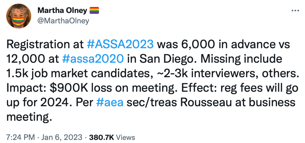
I expected the meetings would shrink, but I was still surprised by how much they did:

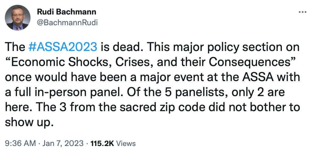
That said, I mostly didn’t notice the smaller numbers on the ground, because most of the missing people are those on the job market, who used to spend most of their time shut away doing interviews anyway. There was still a huge variety of sessions and most seemed well-attended. ASSAs is also still unparalleled for pulling in top names to give talks; I got to talk to Nobel laureate Roger Myerson at a reception. But there may be a trend of the big names being more likely to stay remote:

The big problem with attendance falling to 6k is that they’ve planned years worth of meetings with the assumption of 12k+ attendance. Getting one year further from Covid and dropping mask and vaccine mandates might help some, but the core issue is that 1st-round job interviews have gone remote and aren’t coming back. The best solution I can think of is raising the acceptance rate for papers, which in recent history has been well under 20%.

In terms of the actual economic research, two sessions stood out to me:

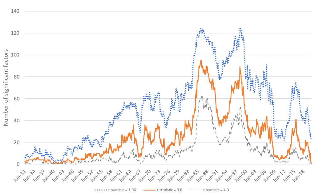
How many factors are there in the stock market? Classic work by Fama and French argues for 3 (size, value, and market risk), but the finance literature as a whole has identified a “zoo” of over 500. Two papers presented one after the other at ASSA argued for two extremes. “Time Series Variation in the Factor Zoo” argues that the number of factors varies over time, but is quite high, typically over 20 and sometimes over 100:

In contrast, “Three Common Factors” argues that there really are just 3 factors, though they are latent and not the same as the Fama-French 3 factors. In this case, the whole zoo of factors in the literature is mostly non-robust results driven by p-hacking and a desire to find more factors (fortune and fame potentially await those who do). Overall these asset pricing papers make me want to look into all this myself; when reading them I’m always struck by an odd mix of reactions- “I don’t understand that”, “why would you do it that way, it seems wrong and unnecessarily complicated”, and “why didn’t the field settle such a seemingly basic question decades ago?”.

Hayek: A Life this session covered the new book by Bruce Caldwell (who taught me much of what I know of the history of economic thought) and Hansjoerg Klausinger. Discussants Emily Skarbek and Stephen Durlauf agreed it is surprisingly readable for a long work of original scholarship, calling it a beautifully written 800p pageturner. Vernon Smith asked Caldwell if Hayek read the Theory of Moral Sentiments. Caldwell: “he cited it.” Smith: “but did he read it? Seems like he didn’t understand it very well.” Caldwell agreed he may not have, or if he did it was a German translation.

Vernon Smith’s own talk featured great comments on market instability: instability in markets comes from retrading. Markets are stable when consumers just value goods for their use, like haircuts and hamburgers. The craziness and potential for bubbles and crashes comes in when people are thinking about reselling something, whether it be tulips, stocks, houses, or crypto.

I asked Bruce Caldwell at a reception how he was able to finish writing such a big book that involved lots of archival work and original research. He said “one chapter at a time”, and noted that its fine to write the easiest chapters first to get the ball rolling.

Overall, while ASSA is diminished from the pre-Covid days and I often disagree with the AEAs decisions, its still a top-tier conference, especially when in New Orleans.

The Decline of Working Hours, in the Long Run and Recently

If you look at the long-run trends in labor markets, one of the most obvious changes is the decline in working hours. The chart from Our World in Data shows the long-run trend for some countries going back to 1870.

Hours of work declined in the US by 43% since 1870. In some countries like Germany, they fell a lot more (59%). But the decline was substantial across the board. One thing to notice in the chart above is that for the very recent years, the US is somewhat of an outlier in two ways. First, there hasn’t been much further decline after about the mid-20th century. Second, average hours of work in the US are quite a bit higher than many of developed countries (though similar to Australia).

But the labor market in the US (and in other countries) is in a very unusual spot at the present moment after the pandemic. So what has happened really recently. Many economists are looking into this question of hours and other questions about the labor market, and a new working paper titled “Where Are the Workers? From Great Resignation to Quiet Quitting” presents a lot of fascinating data about the current state of work in the US. The paper is short (just 14 pages) and readable for non-experts, so I encourage you to read it all yourself.

Here is one table and one chart from the paper that I will highlight, which shows that hours of work have been falling, but in a very specific set of workers: those who work lots of hours, and those with high incomes. For workers at the high end of hours worked, the 90th percentile, they have dropped from 50 hours to 45 hours of work per week just from 2019 to 2022. But workers at the median? Unchanged at 40 hours per week. (The data comes from the CPS.)

The figure below is only for male workers, and it shows a similar decline in hours worked for those at the high end of the earnings distribution. For those at the bottom, hours of work at mostly unchanged.

Bank for International Settlements: $70 Trillion Dollars Is Missing from Official Global Financial Accounting

Seventy trillion dollars is a lot of money. It is nearly three times the size of the U.S. GDP, and approaches total global GDP (around $100 trillion). That is the amount of funds that are missing from normally reported financial statistics, according to a December, 2022 report from the Bank for International Settlements. That report caused a bit of a flurry in financial circles.

It’s not that this money has been stolen, it’s just that it is not publicly known exactly where it is, i.e., how much money that which parties owe to whom. Here is the Abstract of this paper:

FX swaps, forwards and currency swaps create forward dollar payment obligations that do not appear on balance sheets and are missing in standard debt statistics. Non-banks outside the United States owe as much as $25 trillion in such missing debt, up from $17 trillion in 2016. NonUS banks owe upwards of $35 trillion. Much of this debt is very short-term and the resulting rollover needs make for dollar funding squeezes. Policy responses to such squeezes include central bank swap lines that are set in a fog, with little information about the geographic distribution of the missing debt.

Much of this money is in the form of currency swaps, especially foreign exchange (FX) swaps. Even though the U.S. economy no longer dominates the whole world, the U.S. dollar remains the premier basis for international trade and even more for foreign exchange:

As a vehicle currency, the US dollar is on one side of 88% of outstanding positions – or $85 trillion. An investor or bank wanting to do an FX swap from, say, Swiss francs into Polish zloty would swap francs for dollars and then dollars for zloty.

Who cares? Well, the incessant demand for dollars periodically leads to a dollar funding squeeze in international trade, which in turn reverberates into world GDP.

Currency Swaps as Lending Events

In many cases these currency swaps effectively amount to short-term lending /borrowing (of dollars). Much of the financial world is utterly dependent on smoothly flowing short-term funding to cover longer term debt or investments. Borrowing short-term (at usually lower interest rates) and investing or lending out longer-term (at higher rates) is how many institutions and funds exist. For instance, depositors at banks effectively lend their deposits to the bank (short-term), in return for some pitiful little interest on their checking or savings accounts, while the banks turn around and make say 5 year or 30-year loans to businesses or home-buyers. Banks earn profits on the spread between the interest rates they receive on the funds they loan out, and the typically lower rates on the short term funds they “borrow” from their depositors.

This “mismatch” between the maturities of borrowed funds (especially dollars) and invested funds can cause a complete melt-down of the financial system if holders of dollars stop being willing to lend them out, or to lend them out at less than ruinous interest rates:

The very short maturity of the typical FX swap/forward creates potential for liquidity squeezes. Almost four fifths of outstanding amounts at end-June 2022 in Graph 1.B matured in less than one year. Data from the April 2022 Triennial Survey show not only that instruments maturing within a week accounted for some 70% of FX swaps turnover, but also that those maturing overnight accounted for more than 30%. When dollar lenders step back from the FX swap market, the squeeze follows immediately.

Financial customers dominate non-financial firms in the use of FX swaps/forwards. Non-bank financial institutions (NBFIs), proxied by “other financial institutions” in Graph 1.C, are the biggest users of FX swaps, deploying them to fund and hedge portfolios as well as take positions. Despite their long-term foreign currency assets, the likes of Dutch pension funds or Japanese life insurers roll over swaps every month or quarter, running a maturity mismatch.  For their part, dealers’ non-financial customers such as exporters and importers use FX forwards to hedge trade-related payments and receipts, half of which are dollar-invoiced. And corporations of all types use longer-term currency swaps to hedge their own foreign currency bond liabilities .

It is really bad if pension funds or insurance companies get starved of needed ongoing funding. Central banks, especially the dollar-rich Fed, have had to repeatedly jump in and spray dollar liquidity in all directions to mitigate these “dollar squeezes”.  The BIS authors’ main concern is that these big public policy decisions are currently made in absence of data on what the actual needs and issues are.  Hence, “Policy responses to such squeezes include central bank swap lines that are set in a fog.”

This all is part of the murky “Eurodollar” universe of dollar-denominated bank deposits circulating outside the U.S. (more on this some other time).  Investing adviser Jeffery Snider offers the “Eurodollar University” on podcasts and on YouTube, in which he explores the many dimensions of the Eurodollar scene. He likens the Eurodollar system to a black hole: we cannot observe it directly, but we can estimate its size by its effects.

In his YouTube talk on this BIS paper, among other things Snider notes that this short-term lending associated with currency swaps functions much like repo borrowing, except the currency swaps (unlike repo) do not appear on bank or other balance sheets as assets/liabilities. That is part of the attraction of these swaps, since they are effectively invisible to regulators and are not constrained by e.g., capital requirements.

What the Fed does in a dollar squeeze is largely lend dollars to large dealer banks. But unless those other banks then lend those dollars out into the private marketplace of manufacturers and shippers and pension funds, having trillions of dollars in central bank reserves has little effect. It is not the case that “the Fed floods the world with dollars”  — actually, mainstream banks get those dollars, and then lend out at high rates to the dollar-starved rest of financial world, where they can actually do something.

The result, according to Snider, is that the Eurodollar is the only functional reserve currency in existence. This is the real, effective banking system (not “reserves” sitting on some bank’s balance sheet), even though the current accounting system doesn’t show it.

Concentrating on Housing

Housing has become more expensive. Below is a figure that illustrates the change in housing prices since 1975 by state. By far the leaders in housing price appreciation are the District of Columbia, California, and Washington. The price of housing in those states has increased about 2,000% – about double the national average. That’s an annualized rate of about 6.7% per year. That’s pretty rapid seeing as the PCE rate of inflation was 3.3% over the same period. It’s more like an investment grade return considering that the S&P has yielded about 10% over the same time period.

Continue reading

ASSA 2023: New Orleans!

Today the largest annual gathering of economists begins, in-person for the first time in 3 years. It won’t be as big as the pre-Covid conferences, but I’m excited to spend a few days in New Orleans for the first time since I moved away in 2017. I lived there for 4 years; in the eventful 5 years since my knowledge likely became somewhat out of date, but I hope I can still provide some guidance for those new to the city.

For most people the main destination is the French Quarter. People are right about this; it is great to walk through to see the old colonial buildings, hear the street music, and eat the food. Some of the ASSA hotels are in the Quarter, but for those staying downtown or in the Warehouse district its definitely worth the walk. The Quarter is a big, diverse place, not only for tourists. Bourbon Street is the tourist trap. It is probably worth seeing once, but be prepared for crowds, loud music, and touts trying to get you into bars and strip clubs. The standard advice now is to skip Bourbon St and hang out on Frenchman street instead- which is in the Marigny, just east of the Quarter. There are two blocks entirely packed with bars / jazz clubs. Any evening you will have at least 5 shows to choose from, usually jazz, usually with no cover. Café du Monde is the other Quarter attraction that everyone does, and with good reason. They have decent coffee, and great beignets (a donut / fried dough sort of thing drowned in powdered sugar). There is often a long line to get a table or to get to-go, but usually not for both at once. There is a river walk just south of Café Du Monde, and the Jackson Brewery building is just east- there is a good place to sit and look at the river beside their food court.

In a short trip it would be entirely reasonable to just stay in the Quarter. But if you’d like to get out, the main attraction of New Orleans to me is the parks. Audobon Park is west of the Quarter in Uptown. It stretches from the Mississippi river to the Tulane and Loyola campuses. City Park is north of the Quarter in Mid-City, and is home to the Art Museum and Sculpture Garden. Both can be reached by trolley, and both are full of lovely ponds and interesting waterfowl. At the big lake in city park you can rent kayaks, or get a ride in a gondola.

People associate New Orleans with Cajun food, but most of the Cajuns settled to the west. The traditional New Orleans cuisine is Creole- a blend of the Italian, French, and other settlers. When I think about what makes restaurants attractive, I think about three things- food, prices, and everything else (service, wait times, ambience). In New Orleans it is very easy to find places with great food at good prices, but rare to find good places that also have short wait times and good service (Commander’s Palace, the best restaurant in the city, is already booked solid). My restaurant recommendations are the thing most likely to be out of date, so I’ll keep it short:

  • Central Grocery- original home of the Mufalleta, a creole sandwich. In the French quarter. 
  • Dat Dog- fancy hot dogs (mostly sausages) with more toppings than you could ever want to choose from (including crawfish etouffee). One location is on Frenchman St- you can often hear live jazz from the bars by while sitting on their balcony. Cheap.
  • Hotel Monteleone- classy bar, often with live jazz, home to the rotating Carousel bar. One of many good places to try old New Orleans cocktails like the Sazerac. I’ll be staying here trying to get a spot on the Carousel.

New Orleans is unlike anywhere else in the US, almost like a Caribbean island (it practically is an island, surrounded by lakes, rivers, and swamps). The highs (food, music, knowing how to have a good time) are higher than just about anywhere else here, though the lows are also lower. One of the most special things about it is Mardi Gras. Mardi Gras day isn’t until February 21st this year, but Mardi Gras is really a whole season in New Orleans- and the first parade, Krewe of Joan of Arc, starts right in the Quarter on Friday January 6th (Twelfth Night).

Enjoy the city, and let me know if you’d like to meet up.

Air Travel Prices Have Not “Soared” Since 1980 — They’ve Been Cut in Half

Winter holiday travel is notoriously frustrating. This year was especially bad if you were flying on Southwest. But that frustration about delayed and cancelled flights seems to have caused a big increase in pundits criticizing the airline industry generally. Here’s one claim I’ve seen a few times lately, that airline prices have “soared” as airlines consolidated.

Reich’s claim that there are 4 airlines today is strange — yes, there are the “Big Four” (AA, United, Delta, and Southwest), but today there are 14 mainline carriers in the US. There have been many mergers, but there has also been growth in the industry (Allegiant, Frontier, JetBlue, and Spirit are all large, low-cost airlines founded since 1980).

But is he right that prices have increased since 1980? Using data from the Department of Transportation (older data archived here), we can look at average fare data going back to 1979 (the data includes any baggage or change fees). In the chart below, I compare that average fare data (for round-trip, domestic flights) to median wages. The chart shows the number of hours you would have to work at the median wage to purchase the average ticket.

The dip at the end is due to weird pandemic effects in 2020 and 2021, so we can ignore that for the moment (early analysis of the same data for 2022 indicates prices are roughly back to pre-pandemic levels, consistent with the CPI data for airfare).

The main thing we see in the chart is that between 1980 and 2019, the wage-adjusted cost of airfare was cut in half. Almost all of that effect happened between 1980 and 2000, after which it’s become flat. That might be a reason to worry, but it’s certainly not “soaring.”

Of course, my chart doesn’t show the counterfactual. Perhaps without several major mergers in the past 20 years, price would be even lower. Perhaps. But research which tries to establish a counterfactual isn’t promising for that theory. Here’s a paper on the Delta/Northwest merger, suggesting prices rose perhaps 2% on connecting routes (and not at all on non-stop routes). Here’s another paper on the USAir/Piedmont merger, which shows prices being 5-6% higher.

There are probably other papers on other mergers that I’m not aware of. And maybe all of these small effects from particular mergers add up to a large effect in the aggregate. But, as my chart indicates, even if the consolidation has led to some price increases, they weren’t enough to overcome the trend of wages rising faster than airline prices.

One last note: the average flight today is longer than in 1979. I couldn’t find perfectly comparable data for the entire time period, but between 1979 and 2013, the average length of a domestic flight increased by 20%. So, if I measured the cost per mile flown, the decline would be even more dramatic.

Can Central Banks Go Bankrupt?

Finnish crisis researcher Tuomas Malinen has for some time been predicting the collapse of the Western financial system, starting with the melt-down of the European Central Bank. Malinen, an associate professor of economics at the University of Helsinki, offers his views on his substack and elsewhere. He correctly warned in early/mid 2021 of coming inflation, which would present central bankers with severe challenges.

Among other things, by raising interest rates (to counter inflation), the banks necessarily cause the value of bonds to drop. However, a lot of the assets of the central banks consist of medium and long term bonds, especially those issued by sovereign governments. We have come to the point where some central banks are technically insolvent: the current cash value of their liabilities exceed their assets.

Is that a problem? Most authors I found did not seem to think so. For a normal private bank, as soon as the word got out that it was insolvent, customers would rush to withdraw their funds, in a classic “run on the bank”. Customers who waited too late to panic would simply lose their money, since there would not be enough assets on the bank’s balance sheet to cover all withdrawals.

However, no one seems to be in a hurry to beat down the doors of the Fed and demand their money. Most of the liabilities of the Fed are (a) paper currency in circulation, and (b) “Reserve” accounts of major banks at the Fed.

Bandyopadhyay, et al. note that negative equity in central banks (including those of smaller countries) is not uncommon; at any given time, about one out of seven central banks worldwide in the 2014-2017 timeframe suffered operating losses, some of which were large enough to wipe out their capital. However, most central banks are owned by, or have some other synergistic  relationship to , the governments of their respective countries. For instance, there is a standard contractual relationship between the Bank of England (BOE) and the British government. Thus, when the BOE recently fell into arrears, the government provided them with additional funds. This was apparently a routine non-event. (I don’t know where the government came up with those additional funds; did they just issue more bonds, which in turn were purchased by the BOE?)

The Fed, as a privately-owned public/private hybrid, technically has a more arms-length distancing from the U.S. Treasury. For instance, the Fed is not supposed to buy government bonds directly from the government. Rather, the government sells them to large banks, who in turn sell them to the Fed (if the Fed is buying). It is possible for the U.S. Treasury to transfer funds to the Fed to recapitalize it; but for now, the Fed is just booking losses as a “deferred asset”. Voila, the magic of central bank accounting. The presumption is that sometime in the future, the Fed will receive enough net income to overcome these losses.

The biggest debate is over the fate of the European Central Bank (ECB). Its relation to sovereign governments is even more arms-length; it is difficult to see all the European countries, with their own budget issues, agreeing to cough up money to give to ECB. As Malinen sees it, this likely leads to the “deferred asset” accounting scheme to handle negative equity for the ECB. He worries, “Will the markets or the banks trust the ECB after losses starts to mount forcing the Bank to operate with (large) negative equity? We simply do not know.” This is a weighty issue. As we noted earlier, “money” is in the end a social construct, an item of trust among parties for future payments of value. Central banks are the lenders of last resort, the source of money when it has dried up elsewhere; they regularly have to step into financial liquidity crises to inject more money to keep the system going. If people stopped accepted the keystroke-created money from central banks, the whole economy could freeze up.

A more sanguine view of central bank negative equity issues from MMT proponent Bill Mitchell. In his “Central banks can operate with negative equity forever” Mitchell heaps scorn on the very idea that central banks could run into solvency problems. He states that a “government bailout” is an inconsequential paper operation, merely transferring money from the left pocket to the right pocket of the government/central bank joint entity (as he views it). Furthermore, central banks have the capability of creating money out of thin air, so they can always meet their obligations and therefore can never be deemed insolvent:

The global press is full of stories lately about how central banks are taking big losses and risking solvency and then analysing the dire consequences of government bailouts of the said banks. All preposterous nonsense of course. It would be like daily news stories about the threat of ships falling off the edge of the earth. But then we know better than that. But in the economic commentariat there are plenty of flat earthers for sure. Some day, humanity (if it survives) will look back on this period and wonder how their predecessors could have been so ignorant of basic logic and facts. What a stupid bunch those 2022 humans really were.

New Textbook for Game Theory and Behavioral Economics

Game Theory and Behavior is extremely readable. Carpenter and Robbett have a great set of examples (e.g. the poison drink dilemma from The Princess Bride). I think the book has been developed from teaching a course that resonates with undergraduates today. The authors are both experimental economists, so there is natural integration with lab results from experiments with games.

Topics covered include:

Game Theory and standard definitions

Solving Games

Sequential Games

Bargaining

Markets

Social Dilemmas

Voting

Behavioral Extensions of Standard Theory

In their words:

This book provides a clear and accessible formal introduction to standard game theory, while at the same time addressing how people actually behave in these games and demonstrating how the standard theory can be expanded or updated to better predict the behavior of real people. Our objective is to simultaneously provide students with both the theoretical tools to analyze situations through the logic of game theory and the intuition and behavioral insights to apply these tools to real world situations. The book was written to serve as the primary textbook in a first course in game theory at the undergraduate level and does not assume students have any previous exposure to game theory or economics. 

Not every book on game theory would be described as extremely readable. The authors do present mathematical concepts and solutions and practice problems. I want to be clear that I’m not implying that their book is not rigorous. They present game theory as primarily an intuitive and important framework for decisions instead of as primarily a mathematical object, which should go over well with most undergraduate students.

The following are questions that occurred to me as I was writing this post, with ChatGTP replies.

Cleaning Data and Muddying Water

I’ve praised IPUMS before. It’s great.

The census data in particular is vast and relatively comprehensive. But, it’s not all perfect.

Consider three variables:

  • Labforce, which categorizes whether someone is employed
  • Occ1950, which categorizes occupation types
  • Edscor50, which imputes a relative education score based on occupation

These all seem like appropriate variables that a labor economist might want to control for when explaining any number of phenomena. There is a problem. Edscor50, and the several measures like it, are occupation based. Specifically, the scores use details about 1950 occupations to impute educational details. There are similar indices used for earnings, income, status, socioeconomic status, and prestige.

Cool.

Continue reading

Most Improved Data

The US government is great at collecting data, but not so good at sharing it in easy-to-use ways. When people try to access these datasets they either get discouraged and give up, or spend hours getting the data into a usable form. One of the crazy things about this is all the duplicated effort- hundreds of people might end up spending hours cleaning the data in mostly the same way. Ideally the government would just post a better version of the data on their official page. But barring that, researchers and other “data heroes” can provide a huge public service by publicly posting datasets that they have already cleaned up- and some have done so.

I just added a data page to my website that highlights some of these “most improved datasets”:

  • the IPUMS versions of the American Community Survey, Current Population Survey, and Medical Expenditure Panel Survey
  • The County Business Patterns Database, harmonized by Fabian Eckert, Teresa C. Fort, Peter K. Schott, and Natalie J. Yang
  • Code for accessing the Quarterly Census of Employment and Wages by Gabriel Chodorow-Reich
  • The merged Statistics of US Business, my own attempt to contribute

I hope to keep adding to this page as I find other good sources of unofficial/improved data, and as I create them (one of my post-tenure goals). See the page for more detail on these datasets, and comment here if you know of existing improved datasets worth adding, or if you know of needlessly terrible datasets you think someone should clean up.