All of us have assets. Together, they experience some average rate of return and the value of our assets changes over time. Maybe you have an idea of what assets you want to hold. But how much of your portfolio should be composed of each? As a matter of finance, we know that not only do the asset returns and volatilities differ, but that diversification can allow us to choose from a menu of risk & reward combinations. This post exemplifies the point.
1) Describe the Assets
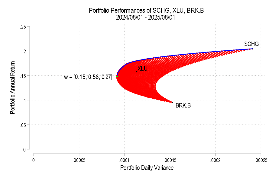
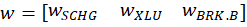
I analyze 3 stocks from August 1, 2024 through August 1, 2025: SCHG (Schwab Growth ETF), XLU (Utility ETF), and BRK.B (Berkshire Hathaway). Over this period, each asset has an average return, a variance, and co-variances of daily returns. The returns can be listed in their own matrix. The covariances are in a matrix with the variances on the diagonal.


The return of the portfolio that is composed of these three stocks is merely the weighted average of the returns. In particular, each return is weighted by the proportion of value that it initially composes in the portfolio. Since daily returns are somewhat correlated, the variance of the daily portfolio returns is not merely equal to the average weighted variances. Stock prices sometimes increase and decrease together, rather than independently.


Since the covariance matrix of returns and the covariance matrix are given, it’s just our job to determine the optimal weights. What does “optimal” mean? This is where financiers fall back onto the language of risk appetite. That’s hard to express in a vacuum. It’s easier, however, if we have a menu of options. Humans are pretty bad at identifying objective details about things. But we are really good at identifying differences between things. So, if we can create a menu of risk-reward combinations, then we’re better able to see how much a bit of reward costs us.
2) Create the Menu
In our simple example of three assets, we have three weights to determine. The weights must sum to one and we’ll limit ourselves to 1% increments. It turns out that this is a finite list. If our portfolio includes 0% SCHG, then the remaining two weights sum to 100%. There are 101 possible pairs that achieve that: (0%, 100%), (1%,99%), (2%,98%), etc. Then, we can increase the weight on SCHG to 1% for which there are 100 possible pairs of the remaining weights: (0%,99%), (1%, 98%), (2%, 97%), etc. We can iterate this process until the SCHG weight reaches 100%. The total number of weight combinations is 5,151. That means that there are 5,151 different possible portfolio returns and variances. The below figure plots each resulting variance-return pair in red.