How Long Does It Take Prices to Double?

Let me start by saying high rates of inflation, especially unexpected inflation, is bad. Still, it is useful to have some historical context. We’ve experienced the highest inflation rates in a generation lately, especially in 2022, but past generations experienced inflation too. How to compare?

Here’s one approach. Using the latest CPI-U data, we can see that prices on average approximately doubled between March 1996 and February 2024. That’s 335 months to double, or just shy of 28 years. How long did it take prices to double if we keep moving backward in time from March 1996?

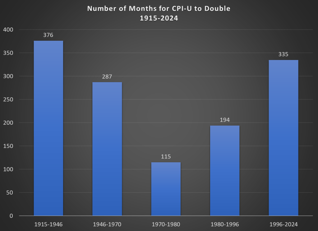
It only took 194 months for prices to double from January 1980 until March 1996, just a little over 16 years. Prior to January 1980, prices doubled even quicker, this time taking less than 10 years! Prior to that, it took 24 years for prices to double between WW2 and 1970, and before that you have to go back 31 years to 1915 for another doubling. Judged by this, our recent history doesn’t look so bad.

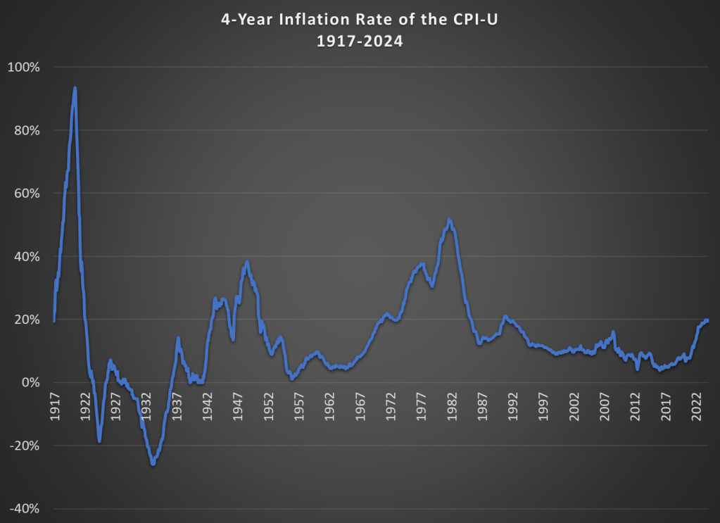
That doesn’t mean everything is OK. As I said above, unexpected inflation is the worst kind, since individuals and businesses aren’t planning for it. And we’ve had 20% inflation in the past 4 years — something not seen since 1991 over a 4-year time period. A 20%+ inflation rate is unusual to us today, but it certainly wasn’t in the past: basically all of the 1970s and 1980s had 20%+ inflation every 4 years, sometimes more than 40% or even 50%.

Finally, while unexpected inflation is bad, we also care about the relationship between wage increases and price increases. We can rightfully bemoan rapid, unexpected price inflation, but if wages are increasing faster than inflation, we are still better off (on average). The BLS average hourly wage series for production and non-supervisory workers only goes back to 1964, so we can’t do a full comparison with the CPI-U, but we can compare the three most recent doublings of prices.

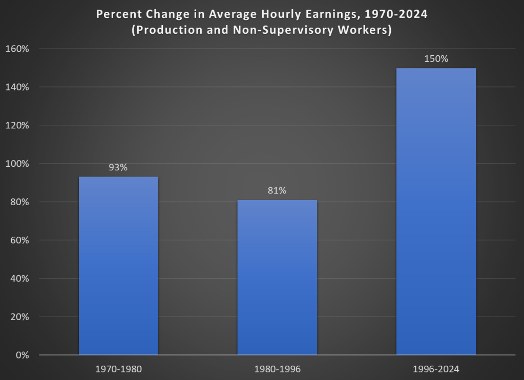
Keep in mind with the chart above that prices (as measured by the CPI-U) increased by 100% for each of these time periods. So, for the 1970s and 1980-1996 periods, wages actually rose by less than rate of inflation — wage stagnation! If we used the PCE price index instead, those time periods still don’t look good: PCE prices increased by 88% for 1970-1980, 85% from 1980-1996, and 78% since 1996. With either price index, the 1996-2024 period is clearly the best of these three, and it’s not even really close.

Let me finish where I started: the recent inflation is bad. I don’t want to downplay that. But some historical perspective is also useful.

See also a similar post and calculation on inflation doubling that I wrote in June 2022, which includes some discussion of 19th century inflation too.

Go East, Young Man

Americans have moved westward in every decade of our history. But after over 200 years, that trend may finally be ending.

A new report from Bank of America notes that the share of Americans who live in the West has been falling since 2020:

The absolute population of the West is still growing slightly, but the Southeast is growing so quickly that it makes every other region of the country a smaller share by comparison:

I think this has a lot to do with the decline in housing affordability that Jeremy discussed yesterday. Americans always went West for free land, or cheap land, or cheap housing. Or in more recent decades on the Pacific coast, they went for nice weather and good jobs with non-insane housing prices. But now all that is gone, and if anything housing prices are pushing people East.

I see some green shoots of zoning reform with the potential to lower housing costs in the West. But I worry that this is too little too late, and that 2030 will confirm that our long national trek Westward has finally been defeated by our own poor housing policy.

Younger Generations Have Higher Incomes Too (and it’s probably not explained by the rise of dual-income families)

Regular readers know that I’ve written numerous times about the wealth levels of younger generations, such as this post from last month. Judged by average (and usually median too) wealth, younger generations are doing as well and often better than past generations. This is not too surprising, if you generally think that subsequent generations are better off than their parents, but many people today seem to think that progress has stopped. The data suggest it hasn’t stopped!

Now there’s a great new paper by Kevin Corinth and Jeff Larrimore which looks at not wealth but income levels by generation. The look at income in a variety of different ways, including both market income and post-tax/transfer income. But the result is pretty consistent: each generation has higher incomes (inflation adjusted) than the previous generation. Here’s a typical chart from the paper:

Continue reading

A Measure of Dissimilarity

I recently learned about an interesting statistic for social scientists. It’s called the “Dissimilarity Index”. It allows you to compare the categorical distribution of two sets.

Many of us already know how to compare two distributions that have only 2 possible values. It’s easy because if you know the proportion of a group who are in category 1, then you know that 1-p will be in category 2. We can conveniently denote these with values of zero and one, and then conduct standard t-tests or z-tests to discover whether they are statistically different. But what about distributions across more than two possible categories?

Continue reading

The Open Internet Is Dead; Long Live The Open Internet

Information on the internet was born free, but now lives everywhere in walled gardens. Blogging sometimes feels like a throwback to an earlier era. So many newer platforms have eclipsed blogs in popularity, almost all of which are harder to search and discover. Facebook was walled off from the beginning, Twitter is becoming more so. Podcasts and video tend to be open in theory, but hard to search as most lack transcripts. Longer-form writing is increasingly hidden behind paywalls on news sites and Substack. People have complained for years that Google search is getting worse; there are many reasons for this, like a complacent company culture and the cat-and-mouse game with SEO companies, but one is this rising tide of content that is harder to search and link.

To me part of the value of blogging is precisely that it remains open in an increasingly closed world. Its influence relative to the rest of the internet has waned since its heydey in ~2009, but most of this is due to how the rest of the internet has grown explosively at the expense of the real world; in absolute terms the influence of blogging remains high, and perhaps rising.

The closing internet of late 2023 will not last forever. Like so much else, AI is transforming it, for better and worse. AI is making it cheap and easy to produce transcripts of podcasts and videos, making them more searchable. Because AI needs large amounts of text to train models, text becomes more valuable. Open blogs become more influential because they become part of the training data for AI; because of what we have written here, AI will think and sound a little bit more like us. I think this is great, but others have the opposite reaction. The New York Times is suing to exclude their data from training AIs, and to delete any models trained with it. Twitter is becoming more closed partly in an attempt to limit scraping by AIs.

So AI leads to human material being easier for search engines to index, and some harder; it also means there will be a flood of AI-produced material, mostly low-quality, clogging up search results. The perpetual challenge of search engines putting relevant, high-quality results first will become much harder, a challenge which AI will of course be set to solve. Search engines already have surprisingly big problems with not indexing writing at all; searching for a post on my old blog with exact quotes and not finding it made me realize Google was missing some posts there, and Bing and DuckDuckGo were missing all of them. While we’re waiting for AI to solve and/or worsen this problem, Gwern has a great page of tips on searching for hard-to-find documents and information, both the kind that is buried deep down in Google and the kind that is not there at all.

Robert Solow on Sustainability

2023 continues to be a dangerous year for eminent economists. We have once again lost a Nobel laureate who was influential even by the standard of Nobelists, Robert Solow:

I’m sure you will soon see many tributes that discuss his namesake Solow Model (MR already has one), or discuss him as a person. I never got to meet him (just saw him give a talk) and the Solow Model is well known, so I thought I’d take this occasion to discuss one of his lesser-known papers- “Sustainability: An Economists Perspective“. What follows comes from my 2009 reaction to his paper:

Continue reading

Former Treasury Official Defends Decision to Issue Short Term Debt for Pandemic;  I’m Not Buying It

We noted earlier (see “The Biggest Blunder in The History of The Treasury”: Yellen’s Failure to Issue Longer-Term Treasury Debt When Rates Were Low ), along with many other observers, that it seemed like a mistake for the Treasure to have issued lots of short-term (e.g. 1-2 year) bonds to finance the sudden multi-trillion dollar budget deficit from the pandemic-related spending surge in 2020-2021. Rates were near-zero (thanks to the almighty Fed) back then.

Now, driven by that spending surge, inflation has also surged, and thus the Fed has been obliged to raise interest rates. And so now, in addition to the enormous current deficit spending,  that tsunami of short-term debt from 2020-2021 is coming due, to be refinanced at much higher rates. This high interest expense will contribute further to the growing government debt.

Hedge fund manager Stanley Druckenmiller  commented in an interview:

When rates were practically zero, every Tom, Dick and Harry in the U.S. refinanced their mortgage… corporations extended [their debt],” he said. “Unfortunately, we had one entity that did not: the U.S. Treasury….

Janet Yellen, I guess because political myopia or whatever, was issuing 2-years at 15 basis points[0.15%]   when she could have issued 10-years at 70 basis points [0.70 %] or 30-years at 180 basis points [1.80%],” he said. “I literally think if you go back to Alexander Hamilton, it is the biggest blunder in the history of the Treasury. I have no idea why she has not been called out on this. She has no right to still be in that job.

Unsurprisingly, Yellen pushed back on this charge (unconvincingly). More recently, former Treasury official Amar Reganti has issued a more detailed defense. Here are some excerpts of his points:

( 1 ) …The Treasury’s functions are intimately tied to the dollar’s role as a reserve currency. It is simply not possible to have a reserve currency without a massive supply of short-duration fixed income securities that carry no credit risk.

( 2 ) …For the Treasury to transition the bulk of its issuance primarily to the long end of the yield curve would be self-defeating since it would most likely destabilise fixed income markets. Why? The demand for long end duration simply does not amount to trillions of dollars each year. This is a key reason why the Treasury decided not to issue ultralong bonds at the 50-year or 100-year maturities. Simply put, it did not expect deep continued investor demand at these points on the curve.

( 3 ) …The Treasury has well over $23tn of marketable debt. Typically, in a given year, anywhere from 28% to 40% of that debt comes due…so as not to disturb broader market functioning, it would take the Treasury years to noticeably shift its weighted average maturity even longer.

( 4 ) …The Treasury does not face rollover risk like private sector issuers.

Here is my reaction:

What Reganti says would be generally valid if the trillions of excess T-bond issuance in 2020-2021 were sold into the general public credit market. In that case, yes, it would have been bad to overwhelm the market with more long-term bonds than were desired.  But that is simply not what happened. It was the Fed that vacuumed up nearly all those Treasuries, not the markets. The markets were desperate for cash, and hence the Fed was madly buying any and every kind of fixed income security, public and corporate and mortgage (even junk bonds that probably violated the Fed’s bylaws), and exchanging them mainly for cash.  Sure, the markets wanted some short-term Treasuries as liquid, safe collateral, but again, most of what the Treasury issued ended up housed in the Fed’s digital vaults.

So, I remain unconvinced that the issuance of mainly long-term (say 10-year and some 30-year; no need to muddy the waters like Reganti did with harping on 50–100-year bonds) debt would have been a problem. So much fixed-income debt was vomited forth from the Treasury that even making a minor portion of it short-term would, I believe, have satisfied market needs. The Fed could have concentrated on buying and holding the longer-term bonds, and rolling them over eventually as needed, without disturbing the markets. That would have bought the country a decade or so of respite before the real interest rate effects of the pandemic debt issuance began to bite.

But nobody asked my opinion at the time.

Let’s Be Thankful for Food Abundance

Despite recent increases in prices of food, we should still all be very thankful this Thanksgiving for the abundance of affordable food available in the modern world. Looking back at my past few blog posts, I notice that I have been very food-centric in my choice of topics! And last week I also showed how the Thanksgiving meal this year will be the second cheapest ever (only behind 2019). While it’s absolutely true that food prices are up a lot in the past 2 and 4 years, they probably aren’t up as much as you have heard.

It’s always my preference to take as long-term perspective as possible when thinking about economic progress. So here’s the best way I’ve come up with to show how cheap and abundant food is today: food as a share of household spending fell dramatically in the 20th century.

Most of the data in this chart comes from the BLS Consumer Expenditure Surveys. This survey was done occasionally since 1901, and then annually since 1984. I also use BEA data to estimate personal taxes paid as a percent of spending (the CEX Surveys have some tax data, but it’s not reliable nor consistent). I picked as close to 30-year intervals as I could (with a preference for showing the earliest and latest years available), and I chose spending categories that are 90-100% of total expenditures in most of these years. Keep in mind also that these are consumer expenditures. As a nation, we spend a lot more on healthcare and education than this chart suggests, but most of that spending is not directly from households (of course, it is indirectly). Think of this chart as an average household budget.

I hope the thing that jumps out at you is that the amount money households spend on food has fallen dramatically since 1901, from over 42 percent to under 13 percent of household expenditures. To be clear, this data includes both spending on food at home and at restaurants (after 1984 we can track them separately, and groceries are pretty consistently about 60 percent of food spending). And you may be wondering about very recent trends too, such as before the pandemic. In 2022, household spent slightly less on food than they did in 2019, falling from 13.5 to 12.8%.

You may also notice that taxes have increased, though not much since 1960. Housing cost have been consistently high, and also a bit higher than 1990, going from 27 percent to 33 percent in 2022. And housing is now the single largest budget expenditure category, but for most of the first half of the 20th century, it was food that was the largest. And since people aren’t changing their housing situation more than once a year (if that), it would also have been food that dominated weekly and monthly budget decisions and worry about price fluctuations.

This year there will be lots of complaining about prices around the Thanksgiving table. And much of that is warranted! But let’s also be thankful on this food-intensive holiday for how cheap the food is.

And if some smart-aleck youngster tries to tell you that they learned on TikTok that things were better during the Great Depression (yes, people are really saying this!), have them watch this video by Christopher Clarke. Or show them that in the mid-1930s an average family spent one-third of their budget on food in my chart above, or how much labor it would have taken to buy that turkey in the 1930s (about 40 times as much time spent working as today).

Econ Tourism

This week I was in Bretton Woods, New Hampshire. The Mount Washington Resort there is lovely on its own terms as a grand old hotel surrounded by mountains, but it is better known (at least among economists) as the site of the 1944 conference that gave us the International Monetary Fund, the World Bank, and the postwar international monetary system.

This got me thinking about what other destinations should top the list of sites for economics tourism. Adam Smith’s house in Scotland has to be on there. In the US I’ve been trying to visit all 12 Federal Reserve banks; they tend to have nice architecture as well as a Money Museum. You can stay at Milton and Rose Friedman’s cabin in Vermont, Capitaf. I’d like to go to Singapore for many reasons, but one is that they seem to listen to economists more than any other country; I’m not sure what places to visit within Singapore that best reflect that, though.

The places I’ve listed so far are somewhat inward looking to the economics profession; you could get a much bigger list by looking outward to the economy itself, doing “economic tourism” rather than “economics tourism”. Visit a port, a mine, or a factory (like Adam Smith visiting a pin factory and getting ideas for the Wealth of Nations); visit a stock exchange or a bazaar. Visit whatever country currently has the fastest economic growth, or the worst inflation.

Those are my ideas, but I’d love to hear yours: what are the best places for econ tourism?

Kids Are Much Less Likely to Be Killed by Cars Than in the Past

On X.com Matt Yglesias posted a chart that sparked some conversation about child safety:

Of course, it was probably more his comment about the “rise of more intensively supervised childhood activities” that generated the feedback and pushback. And I assume his comment was partially tongue-in-cheek, as often happens on Twitter, and designed to generate that very discussion. Still, it is worth thinking about. Exactly why did that decline happen?

I’ve posted on this topic before. In my March 2023 post, I looked at very broad categories of child death. While all death categories have declined, about half of the decrease (depending on the age group, but half is about right) is from a decline in deaths from diseases, as opposed to external causes. And fewer disease death can largely be attributed to improvements in healthcare, broadly defined. Good news!

Of course, that means that about half of the decline is from things other than diseases. What caused those declines? Let’s look into the data. Specifically, let’s look into the data on deaths from car accidents.

Continue reading