I’m going to explore a passage from The Dawn of Everything about whether humans reject Western civilization.
The introductory chapter of The Dawn of Everything is called “Farewell to Humanity’s Childhood.” The authors are idealists wrestling with big questions.
We can take [Steven] Pinker as our quintessential Hobbesian. (page 13)
For instance, if Pinker is correct, then any sane person who had to choose between (a) the violent chaos and abject poverty of the ‘tribal’ stage in human development and (b) the relative security and prosperity of Western civilization would not hesitate to leap for safety. (page 18)
Over the last several centuries, there have been numerous occasions when individuals found themselves in a position to make precisely this choice – and they almost never go the way Pinker would have predicted.
I’ve written about IPUMS before. It’s great. Among individual details are their occupations and industry of their occupation. That’s convenient because we can observe how technology spread across America by observing employment in those industries. We can also identify whether demographic subgroups differed or not by occupation. There’s plenty of ways to slice the data: sex, race, age, nativity, etc.
But what do we know about historical occupations and what they entailed? At first blush, we just have our intuition. But it turns out that we have more. There is a super boring 1949 report published by the Department of Labor called the “Dictionary of Occupational Titles”. The title says it all. But, the DOL published another report in 1956 that’s conceptually more interesting called “Estimates of Worker Trait Requirements for 4,000 Jobs as Defined in the Dictionary of Occupational Titles: An Alphabetical Index”. The report lists thousands of occupations and identifies typical worker aptitudes, worker temperaments, worker interests, worker physical capacities, and working conditions. Below is a sample of the how the table is organized:
For a current research project on institutions, I skimmed The Dawn of Everything (2021).
I liked this passage about an archaeological site in Syria. The following items were found in a destroyed village where people are estimated to have lived 8,000 years ago:
These devices included economic archives, which were miniature precursors to the temple archives at Uruk and other later Mesopotamian cities.
These were not written archives: writing, as such, would not appear for another 3,000 years. What did exist were geometric tokens made of clay, of a sort that appear to have been used in many similar Neolithic villages, most likely to keep track of the allocation of particular resources.
In chunks, the book has fascinating stuff like the quote above. However, D-o-E is the second book I have read this year that tries to do too much. A book on “everything” sounds incredibly fun to write, and I’m the type who would try, so I take these as a warning.
What is more intriguing than history? Emily Wilson said it well, concerning some of the oldest records we have of human words:
I think we should stop selling classics as, “These are the societies that formed modern America, or that formed the Western canon” — which is a really bogus kind of argument — and instead start saying, “We should learn about ancient societies because they’re different from modern societies.” That means that we can learn things by learning about alterity. We can learn about what would it be to be just as human as we are, and yet be living in a very, very different society.
I’ve written about coffee consumption during US alcohol prohibition in the past. I’ve also written about visualizing supply and demand. Many. Times. Today, I want to illustrate how to use supply and demand to reveal clues about the cause of a market’s volume and price changes. I’ll illustrate with an example of coffee consumption during prohibition.
The hypothesis is that alcohol prohibition would have caused consumers to substitute toward more easily accessible goods that were somewhat similar, such as coffee. To help analyze the problem, we have the competitive market model in our theoretical toolkit, which is often used for commodities. Together, the hypothesis and theory tell a story.
Substitution toward coffee would be modeled as greater demand, placing upward pressure on both US coffee imports and coffee prices. However, we know that the price in the long-run competitive market is driven back down to the minimum average cost by firm entry and exit. So, we should observe any changes in demand to be followed by a return to the baseline price. In the current case, increased demand and subsequent expansions of supply should also result in increasing trade volumes rather than decreasing.
Now that we have our hypothesis, theory, and model predictions sorted, we can look at the graph below which compares the price and volume data to the 1918 values. While prohibition’s enforcement by the Volstead act didn’t begin until 1920, “wartime prohibition” and eager congressmen effectively banned most alcohol in 1919. Consequently, the increase in both price and quantity reflects the increased demand for coffee. Suppliers responded by expanding production and bringing more supplies to market such that there were greater volumes by 1921 and the price was almost back down to its 1918 level. Demand again leaps in 1924-1926, increasing the price, until additional supplies put downward pressure on the price and further expanded the quantity transacted.
We see exactly what the hypothesis and theory predicted. There are punctuated jumps in demand, followed by supply-side adjustments that lower the price. Any volume declines are minor, and the overall trend is toward greater output. The supply & demand framework allows us to image the superimposed supply and demand curves that intersect and move along the observed price & quantity data. Increases toward the upper-right reflect demand increases. Changes plotted to the lower-right reflect supply increases. Of course, inflation and deflation account for some of the observed changes, but similar demand patterns aren’t present in the other commodity markets, such as for sugar or wheat. Therefore, we have good reason to believe that the coffee market dynamics were unique in the time period illustrated above.
*BTW, if you’re thinking that the interpretation is thrown off by WWI, then think again. Unlike most industries, US regulation of coffee transport and consumption was relatively light during the war, and US-Brazilian trade routes remained largely intact.
Scholars apologize for attributing Western democracy to a make-believe civilization.
WASHINGTON—A group of leading historians held a press conference Monday at the National Geographic Society to announce they had “entirely fabricated” ancient Greece, a culture long thought to be the intellectual basis of Western civilization.
The group acknowledged that the idea of a sophisticated, flourishing society existing in Greece more than two millennia ago was a complete fiction created by a team of some two dozen historians, anthropologists, and classicists who worked nonstop between 1971 and 1974 to forge “Greek” documents and artifacts.
“Honestly, we never meant for things to go this far,” said Professor Gene Haddlebury, who has offered to resign his position as chair of Hellenic Studies at Georgetown University. “We were young and trying to advance our careers, so we just started making things up: Homer, Aristotle, Socrates, Hippocrates, the lever and fulcrum, rhetoric, ethics, all the different kinds of columns—everything.”
“Way more stuff than any one civilization could have come up with, obviously,” he added.
According to Haddlebury, the idea of inventing a wholly fraudulent ancient culture came about when he and other scholars realized they had no idea what had actually happened in Europe during the 800-year period before the Christian era.
Frustrated by the gap in the record, and finding archaeologists to be “not much help at all,” they took the problem to colleagues who were then scrambling to find a way to explain where things such as astronomy, cartography, and democracy had come from.
Within hours the greatest and most influential civilization of all time was born.
“One night someone made a joke about just taking all these ideas, lumping them together, and saying the Greeks had done it all 2,000 years ago,” Haddlebury said. “One thing led to another, and before you know it, we’re coming up with everything from the golden ratio to the Iliad.”…
Around the same time, a curator at the Smithsonian reportedly asked for Haddlebury’s help: The museum had received a sizeable donation to create an exhibit on the ancient world but “really didn’t have a whole lot to put in there.” The historians immediately set to work, hastily falsifying evidence of a civilization that— complete with its own poets and philosophers, gods and heroes—would eventually become the centerpiece of schoolbooks, college educations, and the entire field of the humanities.
Emily Nguyen-Whiteman, one of the young academics who “pulled a month’s worth of all-nighters” working on the project, explained that the whole of ancient Greek architecture was based on buildings in Washington, D.C., including a bank across the street from the coffee shop where they met to “bat around ideas about mythology or whatever.”
“We picked Greece because we figured nobody would ever go there to check it out,” Nguyen-Whiteman said. “Have you ever seen the place? It’s a dump. It’s like an abandoned gravel pit infested with cats.”
She added, “Inevitably, though, people started looking around for some of this ‘ancient’ stuff, and next thing I know I’m stuck in Athens all summer building a…Parthenon just to cover our tracks.”
Nguyen-Whiteman acknowledged she was also tasked with altering documents ranging from early Bibles to the writings of Thomas Jefferson to reflect a “Classical Greek” influence—a task that also included the creation, from scratch, of a language based on modern Greek that could pass as its ancient precursor.
Historians told reporters that some of the so-called Greek ideas were in fact borrowed from the Romans, stripped to their fundamentals, and then attributed to fictional Greek predecessors. But others they claimed as their own.
“Geometry? That was all Kevin,” said Haddlebury, referring to former graduate student Kevin Davenport. “Man, that kid was on fire in those days. They teach Davenportian geometry in high schools now, though of course they call it Euclidean.”
~ ~ ~ ~ ~ ~ ~ ~ ~ ~ ~ ~ ~ ~ ~ ~ ~ ~ ~ ~ ~ ~ ~ ~ ~
Happy April Fools…the above excerpt was pasted verbatim from a classic article published in the news-satire site The Onion. I thought it was a clever piece, which did a worthy service highlighting the wide-ranging achievements of a relatively small people group (compared to the teeming masses of ancient Mesopotamia and Egypt) in a relatively short period of time.
Apologies to any Greeks reading this post – -my wife has been to Greece and tells me it is in fact a very beautiful country.
Lately on Twitter this chart has been going around:
The chart comes from Bloomberg journalist Justin Fox, who always puts together interesting economic data. You can read his interpretation of the data at Bloomberg, but the folks posting it on Twitter all seem to have the same shock and awe: Detroit was the richest big city in 1949. And of course we all know that today it isn’t. Still, the Detroit MSA has done OK since 1949, even though it is no longer anywhere near the top.
How well has Detroit done? Despite industrial decline and many other major problems, median household income of the Detroit MSA was around $71,000 in 2022 according to the Census Bureau. How does this compare to the $3,627 median income in 1949? It’s about double in real terms: you can multiply it by about 10 using the Census’ preferred inflation adjustment for household incomes since 1949 (the C-CPI-U since 2000, and the R-CPI-U-RS before that).
Let me start by saying high rates of inflation, especially unexpected inflation, are bad. Still, it is useful to have some historical context. We’ve experienced the highest inflation rates in a generation lately, especially in 2022, but past generations experienced inflation too. How to compare?
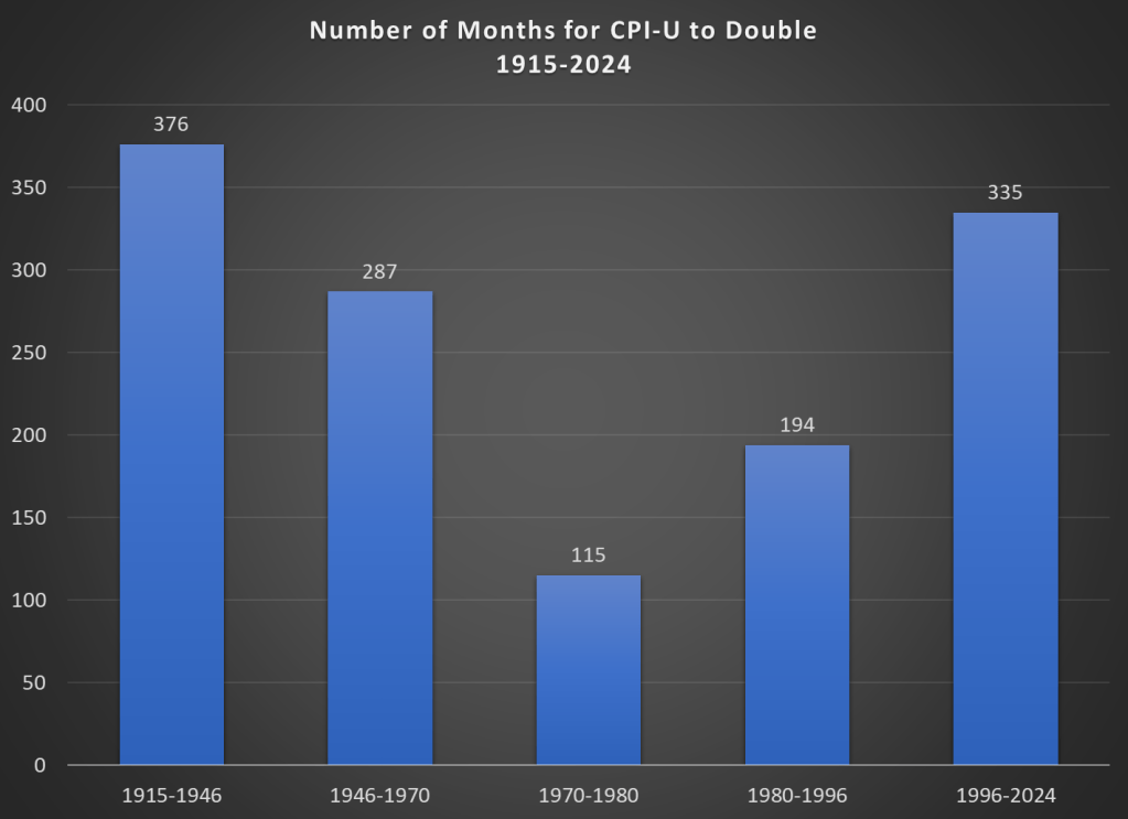
Here’s one approach. Using the latest CPI-U data, we can see that prices on average approximately doubled between March 1996 and February 2024. That’s 335 months to double, or just shy of 28 years. How long did it take prices to double if we keep moving backward in time from March 1996?
It only took 194 months for prices to double from January 1980 until March 1996, just a little over 16 years. Prior to January 1980, prices doubled even quicker, this time taking less than 10 years! Prior to that, it took 24 years for prices to double between WW2 and 1970, and before that you have to go back 31 years to 1915 for another doubling. Judged by this, our recent history doesn’t look so bad.
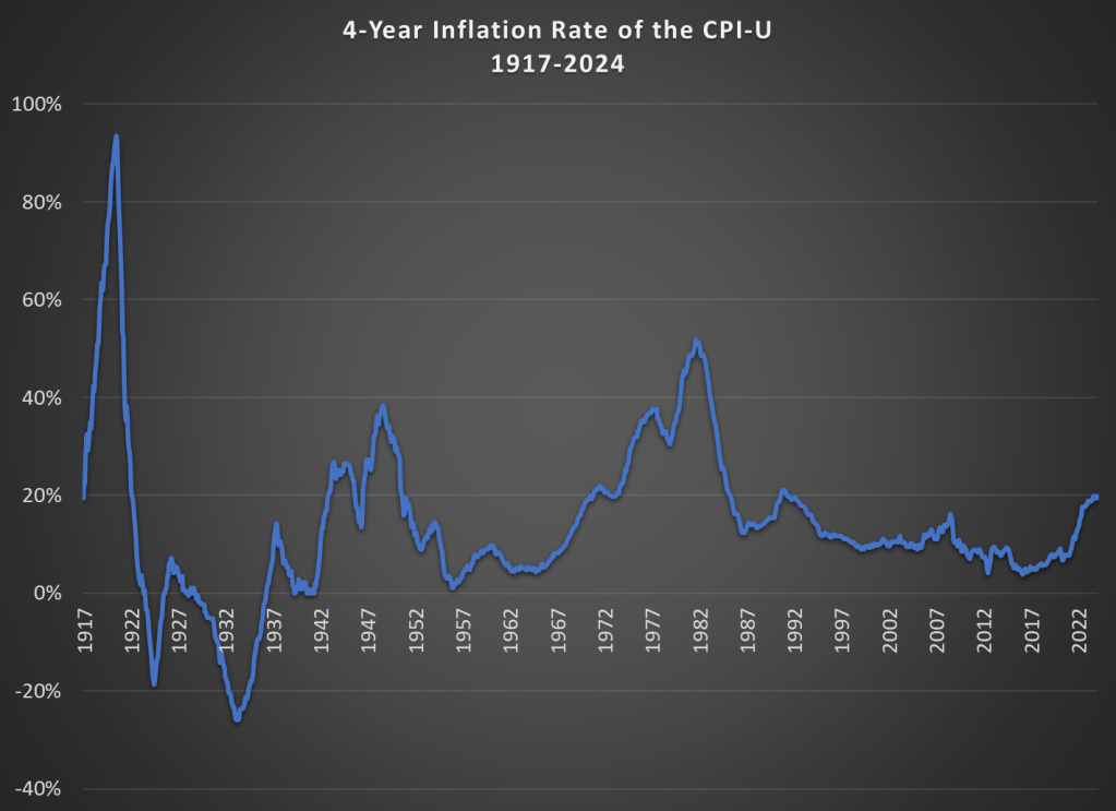
That doesn’t mean everything is OK. As I said above, unexpected inflation is the worst kind, since individuals and businesses aren’t planning for it. And we’ve had 20% inflation in the past 4 years — something not seen since 1991 over a 4-year time period. A 20%+ inflation rate is unusual to us today, but it certainly wasn’t in the past: basically all of the 1970s and 1980s had 20%+ inflation every 4 years, sometimes more than 40% or even 50%.
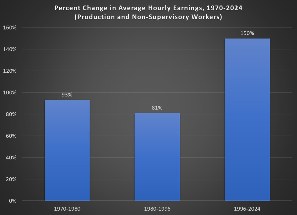
Finally, while unexpected inflation is bad, we also care about the relationship between wage increases and price increases. We can rightfully bemoan rapid, unexpected price inflation, but if wages are increasing faster than inflation, we are still better off (on average). The BLS average hourly wage series for production and non-supervisory workers only goes back to 1964, so we can’t do a full comparison with the CPI-U, but we can compare the three most recent doublings of prices.
Keep in mind with the chart above that prices (as measured by the CPI-U) increased by 100% for each of these time periods. So, for the 1970s and 1980-1996 periods, wages actually rose by less than rate of inflation — wage stagnation! If we used the PCE price index instead, those time periods still don’t look good: PCE prices increased by 88% for 1970-1980, 85% from 1980-1996, and 78% since 1996. With either price index, the 1996-2024 period is clearly the best of these three, and it’s not even really close.
Let me finish where I started: the recent inflation is bad. I don’t want to downplay that. But some historical perspective is also useful.
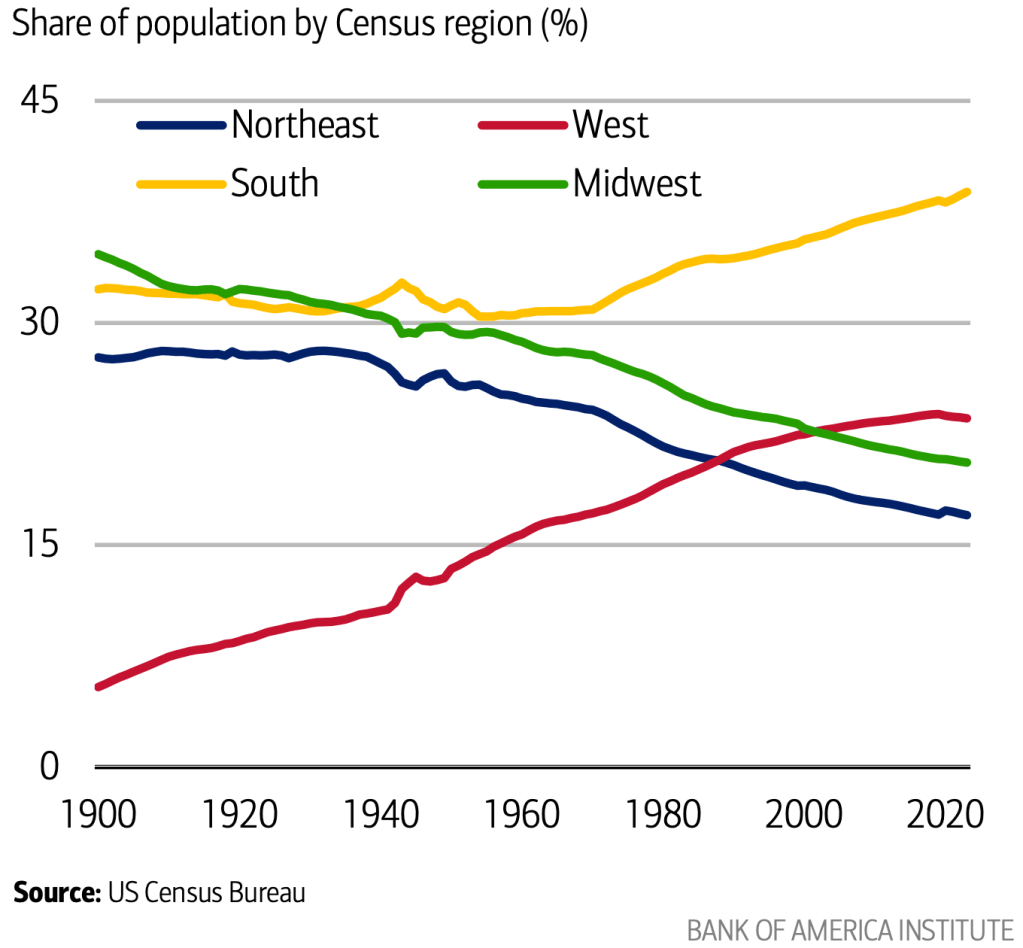
Americans have moved westward in every decade of our history. But after over 200 years, that trend may finally be ending.
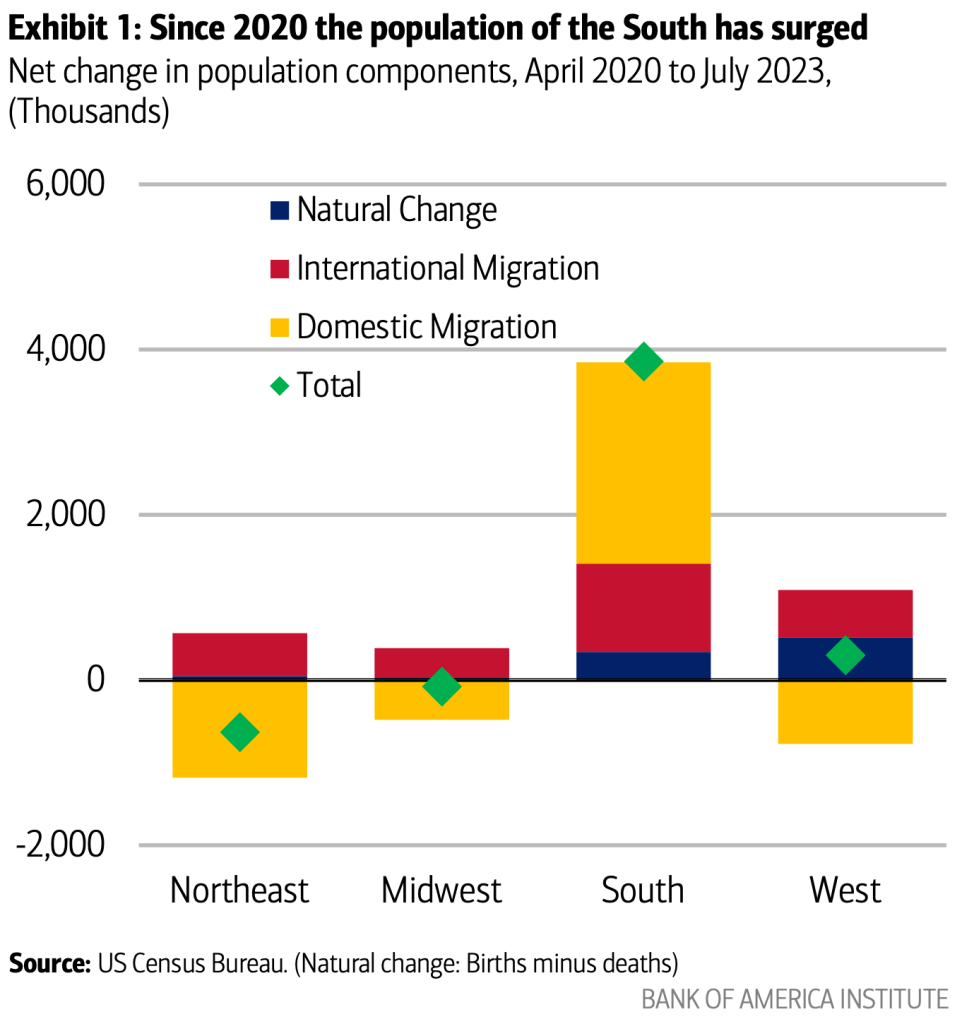
A new report from Bank of America notes that the share of Americans who live in the West has been falling since 2020:
The absolute population of the West is still growing slightly, but the Southeast is growing so quickly that it makes every other region of the country a smaller share by comparison:
I think this has a lot to do with the decline in housing affordability that Jeremy discussed yesterday. Americans always went West for free land, or cheap land, or cheap housing. Or in more recent decades on the Pacific coast, they went for nice weather and good jobs with non-insane housing prices. But now all that is gone, and if anything housing prices are pushing people East.
I see some green shoots of zoningreform with the potential to lower housing costs in the West. But I worry that this is too little too late, and that 2030 will confirm that our long national trek Westward has finally been defeated by our own poor housing policy.
Regular readers know that I’ve written numerous times about the wealth levels of younger generations, such as this post from last month. Judged by average (and usually median too) wealth, younger generations are doing as well and often better than past generations. This is not too surprising, if you generally think that subsequent generations are better off than their parents, but many people today seem to think that progress has stopped. The data suggest it hasn’t stopped!
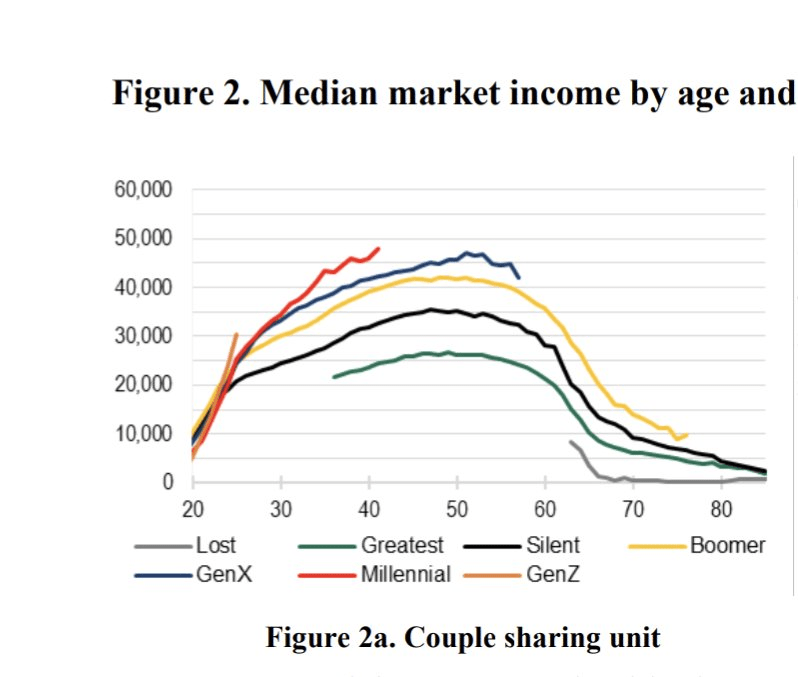
Now there’s a great new paper by Kevin Corinth and Jeff Larrimore which looks at not wealth but income levels by generation. The look at income in a variety of different ways, including both market income and post-tax/transfer income. But the result is pretty consistent: each generation has higher incomes (inflation adjusted) than the previous generation. Here’s a typical chart from the paper:
I recently learned about an interesting statistic for social scientists. It’s called the “Dissimilarity Index”. It allows you to compare the categorical distribution of two sets.
Many of us already know how to compare two distributions that have only 2 possible values. It’s easy because if you know the proportion of a group who are in category 1, then you know that 1-p will be in category 2. We can conveniently denote these with values of zero and one, and then conduct standard t-tests or z-tests to discover whether they are statistically different. But what about distributions across more than two possible categories?