The Open Internet Is Dead; Long Live The Open Internet

Information on the internet was born free, but now lives everywhere in walled gardens. Blogging sometimes feels like a throwback to an earlier era. So many newer platforms have eclipsed blogs in popularity, almost all of which are harder to search and discover. Facebook was walled off from the beginning, Twitter is becoming more so. Podcasts and video tend to be open in theory, but hard to search as most lack transcripts. Longer-form writing is increasingly hidden behind paywalls on news sites and Substack. People have complained for years that Google search is getting worse; there are many reasons for this, like a complacent company culture and the cat-and-mouse game with SEO companies, but one is this rising tide of content that is harder to search and link.

To me part of the value of blogging is precisely that it remains open in an increasingly closed world. Its influence relative to the rest of the internet has waned since its heydey in ~2009, but most of this is due to how the rest of the internet has grown explosively at the expense of the real world; in absolute terms the influence of blogging remains high, and perhaps rising.

The closing internet of late 2023 will not last forever. Like so much else, AI is transforming it, for better and worse. AI is making it cheap and easy to produce transcripts of podcasts and videos, making them more searchable. Because AI needs large amounts of text to train models, text becomes more valuable. Open blogs become more influential because they become part of the training data for AI; because of what we have written here, AI will think and sound a little bit more like us. I think this is great, but others have the opposite reaction. The New York Times is suing to exclude their data from training AIs, and to delete any models trained with it. Twitter is becoming more closed partly in an attempt to limit scraping by AIs.

So AI leads to human material being easier for search engines to index, and some harder; it also means there will be a flood of AI-produced material, mostly low-quality, clogging up search results. The perpetual challenge of search engines putting relevant, high-quality results first will become much harder, a challenge which AI will of course be set to solve. Search engines already have surprisingly big problems with not indexing writing at all; searching for a post on my old blog with exact quotes and not finding it made me realize Google was missing some posts there, and Bing and DuckDuckGo were missing all of them. While we’re waiting for AI to solve and/or worsen this problem, Gwern has a great page of tips on searching for hard-to-find documents and information, both the kind that is buried deep down in Google and the kind that is not there at all.
Robert Solow on Sustainability

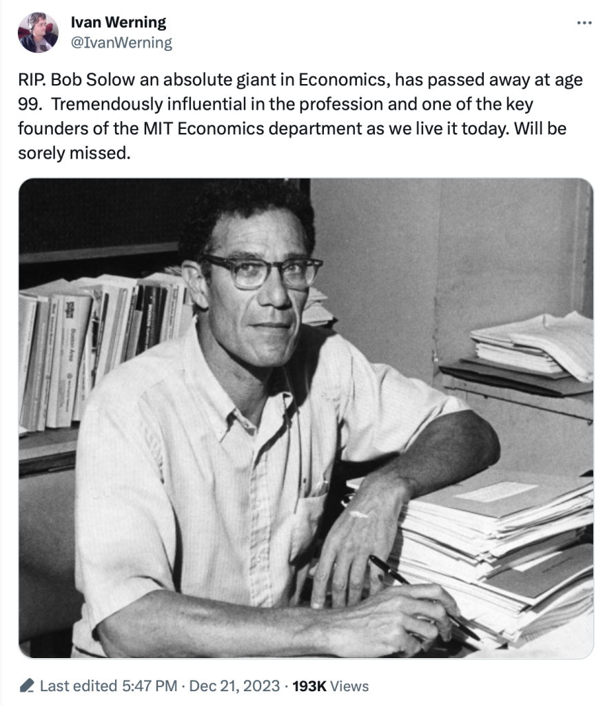
2023 continues to be a dangerous year for eminent economists. We have once again lost a Nobel laureate who was influential even by the standard of Nobelists, Robert Solow:

I’m sure you will soon see many tributes that discuss his namesake Solow Model (MR already has one), or discuss him as a person. I never got to meet him (just saw him give a talk) and the Solow Model is well known, so I thought I’d take this occasion to discuss one of his lesser-known papers- “Sustainability: An Economists Perspective“. What follows comes from my 2009 reaction to his paper:

Continue reading →

Former Treasury Official Defends Decision to Issue Short Term Debt for Pandemic;  I’m Not Buying It

We noted earlier (see “The Biggest Blunder in The History of The Treasury”: Yellen’s Failure to Issue Longer-Term Treasury Debt When Rates Were Low ), along with many other observers, that it seemed like a mistake for the Treasure to have issued lots of short-term (e.g. 1-2 year) bonds to finance the sudden multi-trillion dollar budget deficit from the pandemic-related spending surge in 2020-2021. Rates were near-zero (thanks to the almighty Fed) back then.

Now, driven by that spending surge, inflation has also surged, and thus the Fed has been obliged to raise interest rates. And so now, in addition to the enormous current deficit spending,  that tsunami of short-term debt from 2020-2021 is coming due, to be refinanced at much higher rates. This high interest expense will contribute further to the growing government debt.

Hedge fund manager Stanley Druckenmiller  commented in an interview:

When rates were practically zero, every Tom, Dick and Harry in the U.S. refinanced their mortgage… corporations extended [their debt],” he said. “Unfortunately, we had one entity that did not: the U.S. Treasury….

Janet Yellen, I guess because political myopia or whatever, was issuing 2-years at 15 basis points[0.15%]   when she could have issued 10-years at 70 basis points [0.70 %] or 30-years at 180 basis points [1.80%],” he said. “I literally think if you go back to Alexander Hamilton, it is the biggest blunder in the history of the Treasury. I have no idea why she has not been called out on this. She has no right to still be in that job.

Unsurprisingly, Yellen pushed back on this charge (unconvincingly). More recently, former Treasury official Amar Reganti has issued a more detailed defense. Here are some excerpts of his points:

( 1 ) …The Treasury’s functions are intimately tied to the dollar’s role as a reserve currency. It is simply not possible to have a reserve currency without a massive supply of short-duration fixed income securities that carry no credit risk.

( 2 ) …For the Treasury to transition the bulk of its issuance primarily to the long end of the yield curve would be self-defeating since it would most likely destabilise fixed income markets. Why? The demand for long end duration simply does not amount to trillions of dollars each year. This is a key reason why the Treasury decided not to issue ultralong bonds at the 50-year or 100-year maturities. Simply put, it did not expect deep continued investor demand at these points on the curve.

( 3 ) …The Treasury has well over $23tn of marketable debt. Typically, in a given year, anywhere from 28% to 40% of that debt comes due…so as not to disturb broader market functioning, it would take the Treasury years to noticeably shift its weighted average maturity even longer.

( 4 ) …The Treasury does not face rollover risk like private sector issuers.

Here is my reaction:

What Reganti says would be generally valid if the trillions of excess T-bond issuance in 2020-2021 were sold into the general public credit market. In that case, yes, it would have been bad to overwhelm the market with more long-term bonds than were desired.  But that is simply not what happened. It was the Fed that vacuumed up nearly all those Treasuries, not the markets. The markets were desperate for cash, and hence the Fed was madly buying any and every kind of fixed income security, public and corporate and mortgage (even junk bonds that probably violated the Fed’s bylaws), and exchanging them mainly for cash.  Sure, the markets wanted some short-term Treasuries as liquid, safe collateral, but again, most of what the Treasury issued ended up housed in the Fed’s digital vaults.

So, I remain unconvinced that the issuance of mainly long-term (say 10-year and some 30-year; no need to muddy the waters like Reganti did with harping on 50–100-year bonds) debt would have been a problem. So much fixed-income debt was vomited forth from the Treasury that even making a minor portion of it short-term would, I believe, have satisfied market needs. The Fed could have concentrated on buying and holding the longer-term bonds, and rolling them over eventually as needed, without disturbing the markets. That would have bought the country a decade or so of respite before the real interest rate effects of the pandemic debt issuance began to bite.

But nobody asked my opinion at the time.

Let’s Be Thankful for Food Abundance

Despite recent increases in prices of food, we should still all be very thankful this Thanksgiving for the abundance of affordable food available in the modern world. Looking back at my past few blog posts, I notice that I have been very food-centric in my choice of topics! And last week I also showed how the Thanksgiving meal this year will be the second cheapest ever (only behind 2019). While it’s absolutely true that food prices are up a lot in the past 2 and 4 years, they probably aren’t up as much as you have heard.

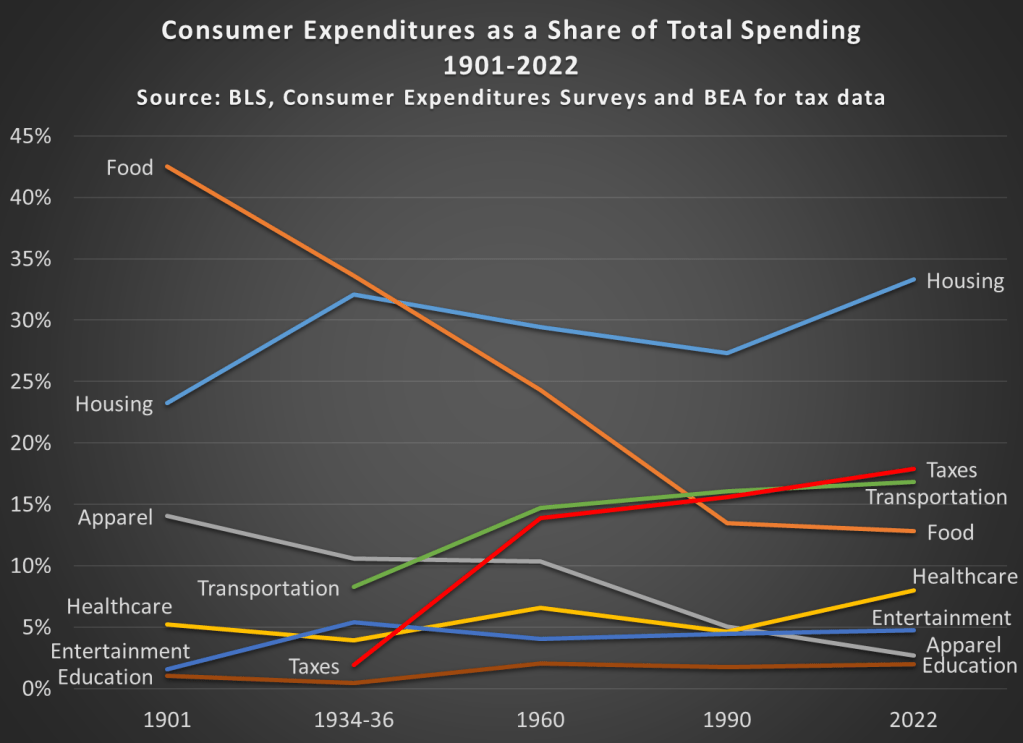
It’s always my preference to take as long-term perspective as possible when thinking about economic progress. So here’s the best way I’ve come up with to show how cheap and abundant food is today: food as a share of household spending fell dramatically in the 20th century.

Most of the data in this chart comes from the BLS Consumer Expenditure Surveys. This survey was done occasionally since 1901, and then annually since 1984. I also use BEA data to estimate personal taxes paid as a percent of spending (the CEX Surveys have some tax data, but it’s not reliable nor consistent). I picked as close to 30-year intervals as I could (with a preference for showing the earliest and latest years available), and I chose spending categories that are 90-100% of total expenditures in most of these years. Keep in mind also that these are consumer expenditures. As a nation, we spend a lot more on healthcare and education than this chart suggests, but most of that spending is not directly from households (of course, it is indirectly). Think of this chart as an average household budget.

I hope the thing that jumps out at you is that the amount money households spend on food has fallen dramatically since 1901, from over 42 percent to under 13 percent of household expenditures. To be clear, this data includes both spending on food at home and at restaurants (after 1984 we can track them separately, and groceries are pretty consistently about 60 percent of food spending). And you may be wondering about very recent trends too, such as before the pandemic. In 2022, household spent slightly less on food than they did in 2019, falling from 13.5 to 12.8%.

You may also notice that taxes have increased, though not much since 1960. Housing cost have been consistently high, and also a bit higher than 1990, going from 27 percent to 33 percent in 2022. And housing is now the single largest budget expenditure category, but for most of the first half of the 20th century, it was food that was the largest. And since people aren’t changing their housing situation more than once a year (if that), it would also have been food that dominated weekly and monthly budget decisions and worry about price fluctuations.

This year there will be lots of complaining about prices around the Thanksgiving table. And much of that is warranted! But let’s also be thankful on this food-intensive holiday for how cheap the food is.

And if some smart-aleck youngster tries to tell you that they learned on TikTok that things were better during the Great Depression (yes, people are really saying this!), have them watch this video by Christopher Clarke. Or show them that in the mid-1930s an average family spent one-third of their budget on food in my chart above, or how much labor it would have taken to buy that turkey in the 1930s (about 40 times as much time spent working as today).

Econ Tourism

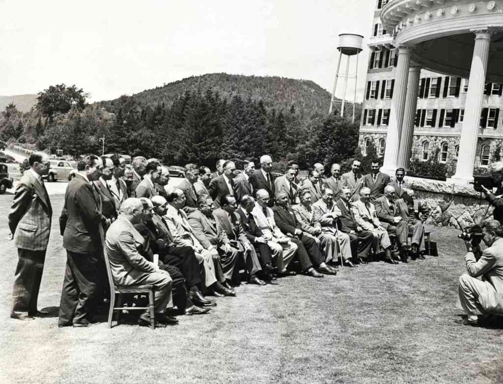
This week I was in Bretton Woods, New Hampshire. The Mount Washington Resort there is lovely on its own terms as a grand old hotel surrounded by mountains, but it is better known (at least among economists) as the site of the 1944 conference that gave us the International Monetary Fund, the World Bank, and the postwar international monetary system.

This got me thinking about what other destinations should top the list of sites for economics tourism. Adam Smith’s house in Scotland has to be on there. In the US I’ve been trying to visit all 12 Federal Reserve banks; they tend to have nice architecture as well as a Money Museum. You can stay at Milton and Rose Friedman’s cabin in Vermont, Capitaf. I’d like to go to Singapore for many reasons, but one is that they seem to listen to economists more than any other country; I’m not sure what places to visit within Singapore that best reflect that, though.

The places I’ve listed so far are somewhat inward looking to the economics profession; you could get a much bigger list by looking outward to the economy itself, doing “economic tourism” rather than “economics tourism”. Visit a port, a mine, or a factory (like Adam Smith visiting a pin factory and getting ideas for the Wealth of Nations); visit a stock exchange or a bazaar. Visit whatever country currently has the fastest economic growth, or the worst inflation.

Those are my ideas, but I’d love to hear yours: what are the best places for econ tourism?

Kids Are Much Less Likely to Be Killed by Cars Than in the Past

On X.com Matt Yglesias posted a chart that sparked some conversation about child safety:

Of course, it was probably more his comment about the “rise of more intensively supervised childhood activities” that generated the feedback and pushback. And I assume his comment was partially tongue-in-cheek, as often happens on Twitter, and designed to generate that very discussion. Still, it is worth thinking about. Exactly why did that decline happen?

I’ve posted on this topic before. In my March 2023 post, I looked at very broad categories of child death. While all death categories have declined, about half of the decrease (depending on the age group, but half is about right) is from a decline in deaths from diseases, as opposed to external causes. And fewer disease death can largely be attributed to improvements in healthcare, broadly defined. Good news!

Of course, that means that about half of the decline is from things other than diseases. What caused those declines? Let’s look into the data. Specifically, let’s look into the data on deaths from car accidents.

Continue reading →

The Goldin Nobel

This week the Nobel Foundation recognized Claudia Goldin “for having advanced our understanding of women’s labour market outcomes”. If you follow our blog you probably already know that each year Marginal Revolution quickly puts up a great explanation of the work that won the economics Prize. This year they kept things brief with a sort of victory lap pointing to their previous posts on Goldin and the videos and podcast they had recorded with her, along with a pointer to her latest paper. You might also remember our own review of her latest book, Career and Family.

But you may not know that Kevin Bryan at A Fine Theorem does a more thorough, and typically more theory-based explanation of the Nobel work most years; here is his main take from this year’s post on Goldin:

Goldin’s work helps us understand whose wages will rise, will fall, will equalize going forward. Not entirely unfairly, she will be described in much of today’s coverage as an economist who studies the gender gap. This description misses two critical pieces. The question of female wages is a direct implication of her earlier work on the return to different skills as the structure of the economy changes, and that structure is the subject of her earliest work on the development of the American economy. Further, her diagnosis of the gender gap is much more optimistic, and more subtle, than the majority of popular discourse on the topic.

He described my favorite Goldin paper, which calculates gender wage gaps by industry and shows that pharmacists moved from having one of the highest gaps to one of the lowest as one key feature of the job changed:

Alongside Larry Katz, Goldin gives the canonical example of the pharmacist, whose gender gap is smaller than almost every other high-wage profession. Why? Wages are largely “linear in hours”. Today, though not historically, pharmacists generally work in teams at offices where they can substitute for each other. No one is always “on call”. Hence a pharmacist who wants to work late nights while young, then shorter hours with a young kid at home, then a longer worker day when older can do so. If pharmacies were structured as independent contractors working for themselves, as they were historically, the marginal productivity of a worker who wanted this type of flexibility would be lower. The structure of the profession affects marginal productivity, hence wages and the gender gap, particularly given the different demand for steady and shorter hours among women. Now, not all jobs can be turned from ones with convex wages for long and unsteady hours to ones with linear wages, but as Goldin points out, it’s not at all obvious that academia or law or other high-wage professions can’t make this shift. Where these changes can be made, we all benefit from high-skilled women remaining in high-productivity jobs: Goldin calls this “the last chapter” of gender convergence.

Source: A Grand Gender Convergence: Its Last Chapter

There is much more to the post, particularly on economic history; it concludes:

When evaluating her work, I can think of no stronger commendation than that I have no idea what Goldin will show me when I begin reading a paper; rather, she is always thoughtful, follows the data, rectifies what she finds with theory, and feels no compunction about sacrificing some golden goose – again, the legacy of 1970s Chicago rears its head. Especially on a topic as politically loaded as gender, this intellectual honesty is the source of her influence and a delight to the reader trying to understand such an important topic.

This year also saw a great summary from Alice Evans, who to my eyes (admittedly as someone who doesn’t work in the subfield) seems like the next Claudia Goldin, the one taking her work worldwide:

That is the story of “Why Women Won”.

Claudia Goldin has now done it all. With empirical rigor, she has theorised every major change in American women’s lives over the twentieth century. These dynamics are not necessarily true worldwide, but Goldin has provided the foundations.

I’ve seen two lines of criticism for this prize. One is the usual critique, generally from the left, that the Econ Nobel shouldn’t exist (or doesn’t exist), to which I say:

The critique from the right is that Goldin studied unimportant subjects and only got the prize because they were politically fashionable. But labor markets make up most of GDP, and women now make up almost half the labor force; this seems obviously important to me. Goldin has clearly been the dominant researcher on the topic, being recognized as a citation laureate in 2020 (i.e. someone likely to win a Nobel because of their citations). At most politics could explain why this was a solo prize (the first in Econ since Thaler in 2017), but even here this seems about as reasonable as the last few solo prizes. David Henderson writes a longer argument in the Wall Street Journal for why Claudia Goldin Deserves that Nobel Prize.

Best of all, Goldin maintains a page to share datasets she helped create here.

Pinball Prices (Not Adjusted for Inflation)

Last weekend I had the opportunity to visit an arcade, but not one of those modern fancy arcades with virtual reality, laser tag, etc. This arcade specializes in having old-school games, primarily pinball, but also early video arcade games. You pay a cover charge ($5 for kids, $10 for adults), and then you use quarters to play the games. But here’s the cool part: the price of the games is the same as it was when the games were first released.

As an economist, of course, I was very interested in the prices.

They had pinball machines that dated back the 1960s, and video games from the late 1970s. Most video arcade games were around 50 cents for the early games (late 1970s and early 1980s). But the pinball machines started out at 25 cents, with the earliest game they had being a Bally Blue Ribbon machine, manufactured in 1965 (interestingly, some of the earlier machines had slots for both dimes and quarters — I assume the price was adjustable mechanically). Notably, you also got to play 5 balls for this price (3 balls seems to be standard later on).

How should we think about that 25 cents? A standard reaction is to adjust the number for inflation. Using the CPI-U as the inflation index, that means the 25 cents from 1965 is “worth” about $2.40 now. That’s interesting, but I don’t think it really provides the relevance that we want today.

An alternative is to calculate the “time price” of playing the game. Using the average hourly wage of $2.67 in December 1965, we can calculate that it would take about 5.5 minutes of work to pay for that game — a game which probably only lasts about 5.5 minutes, unless you are really good at it!

Another comparison we could do is with the cost of video games today compared with wages today. But that’s not really a fair comparison — video games are much more advanced today. We would need to do some sort of quality adjustment, which is overly complicated.

But, at least in my case, there is no need to do the quality adjustment — I can play the exact same game as 1965. In fact, I did (several times). There was also that $10 cover charge that I mentioned, and if I spread that fixed cost over 40 games, it cost me about 50 cents per play (including the 25 cents to start the machine) to play the 1965 Bally’s Blue Ribbon Pinball machine. At the average wage today of $29 per hour, it takes about 1 minute to afford a play of that same game. In other words, my Blue-Ribbon-Pinball standard of living is about 5.5 times greater than in 1965.

Now this isn’t to say we are 5.5 times better off overall than 1965. Prices don’t stay constant for most goods! But hopefully it is a useful way to think about that 25 cent price tag from the past, and how to compare it to today.

New Center for the Restoration of Economic Data

Regular readers will know that we love not only economics, but also history and data. We especially love it when “data heroes” take data that was difficult or impossible to access and make it easily available to everyone. The Federal Reserve Bank of Philadelphia just announced a project that brings together all of these things we love, their new Center for the Restoration of Economic Data:

Our mission is to advance research in topics related to regional economics and consumer finance by making economic data available in readily accessible, digital form. CREED combines state-of-the-art machine learning technology with deep subject matter expertise to convert natively unstructured data (information in books, images, and other undigitized formats) into readily accessible digital data.

The CREED research team shares the original analog or unstructured data as well as the code used to recover and clean these data, which are aggregated for use in novel economic research. Our collection features volumes of old, often overlooked, and frequently inaccessible data, which have been mined, restored, and converted into unstructured digital and analytically usable formats.

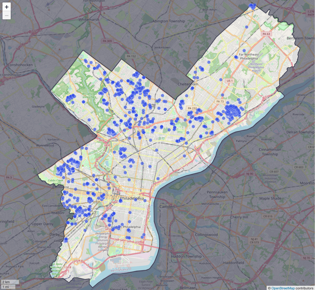
Their first project is to map all of the racially restrictive covenants in the city of Philadelphia. Until the U.S. Supreme Court declared such covenants to be unenforceable in 1948, they often barred properties from being sold to non-whites or non-citizens. After 1948 redlining took different forms, some of which may still persist today.

CREED shares the underlying data used to build the map here, and they say much more is one the way. I love it when economic historians (and regular historians) digitize old paper records and share the resulting data, and hope to see more examples like this to share in the coming years.

Disclaimer: I am a visiting scholar at the Federal Reserve Bank of Philadelphia but I was not involved with this project

Who is the Wealthiest Generation? Mid-2023 Update

The Federal Reserve has released the latest update to their Distributional Financial Accounts data, which the data underlying several of my past posts on generational wealth. With that recent data, I have updated the chart of wealth for Baby Boomers, Generation X, and Millennials.

The data is shown on a log scale to better show growth rates and allow for easier visual comparisons. But if you are interested in the more precise numbers, in the most recent quarter (2023q2) Generation X has, on average about $620,000 in net wealth, which compares favorably with Baby Boomers at about the same age (in 2006) with about $539,000 in net wealth per person. That’s about 20 percent more.

Millennials have about $115,000 in net wealth on average, which also compares favorably with Baby Boomers, who had slightly more at about the same age (in 1990) with $121,000 in net wealth on average. Given the uncertainties of all the data that goes into this, I’d say those are roughly equal. Gen X had a bit more around the same age (in 2007) with $149,000, but that fell significantly the next two years during the Great Recession.

(For more detail on my approach to creating the chart, see the linked post above, but in short I’m using the Fed DFA data for wealth, Census Bureau data by single year of age for population, and the Personal Consumption Expenditures price index for inflation adjustments (I also have a chart with the CPI-U — it’s not much different). Wealth data is for the 2nd quarter in each year (to match 2023), except for 1989 since the 3rd quarter is the first available.)

Given how much wealth can fluctuate based on housing values (see above for Gen X from 2007-2009), it might be useful to look at the data with housing. Housing is also a weird kind of wealth — for the most part, you can’t access it without selling (other than certain home equity loans), and when you do sell, unless your home appreciated more than average, you just have to move to another home that also appreciated.

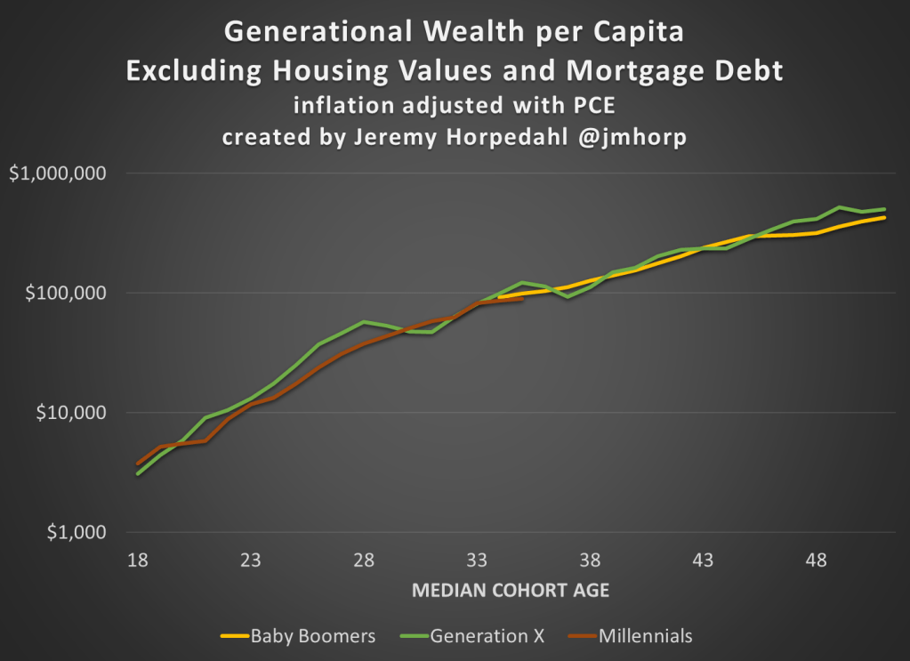
Here’s the chart excluding housing value and mortgage debt:

The chart… doesn’t change much. The values are all lower, of course, but the comparisons across generations look pretty similar. Gen X right now is 17 percent wealthier than Boomers at the same age. And if we look at all three generations around the median age of 35, they are pretty close: Gen X with $123,000 (but slipping over the next few years), Boomers with $99,000, and Millennials with $90,000.