How’s this for a “battleground” stock:
Meta stock has dropped about 13% when its latest quarterly earnings were released, then continued to slide until today’s market exuberance over a potential end to the government shutdown. What is the problem?
Meta has invested enormous sums in AI development already, and committed to invest even more in the future. It is currently plowing some 65% (!!) of its cash flow into AI, with no near-term prospects of making big profits there. CEO Mark Zuckerberg has a history of spending big on the Next Big Thing, which eventually fizzles. Meta’s earnings have historically been so high that he can throw away a few billion here and there and nobody cared. But now (up to $800 billion capex spend through 2028) we are talking real money.
Up till now Big Tech has been able to finance their investments entirely out of cash flow, but (like its peers), Meta started issuing debt to pay for some of the AI spend. Leverage is a two-edged sword – – if you can borrow a ton of money (up to $30 billion here) at say 5%, and invest it in something that returns 10%, that is glorious. Rah, capitalism! But if the payout is not there, you are hosed.
Another ugly issue lurking in the shadows is Meta’s dependence on scam ads for some 10% of its ad revenues. Reuters released a horrifying report last week detailing how Meta deliberately slow-walks or ignores legitimate complaints about false advertising and even more nefarious mis-uses of Facebook. Chilling specific anecdotes abound, but they seem to be part of a pattern of Meta choosing to not aggressively curtail known fraud, because doing so would cut into their revenue. They focus their enforcement efforts in regions where their hands are likely to be slapped hardest by regulators, while continuing to let advertisers defraud users wherever they can get away with it:
…Meta has internally acknowledged that regulatory fines for scam ads are certain, and anticipates penalties of up to $1 billion, according to one internal document.
But those fines would be much smaller than Meta’s revenue from scam ads, a separate document from November 2024 states. Every six months, Meta earns $3.5 billion from just the portion of scam ads that “present higher legal risk,” the document says, such as those falsely claiming to represent a consumer brand or public figure or demonstrating other signs of deceit. That figure almost certainly exceeds “the cost of any regulatory settlement involving scam ads.”
Rather than voluntarily agreeing to do more to vet advertisers, the same document states, the company’s leadership decided to act only in response to impending regulatory action.
Thus, the seamy underside of capitalism. And this:
…The company only bans advertisers if its automated systems predict the marketers are at least 95% certain to be committing fraud, the documents show. If the company is less certain – but still believes the advertiser is a likely scammer – Meta charges higher ad rates as a penalty, according to the documents.
So…if Meta is 94% (but not 95%) sure that an ad is a fraud, they will still let it run, but just charge more for it. Sweet. Guess that sort of thinking is why Zuck is worth $250 million, and I’m not.
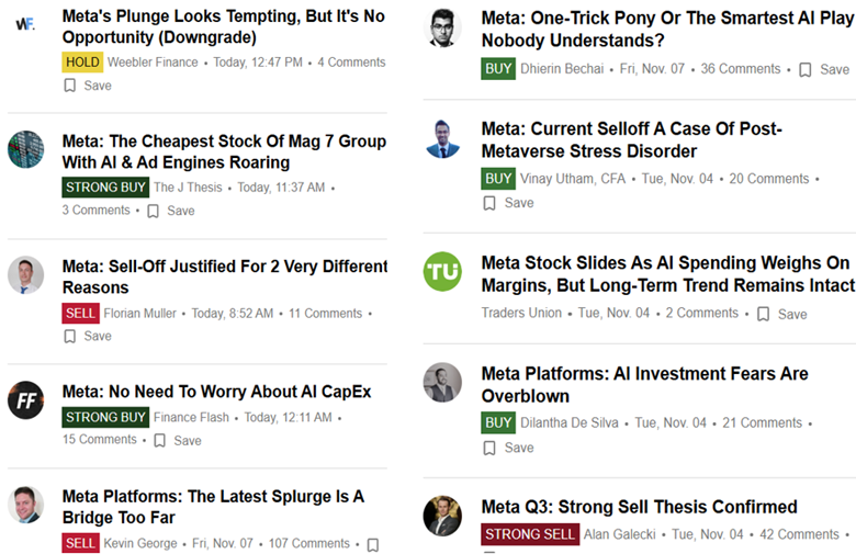
But never fear, Meta’s P/E is the lowest of the Mag 7 group, so maybe it is a buy after all:

As usual, nothing here should be considered advice to buy or sell any security.


#/media/File:Tesla-optimus-bot-gen-2-scaled_(cropped).jpg)