In my undergraduate training, I never came across the term “co-production” but after learning about it a few years back, I find I return to the concept frequently. Co-production is the idea that a consumer’s input is important to production. The term was coined by Nobel Laureate Elinor Ostrom. Examples include:
Police protection – We lock our doors, buy security systems, and engage in neighborhood watch groups.
Fire protection – We buy appliances with improved safety features and have fire extinguishers in our homes.
Education – Parents involve themselves in the education of their children through practice, ensuring the child does their homework and gets plenty of sleep.
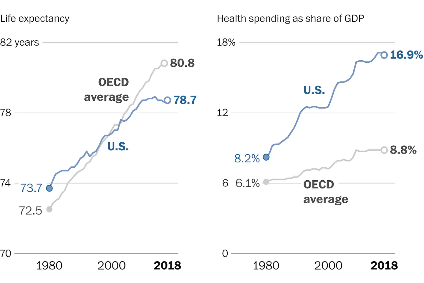
Once you start to think about co-production, you see it everywhere. For example, I am currently teaching health economics and it is not uncommon to come across graphs like this (see below) from The Washington Post. Some suggest these differences highlight how the U.S. needs a less market-oriented health system. But, when I see the graph, I think of all the ways in which the United States is different. Specifically, I question the extent to which we are good co-producers of our health.
In the United States, 36 percent of adults were considered obese in 2016. The most among OECD countries. You can present similar data on drug use disorders, alcoholism, mental health disease burden, and so forth. I do not mean to suggest we have equal control over all of these outcomes but we are often not powerless.
The debate about government v. market provision of health services is a discussion for another time and sure to feature in the upcoming presidential debates. But, I do think any intervention in the health sector that does not address co-production will oversell and underdeliver.
Katherine Abraham and Melissa Kearney just published “Explaining the Decline in the US Employment-to-Population Ratio: A Review of the Evidence” in the Journal of Economic Literature.
The unemployment rate measures people who are actively looking for work and can’t find a job. The authors are not examining short term fluctuations in unemployment (which shot up in pandemic times). They are looking at at long term decline in employment rates of working-age adults in the US. The trend began in 1999. Employment of adults in the US dipped after the Great Recession and still has not recovered a decade later. Less-educated males have experienced the largest drop in employment.
I’m reviewing the entire paper with my Labor Economics class. Most of what the authors talk about can be found throughout our Labor Econ. textbook, but I like using the paper to organize and motivate the collection of facts and theories.
Here’s a summary of their thorough examination of possible causes of the decline in working.
They estimate, drawing on other empirical work, that two factors have a considerable and measurable impact on the decline in formal employment. Import competition from China (the US changed their position on trade with China in 2000) and automation (industrial robots) both result in lower demand for US workers.
There are three contributing forces that the authors declare them to be minor casual factors. Increased receipt of disability benefits disincentivizes working, higher minimum wages results in less jobs, and the increased incarceration rate in the past few decades takes adults out of the labor force.
The paper is called “A Review of the Evidence”. The following is a list of factors that could in theory be responsible for the decline for working but for which data is scarce: Lack of child care Changes in leisure options (i.e. young men play video games) Changes in social norms (i.e. young people can stay “in the basement”) Increased use of opioids (could be a result of diminished job opportunities) Rise in occupational licensing Frictions or matching issues
All of those indeterminate items represent research opportunities.
I categorize this as “News”, because I don’t know if we will have enough posts on medicine to justify a whole category for Medicine. Because the coronavirus is affecting life so much, it’s well worth writing about currently.
R0 is the average number of people who will contract a contagious disease from one person with that disease. If you want, you can pronounce it “R naught”.
If R0 is less than 1, and stays that way for a while, the disease will disappear. That means that the virus can still be passed around between a few people (for example, if 1 out of 1,000 people forgets to bring a mask into the grocery store), but over time it will run out of targets and we will be done with this whole thing. If R0 is above 1, that means that a few cases produces more cases and eventually most people will get infected. Once you understand the potential of R0<1 it does become tempting to engineer a lockdown.
We understand the spread of the virus better than we did when lockdowns were first discussed in the US in March 2020. It’s not as simple as every infected person giving the virus to two new people. The way the virus spreads is often through “superspreaders” and superspreader events. That’s why so many large gatherings have been cancelled and continue to be cancelled. With this wrinkle in mind, there is still the overall R0 score of whether the virus is increasing or decreasing.
If you fail to stop the initial spread of the virus (R0 > 1) then a great many people can be infected and eventually the spread will slow simply because the virus is running out of hosts. One of the more controversial topics in Spring 2020 was whether “herd immunity” is or is not something we should want to achieve as a society.
One of the absolute best places to get virus news is MarginalRevolution.com. Today, Tyler has written a new post about herd immunity. I’ll provide some quotes. Much more at the link of course.
… these same herd immunity theorists tended to be less pessimistic than many of the mainstream forecasts…
Now, I don’t recall many of those theorists early on making a prediction about a specific number required for the herd immunity threshold to be reached. Nonetheless, when deaths and hospitalizations collapsed in Sweden, London, and New York at about 20 percent seroprevalence, obviously it seemed that might be the critical level for herd immunity to kick in.
…
Then things started to go askew in the last few weeks. First, it seems like a bad second wave came to an already fairly hard hit Madrid. OK, you could say Madrid was never had 20% seroprevalence to begin with. And then what appears to be a second wave has started coming to Israel, with rising hospitalizations. Finally, it is believed that in Britian R equals about 1.7, and that a second wave of cases is on the verge of hitting London and Southeast England.
Tyler Cowen
Even though no one has all the answers, this is the conversation we should be having. In fact, I’m starting to wonder if we should make a Medicine blog post category.
It was just yesterday that the dreaded and long foreseen 200,000 deaths was confirmed.
Preheat the oven to 440-450°F (230 °C). Position a rack on a lower-middle shelf. The top of the fully risen popovers should be about midway up the oven. You don’t want the tops of the popping popovers to be too close to the top of the oven, as they might burn.
Use 12 cup nonstick popover pan, e.g. Chicago Metallic. Lightly grease the cups (may not be necessary every time). It is possible to use a standard, i.e. non-popover 12-cup metal muffin tin, one whose cups are close to 2 1/2″ wide x 1 1/2″ deep, though results may not be quite as good unless you preheat the muffin tin in the over for five minutes. As noted above, reduce recipe size for 6-cup popover pan (where each cup is somewhat larger than with the 12-cup popover pans).
Use a wire whisk or beater on low speed to beat together the eggs, milk, and salt. Whisk till the egg and milk are well combined, with no streaks of yolk showing.
Add the flour all at once, and beat till frothy; there shouldn’t be any large lumps in the batter, but smaller lumps are OK.
Stir in the melted butter, combining quickly. Best to let batter then rest at least 10 minutes, e.g. while oven preheats.
Pour the batter into the popover cups, evenly; about 2/3 full. [For 12 standard muffin cups: fill them about 2/3 to 3/4 full. ]
Make absolutely certain your oven is heated, 440- 450°F.
Bake the popovers for 19-20 minutes without opening the oven door. Reduce the heat to 360 °F [180 °C] (again without opening the door), and bake for an additional 15-20 minutes, until they’re a deep, golden brown. [If using muffin tins, for second phase cook only 10-15 min at 350 F]. Preferable: pierce them about 2 minutes before removing from oven to release steam.
If the popovers seem to be browning too quickly, reduce temperature a little.
NOTES ON MAKING POPOVERS:
( A ) These are fairly healthy and easy to make, and taste delicious split open and served warm, with butter and jelly, for dessert or snack. Can also serve with things like chili or stew. Get creative and fill with pudding or whipped cream and fruit. Popovers taste almost like pastry, but without all the fat. The larger popovers from the 6-cup pans look more dramatic, and have big cavity inside them, especially when made with all white flour.
( B ) These are best cooked in special popover pans. These have typically six or twelve metal cups, joined by fairly thin metal rods, so heat can get quickly to the cups. It is possible to cook popovers in regular muffin tins.
( C ) The oven needs to be hot, and the oven door kept closed to keep moisture in, in order for the popovers to rise. They rise because steam gets trapped in sticky eggy dough.
( D ) You can make these with all white flour. Use a full 1.5 c white flour. (I cut back a little with the amount of whole wheat flour, since it absorbs more liquid than white flour). Using all white flour tends to make the popovers rise more, with thinner, drier walls. I like them a little thicker and chewier, hence the whole wheat.
( E ) Popovers are best when eaten within an hour or two of cooking. With time, the crispness of the outer wall gets softened by moisture from the inside. They can be re-crisped by heating in an oven or electric skillet or large covered frying pan at say 350 F for ten minutes or so. They can also be frozen, then gently thawed in microwave and then re-crisped.
( 2 ) TRADITIONAL IRISH SODA BREAD (NO YEAST)
INGREDIENTS
4 cups (580g) all-purpose flour
1½ teaspoons baking soda
1 teaspoon salt
Scant 2 cups (470ml) cold buttermilk
INSTRUCTIONS
( 1) If you don’t have buttermilk, first make it by adding 3.5 T vinegar or fresh lemon juice to measuring cup, and filling to two cups with whole or 2% milk (i.e. a scant 2 T vinegar per cup of milk). Stir and let sit for at least ten minutes for milk to sour. I used apple cider vinegar for a faint fruity aura.
(2) Preheat oven to 425 degrees F (218 degrees C) , or slightly hotter if your oven runs cool. Line a baking sheet with parchment paper or grease well; set aside. You can also use an 8″ cake pan or oven proof skillet.
(3) In a large bowl whisk together the flour, baking soda, and salt. Stir in the buttermilk just until combined and the dough starts to become too stiff to stir. Transfer to work surface and with floured hands lightly knead the dough 5-10 times or until all the flour is moistened and the dough comes together.
(4) Form dough into a 1 ½” (4 cm) high round, approximately 8” (20 cm) diameter. Place on prepared pan. With a serrated or very sharp knife cut a deep cross on the top from side to side, cutting about a third of the way deep into the dough. Bake for 30-35 minutes or until golden brown and it sounds hollow when tapped on the bottom. Alternatively, bake at 425-440 F for 20 min, then turn down to 400 F for last 15 or so minutes.
RECIPE NOTES FOR SODA BREAD
( A ) Note the dough for soda bread is NOT kneaded to the point of being smooth, but just enough to barely hold together, still looking “shaggy”. The reason is that with the baking soda, all the CO2 is released in a relatively short time as the dough heats up, so the dough has to be soft (not tough and cohesive) so it can quickly stretch. (This is the opposite from yeast bread, where you knead the dough long and hard to build gluten chains to strengthen the dough, so the CO2 produced slowly from the yeast during rising will not escape.)
( B ) The deep cross cut in the dough helps it expand, and helps heat to get to the center of the loaf.
( C ) This is authentic, basic Irish soda bread. The crust comes out pretty hard. It is great for dipping in stew or soup, or just spread with butter while warm and chew carefully. I like to have the crust a bit softer, so I brush the loaf with buttermilk or butter just before baking. When cooling the loaf, cooking on rack will make crust crispy, while being covered with tea towel will soften the crust.
( D ) As with most real bread, this goes stale very fast. I suggest cutting off whatever portion you will not eat that day, and freezing it. It is fine thawed. Bread that is not too stale can be partly, temporarily resuscitated by wetting the crust, and baking it for say 12 minutes at 350 F.
This is a slightly more complex recipe for Irish soda bread, including butter, egg, a little sugar, and currants or raisins. Gives softer, sweeter version, verging on scone, instead of plain soda bread with tough crust. Has nice short confidence-building video showing how to work the dough. And has good photos of what dough should look like at each stage.
Currently, I subscribe to Bloomberg Businessweek. Instead of ranking MBA programs, this year they decided to report on a survey of students about switching to online classes. (in the Sept. 21 issue)
Overall, the reaction from students has been negative. They believe an online MBA is not as valuable as the traditional in-person experience.
Something MBA students state, which I have already heard from my own undergraduates, is that it’s difficult to focus during online instruction hours. If your face isn’t being watched through your webcam, then it’s tempting to “multitask” and not pay attention to the professor. I feel the same temptation when I join online research seminars.
What’s the most sympathetic view of this situation? Doing your online classes “isn’t that hard”. I feel like the scold looking over my bifocals at millennials saying, “going to a dry cleaner isn’t that hard”. (We millennials cannot be bothered to go to a dry cleaner.)
Here’s my first and brief thought: College students today have been taught to use screens for recreation by their parents.
Parents put kids in front of screens to get rid of them. I get rid of my own kids by putting them on screens. I ensure that they are not watching something evil.
I hope parents are diligently ensuring that their preteen daughters are not chatting up predators. What responsible parents have been told is to try to limit total screen hours and also to try to keep your child out of the digital equivalent of dark alleys.
That kind of guidance doesn’t teach students how to use screens constructively. They are suddenly being asked by teachers to be constructive on the screen. Some of them can hack it. Some of them can’t. None of them were prepared for this.
Your typical 20-year-old college student today must have done well in traditional classrooms because they did, after all, get admitted to college. But when they were on their screens, they were scrolling and gaming and indulging their impulses. As long as they physically showed up to class on Monday morning and turned in enough homework assignments, no adult was going to make them do chores on screens.
Since screens are here to stay, we need a lot more research on how to raise humans who know how to be responsible on screens.
No answers came to me when posed this question to the hive mind:
Should we gamify more good things or teach our species to do good things without gamification? (If there is a right answer to this question, then many implications follow for teachers.)
I live in Florida and there is a lot of residential construction down here. It’s not typically people just deciding to build a house on some isolated plot of land. A large portion of construction is private or semi-private neighborhoods built by developers. They often include manicured common spaces and strict Home Owners Association (HOA) rules.
The typical procedure is that a developer purchases a large parcel of land, and then starts building. Before the first house is even sold, the HOA is established and the governing board is packed with developer representatives. Written into the HOA bylaws is that the developer maintains a preponderance of the HOA representation during construction. This makes sense. ‘Nice’ neighborhoods command higher property prices and the developer has often invested *very* large sums of money. Certainly more money than it’s willing to risk at the hands of a sloppy, owner-controlled HOA.
Best practice differs by developer.
Typically, the residents will have seats on the HOA board in some proportion of development project completeness. For example, if 75% of the total planned lots have been built and sold, then the developer may retain 2/3 or 3/5 control of an HOA board. The developer finally relinquishes all HOA control after 100% of the planned units are completed and sold.
Ignoring policies for beautification and such, a HOA boards under developer control act differently from those that are resident controlled. As I said, the developer has full discretion on HOA policy, practically speaking, because it maintains a majority of the voting members. But, HOA fees are *not paid* by the developer.[1] Only homeowners pay HOA fees.
For example: Not everyone wants cable TV. But the developer knows that home-buyers want the option for cable TV. Typically, one of the first HOA orders of business is to pay for monthly cable TV. Every single unit pays for cable TV through their HOA fees – whether they use it or not – in exchange for the cable company laying cable lines and providing access. Typically, these contracts are often a decade in duration, after which time the contract can be cancelled and owners can individually decide whether to pay for cable. It’s not obvious that an owner-controlled HOA would pay for cable and have lines laid in the first place (Satellite TV anyone?).
To be clear: The developer sets the HOA policy priorities and determines the HOA budget. Then, the owners pay the quarterly HOA fee. Can you say Principal-Agent problem? Early HOA activities include less resident engagement because residents don’t much affect outcomes. The developer also doesn’t mind higher HOA fees because it doesn’t bear the cost. Do you expect your HOA to put contracts up for bid, say, to do landscaping, pressure washing, etc.? If your HOA is developer-controlled, then you should expect no such thing. Putting contracts ‘up for bid’ is time consuming and reflects a concern for costs. Not to mention that the quality of the bid work may be variable. Developers want high property values and they want them dependably. HOA fiscal prudence, besides solvency, is not a priority.
Having said all this – it’s true that your neighborhood may be ‘nicer’ due to developer control of the HOA. Depending on you preferences, this might align nicely with your priorities. If that’s true, however, you can expect to be less happy in the long-run when your neighbors ultimately gain control of the HOA.
I’m on my HOA board and it’s now 100% privately owned. There are still principal-agent problems. But they are much easier to address now that everyone on the board pays HOA fees. Our problems and our opportunities are truly ours.
[1] Sometimes, the developer will provide a loan to the HOA to provide for initial management costs.
When you mention you teach economics, who among us hasn’t heard someone blurt out, “Oh, I hated that class!” or sigh, “I just never ‘got it’”? There are probably many reasons for this but I suspect their teacher did not have an appreciation for the “rhetorical triangle” or Aristotle’s modes of persuasion: Logos (logic), ethos (credibility), and pathos (emotion). Economists often act like logos and ethos are enough. They are not! When we construct arguments with only the two it’s like trying to create a stable two-legged stool. Good luck, something is missing.
Economists need pathos to create an argument that is memorable and doesn’t fall apart. In this short post, I want to explore the role of beauty to make that emotional appeal.
Christian author Donald Miller writes, “Sometimes you have to watch somebody love something before you can love it yourself. It is as if they are showing you the way.” How can we show students our love for economics and the beauty of the economic way of thinking? Through discussion of what excites us. From helping students to see economics “in the wild” of everyday life to helping students see the magic of markets. All of this improves their understanding of principles and economic concepts. First, let me discuss the mundane and then we can discuss the magic.
When I was an undergraduate, every Friday night I would head to Sonny’s BBQ with some buddies. On Friday nights they had the all-you-can-eat baby back ribs. Normally, the rib re-orders came promptly and the sweet tea refills flowed. But, on one particular Friday night the service was pretty bad and we talked over empty plates and cups.
Why? It wasn’t busier than normal. They didn’t seem understaffed. Our waitress was paying attention to other tables but not our table. Why? Well, our normal group was a party of four but we invited a couple more friends that week. For six person tables, automatic gratuity kicked-in and the waitress was paying attention to tables where her gratuity could still rise or fall with the quality of service. She had us locked in at 18 percent, and being poor college students, she likely didn’t expect us to tip more than 18% if she gave good service. Economics in the wild! The power to explain the mundane.
Share your own stories with your students (or on this blog!). When is the first time you saw economics in the wild? When is the first time you realized you were an economist? For inspiration on the mundane, check out Robert Frank Economics Naturalist and his conversations with Russ Roberts on that book as well as dinner table economics.
For a transition from the mundane to the magic consider having students read, “I, Pencil” by Leonard Reed. Though the video with Uncle Milt is wonderful too. The remarkable journey of a simple pencil!
Build on those ideas either before or after you have them read “I, Pencil” or watch Milton Friedman. Hand out chocolate chip cookies to students and ask them to describe in as much detail as possible how to make a chocolate chip cookie (no, not their grandma’s recipe). Then, help them to see something so simple like a cookie required vast networks of exchange coordinated through a price system that nobody controlled. Inconceivable!
Pencils and cookies are complicated? Really!? Inconceivable!
For another great magical treatment of economics, check out Russ Roberts’ poem, “It’s a Wonderful Loaf” (accompanying video on the same site). The emergence of order from seeming chaos is profound.
We rarely feel more human than when we are on a journey. Beauty has the power to place us on that path of inquiry that awakens a desire to know more. In that search for beauty, we shouldn’t discount the mundane. I tell students there are few things more exhilarating than seeing economics in the wild. You feel like you have a decoder ring to explain the puzzles of our social world. On the other hand, I have always found the magical explanations special and profound, to be appreciated like works of art. Yes, they increase understanding but they also evoke a sense of awe. Both the mundane and magical are beautiful and economists should look to beauty more. Our arguments will be better if we do.
I rarely watch things right when they come out. For once, I’m fairly current on something: the Netflix documentary “The Social Dilemma”.
Former employees of tech companies are using their talents to try to make sure that technology takes our society in a good direction. They appear to feel guilty for creating a product that is so fun it has become addictive.
They call attention to the negative effects of social media, which were difficult to foresee. The guy who claims to have created the Facebook “Like” button says that his intention had been to spread happiness. They didn’t realize that the lack of likes could exacerbate teen depression. They worry that in some cases it has even led to suicide.
They mention early on that social media has actually done some good. I know personally someone who was adopted from a foreign company and then reconnected with his birth family by searching his family name on Facebook. That’s neat.
I think they underrate Facebook as a utility for adults. Parents are using Facebook to notify neighborhood residents of school fundraisers. Adults are using Facebook to sell used furniture.
Facebook is a place to turn for entertainment, but it’s really become more than that for my generation. We don’t have physical address books. We have a phone Contact list and we have our Facebook accounts.
Facebook is not the only service being scrutinized. Former employees of Google and Pinterest, among others, came forward to talk about how those services use customer data to sell advertisements.
One of the good points they make is that the algorithms that maximize ad revenue do not have user well-being in mind and can unintentionally lead to spreading false “news” stories. It’s important for users to know this. I am glad that more people are aware, thanks to the documentary.
The fact that radio is funded by ad revenue never caused us to shut down radio. Maybe it was always more transparent to listeners, and the fact that it is less individualized makes it feel less creepy.
Speaking of creepy, this documentary is creepy. It’s full of creepy music and long pauses in which your mind goes to dark places. They should have made it one hour instead of 1.5 hours. It was very manipulative, which makes sense because it was made by people who confess that they are professional manipulators.
My conclusion is that we should treat social media like alcohol. Most people can live with alcohol, but it kills. Every year, alcohol kills people. The US government estimates that alcohol kills 88,000 people every year in the US. We should be more careful with alcohol and we should all be more educated on the potential for harm.
Some people would be better off if we completely banned alcohol, but currently the strategy is to manage harm through EMTs and medical treatment. There are support groups for people such as Alcoholics Anonymous.
We think young people are more likely to hurt themselves with this dangerous item, so we restrict the sale to youth.
The internet can be very harmful to children and teens. It’s important to point out that respectable social media services like Pinterest are not the only places where kids can go. Kids and “screens” is a whole ball of twine. Regulating Facebook may actually do very little to protect children.
We can do a public health campaign, sort of like what’s going on with sugary sodas right now. I think this documentary is the beginning of a productive conversation.
It’s hard to say that I disagree with the conclusions of the filmmakers. I suspect that I do, and yet they mostly just tell stories and ask open questions and fidget quietly on screen. So, it’s hard to pin them down on precise policy recommendations. Although I resent having to watch them fidget for so many minutes, I also don’t want to sound ungrateful for the effort they made to raise awareness of an issue they feel strongly about.
Let’s have more documentaries, and more blogs, and more in-person conversations about how to make a better world now that the internet genie is out of the bottle. Let’s keep middle school students off of social media. It starts at home and in the neighborhood.
I summarize an article I published in 2020 and relate it to the current polarized political environment, which is not an extension I made as explicitly in the article.
We often talk of a moral obligation to sympathize with others and “walk a mile in his/her shoes”. We do not often “walk a mile” in the shoes of our neighbors just to be nice, and we can’t even do it for money. In a lab experiment, I put people in an environment where they could earn money for accurately guessing what others did. I found that people tend to transfer their own reference point on to other people, which causes them to make bad predictions.
There is more at the blog. I end with a conclusion that some might say is too optimistic or too generous to the opposing side:
If people of opposing political persuasions spent more time learning each other’s life stories, then we would end up with a less toxic climate.
It is not straightforward to define what “money” is in a modern national economy. Simply tallying the amount of coins and paper currency is inadequate. Most buying and selling is now done by shifting numbers between abstract bank accounts, not by pushing a bundle of bills across a table. Thus, these bank accounts serve the functions of money (medium of exchange and store of value). The question then arises as to which of these financial accounts to regard as money.
Among financial assets, there is a broad spectrum of liquidity. Typically you can write a check on your checking account which, when it clears, provides immediate and final settlement for a purchase. On the other hand, if you want to tap your brokerage account with its holdings of Apple stock to buy a television, you would typically have to sell (liquidate) your stock. A third party would have to be willing to give you something more money-like (e.g. credit your money market fund at your brokerage) in exchange for the stock at some negotiated price. Then you might have to transfer the funds from your brokerage fund into your bank checking account before you can actually buy that TV. Because of all these intermediate steps, and the fluctuating value of the stock before you complete the sale, the stock holding would not be counted as “money”, even though its value enabled you to ultimately make your purchase.
There are a number of measures of money in modern economies. In the U.S. some of these are:
M0: The total of all physical currency (coins and paper bills).
MB (“Monetary Base”): The total of all physical currency (coins and bill) plus Federal Reserve Deposits (special deposits that only banks can have at the Fed). This is money essentially created by the government plus the Federal Reserve, which does not necessarily enter the private economy to be spent.
M1: Physical currency circulating outside of the Fed and private banking system, plus the amount of demand deposits, travelers’ checks and other checkable deposits. This is highly “liquid” money, i.e. accepted and used for transactions in the private economy.
M2: M1 + most savings accounts, money market accounts, retail money market mutual funds, and small denomination time deposits (certificates of deposit of under $100,000). The funds in these additional savings and money market accounts can in general be easily transferred to checkable accounts, and thus could go towards making purchases if desired.
MZM: “Money Zero Maturity” is one of the most popular aggregates in use by the Fed because its velocity has historically been the most accurate predictor of inflation. It is M2 – time deposits + institutional money market funds.
Below is a chart showing the growth in the U.S. in the past fifteen years of M0 (total currency, labeled “currency in circulation), MB, M1, and M2. The grayed areas are recessions, i.e. 2008-2009 and the present. [1]
Various Measures of “Money” in the U.S.
The M1 money supply (green line) was about $1.4 trillion ( $1,400 billion on the chart) in 2005, was fairly steady for several years, then started a steady ramp up to $4 trillion by January, 2020. Due to the extraordinary events associated with the Covid-19 shutdown (government stimulus package plus Fed purchases of securities), M1 jumped up to $ 5.4 trillion by August of this year. M2 followed similar trends, though on a much larger scale, rising to$18.3 trillion this year. This compares to a current U. S. total GDP of about $21 trillion.
The lowest line on the chart is the physical currency (blue line), which has grown slowly but steadily. The “Total MB” (red) line, was essentially on top of the blue line up until the 2008-2009 recession. Since MB = physical currency plus reserves, this meant that the amount of money in the reserve balances at the Fed of the private banks was nearly zero before 2008. The reserves jumped up (difference between the red and blue lines) in 2009, with the onset of massive purchases of securities by the Fed (“quantitative easing”). The Fed buys these securities from the banks, and credits their reserve accounts. The Fed has tried to taper down its holdings in recent years (red line declining 2015-2019), but suddenly purchased trillions more this spring (red line jumping up in 2020). Most pundits hold that all this Fed money injected into the financial system has been the major cause of the enormous rise in stock prices in the past decade, especially in the past six months.
[1] Chart produced on the St. Louis Fed “FRED” site, https://fred.stlouisfed.org/categories/24 . This site has a wealth of economic data. Unfortunately, it is not easy to change units, so I was stuck with “billions” instead of “trillions” for the axis labels. Also, the M0 and MB numbers were only available in “millions”, so I had to divide those numbers by 1000 to get them to fit on the plot with M1 and M2. The grayed out spots on the graph labels is where I blotted out the “ /1000 ” which the plotting software put in. It would have been cleaner, in retrospect, to have exported the data to Excel and replotted it there.