Visual Decision Trees in SAS Viya

As I said earlier, I used SAS Viya for Learners this semester. I assigned a final project for students. They had to use the data pre-loaded into the free version of SAS Viya, but otherwise had freedom to select their own variables and construct their own research question.

SAS Viya for Learners just recently opened for any users to make an account. This will allow you to learn SAS Viya functions (but not do your own actual work, because you cannot import new data). I’m using SAS Viya 3.4.

I like the way SAS Viya allows users to create a beautiful intuitive interactive decision tree model. This blog is to show you what that looks like. In traditional EconLit, regressions are more popular than decisions trees. Decision trees are a simple and useful machine learning technique. If you are trying to teach a first-timer about decision trees, then the visualization in SAS Viya for Learners can be helpful.

I’ll demonstrate using a decision tree for classification using built-in SAS data. One of the larger datasets available is USCENSUS1990. I’ll use it to demonstrate (and I do love the 90’s!). Consider the variable about the number of children a person has. This could be reasonably predicted by age and education level. [Footnote 1]

Here’s a chart showing the frequency of family sizes for adult women. (I used a Filter to only include people who are not coded zero in iFertil. See Footnote 1.)
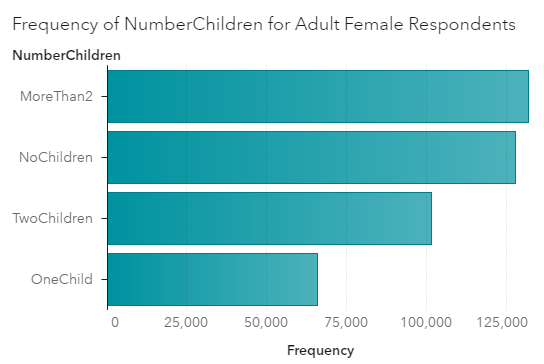
For adult women in 1990, the most frequent category is to have more than 2 children. This would include the parents of Boomers. Think about those big families you know from the Boomer generation.

For input variables to my model, I’ll use age categories and also education levels. I set the new categorical variable I created called NumberChildren as the Response variable for a decision tree model. [Footnote 2] Here’s a zoomed out picture of the visual model output.
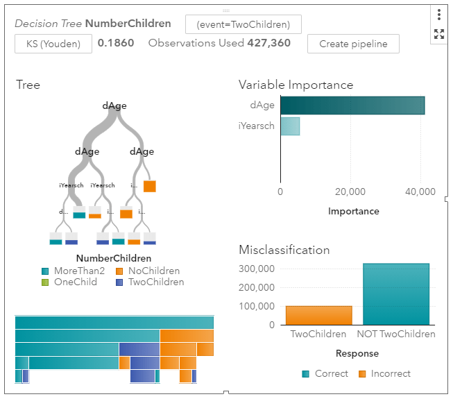
It’s immediately obvious that age is more informative than schooling. Women under the age of 30 are much more likely to have no children. The width of the grey tree branches makes it easy to see where the majority of the observations are.

I’ll zoom in on the left side of the tree where most of the people are.
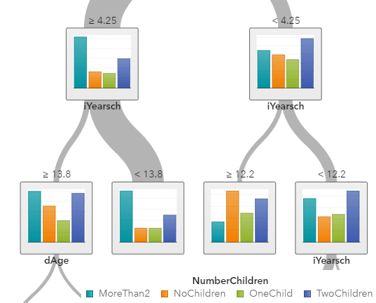
The “>= 4.25” means that women on the far left side are over the age of 40. Among older women, the norm is to have 2 or more children. If you are looking for the older women with exactly two children, you are more likely to find them among those who have an education score of larger than “13”, meaning that they have a Bachelor’s degree or higher.

My point is not to posit causal relationships among education and fertility. My point is how awesome these graphs are. You do have to learn some point-and-click functions within SAS Viya to make them. But I don’t know of any other software that can produce this.

SAS Viya also provides tables and statistics on each node, which is more like what I could get from free open source software a few years ago when I looked into decision tree packages.

[Footnote 1] If you want to replicate what I did, know that the USCENSUS1990 dataset in SAS Viya comes with no explanation. Google brought me to UCI, where I found what I needed in terms of technical documentation.

dAge, iFertil, iSex, iYearsch are the names of the variables you will find in SAS. To create my graphs and models, I converted some of them to categorical variables using the “+New Data Item -> Custom Category” functions. No programming is required.

iSex: 0 indicates Male, 1 indicates Female

dAge is coded as follows: 0 is babies; 1 is under 13, 2 is under 20 (but over 13), 3 is under 30, 4 is under 40, 5 is under 50, 6 is under 65,  7 is for 65 and over

iFertil is coded: 0 is either less than 15 years old or male, 1 is no child, 2 means they have one child (confusing…), 3 means they have two children, all the way up to a 13 which is the code for 12 or more children

iYearsch:  3-10 refers to primary school up to a 10 indicating graduating from high school, 11-13 refer to some college and associate degrees, 14 is a Bachelors degree, 15-17 refers to higher degrees

[Footnote 2]  I decided to set Maximum levels to 5 in Options. This keeps the tree smaller which looks better in the blog.
Civil society and purpose

Any discussion of building a humane economy that addresses important needs like purpose, security, and opportunity would be incomplete without civil society — the third sector composed of our families, churches, affinity groups, and civic organizations. 

In this post, I will touch on purpose. This year our conversations have been dominated by COVID-19 and discussions about the costs and benefits of state and local policies. In August 2020, the CDC released a report on the mental health effects from the lockdown and the results leave one stupefied. Among young adults (18-24 years old), 25 percent had suicidal ideation. One of the authors’ proposals includes “promoting social-connectedness” suggesting the dearth of community played an important role.

The anguish described above also calls to mind recent attention on “deaths of despair”. This refers to the rise in mortality among middle-aged white men starting in the late 1990s from suicide, overdose, chronic liver disease or cirrhosis. What causes these deaths of despair? In their book Deaths of Despair and the Future of Capitalism, Anne Case and Angus Deaton write,

“Destroy work and, in the end, working-class life cannot survive. It is the loss of meaning, of dignity, of pride, and of self-respect that comes with the loss of marriage and of community that brings on despair, not just or even primarily the loss of money.”

This is also reflected in Marco Rubio’s plea for a common-good capitalism where he cites deaths of despair as a ripple effect from an “economic re-ordering” and holds up the primacy of creating jobs that provide dignified work. This is important. As Adam Smith has noted, “Man naturally desires not only to be loved but to be lovely,” and work helps a man to feel he has made a contribution and is deserving of love and respect. At the same time, I want to resist the temptation to think despair flows only from economic conditions.

In his book Sickness Unto Death, Kierkegaard claims that humankind falls into despair when we have a misunderstanding about who we are as human beings. But, for Kierkegaard this despair can serve an important role. Despair signals our need for God, the only one who can heal our despair. A couple years ago at the Southern Economic Association meetings, I saw some preliminary work that suggested these deaths of despair were pre-dated by the decline in occupations but actually corresponded to earlier declines in religious participation. In order for life to have meaning, a person must have faith, and that faith is sustained in communities.

The key point is this: Man cannot live on economics alone. More depth is needed and this can be found in our communities. If a person removes themselves from important communities that can have a negative impact on their flourishing.

Here is a question: Before the fall of man, was everything perfect in the Garden of Eden? No.  “The Lord God said, “It is not good for the man to be alone. I will make a helper suitable for him.”” (Genesis 2:18) We want to love and to be lovely. There must be some other for us to direct our love and receive love from. And, while that other could be a higher power like God, even Adam before the Fall, wanted that love to come from another human. Small groups like our churches provide the context through which this natural inclination can be pursued. Obviously there are other groups too like families, recreational organizations, civic organizations, etc.

Small groups can be chosen for different reasons and with different levels of commitment. This is a good thing because it is akin to a portfolio of identities. Having many different communities where we can engage different pursuits seems preferable to worship at the altar of politics. When we talk about a life well lived, human needs like purpose, security, and opportunity seem important to meet. Economics and work are important for that sense of purpose but we should not overlook how a lack of community can lead to a loss of purpose.

Reflections on Teaching in Fall 2020

As the Fall semester comes to close on college campuses, it’s a good time to reflect on and assess how the past semester went. Many universities went to almost exclusively virtual learning, but other schools tried to make Fall 2020 as normal as possible given the circumstances of the COVID-19 pandemic.

My school, the University of Central Arkansas, chose the route of trying to have things as normal as possible — by which I mean students live on campus, classes are mostly in-person — while still accommodating students and faculty that preferred a more physically distant atmosphere. For example, UCA increased the number of fully online courses available, roughly trying to meet faculty and student demand. I normally teaching one online course per semester anyway, and I continued that this semester. Other faculty had more online classes than usual, or moved their class to be partially online.

So what was my experience?

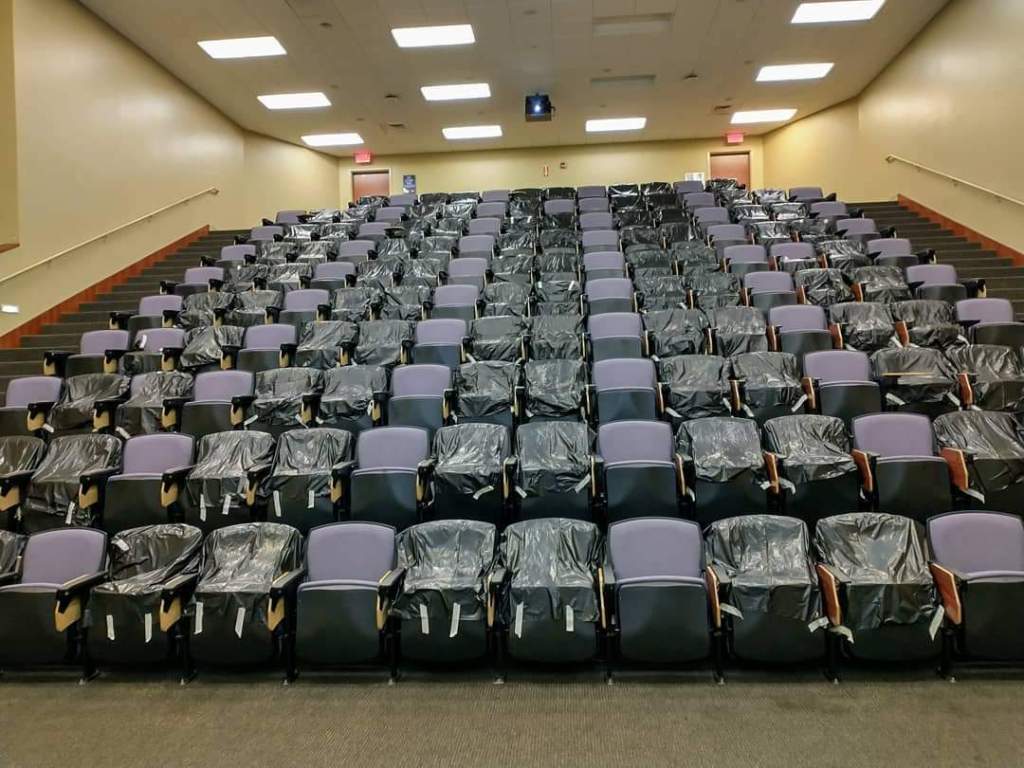
First, the students, the most important part of the teaching process. Overall, I would say my students did very well. At least in the classroom, they complied with all the rules the University set forth: wearing masks, physical distancing in classrooms (seen in the image below), even the one-way entrances and exits to the building. There were only 3-4 times I can recall this semester when a student entered my classroom without a mask, and they immediately asked me for one upon realizing their mistake (I kept a pack of surgical masks with me).

My classroom at the University of Central Arkansas, with chairs blocked off for physical distancing.

As far as academic performance of students, I was very pleased with the students. For those students that were able to stick with the class and keep up, which was most students, they perform as well or better than previous semesters. Some students, due to personal circumstances, had trouble keeping up. I tried as much as possible to accommodate students in these situations, by being flexible with deadlines, offering additional resources, and generally just trying to listen to them and empathize. It was hard for everyone.

On my end, I tried to make the teaching atmosphere of the classroom as normal as possible. I usually do have some interactive aspects of the classroom, where students work in small groups, talk to their neighbors, etc. Most of those activities didn’t happen, unfortunately. But otherwise, the classroom atmosphere operated as usual.

As my students did, I also wore a mask in the classroom while I lectured. For students that had to miss class due to quarantine, isolation, or other reasons, we were asked to record every lecture and have an option for students to watch the lecture virtually if needed. Making sure that the video was properly recording and the I had set up the Zoom link for students that needed to be remote added an extra element to think about at the beginning of each class, but it was the kind of thing that once you get used to it, it just became normal.

I will say that I often felt very exhausted after teaching each day. The mental load of making sure everything was working right in the classroom, combined with the constant sense of doom in the world around us, made this a challenging semester mentally. I’m sure this was even more true for some of my students. But, we made it.

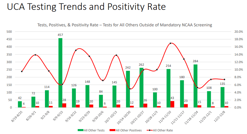
Finally, how about the administration of my University. I’ll bite my tongue a little here: I am up for tenure this year! But really, I don’t have anything major to complain about. Guidance was communicated well, although sometimes big changes were rolled out a bit more quickly than the faculty liked. UCA provided isolation and quarantine dorms for students, though these never came close to capacity. Weekly updates on testing, cases, and related data were provided to everyone (and made publicly available, so I’m not revealing any secrets here).

Testing data for UCA students. This data excludes athletes, since they were required to get tested regularly, which could have skewed the data.

As you can see above, the general student body at UCA did report positive COVID cases every week. And some weeks the positive test rate was a little higher than I was comfortable with! But we never had a large spike in cases, and the University held firm to its commitment to offer in-person classes for everyone that wanted them, as long as the campus was generally safe.

All in all, I think it was the best semester we could have had under the circumstances. The only thing really weighing on my mind: we are going to do it all over in the Spring semester. And we’ll do it as well as we can.

Thanks for the Patent System

Although I write on a variety of subjects, my main professional training (through the PhD level) is as a chemical engineer. Chemical engineering is one of the broader technical disciplines. It bridges between chemistry, which is mainly associated with academic-type laboratory work, and huge chemical plant equipment. One year I was making and testing catalysts in the lab, then next I was calculating fluid flows and designing internals for a 100 ft high distillation tower (and climbing around inside that tower to insure the parts were being properly welded in place):

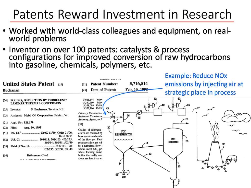
In my work in industrial research, I have been paid to develop technical improvements which could have economic value. A key incentive my company had for investing in this research was the expectation that if we came up with a novel improvement, that we could have exclusive rights to practice that improvement. There would have been little point in paying for research if our competitors could immediately make use of our hard-won insights. A snip of one of my patents is shown below.

For the world, and for most large groupings such as nations, the average income per capital is roughly equal to the average production per capita. The way to get more “stuff” (goods and services, and all their benefits) is to make more stuff. The way to make more stuff (per capita, and for fixed a workweek) is to make workers more productive. A key factor in productivity is technology. Two hundred years ago, nearly everyone in the U.S. had to be out in the sun and cold, working the soil, sowing by hand and plowing with the aid of animals, to grow enough food to feed everyone. Now I believe we are fed by only 2% of the workforce, using artificial fertilizers, improved seeds, huge tractors and combines, and satellite-aided computer scheduling. Most of the rest of us get to work in air-conditioned offices (or homes, in a pandemic year) and eat as much food as we want.

The patent system of the U.S. and other nations is designed to promote progress in productive technology. Early on, the newborn U.S. Congress passed the Patent Act of 1790, titled “An Act to promote the progress of useful Arts”.  Without getting into all the legal details, a valid U.S. patent allows the inventor to exclude any other party from practicing their invention, for a period of twenty years. However, one of the requirement for a patent application is to clearly explain to the public how the invention works. When the twenty years is over, anyone can take advantage of the technology which the inventor has disclosed, which hopefully leads to widespread practice of technical improvements. While we can always ponder improvements to our system of patents, readers can thank it in part for many medical advances, and for delivering them from trudging behind a plow.

Alabama’s Covid Data Hero

Housekeeping: There was no post yesterday on Economist Writing Every Day. It was my day to write and family responsibilities just took up every minute. This might happen occasionally.

Last week I wrote about American Data Heroes. There are many that I don’t know of , but I wanted to share the work of tireless Frank McPhillips. For months he wrote a succinct post every single day within a private Facebook group for concerned citizens of Alabama. Recently he switched to Substack, meaning I can share it here.

McPhillips summarizes and explains the Covid data for the state of Alabama, where I live. This is data that is publicly available, but most people like myself don’t want to do as much work as he does to understand it. He also understands when the reporting might be wrong or late.

I’m going to quote from his most recent posts.

Dec 5:

The Chairman of the Madison County Commission was more blunt. “We’re now talking about alternative space for a morgue”, he said, adding that he has never faced such a decision in 25 years of public service.

According to HHS, 87.7% of Alabama’s ICU beds are occupied… Our State added 3,390 more COVID cases today (incl. 655 probables), raising the 7-day moving average to 3,228 cases per day, which is twice the daily average 3 weeks ago.

Dec 6:

With 473 more cases, Birmingham’s home county, Jefferson, has a 14-day positivity rate that tops 30% for the first time. 

Dec 7:

Now, brace yourself for the updated hospitalization data:  2,079 patients (105 reporting hospitals), a jump of 163 patients in a single day. The Huntsville Hospital system reported 378 COVID patients, an increase of 76 patients in one week. DCH Health system reported 138 patients, double the number just 9 days ago. And finally, Regional Medical Center (Anniston) announced new visitation restrictions due to the pandemic: “For end-of-life care, two visitors will be permitted to remain in the patient’s room, without leaving or re-entering the building and without substitution”.

I appreciate all his work. It’s obvious when he’s getting depressed or exhausted, but he’s decided to keep going (almost) every day. He keeps writing new prose on how this is the most deadly “war” of our time. He wants people to keep fighting back and not get complacent. See his Dec 7 post for more war comparisons.

McPhillips has helped a lot of people in his locality. He inspires me for Writing Every Day.

Teaching with SAS Viya for Learners: Last Report

I used SAS Viya for Learners to teach data analytics to undergraduate business students for one semester.

I’ll start with the benefits of SAS Viya: It’s free; It’s visually appealing and requires no coding; There are some SAS tutorial materials that teachers can use; The way decision tree results are displayed makes intuition easy for students who are new to data mining.

I made a post earlier in which I reported that it actually works. I still think that, but at the end of the semester I did have individual students experience errors and mysterious interruptions to service. It made me wonder if the server gets busy at the end of an academic semester.

SAS is known for making excellent products and charging high fees for them. Since SAS Viya is free, they aren’t going to be giving all the functionality with it. The free version does not let students import any data. There is a sandbox of data to learn with, which is more than enough to fill a semester. I didn’t even open most of the available data sets.

My students did their final projects by choosing one of the pre-loaded datasets and using that for analysis. As far as applying the principles I taught, this was fine. In one sense, it was easier than telling them to fend for themselves and find data on the world wide web.

The downside is that the software-specific skills students learn from free student SAS Viya can’t be used on a project for work or for a different class. Eventually, any useful work involves importing new data.

The decision to use SAS Viya for Learners instead of R should depend on what your students want to do next. Both products will allow them to learn concepts and common functions.

If you are going to use SAS Viya, I highly recommend using the tutorials made by SAS with screenshot-by-screenshot instructions. You can give the instructions to the students, so students aren’t coming to you with questions about every click they need to make.

I paired SAS Viya with a Business Intelligence Textbook. Also note that students had already taken a traditional Business Statistics course previously.

Treating Marriage like a Luxury Good

In the United States, the median age of marriage has been climbing for decades. In 1960 the median age of first marriage for men and women was 22.8 and 20.3 respectively. Fast forward to 2019 and the median ages are 29.8 and 28. Here are the historical tables.

Qualitative studies that interview young people suggest they are waiting on marriage until their careers get underway. Marriage is now something you do once you have a high income. But, this treats marriage as if it were a consumption good.

Consider this blog post from Brides.com,

“With the rising cost of living, mountains of student loan debts, and a lack of job security, some of us just aren’t financially in a position to get married or settled down until we’re a little older.”

What is striking is how marriage is not viewed as a productive and helpful institution to overcome these obstacles in life. This runs contrary to the literature on the Economics of the Family that documents how marriage facilitates gains from trade, risk pools like an insurance policy, and allows couples to take advantage of economies of scale.

Yes, you can obtain some of these advantages with cohabitation but not at the same level of commitment.

This view of marriage as a luxury that is only consumed when your career and finances are in order is harmful because it leads to less opportunity. Marriage is productive and expands our possibilities.

“Firearms and Violence Under Jim Crow”

A new working paper by Mike Makowsky and Patrick Warren finds that “firearms offered an effective means of Black self-defense in the Jim Crow South.” By this the authors mean that greater access to firearms by Blacks decreased the likelihood of being lynched.

That headline finding is sure to be provocative in both debates over gun control and the history of Jim Crow. And with good reason. What I found most interesting is how they measured Black access to firearms. Since they did not have direct access to any good sources measuring Black access to firearms, they proxy access with the percent of Black suicides committed with firearms. Increased access to firearms would also mean a higher proportion of suicides were committed using firearms.

That’s a “grisly” way of measuring Black access to firearms, as Makowsky put it in a Twitter thread summarizing the paper. But also a very creative one.

Here’s the full abstract:

We assess firearm access in the U.S. South by measuring the fraction of suicides committed with firearms. Black residents of the Jim Crow South were disarmed, before re-arming themselves during the Civil-Rights Era. We find that lynchings decrease with greater Black firearm access. During the Civil-Rights Movement, both the relative Black homicide and Black “accidental death by firearm” rates decrease with Black firearm access, indicating frequent misclassification of homicides as accidents. In the contemporary era, greater firearm access correlates with higher Black death rates. We find that firearms offered an effective means of Black self-defense in the Jim Crow South.

Peering Inside the Balance Sheet of the Fed

A balance sheet gives a snapshot of a corporation’s assets and liabilities. The difference between total assets and total liabilities is (by definition) the value of the equity owned by the owners or shareholders of the company.

With, say, a manufacturing firm, the assets would include tangible items such as buildings and equipment and inventory, and intangibles such as cash, bank accounts, and accounts receivable. Liabilities may include mortgages and other loans, and accounts payable such as taxes, wages, pensions, and bills for purchased goods.

The balance sheet for a bank is different. The “Assets” are mainly loans that the bank has made, plus some securities (such as US Treasury bonds) that the bank has purchased. These assets pay interest to the bank. The money the bank used to make these loans and purchase these securities came mainly from customer deposits or other borrowings by the bank (which are considered “Liabilities” of the bank), and also from paid-in capital from the bank owners/shareholders. [1]  As usual, the current equity of the bank is assets minus liabilities. Thus:

Source:  BBVA

The Federal Reserve System is a complex beast. We will not delve into all the components and moving parts, but just take a look at the overall balance sheet.

Unlike other banks, the Fed has the magical power of being able to create money out of thin air. Technically, what the Fed can do with that money is mainly make loans, i.e. buy interest-bearing securities such as government bonds. The Fed makes its transactions through affiliated banks, so it credits a bank’s reserve account with a million dollars, if it buys from that bank a million dollars’ worth of bonds. Those bonds then become part of the Fed’s “assets”, while the reserve account of the bank at the Fed (which is a liability of the Fed) becomes larger by a million dollars. Since the Fed is not a for-profit bank, the “Equity” entry on its balance sheet is nearly zero. Thus, total assets are essentially equal to total liabilities.

The Fed also has the power of literally printing money, in the form of Federal Reserve Notes (printed dollar bills). These, too, are classified as liabilities. Thus, you are probably carrying in your wallet right now some of the liabilities of the central bank of the United States.

Before 2008, the balance sheet of the Fed was under a trillion dollars. Nearly all the “Liabilities” were the Federal Reserve Notes and nearly all the “Assets” were US Treasury securities. The reserve accounts of the affiliated Depository Institutions was minuscule. All that changed with the Global Financial Crisis of 2008-2009. To help stabilize the financial system, the Fed started buying lots of various types of securities, including mortgage-backed securities (MBS) [2]. The Fed thus propped up the value of these securities, and injected cash (liquidity) into the system.

Here is a plot of how the assets of the Fed ballooned in the wake of the GFC, from about $ 0.9 trillion to over $ 4 trillion:

Source: Investopedia

The initial purchases in 2008 were US Treasuries, which the Fed had prior authorization to do. To buy other securities, especially the mortgage products, required congressional authorization. The increased liabilities of the Fed which offset these purchases were mainly in the form of larger reserve accounts of the affiliated banks. The Fed started paying interest on these reserve accounts, to keep short term interest rates above zero at all times (otherwise the whole money market in the U.S. might implode).

 With the Fed relentlessly buying the mortgage and bond products, the interest rates on long-term mortgages and bonds was kept low. This was deemed good for economic growth. The Fed tried to sell off some securities to taper down its balance sheet in 2018, but that effort blew up in its face – – the stock market started crashing in response in late 2018, and so the Fed backtracked . You can look at weekly tables of the Fed balance sheet here.

Anyway, the GFC and its aftermath provided the precedent for massive purchases of “stuff” by the Fed. When the Covid shutdown of the economy hit in March of this year, the Fed very quickly went into high gear. Its balance sheet shot up from $4 trillion to $7 trillion in just a few months. It bought not only Treasuries and MBS, but corporate bonds. This was way outside the Fed’s original charter, but the crisis was so intense that nobody seemed to care whether these actions were legal or not. And now, to finance the huge deficit spending of the federal government in the wake of the shutdowns, the Fed has been buying up nearly the entire issuance of Treasury bonds and notes.

These actions may have long term consequences we will explore in later posts [3]. For now, the Fed has made it clear that it will keep interests rates near zero for at least the next couple of years. Invest accordingly.

ENDNOTES

[1] Huge caveat: This statement gives the impression that a bank must first receive say a thousand dollar deposit before it can make a thousand dollar loan. That is not the case. The reality is just the opposite: the act of making a thousand dollar loan actually CREATES a corresponding thousand dollar deposit. This is very counterintuitive, and I won’t try to explain or justify this point here.

[2] Technically, the Fed is not “buying” the mortgage-backed security (MBS). Rather, it is making a “loan” to the bank, and holding the MBS as collateral against that loan.

[3] It is now harder to take the federal deficit seriously as a constraint on spending:  the government can issue unlimited bonds to fund deficits, which the Fed will purchase to keep interest rates low. Yes, the government has to pay interest on those bonds, but the Fed has to return most of that interest to the Treasury, so the real cost to the government of that extra debt is low.

Meaningful Life and The Queen’s Gambit

If you liked Star Wars: A New Hope, and everyone does, then you will enjoy The Queen’s Gambit. It’s like The Mighty Ducks for chess, with a lot more drugs and female coming-of-age.

The main character, Beth, achieves success and seems happy at the end. There is some pretty on-the-nose dialogue about happiness in the show.

Other female characters represent other arenas of achievement. A high school friend, Margaret, has a baby. The baby curtailed Margaret’s freedom and locally-high-status social life. Marriage and children is portrayed as a drag. Margaret’s baby carriage basket contains only clinking bottles of alcohol, which I suppose is meant to indicate that Margaret is even more miserable than the face she presents to Beth when they meet in a store.

Motherhood is not interesting to Cleo, a model. However, even her own achievements in terms of physical beauty leave Cleo unsatisfied.  Cleo says, “Modeling and models are insipid.” Cleo’s life might seem exciting to those of us on the outside of the fashion world, but Cleo wishes she could win at chess and is openly envious of Beth.

A non-Beth female character who is pursuing a life of the mind is Jolene. Jolene is a paralegal who aspires to be a lawyer because she believes that will make her powerful and respected. Jolene envies Beth’s winner status. Jolene has an active role in giving Beth straight talk about drugs and also in loaning Beth money.

Patriotism and religion are despised by Beth and Jolene. They hate the Christians who run an orphanage where Beth and Jolene apparently received an excellent education. Jolene says she was happy when the director of the “Home for Girls” broke her hip and became crippled thereafter.

The irony of the Queen’s Gambit is that the show exalts intellectual ability and yet a social scientist is left with very little to think about. The star of the show is mesmerizingly beautiful. Viewers mostly just stare at her. Here is some honesty from Twitter

In the show, every typical source of meaning is knocked over like a king in checkmate. It all works out for Beth, because of her inimitable talent and adoring fans.

If you are actually thinking, you might wonder what those of us who are not chess champions should do with ourselves. We can’t all become lawyers, and not even all lawyers are happy.  

Some research shows that American women report wishing they had more children.

In the show, Beth is just as beautiful and fashionable as Cleo, but also wins at chess. Some of us mortals can’t have it all. If anyone is wondering, this is the haircut of the woman who might be the most comparable historical female to Beth.

Incidentally, a social science book has recently been written about the economic power wielded by the Cleo’s. You can listen to Ashley Mears on status and beauty here.