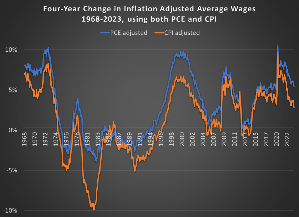
In the October 1980 Presidential debate, Ronald Reagan famously asked that question to the American voters. His next sentence made it clear he was talking about the relationship between prices and wages, or what economists call real wages: “is it easier for you to go and buy things in the stores than it was four years ago?”
Reagan was a master of political rhetoric, so it’s not surprising that many have tried to copy his question in the years since 1980. For example, Romney and Ryan tried to use this phrase in their 2012 campaign against Obama. But it’s a good question to ask! While the President may have less control over the economy than some observers think, the economy does seem to be a key factor in how voters decide (for example, Ray Fair has done a pretty good job of predicting election outcomes with a few major economic variables).
Voters in 2024 will probably be asking themselves a similar question, and both parties (at least for now) seem to be actively encouraging voters to make such a comparison. We still have 12 months of economic data to see before we can really ask the “4 years” question, but how would we answer that question right now? Here’s probably the best approach to see if people are “better off” in terms of being able to “go and buy things at the stores”: inflation-adjusted wages. This chart presents average wages for nonsupervisory workers, with two different inflation adjustments, showing the change over a 4-year time period.
Despite recent increases in prices of food, we should still all be very thankful this Thanksgiving for the abundance of affordable food available in the modern world. Looking back at my past few blog posts, I notice that I have been very food-centric in my choice of topics! And last week I also showed how the Thanksgiving meal this year will be the second cheapest ever (only behind 2019). While it’s absolutely true that food prices are up a lot in the past 2 and 4 years, they probably aren’t up as much as you have heard.
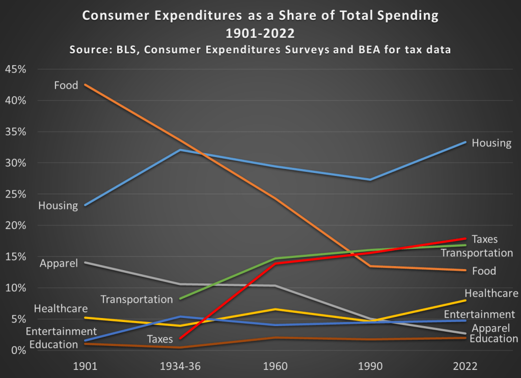
It’s always my preference to take as long-term perspective as possible when thinking about economic progress. So here’s the best way I’ve come up with to show how cheap and abundant food is today: food as a share of household spending fell dramatically in the 20th century.
Most of the data in this chart comes from the BLS Consumer Expenditure Surveys. This survey was done occasionally since 1901, and then annually since 1984. I also use BEA data to estimate personal taxes paid as a percent of spending (the CEX Surveys have some tax data, but it’s not reliable nor consistent). I picked as close to 30-year intervals as I could (with a preference for showing the earliest and latest years available), and I chose spending categories that are 90-100% of total expenditures in most of these years. Keep in mind also that these are consumer expenditures. As a nation, we spend a lot more on healthcare and education than this chart suggests, but most of that spending is not directly from households (of course, it is indirectly). Think of this chart as an average household budget.
I hope the thing that jumps out at you is that the amount money households spend on food has fallen dramatically since 1901, from over 42 percent to under 13 percent of household expenditures. To be clear, this data includes both spending on food at home and at restaurants (after 1984 we can track them separately, and groceries are pretty consistently about 60 percent of food spending). And you may be wondering about very recent trends too, such as before the pandemic. In 2022, household spent slightly less on food than they did in 2019, falling from 13.5 to 12.8%.
You may also notice that taxes have increased, though not much since 1960. Housing cost have been consistently high, and also a bit higher than 1990, going from 27 percent to 33 percent in 2022. And housing is now the single largest budget expenditure category, but for most of the first half of the 20th century, it was food that was the largest. And since people aren’t changing their housing situation more than once a year (if that), it would also have been food that dominated weekly and monthly budget decisions and worry about price fluctuations.
This year there will be lots of complaining about prices around the Thanksgiving table. And much of that is warranted! But let’s also be thankful on this food-intensive holiday for how cheap the food is.
And if some smart-aleck youngster tries to tell you that they learned on TikTok that things were better during the Great Depression (yes, people are really saying this!), have them watch this video by Christopher Clarke. Or show them that in the mid-1930s an average family spent one-third of their budget on food in my chart above, or how much labor it would have taken to buy that turkey in the 1930s (about 40 times as much time spent working as today).
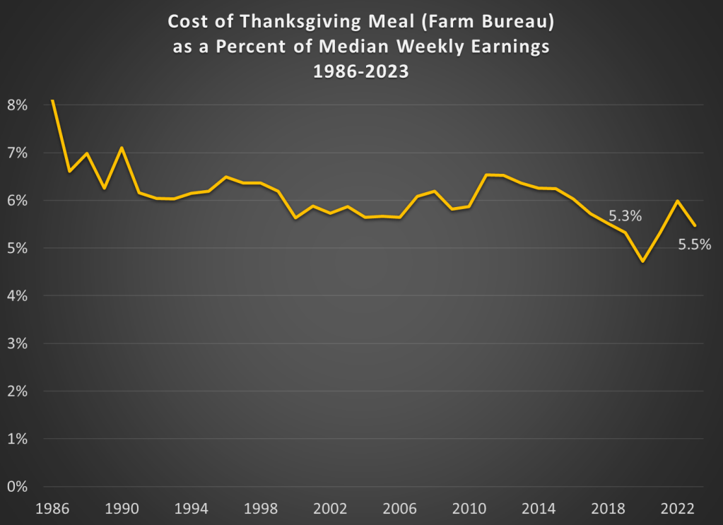
Continuing my tradition of Thanksgivingposts, Farm Bureau released today the latest data on the cost of a traditional Thanksgiving meal. There is welcome news for consumers, as the nominal price of the dinner is slightly lower than last year: $61.17 vs. $64.05 in 2022. The big factor in this decline was the fall in the price of turkeys, though eight of the 12 items in this meal are lower than 2022. As they note in the press release, this is still significantly higher than 2019: about 25% higher.
Regular readers will know what’s coming. Let’s compare those prices (and some historical prices) to earnings:
The Farm Bureau turkey dinner stands at about 5.5 percent of median weekly earnings from the third quarter of this year. That’s a touch higher than 2019, when it was 5.3 percent of weekly earnings. But notice that other than 2019, the figure for 2023 is the lowest ever! (Ignoring the weird years of the pandemic, when wage data is hard to interpret.) So we haven’t quite gotten back to 2019 levels, but we are at the same level as 2018. And lower than 2017. And all prior years too.
The last few Thanksgivings have been tough for Americans. This year, we can all be thankful for falling prices and rising wages.
Last week I gave some advice on how to save money on food. Food prices are up a lot in the past 4 years, but especially since the beginning of 2021. Over the 32 months since January 2021, grocery prices (according to the CPI) are up 20 percent (keep that number in mind). To give you an idea of how unusual that is, in the 32 months before the pandemic (up to January 2020), grocery prices only rose 2 percent. Perhaps even more astonishingly, if we look at October 2019 grocery prices, they were slightly lower on average than 4 years earlier in October 2015. From a flat 4 years to a 25 percent increase over the next 4 years. That’s a huge change for consumers.
But we also shouldn’t overstate the price increases. As you might guess, the best place for overstatements is social media. You can find plenty of them. For example, this very viral video claims that her family’s grocery prices doubled (in fact, almost exactly doubled, to the penny, which is suspicious) in just one single year, from August 2021 to August 2022. According to the CPI data, grocery prices were up 13.5 percent over that period — which, don’t get me wrong, is a lot! But it’s not 100 percent. I’ll focus on this one example, but I’m sure you will believe me that you can find dozens of examples like this on social media every single day (for example, yesterday someone claimed bread prices had tripled since 2019).
Let’s leave aside for a moment that in that viral video she claims to spend $1,500 per month on groceries. This would be a massive outlier for 2022. A family in the middle income quintile spent $460 per month on groceries in 2022, and $713 on all food including restaurants. So even if this family eats every single meal at home, they are still spending twice as much as a middle income family. Even a family with 5 or more people (the largest bucket BLS uses in that report) spent $755 per month on groceries ($1,232 on all food). According to the Consumer Expenditure survey, the middle quintile grocery spending went up 16%, and the five-person household went up 19% from 2021 to 2022. Big increases, no doubt! But not 100%.
So who are we to believe? Have prices roughly doubled since 2021? Or are they up about 20 percent? People are sometimes skeptical of the consumer price index, so let’s look at the actual price data that goes into the index. BLS has data on hundreds of individual food items, but here’s a summary chart with eight common food items. Here’s the change in the prices of those items since January 2021:
It’s the time of the year when we share ideas for things to buy, possibly as Christmas or other holiday gifts. But I’m going to share with you not a specific thing to buy, but instead a method for buying things. And probably not the kind of thing you might think of sticking in a wrapped present: food.
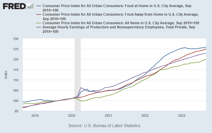
We’ve all heard about and felt inflation lately. But food prices have been especially noticeable to consumer, and not just because it’s a product you frequently buy and probably know the price of many food items. Food prices, both at home and restaurants, have increased much more than the average price levels.
On average, prices are up about 20 percent in the US over the past 4 years. But food prices are up about 25 percent, on average.
Wages (the purple line) actually have increase faster than the general price level over the past 4 years — that may shock you given what we constantly hear in the traditional and social media about “price increases outpacing wage gains” — but it is true when we are talking about food. Your dollar doesn’t go quite as far as it used to for food.
In some sense these costs are hard to avoid: food is a necessity. But there are ways to reduce your costs, and you probably know the general tips. Eat less at restaurants. Buy generic. Buy in bulk. Etc. These are good tips, but they all involve some sacrifice or annoyance. Is there anything else a consumer can do?
Yes. Here’s a few tips that can save you money, without the sacrifice. There is some thought involved, and perhaps a slight annoyance, but I’ve found that once you get in these habits, the mental and time cost is pretty low.
1. RESTAURANT APPS
You should always be ordering your food through restaurant apps when possible, especially for fast food. I try to track limited good deals on Twitter, but most restaurants offer on-going good deals. For example, McDonalds usually has a 20% off coupon, just for using the app. Taco Bell has a $6 box you can build, which would cost around $10 to order as a combo or à la carte at the restaurant. That’s a 40% discount for using the app.
Using apps also means you are using the restaurant’s rewards programs. Valuations vary, but McDonald’s rewards are roughly worth 10% cash back.
2. CHASE THE SALES AT GROCERY STORES
Clipping coupons is the classic way of saving money at the grocery store (we even have reality shows about it), but in the modern world grocery stores have expanded the ways to effectively save the same amount of money. The clearest example is, once again, the rise of apps. Stores will often have “digital only” coupons that you need to access through their app (which is also tied to your rewards account, just like restaurants).
While I’m a strong advocate of coupon clipping (and the virtual equivalent), it can be time consuming. Another strategy that can save you is thinking ahead about seasonal and other cyclical prices. For example, my kids like M&M’s. We usually buy a bulk 62-ounce container at Sam’s Club (already a savings), but today I took the additional saving step of buying the Halloween-themed bulk container. It was 36 percent less than the identical Christmas-themed M&M’s container right next to it. And I was replacing the Easter-themed bulk container that we purchased back in April, and they just finished.
Of course, I had to be planning ahead and know that November 1st was a great day to buy M&M’s. That takes some mental effort, sure. And you might think these kinds of deals are fairly limited in nature. But holidays aren’t the only kind of seasonal deals. For example, even though most fruit is generally available year-round now, there are still predictable price cycles of when things are “in season” and when they have to be imported from expensive locations. Even if you are only able to find these cyclical deals for 10 percent of your purchases, saving 30-50% on cyclical goods will shave another 3-5% off your grocery bill — bringing it closer in line to the average increase in prices (and wages).
3. CASH BACK CREDIT CARDS
I could write an entire post about credit card rewards. But let me focus here on credit cards that are especially good for buying food. At a minimum you should be getting 2 percent back on all of your purchases, as there are several no-annual-fee cards that give you 2 percent: the Citi Double Cash and Wells Fargo Active Cash are good examples.
But on food purchases, you should be able to beat 2 percent. For example, the Citi Custom Cash card gives you 5 percent back on your top spending category each month, up to $500 of spending. This can be on either groceries or restaurants. And since a family in the median quintile spends $250 at restaurants and $460 on groceries per month, you should be getting 5 percent back on basically all of your purchases in one of these two categories. (Personally I stick to restaurants for this card, because I buy most of my groceries at Walmart and Sams Club, which don’t count towards the grocery cash back.) Or if you want a simple card that gives you 3 percent back on both groceries and restaurants, check out the Capital One SavorOne card (again, no annual fee).
There are also several cards that have rotating 5 percent cash back categories each quarter, and they often include either restaurants or groceries. How do I keep track of which card to use for what kind of purchase? Simple: put a strip of masking tape on the card with a label. This will get some chuckles from your friends or the server at the restaurant, but that’s just an opportunity to tell them how to save money too!
Is There Really a Free Lunch?
Some of my economist friends are probably skeptical at this point. Aren’t I say there is a free lunch here? Isn’t the extra hassle of the steps I suggested going to outweigh any discount you get?
The answer is No. And while economists are quick to bring up the concept of opportunity cost, I find that most people tend to overestimate their opportunity cost. But even if you don’t overestimate your opportunity cost, you can bring in another useful economic concept: price discrimination.
Restaurants are very much in the business of price discrimination, and always have been. Tuesday Night specials, happy hours, etc. Every consumer has a different willingness to pay, and since it’s hard to resell a restaurant meal, restaurants can potentially use this technique to their advantage (and yours, if you are willing to look for discrimination). Grocery stores don’t have as much of an opportunity to discriminate, but they still find ways.
Don’t be afraid of price discrimination: use it to your advantage!
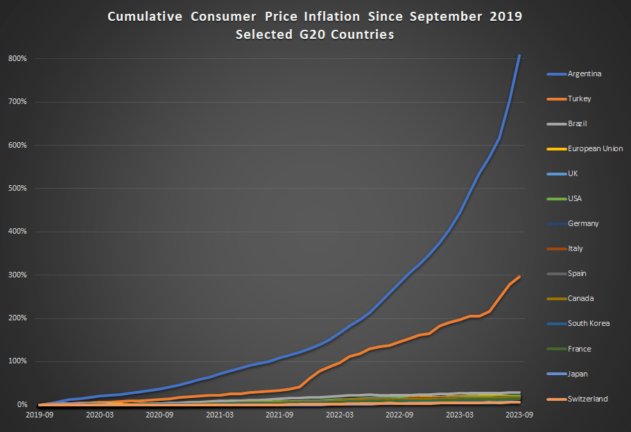
Inflation has been constantly in the news over the past 2 years, but it has especially been in the news lately with regards to one country: Argentina. That country has been experiencing triple-digit annual inflation lately, and it has become one of the key issues in the current presidential race.
How bad is inflation in Argentina? Here’s a comparison to some other G20 countries from September 2019 through September 2023 (data from the OECD).
Cumulative consumer price inflation in Argentina over the past 4 years is over 800 percent. That means goods which cost 100 pesos in September 2019 now costs 900 pesos, on average. Well, they did in September. It’s almost November now, so if the recent inflation rates persisted, those goods are around 1,000 pesos now.
Turkey also stands out as a country with very rapid inflation the past 4 years — without Argentina on the chart, Turkey would clearly stand out from the rest. But other than Turkey, all the other countries are bunched at the bottom. Has there not been much difference among them? Not quite.
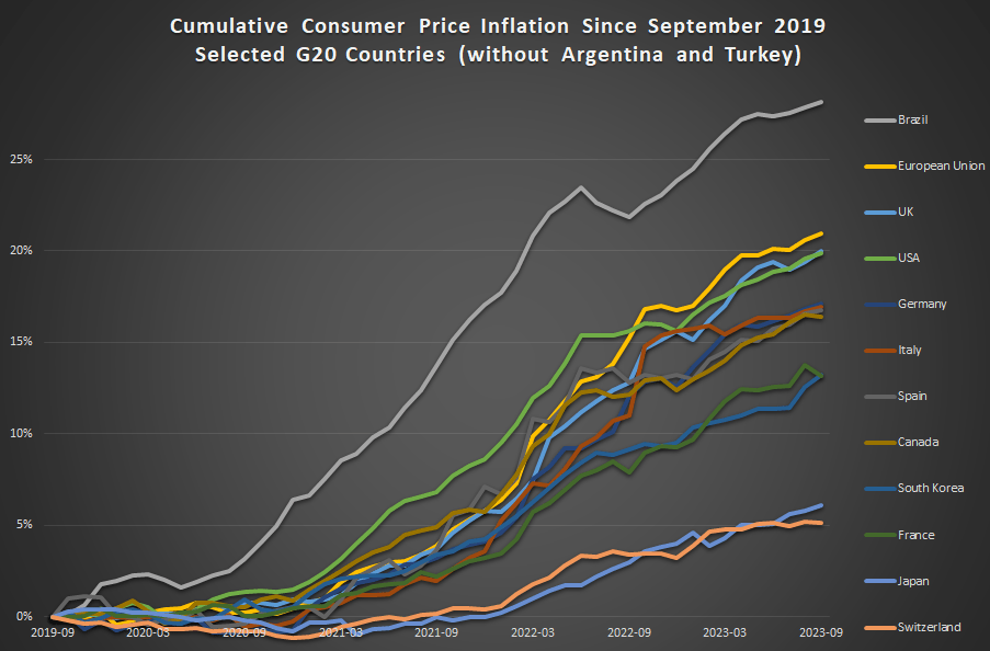
This next chart removes Argentina and Turkey:
In this second chart we see two standouts on the opposite end of the spectrum: Japan and Switzerland have had extremely low inflation, just 6 and 5 percent cumulatively since late 2019 (and this is not unusual for these two countries in recent history).
For us here in the USA, things don’t look so good. Only Brazil and the EU are higher (and the EU is mostly due to energy price inflation in Eastern Europe), so other than that we are basically tied with the UK for the worst inflation performance among very high income countries during the pandemic. That’s bad news! But perhaps one silver lining is that average wages in the US have outpaced inflation slightly: 23 percent vs 20 percent growth over this time period. That’s not much to celebrate — except relative to most of the rest of the world.
On X.com Matt Yglesias posted a chart that sparked some conversation about child safety:
One thing about the much-lamented rise of more intensively supervised childhood activities is that kids have in fact become a lot less likely to die. pic.twitter.com/MTjR7spLM8
Of course, it was probably more his comment about the “rise of more intensively supervised childhood activities” that generated the feedback and pushback. And I assume his comment was partially tongue-in-cheek, as often happens on Twitter, and designed to generate that very discussion. Still, it is worth thinking about. Exactly why did that decline happen?
I’ve posted on this topic before. In my March 2023 post, I looked at very broad categories of child death. While all death categories have declined, about half of the decrease (depending on the age group, but half is about right) is from a decline in deaths from diseases, as opposed to external causes. And fewer disease death can largely be attributed to improvements in healthcare, broadly defined. Good news!
Of course, that means that about half of the decline is from things other than diseases. What caused those declines? Let’s look into the data. Specifically, let’s look into the data on deaths from car accidents.
A few weeks ago I wrote about several measures of the labor market, and whether the labor market was actually doing well. It’s a good idea to look beyond the headline unemployment rate, but even looking at alternative unemployment rates, labor force participation, employment rates, and unemployment insurance claims, I concluded in that post that the labor market is still looking healthy.
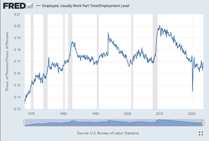
Lately I have heard another objection to the job growth numbers: part-time employment. I’ve seen this pop-up a few times on Twitter lately and just yesterday my co-blogger Scott Buchanan (in a post primarily about excess savings) stated that “much of the jobs creation this year has been in the part-time category.”
So is the jobs recovery mostly about part-time jobs? What is going on?
First things first: most of the data on part-time employment is from the household survey. There’s already a lot of noise in the household survey, due to the sample size, and part-time workers are a small share of the workforce, so expect it to be even noisier. In short, don’t trust one-month fluctuations too much. Furthermore, most of the data folks look at is seasonally adjusted. That’s generally good practice! But again, for a small number in a small sample, the seasonal adjustment factors won’t be perfect. Don’t read too much into one or a few months of data.
Let’s get the big picture first. How much of the labor force in the US is usually working part-time (defined in most data as less than 35 hours per week)? As usual FRED is the best place to go for graphing BLS data:
Last weekend I had the opportunity to visit an arcade, but not one of those modern fancy arcades with virtual reality, laser tag, etc. This arcade specializes in having old-school games, primarily pinball, but also early video arcade games. You pay a cover charge ($5 for kids, $10 for adults), and then you use quarters to play the games. But here’s the cool part: the price of the games is the same as it was when the games were first released.
As an economist, of course, I was very interested in the prices.
They had pinball machines that dated back the 1960s, and video games from the late 1970s. Most video arcade games were around 50 cents for the early games (late 1970s and early 1980s). But the pinball machines started out at 25 cents, with the earliest game they had being a Bally Blue Ribbon machine, manufactured in 1965 (interestingly, some of the earlier machines had slots for both dimes and quarters — I assume the price was adjustable mechanically). Notably, you also got to play 5 balls for this price (3 balls seems to be standard later on).
How should we think about that 25 cents? A standard reaction is to adjust the number for inflation. Using the CPI-U as the inflation index, that means the 25 cents from 1965 is “worth” about $2.40 now. That’s interesting, but I don’t think it really provides the relevance that we want today.
An alternative is to calculate the “time price” of playing the game. Using the average hourly wage of $2.67 in December 1965, we can calculate that it would take about 5.5 minutes of work to pay for that game — a game which probably only lasts about 5.5 minutes, unless you are really good at it!
Another comparison we could do is with the cost of video games today compared with wages today. But that’s not really a fair comparison — video games are much more advanced today. We would need to do some sort of quality adjustment, which is overly complicated.
But, at least in my case, there is no need to do the quality adjustment — I can play the exact same game as 1965. In fact, I did (several times). There was also that $10 cover charge that I mentioned, and if I spread that fixed cost over 40 games, it cost me about 50 cents per play (including the 25 cents to start the machine) to play the 1965 Bally’s Blue Ribbon Pinball machine. At the average wage today of $29 per hour, it takes about 1 minute to afford a play of that same game. In other words, my Blue-Ribbon-Pinball standard of living is about 5.5 times greater than in 1965.
Now this isn’t to say we are 5.5 times better off overall than 1965. Prices don’t stay constant for most goods! But hopefully it is a useful way to think about that 25 cent price tag from the past, and how to compare it to today.
The Federal Reserve has released the latest update to their Distributional Financial Accounts data, which the data underlying several of my past posts on generational wealth. With that recent data, I have updated the chart of wealth for Baby Boomers, Generation X, and Millennials.
The data is shown on a log scale to better show growth rates and allow for easier visual comparisons. But if you are interested in the more precise numbers, in the most recent quarter (2023q2) Generation X has, on average about $620,000 in net wealth, which compares favorably with Baby Boomers at about the same age (in 2006) with about $539,000 in net wealth per person. That’s about 20 percent more.
Millennials have about $115,000 in net wealth on average, which also compares favorably with Baby Boomers, who had slightly more at about the same age (in 1990) with $121,000 in net wealth on average. Given the uncertainties of all the data that goes into this, I’d say those are roughly equal. Gen X had a bit more around the same age (in 2007) with $149,000, but that fell significantly the next two years during the Great Recession.
(For more detail on my approach to creating the chart, see the linked post above, but in short I’m using the Fed DFA data for wealth, Census Bureau data by single year of age for population, and the Personal Consumption Expenditures price index for inflation adjustments (I also have a chart with the CPI-U — it’s not much different). Wealth data is for the 2nd quarter in each year (to match 2023), except for 1989 since the 3rd quarter is the first available.)
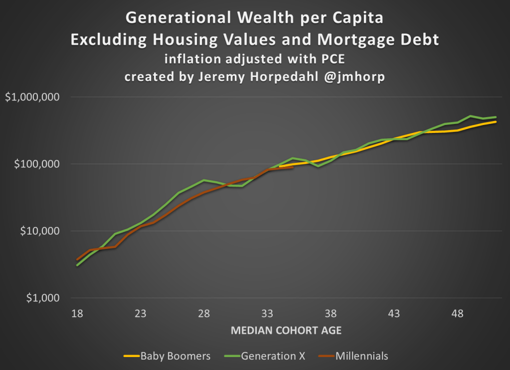
Given how much wealth can fluctuate based on housing values (see above for Gen X from 2007-2009), it might be useful to look at the data with housing. Housing is also a weird kind of wealth — for the most part, you can’t access it without selling (other than certain home equity loans), and when you do sell, unless your home appreciated more than average, you just have to move to another home that also appreciated.
Here’s the chart excluding housing value and mortgage debt:
The chart… doesn’t change much. The values are all lower, of course, but the comparisons across generations look pretty similar. Gen X right now is 17 percent wealthier than Boomers at the same age. And if we look at all three generations around the median age of 35, they are pretty close: Gen X with $123,000 (but slipping over the next few years), Boomers with $99,000, and Millennials with $90,000.