First, here is an updated chart on average wealth by generation, which gives us the first glimpse at 2024 data:
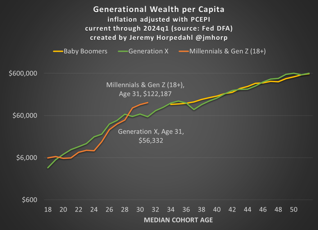
I won’t go into too much detail explaining the chart here, as I have done that in more detail in past posts. But one brief explanatory note: I’m now labeling the most recent generation “Millennials & Gen Z (18+).” Because of the nature of the data from the Fed’s DFA, I can’t separate these two generations (it can be done with the Fed SCF data, but that is now 2 years old). This combined generation now includes everyone from ages 18 to 43 (which means that technically the median age is 30.5, not quite 31 yet), somewhere around 116 million people, which makes it a bit of a weird “generation,” but you work with the data you have. Note though that this makes the case even harder for young Americans to be doing well, as every year I am adding about 400,000 people to the denominator of the calculation, even though 18-year-olds don’t have much wealth.
What’s notable about the data is just how much the youngest “generation” in the chart has jumped up in recent years. They have now have about double the wealth that Gen X had at roughly the same age. Average wealth is about as much as Gen X and Boomers had 5-6 years later in life — and while there are no guarantees, odds are Millennial/Gen Z wealth will be much, much higher in another 5-6 years. You may notice at the tail end of the chart that Gen X and Boomers now have roughly equal amounts of average wealth at the same age (Gen X’s current age), while 2 years ago they were $100,000 ahead. I suspect this is just temporary, and Gen X will soon be ahead again, but we shall see.
Of course, the most common complaint about my data is that these are just averages, so they don’t tell us a lot about the distribution of wealth and could be impacted by outliers. That’s why I’m really excited to share this new data on wealth by decile from the 2022 Fed SCF survey. This data was put together by Rob J. Gruijters and co-authors, and it allows us to compare the wealth of Boomers, Gen X, and Millennials across the wealth distribution. You should read their analysis of the data, but in this post I’ll give my slightly different (and optimistic) interpretation of it.
For all three generations, wealth in the bottom 10% is negative when that generation is in their 30s. And for Millennials, it is the most negative: -$65,000 compared to -$30,000 for Gen X and -$17,000 for Boomers in the bottom decile (as always, the figures are adjusted for inflation). While I haven’t dug into the data, my suspicion is that student debt is driving a lot of the increase. Since this is households in their 30s, I suspect a lot of the bottom decile is composed of folks that just finished graduate and professional school, and are only now starting to acquire assets and pay down debt — they have very high earning potential, which means over their lifetime they will do great, but they are starting from behind. Again, we’ll have to wait and see, but I suspect many in the bottom will quickly climb up the wealth distribution over their working years.
That being said, in the following chart I have left off the bottom 10% for each generation, since displaying negative wealth would make the chart look a little weird. But this chart shows a very optimistic result: Millennials are doing better than Boomers across the distribution, and Millennials are ahead of almost all deciles for Gen X except a few, where they are essentially equal to Gen X (2nd, 7th, and 8th deciles).

The chart may be a little confusing (give me your suggestions to improve it!), but here’s how to read it. The blue bars show Millennial wealth relative to Gen X, at the same age, for each decile (excluding the bottom 10%). For example, the first bar shows that Millennials in the 2nd wealth decile had 100% of the wealth that Gen Xers in the 2nd wealth decile had at the same age — in other words, they were equal. The orange bars show Millennial wealth relative to Baby Boomer wealth at the same age, in the same decile (to repeat, it’s all adjusted for inflation).
Notice that other than the very first bar (Millennials vs. Gen X in the 2nd wealth decile), all of the other bars are over 100%, indicating that Millennials have more wealth than the two prior generations for almost every decile. For some of these, they are much, much greater than 100%. In the 5th decile (close to the median), Millennials have over 50% more wealth than Gen X and almost 200% (double the wealth) of the wealth of Boomers. That’s a massive increase!
A pessimistic read of the chart is that the biggest gains went to the top 10%. Though notice that’s only true relative to Baby Boomers. When compared with Gen X, the 4th and 5th deciles did better than the top 10% in terms of relative improvement. To relate this to the earlier chart in this post, it suggests that relative to Boomers, outliers at the top end might be skewing the average a bit, but that’s probably not the case relative to Gen X. And again, the broad-based gains are visible throughout the distribution from the 2nd decile on up.
Finally, on social media I’ve got several objections about the chart, such as folks not liking the log scale y-axis, and preferring the CPI-U for inflation adjustments instead of the PCEPI that I use. For those objectors, here is a different version of the chart:


