Have you heard the hubbub about eggs? People say that they’re expensive. My wife told me that if she’s going to pay an arm and a leg, then she may as well get the organic, pasture raised eggs. Absolutely. That’s what the substitution effect predicts. As the price ratio of low-quality to high-quality eggs rises, we’re incentivized to consume more of the high-quality version. It has to do with opportunity costs.
Consider a world in which the low-quality eggs cost $2 and the high-quality eggs cost $6 per dozen. Every high-quality egg costs 3 low-quality eggs. You might still choose the high-quality option, but you know that you’re giving up a lot by doing so. Consider the current world where low-quality eggs are priced on par with high-quality eggs. Now, the opportunity cost of consuming the fancy, pasture-raised eggs has fallen. When consuming one high-quality egg costs you one low-quality egg, it’s much easier to opt for the high-quality version. You’re not giving up as much when you purchase it.
For vegetarians, the recent price swing has probably been rough. Not eating meat, they’re facing the price squeeze more so than their omnivorous counterparts. Through the magic of math, median wages, and average retail prices, the figure below charts the affordability of eggs and dairy products.* The median person has been facing falling egg affordability for two decades. Indeed, it’s only been the past few years, punctuated by the Covid crisis, that consumers experienced more affordable eggs.
Dairy products, however, have become much more affordable. The median American can now afford 50% more of their namesake cheese. Further, we can afford 20-25% more whole milk and cheddar cheese. So, the vegetarians are not so poorly off after all.
The US government is great at collecting data, but not so good at sharing it in easy-to-use ways. When people try to access these datasets they either get discouraged and give up, or spend hours getting the data into a usable form. One of the crazy things about this is all the duplicated effort- hundreds of people might end up spending hours cleaning the data in mostly the same way. Ideally the government would just post a better version of the data on their official page. But barring that, researchers and other “data heroes” can provide a huge public service by publicly posting datasets that they have already cleaned up- and some have done so.
That’s what I said in December when I added a data page to my website that highlights some of these “most improved datasets”. Now I’m adding the Behavioral Risk Factor Surveillance Survey. The BRFSS has been collected by the Centers for Disease Control since the 1980s. It now surveys 400,000 Americans each year on health-related topics including alcohol and drug use, health status, chronic disease, health care use, height and weight, diet, and exercise, along with demographics and geography. It’s a great survey that is underused because the CDC only offers it in XPT and ASC formats. So I offer it in Stata DTA and Excel CSV formats here.
Let me know what dataset you’d like to see improved next.
The minimum wage is one of the most studied topics in economics, and also something that is frequently discussed on this blog from many different angles. For someone that isn’t an expert in this area, it can be hard to keep track of all the most recent, cutting-edge research on the topic.
Here’s a brand-new paper in the literature with an important finding: raising the minimum wage increases crime. Specifically, in “The Unintended Effects of Minimum Wage Increases on Crime” the authors find that 16-to-24-year-olds commit more property crimes after a minimum wage increase. For every 1% increase in the minimum wage, there is a 0.2% increase in property crime. That implies a doubling the minimum wage would increase property crimes for this age group by 20%. Here’s a figure from the paper showing this increase in crime:
What is the mechanism by which the rising minimum wage increases crime? Here the authors move into examining one of the central questions of the empirical minimum wage debate: the labor market. The authors do find evidence that employment decreases for this same age group following an increase in the minimum wage. Again, a figure from the paper:
The results in this paper add one more element to the cost-benefit calculus of the minimum wage. But I think the results are also interesting because they seem to point in the opposite direction of a paper co-authored by fellow EWED blogger Mike Makowsky. His paper “The Minimum Wage, EITC, and Criminal Recidivism” found that increasing the minimum wage made it less likely that former prisoners would commit another crime. I would be interested to hear Mike’s thoughts on this paper!
This post is to share some observations that may be helpful to readers who, like me, were rudely surprised by the simultaneous steep decline in both bonds and stocks in the past year.
Bonds and Stocks Are No Longer Inversely Correlated
Back in the day before routine, massive Federal Reserve interventions, say before the 2008 Great Recession, there was a more or less routine business cycle. In an expansionary phase, GDP would increase, there was greater demand for loans, company profits would rise and so would stock prices and interest rates. When interest rates go up, bond prices go down. When the cycle rotated to the recessionary downside, all this would reverse. Stocks would go down, interest rates would decline and investors would flee to bonds, raising their prices.
Thus, bonds served as a good portfolio diversifier, since their prices tended to move inversely to stocks. Hence, the traditional 60/40 portfolio: 60% stocks, 40% bonds, with periodic rebalancing between the two classes.
This approach still worked sort of OK from 2008-2021 or so. The Fed kept beating interest rates lower and lower, and so bond prices kept (fitfully) rising. But at last we hit the “zero bound”. Short- and long-term interest rates went to essentially zero in the U.S. (and actually slightly negative in some other developed countries). Rates had nowhere to go but up, and so bond prices had no place go but down, no matter how stocks performed.
Trillions of dollars of federal deficit spending to pay out various COVID-related benefits in 2020-2021, along with supply chain interruptions, ignited raging inflation in 2022, which the Fed belated addressed with a series of rapid rate hikes and reductions in its bond holdings. The end of easy (nearly no-interest) money and the prospect of a recession knocked stock prices down severely in 2022. However, the rise in both short term and long term interest rates also cratered bond prices. The traditional 60/40 portfolio was decimated. Thus, in an inflationary environment with active Fed intervention, bonds are much less useful as a portfolio diversifier.
Both the stock and bond markets seem to be now driven less by real-world considerations and more by expectations of Fed (and federal government) reactions to real-world occurrences. Pundits have noted the “bad news is good news” effect on stock prices: if GDP dips or unemployment rises (which used to be considered recessionary bad news), the markets cheer, assuming that if any real economic pain occurs, the federal government will flood us with benefits and the Fed will lower rates and buy bonds and otherwise facilitate the renewed deficit spending. (See The Kalecki Profit Equation: Why Government Deficit Spending (Typically) MUST Boost Corporate Earnings for an explanation of why deficit spending normally causes a rise in corporate profits, and hence in stock prices.)
In 2022, there was practically no place to hide from investment losses. Petroleum-related stocks furnished one of the few bright spots, but that was partly a function of economies recovering that year from COVID lockdowns. There is no particular reason to believe that petroleum stocks will rise in the next market downturn. Oil and gas stocks, along with gold and other commodities, might offer a certain degree of diversification, but none of these can be assumed to normally rise (or even stay steady) when the general stock market falls.
Managed Futures Funds as Portfolio Diversifiers
It turns out that there is one class of investable assets that does tend to rise during an extended market downturn, while typically rising slowly or at least staying level during stock bull markets. That is managed futures funds. These funds observe pricing trends across a wide range of commodities and currencies and bond markets, and buy or sell futures to try to profit. If they (or their algorithms) guess right, they make steady, small gains. If there is a new, strong trend that they can buy into, they can make a lot of money quickly. Such was the case for most of 2022. It was obvious that the Fed was going to raise rates heavily that year, which would drive up interest rates and the value of the dollar versus other currencies, and would crush bond prices. The managed futures funds shorted the Euro and bonds, and made a ton of money January-November last year. Investors who held these funds were glad they did. Charts to follow.
The first chart here shows the total returns for the S&P 500 stock index (blue) and a general bond fund, BND (purple), for the past three years, ending Feb 13, 2023. (Ignore the orange curve for the moment). This chart captures the short but very sharp drop in stock prices in early 2020, as COVID lockdowns hit, but government aid was promised. Bonds did not greatly rise as stocks fell then, although after a bit of wobble they stayed fairly steady in early 2020. However, when stocks slid down and down during most of 2022, bonds went right down with them (purple drawn-in arrow), giving no effective diversification. Both stocks and bonds rose in early 2023, showing what is now a positive correlation between these two asset classes.
The next chart (below) omits the bonds line, showing just the blue stocks curve and the orange curve, which is for a managed futures fund, DBMF. The drawn-in red arrows show how DBMF only dipped a little during the COVID crash in early 2020, and it rose greatly in 2022, as stocks (blue arrow) collapsed. This shows the power of managed futures for portfolio diversification.
There was a surprising break in futures trends in November, 2022, as markets suddenly started pricing in an early Fed pivot towards easing in 2023, and so interest rates rose, and bonds and the U.S. dollar tumbled. All the managed futures funds took a sharp hit Nov-Dec 2022; some of them recovered better than DBMF, which kept drifting down for the next few months. Without getting too deep in the weeds, DBMF is an exchange-traded fund (ETF) with favorable fees and taxation aspects for the average investor. However, its holdings are chosen by observing the recent (past few weeks) behavior of other, primary managed futures funds, and trying to match the average performance of these funds. Some of these other, similar funds are EBSIX, PQTNX, GIFMX and AMFNX. These are mutual funds, rather than ETFs, with somewhat higher fees and higher minimum purchases, depending on which “class” of these funds you go with (A, C, or I).
This average matching technique is good, because the performance of any single one of the major managed futures funds can be really good or really any particular year. Some of these individual funds have done consistently horribly, so you’d be in bad shape if you happened to pick one of those. But the average of all those funds, as quantified by a relevant index, does OK and so does DBMF. However, as observed by Seeking Alpha author Macrotips Trading, because of its backwards-looking matching methodology, DBMF can be appreciably slower than other funds to adjust its positions when trends change. KMLM is another managed futures ETF, which tends to be more volatile than DBMF; higher volatility may be desirable for this asset class.
One Fund to Rule Them All
A recommended application of these managed futures funds is to replace maybe a third of your 40% bond holdings with them. Back testing shows good results for say a 15 managed futures/25 bonds/ 60 stocks portfolio, which is periodically rebalanced.
What if there was a fund which combined stocks and managed futures under one wrapper? There is one I have found, called REMIX. It has an “institutional” class, BLNDX, with higher minimum purchase and slightly lower fees, which I have bought into. The chart below shows the past three years of performance for the hybrid REMIX (orange) compared to stocks (blue) and the managed futures-only fund DBMF. We can see that REMIX stayed fairly flat during the COVID blowout in 2020, and it rose along with stocks in 2021, and went roughly flat in 2022 instead of dropping with stocks (see thick drawn-in yellow arrows). The performance of REMIX is actually better than a plain average of stocks (blue curve) and DBMF (purple), so this is an attractive “all-weather” fund. A similar hybrid (multi-asset) fund is MAFCX, which has higher fees but perhaps slightly higher returns to date. MAFCX buys stock (S&P500) futures rather than the stocks themselves, which is a leveraged play – – so for $100 investment in MAFCX you get effectively $100 worth of managed futures plus $50 worth of stock investment.
Managed futures put in an outstanding performance in 2022 because there was a well-telegraphed trend (Fed raising interest rates) in place for many months, which allowed them to make easy profits at the same time that stocks were crashing. But we cannot assume that managed futures will always go up when stocks go down. That said, managed futures will likely be reasonable diversifiers, since they should at least stay roughly level when stocks go down. The trick is to not grow impatient and dump them if their prices stagnate during a long bull stock market phase. Holding them in the form of a multi-asset fund like REMIX may help investors hang in there, since it should go up in a bull market (due to its stock component), while offering protection in a bear.
For instance, below is a five-year chart of a managed futures fund ( EBSIX, purple line ), the S&P 500 stock index (blue line), and a multi-asset fund that combines stocks and managed futures ( MAFIX, orange line. This is the institutional version of MAFCX). The charting program did not account properly for the Dec 2022 dividend of MAFIX, so I extended its curve with a short red line at the right-hand side to show what it should look like if plotted on a consistent total return basis.
With perfect hindsight, I chose a managed futures fund (EBSIX) which has performed among the best over the years; many other such funds would have looked far worse. There was a period of nearly two years (mid-2020 -early 2022) when this fund lagged far behind stocks. It was only when the 2022 catastrophe arrived that the managed future fund EBSIX proved its worth and shot up. The multi-asset fund MAFIX, which is similar to REMIX but with higher fees, basically kept up with stocks in their bull phase, then held more or less steady for 2022, and ended much higher over five years than either SP500 or the plain EBSIX.
I think the single most under-considered development in labor economics has been the revolution in the real-time measurement of labor output over last decade (although there was an interesting article recently in AEJ: Applied looking at the shift in the late 70s from standardized to variable wages within firms). A lot of ink has been spilled agonizing over why “no one wants to work” in fast food establishments for $15-$20 an hour, without appreciation for how much those jobs have been transformed by operations monitoring and management. Simply put, there’s no hiding on the line anymore. You’re either producing or you’re not and everyoone knows. Now, whether subpar performance will quickly result in termination is unclear in such a tight labor market, but you can be sure that your inadequate productivity will be quantified and communicated to you. These numbers may create a feeling of shame or inadequacy, perhaps even sufficient to make you work harder, increasing the disutility of labor faster than your earnings increase. Your prospects for advancement or a pay increase will correlate directly with your measured productivity. The spread of such indignities, previously reserved for those working assembly lines, sales, or independent contract work, are not limited to fast food:
“Workers at the plant told Bloomberg News that Tesla monitors keystrokes to track how long employees spend per task and how much of the day they spend actively working.“
There have long been lines of work where work could be paid “piecemeal” i.e. paid per unit output. These jobs were typically limited to those where labor’s output was discrete, easily measured, and where quality could be distilled into sufficient/not sufficient categorization. Great for sewing textiles, bad for writing code or making gourmet food. When you’re working a piecemeal job you can be rewarded for high output, but it’s a double-edged sword. There’s no obscuring your contributions within the uncertainty of productivity or the efforts of others. It’s the difference between singing in a 50 person choir or playing golf. No one listening to that choir will ever know I can’t hit a note, even after dozens of performances. My fraudulence on a golf course is transparent after a single swing.
The revolution in labor measurement has all kinds of ramifications for the nature of work, management-labor relations, and the distribution of income.
1) Being watched is stressful, being measured doubly so.
2) Nobody likes being judged. Always being watched will only heighten labor skepticism and antagonism towards management.
3) Bigger rewards for higher producers can only increase income inequality even if wages rise for everyone
Better measurement could increase labor’s share of their marginal revenue product simply by reducing uncertainty and risk. This increased share, combined with greater productivity, could raise incomes for all laborers. Even under these assumptions, however, greater measurement is can still increase income inequality because it will likely reward the most productive workers more than the least.
It’s hard to usefully speculate on the exact mechanisms through which transitioning to piecemeal work affects labor. Perhaps it’s safer to just be grossly reductionist: increased monitoring and measurement of labor threaten’s every worker’s god-given right to do a half-assed job.
Worker’s, like all of us, are under-appreciated in the guile and sophistication they bring to bear when maximizing their utility. It’s not just where and when we work, it’s how we work. Some want to climb the ladder, some don’t. Some work to live, some live to work. Some jobs sustain us while we participate in high risk-reward labor tournaments in our side-hustles (music, art, indie game design, etc).
Doing a half-assed job is a tried and true strategy to living a great life if you have the tremendous fortune of living in a wealthy country. Employing half-assed workers, however, is a bit trickier and I suspect the rise in monitoring and measurement is a market response that reveals that the conflict between half-assed labor and management has never solved.
How will such conflicts be reconciled? My suspicion is that this will eventually come out as a mutually beneficial gain, on average, for all parties. Workers will be monitored and measured more tightly, which will make work less pleasant, but they will be paid more and work less. I suspect many of us would actually prefer to work 40% harder for half the hours and make double the pay. There will be people who lose in the transition, however. Every workplace has a slacker who floats from job to job, doing far less than the bare minimum, riding the wave of uncertainty that keeps their unemployment at least temporarily intact. For many occupations that strategy will cease to be viable. I’d feel bad for them…but I don’t. Maybe that makes me a grumpy old man, but if if anyone was taking bets I’d put a lot of money down that for the last 50 years it’s been mostly white men riding off the labor of others…and it’s been mostly the over-contribution of women to marginal output that has subsidized their quarter-assed counterparts.
The days of management trying to increase productivity by exhorting motivational platitudes while dangling the carrot of advancement while pretending to know who deserves credit are over. We know who’s doing the work. Which means that even if you are still formally receiving a salary, your salary will so tightly hew to your productivity that it will effectively be a piece rate. That also means, by the way, that management has no excuses anymore, either. You know who’s getting the work done. The same forces undermining a half-assed labor strategy will hopefully continue to undermine casual cronyism and discrimination as well.
But don’t worry, humans are clever. We’ll game each new system along the way. You’ll never find a more whole-assed effort than someone trying to figure out how to half-ass their job.
SMET was the first acronym used by the National Science Foundation to stand for “science, technology, engineering, and mathematics”. There was a re-branding of the name that we owe to the American biologist Judith Ramaley. The STEM acronym sounds much better!
Does a cosmetic change matter? Will more students study STEM than SMET? The US government funds initiatives aimed at encouraging students to study STEM fields, so answering this question is important.
Some of these initiatives date back several decades, such as the National Science Foundation’s (NSF) Advanced Technological Education program, which was started in 1992 to provide funding for two-year colleges to develop programs that promote STEM education and prepare students for technical careers. The National Math and Science Initiative (NMSI) was established in 2007 and offers training and support for teachers to improve STEM instruction in K-12 schools. In 2009, the White House launched the “Educate to Innovate” campaign, which aimed to improve STEM education in American schools and increase the number of students pursuing STEM careers. Additionally, several federal agencies, including NASA and the Department of Energy, have launched initiatives over the years to promote STEM education and provide opportunities for students to engage in STEM-related research and projects. These efforts reflect a recognition of the importance of STEM fields to the country’s future economic competitiveness and national security, and a commitment to ensuring that all students have access to the skills and knowledge needed to succeed in these fields.
There is something to be said for branding and marketing in relation to science education. However, I see this as an open question: How much does branding matter, as opposed to the fundamentals of the pay and quality of available jobs that students can get in STEM fields?
I’m preparing a public lecture on my “Willingness to Be Paid” paper. Using an experiment, I examined what factors affect a student’s decision to do a computer programming job. I tried out an encouraging message which turned out to not work in the sense that it did not increase participation. I’m planning to open my talk with the SMET affair as an example of what is being tried with messaging and the tech labor supply.
When I was younger, and a more disagreeable libertarian, I was staunchly against almost all taxes. And not just all taxes in general. Each type of tax was a specific affront to human dignity in its own egregious way.
Sales taxes represented government meddling in private contracts.
Income taxes represented government stealing people’s time.
Property tax represented that living on land was a privilege provided by the state landlord. Private property was a myth.
I won’t win the fight over whether the state governments should be spending money. But, given that we have to pay for services, I can definitely opine on the desirable and undesirable traits of one tax or another. Economists tend to like sales taxes because they encourage saving, investment, capital formation, and greater output. Maybe that’s a good idea. But it’s not clear to me that we should incentivize consumption tomorrow at the cost of consumption today. There is no singular right answer to that tradeoff.
I would love to have a per-adult lump sum tax in which everyone pays the same dollar figure no matter what. I would also love to receive a million dollars – and that ain’t going to happen either. In lieu of a lump sum tax on people, I think that the next best thing is a lump sum tax on land. Each acre in a county can pay the same tax bill. On the margin, firms would economize on land and tend toward density. That would bring lots of agglomeration and economies of scale. Jeremy wrote recently about land taxes, which have a lot of proponents. I share the concerns about estimating land value and I think that it’s a non-trivial challenge.
The key lesson, the thing I would impart to any aspiring bloggers, content creators, or newsletter proprietors, is that the cornerstone of internet success is not intelligence or novelty or outrageousness or even speed, but regularity. There are all kinds of things you can do to develop and retain an audience — break news, loudly talk about your own independence, make your Twitter avatar a photo of a cute girl — but the single most important thing you can do is post regularly and never stop.
Granted, “work hard and keep doing the thing you’re doing” is probably above-replacement advice for any kind of entrepreneurial activity. But it’s particularly true for online content creation. As Yglesias suggests, the internet and feed-based social platforms have constructed an insatiable demand for content, so if you can produce content mechanically, without requiring expensive resources (such as time, wit, or subject-specific knowledge), you’re in an excellent position to take advantage. But most importantly, this demand is so insatiable that there is currently no real economic punishment for content overproduction. You will almost never lose money, followers, attention, or reach simply from posting too much.
That is from an excellent post by Max Read. It is fairly short and has some good examples, so I recommend reading the whole thing. Tyler Cowen made a similar point back in 2019:
There’s a certain way in which on the internet you can’t be overexposed. There’s just a steady stream of you, it feels like being overexposed compared to the standards of 1987 or whenever, but in fact it’s not and people are picking and choosing. And you end up just dominating a particular space in a particular kind of way. And I think most older people have not made that transition mentally to understanding how you should exist intellectually on the internet.
Of course, this is also part of Joy’s idea with this site and why we write every day:
It’s just time to start writing more. This is a model that I have learned from Tyler Cowen, and most writers I admire write every day whether or not they have time for it. David Perell has tweeted that writing and thinking are the same thing. Thus, if you are a thinker, writing is not a waste of time. Writing is the thing you are doing anyway in your muddled head.
Tyler Cowen is skeptical about the possibility of a pure land-value tax, even though it has many theoretical benefits. In particular, Cowen points to a host of what we might call “Public Choice NIMBY” issues. In the real world, the same political forces that drive all of the current urban planning issues would either prevent it from being implemented at all, or prevent it from actually being implemented the way Henry George would have wanted.
I grant all these objections, but I do note that there have been multiple YIMBY successes in recent years, particularly in California where NIMBY forces are probably the strongest in the country. Still, if Cowen is mostly correct, are there any real-world options that offer some of the benefits of a LVT? In short, the main benefits are that the deadweight loss of the tax is very small, and that land is more likely to be used for its highest-valued use (which in many cases will mean more density, though this intersects with zoning policy).
Yes. For the clearest example, look to Pennsylvania. Cities are allowed to implement what is called a “split-rate property tax.” It does not only tax land, as a pure LVT would do, but instead taxes land at a higher rate than improvements. A ratio around 5:1 is typical (meaning land is taxed at 5 times the rate of improvements), though some cities have been as high as 26:1.
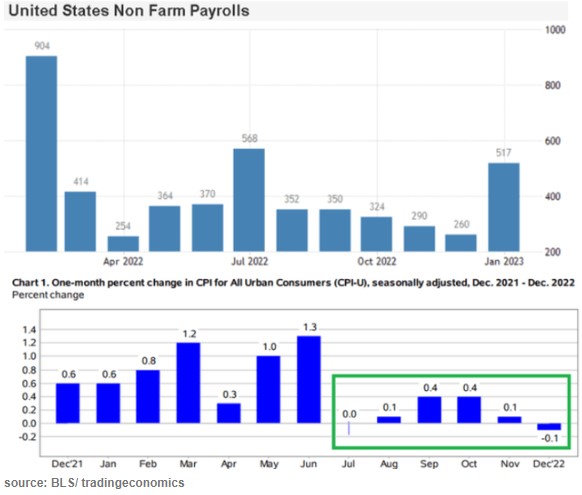
The stock market drools and rips higher at the slightest sign that inflation is abating, since that portends rate cuts instead of rate hikes by the Fed, and a return to the golden days of easy money. But what do the latest data show? Here I’ll show several charts to show what we know so far.
The last couple months’ data points in the lower chart show that inflation (as estimated by CPI) has essentially leveled out and may be starting to decline a little. That is fine but it still leaves inflation far above the Fed’s 2% target. Victor defines a Fed “pivot” not as actually cutting rates, but simply a halt to raising them. By that somewhat anemic definition, sure, a Fed pivot could well come in the next few months. But that leaves rates still very high by recent standards. The real question is when will inflation come down low enough to justify significant rate cuts. The Fed screwed up so abysmally last year with its ridiculous “this inflation is only transitory supply chain issues” that they really cannot afford to relent too soon, and let inflationary psychology take hold.
Side comment: the big “blowout” jobs number for January (last bar on the right, on the top chart above) caused a huge buzz. But there are strong reasons to discount it as an artifact of “ revisions, adjustments, control factors, and recoding “, per Jeffrey Snider.
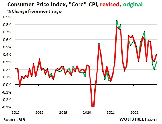
On the other side of the bull/bear divide, Wolf Richter published a glass-half-empty article noting how the Bureau of Labor Statistics recently revised its CPI numbers, and the changes shifted the numbers so as to undermine the argument that inflation has started to drop rapidly:
The chart above with revisions (red line) shows core CPI barely declining over the past 9 months or so, and no trend for an acceleration in that decline. The chart below shows CPI for Services (where we consumers spend most of our money, and which is closely correlated to wages) is holding nearly steady around a red-hot 0.55%/month or about 6.6% annualized. It could be longer than the market thinks before there are substantial rate cuts.
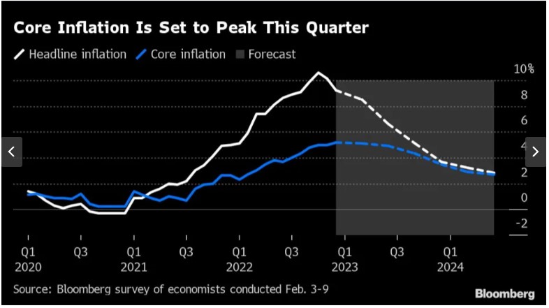
And from the Eurozone, there is this chart, courtesy of Bloomberg via Yahoo, depicting the results of polling economists as to the future course of inflation there:
The consensus view is that inflation in Europe will not approach the 2% target until well into 2024. The European Central Bank is expected to hike by 0.5% in March, followed by another 0.25% to reach 3.25%. (This is much lower than the Fed’s interest rates, but that is probably because the U.S. is still working off the orgy of COVID-related payments that dumped trillions in peoples’ pockets here in 2020-2021). Cuts by the ECB are not expected until the second quarter of 2024.
THIS JUST IN: The January CPI data just came out today (2/14), and pretty much matches up with the picture presented above. Inflation is falling, but ever so slowly, and so it becomes more likely that the Fed will keep its rates higher for longer:
“The Consumer Price Index (CPI) for January showed a 0.5% increase in prices over the past month, an acceleration from the prior reading, government data showed Tuesday. On an annual basis, CPI rose 6.4%, continuing a steady march down from a 9.1% peak last June. Economists had expected prices to climb 6.2% over the year and jump 0.5% month-over-month, per consensus estimates from Bloomberg. …
Core CPI, which strips out the volatile food and energy components of the report, climbed 5.6% year-over-year, more than expected, and 0.4% over the prior month. Forecasts called for a 5.5% annual increase and 0.4% monthly rise in the core CPI reading.”
(For another recent take on the inflation picture, see James Bailey’s The Murky Macro Picture, on this blog).